🧑💻 写在开头
点赞 + 收藏 === 学会🤣🤣🤣
一、传统方案的痛点
以前实现滚动动画需要 JavaScript 监听 scroll 事件:
window.addEventListener('scroll', () => {
  const scrollTop = window.scrollY;
  const progress = scrollTop / (document.body.scrollHeight - window.innerHeight);

  // 更新进度条
  progressBar.style.width = `${progress * 100}%`;

  // 视差效果
  parallaxElement.style.transform = `translateY(${scrollTop * 0.5}px)`;
});
问题:
性能开销大(频繁触发)
需要手动计算
代码复杂
二、scroll-timeline 的解决方案
CSS 滚动驱动动画让元素的动画进度与滚动位置绑定,无需 JavaScript。
基础语法
@keyframes fade-in {
  from { opacity: 0; transform: translateY(50px); }
  to { opacity: 1; transform: translateY(0); }
}

.element {
  animation: fade-in linear;
  animation-timeline: scroll();  /* 绑定到滚动 */
}
三、scroll() 函数
scroll() 创建一个滚动时间线,将动画进度与滚动位置关联。
语法
animation-timeline: scroll(<scroller> <axis>);参数:
scroller: 滚动容器(nearest | root | self)
axis: 滚动方向(block | inline | y | x)
/* 最近的滚动祖先,垂直方向 */
animation-timeline: scroll(nearest block);

/* 根滚动容器,水平方向 */
animation-timeline: scroll(root inline);

/* 元素自身,垂直方向 */
animation-timeline: scroll(self y);
四、实战案例
案例 1:滚动进度条
 <div class="progress-bar"></div>

.progress-bar {
  position: fixed;
  top: 0;
  left: 0;
  height: 4px;
  background: linear-gradient(to right, #4caf50, #2196f3);
  transform-origin: left;

  animation: grow-progress linear;
  animation-timeline: scroll(root block);
}

@keyframes grow-progress {
  from { transform: scaleX(0); }
  to { transform: scaleX(1); }
}
效果:进度条宽度随页面滚动增长。
案例 2:滚动淡入
.fade-in-section {
  opacity: 0;
  transform: translateY(50px);

  animation: fade-in linear;
  animation-timeline: view();  /* 元素进入视口时触发 */
}

@keyframes fade-in {
  from {
    opacity: 0;
    transform: translateY(50px);
  }
  to {
    opacity: 1;
    transform: translateY(0);
  }
}
案例 3:视差滚动
.parallax-bg {
  position: fixed;
  top: 0;
  width: 100%;
  height: 100vh;
  z-index: -1;

  animation: parallax linear;
  animation-timeline: scroll(root block);
}

@keyframes parallax {
  to {
    transform: translateY(50%);
  }
}
案例 4:图片缩放
.hero-image {
  width: 100%;
  height: 100vh;
  object-fit: cover;

  animation: zoom-out linear;
  animation-timeline: scroll(root block);
}

@keyframes zoom-out {
  from {
    transform: scale(1.2);
  }
  to {
    transform: scale(1);
  }
}
五、view() 函数
view() 创建一个视图时间线,当元素进入/离开视口时触发动画。
语法
animation-timeline: view(<axis> <inset>);

/* 元素进入视口时触发 */
.element {
  animation: fade-in linear;
  animation-timeline: view();
}

/* 设置触发范围 */
.element {
  animation: fade-in linear;
  animation-timeline: view(block 20% 20%);
  /* 在视口上下 20% 的范围内触发 */
}
六、animation-range
控制动画在滚动范围内的哪个阶段执行。
.element {
  animation: fade-in linear;
  animation-timeline: view();
  animation-range: entry 0% entry 100%;
  /* 只在进入阶段执行动画 */
}
范围关键字:
entry: 元素进入视口
exit: 元素离开视口
contain: 元素完全在视口内
cover: 整个过程
/* 进入时淡入 */
.fade-in {
  animation: fade linear;
  animation-timeline: view();
  animation-range: entry 0% entry 100%;
}

/* 离开时淡出 */
.fade-out {
  animation: fade linear reverse;
  animation-timeline: view();
  animation-range: exit 0% exit 100%;
}
七、组合使用
多个动画阶段
.card {
  animation:
    slide-in linear,
    rotate linear;
  animation-timeline: view();
  animation-range:
    entry 0% entry 50%,
    entry 50% entry 100%;
}

@keyframes slide-in {
  from { transform: translateX(-100%); }
  to { transform: translateX(0); }
}

@keyframes rotate {
  from { transform: rotate(0deg); }
  to { transform: rotate(360deg); }
}
视差分层
.layer-1 {
  animation: parallax-slow linear;
  animation-timeline: scroll();
}

.layer-2 {
  animation: parallax-medium linear;
  animation-timeline: scroll();
}

.layer-3 {
  animation: parallax-fast linear;
  animation-timeline: scroll();
}

@keyframes parallax-slow {
  to { transform: translateY(20%); }
}

@keyframes parallax-medium {
  to { transform: translateY(40%); }
}

@keyframes parallax-fast {
  to { transform: translateY(60%); }
}
八、浏览器支持
滚动驱动动画在现代浏览器中支持:
Chrome 115+
Edge 115+
Safari 尚未支持
Firefox 尚未支持
特性检测
@supports (animation-timeline: scroll()) {
  /* 支持滚动动画 */
  .element {
    animation: fade-in linear;
    animation-timeline: scroll();
  }
}

@supports not (animation-timeline: scroll()) {
  /* 降级方案:使用 JavaScript */
  .element {
    opacity: 1;
  }
}
Polyfill
<script src="https://flackr.github.io/scroll-timeline/dist/scroll-timeline.js"></script>九、性能优化
1. 使用 transform 和 opacity
/* ✅ 性能好:只触发合成 */
@keyframes good {
  from {
    opacity: 0;
    transform: translateY(50px);
  }
  to {
    opacity: 1;
    transform: translateY(0);
  }
}

/* ❌ 性能差:触发重排 */
@keyframes bad {
  from {
    top: 50px;
    width: 100px;
  }
  to {
    top: 0;
    width: 200px;
  }
}
2. 使用 will-change
.animated-element {
  will-change: transform, opacity;
  animation: fade-in linear;
  animation-timeline: scroll();
}
3. 限制动画元素数量
/* 只对可见区域的元素应用动画 */
.element {
  animation: fade-in linear;
  animation-timeline: view();
  animation-range: entry 0% cover 100%;
}
十、实用技巧
1. 数字滚动计数
@property --num {
  syntax: '<integer>';
  initial-value: 0;
  inherits: false;
}

.counter {
  counter-reset: num var(--num);
  animation: count linear;
  animation-timeline: view();
}

.counter::after {
  content: counter(num);
}

@keyframes count {
  from { --num: 0; }
  to { --num: 100; }
}
2. 文字逐字显示
.text {
  animation: reveal linear;
  animation-timeline: view();
}

@keyframes reveal {
  from {
    clip-path: inset(0 100% 0 0);
  }
  to {
    clip-path: inset(0 0 0 0);
  }
}
3. 图片模糊到清晰
.image {
  filter: blur(10px);
  animation: unblur linear;
  animation-timeline: view();
}

@keyframes unblur {
  to {
    filter: blur(0);
  }
}
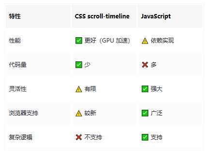
十一、与 JavaScript 对比
如果对您有所帮助,欢迎您点个关注,我会定时更新技术文档,大家一起讨论学习,一起进步。