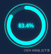
不用插件在vue中封装一个环形进度条组件,根据外部盒子大小自适应变化,一开始用的饿了么的组件,发现大小不会自适应,然后自己就封装了一个
直接上代码
<template>
  <div class="circle-progress" :style="wrapperStyle">
    <svg class="circle-progress__svg" viewBox="0 0 100 100">
      <!-- 外圈光晕环 -->
      <circle
        class="circle-progress__ring--outer"
        cx="50"
        cy="50"
        r="46"
        :stroke="progressColor"
      />
      <!-- 背景环 -->
      <circle
        class="circle-progress__bg"
        cx="50"
        cy="50"
        r="38"
        :stroke="bgColor"
      />
      <!-- 进度环 -->
      <circle
        class="circle-progress__progress"
        cx="50"
        cy="50"
        r="38"
        :stroke="progressColor"
        :stroke-dasharray="circumference"
        :stroke-dashoffset="offset"
        stroke-linecap="round"
      />
    </svg>
    <div class="circle-progress__text" :style="textStyle">
      {{ percent }}%
    </div>
  </div>
</template>

<script>
export default {
  name: 'CircleProgress',
  props: {
    percent: {
      type: Number,
      default: 0,
      validator(val) {
        return val >= 0 && val <= 100
      }
    },
    progressColor: {
      type: String,
      default: '#0ff'
    },
    bgColor: {
      type: String,
      default: 'rgba(0, 255, 255, 0.2)'
    },
    textColor: {
      type: String,
      default: '#0ff'
    }
  },
  computed: {
    circumference() {
      return 2 * Math.PI * 38
    },
    offset() {
      const progress = this.percent / 100
      return this.circumference * (1 - progress)
    },
    wrapperStyle() {
      return {
        width: '100%',
        height: '100%'
      }
    },
    textStyle() {
      return {
        color: this.textColor,
        textShadow: `0 0 6px ${this.progressColor}, 0 0 12px ${this.progressColor}`
      }
    }
  }
}
</script>

<style scoped>
.circle-progress {
  position: relative;
  display: inline-flex;
  align-items: center;
  justify-content: center;
}

.circle-progress__svg {
  width: 100%;
  height: 100%;
  transform: rotate(-90deg);
}

.circle-progress__ring--outer {
  fill: none;
  stroke-width: 2;
  opacity: 0.8;
  filter: drop-shadow(0 0 4px currentColor);
}

.circle-progress__bg {
  fill: none;
  stroke-width: 8;
}

.circle-progress__progress {
  fill: none;
  stroke-width: 8;
  transition: stroke-dashoffset 0.4s ease;
  filter: drop-shadow(0 0 4px currentColor);
}

.circle-progress__text {
  position: absolute;
  top: 50%;
  left: 50%;
  transform: translate(-50%, -50%);
  font-size: 18px;
  font-weight: bold;
  font-family: sans-serif;
}
</style>
使用的时候也非常简单,直接父组件中引入就行了
然后传入需要的参数
<CircleProgress
:percent="83.4"
progress-color="#0ff"
bg-color="rgba(0,255,255,0.2)"
text-color="#0ff"
/>