CSS 页面布局完整教程
第一章:盒子模型回顾
- [1.1 盒子模型核心概念](#1.1 盒子模型核心概念)
- [1.2 盒子模型组成部分](#1.2 盒子模型组成部分)
- [1.2.1 内容区(Content)](#1.2.1 内容区(Content))
- [1.2.2 内边距(Padding)](#1.2.2 内边距(Padding))
- [1.2.3 边框(Border)](#1.2.3 边框(Border))
- [1.2.4 外边距(Margin)](#1.2.4 外边距(Margin))
- [1.3 内容溢出处理](#1.3 内容溢出处理)
- [1.4 元素的显示与隐藏](#1.4 元素的显示与隐藏)
第二章:浮动布局详解
- [2.1 浮动的起源与发展](#2.1 浮动的起源与发展)
- [2.2 文字环绕效果](#2.2 文字环绕效果)
- [2.3 浮动元素的特点](#2.3 浮动元素的特点)
- [2.3.1 特点一:脱离文档流](#2.3.1 特点一:脱离文档流)
- [2.3.2 特点二:浮动元素的显示模式](#2.3.2 特点二:浮动元素的显示模式)
- [2.4 浮动产生的影响](#2.4 浮动产生的影响)
- [2.4.1 对兄弟元素的影响](#2.4.1 对兄弟元素的影响)
- [2.4.2 对父元素的影响(高度塌陷)](#2.4.2 对父元素的影响(高度塌陷))
- [2.5 浮动布局实战案例](#2.5 浮动布局实战案例)
- [2.6 浮动布局的优缺点总结](#2.6 浮动布局的优缺点总结)
第三章:行内块元素布局特点
- [3.1 行内块元素概述](#3.1 行内块元素概述)
- [3.2 行内块元素的居中](#3.2 行内块元素的居中)
- [3.2.1 水平居中](#3.2.1 水平居中)
- [3.2.2 垂直居中](#3.2.2 垂直居中)
- [3.3 行内块元素的空白问题](#3.3 行内块元素的空白问题)
- [3.3.1 问题一:元素之间的水平空白](#3.3.1 问题一:元素之间的水平空白)
- [3.3.2 问题二:底部的空白(图片的幽灵空白)](#3.3.2 问题二:底部的空白(图片的幽灵空白))
- [3.3.3 问题三:文字内容不同导致对齐问题](#3.3.3 问题三:文字内容不同导致对齐问题)
- [3.4 行内块布局实战案例](#3.4 行内块布局实战案例)
第四章:实战案例解析
- [4.1 综合页面布局案例](#4.1 综合页面布局案例)
- [4.2 电商首页布局案例](#4.2 电商首页布局案例)
- [4.3 响应式卡片布局](#4.3 响应式卡片布局)
第五章:布局最佳实践
- [5.1 CSS编码规范](#5.1 CSS编码规范)
- [5.2 常用布局模式](#5.2 常用布局模式)
- [5.2.1 圣杯布局(Holy Grail Layout)](#5.2.1 圣杯布局(Holy Grail Layout))
- [5.2.2 双飞翼布局(Flying Swing Layout)](#5.2.2 双飞翼布局(Flying Swing Layout))
- [5.2.3 等高布局](#5.2.3 等高布局)
- [5.2.4 粘性页脚(Sticky Footer)](#5.2.4 粘性页脚(Sticky Footer))
- [5.3 浏览器兼容性处理](#5.3 浏览器兼容性处理)
- [5.4 性能优化建议](#5.4 性能优化建议)
- [5.4.1 CSS选择器优化](#5.4.1 CSS选择器优化)
- [5.4.2 减少重排重绘](#5.4.2 减少重排重绘)
- [5.4.3 使用CSS Sprites(精灵图)](#5.4.3 使用CSS Sprites(精灵图))
- [5.5 重置样式表(Reset CSS)](#5.5 重置样式表(Reset CSS))
- [5.6 版心(Container)设计](#5.6 版心(Container)设计)
- [5.7 网站图标(Favicon)](#5.7 网站图标(Favicon))
第六章:知识点总结与进阶
- [6.1 核心知识点总结](#6.1 核心知识点总结)
- [6.2 布局方案对比](#6.2 布局方案对比)
- [6.3 常见布局错误与调试](#6.3 常见布局错误与调试)
- [6.4 进阶学习路线](#6.4 进阶学习路线)
- [6.5 实战练习建议](#6.5 实战练习建议)
- [6.6 学习资源推荐](#6.6 学习资源推荐)
附录
- 附录A:CSS属性速查表
- 附录B:浏览器兼容性表格
- 附录C:术语表
- 附录D:目录下所有案例文件说明
- 案例文件结构
- 各案例文件详细说明
- [1. 导航条案例](#1. 导航条案例)
- [2. 文字环绕案例](#2. 文字环绕案例)
- [3. 浮动元素特点案例](#3. 浮动元素特点案例)
- [4. 浮动影响兄弟元素案例](#4. 浮动影响兄弟元素案例)
- [5. 高度塌陷案例](#5. 高度塌陷案例)
- [6. 完整页面布局案例](#6. 完整页面布局案例)
- [7. 元素居中案例](#7. 元素居中案例)
- [8. 行内块空白问题案例](#8. 行内块空白问题案例)
- [9. 图片底部空白案例](#9. 图片底部空白案例)
- [10. 行内块对齐问题案例](#10. 行内块对齐问题案例)
- [11. 晚自习练习](#11. 晚自习练习)
- [12. 尚品汇电商项目](#12. 尚品汇电商项目)
- 重要概念总结
- 学习路径建议
- 常见问题FAQ
- 练习作业
- 附录E:快速参考手册
结语
📊 文档统计信息
| 项目 | 数量 |
|---|---|
| 总章节数 | 6章 + 5个附录 |
| 知识点数 | 80+ 个核心知识点 |
| 代码示例 | 100+ 个完整示例 |
| Mermaid图表 | 20+ 个流程图和思维导图 |
| 实战案例 | 12+ 个完整案例详解 |
| 实际网站应用 | 50+ 个真实案例引用 |
| 配套文件 | 20+ 个HTML/CSS文件 |
| 图片素材 | 30+ 张示例图片 |
第一章:盒子模型回顾
1.1 盒子模型核心概念
CSS盒子模型是网页布局的基础,每个HTML元素都可以看作一个矩形盒子。
盒子模型
内容区 Content
内边距 Padding
边框 Border
外边距 Margin
width/height设置
内容与边框的距离
盒子的边界线
盒子与盒子的距离
1.2 盒子模型组成部分
1.2.1 内容区(Content)
名词解释:内容区是盒子模型的核心区域,用于显示文本、图片等实际内容。
CSS属性:
width:设置内容区宽度height:设置内容区高度
示例代码:
css
.content-box {
    width: 300px;
    height: 200px;
    background-color: #f0f0f0;
}实际应用:淘宝商品列表中每个商品卡片的内容区域设置。
完整示例 - 内容区域的实际应用:
html
<!DOCTYPE html>
<html lang="zh-CN">
<head>
    <meta charset="UTF-8">
    <meta name="viewport" content="width=device-width, initial-scale=1.0">
    <title>内容区域完整示例</title>
    <style>
        /* ==================== 全局样式重置 ==================== */
        /* 这部分很重要!移除浏览器默认样式,确保所有浏览器显示一致 */
        * {
            margin: 0;              /* 移除所有元素的默认外边距 */
            padding: 0;             /* 移除所有元素的默认内边距 */
            box-sizing: border-box; /* 让padding和border包含在width内,更好计算尺寸 */
        }

        body {
            padding: 20px;                    /* 给整个页面留白,内容不贴边 */
            background-color: #f5f5f5;        /* 浅灰色背景,让卡片更突出 */
            font-family: Arial, sans-serif;   /* 设置统一字体 */
        }

        /* ==================== 商品卡片容器 ==================== */
        /* 这是整个商品卡片的外层容器 */
        .product-card {
            /* === 尺寸设置(Content内容区) === */
            width: 280px;   /* 固定宽度280px,这是【内容区】的宽度 */
            height: 380px;  /* 固定高度380px,这是【内容区】的高度 */
            /* 💡 重要:width和height设置的是内容区大小,不包括padding、border、margin */

            /* === 间距设置 === */
            margin: 20px;   /* 卡片之间的距离,属于外边距 */

            /* === 外观样式 === */
            background-color: white;          /* 白色背景,与页面背景形成对比 */
            border-radius: 8px;               /* 圆角8px,让卡片更柔和美观 */
            overflow: hidden;                 /* 隐藏溢出内容,配合圆角使用 */
            box-shadow: 0 2px 8px rgba(0,0,0,0.1);  /* 阴影效果,让卡片有立体感 */

            /* === 动画过渡 === */
            transition: transform 0.3s, box-shadow 0.3s;  /* 鼠标悬停时的过渡动画 */
            cursor: pointer;  /* 鼠标变成手型,提示可点击 */
        }

        /* 鼠标悬停效果 - 提升用户体验 */
        .product-card:hover {
            transform: translateY(-5px);      /* 向上移动5px,视觉上"浮起来" */
            box-shadow: 0 4px 16px rgba(0,0,0,0.2);  /* 阴影加深,增强立体感 */
        }

        /* ==================== 图片区域 ==================== */
        /* 商品图片展示区域,固定尺寸保证布局整齐 */
        .product-image {
            /* === 尺寸设置 === */
            width: 280px;   /* 宽度与卡片一致 */
            height: 280px;  /* 正方形,常用于商品图片 */
            /* 💡 提示:电商网站通常使用正方形或固定比例的图片 */

            /* === 背景设置(演示用渐变色) === */
            background: linear-gradient(135deg, #667eea 0%, #764ba2 100%);
            /* 💡 实际项目中这里会是:background-image: url('product.jpg'); */

            /* === Flexbox居中(让emoji图标居中显示)=== */
            display: flex;              /* 开启弹性布局 */
            align-items: center;        /* 垂直居中 */
            justify-content: center;    /* 水平居中 */

            /* === 文字样式 === */
            color: white;     /* 白色文字 */
            font-size: 48px;  /* 大号图标 */
        }

        /* ==================== 信息区域 ==================== */
        /* 商品信息展示区域:标题、价格、销量等 */
        .product-info {
            /* === 尺寸设置 === */
            width: 280px;   /* 宽度与卡片一致 */
            height: 100px;  /* 固定高度,防止内容过多撑大卡片 */

            /* === 内边距 === */
            padding: 15px;  /* 四周留白15px,让内容不贴边 */
            /* 💡 注意:因为使用了box-sizing: border-box,
               所以padding会包含在280px宽度内,
               实际内容区宽度 = 280 - 15*2 = 250px */
        }

        /* ==================== 商品标题 ==================== */
        /* 标题可能很长,需要限制显示 */
        .product-title {
            /* === 尺寸控制 === */
            height: 40px;       /* 固定高度,最多显示两行 */

            /* === 文字样式 === */
            font-size: 14px;    /* 字体大小 */
            line-height: 20px;  /* 行高20px,配合height: 40px,正好显示2行 */
            color: #333;        /* 深灰色文字 */

            /* === 文字溢出处理(多行省略)=== */
            overflow: hidden;                /* 隐藏溢出文字 */
            text-overflow: ellipsis;         /* 用...表示被截断的文本 */
            display: -webkit-box;            /* 使用webkit的盒子模型 */
            -webkit-line-clamp: 2;           /* 限制显示2行 */
            -webkit-box-orient: vertical;    /* 垂直方向排列 */
            /* 💡 这是实现多行文本截断的标准写法,背下来! */
        }

        /* ==================== 商品价格 ==================== */
        /* 价格是最重要的信息,要突出显示 */
        .product-price {
            /* === 尺寸 === */
            height: 30px;       /* 固定高度 */
            line-height: 30px;  /* 行高等于高度,实现垂直居中 */

            /* === 文字样式(价格要醒目)=== */
            color: #ff4d4f;     /* 红色,吸引用户注意 */
            font-size: 20px;    /* 大字体 */
            font-weight: bold;  /* 加粗 */
            /* 💡 电商网站价格通常用红色,这是行业惯例 */
        }

        /* ==================== 销量信息 ==================== */
        /* 销量是次要信息,字体小,颜色浅 */
        .product-sales {
            /* === 尺寸 === */
            height: 20px;       /* 固定高度 */
            line-height: 20px;  /* 垂直居中 */

            /* === 文字样式(次要信息)=== */
            color: #999;        /* 浅灰色,不太显眼 */
            font-size: 12px;    /* 小字体 */
            /* 💡 次要信息用浅色和小字体,形成视觉层级 */
        }
    </style>
</head>
<body>
    <!-- 页面标题和说明 -->
    <h2>内容区域(Content)示例 - 电商商品卡片</h2>
    <p>每个区域都设置了固定的width和height,确保布局稳定</p>
    <p style="color: #999; font-size: 14px; margin-top: 10px;">
        💡 提示:将鼠标悬停在卡片上查看动画效果
    </p>

    <!-- 商品卡片结构 -->
    <div class="product-card">
        <!-- 商品图片区域 -->
        <div class="product-image">🎁</div>

        <!-- 商品信息区域 -->
        <div class="product-info">
            <!-- 商品标题(会自动截断超长文字)-->
            <div class="product-title">高品质商品标题示例 这是一个很长的标题会自动截断显示省略号</div>

            <!-- 商品价格(红色醒目)-->
            <div class="product-price">¥299.00</div>

            <!-- 销量信息(次要信息)-->
            <div class="product-sales">月销1000+</div>
        </div>
    </div>

    <!-- 知识点总结 -->
    <div style="margin-top: 30px; padding: 20px; background-color: #e6f7ff; border-left: 4px solid #1890ff; border-radius: 4px;">
        <h3 style="color: #1890ff; margin-bottom: 10px;">📚 本示例涉及的知识点:</h3>
        <ul style="line-height: 2; color: #666;">
            <li><strong>Content内容区</strong>:width和height设置的是内容区大小</li>
            <li><strong>box-sizing</strong>:使用border-box让尺寸计算更简单</li>
            <li><strong>固定尺寸布局</strong>:保证所有卡片大小一致</li>
            <li><strong>多行文本截断</strong>:使用-webkit-line-clamp限制行数</li>
            <li><strong>视觉层级</strong>:通过颜色和字体大小区分信息重要性</li>
            <li><strong>hover效果</strong>:使用transform和transition增强交互</li>
        </ul>
    </div>

    <!-- 实际应用说明 -->
    <div style="margin-top: 20px; padding: 20px; background-color: #fff7e6; border-left: 4px solid #faad14; border-radius: 4px;">
        <h3 style="color: #faad14; margin-bottom: 10px;">🌐 实际应用网站:</h3>
        <ul style="line-height: 2; color: #666;">
            <li><strong>淘宝</strong>:商品列表的每个商品卡片</li>
            <li><strong>京东</strong>:搜索结果页的商品展示</li>
            <li><strong>小红书</strong>:笔记卡片布局</li>
            <li><strong>网易严选</strong>:精品商品展示</li>
        </ul>
    </div>
</body>
</html>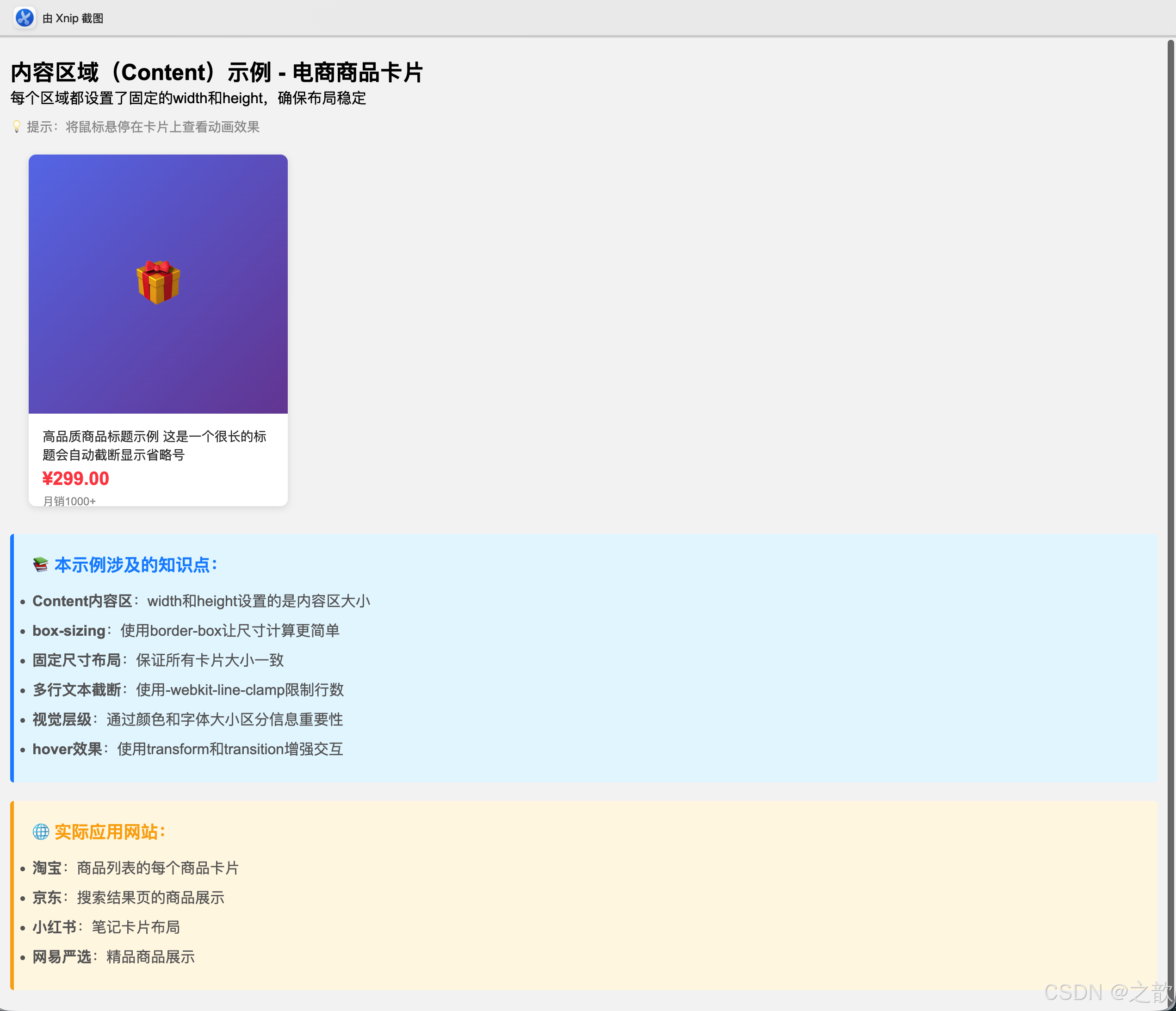
💡 Content区域的特性总结:
| 特性 | 说明 | 注意事项 |
|---|---|---|
| 宽度控制 | width属性控制内容区宽度 |
不包含padding、border、margin |
| 高度控制 | height属性控制内容区高度 |
内容溢出时需要overflow处理 |
| 最小最大值 | min-width、max-width、min-height、max-height |
响应式设计必备 |
| 自动计算 | width: auto / height: auto |
根据内容自动调整 |
| 百分比 | width: 50% |
相对于父元素的内容区宽度 |
🎯 经典使用场景:
-
电商商品卡片
- 固定宽高保证布局一致性
- 图片区域统一尺寸
- 信息区域高度固定
-
新闻列表项
- 标题区域高度限制
- 多行文本截断
- 图文混排
-
用户头像
- 正方形头像容器
- 固定尺寸便于排版
- 圆角或圆形处理
-
视频播放器
- 16:9或4:3比例容器
- 响应式尺寸调整
- 保持宽高比
1.2.2 内边距(Padding)
名词解释:内边距是内容区与边框之间的空白区域,属于盒子的内部空间。
CSS属性:
css
padding-top: 10px;      /* 上内边距 */
padding-right: 15px;    /* 右内边距 */
padding-bottom: 10px;   /* 下内边距 */
padding-left: 15px;     /* 左内边距 */
padding: 10px;          /* 四边相同 */
padding: 10px 15px;     /* 上下10px 左右15px */
示例 :参考 课堂案例/images/bg.gif
html
<!DOCTYPE html>
<html lang="zh-CN">
<head>
    <meta charset="UTF-8">
    <title>内边距示例</title>
    <style>
        .card {
            width: 300px;
            padding: 20px;
            background-color: #fff;
            border: 1px solid #e0e0e0;
            background-image: url(课堂案例/images/bg.gif);
        }
        .card-content {
            background-color: #f5f5f5;
        }
    </style>
</head>
<body>
    <div class="card">
        <div class="card-content">
            内边距为内容提供呼吸空间
        </div>
    </div>
</body>
</html>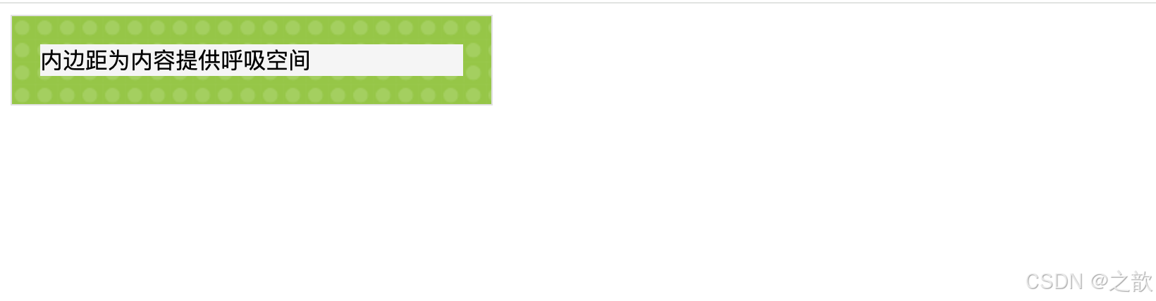
实际应用场景:
- 京东商品详情页的产品描述区域
- 知乎回答内容的内边距设置
- B站评论区每条评论的内边距
完整示例 - Padding的多种应用:
html
<!DOCTYPE html>
<html lang="zh-CN">
<head>
    <meta charset="UTF-8">
    <meta name="viewport" content="width=device-width, initial-scale=1.0">
    <title>内边距(Padding)完整示例 - 从零开始详解</title>
    <style>
        /* ==================== 第一步:全局重置 ==================== */
        /* 为什么要重置?因为不同浏览器的默认样式不一样 */
        * {
            margin: 0;              /* 清除默认外边距 */
            padding: 0;             /* 清除默认内边距 */
            box-sizing: border-box; /* 重要!让padding包含在width内 */
        }
        /* 💡 box-sizing解释:
           - content-box(默认):width只包含内容区
           - border-box(推荐):width包含content+padding+border
           例如:width: 200px; padding: 20px;
           content-box:总宽度 = 200 + 40 = 240px
           border-box:总宽度 = 200px(padding已包含在内)
        */

        body {
            padding: 20px;                  /* 整个页面内边距20px,内容不贴边 */
            background-color: #f0f0f0;      /* 浅灰背景 */
            font-family: Arial, sans-serif; /* 统一字体 */
        }

        .container {
            max-width: 1200px;  /* 最大宽度限制 */
            margin: 0 auto;     /* 水平居中 */
        }

        h2 {
            margin: 30px 0 15px;  /* 上30px 左右0 下15px */
            color: #333;
        }

        /* ==================== 示例1:按钮内边距 ==================== */
        /* 💡 核心概念:padding决定了按钮的可点击区域大小 */
        /* padding越大 → 按钮越大 → 越容易点击(费茨定律)*/

        .btn-group {
            margin: 20px 0;  /* 按钮组上下间距 */
        }

        .btn {
            /* === 基础样式 === */
            display: inline-block;  /* 行内块:可以横向排列,也可以设置宽高 */
            border: none;           /* 移除默认边框 */
            border-radius: 4px;     /* 圆角4px */
            background-color: #1890ff;  /* 蓝色背景 */
            color: white;           /* 白色文字 */
            font-size: 14px;        /* 字体大小 */
            cursor: pointer;        /* 鼠标悬停显示手型 */
            transition: all 0.3s;   /* 所有变化都有0.3秒过渡动画 */
        }

        /* === 不同尺寸的按钮(核心是padding)=== */
        .btn-small {
            padding: 5px 12px;
            /* 💡 解读:上下5px,左右12px
               垂直padding小:按钮扁平
               水平padding稍大:文字不拥挤 */
        }

        .btn-medium {
            padding: 8px 16px;
            /* 💡 标准按钮尺寸
               上下8px:舒适的点击区域
               左右16px:文字两侧有充足空间 */
        }

        .btn-large {
            padding: 12px 24px;
            /* 💡 大按钮(主要操作按钮)
               上下12px:点击区域大,不易误点
               左右24px:醒目,吸引用户点击 */
        }

        /* 鼠标悬停效果 */
        .btn:hover {
            background-color: #40a9ff;  /* 颜色变浅 */
            transform: translateY(-2px); /* 向上移动2px */
            box-shadow: 0 4px 8px rgba(24, 144, 255, 0.3);  /* 添加阴影 */
        }

        /* ==================== 示例2:卡片内边距对比 ==================== */
        /* 💡 目的:对比有无padding的视觉差异 */

        .card {
            background-color: white;
            border-radius: 8px;
            box-shadow: 0 2px 8px rgba(0,0,0,0.1);
            margin: 20px 0;
        }

        .card-no-padding {
            padding: 0;
            /* ❌ 没有padding:内容紧贴边缘,难看又难读 */
        }

        .card-with-padding {
            padding: 20px;
            /* ✅ 有padding:内容有呼吸空间,阅读舒适 */
        }

        /* === 卡片分区域(不同区域可以有不同padding)=== */
        .card-header {
            background-color: #f5f5f5;
            padding: 15px 20px;  /* 上下15px 左右20px */
            border-bottom: 1px solid #e0e0e0;
            font-weight: bold;
            /* 💡 为什么左右padding比上下大?
               因为标题是水平文本,需要左右留白 */
        }

        .card-body {
            padding: 20px;  /* 主内容区:四周padding相等 */
            line-height: 1.6;  /* 行高增加可读性 */
        }

        .card-footer {
            background-color: #fafafa;
            padding: 12px 20px;  /* 页脚padding稍小 */
            border-top: 1px solid #e0e0e0;
            text-align: right;
        }

        /* ==================== 示例3:列表项内边距 ==================== */
        /* 💡 列表项的padding让整行都可以点击,提升用户体验 */

        .list {
            list-style: none;  /* 移除默认列表样式 */
            background-color: white;
            border-radius: 8px;
            overflow: hidden;  /* 配合圆角使用 */
        }

        .list-item {
            padding: 15px 20px;
            /* 💡 为什么这个padding很重要?
               1. 让内容不贴边
               2. 增大可点击区域(整行都能点)
               3. 视觉上更舒适 */

            border-bottom: 1px solid #f0f0f0;  /* 分隔线 */
            transition: background-color 0.3s;  /* 背景色过渡 */
        }

        .list-item:last-child {
            border-bottom: none;  /* 最后一项不需要分隔线 */
        }

        .list-item:hover {
            background-color: #f5f5f5;  /* 鼠标悬停变色 */
        }

        /* ==================== 示例4:表单输入框 ==================== */
        /* 💡 输入框的padding影响输入体验 */

        .form-group {
            margin: 15px 0;  /* 表单项上下间距 */
        }

        .form-label {
            display: block;  /* 独占一行 */
            margin-bottom: 5px;
            color: #333;
            font-weight: 500;
        }

        .form-input {
            width: 100%;  /* 宽度100% */
            padding: 10px 15px;
            /* 💡 输入框padding很重要:
               - 上下10px:让文字垂直居中
               - 左右15px:光标不贴边,输入舒适
               - padding不够:难以点击,输入不舒适
               - padding太大:浪费空间 */

            border: 1px solid #d9d9d9;  /* 浅灰边框 */
            border-radius: 4px;
            font-size: 14px;
            transition: all 0.3s;  /* 焦点状态过渡 */
        }

        /* 输入框获得焦点时的样式 */
        .form-input:focus {
            outline: none;  /* 移除默认的蓝色外框 */
            border-color: #1890ff;  /* 边框变蓝 */
            box-shadow: 0 0 0 2px rgba(24, 144, 255, 0.2);  /* 添加蓝色光晕 */
        }

        .form-textarea {
            width: 100%;
            padding: 10px 15px;  /* 与输入框保持一致 */
            border: 1px solid #d9d9d9;
            border-radius: 4px;
            font-size: 14px;
            resize: vertical;  /* 只允许垂直拉伸 */
            min-height: 100px;  /* 最小高度 */
            font-family: inherit;  /* 继承父元素字体 */
        }

        /* ==================== 示例5:padding值对比 ==================== */
        /* 💡 直观展示不同padding值的视觉效果 */

        .content-box {
            background-color: white;
            border: 2px solid #1890ff;  /* 蓝色边框:方便看清padding */
            margin: 10px;
            width: 300px;
            display: inline-block;  /* 横向排列 */
            vertical-align: top;  /* 顶部对齐 */
        }

        .content-inner {
            background-color: #e6f7ff;  /* 浅蓝背景:这是内容区 */
            min-height: 100px;
            /* 💡 内外盒子颜色不同,可以清楚看到padding的大小 */
        }

        /* === 不同的padding值 === */
        .padding-0 {
            padding: 0;
            /* 内容紧贴边框 */
        }

        .padding-10 {
            padding: 10px;
            /* 四周10px间距 */
        }

        .padding-20 {
            padding: 20px;
            /* 四周20px间距(标准) */
        }

        .padding-asymmetric {
            padding: 10px 20px 30px 40px;
            /* 💡 四个值的顺序:上 右 下 左(顺时针)
               记忆技巧:从上开始,顺时针转一圈
               - 上:10px
               - 右:20px
               - 下:30px
               - 左:40px */
        }
    </style>
</head>
<body>
    <div class="container">
        <h1 style="text-align: center; margin-bottom: 30px;">内边距(Padding)从零开始详解</h1>

        <!-- ========== 示例1:按钮内边距 ========== -->
        <h2>示例1:按钮内边距 - 影响可点击区域大小</h2>
        <div class="btn-group">
            <button class="btn btn-small">小按钮 (5px 12px)</button>
            <button class="btn btn-medium">中按钮 (8px 16px)</button>
            <button class="btn btn-large">大按钮 (12px 24px)</button>
        </div>
        <div style="padding: 15px; background-color: #e6f7ff; border-left: 4px solid #1890ff; border-radius: 4px; margin: 15px 0;">
            <p style="margin: 0; color: #666; line-height: 1.8;">
                💡 <strong>知识点</strong>:<br>
                • padding值越大,按钮越大,更容易点击<br>
                • 这符合<strong>费茨定律</strong>:目标越大,用户点击越快越准<br>
                • 移动端按钮的padding要比PC端更大(手指比鼠标难点)<br>
                • 主要按钮(CTA)padding最大,次要按钮稍小
            </p>
        </div>

        <!-- ========== 示例2:卡片内边距对比 ========== -->
        <h2>示例2:卡片内边距对比</h2>
        <div class="card card-no-padding" style="margin-bottom: 15px;">
            <div style="background-color: #fff7e6; padding: 15px; border-left: 4px solid #faad14;">
                ⚠️ <strong>没有内边距的卡片</strong>:内容紧贴边缘,可读性差,看起来很拥挤
            </div>
        </div>

        <div class="card card-with-padding">
            <div style="background-color: #f6ffed; border-left: 4px solid #52c41a;">
                ✅ <strong>有内边距的卡片</strong>:内容有呼吸空间,阅读舒适,专业美观
            </div>
        </div>

        <!-- ========== 示例3:分区域padding ========== -->
        <h2>示例3:卡片分区域内边距</h2>
        <div class="card card-no-padding">
            <div class="card-header">
                卡片标题区域 (padding: 15px 20px)
            </div>
            <div class="card-body">
                <p>这是卡片内容区域 (padding: 20px)。每个区域都有自己的内边距设置:</p>
                <ul style="margin-top: 10px; padding-left: 20px; line-height: 2;">
                    <li><strong>Header</strong>: padding: 15px 20px - 标题区域</li>
                    <li><strong>Body</strong>: padding: 20px - 主内容区</li>
                    <li><strong>Footer</strong>: padding: 12px 20px - 页脚区域</li>
                </ul>
            </div>
            <div class="card-footer">
                <button class="btn btn-medium">操作按钮</button>
            </div>
        </div>

        <div style="padding: 15px; background-color: #fff0f6; border-left: 4px solid #eb2f96; border-radius: 4px; margin: 15px 0;">
            <p style="margin: 0; color: #666; line-height: 1.8;">
                💡 <strong>设计原则</strong>:<br>
                • 标题区padding稍小(视觉更紧凑)<br>
                • 内容区padding标准(阅读舒适)<br>
                • 页脚padding最小(次要区域)
            </p>
        </div>

        <!-- ========== 示例4:列表项内边距 ========== -->
        <h2>示例4:列表项内边距 - 提升交互体验</h2>
        <ul class="list">
            <li class="list-item">列表项1 - padding: 15px 20px(整行可点击)</li>
            <li class="list-item">列表项2 - 鼠标悬停试试效果</li>
            <li class="list-item">列表项3 - padding让点击区域更大</li>
            <li class="list-item">列表项4 - 提升用户体验的关键</li>
        </ul>

        <!-- ========== 示例5:表单输入框 ========== -->
        <h2>示例5:表单元素内边距 - 影响输入体验</h2>
        <div class="card card-with-padding">
            <div class="form-group">
                <label class="form-label">用户名</label>
                <input type="text" class="form-input" placeholder="请输入用户名(注意输入框内的间距)">
            </div>
            <div class="form-group">
                <label class="form-label">个人简介</label>
                <textarea class="form-textarea" placeholder="请输入个人简介(文本域也需要合适的padding)"></textarea>
            </div>
        </div>

        <div style="padding: 15px; background-color: #e6f7ff; border-left: 4px solid #1890ff; border-radius: 4px; margin: 15px 0;">
            <p style="margin: 0; color: #666; line-height: 1.8;">
                💡 <strong>输入框padding最佳实践</strong>:<br>
                • 标准:padding: 10px 15px(适合大多数场景)<br>
                • 大号:padding: 12px 20px(移动端,手指容易点)<br>
                • 小号:padding: 6px 10px(空间有限时)<br>
                • 原则:让用户点击容易,输入舒适
            </p>
        </div>

        <!-- ========== 示例6:不同padding值对比 ========== -->
        <h2>示例6:不同padding值的视觉效果对比</h2>
        <div style="text-align: center; margin: 20px 0;">
            <!-- padding: 0 -->
            <div class="content-box padding-0">
                <div class="content-inner" style="padding: 10px;">
                    <strong>padding: 0</strong><br>
                    内容紧贴边缘<br>
                    (蓝色边框贴着浅蓝背景)
                </div>
            </div>

            <!-- padding: 10px -->
            <div class="content-box padding-10">
                <div class="content-inner" style="padding: 10px;">
                    <strong>padding: 10px</strong><br>
                    小间距<br>
                    (看到10px的留白了吗?)
                </div>
            </div>

            <!-- padding: 20px -->
            <div class="content-box padding-20">
                <div class="content-inner" style="padding: 10px;">
                    <strong>padding: 20px</strong><br>
                    标准间距<br>
                    (留白更舒适)
                </div>
            </div>

            <!-- padding: 不对称 -->
            <div class="content-box padding-asymmetric">
                <div class="content-inner" style="padding: 10px; text-align: left;">
                    <strong>不对称padding</strong><br>
                    上: 10px<br>
                    右: 20px<br>
                    下: 30px<br>
                    左: 40px<br>
                    <small style="color: #999;">顺时针方向</small>
                </div>
            </div>
        </div>

        <!-- ========== 知识总结 ========== -->
        <div style="padding: 20px; background-color: #f0f5ff; border: 2px solid #1890ff; border-radius: 8px; margin: 30px 0;">
            <h3 style="color: #1890ff; margin-bottom: 15px;">📚 本节重点总结</h3>
            <div style="line-height: 2.2; color: #666;">
                <p><strong>1. padding的作用</strong></p>
                <ul style="margin-left: 20px; margin-bottom: 15px;">
                    <li>内容与边框之间的距离</li>
                    <li>增大元素的可点击区域</li>
                    <li>让内容有"呼吸空间",提升美观度</li>
                </ul>

                <p><strong>2. padding值的写法</strong></p>
                <ul style="margin-left: 20px; margin-bottom: 15px;">
                    <li><code>padding: 10px;</code> → 四边都是10px</li>
                    <li><code>padding: 10px 20px;</code> → 上下10px,左右20px</li>
                    <li><code>padding: 10px 15px 20px;</code> → 上10px,左右15px,下20px</li>
                    <li><code>padding: 10px 15px 20px 25px;</code> → 上右下左(顺时针)</li>
                </ul>

                <p><strong>3. box-sizing的重要性</strong></p>
                <ul style="margin-left: 20px; margin-bottom: 15px;">
                    <li><code>box-sizing: border-box;</code> → padding包含在width内(推荐)</li>
                    <li><code>box-sizing: content-box;</code> → padding额外增加宽度(默认)</li>
                </ul>

                <p><strong>4. 实际应用建议</strong></p>
                <ul style="margin-left: 20px;">
                    <li>按钮:padding: 8px 16px(标准)</li>
                    <li>卡片:padding: 20px(舒适)</li>
                    <li>输入框:padding: 10px 15px(易用)</li>
                    <li>列表项:padding: 15px 20px(可点击)</li>
                </ul>
            </div>
        </div>
    </div>
</body>
</html>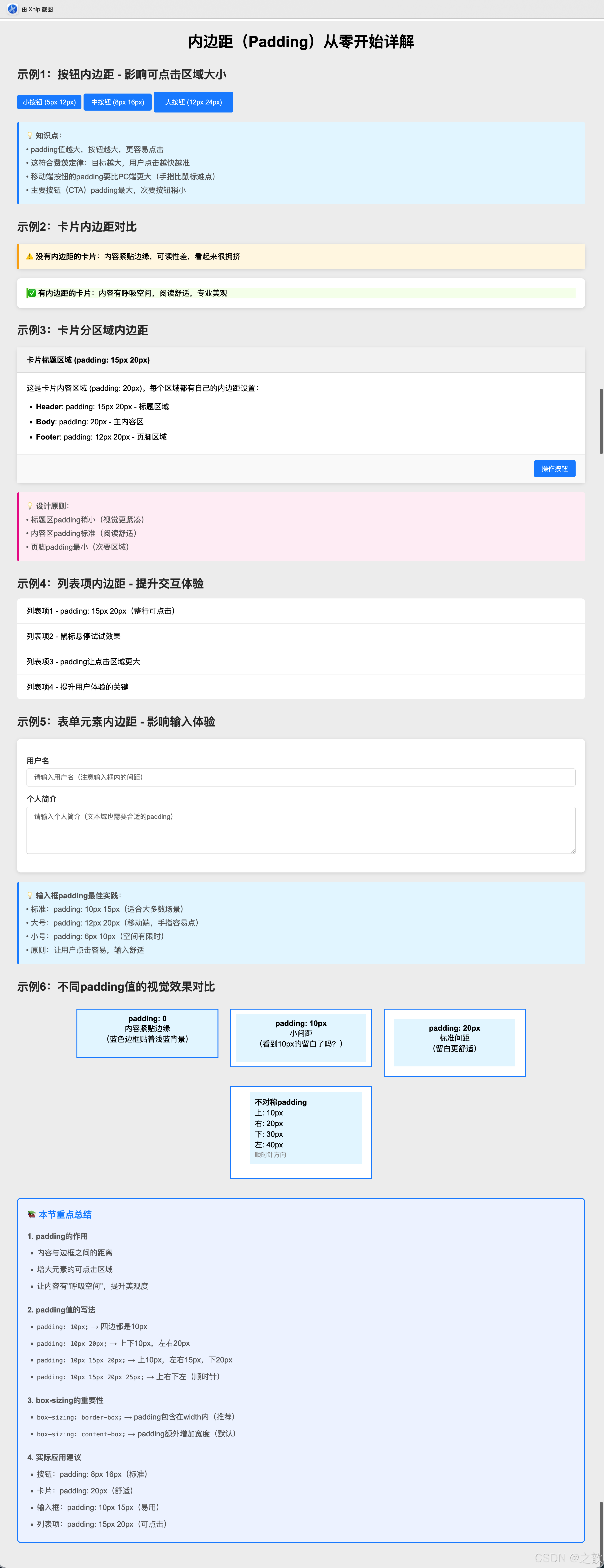
    .btn:hover {
        background-color: #40a9ff;
        transform: translateY(-2px);
        box-shadow: 0 4px 8px rgba(24, 144, 255, 0.3);
    }

    /* 示例2:卡片内边距 - 内容呼吸空间 */
    .card {
        background-color: white;
        border-radius: 8px;
        box-shadow: 0 2px 8px rgba(0,0,0,0.1);
        margin: 20px 0;
    }

    .card-no-padding {
        padding: 0;
    }

    .card-with-padding {
        padding: 20px;
    }

    .card-header {
        background-color: #f5f5f5;
        padding: 15px 20px;
        border-bottom: 1px solid #e0e0e0;
        font-weight: bold;
    }

    .card-body {
        padding: 20px;
        line-height: 1.6;
    }

    .card-footer {
        background-color: #fafafa;
        padding: 12px 20px;
        border-top: 1px solid #e0e0e0;
        text-align: right;
    }

    /* 示例3:列表项内边距 */
    .list {
        list-style: none;
        background-color: white;
        border-radius: 8px;
        overflow: hidden;
    }

    .list-item {
        padding: 15px 20px;
        border-bottom: 1px solid #f0f0f0;
        transition: background-color 0.3s;
    }

    .list-item:last-child {
        border-bottom: none;
    }

    .list-item:hover {
        background-color: #f5f5f5;
    }

    /* 示例4:输入框内边距 */
    .form-group {
        margin: 15px 0;
    }

    .form-label {
        display: block;
        margin-bottom: 5px;
        color: #333;
        font-weight: 500;
    }

    .form-input {
        width: 100%;
        padding: 10px 15px;  /* 上下10px 左右15px */
        border: 1px solid #d9d9d9;
        border-radius: 4px;
        font-size: 14px;
        transition: all 0.3s;
    }

    .form-input:focus {
        outline: none;
        border-color: #1890ff;
        box-shadow: 0 0 0 2px rgba(24, 144, 255, 0.2);
    }

    .form-textarea {
        width: 100%;
        padding: 10px 15px;
        border: 1px solid #d9d9d9;
        border-radius: 4px;
        font-size: 14px;
        resize: vertical;
        min-height: 100px;
    }

    /* 示例5:内容区域不同padding效果对比 */
    .content-box {
        background-color: white;
        border: 2px solid #1890ff;
        margin: 10px;
        width: 300px;
    }

    .content-inner {
        background-color: #e6f7ff;
        min-height: 100px;
    }

    .padding-0 { padding: 0; }
    .padding-10 { padding: 10px; }
    .padding-20 { padding: 20px; }
    .padding-asymmetric { padding: 10px 20px 30px 40px; }
</style>
内边距(Padding)完整应用示例
    <!-- 示例1:按钮内边距 -->
    <h2>示例1:按钮内边距 - 影响可点击区域大小</h2>
    <div class="btn-group">
        <button class="btn btn-small">小按钮 (5px 12px)</button>
        <button class="btn btn-medium">中按钮 (8px 16px)</button>
        <button class="btn btn-large">大按钮 (12px 24px)</button>
    </div>
    <p style="color: #666; font-size: 14px;">💡 内边距越大,按钮越大,更易点击,符合费茨定律</p>

    <!-- 示例2:卡片内边距对比 -->
    <h2>示例2:卡片内边距 - 提供内容呼吸空间</h2>
    <div class="card card-no-padding">
        <div style="background-color: #fff7e6; padding: 15px; border-left: 4px solid #faad14;">
            ⚠️ 没有内边距的卡片:内容紧贴边缘,可读性差
        </div>
    </div>

    <div class="card card-with-padding">
        <div style="background-color: #f6ffed; border-left: 4px solid #52c41a;">
            ✅ 有内边距的卡片:内容有呼吸空间,阅读舒适
        </div>
    </div>

    <!-- 示例3:分区域padding -->
    <h2>示例3:卡片分区域内边距</h2>
    <div class="card card-no-padding">
        <div class="card-header">卡片标题</div>
        <div class="card-body">
            这是卡片内容区域。每个区域都有自己的内边距设置:<br>
            - Header: padding: 15px 20px<br>
            - Body: padding: 20px<br>
            - Footer: padding: 12px 20px
        </div>
        <div class="card-footer">
            <button class="btn btn-medium">操作按钮</button>
        </div>
    </div>

    <!-- 示例4:列表项内边距 -->
    <h2>示例4:列表项内边距 - 提升交互体验</h2>
    <ul class="list">
        <li class="list-item">列表项1 - padding: 15px 20px</li>
        <li class="list-item">列表项2 - 鼠标悬停试试</li>
        <li class="list-item">列表项3 - 内边距让点击区域更大</li>
    </ul>

    <!-- 示例5:表单元素内边距 -->
    <h2>示例5:表单元素内边距 - 提升输入体验</h2>
    <div class="card card-with-padding">
        <div class="form-group">
            <label class="form-label">用户名</label>
            <input type="text" class="form-input" placeholder="请输入用户名(padding: 10px 15px)">
        </div>
        <div class="form-group">
            <label class="form-label">个人简介</label>
            <textarea class="form-textarea" placeholder="请输入个人简介(padding: 10px 15px)"></textarea>
        </div>
    </div>

    <!-- 示例6:不同padding值的视觉效果对比 -->
    <h2>示例6:不同padding值的视觉效果对比</h2>
    <div style="display: flex; flex-wrap: wrap; gap: 20px;">
        <div class="content-box padding-0">
            <div class="content-inner">
                padding: 0<br>内容紧贴边缘
            </div>
        </div>

        <div class="content-box padding-10">
            <div class="content-inner">
                padding: 10px<br>小间距
            </div>
        </div>

        <div class="content-box padding-20">
            <div class="content-inner">
                padding: 20px<br>标准间距
            </div>
        </div>

        <div class="content-box padding-asymmetric">
            <div class="content-inner">
                padding: 10px 20px 30px 40px<br>
                不对称内边距<br>
                上右下左
            </div>
        </div>
    </div>
</div>
```
💡 Padding的特性总结:
| 特性 | 说明 | 使用技巧 |
|---|---|---|
| 增加元素尺寸 | padding会增加元素的实际占用空间 | 使用box-sizing: border-box保持总宽度不变 |
| 背景色延伸 | 背景色会延伸到padding区域 | 可用于创建内部边框效果 |
| 可点击区域 | padding区域也是可点击的 | 增大按钮padding提升用户体验 |
| 百分比相对 | padding百分比相对于父元素宽度 | 即使是上下padding,也相对于宽度 |
| 不能为负值 | padding只能是0或正值 | 负值无效 |
| 简写顺序 | padding: 上 右 下 左(顺时针) | 记忆:从上开始,顺时针转一圈 |
🎯 经典使用场景:
-
按钮设计
- 小按钮:
padding: 4px 8px(工具栏图标按钮) - 中按钮:
padding: 8px 16px(普通操作按钮) - 大按钮:
padding: 12px 24px(主要行动按钮) - 超大按钮:
padding: 16px 32px(首页CTA按钮)
- 小按钮:
-
表单输入框
- 标准输入框:
padding: 10px 15px - 大号输入框:
padding: 12px 20px - 文本域:
padding: 10px 15px(同输入框保持一致)
- 标准输入框:
-
卡片容器
- 紧凑卡片:
padding: 12px - 标准卡片:
padding: 20px - 宽松卡片:
padding: 30px
- 紧凑卡片:
-
列表项
- 简洁列表:
padding: 10px 15px - 标准列表:
padding: 15px 20px - 信息丰富列表:
padding: 20px
- 简洁列表:
-
导航栏
- 水平导航:
padding: 0 20px(左右间距) - 垂直导航:
padding: 12px 20px(上下和左右间距)
- 水平导航:
-
消息提示框
- 小提示:
padding: 8px 12px - 标准提示:
padding: 12px 16px - 重要提示:
padding: 16px 20px
- 小提示:
⚡ padding使用最佳实践:
css
/* ✅ 推荐:使用box-sizing统一盒模型 */
* {
    box-sizing: border-box; /* padding不会撑大元素 */
}

/* ✅ 推荐:使用简写提高效率 */
.box {
    padding: 20px;          /* 四边相同 */
    padding: 10px 20px;     /* 上下、左右 */
    padding: 10px 15px 20px; /* 上、左右、下 */
}

/* ❌ 不推荐:写四次太冗长 */
.box {
    padding-top: 10px;
    padding-right: 15px;
    padding-bottom: 20px;
    padding-left: 15px;
}

/* ✅ 推荐:使用CSS变量统一间距 */
:root {
    --spacing-sm: 8px;
    --spacing-md: 16px;
    --spacing-lg: 24px;
}

.btn {
    padding: var(--spacing-sm) var(--spacing-md);
}
1.2.3 边框(Border)
名词解释:边框是环绕在内边距和内容外的边界线。
CSS属性:
css
border-width: 2px;           /* 边框宽度 */
border-style: solid;         /* 边框样式 */
border-color: #333;          /* 边框颜色 */
border: 2px solid #333;      /* 简写形式 */
border-radius: 5px; /* 圆角边框 */边框样式类型:
solid:实线边框dashed:虚线边框dotted:点状边框double:双线边框none:无边框
示例代码:
html
<!DOCTYPE html>
<html lang="zh-CN">
<head>
    <meta charset="UTF-8">
    <title>边框示例</title>
    <style>
        .border-demo {
            margin: 20px;
            padding: 15px;
            width: 200px;
        }
        .solid-border {
            border: 3px solid #e4831f;
        }
        .dashed-border {
            border: 2px dashed #00a0e9;
        }
        .rounded-border {
            border: 2px solid #52c41a;
            border-radius: 10px;
        }
    </style>
</head>
<body>
    <div class="border-demo solid-border">实线边框</div>
    <div class="border-demo dashed-border">虚线边框</div>
    <div class="border-demo rounded-border">圆角边框</div>
</body>
</html>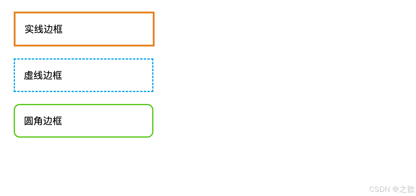
实际应用:
- 网易云音乐的播放器边框
- 微信网页版的聊天框边框
- GitHub代码块的边框样式
1.2.4 外边距(Margin)
名词解释:外边距是盒子与盒子之间的距离,属于盒子外部空间。
CSS属性:
css
margin-top: 20px;
margin-right: 15px;
margin-bottom: 20px;
margin-left: 15px;
margin: 20px auto; /* 上下20px 左右自动(实现居中)*/外边距特殊现象:
- 外边距合并(Margin Collapse)
名词解释:当两个垂直外边距相遇时,它们将合并为一个外边距,取两者中较大的值。
css
.box1 {
    margin-bottom: 30px;
}
.box2 {
    margin-top: 20px;
}
/* 实际间距是30px,而不是50px */- 外边距塌陷(Margin Collapse in Parent)
名词解释:子元素的上外边距会传递给父元素,导致父元素产生外边距。
解决方案:
- 给父元素设置边框
- 给父元素设置内边距
- 给父元素设置
overflow: hidden
html
<!DOCTYPE html>
<html lang="zh-CN">
<head>
    <meta charset="UTF-8">
    <title>外边距塌陷解决</title>
    <style>
        .parent {
            width: 400px;
            background-color: #ccc;
            /* 解决方案1:添加overflow */
            overflow: hidden;
        }
        .child {
            margin-top: 30px;
            width: 200px;
            height: 100px;
            background-color: #e4831f;
        }
    </style>
</head>
<body>
    <div class="parent">
        <div class="child">子元素</div>
    </div>
</body>
</html>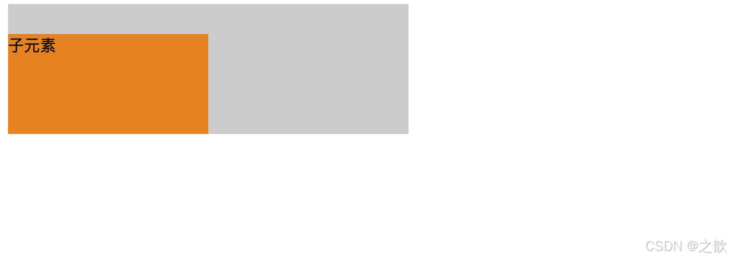
1.3 内容溢出处理
名词解释 :当内容超出盒子设定的宽高时,需要通过overflow属性控制溢出内容的显示方式。
CSS属性值:
css
overflow: visible;   /* 默认值,溢出内容可见 */
overflow: hidden;    /* 隐藏溢出内容 */
overflow: scroll;    /* 始终显示滚动条 */
overflow: auto; /* 需要时显示滚动条 */示例代码:
html
<!DOCTYPE html>
<html lang="zh-CN">
<head>
    <meta charset="UTF-8">
    <title>内容溢出示例</title>
    <style>
        .overflow-box {
            width: 300px;
            height: 150px;
            margin: 20px;
            padding: 15px;
            border: 2px solid #333;
        }
        .overflow-hidden {
            overflow: hidden;
        }
        .overflow-scroll {
            overflow: scroll;
        }
        .overflow-auto {
            overflow: auto;
        }
    </style>
</head>
<body>
    <div class="overflow-box overflow-hidden">
        <p>隐藏溢出:这是一段很长的文本内容,当内容超出容器高度时,超出部分将被隐藏,用户无法看到被隐藏的内容。这种方式常用于固定高度的卡片布局。</p>
    </div>

    <div class="overflow-box overflow-auto">
        <p>自动滚动:这是一段很长的文本内容,当内容超出容器高度时,会自动出现滚动条,用户可以通过滚动查看全部内容。这是最常用的处理方式。</p>
    </div>
</body>
</html>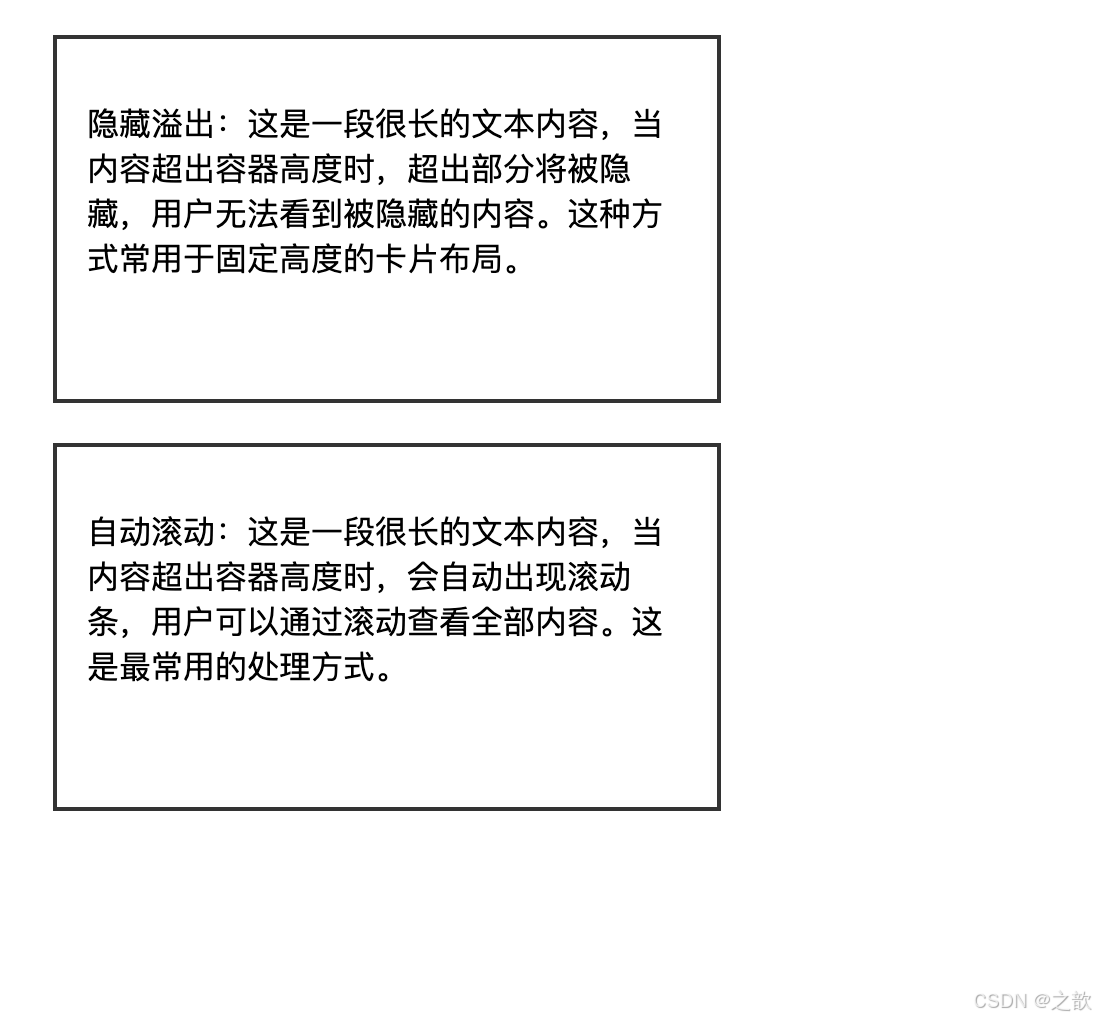
实际应用:
- Twitter时间线的滚动效果(
overflow: auto) - 今日头条新闻标题截断(
overflow: hidden+text-overflow: ellipsis) - 掘金文章列表的滚动容器
1.4 元素的显示与隐藏
display vs visibility
元素隐藏方式
display: none
visibility: hidden
元素完全移除
不占据空间
无法交互
元素隐藏
仍占据空间
保留布局位置
对比示例:
html
<!DOCTYPE html>
<html lang="zh-CN">
<head>
    <meta charset="UTF-8">
    <title>显示隐藏对比</title>
    <style>
        .box {
            width: 200px;
            height: 100px;
            margin: 10px;
            background-color: #00a0e9;
        }
        .display-none {
            display: none;
        }
        .visibility-hidden {
            visibility: hidden;
        }
    </style>
</head>
<body>
    <div class="box">盒子1</div>
    <div class="box display-none">盒子2 - display:none</div>
    <div class="box">盒子3</div>

    <hr>

    <div class="box">盒子A</div>
    <div class="box visibility-hidden">盒子B - visibility:hidden</div>
    <div class="box">盒子C</div>
</body>
</html>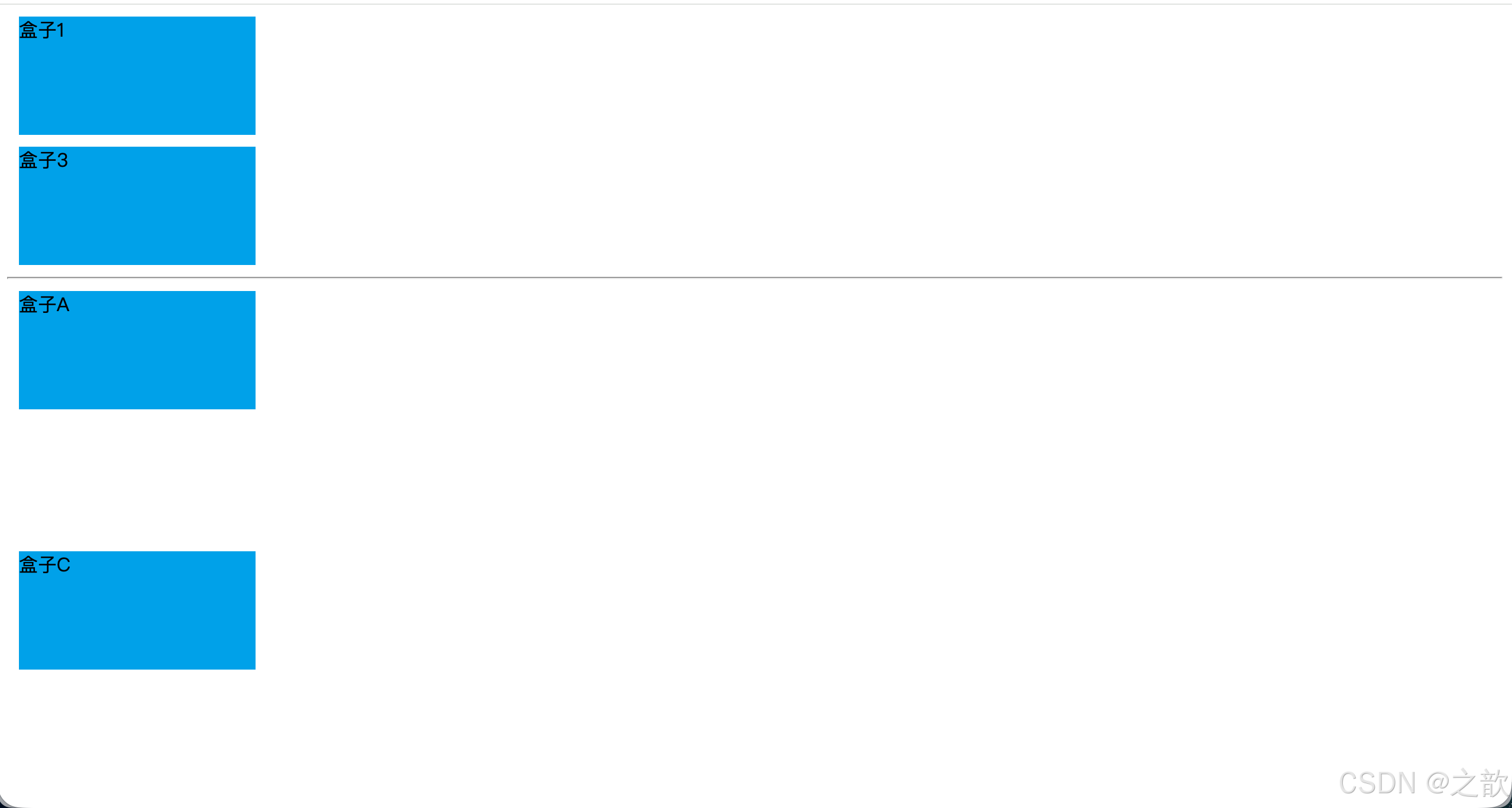
实际应用:
- 抖音播放器控制栏的显示隐藏(display)
- 美团外卖菜单的折叠效果(display)
- 百度搜索建议的显示隐藏(display)
第二章:浮动布局详解
2.1 浮动的起源与发展
名词解释:浮动(Float)最初是为了实现文字环绕图片的效果而设计的CSS属性,现在已成为主流的页面布局技术之一。
1996 CSS1规范发布 引入float属性 2004 Float布局流行 成为主流布局方式 2010 兼容性成熟 各浏览器支持完善 2017 新技术出现 Flexbox和Grid逐渐替代 2023 仍在使用 特定场景依然重要 浮动技术的发展历程
2.2 文字环绕效果
示例 :参考 课堂案例/02-浮动/01-文字环绕[平价资源](微AG 110660).html
html
<!DOCTYPE html>
<html lang="zh-CN">
<head>
    <meta charset="UTF-8">
    <title>文字环绕效果</title>
    <style>
        .article {
            width: 800px;
            margin: 20px auto;
            padding: 20px;
            background-color: #f5f5f5;
            font-size: 16px;
            line-height: 1.8;
        }

        .article img {
            float: left;
            margin-right: 20px;
            margin-bottom: 10px;
            width: 300px;
            border-radius: 8px;
            box-shadow: 0 2px 8px rgba(0,0,0,0.1);
        }

        .article-title {
            font-size: 24px;
            font-weight: bold;
            margin-bottom: 15px;
            color: #333;
        }
    </style>
</head>
<body>
    <div class="article">
        <h2 class="article-title">图文混排示例</h2>
        <img src="课堂案例/images/小乐.jpg" alt="示例图片">
        <p>浮动属性最初被设计用来实现文字环绕图片的效果。在传统的报纸杂志排版中,文字围绕图片排列是一种常见的版式设计。通过设置图片的float属性为left或right,可以让图片脱离正常的文档流,而周围的文字会自动环绕在图片周围。</p>
        <p>这种布局方式在博客文章、新闻报道、产品介绍等场景中非常常见。现代网页设计中,虽然出现了更先进的布局技术,但文字环绕效果依然是浮动属性最经典的应用场景之一。</p>
        <p>在实际开发中,我们通常会给浮动的图片添加适当的外边距,以确保文字与图片之间有足够的间距,提升阅读体验。同时,为了美观,还可以添加圆角、阴影等装饰效果。</p>
    </div>
</body>
</html>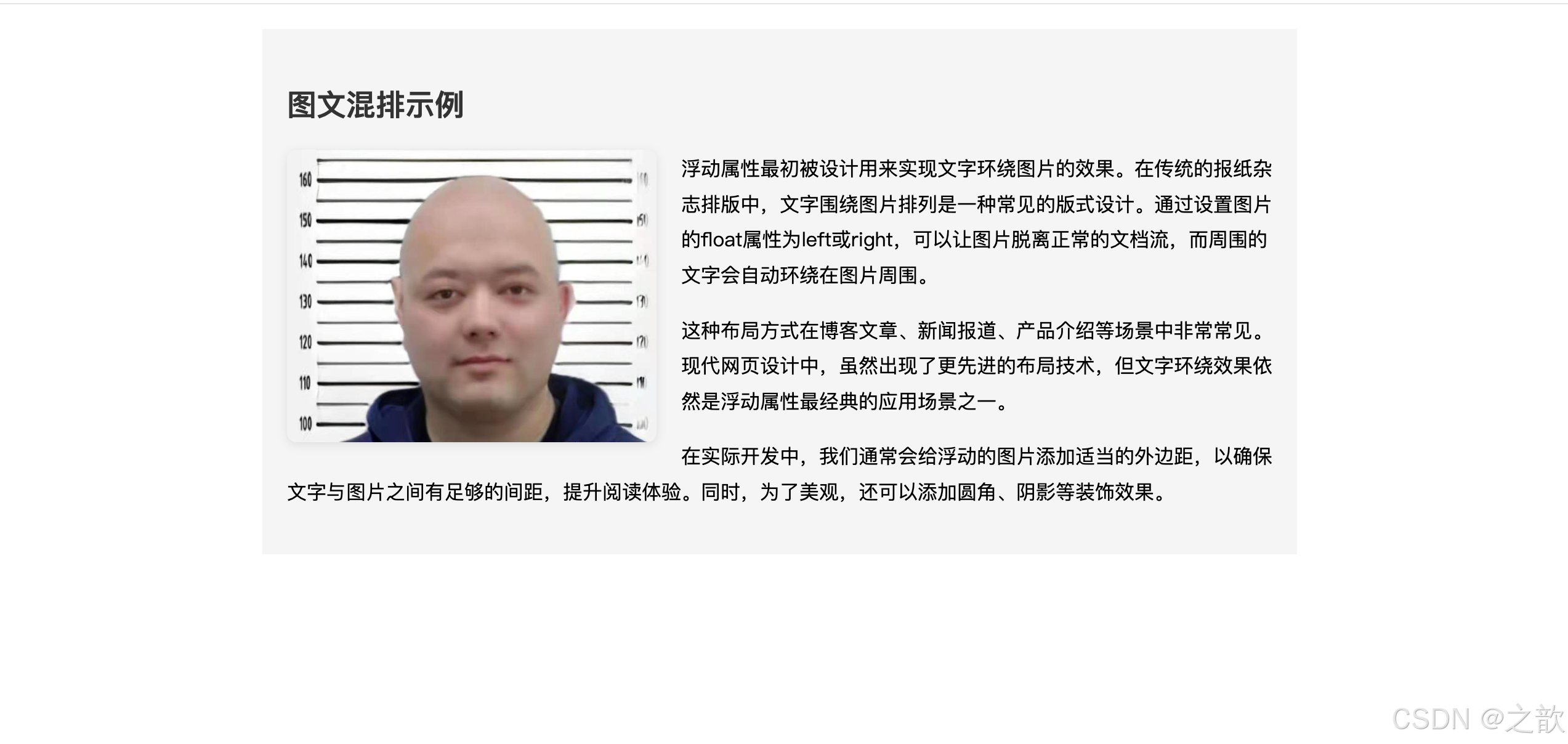
实际应用:
- 微信公众号文章的图文排版
- 知乎回答中的配图布局
- Medium博客平台的文章排版
- 豆瓣影评的海报与文字布局
2.3 浮动元素的特点
核心概念图:
浮动元素特点
脱离文档流
水平排列
显示模式转换
不占据原有位置
层级提升
影响后续元素
从左到右排列
自动换行
紧密排列
具备块级特性
具备行内块特性
可设置宽高
2.3.1 特点一:脱离文档流
名词解释 - 文档流(Document Flow):文档流是指元素按照HTML标签的书写顺序,从上到下、从左到右依次排列的正常布局方式。
示例 :参考 课堂案例/02-浮动/02-浮动元素的特点[平价资源](微AG 110660).html
html
<!DOCTYPE html>
<html lang="zh-CN">
<head>
    <meta charset="UTF-8">
    <title>浮动元素特点演示</title>
    <style>
        .container {
            width: 800px;
            margin: 30px auto;
            padding: 20px;
            border: 3px solid #333;
            background-color: #f0f0f0;
        }

        .box {
            width: 180px;
            height: 120px;
            padding: 15px;
            margin: 10px;
            color: white;
            font-size: 18px;
            font-weight: bold;
            text-align: center;
            line-height: 120px;
        }

        .box1 {
            float: left;
            background-color: #ff4d4f;
        }

        .box2 {
            float: left;
            width: 220px;
            height: 100px;
            line-height: 100px;
            background-color: #52c41a;
        }

        .box3 {
            float: left;
            width: 160px;
            height: 140px;
            line-height: 140px;
            background-color: #1890ff;
        }

        .box4 {
            float: left;
            background-color: #faad14;
        }
    </style>
</head>
<body>
    <div class="container">
        <div class="box box1">浮动盒子1</div>
        <div class="box box2">浮动盒子2<br>宽220高100</div>
        <div class="box box3">浮动盒子3<br>宽160高140</div>
        <div class="box box4">浮动盒子4</div>
    </div>
</body>
</html>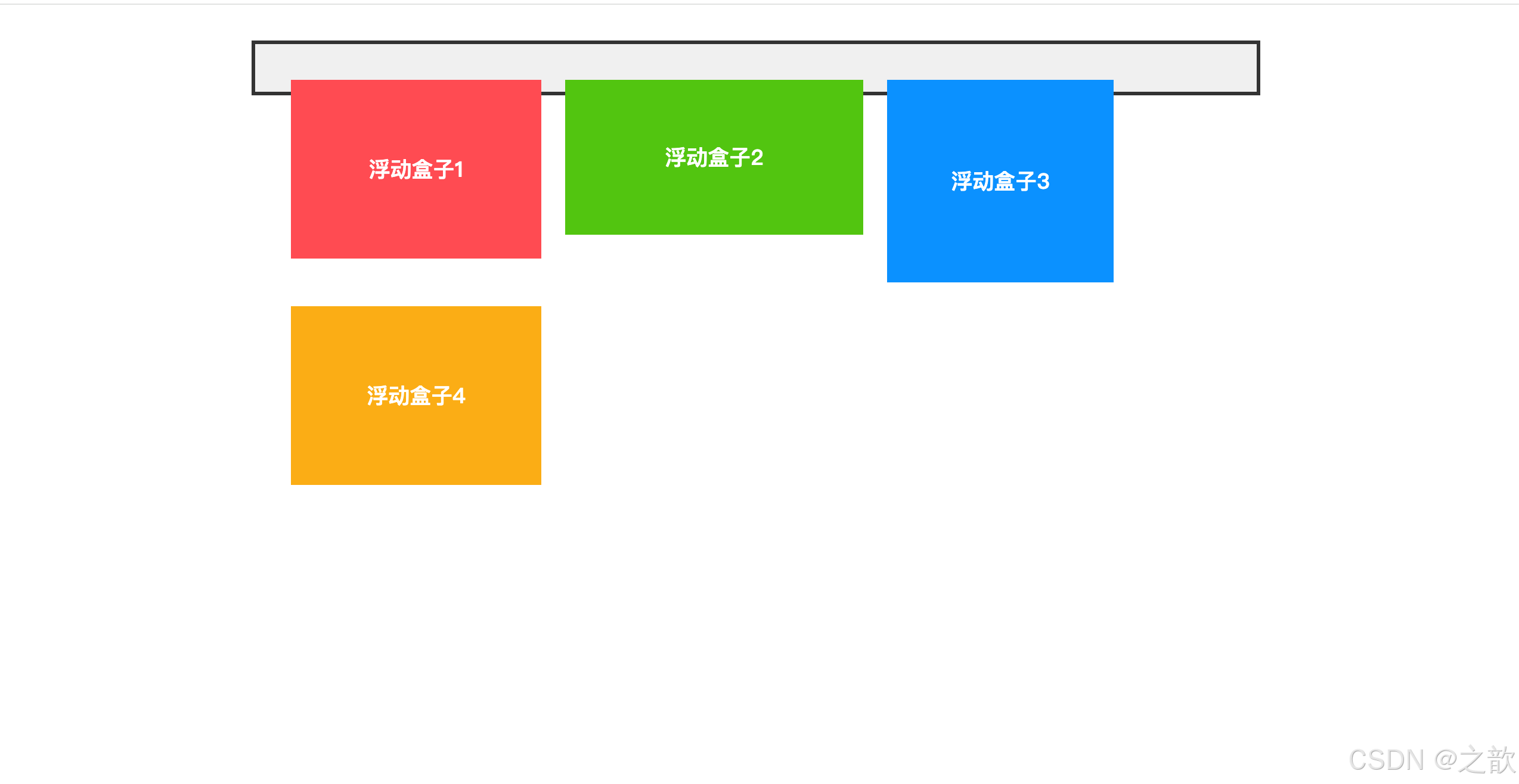
关键观察点:
- 所有浮动元素水平排列
- 元素宽高不同时自动适应
- 一行放不下时自动换行
- 元素之间紧密排列
2.3.2 特点二:浮动元素的显示模式
名词解释 - 显示模式(Display Mode):元素在页面上的呈现方式,决定了元素如何排列、是否可以设置宽高等特性。
浮动元素的特殊性:
css
/* 原本是块级元素的div */
div {
    float: left;
    /* 现在既有块级特性(可设置宽高),又有行内块特性(水平排列)*/
    width: 200px;
    height: 150px;
}

/* 原本是行内元素的span */
span {
    float: left;
    /* 现在也可以设置宽高了 */
    width: 150px;
    height: 100px;
}对比表格:
| 特性 | 块级元素 | 行内元素 | 行内块元素 | 浮动元素 |
|---|---|---|---|---|
| 独占一行 | ✓ | ✗ | ✗ | ✗ |
| 水平排列 | ✗ | ✓ | ✓ | ✓ |
| 可设置宽高 | ✓ | ✗ | ✓ | ✓ |
| 左右margin:auto居中 | ✓ | ✗ | ✗ | ✗ |
| 外边距合并 | ✓ | ✗ | ✗ | ✗ |
| 脱离文档流 | ✗ | ✗ | ✗ | ✓ |
2.4 浮动产生的影响
2.4.1 对兄弟元素的影响
影响机制图:
浮动元素对兄弟元素的影响
前面的兄弟元素
后面的兄弟元素
无影响
保持原有位置
块级元素被覆盖
行内元素环绕排列
位置发生变化
示例 :参考 课堂案例/02-浮动/03-浮动元素对后面兄弟元素的影响[平价资源](微AG 110660).html
html
<!DOCTYPE html>
<html lang="zh-CN">
<head>
    <meta charset="UTF-8">
    <title>浮动对兄弟元素的影响</title>
    <style>
        .demo-container {
            width: 800px;
            margin: 30px auto;
            padding: 20px;
            border: 2px solid #999;
        }

        .box {
            width: 200px;
            height: 120px;
            padding: 10px;
            margin: 10px;
            color: white;
            font-weight: bold;
        }

        .box1 {
            background-color: #ff4d4f;
        }

        .box2 {
            float: left;
            background-color: #52c41a;
        }

        .box3 {
            float: right;
            background-color: #1890ff;
        }

        .box4 {
            /* 清除浮动影响 */
            clear: both;
            background-color: #faad14;
        }
    </style>
</head>
<body>
    <div class="demo-container">
        <div class="box box1">正常元素A</div>
        <div class="box box2">左浮动元素B</div>
        <div class="box box3">右浮动元素C</div>
        <div class="box box4">清除浮动元素D</div>
    </div>
</body>
</html>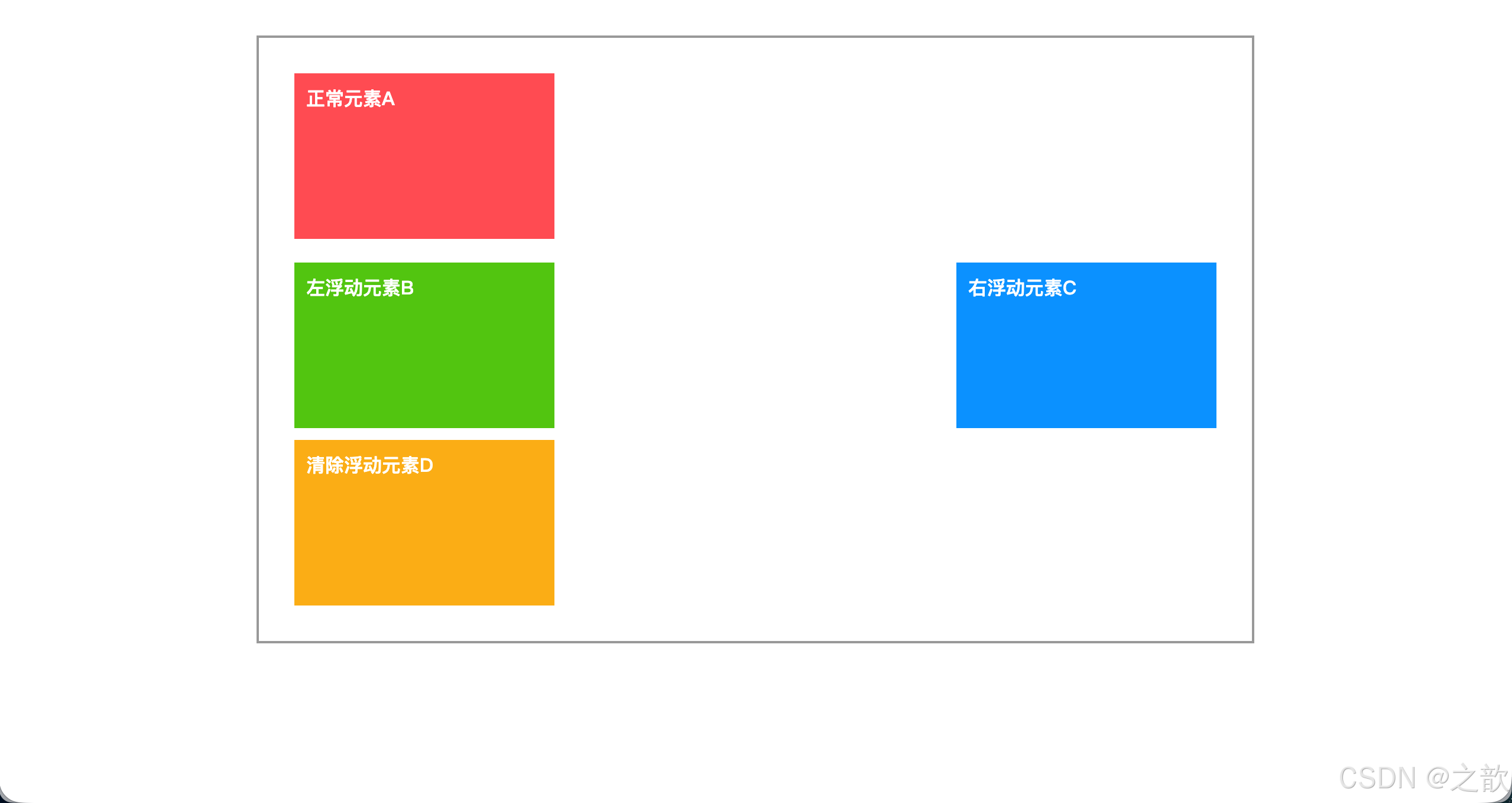
解决方案:
方案一:使用clear属性
css
.after-float {
    clear: both;  /* 清除左右两侧的浮动影响 */
    clear: left;  /* 只清除左侧浮动影响 */
    clear: right; /* 只清除右侧浮动影响 */
}
方案二:统一浮动
css
/* 让所有需要水平排列的元素都浮动 */
.sibling-box {
    float: left;
}实际应用场景:
- 淘宝商品列表的横向排列
- 网易云音乐的歌单卡片布局
- B站首页的内容缩略图排列
2.4.2 对父元素的影响(高度塌陷)
名词解释 - 高度塌陷(Height Collapse):当父元素没有设置固定高度,且所有子元素都浮动时,父元素的高度会变为0,无法被子元素撑开。
问题演示图:
父元素高度塌陷问题
原因分析
产生后果
子元素浮动脱离文档流
父元素无固定高度
父元素高度计算异常
父元素高度为0
背景色/边框不可见
影响后续布局
示例 :参考 课堂案例/02-浮动/04-浮动元素对父元素的影响[平价资源](微AG 110660).html
html
<!DOCTYPE html>
<html lang="zh-CN">
<head>
    <meta charset="UTF-8">
    <title>高度塌陷问题演示</title>
    <style>
        .parent {
            margin: 30px auto;
            width: 800px;
            padding: 20px;
            border: 4px solid #e4831f;
            background-color: #fff7e6;
        }

        .child {
            float: left;
            width: 180px;
            height: 120px;
            margin: 10px;
            background-color: #1890ff;
            color: white;
            text-align: center;
            line-height: 120px;
            font-size: 18px;
        }

        .next-section {
            margin-top: 20px;
            padding: 20px;
            background-color: #f0f0f0;
            border: 2px solid #999;
        }
    </style>
</head>
<body>
    <h2>未解决高度塌陷的效果:</h2>
    <div class="parent">
        <div class="child">浮动子元素1</div>
        <div class="child">浮动子元素2</div>
        <div class="child">浮动子元素3</div>
        <div class="child">浮动子元素4</div>
    </div>

    <div class="next-section">
        <p>这个区域会紧贴着塌陷的父元素,造成布局混乱</p>
    </div>
</body>
</html>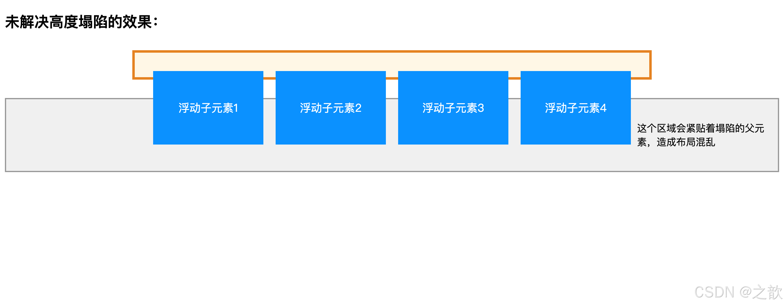
五大解决方案详解:
方案一:设置固定高度
css
.parent {
    height: 200px; /* 固定高度 */
}
优点 :简单直接
缺点 :不够灵活,内容增减需要手动调整高度
适用场景:高度确定的banner区域
方案二:父元素也浮动
css
.parent {
    float: left;
}
优点 :能撑开高度
缺点 :父元素也脱离文档流,产生连锁反应
适用场景:整体布局都使用浮动时
方案三:设置overflow
css
.parent {
    overflow: hidden;  /* 或 auto、scroll */
}
优点 :简单有效,代码量少
缺点 :可能裁剪内容或产生滚动条
适用场景:无溢出内容的容器
方案四:添加空元素清除浮动
html
<div class="parent">
    <div class="child float-left">浮动元素1</div>
    <div class="child float-left">浮动元素2</div>
    <div style="clear: both;"></div>
</div>
优点 :兼容性好
缺点 :增加无意义标签
适用场景:旧浏览器兼容
方案五:使用伪元素清除浮动(推荐)
css
.clearfix::after {
    content: "";
    display: block;
    clear: both;
}

/* 兼容IE6/7的完整版本 */
.clearfix::before,
.clearfix::after {
    content: "";
    display: table;
}

.clearfix::after {
    clear: both;
}

.clearfix {
    *zoom: 1; /* IE6/7触发hasLayout */
}使用方式:
html
<div class="parent clearfix">
    <div class="child float-left">浮动元素1</div>
    <div class="child float-left">浮动元素2</div>
</div>优点:
- 不增加额外HTML标签
- 代码优雅,可复用
- 兼容性好
- 行业标准做法
实际应用:
- Bootstrap框架的clearfix类
- 各大互联网公司的CSS框架
- 推荐在所有项目中使用
2.5 浮动布局实战案例
案例一:简单页面布局
参考:课堂案例/02-浮动/05-页面案例[平价资源](微AG 110660).html 和 简单浮动布局图例/浮动布局小案例.png
html
<!DOCTYPE html>
<html lang="zh-CN">
<head>
    <meta charset="UTF-8">
    <title>经典浮动布局实战</title>
    <style>
        /* ==========全局样式========== */
        * {
            margin: 0;
            padding: 0;
            box-sizing: border-box;
        }

        body {
            font-family: -apple-system, BlinkMacSystemFont, "Segoe UI", Roboto, "Helvetica Neue", Arial, sans-serif;
            text-align: center;
            background-color: #f5f5f5;
        }

        /* 版心容器 */
        .container {
            margin: 0 auto;
            width: 960px;
            background-color: white;
        }

        /* 浮动工具类 */
        .leftfix {
            float: left;
        }

        .rightfix {
            float: right;
        }

        /* 清除浮动 */
        .clearfix::after {
            content: "";
            display: block;
            clear: both;
        }

        /* ==========页头样式========== */
        .page-header {
            padding: 20px 0;
        }

        .logo {
            width: 200px;
            height: 80px;
            background: linear-gradient(135deg, #667eea 0%, #764ba2 100%);
            color: white;
            line-height: 80px;
            font-size: 24px;
            font-weight: bold;
            border-radius: 4px;
        }

        .banner1 {
            margin-left: 10px;
            width: 540px;
            height: 80px;
            background: linear-gradient(135deg, #f093fb 0%, #f5576c 100%);
            color: white;
            line-height: 80px;
            font-size: 20px;
            border-radius: 4px;
        }

        .banner2 {
            width: 200px;
            height: 80px;
            background: linear-gradient(135deg, #4facfe 0%, #00f2fe 100%);
            color: white;
            line-height: 80px;
            font-size: 18px;
            border-radius: 4px;
        }

        /* ==========导航栏样式========== */
        .page-nav {
            margin-top: 10px;
            height: 50px;
            background: linear-gradient(to right, #434343 0%, #000000 100%);
            color: white;
            line-height: 50px;
            font-size: 16px;
            letter-spacing: 2px;
        }

        /* ==========主内容区样式========== */
        .page-main {
            margin-top: 20px;
            padding: 0 10px;
        }

        .page-content {
            width: 750px;
        }

        .row {
            margin-bottom: 10px;
        }

        .column-a {
            width: 365px;
            height: 198px;
            background: linear-gradient(135deg, #a8edea 0%, #fed6e3 100%);
            border-radius: 8px;
            line-height: 198px;
            font-size: 18px;
            color: #333;
            font-weight: bold;
        }

        .column-b {
            float: left;
            margin-right: 10px;
            width: 178px;
            height: 198px;
            background: linear-gradient(135deg, #ffecd2 0%, #fcb69f 100%);
            border-radius: 8px;
            line-height: 198px;
            font-size: 16px;
            color: #333;
            font-weight: bold;
        }

        .column-b.last {
            margin-right: 0;
        }

        /* ==========侧边栏样式========== */
        .page-sidebar {
            width: 190px;
        }

        .column-c {
            margin-bottom: 10px;
            width: 190px;
            height: 135px;
            background: linear-gradient(135deg, #ff9a9e 0%, #fecfef 100%);
            border-radius: 8px;
            line-height: 135px;
            font-size: 16px;
            color: #333;
            font-weight: bold;
        }

        .column-c:last-child {
            margin-bottom: 0;
        }

        /* ==========页脚样式========== */
        .page-footer {
            margin-top: 20px;
            height: 80px;
            background: linear-gradient(to right, #232526 0%, #414345 100%);
            color: white;
            line-height: 80px;
            font-size: 16px;
        }
    </style>
</head>
<body>
    <div class="container">
        <!-- 页头区域 -->
        <div class="page-header clearfix">
            <div class="logo leftfix">LOGO</div>
            <div class="banner1 leftfix">横幅广告1</div>
            <div class="banner2 rightfix">横幅广告2</div>
        </div>

        <!-- 导航栏 -->
        <div class="page-nav">网站导航</div>

        <!-- 主内容区 -->
        <div class="page-main clearfix">
            <!-- 左侧内容区 -->
            <div class="page-content leftfix">
                <!-- 第一行 -->
                <div class="row clearfix">
                    <div class="column-a leftfix">内容栏目一</div>
                    <div class="column-a rightfix">内容栏目二</div>
                </div>
                <!-- 第二行 -->
                <div class="row clearfix">
                    <div class="column-b">内容栏目三</div>
                    <div class="column-b">内容栏目四</div>
                    <div class="column-b">内容栏目五</div>
                    <div class="column-b last">内容栏目六</div>
                </div>
            </div>

            <!-- 右侧边栏 -->
            <div class="page-sidebar rightfix">
                <div class="column-c">侧边栏目七</div>
                <div class="column-c">侧边栏目八</div>
                <div class="column-c">侧边栏目九</div>
            </div>
        </div>

        <!-- 页脚 -->
        <div class="page-footer">网站页脚 © 2026</div>
    </div>
</body>
</html>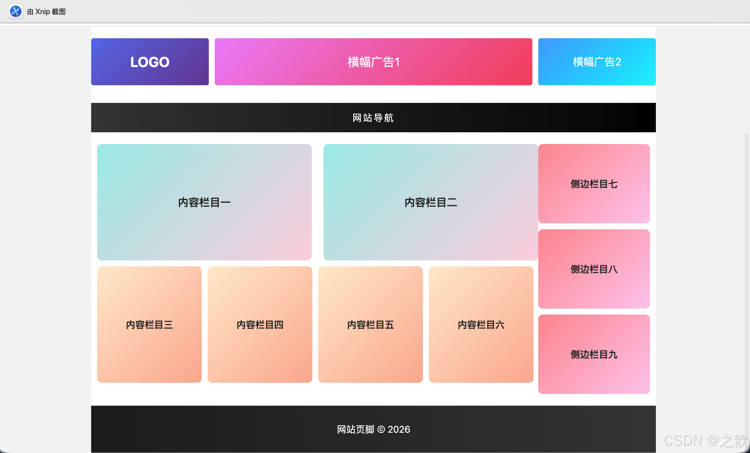
布局结构分析:
整体布局 container
页头 header
导航 nav
主体 main
页脚 footer
Logo 左浮动
Banner1 左浮动
Banner2 右浮动
内容区 左浮动
侧边栏 右浮动
第一行 2列
第二行 4列
侧栏1
侧栏2
侧栏3
实际应用案例:
- 新浪门户网站的经典布局
- 传统企业官网的首页布局
- 博客网站的文章列表页
- 电商网站的商品分类页
2.6 浮动布局的优缺点总结
优点:
- ✅ 兼容性极好,支持所有浏览器
- ✅ 实现简单,学习成本低
- ✅ 适合图文混排
- ✅ 可实现多列等高布局
缺点:
- ❌ 容易产生高度塌陷问题
- ❌ 需要手动清除浮动
- ❌ 不够灵活,响应式适配困难
- ❌ 代码维护成本较高
现代替代方案:
- Flexbox(弹性盒子布局)
- Grid(网格布局)
- Position(定位布局)
2.7 浮动布局综合实战示例
完整可运行示例 - 经典三栏布局(圣杯布局):
html
<!DOCTYPE html>
<html lang="zh-CN">
<head>
<meta charset="UTF-8">
<meta name="viewport" content="width=device-width, initial-scale=1.0">
<title>浮动布局综合实战 - 经典门户网站首页</title>
<style>
/* ========== 全局重置 ========== */
* {
margin: 0;
padding: 0;
box-sizing: border-box;
}
body {
font-family: -apple-system, BlinkMacSystemFont, "Segoe UI", Roboto, Arial, sans-serif;
background-color: #f5f5f5;
line-height: 1.6;
}
/* ========== 工具类 ========== */
.clearfix::after {
content: "";
display: block;
clear: both;
}
.fl {
float: left;
}
.fr {
float: right;
}
/* ========== 容器 ========== */
.container {
width: 1200px;
margin: 0 auto;
background-color: white;
}
/* ========== 顶部栏 ========== */
.topbar {
background-color: #f0f0f0;
height: 30px;
line-height: 30px;
font-size: 12px;
color: #666;
}
.topbar a {
color: #666;
text-decoration: none;
padding: 0 10px;
}
.topbar a:hover {
color: #1890ff;
}
/* ========== 页头 ========== */
.header {
padding: 20px 0;
}
.logo {
float: left;
width: 200px;
height: 60px;
background: linear-gradient(135deg, #667eea 0%, #764ba2 100%);
color: white;
text-align: center;
line-height: 60px;
font-size: 24px;
font-weight: bold;
border-radius: 4px;
}
.search {
float: left;
margin-left: 50px;
margin-top: 10px;
}
.search-input {
width: 400px;
height: 40px;
padding: 0 15px;
border: 2px solid #1890ff;
border-radius: 4px 0 0 4px;
font-size: 14px;
outline: none;
float: left;
}
.search-btn {
width: 80px;
height: 40px;
background-color: #1890ff;
color: white;
border: none;
border-radius: 0 4px 4px 0;
cursor: pointer;
float: left;
}
.search-btn:hover {
background-color: #40a9ff;
}
.user-info {
float: right;
margin-top: 20px;
}
.user-info a {
display: inline-block;
padding: 5px 15px;
color: #333;
text-decoration: none;
border: 1px solid #d9d9d9;
border-radius: 4px;
margin-left: 10px;
}
.user-info a:hover {
border-color: #1890ff;
color: #1890ff;
}
/* ========== 导航栏 ========== */
.navbar {
background: linear-gradient(to right, #434343 0%, #000000 100%);
height: 45px;
}
.nav-list {
list-style: none;
}
.nav-item {
float: left;
}
.nav-item a {
display: block;
padding: 0 25px;
height: 45px;
line-height: 45px;
color: white;
text-decoration: none;
transition: background-color 0.3s;
}
.nav-item a:hover,
.nav-item a.active {
background-color: #1890ff;
}
/* ========== 主体区域 ========== */
.main {
padding: 20px 0;
min-height: 600px;
}
/* 左侧边栏 */
.sidebar-left {
float: left;
width: 200px;
background-color: #fafafa;
border-radius: 4px;
padding: 15px;
}
.sidebar-title {
font-size: 16px;
font-weight: bold;
color: #333;
margin-bottom: 15px;
padding-bottom: 10px;
border-bottom: 2px solid #1890ff;
}
.sidebar-menu {
list-style: none;
}
.sidebar-menu li {
margin: 5px 0;
}
.sidebar-menu a {
display: block;
padding: 8px 12px;
color: #666;
text-decoration: none;
border-radius: 4px;
transition: all 0.3s;
}
.sidebar-menu a:hover {
background-color: #e6f7ff;
color: #1890ff;
}
/* 中间内容区 */
.content {
float: left;
width: 760px;
margin: 0 20px;
}
.banner {
height: 300px;
background: linear-gradient(135deg, #667eea 0%, #764ba2 100%);
border-radius: 8px;
display: flex;
align-items: center;
justify-content: center;
color: white;
font-size: 48px;
margin-bottom: 20px;
}
.news-section {
margin-bottom: 30px;
}
.section-title {
font-size: 20px;
font-weight: bold;
color: #333;
margin-bottom: 15px;
padding-left: 10px;
border-left: 4px solid #1890ff;
}
.news-list {
background-color: white;
border: 1px solid #e8e8e8;
border-radius: 4px;
}
.news-item {
padding: 15px;
border-bottom: 1px solid #f0f0f0;
transition: background-color 0.3s;
}
.news-item:last-child {
border-bottom: none;
}
.news-item:hover {
background-color: #fafafa;
}
.news-title {
color: #333;
font-size: 16px;
text-decoration: none;
}
.news-title:hover {
color: #1890ff;
}
.news-meta {
margin-top: 8px;
font-size: 12px;
color: #999;
}
/* 商品网格 */
.product-grid {
display: block;
}
.product-card {
float: left;
width: 176px;
margin-right: 20px;
margin-bottom: 20px;
background-color: white;
border: 1px solid #e8e8e8;
border-radius: 8px;
overflow: hidden;
transition: all 0.3s;
}
.product-card:nth-child(4n) {
margin-right: 0;
}
.product-card:hover {
transform: translateY(-5px);
box-shadow: 0 4px 12px rgba(0,0,0,0.15);
}
.product-img {
width: 176px;
height: 176px;
background: linear-gradient(135deg, #f093fb 0%, #f5576c 100%);
display: flex;
align-items: center;
justify-content: center;
font-size: 48px;
}
.product-info {
padding: 12px;
}
.product-name {
font-size: 14px;
color: #333;
height: 40px;
line-height: 20px;
overflow: hidden;
}
.product-price {
color: #ff4d4f;
font-size: 18px;
font-weight: bold;
margin-top: 8px;
}
/* 右侧边栏 */
.sidebar-right {
float: right;
width: 200px;
}
.widget {
background-color: #fafafa;
border-radius: 4px;
padding: 15px;
margin-bottom: 20px;
}
.widget-title {
font-size: 16px;
font-weight: bold;
color: #333;
margin-bottom: 15px;
padding-bottom: 10px;
border-bottom: 2px solid #52c41a;
}
.hot-list {
list-style: none;
}
.hot-item {
padding: 10px 0;
border-bottom: 1px dashed #e8e8e8;
}
.hot-item:last-child {
border-bottom: none;
}
.hot-item a {
color: #666;
text-decoration: none;
font-size: 14px;
}
.hot-item a:hover {
color: #52c41a;
}
.hot-badge {
display: inline-block;
width: 20px;
height: 20px;
line-height: 20px;
text-align: center;
background-color: #ff4d4f;
color: white;
border-radius: 4px;
font-size: 12px;
margin-right: 8px;
}
/* ========== 页脚 ========== */
.footer {
background-color: #333;
color: #999;
padding: 30px 0;
text-align: center;
margin-top: 40px;
}
.footer-nav {
margin-bottom: 20px;
}
.footer-nav a {
color: #999;
text-decoration: none;
margin: 0 15px;
}
.footer-nav a:hover {
color: white;
}
.copyright {
font-size: 12px;
color: #666;
}
</style>
</head>
<body>
<!-- 顶部栏 -->
<div class="topbar">
<div class="container clearfix">
<div class="fl">
欢迎来到我的网站
</div>
<div class="fr">
<a href="#">登录</a>
<a href="#">注册</a>
<a href="#">帮助中心</a>
</div>
</div>
</div>
<!-- 页头 -->
<div class="header">
<div class="container clearfix">
<div class="logo">MY LOGO</div>
<div class="search clearfix">
<input type="text" class="search-input" placeholder="搜索商品、资讯...">
<button class="search-btn">搜索</button>
</div>
<div class="user-info">
<a href="#">购物车</a>
<a href="#">我的订单</a>
</div>
</div>
</div>
<!-- 导航栏 -->
<div class="navbar">
<div class="container">
<ul class="nav-list clearfix">
<li class="nav-item"><a href="#" class="active">首页</a></li>
<li class="nav-item"><a href="#">新闻资讯</a></li>
<li class="nav-item"><a href="#">产品中心</a></li>
<li class="nav-item"><a href="#">解决方案</a></li>
<li class="nav-item"><a href="#">技术支持</a></li>
<li class="nav-item"><a href="#">关于我们</a></li>
<li class="nav-item"><a href="#">联系我们</a></li>
</ul>
</div>
</div>
<!-- 主体区域 -->
<div class="main">
<div class="container clearfix">
<!-- 左侧边栏 -->
<div class="sidebar-left">
<h3 class="sidebar-title">产品分类</h3>
<ul class="sidebar-menu">
<li><a href="#">手机数码</a></li>
<li><a href="#">电脑办公</a></li>
<li><a href="#">家用电器</a></li>
<li><a href="#">服饰鞋包</a></li>
<li><a href="#">美妆个护</a></li>
<li><a href="#">运动户外</a></li>
<li><a href="#">图书文娱</a></li>
<li><a href="#">食品生鲜</a></li>
</ul>
</div>
<!-- 中间内容区 -->
<div class="content">
<!-- 轮播图 -->
<div class="banner">🎨 轮播图区域</div>
<!-- 新闻资讯 -->
<div class="news-section">
<h2 class="section-title">最新资讯</h2>
<div class="news-list">
<div class="news-item">
<a href="#" class="news-title">前端技术发展趋势分析:2026年最值得关注的技术</a>
<div class="news-meta">2026-05-03 | 阅读量: 1234</div>
</div>
<div class="news-item">
<a href="#" class="news-title">CSS布局技巧:掌握浮动与行内块的完整指南</a>
<div class="news-meta">2026-05-02 | 阅读量: 2345</div>
</div>
<div class="news-item">
<a href="#" class="news-title">响应式设计最佳实践:让你的网站适配所有设备</a>
<div class="news-meta">2026-05-01 | 阅读量: 3456</div>
</div>
</div>
</div>
<!-- 商品展示 -->
<div class="news-section">
<h2 class="section-title">热门商品</h2>
<div class="product-grid clearfix">
<div class="product-card">
<div class="product-img">📱</div>
<div class="product-info">
<div class="product-name">智能手机 5G全网通</div>
<div class="product-price">¥2999</div>
</div>
</div>
<div class="product-card">
<div class="product-img">💻</div>
<div class="product-info">
<div class="product-name">轻薄笔记本电脑 办公首选</div>
<div class="product-price">¥4999</div>
</div>
</div>
<div class="product-card">
<div class="product-img">⌚</div>
<div class="product-info">
<div class="product-name">智能手表 运动健康</div>
<div class="product-price">¥1299</div>
</div>
</div>
<div class="product-card">
<div class="product-img">🎧</div>
<div class="product-info">
<div class="product-name">无线蓝牙耳机 降噪</div>
<div class="product-price">¥899</div>
</div>
</div>
</div>
</div>
</div>
<!-- 右侧边栏 -->
<div class="sidebar-right">
<div class="widget">
<h3 class="widget-title">热门排行</h3>
<ul class="hot-list">
<li class="hot-item">
<span class="hot-badge">1</span>
<a href="#">CSS Grid 布局完全指南</a>
</li>
<li class="hot-item">
<span class="hot-badge">2</span>
<a href="#">JavaScript ES2026 新特性</a>
</li>
<li class="hot-item">
<span class="hot-badge">3</span>
<a href="#">Vue 3.0 实战教程</a>
</li>
<li class="hot-item">
<span class="hot-badge">4</span>
<a href="#">React Hooks 深入浅出</a>
</li>
<li class="hot-item">
<span class="hot-badge">5</span>
<a href="#">TypeScript 进阶指南</a>
</li>
</ul>
</div>
<div class="widget">
<h3 class="widget-title">友情链接</h3>
<ul class="hot-list">
<li class="hot-item"><a href="#">MDN Web Docs</a></li>
<li class="hot-item"><a href="#">Can I Use</a></li>
<li class="hot-item"><a href="#">CSS Tricks</a></li>
<li class="hot-item"><a href="#">掘金社区</a></li>
</ul>
</div>
</div>
</div>
</div>
<!-- 页脚 -->
<div class="footer">
<div class="container">
<div class="footer-nav">
<a href="#">关于我们</a> |
<a href="#">联系方式</a> |
<a href="#">隐私政策</a> |
<a href="#">服务条款</a> |
<a href="#">网站地图</a>
</div>
<div class="copyright">
© 2026 浮动布局示例网站 | 仅供学习交流使用
</div>
</div>
</div>
</body>
</html>
🎯 该示例展示的核心技术点:
-
三栏布局
- 左侧固定宽度 200px
- 中间自适应宽度 760px
- 右侧固定宽度 200px
-
clearfix清除浮动
- 防止父元素高度塌陷
- 所有包含浮动元素的容器都添加clearfix
-
商品网格布局
- 4列布局,每列宽度176px
- 使用
:nth-child(4n)清除第4个的右边距 - 实现自动换行
-
导航栏
- 使用浮动实现水平排列
- hover效果和active状态
-
完整页面结构
- 顶部栏 → 页头 → 导航栏 → 主体 → 页脚
- 版心容器居中
- 响应式友好
💡 实际应用场景:
| 网站类型 | 使用部分 | 典型网站 |
|---|---|---|
| 门户网站 | 整体三栏布局 | 新浪、网易、搜狐 |
| 电商平台 | 商品网格布局 | 淘宝、京东(早期版本) |
| 企业官网 | 页头、导航、页脚 | 传统企业网站 |
| 博客系统 | 左侧菜单+内容 | WordPress主题 |
| 文档网站 | 左侧目录+内容+右侧索引 | 各类API文档 |