一、说明
Flutter作为跨平台UI框架,其核心能力在于实现一套代码的多端一致性渲染。字体文本渲染作为保障应用UI视觉统一和文案展示规范的基础能力,在开发中具有关键作用。开发人员通常通过Dart层的TextStyle和全局ThemeData配置字体家族、字重和样式,即可实现Android/iOS多平台的正常文本展示。
二、字体生效原理
我们在创建 MaterialApp 的时候会传入 ThemeData,示例:
Dart
MaterialApp(
theme: ThemeData(
fontFamily: "CustomFont",
useMaterial3: true,
),
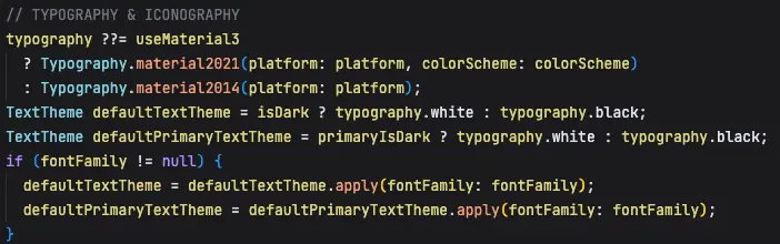
);在构造函数中,如果你配置了自己的字体则会用自己的,如果没有配置,Flutter 会为你配置一套主题字体。
theme_data.dart
我们再看一下 typography.dart 干了什么
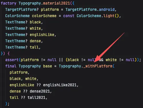
根据不同的平台配置不同的字体
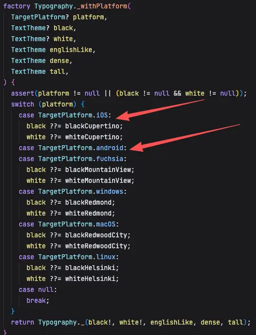
Android 默认主题
iOS 默认主题
所以在 Framework 层其实已经做了兜底策略,你如果不手动设置的话,它会配置一套系统的默认字体。
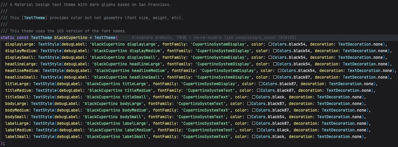
源码中提到 iOS 的字体使用了 San Francisco 的字体主题。
A Material Design text theme with dark glyphs based on San Francisco.
这儿的 CupertinoSystemDisplay 和 CupertinoSystemText 名称是怎样去找到系统的 SF 字体的呢?
首先,Flutter 引擎层会通过不同的字体管理器去获取不同的字体。
引擎层源码:font_collection.cc
cpp
std::vector<sk_sp<SkTypeface>> FontCollection::findTypefaces(const std::vector<SkString>& familyNames, SkFontStyle fontStyle, const std::optional<FontArguments>& fontArgs) {
    std::vector<sk_sp<SkTypeface>> typefaces;
    for (const SkString& familyName : familyNames) {
        // 匹配字体
        sk_sp<SkTypeface> match = matchTypeface(familyName, fontStyle);
        if (match && fontArgs) {
            match = fontArgs->CloneTypeface(match);
        }
        if (match) {
            typefaces.emplace_back(std::move(match));
        }
    }

    return typefaces;
}

// 查找字体
sk_sp<SkTypeface> FontCollection::matchTypeface(const SkString& familyName, SkFontStyle fontStyle) {
    for (const auto& manager : this->getFontManagerOrder()) {
        // 匹配字体
        sk_sp<SkFontStyleSet> set(manager->matchFamily(familyName.c_str()));
        // 没找到字体找下一个
        if (!set || set->count() == 0) {
            continue;
        }

        // 如果找到了就匹配样式:字重、宽度、斜体等
        sk_sp<SkTypeface> match(set->matchStyle(fontStyle));
        if (match) {
            return match;
        }
    }

    return nullptr;
}


// 获取字体管理器数组
std::vector<sk_sp<SkFontMgr>> FontCollection::getFontManagerOrder() const {
    std::vector<sk_sp<SkFontMgr>> order;
    if (fDynamicFontManager) {
        order.push_back(fDynamicFontManager);
    }
    if (fAssetFontManager) {
        order.push_back(fAssetFontManager);
    }
    if (fTestFontManager) {
        order.push_back(fTestFontManager);
    }
    if (fDefaultFontManager && fEnableFontFallback) {
        order.push_back(fDefaultFontManager);
    }
    return order;
}
flutter 会维护 4 种不同的字体管理器,查找字体的时候会根据顺序依次查找:
- DynamicFontManager :系统特定字体(如iOS的SF Pro Display)和动态注册的字体。
- AssetFontManager :pubspec注册的应用字体(自定义字体)
- TestFontManager :仅用于测试
- DefaultFontManager :平台默认字体(如iOS的SF Pro Text)
当使用 CupertinoSystemText 时 :
- 先在动态字体管理器中查找,找不到
- 再在资源字体管理器中查找,找不到
- 最终在默认字体管理器(CoreText)中找到SF Pro Text
- CoreText根据获取到 SF Pro Text
CupertinoSystemDisplay 对应的 SF Pro Display 对应的加载方式,我们继续查看源码:
cpp
FontCollection::RegisterFonts(
    const std::shared_ptr<AssetManager>& asset_manager) {
#if FML_OS_MACOSX || FML_OS_IOS
  RegisterSystemFonts(*dynamic_font_manager_);
#endif
进一步查看 platform_mac.mm
cpp
// Apple system font larger than size 29 returns SFProDisplay typeface.
static const CGFloat kSFProDisplayBreakPoint = 29;
// Font name represents the "SF Pro Display" system font on Apple platforms.
static const std::string kSFProDisplayName = "CupertinoSystemDisplay";

void RegisterSystemFonts(const DynamicFontManager& dynamic_font_manager) {
  auto register_weighted_font = [&dynamic_font_manager](const int weight) {
    sk_sp<SkTypeface> large_system_font_weighted = SkMakeTypefaceFromCTFont(MatchSystemUIFont(weight, kSFProDisplayBreakPoint));
    if (large_system_font_weighted) {
      dynamic_font_manager.font_provider().RegisterTypeface(large_system_font_weighted, kSFProDisplayName);
    }
  };
  for (int i = 0; i < 8; i++) {
    const int font_weight = i * 100;
    register_weighted_font(font_weight);
  }
  // The value 780 returns a font weight of 800.
  register_weighted_font(780);
  // The value of 810 returns a font weight of 900.
  register_weighted_font(810);
}
使用 MatchSystemUIFont 函数通过CoreText的 CTFontCreateUIFontForLanguage 获取系统字体。
由于 CoreText 是 Apple 开发的闭源系统库,用于文本渲染和排版。Apple 只提供该函数的声明(头文件) 和 二进制库 ,不开放实现源码,我们只能看到这一层。
指定字体大小为 kSFProDisplayBreakPoint (29)确保获取的是SF Pro Display字体。
通过 dynamic_font_manager.font_provider().RegisterTypeface 将获取到的SF Pro Display字体注册为 CupertinoSystemDisplay 名称,这样Flutter框架就可以通过这个名称使用SF字体。
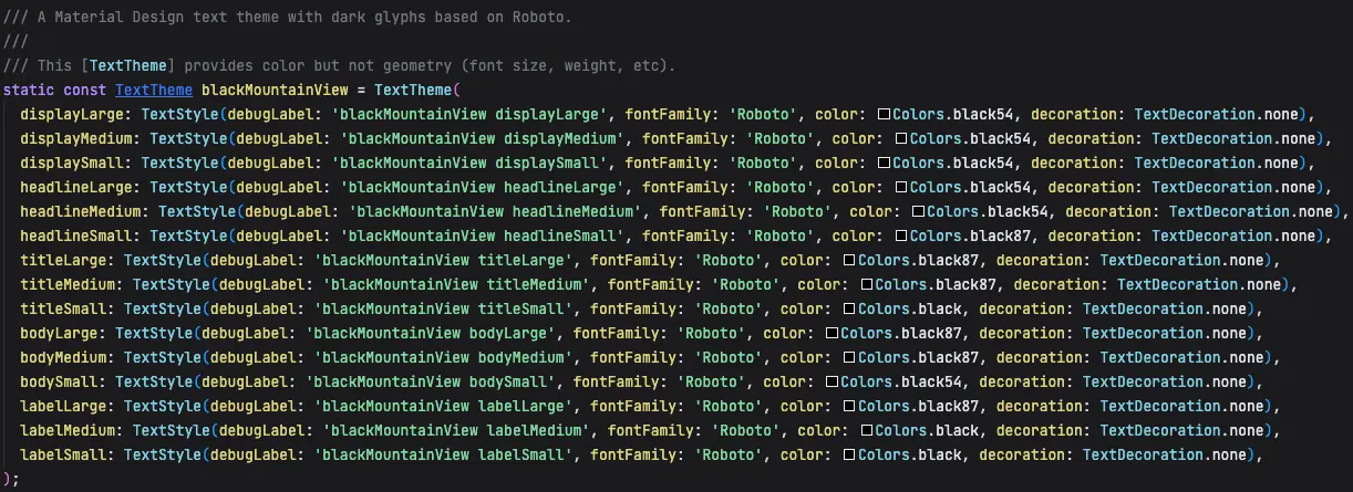
而安卓主题注释信息中有提到
A Material Design text theme with dark glyphs based on Roboto.
它是基于 robot 字体的主题。
以上的两种字体只是英文的,为什么没有提到中文呢?
进一步查看 text_style.dart 中的说明
/// The fallback order is:
///
/// * fontFamily
/// * fontFamilyFallback in order of first to last.
/// * System fallback fonts which will vary depending on platform. Flutter
通过智能字体回退机制来解决找不到字体的问题。回退顺序为:
- fontFamily (主要字体 - Roboto)
- fontFamilyFallback (自定义回退字体列表 - Android 默认为空)
- System fallback fonts (系统回退字体 - 关键!)
我们从源码中可以看到底层并未设置 fontFamilyFallback,所以它主要是通过系统层的回退机制去查找的。
安卓系统的回退机制为:Roboto (主要字体) → Noto Sans CJK (中文) → Noto Color Emoji (表情) → 其他系统字体 iOS 的回退机制为:San Francisco → PingFang SC → 系统默认中文字体
举例:Flutter 在安卓端显示混合文本:"Hello 你好!🌍"
Dart
Text("Hello 你好!🌍")字符级别的字体查找:
- 'H' → Roboto ✅ (使用 Roboto)
- 'e' → Roboto ✅ (使用 Roboto)
- 'l' → Roboto ✅ (使用 Roboto)
- 'l' → Roboto ✅ (使用 Roboto)
- 'o' → Roboto ✅ (使用 Roboto)
- ' ' → Roboto ✅ (使用 Roboto)
- '你' → Roboto ❌ → 系统回退 → Noto Sans CJK ✅ (使用 Noto Sans CJK)
- '好' → Roboto ❌ → 系统回退 → Noto Sans CJK ✅ (使用 Noto Sans CJK)
- '!' → Roboto ✅ (使用 Roboto)
- '🌍' → Roboto ❌ → 系统回退 → Noto Color Emoji ✅ (使用 Noto Color Emoji)
所以,在不手动设置 Flutter 字体的情况下,其使用的是系统默认的字体。
三、字重生效原理
Flutter 会先找到字体后再去尝试查找字重。
cpp
// 查找字体
sk_sp<SkTypeface> FontCollection::matchTypeface(const SkString& familyName, SkFontStyle fontStyle) {
    for (const auto& manager : this->getFontManagerOrder()) {
        // 匹配字体
        sk_sp<SkFontStyleSet> set(manager->matchFamily(familyName.c_str()));
        // 没找到字体找下一个
        if (!set || set->count() == 0) {
            continue;
        }

        // 如果找到了就匹配样式:字重、宽度、斜体等
        sk_sp<SkTypeface> match(set->matchStyle(fontStyle));
        if (match) {
            return match;
        }
    }

    return nullptr;
}
matchStyle 部分又做了什么呢?
typeface_font_asset_provider.cc
cpp
sk_sp<SkTypeface> TypefaceFontStyleSet::matchStyle(const SkFontStyle& pattern) {
  return matchStyleCSS3(pattern);
}
SKFontMgr.cpp
cpp
/**
* Width has the greatest priority.
* If the value of pattern.width is 5 (normal) or less,
* narrower width values are checked first, then wider values.
* If the value of pattern.width is greater than 5 (normal),
* wider values are checked first, followed by narrower values.
*
* Italic/Oblique has the next highest priority.
* If italic requested and there is some italic font, use it.
* If oblique requested and there is some oblique font, use it.
* If italic requested and there is some oblique font, use it.
* If oblique requested and there is some italic font, use it.
*
* Exact match.
* If pattern.weight < 400, weights below pattern.weight are checked
* in descending order followed by weights above pattern.weight
* in ascending order until a match is found.
* If pattern.weight > 500, weights above pattern.weight are checked
* in ascending order followed by weights below pattern.weight
* in descending order until a match is found.
* If pattern.weight is 400, 500 is checked first
* and then the rule for pattern.weight < 400 is used.
* If pattern.weight is 500, 400 is checked first
* and then the rule for pattern.weight < 400 is used.
*/
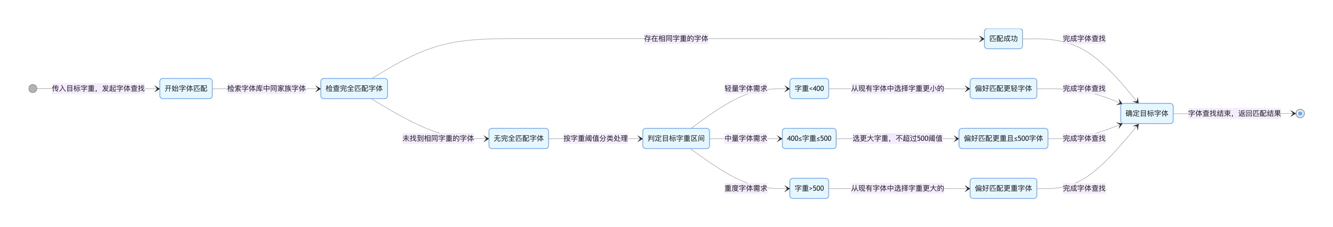
sk_sp<SkTypeface> SkFontStyleSet::matchStyleCSS3(const SkFontStyle& pattern) {
int count = this->count();
if (0 == count) {
return nullptr;
}
struct Score {
int score;
int index;
Score& operator +=(int rhs) { this->score += rhs; return *this; }
Score& operator <<=(int rhs) { this->score <<= rhs; return *this; }
bool operator <(const Score& that) { return this->score < that.score; }
};
Score maxScore = { 0, 0 };
for (int i = 0; i < count; ++i) {
SkFontStyle current;
this->getStyle(i, ¤t, nullptr);
Score currentScore = { 0, i };
// CSS weight / SkFontStyle::Weight
// The 'closer' to the target weight, the higher the score.
// 1000 is the 'heaviest' recognized weight
if (pattern.weight() == current.weight()) {
currentScore += 1000;
// less than 400 prefer lighter weights
} else if (pattern.weight() < 400) {
if (current.weight() <= pattern.weight()) {
currentScore += 1000 - pattern.weight() + current.weight();
} else {
currentScore += 1000 - current.weight();
}
// between 400 and 500 prefer heavier up to 500, then lighter weights
} else if (pattern.weight() <= 500) {
if (current.weight() >= pattern.weight() && current.weight() <= 500) {
currentScore += 1000 + pattern.weight() - current.weight();
} else if (current.weight() <= pattern.weight()) {
currentScore += 500 + current.weight();
} else {
currentScore += 1000 - current.weight();
}
// greater than 500 prefer heavier weights
} else if (pattern.weight() > 500) {
if (current.weight() > pattern.weight()) {
currentScore += 1000 + pattern.weight() - current.weight();
} else {
currentScore += current.weight();
}
}
if (maxScore < currentScore) {
maxScore = currentScore;
}
}
return this->createTypeface(maxScore.index);
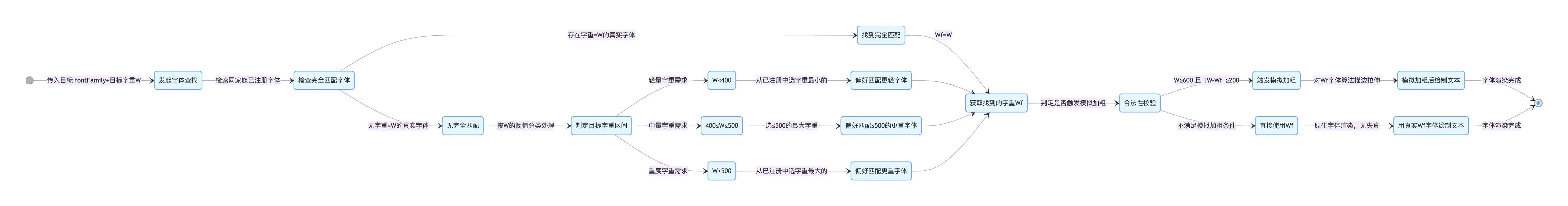
}这个时候会按照 CSS Fonts Module Level 3 规范中的规则去匹配字重,匹配算法遵循标准:
- 评分系统 :为每种字体样式计算一个匹配得分
- 字重匹配 :根据目标字重与当前字体字重的差异计算得分
按照上面的逻辑来看,如果某个字体只有一种字重的话,应该是不管设置多大的字重,都只会使用自带的字重,比如 thin 的字重是 300,应该是将字重设置为 100 到 900,它都只会使用 300 的字重。我们搞个 demo 实践一下:
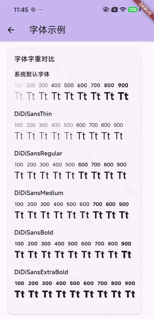
从 demo 中发现 2 个问题:
- 如果设置的字重比它自身的字重小的话,以字体的实际字重兜底。举例:thin 是 300 的字重,你给它设置 100 的时候它也是 300。
- 当大到一定程度,它会自动加粗,但加粗的效果好像不如真实的。举例:thin 虽然只有 300 的字重,但是从 600 开始变得粗了,但它这儿的 600 不如真实的 600 字重粗。
问题:为什么会造成这样的情况呢?
skia/modules/skparagraph/src/OneLineShaper.cpp
在 matchResolvedFonts 的调用中我们发现这样一段逻辑:
cpp
// Apply fake bold and/or italic settings to the font if the typeface's attributes do not match the intended font style.
int wantedWeight = block.fStyle.getFontStyle().weight();
bool fakeBold = wantedWeight >= 600 && wantedWeight - font.getTypeface()->fontStyle().weight() >= 200;
font.setEmbolden(fakeBold);
判断逻辑为:
目标字重大于等于 600,并且与找到的字重相差大于等于200,才会触发模拟加粗,否则直接用找到的字重去绘制。 到这儿也就能解释上面的 demo 中为什么会有加粗的效果了。
底层是怎样模拟加粗的呢?
cpp
skia/src/ports/SkFontHost_FreeType.cpp   #ifndef SK_OUTLINE_EMBOLDEN_DIVISOR
    #ifdef __ANDROID__
        #define SK_OUTLINE_EMBOLDEN_DIVISOR   34
    #else
        #define SK_OUTLINE_EMBOLDEN_DIVISOR   24
    #endif
#endif


// 加粗强度
const FT_Pos strength = FT_MulFix(face->units_per_EM, face->size->metrics.y_scale) / SK_OUTLINE_EMBOLDEN_DIVISOR;
// 应用合成加粗
return 0 == FT_Outline_Embolden(&glyph->outline, strength);- FT_Pos :FreeType 的位置类型,通常是 32 位整数,使用 16.16 定点数格式(高 16 位整数部分,低 16 位小数部分)
- face->units_per_EM :字体的设计大小,通常固定为 1000 或 2048,单位是字体设计单位
- face->size->metrics.y_scale :当前字体大小的 Y 轴缩放因子,将字体设计单位转换为设备像素
- FT_MulFix(a, b) :FreeType 提供的定点数乘法函数
- SK_OUTLINE_EMBOLDEN_DIVISOR :控制加粗强度的除数,根据平台不同为 24 或 34
- 小字体 :加粗效果适中,避免笔画粘连
- 大字体 :加粗效果明显,保持视觉一致性
- 跨平台 :根据不同平台的显示特性调整强度
举例:
cpp
// 示例 1:12pt 字体,units_per_EM = 1000,y_scale = 0.012
strength = FT_MulFix(1000, 0.012 * 65536) / 24
         = (1000 * 786.432) / 24
         = 786432 / 24
         = 32768 (约等于 0.5 像素)

// 示例 2:24pt 字体,units_per_EM = 1000,y_scale = 0.024
strength = FT_MulFix(1000, 0.024 * 65536) / 24
         = (1000 * 1572.864) / 24
         = 1572864 / 24
         = 65536 (约等于 1 像素)
所以,字体越大,加粗效果越明显。
所以,字重的整体匹配逻辑如下:
四、总结
Flutter作为跨平台框架,通过统一的字体文本渲染机制确保多端UI一致性。开发人员可通过TextStyle和ThemeData配置字体家族、字重等属性,框架默认提供Android的Roboto和iOS的San Francisco作为兜底字体。
字体加载流程依赖引擎层的动态管理器、资源管理器等四类管理器按序查找。iOS通过CoreText闭源库获取系统字体,例如CupertinoSystemDisplay对应SF Pro Display,安卓则基于Roboto主题。
对于中文等非默认字体,Flutter采用智能回退机制:优先匹配主字体,失败后依次尝试自定义回退列表和系统回退字体(如安卓的Noto Sans CJK)。这种字符级匹配策略保障了混合文本(如英文+中文+表情)的正确渲染。