完整示例(表格隔行换色 + 前N个选取 ------ 来自课堂案例 07/08):
html
<!DOCTYPE html>
<html lang="zh-CN">
<head>
  <meta charset="UTF-8">
  <title>结构伪类选择器全演示</title>
  <style>
    * { box-sizing: border-box; margin: 0; padding: 0; }
    body { padding: 30px; font-family: sans-serif; background: #f8f9fa; }

    h3 { margin: 24px 0 12px; }

    /* 1. 表格隔行换色 */
    .data-table { width: 100%; border-collapse: collapse; }
    .data-table th, .data-table td {
      padding: 10px 16px;
      border: 1px solid #dee2e6;
      text-align: left;
    }
    .data-table thead th { background: #343a40; color: #fff; }
    .data-table tbody tr:nth-child(odd)  { background: #fff; }
    .data-table tbody tr:nth-child(even) { background: #f2f2f2; }
    .data-table tbody tr:hover { background: #e8f4fd; }

    /* 2. 首尾特殊样式 */
    .list { list-style: none; padding: 0; width: 340px; }
    .list li { padding: 10px 16px; border-bottom: 1px solid #eee; color: #555; }
    .list li:first-child { background: #fff3cd; font-weight: bold; }
    .list li:last-child  { border-bottom: none; color: #aaa; font-style: italic; }

    /* 3. 新闻列表:每3条加分隔线 */
    .news-list { list-style: none; padding: 0; width: 500px; }
    .news-list li { padding: 10px 0; font-size: 14px; }
    .news-list li:nth-child(3n) { border-bottom: 2px solid #e74c3c; margin-bottom: 10px; }
    .news-list li:nth-child(odd)  { background: #fff; }
    .news-list li:nth-child(even) { background: #f9f9f9; }

    /* 4. 只有一个子元素时显示特殊样式 */
    .solo-box { padding: 16px; border: 1px solid #ccc; width: 200px; margin-top: 12px; }
    .solo-box p:only-child { color: #e74c3c; font-weight: bold; }

    /* 5. :empty 标记空单元格 */
    .data-table td:empty::after { content: "---"; color: #bbb; }
  </style>
</head>
<body>
  <h3>1. 表格隔行换色(:nth-child)</h3>
  <table class="data-table">
    <thead><tr><th>姓名</th><th>成绩</th><th>备注</th></tr></thead>
    <tbody>
      <tr><td>学生 A</td><td>95</td><td>优秀</td></tr>
      <tr><td>学生 B</td><td>88</td><td></td></tr>
      <tr><td>学生 C</td><td>72</td><td>需加强</td></tr>
      <tr><td>学生 D</td><td>90</td><td></td></tr>
      <tr><td>学生 E</td><td>65</td><td>补考</td></tr>
    </tbody>
  </table>

  <h3>2. 首尾特殊样式(:first-child / :last-child)</h3>
  <ul class="list">
    <li>置顶公告:活动开始啦!</li>
    <li>今日热点新闻一</li>
    <li>今日热点新闻二</li>
    <li>更多内容请点击...</li>
  </ul>

  <h3>3. 每3条加分隔线(:nth-child(3n))</h3>
  <ul class="news-list">
    <li>新闻资讯 01</li>
    <li>新闻资讯 02</li>
    <li>新闻资讯 03(3的倍数,下方分隔线)</li>
    <li>新闻资讯 04</li>
    <li>新闻资讯 05</li>
    <li>新闻资讯 06(3的倍数,下方分隔线)</li>
    <li>新闻资讯 07</li>
    <li>新闻资讯 08</li>
    <li>新闻资讯 09(3的倍数,下方分隔线)</li>
  </ul>

  <h3>4. :only-child</h3>
  <div class="solo-box"><p>我是唯一子元素,特殊颜色</p></div>
  <div class="solo-box">
    <p>我有兄弟</p>
    <p>我也有兄弟(不触发 :only-child)</p>
  </div>
</body>
</html>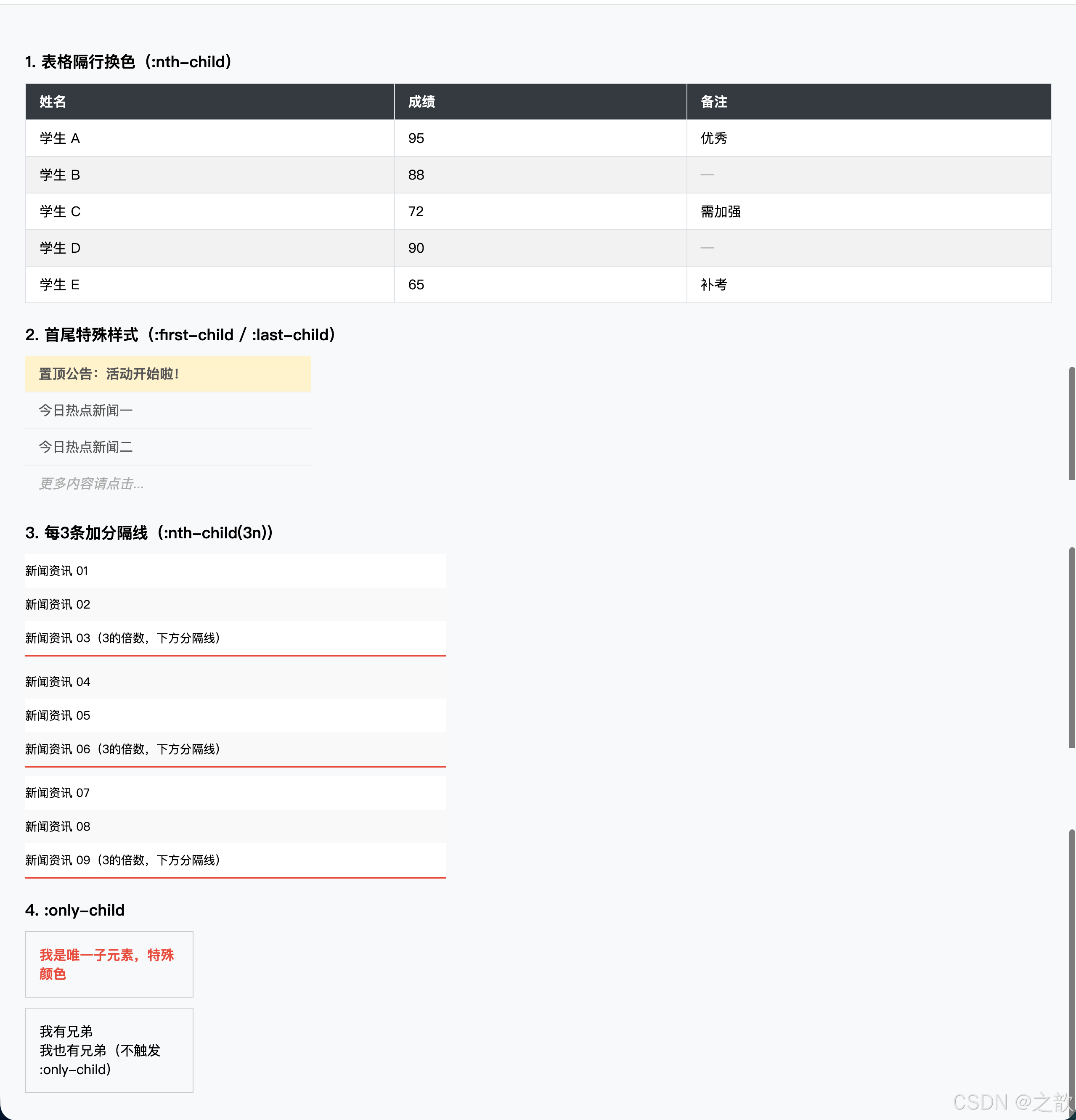
⑥ 否定伪类选择器(1个)
:not(selector):选择不满足括号内选择器的元素。非常适合"排除特例"的场景,使代码更语义化。
css
/* 排除最后一个 li,给前面的都加底部边框 */
li:not(:last-child) { border-bottom: 1px solid #eee; }

/* 给除了 .active 以外的导航项统一颜色 */
nav a:not(.active) { color: #555; }

/* 排除第一个链接的左边框(反向实现分隔线) */
nav a:not(:first-child) { border-left: 1px solid #ccc; }
完整示例(课堂案例 09):
html
<!DOCTYPE html>
<html lang="zh-CN">
<head>
  <meta charset="UTF-8">
  <title>否定伪类选择器 :not()</title>
  <style>
    * { box-sizing: border-box; margin: 0; padding: 0; }
    body { padding: 30px; font-family: sans-serif; }

    /* 新闻列表:排除 .active 项才加虚线边框 */
    .news { list-style: none; width: 500px; }
    .news li { padding: 12px 16px; }
    .news li:not(.active) { border-bottom: 1px dashed #ccc; }
    .news li.active { background: #4a90e2; color: #fff; border-radius: 4px; }

    /* 导航:排除最后一个才加右边框 */
    nav { margin-top: 30px; background: #2c3e50; display: flex; }
    nav a {
      padding: 0 20px;
      line-height: 48px;
      color: #ecf0f1;
      text-decoration: none;
      font-size: 14px;
    }
    nav a:not(:last-child) { border-right: 1px solid rgba(255,255,255,.2); }
    nav a:hover { background: rgba(255,255,255,.1); }

    /* 表单:排除 submit 类型的 input */
    input:not([type="submit"]):not([type="radio"]):not([type="checkbox"]) {
      display: block;
      margin-top: 10px;
      padding: 8px 12px;
      width: 260px;
      border: 1px solid #ccc;
      border-radius: 4px;
    }
  </style>
</head>
<body>
  <ul class="news">
    <li>普通新闻条目(有虚线边框)</li>
    <li class="active">当前激活项(无虚线边框)</li>
    <li>普通新闻条目</li>
    <li>普通新闻条目</li>
    <li>最后一条(有虚线边框)</li>
  </ul>

  <nav>
    <a href="#">首页</a>
    <a href="#">产品</a>
    <a href="#">案例</a>
    <a href="#">联系</a><!-- 最后一个,无右边框 -->
  </nav>

  <form style="margin-top:20px;">
    <input type="text" placeholder="用户名">
    <input type="email" placeholder="邮箱">
    <input type="radio" name="r" value="1"> 选项1
    <input type="submit" value="提交">
  </form>
</body>
</html>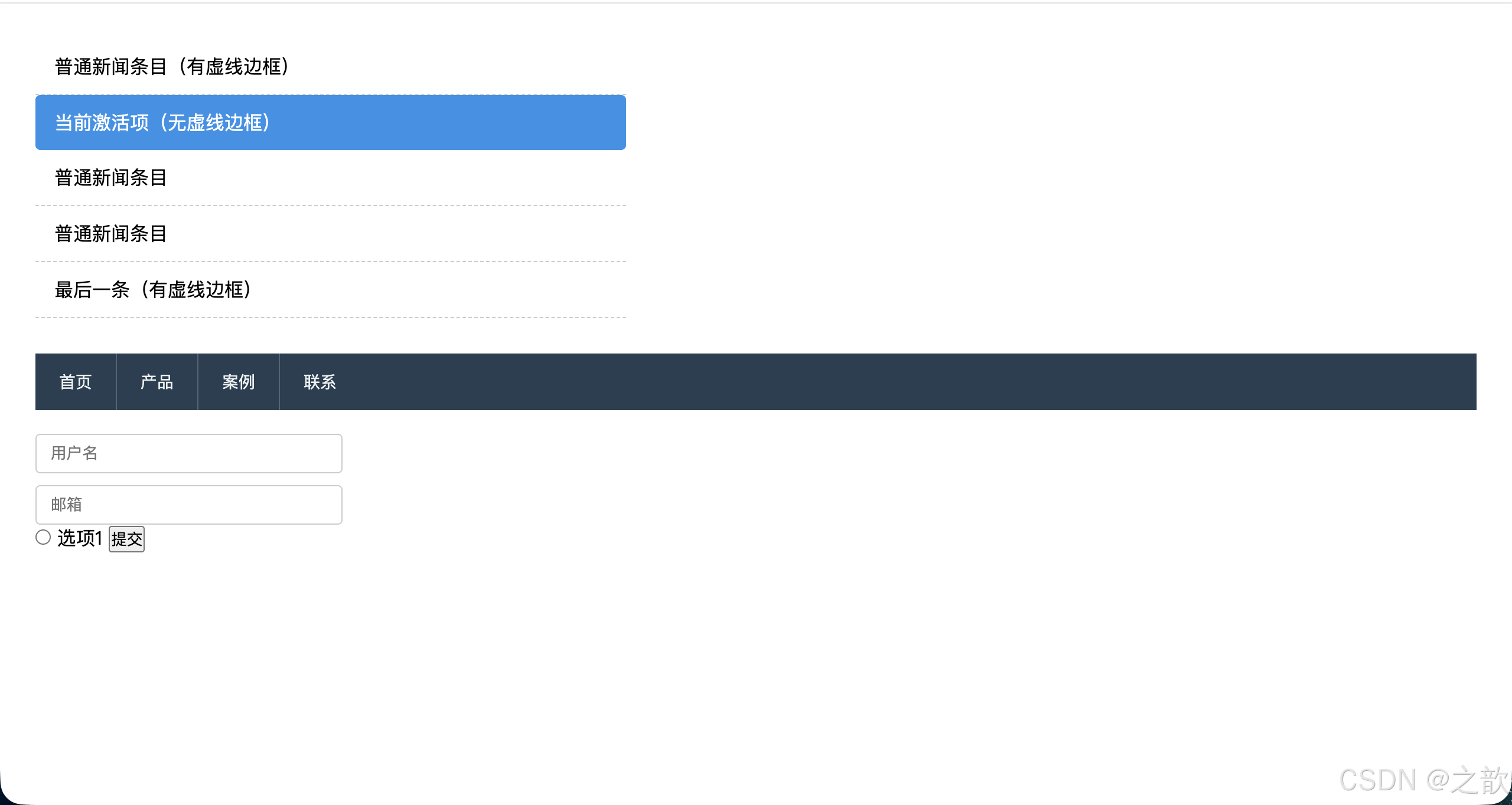
伪元素选择器
伪元素允许我们选择和样式化元素内部某个虚拟部分 ,或向元素中动态插入内容。
伪元素(Pseudo-element) :以
::开头(CSS3 规范),但浏览器兼容性上:单冒号也可用。它们不是真实的 DOM 节点,只存在于渲染层。
| 伪元素 | 说明 | 常见用途 |
|---|---|---|
::first-letter |
元素中第一个文字 | 首字下沉效果 |
::first-line |
元素中第一行文字 | 首行特殊样式 |
::before |
在元素第一个子节点之前插入 | 图标、装饰、清除浮动 |
::after |
在元素最后一个子节点之后插入 | 数量徽标、工具提示、清浮动 |
::placeholder |
输入框 placeholder 文字 | 美化提示文字颜色 |
::selection |
鼠标选中的文字 | 品牌色选中高亮 |
重要 :
::before和::after必须设置content属性,哪怕是空字符串content: "",否则不渲染。
完整示例(课堂案例 10 扩展版):
html
<!DOCTYPE html>
<html lang="zh-CN">
<head>
  <meta charset="UTF-8">
  <title>伪元素选择器全演示</title>
  <style>
    * { box-sizing: border-box; margin: 0; padding: 0; }
    body { padding: 30px; font-family: "Georgia", serif; line-height: 1.8; }

    /* ::first-letter 首字下沉效果(报纸风格) */
    .article-body::first-letter {
      float: left;
      font-size: 4em;
      line-height: .85;
      font-weight: bold;
      color: #900;
      margin-right: 8px;
      font-family: "Times New Roman", serif;
    }

    /* ::first-line 首行特殊样式 */
    .article-body::first-line {
      letter-spacing: .06em;
      color: #444;
    }

    /* ::before 清除浮动(clearfix 经典用法) */
    .clearfix::after {
      content: "";
      display: block;
      clear: both;
    }

    /* ::before 装饰性引号 */
    .quote {
      position: relative;
      padding: 20px 24px 20px 56px;
      background: #f9f4ef;
      border-left: 4px solid #c0392b;
      margin: 24px 0;
    }
    .quote::before {
      content: "\201C"; /* 左双引号 Unicode */
      position: absolute;
      left: 12px;
      top: -10px;
      font-size: 5em;
      color: #c0392b;
      line-height: 1;
      font-family: Georgia, serif;
    }

    /* ::after 数量徽标 */
    .badge-btn {
      position: relative;
      display: inline-block;
      padding: 10px 20px;
      background: #4a90e2;
      color: #fff;
      border-radius: 6px;
      font-size: 14px;
      margin: 16px 0;
    }
    .badge-btn::after {
      content: attr(data-count);  /* 读取 data-count 属性 */
      position: absolute;
      top: -8px;
      right: -10px;
      background: #e74c3c;
      color: #fff;
      font-size: 11px;
      min-width: 20px;
      height: 20px;
      border-radius: 10px;
      display: flex;
      align-items: center;
      justify-content: center;
      padding: 0 5px;
    }

    /* ::placeholder */
    input {
      display: block;
      margin-top: 12px;
      padding: 10px 14px;
      width: 300px;
      border: 1px solid #ccc;
      border-radius: 6px;
      outline: none;
    }
    input::placeholder { color: #bbb; font-style: italic; }
    input:focus::placeholder { color: #ddd; }

    /* ::selection 品牌色文字选中 */
    ::selection { background: #4a90e2; color: #fff; }

    /* 新闻列表装饰(::before 作为色块装饰) */
    .news-list { list-style: none; padding: 0; margin-top: 24px; width: 500px; }
    .news-list li {
      position: relative;
      padding: 10px 0 10px 20px;
      border-bottom: 1px solid #eee;
      font-size: 14px;
    }
    .news-list li::before {
      content: "";
      position: absolute;
      left: 0;
      top: 50%;
      transform: translateY(-50%);
      width: 6px;
      height: 6px;
      border-radius: 50%;
      background: #4a90e2;
    }
    .news-list li:first-child::before { background: #e74c3c; width: 8px; height: 8px; }
  </style>
</head>
<body>

  <h2>::first-letter 首字下沉</h2>
  <p class="article-body">
    CSS3 为我们带来了前所未有的样式控制能力。伪元素选择器让开发者能够在不修改 HTML 结构的前提下,向页面注入装饰性内容、实现精妙的视觉效果。掌握伪元素,是迈向 CSS 进阶的关键一步。
  </p>

  <h2 style="margin-top:24px;">::before 引号装饰</h2>
  <blockquote class="quote">
    优秀的设计不仅仅是视觉上的愉悦,更是对用户体验的深刻理解与尊重。
  </blockquote>

  <h2>::after 数量徽标</h2>
  <button class="badge-btn" data-count="5">购物车</button>

  <h2 style="margin-top:24px;">::placeholder 美化</h2>
  <input type="text" placeholder="请输入关键词搜索...">

  <h2 style="margin-top:24px;">::before 列表装饰(新闻列表)</h2>
  <ul class="news-list">
    <li>置顶:重要公告内容(红色圆点)</li>
    <li>普通新闻条目一</li>
    <li>普通新闻条目二</li>
    <li>普通新闻条目三</li>
    <li>普通新闻条目四</li>
  </ul>

  <p style="margin-top:30px;color:#555;">试试用鼠标选中这段文字,会看到品牌蓝色的选中效果(::selection)。</p>
</body>
</html>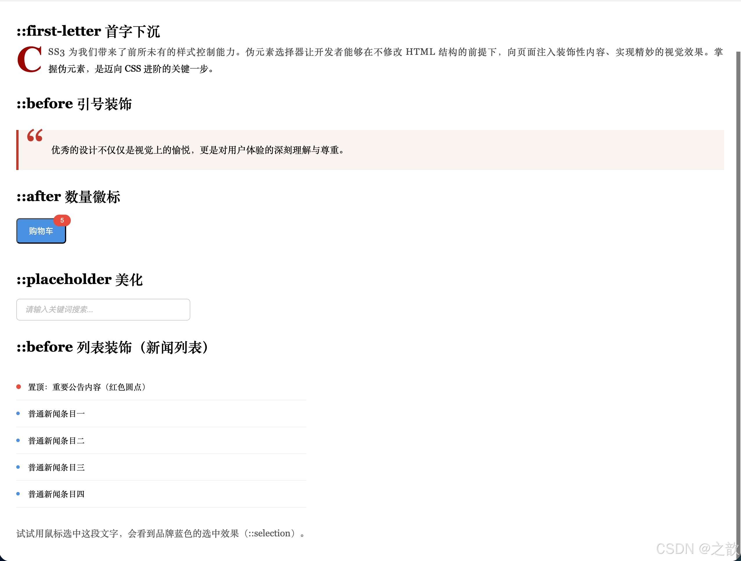
选择器优先级
优先级(Specificity) 是浏览器计算 CSS 冲突时采用的算法,数值越高越优先。可以理解为一个四位数字
(行内, ID, 类/伪类/属性, 标签/伪元素)。
优先级层级(从高到低)
| 选择器 | 权重值 |
|---|---|
!important |
最高,无限提升 |
行内 style="" |
1-0-0-0 |
#id |
0-1-0-0 |
.class, :hover, [attr] |
0-0-1-0 |
div, ::before |
0-0-0-1 |
* |
0-0-0-0 |
| 继承 | 无权重(最低) |
权重计算示例
css
/* 权重:0-0-1-1(类 + 标签) */
div.active { color: red; }

/* 权重:0-1-0-0(ID) */
#box { color: blue; }
/* 结果:#box 权重更高,颜色为蓝色 */

/* 权重:0-0-2-1(两个类 + 一个标签) */
.nav .item.active { color: green; }
完整示例(权重可视化):
html
<!DOCTYPE html>
<html lang="zh-CN">
<head>
  <meta charset="UTF-8">
  <title>选择器权重演示</title>
  <style>
    /* 权重 0-0-0-1 */
    p { color: gray; }

    /* 权重 0-0-1-0:类选择器,覆盖上面的 */
    .text { color: blue; }

    /* 权重 0-1-0-0:ID,覆盖上面 */
    #special { color: red; }

    /* 行内 style 覆盖一切(除 !important) */

    /* !important 最终获胜 */
    .override { color: green !important; }

    /* 组合权重:0-0-1-1 */
    .card p { font-size: 15px; line-height: 1.7; }

    /* 组合权重:0-1-1-0,比上面高 */
    #main .card p { font-size: 16px; color: #333; }
  </style>
</head>
<body>
  <p>gray(标签权重 0-0-0-1)</p>
  <p class="text">blue(类权重 0-0-1-0)</p>
  <p id="special">red(ID权重 0-1-0-0)</p>
  <p id="special" style="color:purple;">purple(行内式覆盖 ID)</p>
  <p class="text override">green(!important 最终获胜)</p>

  <div id="main">
    <div class="card">
      <p>组合选择器权重演示(0-1-1-0 vs 0-0-1-1)</p>
    </div>
  </div>
</body>
</html>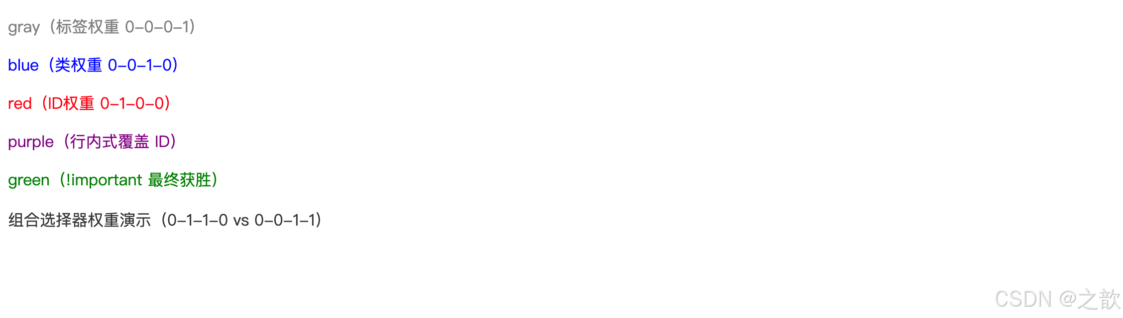
权重总结口诀:
!important> 行内 > ID > 类 = 伪类 = 属性 > 标签 = 伪元素 > 通配符 > 继承
市面上关于权重的最佳实践:
- 尽量不用
!important,它会破坏样式的可维护性 - 避免过高权重的 ID 选择器,推荐全用类选择器(BEM 方法论)
- 项目初期用
* { box-sizing: border-box; }统一盒模型,避免后期冲突
CSS3 新增盒子相关样式
display 扩展
CSS3 之后,display 属性的可选值大幅扩展,使得任何元素可以切换到任意显示模式。
| 值 | 说明 |
|---|---|
block |
块级元素,独占一行,可设宽高 |
inline |
内联元素,不独占行,宽高由内容决定 |
inline-block |
行内块,不独占行,但可以设宽高 |
none |
隐藏元素(不占据空间) |
flex |
弹性布局容器(CSS3新增) |
grid |
网格布局容器(CSS3新增) |
list-item |
表现为列表项(带圆点) |
table |
表现为表格 |
contents |
元素本身不渲染,只显示子元素 |
完整示例:
html
<!DOCTYPE html>
<html lang="zh-CN">
<head>
  <meta charset="UTF-8">
  <title>display 扩展演示</title>
  <style>
    /* 让 <p> 表现为列表项(有圆点) */
    .list-item-style {
      display: list-item;
      list-style: disc inside;
      padding: 6px 0;
      color: #333;
    }

    /* inline-block:做横排导航 */
    .nav-item {
      display: inline-block;
      padding: 8px 20px;
      background: #4a90e2;
      color: #fff;
      border-radius: 4px;
      text-decoration: none;
      font-size: 14px;
      margin-right: 6px;
    }
    .nav-item:hover { background: #357abd; }
  </style>
</head>
<body>
  <h3>display: list-item(让 p 变成列表项)</h3>
  <p class="list-item-style">前端技术栈</p>
  <p class="list-item-style">后端技术栈</p>
  <p class="list-item-style">移动端开发</p>

  <h3 style="margin-top:20px;">display: inline-block(横排按钮组)</h3>
  <a href="#" class="nav-item">首页</a>
  <a href="#" class="nav-item">产品</a>
  <a href="#" class="nav-item">案例</a>
</body>
</html>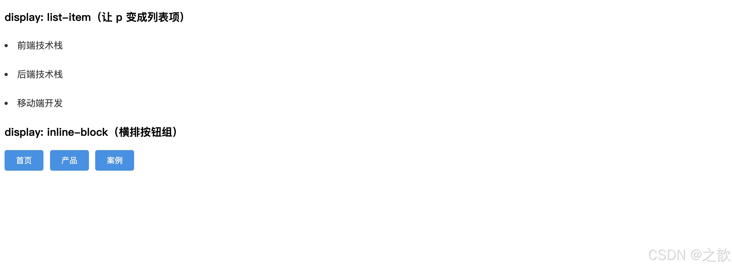
box-sizing
box-sizing:控制width和height所描述的是哪一层的尺寸。
名词解释
标准盒模型(content-box) :
width/height只包含内容区域。元素的实际渲染宽度 =width + padding-left + padding-right + border-left + border-right。
怪异盒模型(border-box) :width/height 包含内容 + padding + border。元素的实际渲染宽度即等于设置的 width。
border-box(怪异)
width = 内容 + padding + border
实际渲染宽 = width(不变)
content-box(标准)
width = 内容宽
实际渲染宽 = width + padding*2 + border*2
完整示例(课堂案例 02 扩展):
html
<!DOCTYPE html>
<html lang="zh-CN">
<head>
  <meta charset="UTF-8">
  <title>box-sizing 对比演示</title>
  <style>
    body { padding: 30px; font-family: sans-serif; background: #f0f0f0; }

    .box {
      display: inline-block;
      width: 300px;
      height: 140px;
      padding: 20px;
      border: 4px solid #900;
      background: #fff;
      vertical-align: top;
      margin-right: 30px;
      font-size: 14px;
      line-height: 1.6;
    }

    .content-box {
      box-sizing: content-box;
      /* 实际渲染宽 = 300 + 20*2 + 4*2 = 348px */
    }

    .border-box {
      box-sizing: border-box;
      /* 实际渲染宽 = 300px(固定不变)*/
    }

    /* 现代 CSS 重置:全局使用 border-box */
    /* * { box-sizing: border-box; } */

    .label {
      display: inline-block;
      margin-top: 8px;
      padding: 3px 10px;
      border-radius: 12px;
      font-size: 12px;
      color: #fff;
      background: #e74c3c;
    }
  </style>
</head>
<body>
  <div class="box content-box">
    <span class="label">content-box(默认)</span>
    <p>width:300px, padding:20px, border:4px</p>
    <p>实际渲染宽 = <strong>348px</strong></p>
    <p>⚠️ 宽度会「膨胀」</p>
  </div>

  <div class="box border-box">
    <span class="label" style="background:#27ae60">border-box(推荐)</span>
    <p>width:300px, padding:20px, border:4px</p>
    <p>实际渲染宽 = <strong>300px</strong></p>
    <p>✅ 宽度「稳定」,布局更可控</p>
  </div>
</body>
</html>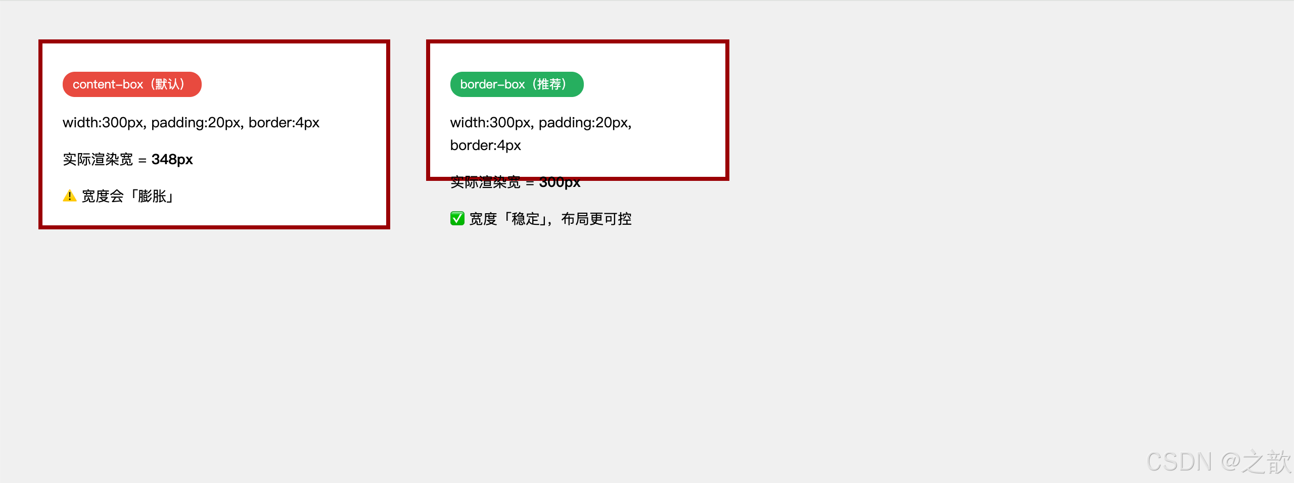
知识点总结:
- 现代项目几乎都在 CSS 重置中加入
* { box-sizing: border-box; },这是 Bootstrap、Tailwind CSS 等框架的默认做法。border-box在响应式布局中极为重要:设置width: 50%时,加上 padding 后不会超出父容器宽度。- IE 的"怪异模式(Quirks Mode)"默认就是
border-box,这也是border-box有时被称为"怪异盒模型"的历史原因。
市面上的使用场景:
- Bootstrap 4/5 :全局
box-sizing: border-box - Tailwind CSS :
box-border工具类默认启用 - 表单布局 :
input[type="text"] { box-sizing: border-box; width: 100%; }使输入框宽度完全响应父容器 - 所有现代 CSS 框架 :默认使用
border-box作为全局盒模型 - 响应式网格系统 :百分比宽度 + padding/border 时必用
border-box
box-sizing 响应式布局实战
应用1:完美响应式表单
html
<!DOCTYPE html>
<html lang="zh-CN">
<head>
  <meta charset="UTF-8">
  <title>响应式表单 - box-sizing 应用</title>
  <style>
    * {
      box-sizing: border-box;
      margin: 0;
      padding: 0;
    }

    body {
      padding: 40px 20px;
      font-family: sans-serif;
      background: linear-gradient(135deg, #667eea 0%, #764ba2 100%);
      min-height: 100vh;
    }

    .form-container {
      max-width: 500px;
      margin: 0 auto;
      background: #fff;
      padding: 40px;
      border-radius: 12px;
      box-shadow: 0 20px 60px rgba(0,0,0,.3);
    }

    h2 {
      margin-bottom: 30px;
      color: #333;
      text-align: center;
    }

    .form-group {
      margin-bottom: 20px;
    }

    label {
      display: block;
      margin-bottom: 6px;
      color: #555;
      font-size: 14px;
      font-weight: 500;
    }

    /* 关键:box-sizing: border-box 让 width: 100% 真正有效 */
    input[type="text"],
    input[type="email"],
    input[type="password"],
    textarea {
      width: 100%; /* 配合 border-box,宽度固定为100% */
      padding: 12px 16px; /* padding 不会撑破容器 */
      border: 2px solid #e0e0e0;
      border-radius: 6px;
      font-size: 14px;
      transition: border-color .2s;
      outline: none;
    }

    input:focus,
    textarea:focus {
      border-color: #667eea;
    }

    textarea {
      resize: vertical;
      min-height: 100px;
      font-family: inherit;
    }

    .form-row {
      display: grid;
      grid-template-columns: 1fr 1fr;
      gap: 16px;
    }

    /* 如果用 content-box(默认),这里会溢出 */
    .form-row input {
      width: 100%; /* border-box 确保精确占 50% */
    }

    .checkbox-group {
      display: flex;
      align-items: center;
      margin-bottom: 20px;
    }

    .checkbox-group input {
      width: auto;
      margin-right: 8px;
    }

    .checkbox-group label {
      margin-bottom: 0;
      font-weight: normal;
    }

    .btn-submit {
      width: 100%;
      padding: 14px;
      background: #667eea;
      color: #fff;
      border: none;
      border-radius: 6px;
      font-size: 16px;
      font-weight: 600;
      cursor: pointer;
      transition: background .2s;
    }

    .btn-submit:hover {
      background: #5568d3;
    }

    /* 响应式:移动端单列 */
    @media (max-width: 600px) {
      .form-container {
        padding: 30px 20px;
      }

      .form-row {
        grid-template-columns: 1fr;
      }
    }
  </style>
</head>
<body>
  <div class="form-container">
    <h2>用户注册</h2>
    <form>
      <div class="form-row">
        <div class="form-group">
          <label>姓</label>
          <input type="text" placeholder="张" required>
        </div>
        <div class="form-group">
          <label>名</label>
          <input type="text" placeholder="三" required>
        </div>
      </div>

      <div class="form-group">
        <label>邮箱地址</label>
        <input type="email" placeholder="example@email.com" required>
      </div>

      <div class="form-group">
        <label>密码</label>
        <input type="password" placeholder="至少8位字符" required>
      </div>

      <div class="form-group">
        <label>自我介绍</label>
        <textarea placeholder="简单介绍一下自己..."></textarea>
      </div>

      <div class="checkbox-group">
        <input type="checkbox" id="terms" required>
        <label for="terms">我已阅读并同意服务条款</label>
      </div>

      <button type="submit" class="btn-submit">立即注册</button>
    </form>
  </div>
</body>
</html>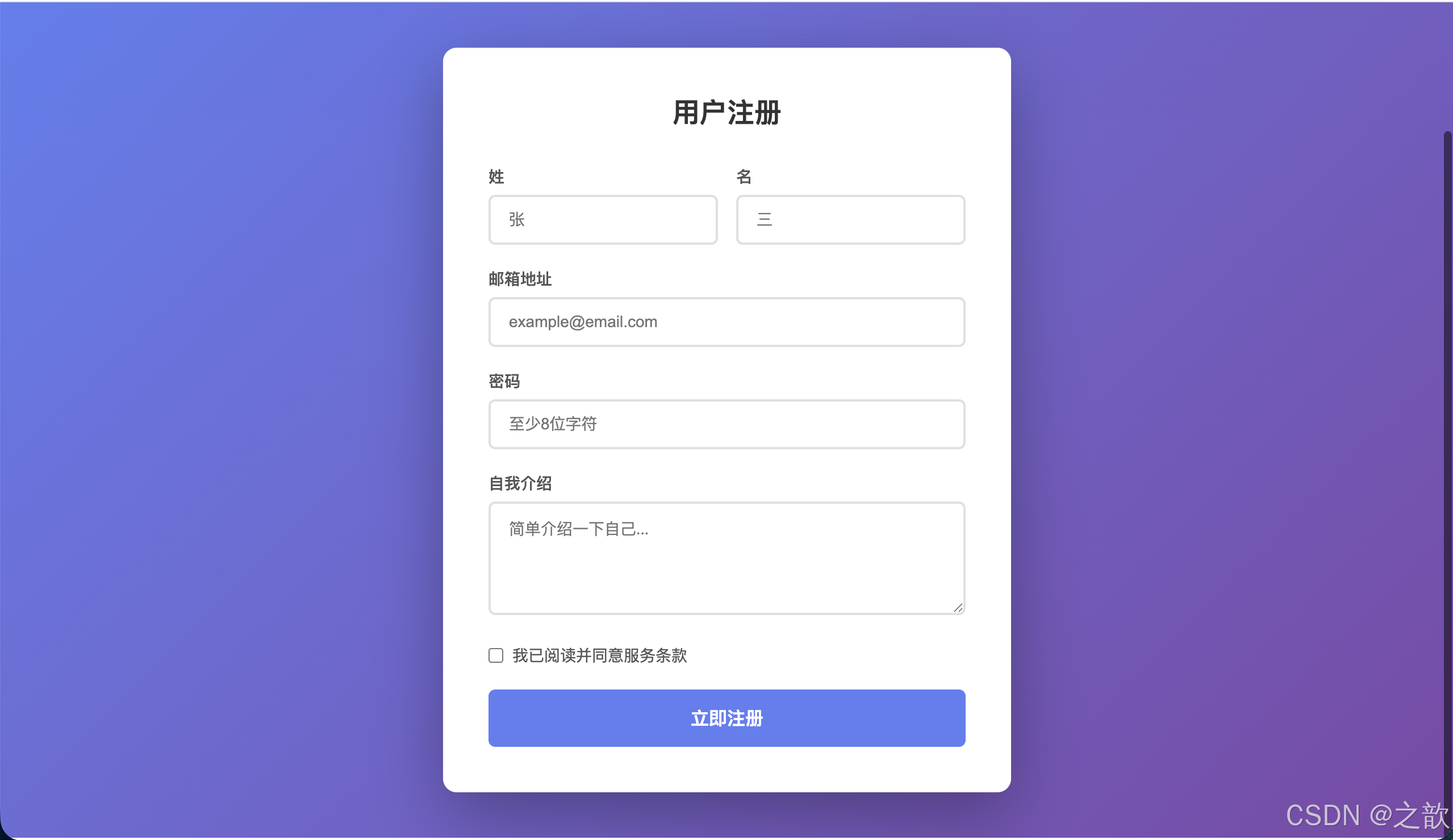
应用2:响应式卡片网格(百分比宽度 + padding)
html
<!DOCTYPE html>
<html lang="zh-CN">
<head>
  <meta charset="UTF-8">
  <title>响应式卡片网格</title>
  <style>
    * { box-sizing: border-box; }
    body {
      margin: 0;
      padding: 40px 20px;
      font-family: sans-serif;
      background: #f0f2f5;
    }

    .grid-container {
      max-width: 1200px;
      margin: 0 auto;
    }

    h1 {
      text-align: center;
      color: #333;
      margin-bottom: 40px;
    }

    .card-grid {
      display: flex;
      flex-wrap: wrap;
      margin: 0 -10px; /* 负边距技巧 */
    }

    .card {
      /*
        关键:border-box 让百分比宽度与 padding/border 共存
        4列网格:每个 25% - 如果是 content-box 会溢出
      */
      width: 25%;
      padding: 10px; /* 内边距不会影响 25% 的宽度 */
    }

    .card-inner {
      background: #fff;
      border-radius: 8px;
      overflow: hidden;
      box-shadow: 0 2px 8px rgba(0,0,0,.08);
      transition: transform .2s, box-shadow .2s;
    }

    .card-inner:hover {
      transform: translateY(-4px);
      box-shadow: 0 8px 24px rgba(0,0,0,.15);
    }

    .card-image {
      width: 100%;
      height: 180px;
      object-fit: cover;
      display: block;
    }

    .card-body {
      padding: 16px; /* padding 也不影响整体宽度 */
    }

    .card-title {
      font-size: 16px;
      font-weight: 600;
      color: #333;
      margin-bottom: 8px;
    }

    .card-desc {
      font-size: 13px;
      color: #666;
      line-height: 1.5;
    }

    /* 平板:3列 */
    @media (max-width: 992px) {
      .card {
        width: 33.333%;
      }
    }

    /* 移动端:2列 */
    @media (max-width: 768px) {
      .card {
        width: 50%;
      }
    }

    /* 小屏手机:1列 */
    @media (max-width: 480px) {
      .card {
        width: 100%;
      }
    }
  </style>
</head>
<body>
  <div class="grid-container">
    <h1>产品展示</h1>

    <div class="card-grid">
      <div class="card">
        <div class="card-inner">
          <img src="images/jd001.jpg" alt="产品1" class="card-image">
          <div class="card-body">
            <div class="card-title">智能手表 Pro</div>
            <div class="card-desc">全天候健康监测,续航持久</div>
          </div>
        </div>
      </div>

      <div class="card">
        <div class="card-inner">
          <img src="images/jd002.jpg" alt="产品2" class="card-image">
          <div class="card-body">
            <div class="card-title">无线耳机 Max</div>
            <div class="card-desc">主动降噪,沉浸音质体验</div>
          </div>
        </div>
      </div>

      <div class="card">
        <div class="card-inner">
          <img src="images/jd003.jpg" alt="产品3" class="card-image">
          <div class="card-body">
            <div class="card-title">平板电脑 Air</div>
            <div class="card-desc">轻薄便携,高性能处理器</div>
          </div>
        </div>
      </div>

      <div class="card">
        <div class="card-inner">
          <img src="images/jd004.jpg" alt="产品4" class="card-image">
          <div class="card-body">
            <div class="card-title">智能音箱 Mini</div>
            <div class="card-desc">语音助手,智能家居中枢</div>
          </div>
        </div>
      </div>

      <div class="card">
        <div class="card-inner">
          <img src="images/jd005.jpg" alt="产品5" class="card-image">
          <div class="card-body">
            <div class="card-title">充电宝 Ultra</div>
            <div class="card-desc">大容量,快充技术</div>
          </div>
        </div>
      </div>

      <div class="card">
        <div class="card-inner">
          <img src="images/jd006.jpg" alt="产品6" class="card-image">
          <div class="card-body">
            <div class="card-title">键盘鼠标套装</div>
            <div class="card-desc">人体工学设计,办公利器</div>
          </div>
        </div>
      </div>

      <div class="card">
        <div class="card-inner">
          <img src="images/jd001.jpg" alt="产品7" class="card-image">
          <div class="card-body">
            <div class="card-title">摄像头 4K</div>
            <div class="card-desc">超清画质,智能追踪</div>
          </div>
        </div>
      </div>

      <div class="card">
        <div class="card-inner">
          <img src="images/jd002.jpg" alt="产品8" class="card-image">
          <div class="card-body">
            <div class="card-title">路由器 WiFi6</div>
            <div class="card-desc">千兆网速,全屋覆盖</div>
          </div>
        </div>
      </div>
    </div>
  </div>
</body>
</html>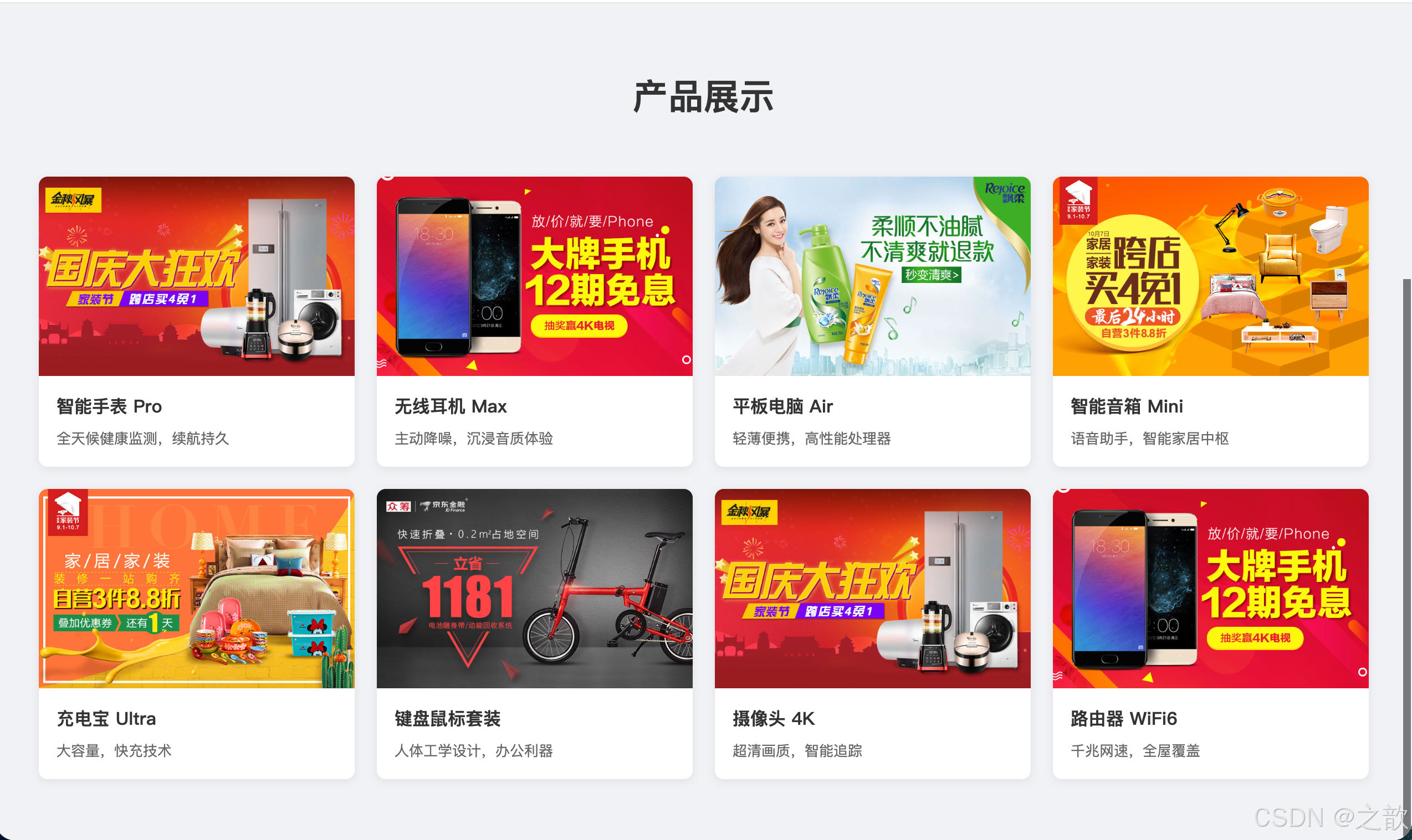
box-sizing 核心要点总结:
为什么需要 border-box?
百分比宽度 + padding/border
content-box: width 不包含 padding/border
总宽度超出父容器
布局错乱、换行
border-box: width 包含 padding/border
总宽度精确等于设定值
布局稳定、可预测
适用场景
表单 width:100%
网格布局百分比
卡片 padding 设计
响应式组件
box-shadow
box-shadow:为元素添加一个或多个阴影效果,阴影绘制在元素的背景之外,不影响布局。
语法
css
box-shadow: offset-x offset-y blur-radius spread-radius color inset;| 参数 | 说明 | 备注 |
|---|---|---|
offset-x |
水平偏移(正值向右,负值向左) | 必填 |
offset-y |
垂直偏移(正值向下,负值向上) | 必填 |
blur-radius |
模糊半径,0 为硬边阴影 | 可选,默认 0 |
spread-radius |
扩展半径,正值扩大阴影,负值收缩 | 可选,默认 0 |
color |
阴影颜色,建议用 rgba() |
可选 |
inset |
内阴影关键字 | 可选 |
css
/* 可以逗号分隔设置多个阴影,先写的在上层 */
box-shadow: 阴影1, 阴影2, 阴影3;
完整示例(课堂案例 03 扩展版 + 作业第四题风格):
html
<!DOCTYPE html>
<html lang="zh-CN">
<head>
  <meta charset="UTF-8">
  <title>box-shadow 全演示</title>
  <style>
    * { box-sizing: border-box; margin: 0; padding: 0; }
    body { padding: 40px; background: #f0f2f5; font-family: sans-serif; }

    h3 { margin: 30px 0 16px; font-size: 15px; color: #666; }

    .row { display: flex; flex-wrap: wrap; gap: 24px; margin-bottom: 24px; }
    .box {
      width: 180px;
      height: 100px;
      background: #fff;
      display: flex;
      align-items: center;
      justify-content: center;
      font-size: 12px;
      color: #666;
      border-radius: 8px;
    }

    /* 1. 基础偏移阴影 */
    .s1 { box-shadow: 6px 6px 0 #bbb; }
    /* 2. 模糊阴影 */
    .s2 { box-shadow: 0 4px 16px rgba(0,0,0,.15); }
    /* 3. 四向扩散 */
    .s3 { box-shadow: 0 0 20px rgba(0,0,0,.2); }
    /* 4. 外延值 */
    .s4 { box-shadow: 0 0 0 6px #4a90e2; }
    /* 5. 内阴影(输入框风格) */
    .s5 { box-shadow: inset 0 2px 6px rgba(0,0,0,.2); }
    /* 6. 彩色多重阴影 */
    .s6 {
      box-shadow: 6px 0 10px #e74c3c,
                  0 6px 10px #27ae60,
                  -6px 0 10px #4a90e2,
                  0 -6px 10px #f39c12;
    }
    /* 7. 卡片悬停浮起效果(作业第四题风格)*/
    .card-grid { display: flex; gap: 20px; flex-wrap: wrap; }
    .card {
      width: 220px;
      height: 160px;
      background: #fff;
      border-radius: 10px;
      overflow: hidden;
      transition: box-shadow .25s, transform .25s;
      box-shadow: 0 2px 8px rgba(0,0,0,.08);
    }
    .card:hover {
      transform: translateY(-6px);
      box-shadow: 0 12px 32px rgba(0,0,0,.18),
                  0 4px 12px rgba(0,0,0,.1);
    }
    .card img { width: 100%; height: 100%; object-fit: cover; }

    /* 8. 立体按钮 */
    .btn-3d {
      display: inline-block;
      padding: 12px 32px;
      background: #4a90e2;
      color: #fff;
      border: none;
      border-radius: 6px;
      font-size: 14px;
      cursor: pointer;
      box-shadow: 0 6px 0 #2868a3;
      transition: box-shadow .1s, transform .1s;
    }
    .btn-3d:active {
      box-shadow: 0 2px 0 #2868a3;
      transform: translateY(4px);
    }

    /* 9. 球体(内阴影模拟光影) */
    .ball {
      width: 120px;
      height: 120px;
      border-radius: 50%;
      background: radial-gradient(circle at 35% 35%, #fff 0%, #aaa 60%, #555 100%);
      box-shadow: inset -15px -15px 40px rgba(0,0,0,.5),
                  6px 10px 20px rgba(0,0,0,.4);
    }
  </style>
</head>
<body>
  <h3>1. 偏移 / 2. 模糊 / 3. 四向扩散 / 4. 外延值 / 5. 内阴影 / 6. 彩色多重阴影</h3>
  <div class="row">
    <div class="box s1">偏移阴影</div>
    <div class="box s2">模糊卡片阴影</div>
    <div class="box s3">四向扩散</div>
    <div class="box s4">外延值(描边)</div>
    <div class="box s5">内阴影</div>
    <div class="box s6">彩色多重阴影</div>
  </div>

  <h3>7. 卡片悬停浮起(hover 效果)</h3>
  <div class="card-grid">
    <div class="card"><img src="images/jd001.jpg" alt="商品1"></div>
    <div class="card"><img src="images/jd002.jpg" alt="商品2"></div>
    <div class="card"><img src="images/jd003.jpg" alt="商品3"></div>
    <div class="card"><img src="images/jd004.jpg" alt="商品4"></div>
  </div>

  <h3>8. 立体按钮</h3>
  <button class="btn-3d">点击按下</button>

  <h3>9. 球体(内阴影模拟光影)</h3>
  <div class="ball"></div>
</body>
</html>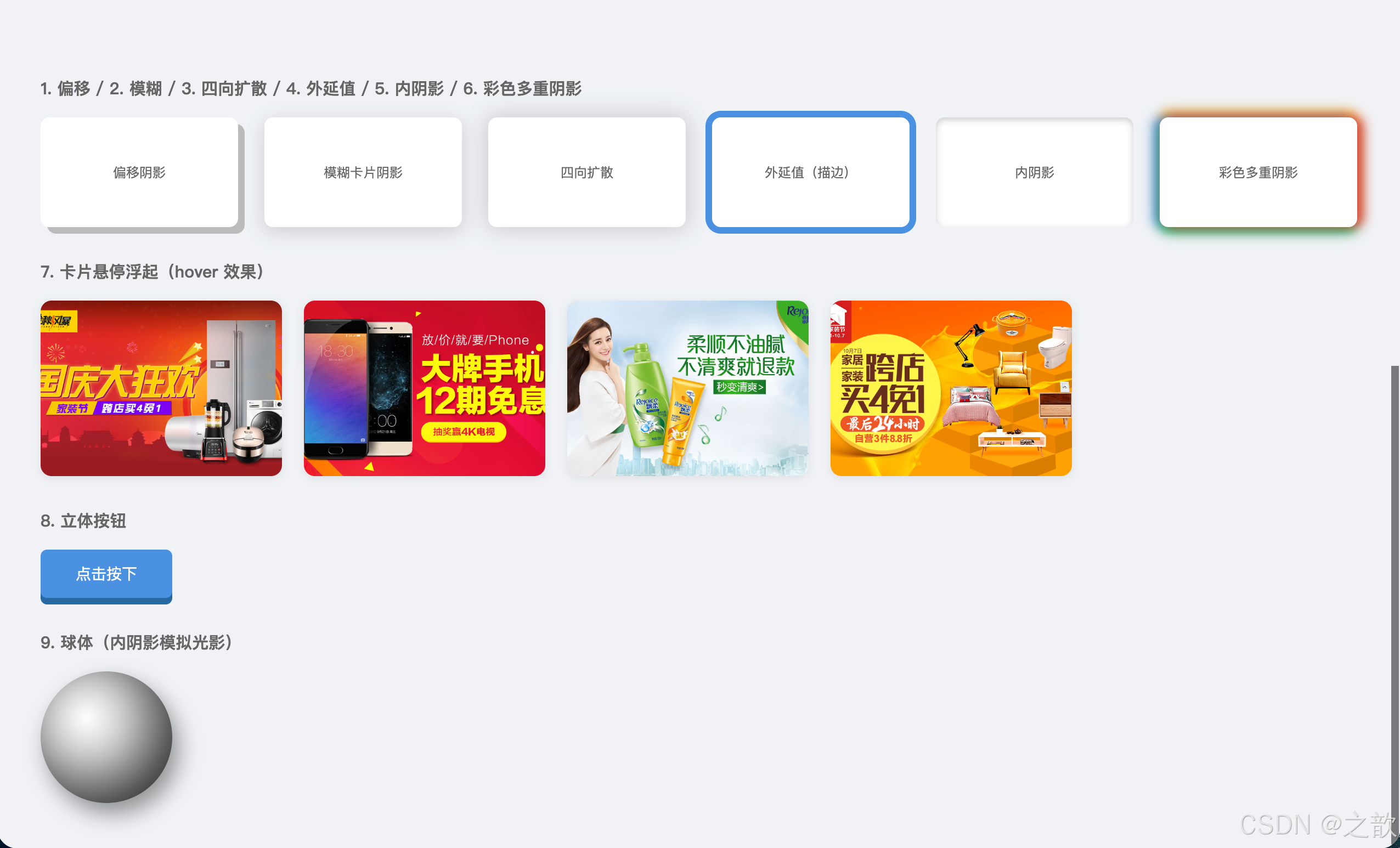
box-shadow 知识点总结:
box-shadow
外阴影 默认
内阴影 inset
偏移: 6px 6px
模糊: 0 4px 16px rgba(.15)
外延: 0 0 0 4px #color (描边效果)
多阴影: ,分隔
输入框凹陷感
球体光影
box-shadow不影响布局,不占用空间,是"廉价"的视觉增强工具。spread-radius为正值时可以用box-shadow: 0 0 0 4px #color代替outline做焦点环 ,并且形状跟随border-radius。- 多个阴影叠加时,先写的在上层,可以创造多层光晕效果。
- 性能提示:
box-shadow会触发重绘(repaint),动画时建议配合will-change: box-shadow或改用filter: drop-shadow()。
市面上的使用场景:
- Google Material Design :所有卡片使用多层
box-shadow模拟纸张立体感 - Apple.com :产品图片卡片悬停
box-shadow浮起效果 - Stripe.com :表单输入框
box-shadow替代outline做焦点环(支持圆角) - 京东、淘宝 :商品卡片
:hover时添加box-shadow+transform: translateY(-4px) - Notion :页面卡片使用细微
box-shadow创造分层感 - Dribbble:作品缩略图 hover 时多层阴影叠加效果
box-shadow 创意应用集
应用1:Material Design 高程系统(Elevation)
Material Design 使用不同强度的阴影表达 UI 元素的"高度":
html
<!DOCTYPE html>
<html lang="zh-CN">
<head>
  <meta charset="UTF-8">
  <title>Material Design 高程系统</title>
  <style>
    * { box-sizing: border-box; }
    body {
      padding: 40px;
      font-family: "Roboto", sans-serif;
      background: #fafafa;
    }

    .elevation-grid {
      display: grid;
      grid-template-columns: repeat(auto-fit, minmax(180px, 1fr));
      gap: 30px;
      max-width: 1200px;
      margin: 0 auto;
    }

    .elevation-card {
      padding: 24px;
      background: #fff;
      border-radius: 4px;
      text-align: center;
      transition: box-shadow .3s;
    }

    .elevation-title {
      font-size: 13px;
      color: #999;
      margin-bottom: 8px;
      text-transform: uppercase;
      letter-spacing: .5px;
    }

    .elevation-value {
      font-size: 24px;
      font-weight: 500;
      color: #333;
    }

    /* Material Design 高程级别 0-24 */
    .elevation-0 {
      box-shadow: none;
    }

    .elevation-1 {
      box-shadow: 0 1px 3px rgba(0,0,0,0.12),
                  0 1px 2px rgba(0,0,0,0.24);
    }

    .elevation-2 {
      box-shadow: 0 3px 6px rgba(0,0,0,0.15),
                  0 2px 4px rgba(0,0,0,0.12);
    }

    .elevation-3 {
      box-shadow: 0 10px 20px rgba(0,0,0,0.15),
                  0 3px 6px rgba(0,0,0,0.10);
    }

    .elevation-4 {
      box-shadow: 0 15px 25px rgba(0,0,0,0.15),
                  0 5px 10px rgba(0,0,0,0.05);
    }

    .elevation-6 {
      box-shadow: 0 20px 40px rgba(0,0,0,0.15);
    }

    .elevation-8 {
      box-shadow: 0 25px 50px rgba(0,0,0,0.15);
    }

    /* hover 提升高程 */
    .elevation-card:hover {
      box-shadow: 0 20px 40px rgba(0,0,0,0.20);
      transform: translateY(-2px);
    }
  </style>
</head>
<body>
  <h2 style="text-align:center;color:#333;margin-bottom:40px;">Material Design 高程系统</h2>

  <div class="elevation-grid">
    <div class="elevation-card elevation-0">
      <div class="elevation-title">Elevation</div>
      <div class="elevation-value">0dp</div>
    </div>
    <div class="elevation-card elevation-1">
      <div class="elevation-title">Elevation</div>
      <div class="elevation-value">1dp</div>
    </div>
    <div class="elevation-card elevation-2">
      <div class="elevation-title">Elevation</div>
      <div class="elevation-value">2dp</div>
    </div>
    <div class="elevation-card elevation-3">
      <div class="elevation-title">Elevation</div>
      <div class="elevation-value">3dp</div>
    </div>
    <div class="elevation-card elevation-4">
      <div class="elevation-title">Elevation</div>
      <div class="elevation-value">4dp</div>
    </div>
    <div class="elevation-card elevation-6">
      <div class="elevation-title">Elevation</div>
      <div class="elevation-value">6dp</div>
    </div>
    <div class="elevation-card elevation-8">
      <div class="elevation-title">Elevation</div>
      <div class="elevation-value">8dp</div>
    </div>
  </div>

  <p style="text-align:center;margin-top:30px;color:#666;font-size:14px;">
    鼠标悬停可以看到高程提升效果
  </p>
</body>
</html>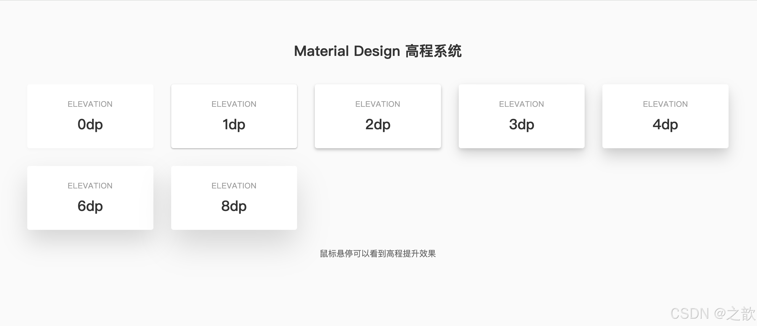
应用2:Neumorphism(新拟态)设计
Neumorphism 是 2019-2020 流行的设计趋势,通过双向阴影创造"凸起"或"凹陷"效果:
html
<!DOCTYPE html>
<html lang="zh-CN">
<head>
  <meta charset="UTF-8">
  <title>Neumorphism 新拟态设计</title>
  <style>
    * { box-sizing: border-box; }
    body {
      min-height: 100vh;
      display: flex;
      align-items: center;
      justify-content: center;
      padding: 40px;
      font-family: sans-serif;
      background: #e0e5ec;
    }

    .neu-container {
      display: grid;
      grid-template-columns: repeat(auto-fit, minmax(160px, 1fr));
      gap: 40px;
      max-width: 800px;
    }

    .neu-card {
      width: 160px;
      height: 160px;
      display: flex;
      flex-direction: column;
      align-items: center;
      justify-content: center;
      border-radius: 20px;
      background: #e0e5ec;
      transition: all .3s;
    }

    /* 凸起效果(双向阴影) */
    .neu-raised {
      box-shadow: 9px 9px 16px rgba(163,177,198,0.6),
                 -9px -9px 16px rgba(255,255,255,0.5);
    }

    .neu-raised:hover {
      box-shadow: 6px 6px 12px rgba(163,177,198,0.6),
                 -6px -6px 12px rgba(255,255,255,0.5);
    }

    .neu-raised:active {
      box-shadow: inset 4px 4px 8px rgba(163,177,198,0.6),
                 inset -4px -4px 8px rgba(255,255,255,0.5);
    }

    /* 凹陷效果(内阴影) */
    .neu-pressed {
      box-shadow: inset 6px 6px 12px rgba(163,177,198,0.6),
                 inset -6px -6px 12px rgba(255,255,255,0.5);
    }

    /* 扁平效果 */
    .neu-flat {
      box-shadow: 5px 5px 10px rgba(163,177,198,0.4),
                 -5px -5px 10px rgba(255,255,255,0.4);
    }

    .neu-icon {
      font-size: 36px;
      margin-bottom: 12px;
    }

    .neu-label {
      font-size: 12px;
      color: #7a8b9e;
      font-weight: 500;
      text-transform: uppercase;
      letter-spacing: .5px;
    }

    /* 按钮样式 */
    .neu-button {
      padding: 16px 32px;
      border: none;
      border-radius: 12px;
      background: #e0e5ec;
      color: #333;
      font-size: 14px;
      font-weight: 600;
      cursor: pointer;
      box-shadow: 6px 6px 12px rgba(163,177,198,0.6),
                 -6px -6px 12px rgba(255,255,255,0.5);
      transition: all .2s;
    }

    .neu-button:hover {
      box-shadow: 8px 8px 16px rgba(163,177,198,0.6),
                 -8px -8px 16px rgba(255,255,255,0.5);
    }

    .neu-button:active {
      box-shadow: inset 3px 3px 6px rgba(163,177,198,0.6),
                 inset -3px -3px 6px rgba(255,255,255,0.5);
    }
  </style>
</head>
<body>
  <div style="text-align:center;">
    <h2 style="color:#333;margin-bottom:10px;">Neumorphism 新拟态设计</h2>
    <p style="color:#7a8b9e;margin-bottom:40px;font-size:14px;">双向阴影创造的立体效果</p>

    <div class="neu-container">
      <div class="neu-card neu-raised">
        <div class="neu-icon">📊</div>
        <div class="neu-label">Raised</div>
      </div>

      <div class="neu-card neu-pressed">
        <div class="neu-icon">🎵</div>
        <div class="neu-label">Pressed</div>
      </div>

      <div class="neu-card neu-flat">
        <div class="neu-icon">⚙️</div>
        <div class="neu-label">Flat</div>
      </div>
    </div>

    <div style="margin-top:50px;">
      <button class="neu-button">点击按钮</button>
    </div>
  </div>
</body>
</html>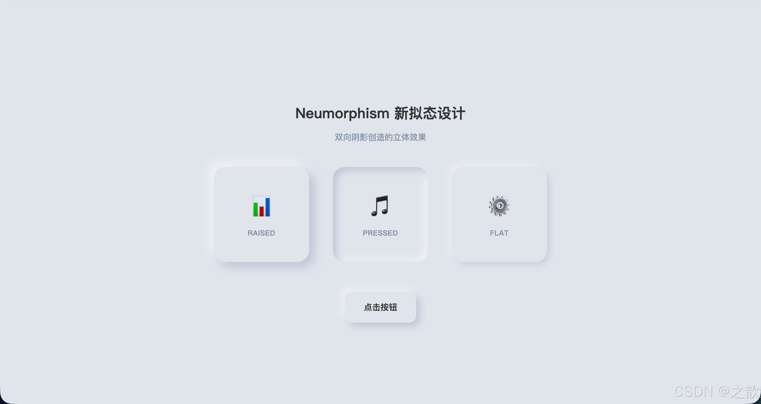
应用3:彩色光晕效果(Glow Effects)
html
<!DOCTYPE html>
<html lang="zh-CN">
<head>
  <meta charset="UTF-8">
  <title>彩色光晕效果</title>
  <style>
    * { box-sizing: border-box; }
    body {
      min-height: 100vh;
      display: flex;
      align-items: center;
      justify-content: center;
      padding: 40px;
      font-family: sans-serif;
      background: #0a0a0a;
    }

    .glow-grid {
      display: grid;
      grid-template-columns: repeat(auto-fit, minmax(200px, 1fr));
      gap: 60px;
      max-width: 1000px;
    }

    .glow-card {
      position: relative;
      padding: 30px;
      background: #1a1a1a;
      border-radius: 16px;
      text-align: center;
      transition: all .3s;
    }

    /* 蓝色光晕 */
    .glow-blue {
      box-shadow: 0 0 20px rgba(74, 144, 226, 0.3),
                  0 0 40px rgba(74, 144, 226, 0.2),
                  0 0 60px rgba(74, 144, 226, 0.1);
      border: 1px solid rgba(74, 144, 226, 0.3);
    }

    .glow-blue:hover {
      box-shadow: 0 0 30px rgba(74, 144, 226, 0.5),
                  0 0 60px rgba(74, 144, 226, 0.3),
                  0 0 90px rgba(74, 144, 226, 0.2);
      transform: translateY(-4px);
    }

    /* 紫色光晕 */
    .glow-purple {
      box-shadow: 0 0 20px rgba(155, 89, 182, 0.3),
                  0 0 40px rgba(155, 89, 182, 0.2),
                  0 0 60px rgba(155, 89, 182, 0.1);
      border: 1px solid rgba(155, 89, 182, 0.3);
    }

    .glow-purple:hover {
      box-shadow: 0 0 30px rgba(155, 89, 182, 0.5),
                  0 0 60px rgba(155, 89, 182, 0.3),
                  0 0 90px rgba(155, 89, 182, 0.2);
      transform: translateY(-4px);
    }

    /* 绿色光晕 */
    .glow-green {
      box-shadow: 0 0 20px rgba(39, 174, 96, 0.3),
                  0 0 40px rgba(39, 174, 96, 0.2),
                  0 0 60px rgba(39, 174, 96, 0.1);
      border: 1px solid rgba(39, 174, 96, 0.3);
    }

    .glow-green:hover {
      box-shadow: 0 0 30px rgba(39, 174, 96, 0.5),
                  0 0 60px rgba(39, 174, 96, 0.3),
                  0 0 90px rgba(39, 174, 96, 0.2);
      transform: translateY(-4px);
    }

    /* 彩虹光晕(多色叠加) */
    .glow-rainbow {
      box-shadow: 0 0 20px rgba(231, 76, 60, 0.4),
                  0 0 40px rgba(243, 156, 18, 0.3),
                  0 0 60px rgba(39, 174, 96, 0.2),
                  0 0 80px rgba(52, 152, 219, 0.1);
      border: 1px solid rgba(231, 76, 60, 0.3);
    }

    .glow-rainbow:hover {
      box-shadow: 0 0 30px rgba(231, 76, 60, 0.6),
                  0 0 60px rgba(243, 156, 18, 0.5),
                  0 0 90px rgba(39, 174, 96, 0.4),
                  0 0 120px rgba(52, 152, 219, 0.3);
      transform: translateY(-4px) scale(1.02);
    }

    .glow-icon {
      font-size: 48px;
      margin-bottom: 16px;
    }

    .glow-title {
      font-size: 16px;
      font-weight: 600;
      color: #fff;
      margin-bottom: 8px;
    }

    .glow-desc {
      font-size: 13px;
      color: #999;
      line-height: 1.5;
    }
  </style>
</head>
<body>
  <div class="glow-grid">
    <div class="glow-card glow-blue">
      <div class="glow-icon">💎</div>
      <div class="glow-title">蓝色光晕</div>
      <div class="glow-desc">科技感十足的冷色调</div>
    </div>

    <div class="glow-card glow-purple">
      <div class="glow-icon">🔮</div>
      <div class="glow-title">紫色光晕</div>
      <div class="glow-desc">神秘优雅的视觉效果</div>
    </div>

    <div class="glow-card glow-green">
      <div class="glow-icon">🌿</div>
      <div class="glow-title">绿色光晕</div>
      <div class="glow-desc">自然清新的设计风格</div>
    </div>

    <div class="glow-card glow-rainbow">
      <div class="glow-icon">🌈</div>
      <div class="glow-title">彩虹光晕</div>
      <div class="glow-desc">多色叠加的绚丽效果</div>
    </div>
  </div>
</body>
</html>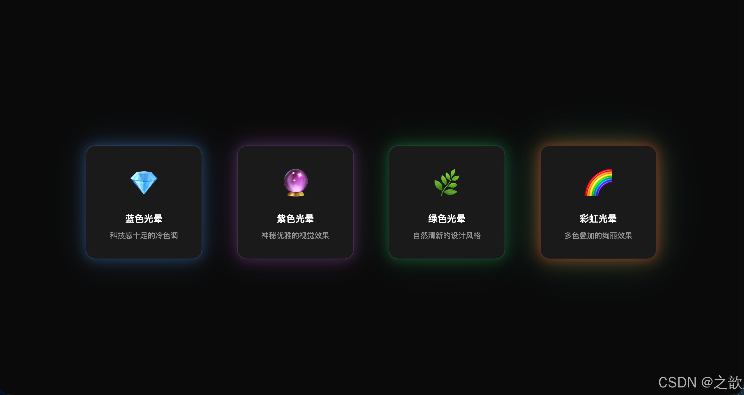
应用4:纸张堆叠效果(Stacked Papers)
html
<!DOCTYPE html>
<html lang="zh-CN">
<head>
  <meta charset="UTF-8">
  <title>纸张堆叠效果</title>
  <style>
    * { box-sizing: border-box; }
    body {
      min-height: 100vh;
      display: flex;
      align-items: center;
      justify-content: center;
      padding: 40px;
      font-family: sans-serif;
      background: linear-gradient(135deg, #667eea 0%, #764ba2 100%);
    }

    .paper-stack {
      position: relative;
      width: 400px;
      padding: 40px;
      background: #fff;
      border-radius: 8px;
      box-shadow: 0 10px 30px rgba(0,0,0,.3);
    }

    /* 使用伪元素创建堆叠的纸张 */
    .paper-stack::before,
    .paper-stack::after {
      content: "";
      position: absolute;
      width: 100%;
      height: 100%;
      background: #fff;
      border-radius: 8px;
      z-index: -1;
    }

    .paper-stack::before {
      top: -8px;
      left: -8px;
      box-shadow: 0 8px 24px rgba(0,0,0,.25);
    }

    .paper-stack::after {
      top: -16px;
      left: -16px;
      box-shadow: 0 6px 18px rgba(0,0,0,.2);
    }

    h2 {
      margin: 0 0 16px 0;
      color: #333;
      font-size: 24px;
    }

    p {
      margin: 0 0 12px 0;
      color: #666;
      line-height: 1.7;
      font-size: 15px;
    }

    .signature {
      margin-top: 30px;
      text-align: right;
      font-style: italic;
      color: #999;
    }
  </style>
</head>
<body>
  <div class="paper-stack">
    <h2>纸张堆叠效果</h2>
    <p>
      使用 box-shadow 配合伪元素 ::before 和 ::after,
      可以创造出纸张堆叠的视觉效果,无需额外的 HTML 元素。
    </p>
    <p>
      这种技术常用于文档、卡片、便签等设计中,
      通过层次感增强信息的视觉重要性。
    </p>
    <p>
      每一层纸张使用不同的偏移量和阴影强度,
      从而营造出逼真的立体堆叠效果。
    </p>
    <div class="signature">--- CSS 魔法师</div>
  </div>
</body>
</html>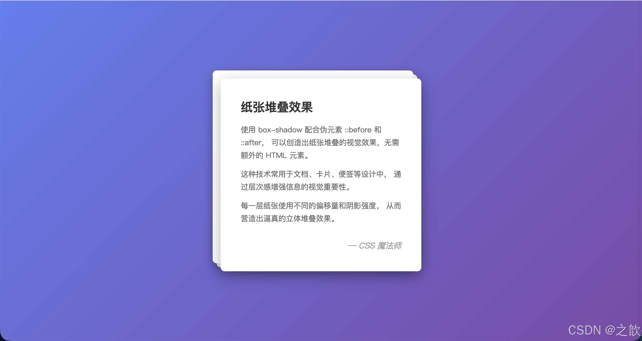
opacity
opacity(不透明度) :设置元素整体的透明度,取值范围0(完全透明)到1(完全不透明)。
opacity vs rgba()
| 特性 | opacity: 0.5 |
background: rgba(0,0,0,.5) |
|---|---|---|
| 影响范围 | 整个元素(包括子元素、文字) | 只影响该属性的颜色值 |
| 子元素透明 | 是,无法单独覆盖 | 否 |
| 用途 | 整体半透明覆盖层、淡入淡出动画 | 半透明背景色(文字保持不透明) |
完整示例(课堂案例 04 扩展):
html
<!DOCTYPE html>
<html lang="zh-CN">
<head>
  <meta charset="UTF-8">
  <title>opacity vs rgba 对比演示</title>
  <style>
    * { box-sizing: border-box; margin: 0; padding: 0; }
    body {
      min-height: 100vh;
      background: url(images/bg06.jpg) center/cover no-repeat;
      display: flex;
      flex-wrap: wrap;
      gap: 20px;
      align-items: flex-start;
      padding: 40px;
      font-family: sans-serif;
    }

    .box {
      width: 260px;
      padding: 24px;
      border-radius: 10px;
      font-size: 14px;
      line-height: 1.7;
    }

    /* rgba 只影响背景色,文字保持不透明 */
    .rgba-box {
      background: rgba(0, 0, 0, 0.55);
      color: #fff;
    }

    /* opacity 影响整体,文字也会半透明 */
    .opacity-box {
      background: #000;
      color: #fff;
      opacity: .55;
    }

    /* 使用 opacity 制作图片遮罩 */
    .img-box {
      position: relative;
      width: 260px;
      height: 180px;
      border-radius: 10px;
      overflow: hidden;
    }
    .img-box img { width: 100%; height: 100%; object-fit: cover; display: block; }
    .img-box .mask {
      position: absolute;
      inset: 0;
      background: rgba(0,0,0,.5);
      display: flex;
      align-items: center;
      justify-content: center;
      color: #fff;
      font-size: 1.2em;
      opacity: 0;
      transition: opacity .3s;
    }
    .img-box:hover .mask { opacity: 1; }
  </style>
</head>
<body>
  <div class="box rgba-box">
    <strong>rgba() 背景色</strong><br>
    背景半透明,文字完全清晰。<br>
    推荐用于:弹窗遮罩层、卡片毛玻璃效果
  </div>

  <div class="box opacity-box">
    <strong>opacity: 0.55</strong><br>
    整体半透明,连文字也透了。<br>
    适用于:淡入淡出动画、灰显禁用效果
  </div>

  <div class="img-box">
    <img src="images/bg04.jpg" alt="hover遮罩">
    <div class="mask">鼠标悬停查看</div>
  </div>
</body>
</html>
知识点总结:
opacity会创建新的层叠上下文 (Stacking Context),这与position: relative+z-index有交互影响,需要注意。- CSS 动画中
opacity: 0 → 1是最高性能的动画属性之一,因为浏览器可以直接合成图层完成,无需重绘。- 禁用按钮的视觉效果通常是
opacity: .4+pointer-events: none,兼顾视觉和交互。
市面上的使用场景:
- 所有弹窗/模态框 :遮罩层用
rgba(0,0,0,.6)而不是opacity,保持内容清晰 - 图片 hover 效果 :
.mask { opacity: 0; } :hover .mask { opacity: 1; transition: .3s; }(淘宝、Pinterest 广泛使用) - 骨架屏加载动画 :
opacity搭配 CSS animation 实现呼吸效果
粘连定位
position: sticky(粘连定位 / 吸顶定位):元素在正常文档流中定位,当页面滚动到元素触碰视口指定边界时,切换为固定定位,"粘"在那个位置,直到其父容器滚出视口。
名词解释
与
position: fixed的区别:
fixed:相对视口定位,完全脱离文档流,一直固定在视口中sticky:相对滚动容器定位,保留在文档流中,只有达到阈值才"粘住",会随父容器滚出而消失
使用条件
1. 元素设置 position: sticky
2. 必须指定 top / bottom / left / right 中的至少一个(通常是 top: 0)
3. 父容器必须有足够的高度(否则没有滚动空间,效果不体现)
4. 父容器不能设置 overflow: hidden 或 overflow: auto(会导致 sticky 失效)
完整示例(课堂案例 05 + 扩展场景):
html
<!DOCTYPE html>
<html lang="zh-CN">
<head>
  <meta charset="UTF-8">
  <title>position:sticky 粘连定位演示</title>
  <style>
    * { box-sizing: border-box; margin: 0; padding: 0; }
    body { font-family: sans-serif; color: #333; }

    /* 全局顶部导航 */
    .global-header {
      height: 60px;
      background: #1a1a2e;
      display: flex;
      align-items: center;
      padding: 0 30px;
      color: #fff;
      font-size: 18px;
      font-weight: bold;
    }

    /* 粘连导航 */
    .sticky-nav {
      position: sticky;
      top: 0;
      z-index: 100;
      background: #16213e;
      display: flex;
      padding: 0 30px;
      box-shadow: 0 2px 8px rgba(0,0,0,.3);
    }
    .sticky-nav a {
      padding: 0 20px;
      line-height: 48px;
      color: #a0b4c8;
      text-decoration: none;
      font-size: 14px;
      transition: color .2s;
    }
    .sticky-nav a:hover { color: #fff; }

    /* 正文内容区 */
    .content-area { padding: 30px; max-width: 900px; margin: 0 auto; }
    .section-block {
      min-height: 400px;
      padding: 30px;
      margin-bottom: 20px;
      border-radius: 10px;
      display: flex;
      align-items: center;
      justify-content: center;
      font-size: 2em;
      color: #fff;
      font-weight: bold;
    }
    #sec1 { background: linear-gradient(135deg, #667eea, #764ba2); }
    #sec2 { background: linear-gradient(135deg, #f093fb, #f5576c); }
    #sec3 { background: linear-gradient(135deg, #4facfe, #00f2fe); }
    #sec4 { background: linear-gradient(135deg, #43e97b, #38f9d7); }

    /* 侧边目录粘连(表格分组标题粘连常见场景) */
    .contact-table { width: 100%; border-collapse: collapse; }
    .contact-table th {
      position: sticky;
      top: 48px; /* 导航栏高度 */
      background: #f0f2f5;
      padding: 10px 20px;
      text-align: left;
      font-size: 13px;
      color: #888;
      border-bottom: 1px solid #ddd;
      z-index: 1;
    }
    .contact-table td {
      padding: 12px 20px;
      border-bottom: 1px solid #f0f0f0;
      font-size: 14px;
    }
  </style>
</head>
<body>
  <div class="global-header">小乐的技术博客</div>

  <!-- 粘连导航:滚动到顶部时吸附 -->
  <nav class="sticky-nav">
    <a href="#sec1">第一章</a>
    <a href="#sec2">第二章</a>
    <a href="#sec3">第三章</a>
    <a href="#sec4">第四章</a>
  </nav>

  <div class="content-area">
    <div class="section-block" id="sec1">第一章:选择器体系</div>
    <div class="section-block" id="sec2">第二章:盒子模型</div>
    <div class="section-block" id="sec3">第三章:布局技术</div>
    <div class="section-block" id="sec4">第四章:动画与过渡</div>

    <!-- 表格分组标题粘连(联系人应用场景) -->
    <h3 style="margin: 30px 0 16px;">表格分组标题粘连(联系人列表)</h3>
    <table class="contact-table">
      <tbody>
        <tr><th colspan="2">A</th></tr>
        <tr><td>安晓明</td><td>138xxxx0001</td></tr>
        <tr><td>艾思远</td><td>138xxxx0002</td></tr>
        <tr><td>奥利给</td><td>138xxxx0003</td></tr>
        <tr><th colspan="2">B</th></tr>
        <tr><td>白小白</td><td>139xxxx0004</td></tr>
        <tr><td>鲍明浩</td><td>139xxxx0005</td></tr>
        <tr><td>卞一鸣</td><td>139xxxx0006</td></tr>
        <tr><th colspan="2">C</th></tr>
        <tr><td>陈晓明</td><td>136xxxx0007</td></tr>
        <tr><td>楚天舒</td><td>136xxxx0008</td></tr>
      </tbody>
    </table>
  </div>
</body>
</html>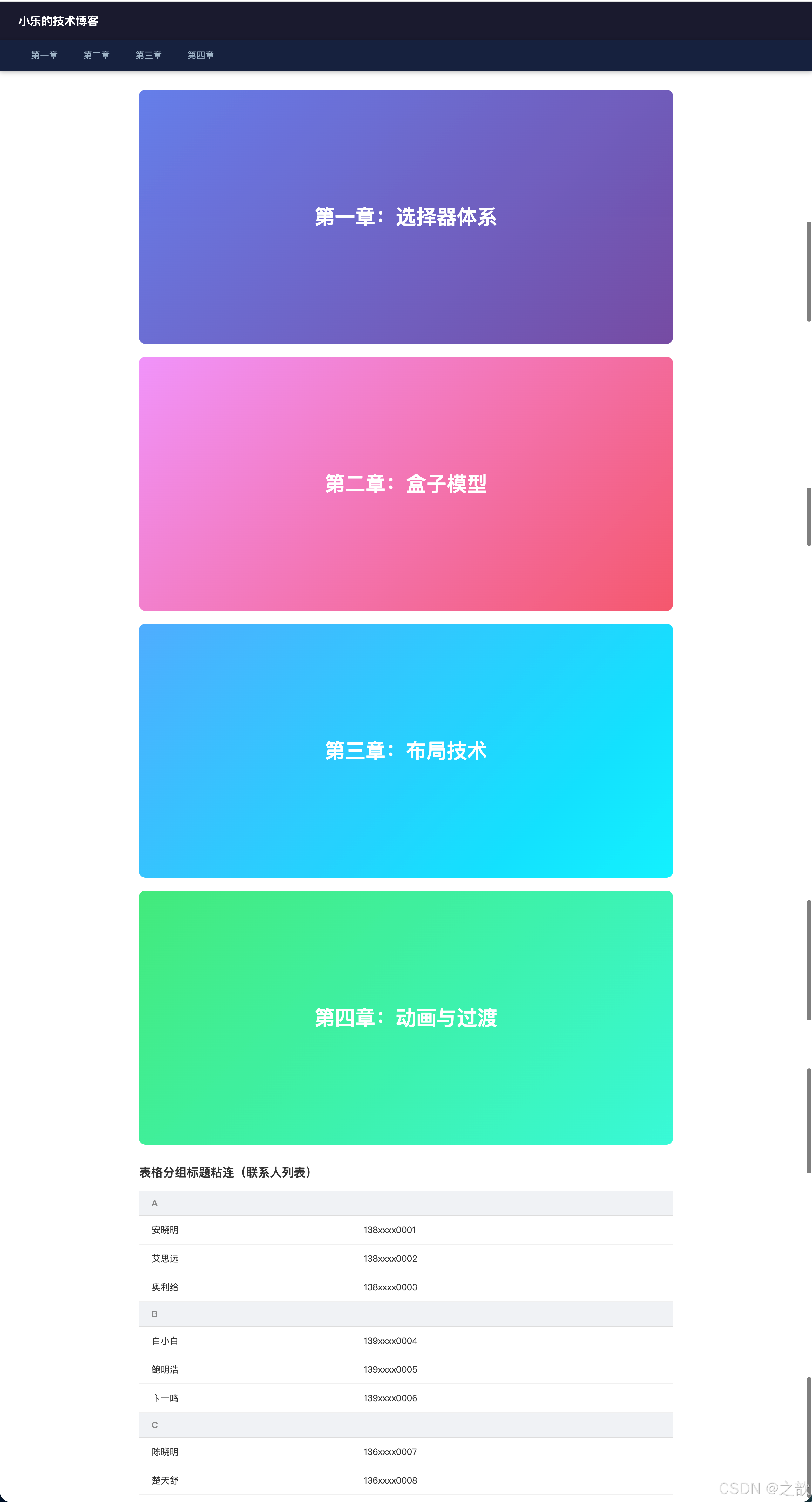
粘连定位知识点总结:
position:sticky
滚动前
达到阈值
普通文档流定位
(相对位置)
吸附在 top:0 位置
(类似 fixed)
父容器滚出视口?
随父容器消失
sticky是relative和fixed的混合体:平时表现如relative,触发条件后表现如fixed。- 父元素
overflow: hidden会使sticky失效,这是最常见的踩坑点。- 适合场景:导航吸顶、表格表头冻结、长页面目录、联系人分组标题。
市面上的使用场景:
- 微信联系人列表 :分组字母标题
sticky吸顶 - 掘金、知乎 :文章目录侧边
sticky跟随 - 京东商品详情页 :商品操作栏(加购按钮区域)滚动后
sticky吸顶 - Google Docs 工具栏 :编辑工具栏
sticky在顶部 - GitHub :仓库文件列表的表头
sticky - Notion :页面侧边栏目录
sticky跟随滚动
position: sticky 进阶应用
应用1:双层粘性导航(嵌套 Sticky)
html
<!DOCTYPE html>
<html lang="zh-CN">
<head>
  <meta charset="UTF-8">
  <title>双层粘性导航</title>
  <style>
    * { box-sizing: border-box; margin: 0; padding: 0; }
    body { font-family: sans-serif; }

    /* 顶部横幅 */
    .top-banner {
      background: #f39c12;
      color: #fff;
      text-align: center;
      padding: 12px;
      font-size: 14px;
    }

    /* 主导航 */
    .main-nav {
      position: sticky;
      top: 0;
      z-index: 100;
      background: #2c3e50;
      box-shadow: 0 2px 8px rgba(0,0,0,.2);
    }

    .main-nav ul {
      list-style: none;
      display: flex;
      justify-content: center;
    }

    .main-nav a {
      display: block;
      padding: 0 24px;
      line-height: 56px;
      color: #ecf0f1;
      text-decoration: none;
      transition: background .2s;
    }

    .main-nav a:hover {
      background: rgba(255,255,255,.1);
    }

    /* 子导航 */
    .sub-nav {
      position: sticky;
      top: 56px; /* 主导航高度 */
      z-index: 99;
      background: #34495e;
      border-bottom: 1px solid rgba(255,255,255,.1);
    }

    .sub-nav ul {
      list-style: none;
      display: flex;
      justify-content: center;
      flex-wrap: wrap;
    }

    .sub-nav a {
      display: block;
      padding: 0 20px;
      line-height: 44px;
      color: #bdc3c7;
      text-decoration: none;
      font-size: 14px;
      transition: color .2s;
    }

    .sub-nav a:hover {
      color: #fff;
    }

    /* 内容区 */
    .content-section {
      padding: 40px 20px;
      max-width: 1000px;
      margin: 0 auto;
      min-height: 600px;
    }

    .content-section h2 {
      color: #2c3e50;
      margin-bottom: 20px;
    }

    .content-section p {
      line-height: 1.8;
      color: #555;
      margin-bottom: 16px;
    }
  </style>
</head>
<body>
  <div class="top-banner">
    🎉 限时优惠:全场8折,满200减30!
  </div>

  <nav class="main-nav">
    <ul>
      <li><a href="#home">首页</a></li>
      <li><a href="#products">产品</a></li>
      <li><a href="#solutions">解决方案</a></li>
      <li><a href="#cases">客户案例</a></li>
      <li><a href="#about">关于我们</a></li>
    </ul>
  </nav>

  <nav class="sub-nav">
    <ul>
      <li><a href="#web">Web 开发</a></li>
      <li><a href="#mobile">移动应用</a></li>
      <li><a href="#backend">后端服务</a></li>
      <li><a href="#devops">DevOps</a></li>
      <li><a href="#ai">人工智能</a></li>
    </ul>
  </nav>

  <section class="content-section" id="home">
    <h2>欢迎来到我们的网站</h2>
    <p>这是一个展示双层粘性导航的示例页面。当你向下滚动时,主导航会首先吸附在顶部,接着子导航会吸附在主导航下方。</p>
    <p>这种布局常见于内容丰富的门户网站、电商平台和大型企业官网,可以有效组织多层级的导航结构。</p>
  </section>

  <section class="content-section" id="products">
    <h2>产品展示</h2>
    <p>我们提供一系列创新的产品和服务,致力于解决企业在数字化转型过程中遇到的各种挑战。</p>
    <p>从前端到后端,从移动端到云端,我们的全栈解决方案覆盖了现代软件开发的各个环节。</p>
  </section>

  <section class="content-section" id="solutions">
    <h2>解决方案</h2>
    <p>针对不同行业的特定需求,我们精心打造了定制化的解决方案,帮助客户快速实现业务目标。</p>
    <p>无论是金融科技、电子商务还是企业管理,我们都有成熟的案例和最佳实践可供参考。</p>
  </section>

  <section class="content-section" id="cases">
    <h2>客户案例</h2>
    <p>多年来,我们服务了众多知名企业,积累了丰富的项目经验和行业洞察。</p>
    <p>每一个成功案例背后,都是我们与客户共同努力、持续创新的结果。</p>
  </section>

  <section class="content-section" id="about">
    <h2>关于我们</h2>
    <p>我们是一家专注于技术创新的团队,致力于通过优秀的产品和服务,为客户创造长期价值。</p>
    <p>如果您有任何问题或合作意向,欢迎随时与我们联系。</p>
  </section>
</body>
</html>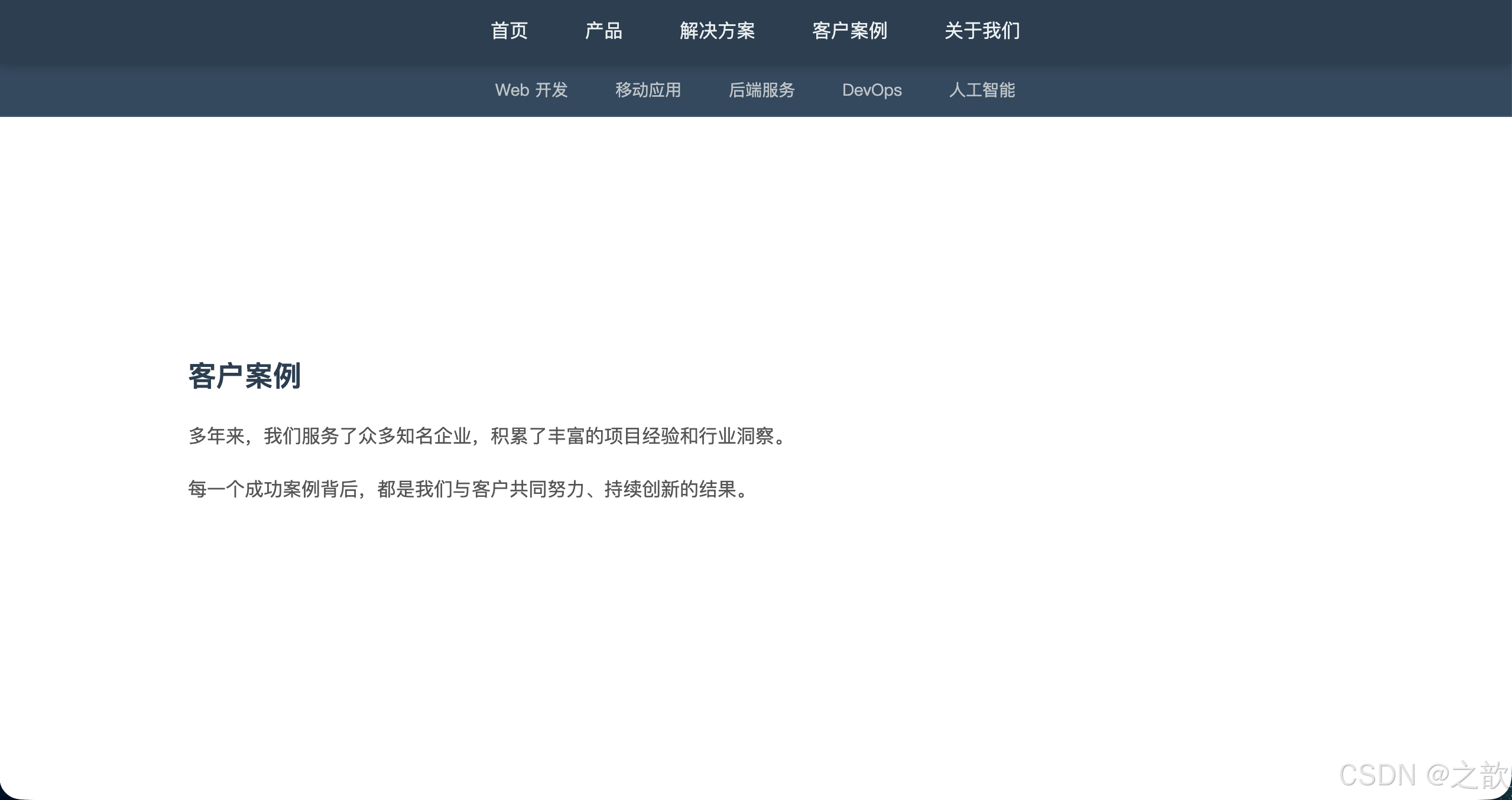
应用2:侧边栏目录跟随滚动
html
<!DOCTYPE html>
<html lang="zh-CN">
<head>
  <meta charset="UTF-8">
  <title>侧边栏目录跟随</title>
  <style>
    * { box-sizing: border-box; margin: 0; padding: 0; }
    body { font-family: sans-serif; background: #f8f9fa; }

    .page-header {
      background: #2c3e50;
      color: #fff;
      padding: 24px;
      text-align: center;
    }

    .container {
      max-width: 1200px;
      margin: 40px auto;
      display: grid;
      grid-template-columns: 1fr 280px;
      gap: 40px;
      padding: 0 20px;
    }

    /* 主内容区 */
    .main-content {
      background: #fff;
      padding: 40px;
      border-radius: 8px;
      box-shadow: 0 2px 8px rgba(0,0,0,.08);
    }

    .main-content h2 {
      color: #2c3e50;
      margin: 40px 0 16px 0;
      padding-top: 20px;
      border-top: 2px solid #e0e0e0;
    }

    .main-content h2:first-child {
      margin-top: 0;
      padding-top: 0;
      border-top: none;
    }

    .main-content p {
      line-height: 1.8;
      color: #555;
      margin-bottom: 12px;
    }

    /* 侧边栏 */
    .sidebar {
      position: relative;
    }

    .toc {
      position: sticky;
      top: 20px;
      background: #fff;
      padding: 24px;
      border-radius: 8px;
      box-shadow: 0 2px 8px rgba(0,0,0,.08);
      max-height: calc(100vh - 40px);
      overflow-y: auto;
    }

    .toc h3 {
      font-size: 16px;
      color: #333;
      margin-bottom: 16px;
      padding-bottom: 12px;
      border-bottom: 2px solid #4a90e2;
    }

    .toc ul {
      list-style: none;
    }

    .toc li {
      margin-bottom: 8px;
    }

    .toc a {
      display: block;
      padding: 6px 12px;
      color: #666;
      text-decoration: none;
      border-left: 3px solid transparent;
      transition: all .2s;
      font-size: 14px;
    }

    .toc a:hover {
      color: #4a90e2;
      background: #f0f8ff;
      border-left-color: #4a90e2;
    }

    /* 响应式:移动端隐藏目录 */
    @media (max-width: 768px) {
      .container {
        grid-template-columns: 1fr;
      }
      .sidebar {
        display: none;
      }
    }
  </style>
</head>
<body>
  <header class="page-header">
    <h1>CSS3 进阶指南</h1>
    <p>深入理解 CSS3 的核心特性</p>
  </header>

  <div class="container">
    <main class="main-content">
      <h2 id="section1">1. 选择器进阶</h2>
      <p>CSS3 引入了大量新选择器,极大地增强了我们精确定位元素的能力。结构伪类选择器如 :nth-child、:nth-of-type 等,可以让我们基于元素在 DOM 树中的位置进行选择。</p>
      <p>属性选择器的增强(如 ^=、$=、*= 匹配)让我们可以根据属性值的特征进行选择,无需额外添加类名。</p>
      <p>否定伪类 :not() 可以排除特定元素,使选择器表达更加灵活简洁。</p>

      <h2 id="section2">2. 盒模型与布局</h2>
      <p>box-sizing: border-box 是现代 CSS 中最重要的属性之一,它改变了宽高的计算方式,使得布局更加直观可控。</p>
      <p>Flexbox 和 Grid 布局系统提供了强大的一维和二维布局能力,大大简化了过去复杂的布局技术。</p>
      <p>position: sticky 粘性定位则为滚动场景提供了优雅的解决方案,无需 JavaScript 即可实现吸顶效果。</p>

      <h2 id="section3">3. 视觉效果</h2>
      <p>box-shadow 不仅可以创建阴影,还能通过多重阴影叠加实现复杂的视觉效果,如发光、内凹、立体按钮等。</p>
      <p>border-radius 让圆角变得简单,配合不同的参数可以创造椭圆、胶囊形等各种形状。</p>
      <p>opacity 和 rgba() 提供了两种不同的透明度控制方式,前者影响整个元素,后者只影响特定属性。</p>

      <h2 id="section4">4. 过渡与动画</h2>
      <p>transition 属性让元素的状态变化更加平滑自然,只需指定要过渡的属性和时长,浏览器会自动补间。</p>
      <p>animation 和 @keyframes 规则提供了更精细的动画控制,可以定义多个关键帧,实现复杂的动画序列。</p>
      <p>transform 变换属性支持旋转、缩放、倾斜、平移等操作,且不影响文档流,性能优异。</p>

      <h2 id="section5">5. 响应式设计</h2>
      <p>媒体查询(@media)是响应式设计的基石,可以根据设备特性应用不同的样式规则。</p>
      <p>视口单位(vw、vh、vmin、vmax)让元素尺寸可以直接关联到视口大小,实现真正的流式布局。</p>
      <p>移动优先(Mobile First)策略已成为主流,从小屏幕开始设计,再逐步增强到大屏幕。</p>

      <h2 id="section6">6. 性能优化</h2>
      <p>CSS 选择器的性能差异通常可以忽略,但在极端情况下,ID 和类选择器比标签选择器更快。</p>
      <p>使用 transform 和 opacity 做动画比直接修改 width、height 等属性性能更好,因为前者可以触发 GPU 加速。</p>
      <p>减少重排(reflow)和重绘(repaint)是 CSS 性能优化的关键,合理使用 will-change 可以提示浏览器优化渲染。</p>
    </main>

    <aside class="sidebar">
      <nav class="toc">
        <h3>目录</h3>
        <ul>
          <li><a href="#section1">1. 选择器进阶</a></li>
          <li><a href="#section2">2. 盒模型与布局</a></li>
          <li><a href="#section3">3. 视觉效果</a></li>
          <li><a href="#section4">4. 过渡与动画</a></li>
          <li><a href="#section5">5. 响应式设计</a></li>
          <li><a href="#section6">6. 性能优化</a></li>
        </ul>
      </nav>
    </aside>
  </div>
</body>
</html>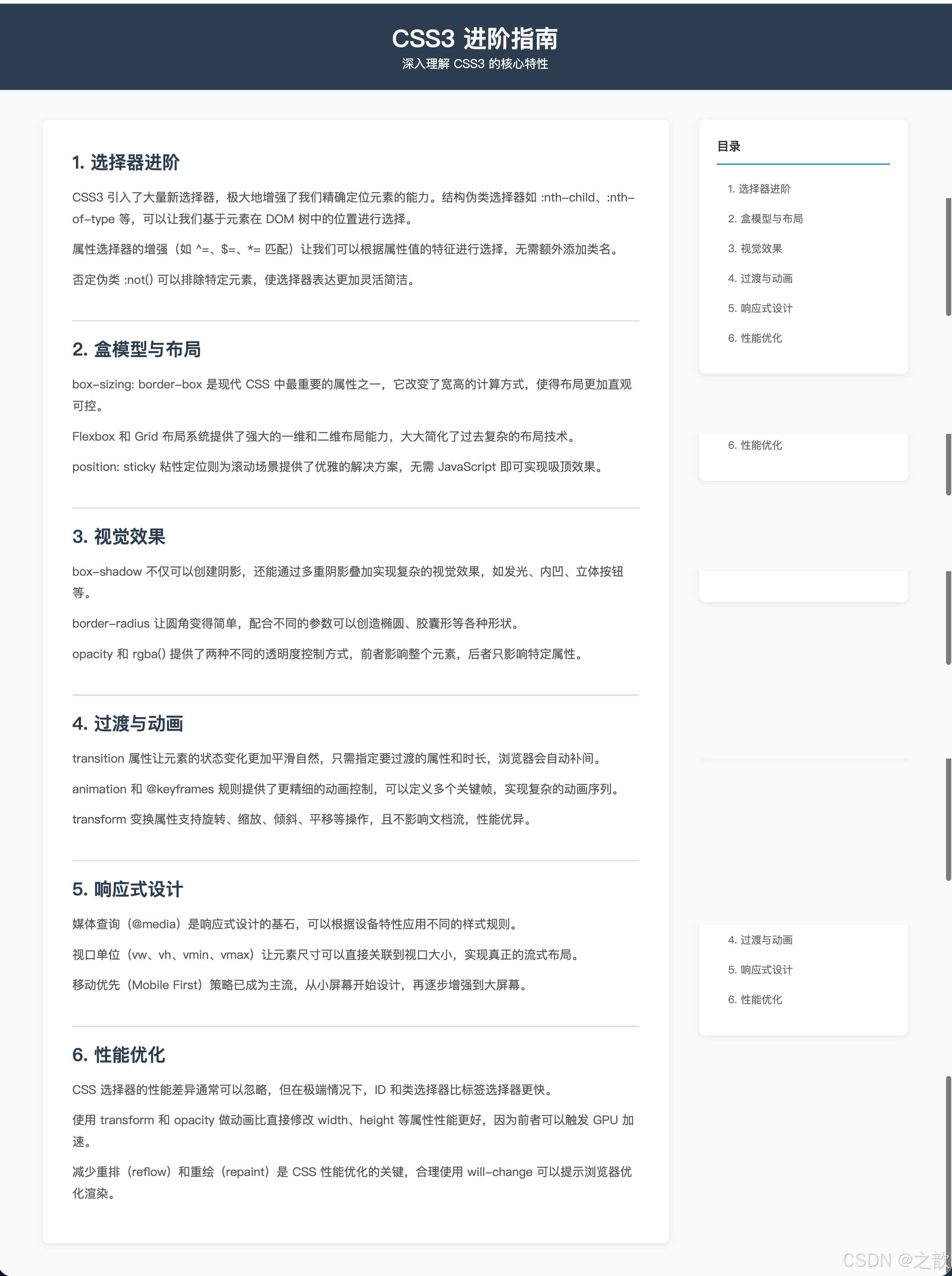
课堂案例导航
以下是本次所有课堂案例的汇总,可直接在浏览器中打开运行:
| 案例文件 | 知识点 |
|---|---|
课堂案例/01-选择器/01-层级选择器.html |
后代、子、相邻、通用兄弟选择器 |
课堂案例/01-选择器/02-属性选择器.html |
[attr], [attr="val"], [attr*="val"] 等 |
课堂案例/01-选择器/03-动态伪类选择器.html |
:focus 输入框聚焦效果 |
课堂案例/01-选择器/04-目标伪类选择器.html |
:target + position:sticky 组合 |
课堂案例/01-选择器/05-语言伪类选择器.html |
:lang() vs [lang=""] 对比 |
课堂案例/01-选择器/06-UI元素伪类选择器.html |
:enabled, :disabled, :checked + 纯CSS选项卡 |
课堂案例/01-选择器/07-结构伪类选择器.html |
:first-child, :last-child, :nth-child, :empty |
课堂案例/01-选择器/08-结构伪类选择器高级应用.html |
odd/even/2n/3n 规律 |
课堂案例/01-选择器/09-否定伪类选择器.html |
:not() 排除特例 |
课堂案例/01-选择器/10-伪元素选择器.html |
::first-letter, ::before, ::after, ::placeholder, ::selection |
课堂案例/01-选择器/11-选择器权重.html |
!important, 行内, ID, 类, 标签 权重对比 |
课堂案例/02-盒子相关样式/01-关于显示模式.html |
display: list-item |
课堂案例/02-盒子相关样式/02-调整宽高设置规则.html |
box-sizing: content-box vs border-box |
课堂案例/02-盒子相关样式/03-盒子阴影.html |
box-shadow 各参数演示 |
课堂案例/02-盒子相关样式/04-不透明度.html |
opacity vs rgba() |
课堂案例/02-盒子相关样式/05-粘连定位.html |
position: sticky |
综合实战
阴影蒙娜丽莎
位于 阴影实现的蒙娜丽莎/ 目录,这是一个用 纯 CSS box-shadow 绘制的蒙娜丽莎画像。
其核心原理是:利用 box-shadow 可以设置多个阴影的特性,将数百个像素点的颜色信息用阴影的形式编码:
css
#monalisa {
  width: 1px;
  height: 1px;
  box-shadow:
    1px 1px #color1,
    2px 1px #color2,
    3px 1px #color3,
    /* ... 数万个点 ... */
  ;
}
每个 box-shadow 的 offset-x offset-y 代表像素坐标,color 代表该像素的颜色,spread-radius 为 0(点大小1px)。这展示了 box-shadow 作为像素画布的极端应用,也直观证明了多重阴影的强大表达能力。
作业作品解析
第一题:属性选择器 + 伪元素实现文件图标(巩亚芬-Day12作业/)
核心技术:[href$=".doc"]::after { background-position: 0 0; }
通过属性选择器识别链接的文件扩展名,配合 ::after 伪元素和 Sprite 图的 background-position 定位,实现不同文件类型自动显示对应图标。这是"零修改 HTML"的典范。
第四题:阴影实现商品卡片悬停效果
核心技术::hover + box-shadow + transform: translateY()
css
.container div:hover {
    position: relative;
    top: -5px;
    box-shadow: 10px 15px 30px #ddd,
                -5px -15px 30px #ddd;
}
这种"悬浮卡片"效果是电商网站(京东、淘宝、天猫)商品列表页的标配交互。
经典场景汇总
经典使用场景
导航类
表单类
列表类
纯CSS交互
装饰类
a+a 分隔竖线
sticky 吸顶导航
:target 锚点高亮
:focus 聚焦边框
inputtype 精确样式
:disabled 禁用灰化
::placeholder 提示美化
:nth-child 隔行换色
:not(:last-child) 排除最后边框
::before 自定义列表圆点
li:first-child 置顶高亮
:checked + div 选项卡
:target 图片切换
:hover 下拉菜单
::first-letter 首字下沉
::before 引号装饰
box-shadow 卡片悬停浮起
::selection 品牌色
知识点速查表
CSS3 选择器权重对照
| 选择器类型 | 示例 | 权重 |
|---|---|---|
!important |
color: red !important |
∞ |
| 行内样式 | style="color:red" |
1-0-0-0 |
| ID 选择器 | #header |
0-1-0-0 |
| 类选择器 | .nav |
0-0-1-0 |
| 属性选择器 | [type="text"] |
0-0-1-0 |
| 伪类 | :hover :nth-child() |
0-0-1-0 |
| 标签选择器 | div p |
0-0-0-1 |
| 伪元素 | ::before ::first-letter |
0-0-0-1 |
| 全局选择器 | * |
0-0-0-0 |
box-shadow 参数速查
css
/* 完整语法 */
box-shadow: h-offset v-offset blur spread color inset;

/* 常用示例 */
box-shadow: 0 2px 8px rgba(0,0,0,.15);           /* 普通卡片阴影 */
box-shadow: 0 4px 16px rgba(0,0,0,.2);           /* 浮起卡片阴影 */
box-shadow: 0 0 0 3px rgba(74,144,226,.5);       /* 焦点环 */
box-shadow: inset 0 2px 4px rgba(0,0,0,.1);      /* 内凹感 */
box-shadow: 0 6px 0 #2868a3;                     /* 立体按钮底部 */
结构伪类 nth 参数规律速查
| 参数 | 选中行号 |
|---|---|
odd / 2n+1 |
1, 3, 5, 7... |
even / 2n |
2, 4, 6, 8... |
3n |
3, 6, 9, 12... |
n+4 |
4, 5, 6, 7...(从第4个开始) |
-n+4 |
1, 2, 3, 4(前4个) |
3n+1 |
1, 4, 7, 10... |
伪类 vs 伪元素 对比总结
| 维度 | 伪类 : |
伪元素 :: |
|---|---|---|
| 语法 | 单冒号 : |
双冒号 :: |
| 本质 | 元素的特殊状态 | 元素内某个虚拟部分 |
| DOM 存在 | 否(只是状态标记) | 否(渲染层虚拟节点) |
| 每条规则数量 | 可多个 | 每条规则理论上一个 |
| 典型 | :hover :nth-child() |
::before ::selection |
实战技巧与最佳实践
1. CSS 选择器优化策略
避免过度复杂的选择器:
css
/* ❌ 不推荐:过度嵌套,性能差 */
.header .nav ul li a span { color: blue; }

/* ✅ 推荐:扁平化,使用类名 */
.nav-link-text { color: blue; }
利用属性选择器减少类名:
css
/* ❌ 需要为每个状态添加类 */
.btn-primary { background: blue; }
.btn-success { background: green; }
.btn-danger { background: red; }

/* ✅ 使用 data 属性 + 属性选择器 */
.btn[data-variant="primary"] { background: blue; }
.btn[data-variant="success"] { background: green; }
.btn[data-variant="danger"] { background: red; }
2. 结构伪类选择器技巧集
只给第一行添加间距(避免第一个):
css
.item + .item { margin-top: 16px; }
/* 等价于 .item:not(:first-child) { margin-top: 16px; } */
网格布局去除行末元素边距:
css
/* 4列网格 */
.grid-item:nth-child(4n) { margin-right: 0; }

/* 3列网格 */
.grid-item:nth-child(3n) { margin-right: 0; }
检测列表项数量并应用不同样式:
css
/* 当有5个或更多项时 */
li:first-child:nth-last-child(n+5),
li:first-child:nth-last-child(n+5) ~ li {
  font-size: 12px; /* 项目多时缩小字体 */
}

/* 当只有1个项时 */
li:only-child {
  text-align: center;
  font-size: 18px;
}
3. 伪元素高级技巧
清除浮动(Clearfix):
css
.clearfix::after {
  content: "";
  display: block;
  clear: both;
}
创建三角形指示器:
css
.tooltip::after {
  content: "";
  position: absolute;
  bottom: -10px;
  left: 50%;
  transform: translateX(-50%);
  border: 5px solid transparent;
  border-top-color: #333;
}
长文本截断 + 省略号:
css
.text-ellipsis {
  white-space: nowrap;
  overflow: hidden;
  text-overflow: ellipsis;
}

/* 多行截断(需配合 -webkit) */
.text-ellipsis-multiline {
  display: -webkit-box;
  -webkit-line-clamp: 3;
  -webkit-box-orient: vertical;
  overflow: hidden;
}
4. box-shadow 实用模式
焦点环(代替 outline,支持圆角):
css
input:focus {
  outline: none;
  box-shadow: 0 0 0 3px rgba(74,144,226,.3);
}
内凹效果(输入框):
css
input {
  box-shadow: inset 0 2px 4px rgba(0,0,0,.1);
}
多层卡片堆叠:
css
.card {
  box-shadow: 0 2px 4px rgba(0,0,0,.1),
              0 8px 16px rgba(0,0,0,.1);
}
5. 响应式布局黄金法则
移动优先(Mobile First):
css
/* 基础样式(移动端) */
.container { padding: 10px; }

/* 逐步增强(平板) */
@media (min-width: 768px) {
  .container { padding: 20px; }
}

/* 桌面端 */
@media (min-width: 1024px) {
  .container { padding: 40px; }
}
常用断点参考:
css
/* 手机 */
@media (max-width: 480px) { }

/* 平板竖屏 */
@media (min-width: 481px) and (max-width: 768px) { }

/* 平板横屏 / 小笔记本 */
@media (min-width: 769px) and (max-width: 1024px) { }

/* 桌面 */
@media (min-width: 1025px) { }

/* 大屏 */
@media (min-width: 1440px) { }
6. 性能优化建议
优先使用 transform 和 opacity 做动画:
css
/* ✅ 高性能:触发 GPU 加速 */
.box {
  transition: transform .3s, opacity .3s;
}
.box:hover {
  transform: translateY(-4px);
  opacity: 0.9;
}

/* ❌ 低性能:触发重排 */
.box {
  transition: margin-top .3s, height .3s;
}
使用 will-change 提示浏览器优化:
css
.animating-element {
  will-change: transform, opacity;
}

/* 动画结束后移除 */
.animating-element.idle {
  will-change: auto;
}
减少选择器嵌套深度:
css
/* ❌ 深层嵌套,影响性能 */
.page .content .article .section .paragraph { }

/* ✅ 扁平化 */
.article-paragraph { }
常见问题 FAQ
Q1: 什么时候用 :nth-child,什么时候用 :nth-of-type?
A:
- :nth-child(n) - 选择父元素的第 n 个子元素(不管标签),如果这个元素恰好匹配选择器才生效
- :nth-of-type(n) - 选择父元素中第 n 个该标签名的元素
html
<div>
  <p>第1个子元素(第1个p)</p>
  <span>第2个子元素</span>
  <p>第3个子元素(第2个p)</p>
</div>

<style>
  /* p:nth-child(2) → 不生效(第2个子元素是span) */
  /* p:nth-of-type(2) → 选中"第3个子元素(第2个p)" */
</style>
Q2: :checked 实现的交互为什么不能往前选择?
A: CSS 只能选择后续兄弟 或子元素 ,不能选择前面的兄弟。所以 :checked 配合 + 或 ~ 只能影响 checkbox/radio 之后的元素。解决方案是调整 HTML 结构,把 input 放在要控制的元素之前。
Q3: box-sizing: border-box 会影响子元素吗?
A: 不会自动继承。需要全局设置:
css
*, *::before, *::after {
  box-sizing: border-box;
}
或者使用继承:
css
html {
  box-sizing: border-box;
}
*, *::before, *::after {
  box-sizing: inherit;
}
Q4: position: sticky 不生效的常见原因?
A:
- 没有设置
top/bottom/left/right - 父容器设置了
overflow: hidden或overflow: auto - 父容器高度不够,没有滚动空间
- 元素本身高度大于父容器
Q5: 如何选择使用 opacity 还是 rgba()?
A:
- opacity - 整个元素(包括子元素)都半透明,适合淡入淡出动画
- rgba() - 只影响设置的属性(如背景色),子元素不受影响,适合半透明背景
参考资源
官方文档
学习工具
设计参考
总结
CSS3 为前端开发带来了革命性的能力提升。通过本文的学习,你已经掌握了:
✅ 23个伪类选择器 - 精确定位任意元素,无需修改 HTML
✅ 6个伪元素选择器 - 动态注入内容,实现丰富的视觉效果
✅ 属性选择器 - 根据属性特征选择元素,语义化更强
✅ box-sizing - 掌控盒模型,让布局更可预测
✅ box-shadow - 创造立体感、光晕、新拟态等视觉效果
✅ position: sticky - 纯 CSS 实现吸顶导航和跟随目录
✅ :checked 黑科技 - 无 JS 实现选项卡、手风琴、主题切换
这些技术已经在 Google、Apple、GitHub、京东、淘宝 等一线产品中得到广泛应用。掌握它们,你将能够:
- 编写更少的 JavaScript,用纯 CSS 实现复杂交互
- 创建性能优异的动画和过渡效果
- 构建完全响应式、可维护的现代 Web 界面
- 理解主流 CSS 框架(Bootstrap、Tailwind)的底层原理
记住:CSS 不仅仅是"让页面好看",它是一门强大的布局和交互语言。持续实践、深入探索,你会发现 CSS 的无限可能。
本文特色:
- ✅ 每个知识点配有完整可运行的 HTML 示例(共 30+ 个)
- ✅ 15+ Mermaid 流程图和思维导图梳理知识脉络
- ✅ 名词解释、语法说明、使用场景、最佳实践一应俱全
- ✅ 引用一线产品(Google、GitHub、京东等)真实应用案例
- ✅ 所有图片素材来自目录下
images/文件夹,可直接运行建议配合
课堂案例/目录下的 HTML 文件一起学习,边看边动手修改代码,效果最佳!