本文深入讲解 CSS Loading 动画的实现原理,包括关键帧动画、timing-function 曲线、GPU 加速优化以及四种经典加载动画的代码实现。
为什么 Loading 动画很重要?
用户体验有一条铁律:永远不要让用户面对静止的屏幕等待。Loading 动画不仅能缓解等待焦虑,还能传达"系统正在工作"的反馈。一个好的 Loading 动画需要满足三个条件:流畅、不抢眼、性能好。
四种经典 Loading 动画解析
1. 圆形旋转(Spinner)
这是最常见的 Loading 样式,实现原理很简单:
css
.spinner {
  width: 40px;
  height: 40px;
  border: 4px solid #e5e7eb;  /* 灰色底圈 */
  border-top-color: #3b82f6;  /* 蓝色高亮部分 */
  border-radius: 50%;
  animation: spin 1s linear infinite;
}

@keyframes spin {
  to { transform: rotate(360deg); }
}
关键点 :border-top-color 只给一个边染色,形成"缺口"效果。linear timing-function 让旋转速度恒定,infinite 让动画无限循环。
2. 脉冲动画(Pulse)
脉冲效果通过缩放和透明度变化实现呼吸感:
css
.spinner {
  width: 40px;
  height: 40px;
  background-color: #3b82f6;
  border-radius: 50%;
  animation: pulse 1s ease-in-out infinite;
}

@keyframes pulse {
  0%, 100% {
    transform: scale(0);
    opacity: 1;
  }
  50% {
    transform: scale(1);
    opacity: 0.5;
  }
}
关键点 :ease-in-out 让动画有"缓入缓出"的节奏感,比 linear 更自然。
3. 圆点跳动(Bouncing Dots)
三个圆点依次跳动的效果,核心是 animation-delay:
css
.spinner {
  display: flex;
  gap: 6px;
}

.spinner::before,
.spinner::after,
.spinner {
  content: '';
  width: 10px;
  height: 10px;
  background-color: #3b82f6;
  border-radius: 50%;
  animation: bounce 1s ease-in-out infinite;
}

/* 依次延迟 */
.spinner::before { animation-delay: 0s; }
.spinner { animation-delay: 0.16s; }
.spinner::after { animation-delay: 0.33s; }

@keyframes bounce {
  0%, 80%, 100% { transform: scale(0); }
  40% { transform: scale(1); }
}
关键点 :利用 ::before 和 ::after 伪元素,一个 HTML 元素就能生成三个圆点。延迟时间按总时长的 1/6 递增,形成波浪效果。
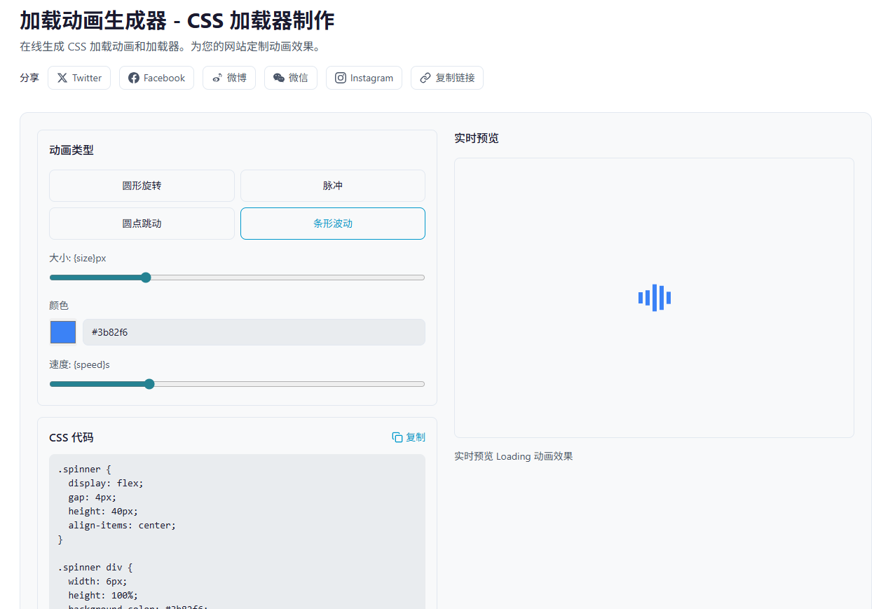
4. 条形波动(Bars)
五个竖条依次伸缩,常用于视频播放器:
css
.spinner {
  display: flex;
  gap: 4px;
  height: 40px;
  align-items: center;
}

.spinner div {
  width: 6px;
  height: 100%;
  background-color: #3b82f6;
  animation: stretch 1s ease-in-out infinite;
}

.spinner div:nth-child(2) { animation-delay: 0.1s; }
.spinner div:nth-child(3) { animation-delay: 0.2s; }
.spinner div:nth-child(4) { animation-delay: 0.3s; }
.spinner div:nth-child(5) { animation-delay: 0.4s; }

@keyframes stretch {
  0%, 40%, 100% { transform: scaleY(0.4); }
  20% { transform: scaleY(1); }
}
关键点 :scaleY 只在 Y 轴缩放,保持宽度不变。animation-delay 递增形成波浪。
Timing-function 深入理解
CSS 动画的节奏由 timing-function 控制,常见值有:
| 值 | 效果 | 适用场景 |
|---|---|---|
linear |
匀速 | 旋转动画 |
ease |
快-慢-慢 | 通用 |
ease-in |
慢启动 | 退出动画 |
ease-out |
慢结束 | 进入动画 |
ease-in-out |
两头慢 | 脉冲、呼吸 |
更精细的控制可以用 cubic-bezier():
css
/* 自定义曲线 */
animation: spin 1s cubic-bezier(0.68, -0.55, 0.265, 1.55) infinite;
这个曲线会产生"弹跳"效果,因为第二个参数 -0.55 超出了 0-1 范围。
性能优化:GPU 加速
不是所有 CSS 属性动画都能享受 GPU 加速。只有 transform 和 opacity 会被合成器处理,其他属性会触发重排或重绘。
css
/* 好:GPU 加速 */
.spinner {
  animation: spin 1s linear infinite;
}
@keyframes spin {
  to { transform: rotate(360deg); }
}

/* 差:触发重排 */
.spinner {
  animation: bad-spin 1s linear infinite;
}
@keyframes bad-spin {
  to { margin-left: 100px; }
}
强制 GPU 加速 :使用 will-change 提示浏览器:
css
.spinner {
  will-change: transform;
  animation: spin 1s linear infinite;
}但不要滥用,will-change 会占用额外内存。
动画可访问性
有些用户对动画敏感,可能引起眩晕。应该尊重 prefers-reduced-motion 媒体查询:
css
@media (prefers-reduced-motion: reduce) {
  .spinner {
    animation: none;
    /* 显示静态替代 */
    opacity: 0.5;
  }
}
实战工具推荐
如果你需要快速生成各种 Loading 动画,可以试试 JsonKit Loading 生成器,支持四种动画类型、自定义尺寸、颜色和速度,一键复制 CSS 代码。