一、前言
在移动应用开发中,文件上传是一个高频且复杂的需求场景,无论是用户头像上传、图片分享,还是文档提交、视频发布,都离不开一个稳定、易用的上传组件。
uView Pro 的 u-upload 组件经过几次迭代、重构,现已支持图片、视频、文档等多种文件类型 ,提供网格(grid)和列表(list)两种展示模式,完全向后兼容的同时带来了更强大的功能和更优雅的使用体验。
二、组件核心优势
1. 多文件类型支持
不再局限于图片上传,u-upload 现已支持:
- 图片 - 支持预览、压缩、多选
- 视频 - 支持时长限制、摄像头方向设置
- 文件 - PDF、Word、Excel 等文档类型(H5/微信小程序)
- 媒体文件 - 图片+视频混合选择
- 所有类型 - 一键开启全类型支持
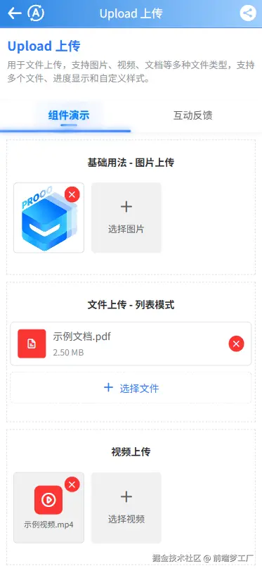
2. 双模式展示
根据文件类型自动适配最佳展示方式:
网格模式(默认) - 适合图片展示
- 宫格布局,视觉整齐
- 支持图片预览、删除
- 适合头像、相册等场景
列表模式 - 适合文件展示
- 显示文件名、文件大小
- 进度条直观展示上传状态
- 适合文档、资料上传场景
3. v-model 双向绑定
最新版本告别繁琐的事件监听,支持双向绑定,一行代码实现数据同步:
html
<u-upload :action="action" v-model="fileList"></u-upload>4. 全平台兼容
完美适配 uni-app 所有平台:
- App(Android/iOS/鸿蒙)
- H5
- 微信小程序、支付宝小程序、百度小程序、头条小程序、QQ小程序
三、快速上手
1. 基础用法
最简单的上传配置,只需设置服务器地址:
html
<template>
    <u-upload :action="action" v-model="fileList"></u-upload>
</template>

<script setup lang="ts">
import { ref } from 'vue'

const action = ref('https://your-server.com/upload')
const fileList = ref([
    {
        url: 'https://example.com/avatar.jpg',
        name: 'avatar.jpg',
        size: 1024 * 50,
        progress: 100,
        error: false
    }
])
</script>
2. 上传不同文件类型
通过 accept 参数一键切换文件类型:
html
<!-- 上传图片(默认) -->
<u-upload :action="action" accept="image"></u-upload>

<!-- 上传视频 -->
<u-upload :action="action" accept="video" :max-duration="120"></u-upload>

<!-- 上传文件(H5/微信小程序) -->
<u-upload :action="action" accept="file" :extension="['.pdf', '.docx']"></u-upload>

<!-- 上传所有类型 -->
<u-upload :action="action" accept="all"></u-upload>
3. 展示模式切换
html
<!-- 网格模式 - 适合图片 -->
<u-upload :action="action" accept="image" mode="grid"></u-upload>

<!-- 列表模式 - 适合文件 -->
<u-upload :action="action" accept="file" mode="list" :show-file-name="true" :show-file-size="true"></u-upload>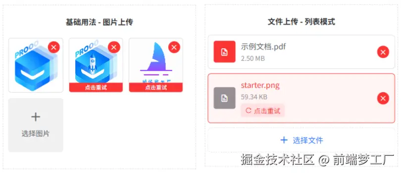
四、进阶功能
1. 手动上传控制
默认自动上传,也可改为手动控制:
html
<template>
    <view>
        <u-upload ref="uUploadRef" :action="action" :auto-upload="false"></u-upload>
        <u-button @click="submit" type="primary">提交上传</u-button>
    </view>
</template>

<script setup lang="ts">
import { ref } from 'vue'

const action = ref('https://your-server.com/upload')
const uUploadRef = ref()

function submit() {
    // 手动触发上传
    uUploadRef.value?.upload()
}
</script>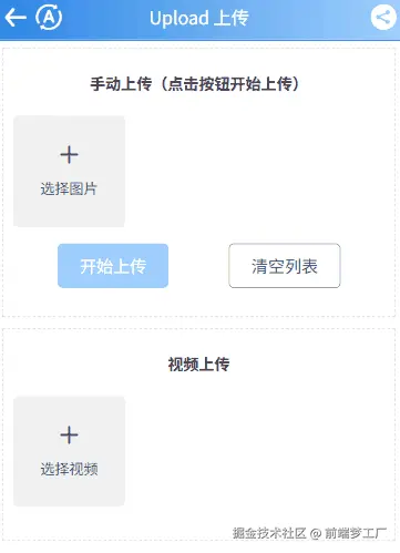
2. 上传前处理
通过 before-upload 钩子实现自定义逻辑:
html
<template>
    <u-upload :before-upload="beforeUpload" :action="action"></u-upload>
</template>

<script setup lang="ts">
async function beforeUpload(index: number, list: any[]) {
    // 示例:上传前获取签名
    const sign = await getUploadSign()

    // 返回 true 继续上传,false 跳过当前文件
    return !!sign
}

async function getUploadSign() {
    // 模拟获取上传签名
    return 'upload-sign-xxx'
}
</script>
3. 文件限制
灵活控制上传文件的数量、大小和类型:
html
<u-upload
    :action="action"
    :max-count="6"                    <!-- 最多选择6个文件 -->
    :max-size="5 * 1024 * 1024"       <!-- 单个文件最大5MB -->
    accept="image"
    :limit-type="['png', 'jpg', 'jpeg']"  <!-- 限制图片格式 -->
></u-upload>
4. 自定义文件选择
对于不支持文件选择的平台(如 App),可以通过 custom-choose 属性开启自定义选择:
html
<template>
    <u-upload
        ref="uploadRef"
        accept="file"
        :custom-choose="true"
        :action="action"
        @on-choose="handleCustomChoose"
    ></u-upload>
</template>

<script setup lang="ts">
import { ref } from 'vue'

const action = ref('https://your-server.com/upload')
const uploadRef = ref()

// 自定义文件选择
function handleCustomChoose({ accept, maxCount, fileList, index }: any) {
    // App 端使用原生文件选择
    // #ifdef APP-PLUS
    plus.runtime.chooseFile({
        success: (res: any) => {
            const files = res.files.map((file: any) => ({
                path: file.path,
                name: file.name,
                size: file.size,
                fileType: 'file'
            }))
            // 将文件添加到组件
            uploadRef.value?.addFiles(files)
        }
    })
    // #endif
}
</script>
核心要点:
- 设置
:custom-choose="true"开启自定义选择模式 - 监听
@on-choose事件,自行处理文件选择逻辑 - 选择完成后调用
uploadRef.value?.addFiles(files)将文件添加到组件
5. 自定义上传按钮
通过插槽打造个性化上传入口:

html
<u-upload :custom-btn="true">
<template #addBtn>
<view class="custom-upload-btn">
<u-icon name="plus" size="40" color="#2979ff"></u-icon>
<text class="upload-text">点击上传</text>
</view>
</template>
</u-upload>
<style>
.custom-upload-btn {
width: 200rpx;
height: 200rpx;
display: flex;
flex-direction: column;
align-items: center;
justify-content: center;
background: #f5f5f5;
border-radius: 10rpx;
border: 2rpx dashed #ddd;
}
.upload-text {
margin-top: 10rpx;
font-size: 24rpx;
color: #666;
}
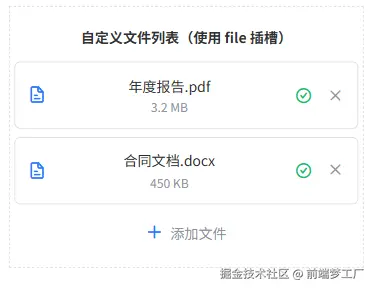
</style>6. 完全自定义文件列表展示
通过 file 插槽完全自定义文件列表的展示方式,实现更灵活的文件管理界面:
html
<template>
  <u-upload
    ref="customFileListRef"
    v-model="customFileList"
    accept="file"
    mode="list"
    :action="action"
    :show-upload-list="false"
    :custom-btn="true"
    :max-count="5"
  >
    <!-- 自定义文件列表 -->
    <template #file="{ file }">
      <view class="custom-file-list">
        <view
          v-for="(item, index) in file"
          :key="index"
          class="custom-file-item"
        >
          <!-- 文件类型图标 -->
          <u-icon
            :name="isImageFile(item) ? 'photo' : 'file-text'"
            size="40"
            color="var(--u-type-primary)"
          />

          <!-- 文件信息 -->
          <view class="custom-file-info">
            <text class="custom-file-name">{{ item.name || '未命名文件' }}</text>
            <text v-if="item.size" class="custom-file-size">
              {{ formatSize(item.size) }}
            </text>
          </view>

          <!-- 上传进度条 -->
          <view
            v-if="item.progress < 100 && item.progress > 0"
            class="custom-file-progress"
          >
            <u-line-progress :percent="item.progress" height="8" />
          </view>

          <!-- 上传状态 -->
          <view class="custom-file-status">
            <u-icon
              v-if="item.progress === 100"
              :name="item.error ? 'close-circle' : 'checkmark-circle'"
              size="34"
              :color="item.error ? 'var(--u-type-error)' : 'var(--u-type-success)'"
            />
            <text v-else class="custom-file-progress-text">
              {{ Math.floor(item.progress || 0) }}%
            </text>
          </view>

          <!-- 删除按钮 -->
          <view class="custom-file-delete" @click="removeCustomFile(index)">
            <u-icon name="close" size="24" color="var(--u-tips-color)" />
          </view>
        </view>
      </view>
    </template>

    <!-- 自定义添加按钮 -->
    <template #addBtn>
      <view class="custom-file-add-btn">
        <u-icon name="plus" size="32" color="var(--u-type-primary)" />
        <text class="custom-file-add-text">添加文件</text>
      </view>
    </template>
  </u-upload>
</template>

<script setup lang="ts">
import { ref } from 'vue'
import type { UploadFileItem } from '@/uni_modules/uview-pro/types/global'

const action = ref('https://your-server.com/upload')
const customFileList = ref<UploadFileItem[]>([])
const customFileListRef = ref()

// 判断是否为图片文件
function isImageFile(item: UploadFileItem): boolean {
  const ext = item.name?.split('.').pop()?.toLowerCase() || ''
  return ['png', 'jpg', 'jpeg', 'gif', 'webp', 'bmp', 'svg'].includes(ext)
}

// 格式化文件大小
function formatSize(bytes: number): string {
  if (bytes === 0) return '0 B'
  const k = 1024
  const sizes = ['B', 'KB', 'MB', 'GB']
  const i = Math.floor(Math.log(bytes) / Math.log(k))
  return parseFloat((bytes / Math.pow(k, i)).toFixed(2)) + ' ' + sizes[i]
}

// 删除文件
function removeCustomFile(index: number) {
  customFileListRef.value?.remove(index)
}
</script>

<style scoped>
.custom-file-list {
  width: 100%;
  margin-bottom: 20rpx;
}

.custom-file-item {
  display: flex;
  align-items: center;
  padding: 24rpx;
  background: var(--u-bg-white);
  border-radius: 12rpx;
  margin-bottom: 16rpx;
  border: 1rpx solid var(--u-border-color);
}

.custom-file-item:last-child {
  margin-bottom: 0;
}

.custom-file-info {
  flex: 1;
  margin-left: 20rpx;
  display: flex;
  flex-direction: column;
  min-width: 0;
}

.custom-file-name {
  font-size: 28rpx;
  color: var(--u-main-color);
  overflow: hidden;
  text-overflow: ellipsis;
  white-space: nowrap;
}

.custom-file-size {
  font-size: 24rpx;
  color: var(--u-tips-color);
  margin-top: 8rpx;
}

.custom-file-progress {
  width: 120rpx;
  margin-left: 20rpx;
}

.custom-file-progress-text {
  font-size: 24rpx;
  color: var(--u-primary-color);
}

.custom-file-status {
  margin-left: 20rpx;
  min-width: 48rpx;
  display: flex;
  justify-content: center;
  align-items: center;
}

.custom-file-delete {
  display: flex;
  align-items: center;
  margin-left: 20rpx;
  padding: 8rpx;
}

.custom-file-add-btn {
  display: flex;
  flex-direction: row;
  align-items: center;
  justify-content: center;
  background: var(--u-bg-white);
}

.custom-file-add-text {
  margin-left: 16rpx;
  font-size: 28rpx;
  color: var(--u-tips-color);
}
</style>
核心要点:
- 隐藏默认列表 :设置
:show-upload-list="false" - file 插槽 :接收
{ file }参数,file即当前文件列表 - 文件属性 :
item.name- 文件名item.size- 文件大小(字节)item.progress- 上传进度 0-100item.error- 上传失败标记
- 操作文件 :通过
ref调用remove(index)删除文件 - 进度展示 :使用
u-line-progress组件显示上传进度
五、实际应用场景
场景一:用户头像上传
html
<u-upload
    accept="image"
    image-shape="circle"
    :action="action"
    :max-count="1"
    :max-size="2 * 1024 * 1024"
    :limit-type="['jpg', 'png']"
    @on-success="onAvatarSuccess"
></u-upload>
场景二:资料文档上传
html
<u-upload
    accept="file"
    mode="list"
    :action="action"
    :show-file-name="true"
    :show-file-size="true"
    :extension="['.pdf', '.doc', '.docx']"
></u-upload>
场景三:视频作品发布
html
<u-upload
    accept="video"
    camera="back"
    :action="action"
    :max-count="1"
    :max-size="50 * 1024 * 1024"
    :max-duration="300"
></u-upload>
六、平台适配说明
虽然 u-upload 已实现全平台支持,但部分功能在不同平台存在差异:
| 功能 | App | H5 | 微信小程序 | 支付宝小程序 |
|---|---|---|---|---|
| 图片上传 | ✓ | ✓ | ✓ | ✓ |
| 视频上传 | ✓ | ✓ | ✓ | ✓ |
| 文件上传 | ✗ | ✓ | ✓ | ✗ |
| 文件预览 | ✗ | ✓ | ✗ | ✗ |
| 压缩选项 | ✓ | ✓ | ✓ | ✓ |
最佳实践建议:
- 文件上传功能在 H5 和微信小程序体验最佳
- 如需在 App 中使用文件上传,建议使用原生能力或第三方 SDK
- 生产环境务必做好各平台的真机测试
七、总结
uView Pro 的 u-upload 组件经历了从单一图片上传到全能文件管理。无论是简单的头像上传,还是复杂的资料提交,还支持高度自定义,无论如何都能找到最适合的配置方案。
核心亮点:
- 多类型支持 - 图片、视频、文档全覆盖
- 双模式展示 - 网格/列表随心切换
- 高度自定义 - 插槽机制、自定义满足个性需求
- 全平台适配 - 一套代码多端运行
附录:API 完整参考
Props 参数
| 参数 | 说明 | 类型 | 默认值 | 可选值 |
|---|---|---|---|---|
| action | 服务器上传地址 | String | '' | - |
| accept | 接受的文件类型 | String | image | image / video / file / media / all |
| image-shape | 图片/图标展示形状 | String | square | circle / square |
| modelValue | 文件列表(推荐,v-model 双向绑定) | Array | \[\] | - |
| file-list | 默认显示的文件列表(旧版,建议使用 v-model) | Array | \[\] | - |
| custom-choose | 是否使用自定义文件选择 | Boolean | false | true / false |
| mode | 展示模式 | String | grid | grid / list |
| max-count | 最大选择文件的数量 | String/Number | 52 | - |
| max-size | 选择单个文件的最大大小,单位字节 | String/Number | Number.MAX_VALUE | - |
| width | 预览区域和添加按钮的宽度,单位rpx | String/Number | 200 | - |
| height | 预览区域和添加按钮的高度,单位rpx | String/Number | 200 | - |
| multiple | 是否开启文件多选 | Boolean | true | true / false |
| disabled | 是否禁用组件 | Boolean | false | true / false |
| auto-upload | 选择完文件是否自动上传 | Boolean | true | true / false |
| deletable | 是否显示删除文件的按钮 | Boolean | true | true / false |
| show-confirm | 删除文件前是否显示确认弹窗 | Boolean | true | true / false |
| show-tips | 特殊情况下是否自动提示toast | Boolean | true | true / false |
| show-progress | 是否显示上传进度条 | Boolean | true | true / false |
| show-upload-list | 是否显示组件内部的文件预览列表 | Boolean | true | true / false |
| show-file-name | 是否显示文件名 | Boolean | true | true / false |
| show-file-size | 是否显示文件大小 | Boolean | false | true / false |
| preview-full-image | 是否可以通过 uni.previewImage 预览已选择的图片 | Boolean | true | true / false |
| preview-file | 是否可预览文件(非图片类型) | Boolean | true | true / false |
| custom-btn | 是否自定义选择文件的按钮 | Boolean | false | true / false |
| upload-text | 选择文件按钮的提示文字 | String | 根据accept自动显示 | - |
| image-mode | 预览图片的显示模式 | String | aspectFill | - |
| del-icon | 右上角删除图标名称 | String | close | - |
| del-bg-color | 右上角删除按钮的背景颜色 | String | var(--u-type-error) | - |
| del-color | 右上角删除按钮图标的颜色 | String | var(--u-white-color) | - |
| header | 上传携带的请求头信息 | Object | {} | - |
| form-data | 上传额外携带的参数 | Object | {} | - |
| name | 上传文件的字段名 | String | file | - |
| size-type | original 原图,compressed 压缩图 | Array | 'original', 'compressed' | - |
| source-type | 选择文件的来源,album-相册,camera-相机 | Array | 'album', 'camera' | - |
| limit-type | 限制允许上传的文件后缀,优先级高于accept | Array | \[\] | - |
| extension | 选择文件时的扩展名过滤,仅H5和微信小程序有效 | Array | \[\] | - |
| file-icon-map | 文件类型图标映射配置 | Object | {} | - |
| compressed | 选择视频时是否压缩 | Boolean | true | true / false |
| max-duration | 选择视频时拍摄最长时长,单位秒 | Number | 60 | - |
| camera | 选择视频时摄像头方向 | String | back | front / back |
| before-upload | 上传前钩子,返回 true/false/Promise | Function | null | - |
| before-remove | 删除前钩子,返回 true/false/Promise | Function | null | - |
| to-json | 如果上传后返回值为json字符串,是否自动转为json | Boolean | true | true / false |
| index | 在各个回调事件中的最后一个参数返回,用于区别是哪一个组件的事件 | String/Number | '' | - |
| custom-style | 自定义根节点样式 | String/Object | {} | - |
| custom-class | 自定义根节点样式类 | String | '' | - |
Methods 方法
通过 ref 手动调用组件方法:
| 名称 | 说明 | 参数 |
|---|---|---|
| upload | 手动触发上传文件 | - |
| clear | 清空内部文件列表 | - |
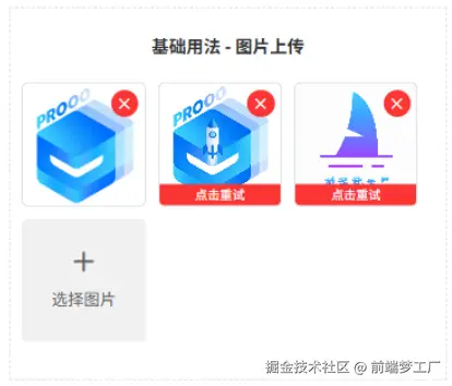
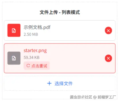
| reUpload | 重新上传所有失败/未上传的文件 | - |
| retry(index) | 重新上传指定索引的文件 | index: 文件索引 |
| remove(index) | 手动移除指定索引的文件 | index: 文件索引 |
| selectFile | 手动触发文件选择 | - |
| doPreviewImage(url, index) | 预览图片 | url: 图片地址, index: 索引 |
| doPreviewFile(item, index) | 预览/打开文件 | item: 文件对象, index: 索引 |
| addFiles(files) | 添加文件到列表(配合 custom-choose 使用) | files: 文件数组 |
Slots 插槽
| 名称 | 说明 |
|---|---|
| addBtn | 自定义选择文件按钮 |
| file | 自定义文件列表插槽 |
Events 事件
| 事件名 | 说明 | 回调参数 |
|---|---|---|
| on-oversize | 文件大小超出 max-size 限制时触发 | (file, lists, name) |
| on-exceed | 文件数量超出 max-count 限制时触发 | (file, lists, name) |
| on-choose-complete | 每次选择文件后触发 | (lists, name) |
| on-choose-fail | 文件选择失败时触发 | (error) |
| on-uploaded | 所有文件上传完毕触发 | (lists, name) |
| on-success | 单个文件上传成功时触发 | (data, index, lists, name) |
| on-error | 单个文件上传失败时触发 | (res, index, lists, name) |
| on-change | 单个文件上传状态改变时触发(无论成功或失败) | (res, index, lists, name) |
| on-progress | 文件上传过程中的进度变化时触发 | (res, index, lists, name) |
| on-remove | 移除文件时触发 | (index, lists, name) |
| on-preview | 预览文件时触发 | (url, lists, name) |
| on-list-change | 文件列表发生变化时触发 | (lists, name) |
| on-choose | 启用 custom-choose 时触发,用户可自定义文件选择逻辑 | ({ accept, maxCount, currentFiles, index }) |
| update:modelValue | v-model 双向绑定事件,文件列表变化时触发 | (lists) |
说明:
lists- 当前组件内的所有文件数组index- 当前操作的文件索引name- 通过 props 传递的 index 参数,用于区分多个组件实例
文件列表对象结构
lists 数组中每个元素(UploadFileItem)的结构:
typescript
{
  // 基础信息
  url: string,           // 文件地址(上传成功后返回)
  path: string,          // 文件本地路径
  name: string,          // 文件名
  size: number,          // 文件大小(字节)
  fileType: 'image' | 'video' | 'file',  // 文件类型

  // 上传状态
  progress: number,      // 上传进度 0-100,100表示上传成功
  error: boolean,        // 上传失败标记
  response?: any,        // 服务器返回的数据

  // 媒体文件特有
  thumb?: string,        // 视频缩略图(仅视频)
  width?: number,        // 图片/视频宽度
  height?: number,       // 图片/视频高度
  duration?: number,     // 视频时长(秒)

  // 原始文件对象
  file?: any,            // 原始文件对象
  uploadTask?: UniApp.UploadTask  // 上传任务对象(用于取消上传)
}
文件类型说明
根据 accept 参数,支持以下文件类型:
| accept 值 | 说明 | 自动检测的文件后缀 |
|---|---|---|
| image | 图片 | png, jpg, jpeg, gif, webp, bmp, svg |
| video | 视频 | mp4, avi, mov, wmv, flv, mkv, rmvb, 3gp, m3u8 |
| file | 文件 | 根据 extension 参数或允许所有 |
| media | 媒体(图片+视频) | 图片和视频后缀合集 |
| all | 所有文件 | 允许所有文件类型 |
注意:
- 文件上传(accept=file)仅在 H5 和微信小程序支持
- 媒体选择(accept=media)仅在微信小程序、App、头条小程序支持
- 文件预览功能在 H5 体验最佳,其他平台可能受限
- 通过自定义,你也可以实现不支持的平台特性功能
现在就开始使用 u-upload,让文件上传功能开发变得更加方便!更多内容请参考官方文档。
文档地址: uviewpro.cn/
开源地址:
- GitHub:github.com/anyup/uview...
- Gitee:gitee.com/anyup/uview...