一、核心概念
1.1 什么是路径动画?
路径动画 = PathGeometry 驱动 UI 元素运动
区别于普通线性动画(From/To/By)和关键帧动画,路径动画以 PathGeometry 为核心,让 UI 元素沿任意复杂轨迹(直线、曲线、弧线、复合图形)运动,还能同步控制旋转、缩放。
自绘制控件 是通过 Path、Polygon、Ellipse、Rectangle 等基础几何元素手动绘制 UI,优势:
- 样式完全可定制
- 交互灵活控制
- 与路径动画天然适配
- 摆脱默认控件样式束缚
1.2 三大核心路径动画类
| 动画类 | 驱动类型 | 核心用途 | 关键特性 |
|---|---|---|---|
DoubleAnimationUsingPath |
Double 数值 | 平移、角度、透明度控制 | 需绑定 X/Y/Angle,灵活控制单一属性 |
PointAnimationUsingPath |
Point 点 | 直接定位(Canvas.Left/Top) | 无需拆分 X/Y,简洁高效 |
MatrixAnimationUsingPath |
Matrix 矩阵 | 复合变换(平移+旋转) | DoesRotateWithTangent 自动随路径旋转 |
1.3 PathGeometry 路径语法
路径动画的"轨迹蓝图",XAML 中用 Figures 属性描述:
| 指令 | 含义 | 语法示例 |
|---|---|---|
| M | 移动到起点 | M 50,120 |
| L | 画直线 | L 550,120 |
| C | 三次贝塞尔曲线 | C 150,30 400,220 550,120 |
| A | 圆弧 | A 50,50 0 1,1 200,120 |
| Z | 闭合路径 | Z |
常用路径示例:
xml
<!-- 1. 直线路径 -->
<!-- M 50,50:画笔移动到坐标(50,50),不绘图 -->
<!-- L 550,50:从当前点直线连接到坐标(550,50) -->
<PathGeometry x:Key="LinePath" Figures="M 50,50 L 550,50"/>

<!-- 2. 三次贝塞尔曲线路径 -->
<!-- M 50,120:起点坐标(50,120) -->
<!-- C 150,30 400,220 550,120:三次贝塞尔曲线 -->
<!-- 150,30=第一个控制点  400,220=第二个控制点  550,120=曲线终点 -->
<PathGeometry x:Key="CurvePath" Figures="M 50,120 C 150,30 400,220 550,120"/>

<!-- 3. 圆弧路径 -->
<!-- M 100,220:圆弧起点坐标(100,220) -->
<!-- A 50,50 0 1,1 200,220:画圆弧 -->
<!-- 50,50=横向半径、纵向半径  0=圆弧旋转角度 -->
<!-- 1=大弧模式  1=顺时针绘制  200,220=圆弧终点坐标 -->
<!-- Z=闭合路径,终点连回起点形成封闭图形 -->
<PathGeometry x:Key="ArcPath" Figures="M 100,220 A 50,50 0 1,1 200,220 Z"/>

<!-- 4. 复合组合路径 -->
<!-- M 50,300:起始坐标(50,300) -->
<!-- L 150,300:画直线到(150,300) -->
<!-- C 200,230 300,370 400,300:接一段三次贝塞尔曲线 -->
<!-- L 550,300:曲线结束后再画直线到(550,300) -->
<PathGeometry x:Key="CompositePath" Figures="M 50,300 L 150,300 C 200,230 300,370 400,300 L 550,300"/>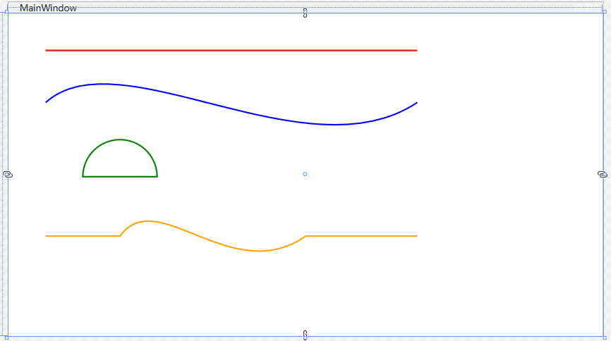
1.4 DoubleAnimation 基础动画
常与路径动画搭配实现复合动效:
| 核心属性 | 作用说明 |
|---|---|
From |
动画起始值(可选) |
To |
动画结束值(必选) |
Duration |
动画时长,格式 时:分:秒 |
RepeatBehavior |
重复行为,Forever 无限循环 |
AutoReverse |
是否反向播放 |
1.5 自绘制控件基础
Ellipse(椭圆/圆形)
xml
<!-- Ellipse 圆形控件 -->
<!-- Canvas.Left="50":距离画布左侧50像素(X轴坐标) -->
<!-- Canvas.Top="40":距离画布顶部40像素(Y轴坐标) -->
<!-- Width/Height="30":圆形宽度和高度均为30像素 -->
<!-- Fill="#E53935":内部填充颜色为红色 -->
<!-- Stroke="Black":边框颜色为黑色 -->
<!-- StrokeThickness="1":边框粗细为1像素 -->
<Ellipse Canvas.Left="50" Canvas.Top="40" Width="30" Height="30" Fill="#E53935" Stroke="Black" StrokeThickness="1"/>
Polygon(多边形)
xml
<!-- Polygon 多边形控件(三角形) -->
<!-- Canvas.Left="50":与圆形X轴对齐,距离左侧50像素 -->
<!-- Canvas.Top="120":距离顶部120像素,位于圆形下方 -->
<!-- Points="0,0 20,10 0,20":定义三个顶点坐标,连接成三角形 -->
<!-- Fill="#4CAF50":内部填充颜色为绿色 -->
<Polygon Canvas.Left="50" Canvas.Top="120"  Points="0,0 20,10 0,20" Fill="#4CAF50" Stroke="Black" StrokeThickness="1"/>
Path(路径)
xml
 <!-- Path 路径控件(矩形) -->
 <!-- Canvas.Left="50":与圆形、三角形X轴对齐,距离左侧50像素 -->
 <!-- Canvas.Top="200":距离顶部200像素,位于三角形下方 -->
 <!-- Data 路径语法:M=起点 L=画线 Z=闭合图形 -->
 <!-- Fill="#2196F3":内部填充颜色为蓝色 -->
 <Path Canvas.Left="50" Canvas.Top="200" Data="M 0,0 L 120,0 L 120,40 L 0,40 Z" Fill="#2196F3" Stroke="#1976D2" StrokeThickness="1"/>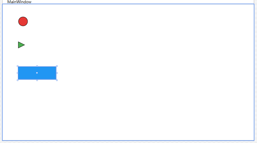
二、实战案例
项目结构
00025.WPF 路径动画完全指南:自绘制实战/
├── 1_常用路径示例/
├── 2_自绘制控件基础/
├── 3_实战1:直线 + 圆形动画/
├── 4_实战2:曲线 + 箭头动画/
├── 5_效果A:淡入 + 缩放/
├── 6_路径动画 + 淡入 + 缩放/
├── 7_场景1:自绘制按钮(悬浮动效)/
├── 8_自绘制进度条(流动效果)/
├── 9_自绘制窗口控制按钮/
实战1:直线 + 圆形动画(DoubleAnimationUsingPath)
目标: 红色圆形沿直线往返移动,无限循环。
MainWindow.xaml
xml
<Window x:Class="_3_实战1_直线___圆形动画.MainWindow"
        xmlns="http://schemas.microsoft.com/winfx/2006/xaml/presentation"
        xmlns:x="http://schemas.microsoft.com/winfx/2006/xaml"
        xmlns:d="http://schemas.microsoft.com/expression/blend/2008"
        xmlns:mc="http://schemas.openxmlformats.org/markup-compatibility/2006"
        xmlns:local="clr-namespace:_3_实战1_直线___圆形动画"
        mc:Ignorable="d"
        Title="MainWindow" Height="450" Width="800">

    <!-- 定义运动轨迹资源 -->
    <Window.Resources>
        <!-- 路径几何图形:用于动画的直线路径 -->
        <PathGeometry x:Key="LinePath" Figures="M 0,0 L 500,0"/>
    </Window.Resources>

    <!-- 画布布局容器 -->
    <Canvas Background="#F8F9FA">

        <!-- 路径轨迹线 -->
        <!-- Data:绘制直线路径坐标 -->
        <!-- Stroke:线条颜色蓝色 -->
        <!-- StrokeThickness:线条粗细2 -->
        <!-- StrokeDashArray:虚线样式 -->
        <Path Data="M 50,120 L 550,120"
              Stroke="Blue"
              StrokeThickness="2"
              StrokeDashArray="2,2"/>

        <!-- 圆形动画控件 -->
        <!-- Width:圆形宽度30 -->
        <!-- Height:圆形高度30 -->
        <!-- Canvas.Left:水平初始位置50 -->
        <!-- Canvas.Top:垂直居中对齐直线 -->
        <!-- Fill:填充红色 -->
        <!-- Stroke:边框黑色 -->
        <!-- StrokeThickness:边框粗细1 -->
        <Ellipse Width="30" Height="30"
                 Canvas.Left="35"
                 Canvas.Top="105"
                 Fill="#E53935"
                 Stroke="Black"
                 StrokeThickness="1">

            <!-- 渲染变换:设置位移变换 -->
            <Ellipse.RenderTransform>
                <TranslateTransform x:Name="BallTranslate"/>
            </Ellipse.RenderTransform>

            <!-- 动画触发器集合 -->
            <Ellipse.Triggers>
                <!-- 路由事件:窗体加载完成触发 -->
                <EventTrigger RoutedEvent="Loaded">
                    <BeginStoryboard>
                        <!-- 故事板:动画容器 -->
                        <!-- RepeatBehavior:永久循环 -->
                        <!-- AutoReverse:自动往返 -->
                        <Storyboard RepeatBehavior="Forever" AutoReverse="True">

                            <!-- X轴路径动画 -->
                            <!-- Storyboard.TargetName:目标元素 -->
                            <!-- Storyboard.TargetProperty:动画属性X -->
                            <!-- Source:数据源为X坐标 -->
                            <!-- PathGeometry:路径资源 -->
                            <!-- Duration:时长3秒 -->
                            <DoubleAnimationUsingPath
                                Storyboard.TargetName="BallTranslate"
                                Storyboard.TargetProperty="X"
                                Source="X"
                                PathGeometry="{StaticResource LinePath}"
                                Duration="0:0:3"/>

                            <!-- Y轴路径动画 -->
                            <!-- Storyboard.TargetName:目标元素 -->
                            <!-- Storyboard.TargetProperty:动画属性Y -->
                            <!-- Source:数据源为Y坐标 -->
                            <!-- PathGeometry:路径资源 -->
                            <!-- Duration:时长3秒 -->
                            <DoubleAnimationUsingPath
                                Storyboard.TargetName="BallTranslate"
                                Storyboard.TargetProperty="Y"
                                Source="Y"
                                PathGeometry="{StaticResource LinePath}"
                                Duration="0:0:3"/>
                        </Storyboard>
                    </BeginStoryboard>
                </EventTrigger>
            </Ellipse.Triggers>
        </Ellipse>
    </Canvas>
</Window>
MainWindow.xaml.cs
csharp
using System.Windows;

namespace WpfPathAnimationDemo.Views
{
    public partial class MainWindow : Window
    {
        public MainWindow()
        {
            InitializeComponent();
        }
    }
}
效果: 红色圆形沿蓝色虚线直线往返移动,3秒/轮,无限循环。

视频转gif https://tool.bugcome.com/media-tools/video-convert/mp4-to-gif
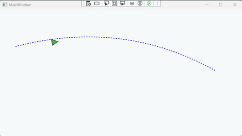
实战2:曲线 + 箭头动画(MatrixAnimationUsingPath)
目标: 绿色箭头沿贝塞尔曲线移动,自动随切线旋转。
MainWindow.xaml
xml
<Window x:Class="_4_实战2_曲线___箭头动画.MainWindow"
        xmlns="http://schemas.microsoft.com/winfx/2006/xaml/presentation"
        xmlns:x="http://schemas.microsoft.com/winfx/2006/xaml"
        xmlns:d="http://schemas.microsoft.com/expression/blend/2008"
        xmlns:mc="http://schemas.openxmlformats.org/markup-compatibility/2006"
        xmlns:local="clr-namespace:_4_实战2_曲线___箭头动画"
        mc:Ignorable="d"
        Title="MainWindow" Height="450" Width="800">

    <!-- 定义运动轨迹资源 -->
    <Window.Resources>
        <!-- 路径几何图形:用于动画的曲线路径(相对坐标) -->
        <PathGeometry x:Key="CurvePath" Figures="M 0,0 Q 350,-90 650,80"/>
    </Window.Resources>

    <!-- 画布布局容器 -->
    <Canvas Background="#F8F9FA">

        <!-- 路径轨迹线 -->
        <!-- Data:绘制曲线路径坐标 -->
        <!-- Stroke:线条颜色蓝色 -->
        <!-- StrokeThickness:线条粗细2 -->
        <!-- StrokeDashArray:虚线样式 -->
        <Path Data="M 50,120 Q 400,30 700,200"
              Stroke="Blue"
              StrokeThickness="2"
              StrokeDashArray="2,2"/>

        <!-- 箭头动画控件 -->
        <!-- Points:三角形箭头顶点坐标 -->
        <!-- Fill:填充绿色 -->
        <!-- Stroke:边框黑色 -->
        <!-- StrokeThickness:边框粗细1 -->
        <!-- Canvas.Left:水平初始位置50 -->
        <!-- Canvas.Top:垂直初始位置120 -->
        <!-- RenderTransformOrigin:旋转中心点(箭头左侧中心) -->
        <Polygon Points="0 0 20 10 0 20"
                 Fill="#4CAF50"
                 Stroke="Black"
                 StrokeThickness="1"
                 Canvas.Left="50"
                 Canvas.Top="120"
                 RenderTransformOrigin="0,0.5">

            <!-- 渲染变换:矩阵变换控制位置与旋转 -->
            <Polygon.RenderTransform>
                <MatrixTransform x:Name="ArrowMatrix"/>
            </Polygon.RenderTransform>

            <!-- 动画触发器集合 -->
            <Polygon.Triggers>
                <!-- 路由事件:窗体加载完成触发 -->
                <EventTrigger RoutedEvent="Loaded">
                    <BeginStoryboard>
                        <!-- 故事板:动画容器 -->
                        <!-- RepeatBehavior:永久循环 -->
                        <!-- AutoReverse:自动往返 -->
                        <!-- Duration:单次动画时长3秒 -->
                        <Storyboard RepeatBehavior="Forever" AutoReverse="True" Duration="0:0:3">

                            <!-- 曲线路径矩阵动画 -->
                            <!-- Storyboard.TargetName:目标元素 -->
                            <!-- Storyboard.TargetProperty:动画矩阵属性 -->
                            <!-- PathGeometry:路径资源 -->
                            <!-- DoesRotateWithTangent:随路径切线自动旋转 -->
                            <MatrixAnimationUsingPath
                                Storyboard.TargetName="ArrowMatrix"
                                Storyboard.TargetProperty="Matrix"
                                PathGeometry="{StaticResource CurvePath}"
                                DoesRotateWithTangent="True"/>

                        </Storyboard>
                    </BeginStoryboard>
                </EventTrigger>
            </Polygon.Triggers>
        </Polygon>

    </Canvas>
</Window>
效果: 绿色箭头沿曲线平滑移动,方向始终与路径切线一致,4秒/轮。
视频转gif https://tool.bugcome.com/media-tools/video-convert/mp4-to-gif
实战3:DoubleAnimation 复合动效
效果A:按钮 + 淡入 + 缩放
xml
<Window x:Class="WpfPathAnimationDemo.Views.MainWindow"
        xmlns="http://schemas.microsoft.com/winfx/2006/xaml/presentation"
        xmlns:x="http://schemas.microsoft.com/winfx/2006/xaml"
        Title="DoubleAnimation 基础实战" Height="400" Width="600">
    <Canvas Background="#F8F9FA">
        <Ellipse x:Name="AnimateBall"
                 Width="30" Height="30"
                 Fill="#2196F3"
                 Stroke="Black"
                 StrokeThickness="1"
                 Opacity="0"
                 Canvas.Left="300"
                 Canvas.Top="180">
            <Ellipse.RenderTransform>
                <ScaleTransform x:Name="BallScale" CenterX="15" CenterY="15"/>
            </Ellipse.RenderTransform>

            <Ellipse.Triggers>
                <EventTrigger RoutedEvent="Loaded">
                    <BeginStoryboard>
                        <Storyboard>
                            <!-- 淡入 -->
                            <DoubleAnimation
                                Storyboard.TargetName="AnimateBall"
                                Storyboard.TargetProperty="Opacity"
                                From="0" To="1"
                                Duration="0:0:0.5"/>

                            <!-- 缩放 -->
                            <DoubleAnimation
                                Storyboard.TargetName="BallScale"
                                Storyboard.TargetProperty="ScaleX"
                                From="0.5" To="1.2"
                                Duration="0:0:0.5"/>
                            <DoubleAnimation
                                Storyboard.TargetName="BallScale"
                                Storyboard.TargetProperty="ScaleY"
                                From="0.5" To="1.2"
                                Duration="0:0:0.5"/>
                        </Storyboard>
                    </BeginStoryboard>
                </EventTrigger>
            </Ellipse.Triggers>
        </Ellipse>
    </Canvas>
</Window>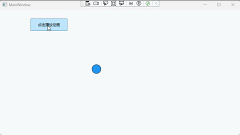
视频转gif https://tool.bugcome.com/media-tools/video-convert/mp4-to-gif
效果B:路径动画 + 淡入 + 缩放 + 位置对齐 + 完整注释 + 按钮控制
xml
<Window x:Class="_6_路径动画___淡入___缩放.MainWindow"
        xmlns="http://schemas.microsoft.com/winfx/2006/xaml/presentation"
        xmlns:x="http://schemas.microsoft.com/winfx/2006/xaml"
        xmlns:d="http://schemas.microsoft.com/expression/blend/2008"
        xmlns:mc="http://schemas.openxmlformats.org/markup-compatibility/2006"
        xmlns:local="clr-namespace:_6_路径动画___淡入___缩放"
        mc:Ignorable="d"
        Title="MainWindow" Height="450" Width="800">

    <!-- 定义运动轨迹资源 -->
    <Window.Resources>
        <!-- 路径几何图形:相对路径(从0,0开始,确保位置不偏移) -->
        <PathGeometry x:Key="LinePath" Figures="M 0,0 L 400,0"/>

        <!-- 定义复合动画故事板 -->
        <Storyboard x:Key="CombineAnimation">
            <!-- 路径动画:沿直线X轴移动 -->
            <DoubleAnimationUsingPath
                Storyboard.TargetName="CombineTranslate"
                Storyboard.TargetProperty="X"
                Source="X"
                PathGeometry="{StaticResource LinePath}"
                Duration="0:0:3"
                RepeatBehavior="Forever"
                AutoReverse="True"/>

            <!-- 淡入动画:透明度从0到1 -->
            <DoubleAnimation
                Storyboard.TargetName="CombineBall"
                Storyboard.TargetProperty="Opacity"
                From="0" To="1"
                Duration="0:0:3"/>

            <!-- X轴缩放动画:从0.8倍到1.2倍 -->
            <DoubleAnimation
                Storyboard.TargetName="CombineScale"
                Storyboard.TargetProperty="ScaleX"
                From="0.8" To="1.2"
                Duration="0:0:3"
                RepeatBehavior="Forever"
                AutoReverse="True"/>

            <!-- Y轴缩放动画:从0.8倍到1.2倍 -->
            <DoubleAnimation
                Storyboard.TargetName="CombineScale"
                Storyboard.TargetProperty="ScaleY"
                From="0.8" To="1.2"
                Duration="0:0:3"
                RepeatBehavior="Forever"
                AutoReverse="True"/>
        </Storyboard>
    </Window.Resources>

    <!-- 画布布局容器 -->
    <Canvas Background="#F8F9FA">

        <!-- 控制按钮 -->
        <!-- Content:按钮显示文字 -->
        <!-- Width:按钮宽度120 -->
        <!-- Height:按钮高度40 -->
        <!-- Canvas.Left:按钮水平位置100 -->
        <!-- Canvas.Top:按钮垂直位置30 -->
        <Button x:Name="ToggleBtn"
                Content="启动动画"
                Width="120"
                Height="40"
                Canvas.Left="100"
                Canvas.Top="30"
                Click="ToggleBtn_Click"/>

        <!-- 路径轨迹线 -->
        <!-- Data:绘制直线路径坐标 -->
        <!-- Stroke:线条颜色蓝色 -->
        <!-- StrokeThickness:线条粗细2 -->
        <!-- StrokeDashArray:虚线样式 -->
        <Path Data="M 50,180 L 550,180"
              Stroke="Blue"
              StrokeThickness="2"
              StrokeDashArray="2,2"/>

        <!-- 复合动画圆形 -->
        <!-- Width:圆形宽度30 -->
        <!-- Height:圆形高度30 -->
        <!-- Fill:填充橙色 -->
        <!-- Stroke:边框黑色 -->
        <!-- StrokeThickness:边框粗细1 -->
        <!-- Opacity:初始透明度0 -->
        <Ellipse x:Name="CombineBall"
                 Width="30" Height="30"
                 Fill="#FF9800"
                 Stroke="Black"
                 StrokeThickness="1"
                 Opacity="0"
                 Canvas.Left="50"
                 Canvas.Top="180">

            <!-- 渲染变换:组合变换(位移+缩放) -->
            <Ellipse.RenderTransform>
                <TransformGroup>
                    <!-- 位移变换:控制水平移动 -->
                    <TranslateTransform x:Name="CombineTranslate"/>
                    <!-- 缩放变换:控制大小缩放 -->
                    <ScaleTransform x:Name="CombineScale" CenterX="15" CenterY="15"/>
                </TransformGroup>
            </Ellipse.RenderTransform>
        </Ellipse>
    </Canvas>
</Window>
视频转gif https://tool.bugcome.com/media-tools/video-convert/mp4-to-gif
三、进阶实战
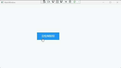
场景1:自绘制按钮(悬浮动效)
目标: 鼠标悬浮时沿微小曲线微动 + 放大 + 颜色加深。
xml
<Window x:Class="_7_场景1_自绘制按钮_悬浮动效_.MainWindow"
        xmlns="http://schemas.microsoft.com/winfx/2006/xaml/presentation"
        xmlns:x="http://schemas.microsoft.com/winfx/2006/xaml"
        xmlns:d="http://schemas.microsoft.com/expression/blend/2008"
        xmlns:mc="http://schemas.openxmlformats.org/markup-compatibility/2006"
        xmlns:local="clr-namespace:_7_场景1_自绘制按钮_悬浮动效_"
        mc:Ignorable="d"
        Title="MainWindow" Height="450" Width="800">

    <!-- 画布布局容器 -->
    <Canvas Background="#F8F9FA">

        <!-- 按钮整体容器:文字 + 按钮一起缩放 -->
        <!-- Canvas.Left:容器水平位置 240 -->
        <!-- Canvas.Top:容器垂直位置 180 -->
        <!-- 绑定鼠标事件:移入、移出、点击 -->
        <Canvas x:Name="ButtonCanvas"
                Canvas.Left="240"
                Canvas.Top="180"
                MouseEnter="ButtonCanvas_MouseEnter"
                MouseLeave="ButtonCanvas_MouseLeave"
                MouseLeftButtonDown="ButtonCanvas_MouseLeftButtonDown"
                Cursor="Hand">

            <!-- 渲染变换:缩放控制 -->
            <Canvas.RenderTransform>
                <!-- 从正中心放大 -->
                <ScaleTransform x:Name="ButtonScale"
                                ScaleX="1"
                                ScaleY="1"/>
            </Canvas.RenderTransform>

            <!-- 变换中心点:0.5,0.5 为中心缩放 -->
            <Canvas.RenderTransformOrigin>
                <Point>0.5,0.5</Point>
            </Canvas.RenderTransformOrigin>

            <!-- 按钮形状:矩形按钮 -->
            <!-- Width:按钮宽度 120 -->
            <!-- Height:按钮高度 40 -->
            <!-- Fill:按钮填充颜色 -->
            <!-- Stroke:按钮边框颜色 -->
            <Path Width="120" Height="40"
                  Data="M0,0 L120,0 L120,40 L0,40 Z"
                  Fill="#2196F3"
                  Stroke="#1976D2"
                  StrokeThickness="1"/>

            <!-- 按钮文字 -->
            <!-- Canvas.Left:文字距离左侧 25 -->
            <!-- Canvas.Top:文字距离顶部 10 -->
            <!-- IsHitTestVisible:不接收鼠标事件 -->
            <TextBlock Text="自绘制按钮"
                       Canvas.Left="25"
                       Canvas.Top="10"
                       FontSize="14"
                       Foreground="White"
                       FontWeight="Medium"
                       IsHitTestVisible="False"/>
        </Canvas>
    </Canvas>
</Window>
csharp
using System.Windows;
using System.Windows.Input;
using System.Windows.Media;
using System.Windows.Media.Animation;

namespace _7_场景1_自绘制按钮_悬浮动效_
{
    /// <summary>
    /// 自绘制按钮 + 中心悬浮放大动效
    /// </summary>
    public partial class MainWindow : Window
    {
        public MainWindow()
        {
            InitializeComponent(); // 初始化界面
        }

        // 鼠标进入:从中心放大 1.2 倍
        private void ButtonCanvas_MouseEnter(object sender, MouseEventArgs e)
        {
            // 创建缩放动画
            DoubleAnimation scale = new DoubleAnimation
            {
                To = 1.2,                      // 目标放大到 1.2 倍
                Duration = TimeSpan.FromSeconds(0.2) // 动画时长 0.2 秒
            };

            // 执行 X 轴缩放
            ButtonScale.BeginAnimation(ScaleTransform.ScaleXProperty, scale);
            // 执行 Y 轴缩放
            ButtonScale.BeginAnimation(ScaleTransform.ScaleYProperty, scale);
        }

        // 鼠标离开:恢复原始大小
        private void ButtonCanvas_MouseLeave(object sender, MouseEventArgs e)
        {
            // 创建复位动画
            DoubleAnimation scale = new DoubleAnimation
            {
                To = 1,                        // 恢复到 1 倍原始大小
                Duration = TimeSpan.FromSeconds(0.2)
            };

            // X 轴复位
            ButtonScale.BeginAnimation(ScaleTransform.ScaleXProperty, scale);
            // Y 轴复位
            ButtonScale.BeginAnimation(ScaleTransform.ScaleYProperty, scale);
        }

        // 鼠标点击事件:弹出提示
        private void ButtonCanvas_MouseLeftButtonDown(object sender, MouseButtonEventArgs e)
        {
            MessageBox.Show("自绘制按钮被点击!", "提示");
        }
    }
}
视频转gif https://tool.bugcome.com/media-tools/video-convert/mp4-to-gif
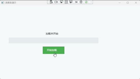
场景2:自绘制进度条(流动效果)
xml
<Window x:Class="_8_自绘制进度条_流动效果_.MainWindow"
        xmlns="http://schemas.microsoft.com/winfx/2006/xaml/presentation"
        xmlns:x="http://schemas.microsoft.com/winfx/2006/xaml"
        xmlns:d="http://schemas.microsoft.com/expression/blend/2008"
        xmlns:mc="http://schemas.openxmlformats.org/markup-compatibility/2006"
        xmlns:local="clr-namespace:_8_自绘制进度条_流动效果_"
        mc:Ignorable="d"
        Title="进度条演示" Height="450" Width="800">

    <!-- 窗口资源:定义进度条背景路径 -->
    <Window.Resources>
        <PathGeometry x:Key="ProgressBgPath"
                      Figures="M 50,180 L 550,180 L 550,210 L 50,210 Z"/>
    </Window.Resources>

    <!-- 主画布:页面布局容器 -->
    <Canvas Background="#F8F9FA">

        <!-- 进度条背景 -->
        <!-- Data:背景形状路径(引用Window.Resources中的ProgressBgPath) -->
        <!-- Fill:背景填充色 -->
        <!-- Stroke:边框颜色 -->
        <!-- StrokeThickness:边框粗细 -->
        <Path Data="{StaticResource ProgressBgPath}"
              Fill="#E9ECEF"
              Stroke="#DEE2E6"
              StrokeThickness="1"/>

        <!-- 流动进度条(蓝色加载条) -->
        <!-- x:Name:后台代码通过此名称访问该元素 -->
        <!-- Fill:填充色(蓝色) -->
        <!-- Stroke:边框颜色(深蓝色) -->
        <!-- StrokeThickness:边框粗细 -->
        <!-- 初始不设置Data,默认完全隐藏,无任何蓝色 -->
        <Path x:Name="FlowPath"
              Fill="#2196F3"
              Stroke="#1976D2"
              StrokeThickness="1"/>

        <!-- 进度显示文本 -->
        <!-- x:Name:后台代码通过此名称更新文字 -->
        <!-- Text:初始显示文字 -->
        <!-- Canvas.Left:水平位置 -->
        <!-- Canvas.Top:垂直位置 -->
        <!-- FontSize:文字大小 -->
        <!-- Foreground:文字颜色 -->
        <TextBlock x:Name="ProgressText"
                   Text="加载未开始"
                   Canvas.Left="256"
                   Canvas.Top="148"
                   FontSize="14"
                   Foreground="#333"/>

        <!-- 按钮整体容器 -->
        <!-- Canvas.Left:容器水平位置 -->
        <!-- Canvas.Top:容器垂直位置 -->
        <Canvas Canvas.Left="240" Canvas.Top="230">

            <!-- 按钮形状 -->
            <!-- x:Name:后台代码通过此名称绑定点击事件 -->
            <!-- Data:按钮绘制路径(120x40的矩形) -->
            <!-- Fill:填充色(绿色) -->
            <!-- Stroke:边框色(深绿色) -->
            <!-- StrokeThickness:边框粗细 -->
            <!-- Cursor:鼠标悬浮样式(手型) -->
            <Path x:Name="ControlBtn"
                  Data="M 0,0 L 120,0 L 120,40 L 0,40 Z"
                  Fill="#4CAF50"
                  Stroke="#388E3C"
                  StrokeThickness="1"
                  Cursor="Hand"/>

            <!-- 按钮文字 -->
            <!-- Text:文字内容 -->
            <!-- Canvas.Left:文字左侧偏移 -->
            <!-- Canvas.Top:文字顶部偏移 -->
            <!-- FontSize:文字字号 -->
            <!-- Foreground:文字颜色 -->
            <!-- FontWeight:文字粗细 -->
            <!-- IsHitTestVisible:不接收鼠标事件(让点击穿透到下方的Path按钮) -->
            <TextBlock Text="开始加载"
                       Canvas.Left="22"
                       Canvas.Top="10"
                       FontSize="14"
                       Foreground="White"
                       FontWeight="Medium"
                       IsHitTestVisible="False"/>
        </Canvas>
    </Canvas>
</Window>
csharp
using System.Windows;
using System.Windows.Media;
using System.Windows.Threading;

namespace _8_自绘制进度条_流动效果_
{
    /// <summary>
    /// 自绘制进度条 - 3秒从0%到100%
    /// </summary>
    public partial class MainWindow : Window
    {
        // ==================== 常量配置 ====================
        private const double TotalLength = 500;     // 进度条总长度(像素)
        private const double TotalSeconds = 3.0;    // 总时长(秒)
        private const double IntervalMs = 16;       // 定时器间隔 ~60fps

        // ==================== 状态变量 ====================
        private DispatcherTimer _timer;     // 动画定时器
        private DateTime _startTime;        // 开始时间,用于精确计算进度
        private bool _isRunning = false;    // 防止重复点击

        public MainWindow()
        {
            InitializeComponent();

            // 初始状态:隐藏进度条
            FlowPath.Visibility = Visibility.Hidden;

            // 创建定时器
            _timer = new DispatcherTimer();
            _timer.Interval = TimeSpan.FromMilliseconds(IntervalMs);
            _timer.Tick += Timer_Tick;

            // 绑定按钮点击事件
            ControlBtn.MouseLeftButtonDown += (s, e) => StartLoad();
        }

        /// <summary>
        /// 开始加载动画
        /// </summary>
        private void StartLoad()
        {
            // 防止动画过程中重复点击
            if (_isRunning) return;

            _isRunning = true;
            _startTime = DateTime.Now;      // 记录开始时间

            // 显示进度条并重置为0
            FlowPath.Visibility = Visibility.Visible;
            UpdatePath(0);

            // 启动定时器
            _timer.Start();
        }

        /// <summary>
        /// 定时器回调 - 每16ms执行一次
        /// </summary>
        private void Timer_Tick(object sender, EventArgs e)
        {
            // 计算实际经过的秒数(基于真实时间,避免累积误差)
            double elapsed = (DateTime.Now - _startTime).TotalSeconds;

            // 计算进度比例 (0.0 ~ 1.0)
            double progress = elapsed / TotalSeconds;

            if (progress >= 1.0)
            {
                // ========== 动画完成 ==========
                _timer.Stop();
                _isRunning = false;

                ProgressText.Text = "加载完成!100%";
                UpdatePath(TotalLength);    // 确保填满500像素
            }
            else
            {
                // ========== 动画进行中 ==========
                double currentLength = progress * TotalLength;

                // 显示百分比,保留1位小数
                ProgressText.Text = $"加载中... {progress * 100:F1}%";

                UpdatePath(currentLength);
            }
        }

        /// <summary>
        /// 更新进度条路径
        /// </summary>
        /// <param name="length">当前进度长度(像素)</param>
        private void UpdatePath(double length)
        {
            // M:移动到起点
            // L:画直线到终点
            // Z:闭合路径
            double endX = 50 + length;
            string data = $"M 50,180 L {endX},180 L {endX},210 L 50,210 Z";
            FlowPath.Data = Geometry.Parse(data);
        }
    }
}
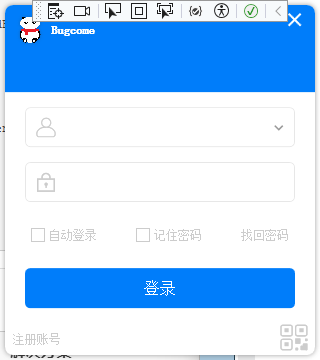
场景3:自绘制窗口控制按钮
xml
<Window x:Class="_9_自绘制窗口控制按钮.MainWindow"
xmlns="http://schemas.microsoft.com/winfx/2006/xaml/presentation"
xmlns:x="http://schemas.microsoft.com/winfx/2006/xaml"
Title="登录" Height="360" Width="320"
FontFamily="宋体" FontWeight="ExtraLight"
WindowStartupLocation="CenterScreen"
WindowStyle="None"
Icon="/Assets/Images/logo.png"
ShowInTaskbar="False"
AllowsTransparency="True" Background="{x:Null}"
Name="loginView">
<Window.Resources>
<!-- 最小化按钮 -->
<ControlTemplate x:Key="MinimizedButtonTemplate" TargetType="Button">
<Border Background="Transparent" Name="backMinimized" Width="30" Height="30">
<Path Data="M0 0 12 0" Stroke="White" StrokeThickness="2" VerticalAlignment="Center" HorizontalAlignment="Center"/>
</Border>
<ControlTemplate.Triggers>
<Trigger Property="IsMouseOver" Value="True">
<Setter TargetName="backMinimized" Property="Background" Value="#22FFFFFF"/>
</Trigger>
<Trigger Property="IsPressed" Value="True">
<Setter TargetName="backMinimized" Property="Background" Value="#44FFFFFF"/>
</Trigger>
</ControlTemplate.Triggers>
</ControlTemplate>
<!-- 关闭按钮 -->
<ControlTemplate x:Key="CloseButtonTemplate" TargetType="Button">
<Border Background="Transparent" Name="backClose" Width="30" Height="30">
<Path Data="M0 0 12 12M0 12 12 0" Stroke="White" StrokeThickness="2" VerticalAlignment="Center" HorizontalAlignment="Center"/>
</Border>
<ControlTemplate.Triggers>
<Trigger Property="IsMouseOver" Value="True">
<Setter TargetName="backClose" Property="Background" Value="#EE4863"/>
<Setter TargetName="backClose" Property="CornerRadius" Value="0,8,0,0"/>
</Trigger>
<Trigger Property="IsPressed" Value="True">
<Setter TargetName="backClose" Property="Background" Value="#EF1A48"/>
<Setter TargetName="backClose" Property="CornerRadius" Value="0,8,0,0"/>
</Trigger>
</ControlTemplate.Triggers>
</ControlTemplate>
<!-- 找回密码 -->
<ControlTemplate x:Key="ForgotPasswordButtonTemplate" TargetType="Button">
<Border Background="Transparent">
<TextBlock Text="找回密码" FontSize="12" Foreground="#CCC" Name="backForgotPassword"/>
</Border>
<ControlTemplate.Triggers>
<Trigger Property="IsMouseOver" Value="True">
<Setter TargetName="backForgotPassword" Property="Foreground" Value="Black"/>
</Trigger>
<Trigger Property="IsPressed" Value="True">
<Setter TargetName="backForgotPassword" Property="Foreground" Value="#00B3F6"/>
</Trigger>
</ControlTemplate.Triggers>
</ControlTemplate>
<!-- 注册账号 -->
<ControlTemplate x:Key="RegisterButtonTemplate" TargetType="Button">
<Border Background="Transparent">
<TextBlock Text="注册账号" FontSize="12" VerticalAlignment="Center" HorizontalAlignment="Center" Margin="8" Foreground="#CCC" Name="backRegister"/>
</Border>
<ControlTemplate.Triggers>
<Trigger Property="IsMouseOver" Value="True">
<Setter TargetName="backRegister" Property="Foreground" Value="Black"/>
</Trigger>
<Trigger Property="IsPressed" Value="True">
<Setter TargetName="backRegister" Property="Foreground" Value="#00B3F6"/>
</Trigger>
</ControlTemplate.Triggers>
</ControlTemplate>
<!-- 二维码 -->
<ControlTemplate x:Key="QRcodeButtonTemplate" TargetType="Button">
<Border Background="Transparent">
<TextBlock Text="" Foreground="#CCC" FontSize="30" FontFamily="/Assets/Fonts/#iconfont" Margin="0,0,6,-2" Name="backQRcode"/>
</Border>
<ControlTemplate.Triggers>
<Trigger Property="IsMouseOver" Value="True">
<Setter TargetName="backQRcode" Property="Foreground" Value="Black"/>
</Trigger>
<Trigger Property="IsPressed" Value="True">
<Setter TargetName="backQRcode" Property="Foreground" Value="#00B3F6"/>
</Trigger>
</ControlTemplate.Triggers>
</ControlTemplate>
<!-- 登录按钮 -->
<ControlTemplate x:Key="LoginButtonTemplate" TargetType="Button">
<Border Background="#007DFA" CornerRadius="5" Height="40">
<Grid>
<Border CornerRadius="4" Background="#22FFFFFF" x:Name="backLogin" Visibility="Hidden"/>
<ContentControl Content="{TemplateBinding Content}" VerticalAlignment="Center" HorizontalAlignment="Center"/>
</Grid>
</Border>
<ControlTemplate.Triggers>
<Trigger Property="IsMouseOver" Value="True">
<Setter TargetName="backLogin" Property="Visibility" Value="Visible"/>
</Trigger>
</ControlTemplate.Triggers>
</ControlTemplate>
<!-- 账号输入框样式(ComboBox 修复下拉没内容) -->
<ControlTemplate x:Key="AccountComboBoxTemplate" TargetType="ComboBox">
<Grid>
<Border Background="White" BorderBrush="#E7E7E7" BorderThickness="1" CornerRadius="5" Height="40">
<Grid>
<Grid.ColumnDefinitions>
<ColumnDefinition Width="40"/>
<ColumnDefinition/>
<ColumnDefinition Width="30"/>
</Grid.ColumnDefinitions>
<!-- 图标 -->
<TextBlock Text="" FontFamily="/Assets/Fonts/#iconfont" FontSize="20"
Foreground="#CCC" VerticalAlignment="Center" HorizontalAlignment="Center"/>
<!-- 输入区域 -->
<TextBox x:Name="PART_EditableTextBox" Grid.Column="1" BorderThickness="0"
Background="Transparent" VerticalAlignment="Center" FontSize="14"
Padding="0" Margin="0" CaretBrush="#555"/>
<!-- 下拉箭头 -->
<ToggleButton Grid.Column="2" Width="30" Height="30"
IsChecked="{Binding IsDropDownOpen, Mode=TwoWay, RelativeSource={RelativeSource TemplatedParent}}"
ClickMode="Press" Focusable="False">
<ToggleButton.Template>
<ControlTemplate TargetType="ToggleButton">
<Border Background="Transparent">
<Path Data="M0 0 4 4 8 0" Stroke="#999" StrokeThickness="1.5"
VerticalAlignment="Center" HorizontalAlignment="Center" Margin="0,2,0,0"/>
</Border>
</ControlTemplate>
</ToggleButton.Template>
</ToggleButton>
</Grid>
</Border>
<!-- 下拉面板 修复空白无内容 -->
<Popup IsOpen="{TemplateBinding IsDropDownOpen}" Placement="Bottom"
Width="{TemplateBinding ActualWidth}" StaysOpen="False">
<Border Background="White" BorderBrush="#E7E7E7" BorderThickness="1" CornerRadius="0,0,5,5"
MaxHeight="150" Margin="0,-1,0,0">
<ScrollViewer VerticalScrollBarVisibility="Auto">
<!-- 关键:用ItemsPresenter自带默认项模板,不会空白 -->
<ItemsPresenter />
</ScrollViewer>
</Border>
</Popup>
</Grid>
</ControlTemplate>
<!-- PasswordBox 样式 -->
<SolidColorBrush x:Key="TextBox.Focus.Border1" Color="#FF569DE5"/>
<Style x:Key="PasswordBoxStyle" TargetType="{x:Type PasswordBox}">
<Setter Property="PasswordChar" Value="●"/>
<Setter Property="Background" Value="White"/>
<Setter Property="BorderBrush" Value="#E7E7E7"/>
<Setter Property="Foreground" Value="#555"/>
<Setter Property="BorderThickness" Value="1"/>
<Setter Property="FontSize" Value="14"/>
<Setter Property="Height" Value="40"/>
<Setter Property="Template">
<Setter.Value>
<ControlTemplate TargetType="{x:Type PasswordBox}">
<Border x:Name="border" Background="{TemplateBinding Background}"
BorderBrush="{TemplateBinding BorderBrush}"
BorderThickness="{TemplateBinding BorderThickness}"
SnapsToDevicePixels="True" CornerRadius="5" Height="40">
<Grid>
<Grid.ColumnDefinitions>
<ColumnDefinition Width="40"/>
<ColumnDefinition/>
<ColumnDefinition Width="30"/>
</Grid.ColumnDefinitions>
<TextBlock Text="" Foreground="#CCC" FontSize="20"
FontFamily="/Assets/Fonts/#iconfont" VerticalAlignment="Center" HorizontalAlignment="Center"/>
<ScrollViewer x:Name="PART_ContentHost" Grid.Column="1"
Focusable="false"
HorizontalScrollBarVisibility="Hidden"
VerticalScrollBarVisibility="Hidden"
VerticalAlignment="Center"/>
</Grid>
</Border>
<ControlTemplate.Triggers>
<Trigger Property="IsMouseOver" Value="true">
<Setter Property="BorderBrush" TargetName="border" Value="#959595"/>
</Trigger>
<Trigger Property="IsKeyboardFocused" Value="true">
<Setter Property="BorderBrush" TargetName="border" Value="{StaticResource TextBox.Focus.Border1}"/>
</Trigger>
</ControlTemplate.Triggers>
</ControlTemplate>
</Setter.Value>
</Setter>
</Style>
<!-- 复选框样式 -->
<SolidColorBrush x:Key="OptionMark.Static.Glyph" Color="#00B5FC"/>
<Style x:Key="CheckBoxStyle" TargetType="{x:Type CheckBox}">
<Setter Property="Foreground" Value="#CCC"/>
<Setter Property="FontSize" Value="12"/>
<Setter Property="Template">
<Setter.Value>
<ControlTemplate TargetType="{x:Type CheckBox}">
<Grid Background="Transparent" SnapsToDevicePixels="True">
<Grid.ColumnDefinitions>
<ColumnDefinition Width="Auto"/>
<ColumnDefinition Width="*"/>
</Grid.ColumnDefinitions>
<Border x:Name="checkBoxBorder" Background="White" BorderBrush="#CCC" BorderThickness="1"
HorizontalAlignment="Center" Margin="0,0,4,0" VerticalAlignment="Center" Width="14" Height="14">
<Grid>
<Path x:Name="optionMark" Data="M 2 7 L 5 10 L 10 3"
Stroke="{StaticResource OptionMark.Static.Glyph}" StrokeThickness="2"
Margin="1" Opacity="0" Stretch="None" StrokeStartLineCap="Round" StrokeEndLineCap="Round"/>
</Grid>
</Border>
<ContentPresenter x:Name="contentPresenter" Grid.Column="1" Focusable="False"
VerticalAlignment="Center"/>
</Grid>
<ControlTemplate.Triggers>
<Trigger Property="IsMouseOver" Value="true">
<Setter TargetName="checkBoxBorder" Property="BorderBrush" Value="#FF5593FF"/>
</Trigger>
<Trigger Property="IsChecked" Value="true">
<Setter TargetName="optionMark" Property="Opacity" Value="1"/>
</Trigger>
</ControlTemplate.Triggers>
</ControlTemplate>
</Setter.Value>
</Setter>
</Style>
</Window.Resources>
<Border Margin="5" Background="White" CornerRadius="8">
<Border.Effect>
<DropShadowEffect Color="Gray" ShadowDepth="0" BlurRadius="8" Opacity="0.5" Direction="0"/>
</Border.Effect>
<Grid MouseLeftButtonDown="Grid_MouseLeftButtonDown">
<Grid.RowDefinitions>
<RowDefinition Height="1.2*"/>
<RowDefinition Height="3*"/>
<RowDefinition Height="45"/>
</Grid.RowDefinitions>
<!-- 顶部蓝色栏 -->
<Border Background="#007DFA" CornerRadius="8,8,0,0"/>
<!-- 窗口控制按钮 绑定点击事件 -->
<Button Click="BtnMinimize_Click" VerticalAlignment="Top" HorizontalAlignment="Right" Width="30" Height="30"
Margin="0,0,35,0" Template="{StaticResource MinimizedButtonTemplate}"/>
<Button Click="BtnClose_Click" VerticalAlignment="Top" HorizontalAlignment="Right" Width="30" Height="30"
Margin="0,0,5,0" Template="{StaticResource CloseButtonTemplate}"/>
<!-- Logo与标题 原样保留 -->
<StackPanel Orientation="Horizontal" VerticalAlignment="Top" HorizontalAlignment="Left">
<Border Width="30" Height="30" Margin="10,10,6,10">
<Border.Effect>
<DropShadowEffect Color="Gray" ShadowDepth="0" BlurRadius="5" Opacity="0.3" Direction="0"/>
</Border.Effect>
<Border.Background>
<ImageBrush ImageSource="/Assets/Images/logo.png"/>
</Border.Background>
</Border>
<TextBlock Text="Bugcome" HorizontalAlignment="Center" Foreground="White"
VerticalAlignment="Center" FontSize="12" FontWeight="Black"/>
</StackPanel>
<!-- 表单区域 -->
<Grid Grid.Row="1" Margin="20,15,20,0">
<Grid.RowDefinitions>
<RowDefinition Height="40"/>
<RowDefinition Height="15"/>
<RowDefinition Height="40"/>
<RowDefinition Height="20"/>
<RowDefinition Height="26"/>
<RowDefinition Height="20"/>
<RowDefinition Height="40"/>
<RowDefinition Height="22"/>
</Grid.RowDefinitions>
<!-- 账号输入框 -->
<ComboBox x:Name="cboAccount" Template="{StaticResource AccountComboBoxTemplate}"
IsEditable="True" Height="40" VerticalAlignment="Center"
FontSize="14" Foreground="#555"/>
<!-- 密码输入框 -->
<PasswordBox Style="{StaticResource PasswordBoxStyle}" Grid.Row="2"
VerticalAlignment="Center" HorizontalAlignment="Stretch"/>
<!-- 选项栏 -->
<StackPanel Grid.Row="4" Orientation="Horizontal" HorizontalAlignment="Center" VerticalAlignment="Center">
<CheckBox Style="{StaticResource CheckBoxStyle}" Content="自动登录" Width="95"/>
<CheckBox Style="{StaticResource CheckBoxStyle}" Content="记住密码" Width="95" Margin="10,0"/>
<Button Template="{StaticResource ForgotPasswordButtonTemplate}" VerticalAlignment="Center"/>
</StackPanel>
<!-- 登录按钮 -->
<Button Content="登录" Grid.Row="6" Height="40"
Template="{StaticResource LoginButtonTemplate}"
Foreground="White" FontSize="16" IsDefault="True"/>
<!-- 错误提示 -->
<TextBlock Foreground="Red" LineHeight="22" Grid.Row="7"
VerticalAlignment="Center" HorizontalAlignment="Center"
TextWrapping="Wrap" Text=""/>
</Grid>
<!-- 底部栏 -->
<Grid Grid.Row="2">
<UniformGrid Columns="2">
<Button VerticalAlignment="Bottom" HorizontalAlignment="Left" Height="32"
Template="{StaticResource RegisterButtonTemplate}" Name="register"/>
<Button VerticalAlignment="Bottom" HorizontalAlignment="Right" Height="32"
Template="{StaticResource QRcodeButtonTemplate}" Name="QRcode"/>
</UniformGrid>
</Grid>
</Grid>
</Border>
</Window>
csharp
using System;
using System.Windows;
using System.Windows.Input;

namespace _9_自绘制窗口控制按钮
{
    public partial class MainWindow : Window
    {
        public MainWindow()
        {
            InitializeComponent();

            // 给下拉框加测试数据,立马能看到下拉有内容
            cboAccount.Items.Add("admin");
            cboAccount.Items.Add("user123");
            cboAccount.Items.Add("test001");
        }

        private void Grid_MouseLeftButtonDown(object sender, MouseButtonEventArgs e)
        {
            if (e.LeftButton == MouseButtonState.Pressed)
            {
                this.DragMove();
            }
        }

        private void BtnMinimize_Click(object sender, RoutedEventArgs e)
        {
            this.WindowState = WindowState.Minimized;
        }

        private void BtnClose_Click(object sender, RoutedEventArgs e)
        {
            this.Close();
        }
    }
}
四、避坑指南
| 问题 | 原因 | 解决方案 |
|---|---|---|
| 动画不生效,提示找不到目标 | x:Name 未设置或拼写错误 |
检查 TargetName 与 x:Name 完全一致(区分大小写) |
| 路径动画偏移、不贴合轨迹 | 起点与元素初始位置不匹配 | 确保元素位置与 PathGeometry 起点一致 |
| 自绘制元素无填充/边框 | 未设置 Fill/Stroke |
明确设置 Fill、Stroke、StrokeThickness |
FindName 返回 null |
调用时机过早或元素未命名 | 在 Loaded 事件中调用,确保元素已加载 |
| 动画卡顿 | 时长设置不合理或路径过于复杂 | 微动效 0.2-0.3 秒,简化路径节点 |
五、总结
-
核心逻辑: 自绘制控件(Path/Polygon/Ellipse)是基础,
PathGeometry是轨迹蓝图,三大路径动画类是核心工具。 -
实战重点: 掌握"自绘制元素绘制 → 动画绑定 → 功能联动"的完整流程。
-
关键技巧:
- 熟记路径语法(M、L、C、A、Z)
- 动画绑定注意
x:Name正确性 - 复合动效协调动画时长和变换中心
- 自绘制样式完全自由定制
👋 关注我!持续分享 C# 实战技巧、代码示例 & 技术干货
- 获取示例代码,轻松上手!
- 私信输入数字: g843
- 获取代码下载链接
六、英文单词汉译对照表
文章有很多陌生单词,我先列举出来,可以分页对照!
| 英文 | 中文翻译 | 英文 | 中文翻译 | 英文 | 中文翻译 |
|---|---|---|---|---|---|
| PathGeometry | 路径几何 | UI | 用户界面 | DoubleAnimation | 双精度动画 |
| Path | 路径 | Polygon | 多边形 | Ellipse | 椭圆 |
| Rectangle | 矩形 | DoubleAnimationUsingPath | 路径双精度动画 | PointAnimationUsingPath | 路径点动画 |
| MatrixAnimationUsingPath | 路径矩阵动画 | DoesRotateWithTangent | 随切线旋转 | From | 起始值 |
| To | 目标值 | Duration | 持续时间 | RepeatBehavior | 重复行为 |
| Forever | 永远 | AutoReverse | 自动反向 | Figures | 图形集 |
| StartPoint | 起点 | LineSegment | 线段 | ArcPath | 圆弧路径 |
| CompositePath | 复合路径 | CurvePath | 曲线路径 | LinePath | 直线路径 |
| Background | 背景 | Canvas | 画布 | RenderTransform | 渲染变换 |
| TranslateTransform | 平移变换 | transX | X轴平移 | transY | Y轴平移 |
| Storyboard | 故事板 | BeginStoryboard | 开始故事板 | EventTrigger | 事件触发器 |
| Loaded | 已加载 | Animation | 动画 | MatrixTransform | 矩阵变换 |
| ArrowMatrix | 箭头矩阵 | ScaleTransform | 缩放变换 | BallScale | 球缩放变换 |
| BallTranslate | 球平移变换 | CenterX | 中心X坐标 | CenterY | 中心Y坐标 |
| TransformGroup | 变换组 | CombineBall | 复合球 | CombineScale | 复合缩放 |
| CombineTranslate | 复合平移 | Opacity | 不透明度 | SmallCurvePath | 微小曲线路径 |
| SelfDrawBtn | 自绘制按钮 | SelfDrawButtonStyle | 自绘制按钮样式 | Style | 样式 |
| Setter | 设置器 | TargetType | 目标类型 | Fill | 填充 |
| Stroke | 描边 | StrokeThickness | 描边粗细 | RenderTransformOrigin | 渲染变换原点 |
| Cursor | 光标 | Hand | 手型光标 | MouseEnter | 鼠标进入 |
| MouseLeave | 鼠标离开 | MouseLeftButtonDown | 鼠标左键按下 | IsHitTestVisible | 命中测试可见 |
| Text | 文本 | TextBlock | 文本块 | FontSize | 字体大小 |
| Foreground | 前景色 | FontWeight | 字体粗细 | SetTarget | 设置目标 |
| SetTargetProperty | 设置目标属性 | TargetName | 目标名称 | TargetProperty | 目标属性 |
| PropertyPath | 属性路径 | ScaleX | X轴缩放 | ScaleXProperty | X轴缩放属性 |
| ScaleY | Y轴缩放 | ScaleYProperty | Y轴缩放属性 | Source | 源 |
| PathAnimationSource | 路径动画源 | StaticResource | 静态资源 | FindResource | 查找资源 |
| Geometry | 几何 | Parse | 解析 | FlowGeometry | 流动几何 |
| FlowPath | 流动路径 | flowWidth | 流动宽度 | ProgressBgPath | 进度背景路径 |
| ProgressText | 进度文本 | progressTimer | 进度定时器 | progressValue | 进度值 |
| StartProgress | 开始进度 | ControlBtn | 控制按钮 | DispatcherTimer | 调度定时器 |
| Interval | 间隔 | Tick | 定时触发 | TimeSpan | 时间跨度 |
| FromMilliseconds | 从毫秒 | FromSeconds | 从秒 | FromArgb | 从ARGB |
| WindowControlBtnStyle | 窗口控制按钮样式 | Title | 标题 | TitleBar | 标题栏 |
| SizeAll | 四向调整光标 | MinimizeBtn | 最小化按钮 | MaximizeBtn | 最大化按钮 |
| CloseBtn | 关闭按钮 | isMaximized | 是否最大化 | DragMove | 拖动移动 |
| WindowState | 窗口状态 | Minimized | 已最小化 | Maximized | 已最大化 |
| Normal | 正常 | None | 无 | Transparent | 透明 |
| SolidColorBrush | 纯色画刷 | System | 系统 | Input | 输入 |
| InitializeComponent | 初始化组件 | Helpers | 辅助工具 | EmptyHelper | 空辅助类 |
| Models | 模型层 | EmptyModel | 空模型 | ViewModels | 视图模型层 |
| MainViewModel | 主视图模型 | Views | 视图层 | MainWindow | 主窗口 |
| AssemblyInfo | 程序集信息 | WpfPathAnimationDemo | WPF路径动画演示 | WPF | Windows呈现基础 |
| winfx | Windows框架扩展 | schemas | 架构 | xmlns | XML命名空间 |
| XAML | 可扩展应用程序标记语言 | X | X轴 | XProperty | X属性 |
| Y | Y轴 | YProperty | Y属性 | Z | 闭合指令 |
| Click | 点击 | Close | 关闭 | Color | 颜色 |
| Controls | 控件集 | Children | 子元素集 | ResizeMode | 调整大小模式 |
| WindowStyle | 窗口样式 | Windows | 窗口系统 | MessageBox | 消息框 |
| Media | 媒体 | Medium | 中等 | EventArgs | 事件参数 |
| RoutedEvent | 路由事件 | RoutedEventArgs | 路由事件参数 | MouseEventArgs | 鼠标事件参数 |
| MouseButtonEventArgs | 鼠标按钮事件参数 | Threading | 线程 | FindName | 查找名称 |
| Resources | 资源 | StrokeDashArray | 描边虚线 | Brushes | 画刷集 |
| BtnScale | 按钮缩放 | BtnTranslate | 按钮平移 | Segments | 线段集 |
| Points | 点集 | Point | 点 | PathFigure | 路径图形 |
| PathFigureCollection | 路径图形集 | Property | 属性 | presentation | 表示层 |