Flutter + 开源鸿蒙实战|城市智慧停车管理系统 Day6 全局组件封装+意见反馈+系统设置+代码重构+bug修复+细节调优
欢迎加入开源鸿蒙跨平台社区:https://openharmonycrossplatform.csdn.net
html
<!-- Schema.org 结构化数据 -->
<script type="application/ld+json">
{
  "@context":"https://schema.org",
  "type":"BlogPosting",
  "headline":"Flutter+开源鸿蒙实战 城市智慧停车管理系统Day6 全局组件封装+意见反馈+系统设置+代码重构+bug修复+细节调优",
  "author":{"type":"Person","name":"鸿蒙跨端开发者"},
  "publisher":{"type":"Organization","name":"开源鸿蒙技术社区"},
  "datePublished":"2026-05-09",
  "description":"商业级非校园实战项目Day6,详细讲解全局通用组件深度封装、意见反馈页面完整开发、系统设置全功能实现、代码整体重构优化、全量遗留bug修复、多端适配细节调优,让项目代码更规范、功能更稳定、体验更流畅,适配鸿蒙手机平板,毕设可直接真机演示、源码提交",
  "keywords":"Flutter,开源鸿蒙,OpenHarmony,智慧停车,全局组件封装,意见反馈,系统设置,代码重构,bug修复,细节调优"
}
</script>
一、前言
哈喽小伙伴们,我们继续深耕城市智慧停车管理系统,全程聚焦城市商圈、小区、市政停车场真实商用场景,无任何校园同质化内容,致力于打造一套"功能完整、代码规范、体验流畅、部署可用"的商业级跨平台项目,无论是毕设答辩、作品集展示,还是面试项目提交,都能脱颖而出。
首先,我们用最详细的方式复盘前5天的完整开发进度,帮大家精准衔接今日开发内容,避免遗漏关键知识点:
- Day1:完成项目从零初始化,搭建企业级分层架构(core、controller、models、pages、utils、widgets),集成全套必备第三方库(高德地图、定位、权限、本地缓存、网络请求、屏幕适配、GetX状态管理),搭建底部导航栏和五大主页面空白骨架,封装通用工具类,完成项目底层基座搭建,为后续所有开发奠定基础。
- Day2:重点落地地图与定位核心能力,配置高德地图Key并完成初始化,实现实时定位功能(适配鸿蒙动态权限),在地图上标注附近车场点位并实现点击弹窗,搭建首页搜索栏实现车场名称模糊搜索,封装车场实体模型和通用车场卡片组件,配置全局路由表,完成"定位→查询→筛选"的核心链路。
- Day3:聚焦停车核心业务闭环,开发车场详情页完整布局(包含车场信息、收费规则、车位网格),定义车位三种状态(空闲/占用/已预约)并封装车位组件,实现车位预约逻辑(锁定车位、禁止重复预约),编写阶梯式停车计时计费算法(区分普通用户/会员折扣,毕设核心亮点),集成高德路线导航功能,实现常用车场本地缓存持久化,完成"详情→预约→计时→计费→导航→缓存"的业务升级。
- Day4:落地订单与支付业务,定义4种订单状态枚举(停车中/待缴费/已完成/超时未缴),完善订单实体模型,实现停车结束自动生成唯一订单号、在线缴费模拟弹窗(缴费后更新订单状态),搭建我的订单页面(支持多标签筛选、下拉刷新),封装全局订单卡片组件(按状态区分颜色),开发会员中心页面,完善个人中心功能并实现退出登录+缓存清理,完成"订单生成→状态管理→在线缴费→订单查询→会员权益"的商业闭环。
- Day5:重点优化用户体验、合规性与部署能力,开发停车超时提醒弹窗(超时额外计费提示),封装全局主题控制器实现深浅色模式一键切换,搭建完整登录页面(账号密码登录+记住登录本地缓存),开发首次启动隐私协议弹窗(符合鸿蒙上架规范),完成全局UI精细化美化(统一按钮、输入框、卡片样式),配置鸿蒙打包签名生成hap安装包,让项目达到商用级可交付标准。
来到 Day6 ,这是项目开发的"收尾优化阶段"------我们不再新增全新业务逻辑,而是将重点放在「代码规范、功能稳定、体验流畅、细节完善」上。今天的开发内容虽然不涉及新业务,但却是毕设拿高分、项目能落地的关键:通过全局组件深度封装,让代码更简洁、可复用性更强;开发意见反馈和系统设置页面,完善产品功能闭环;对前期代码进行整体重构,修复所有遗留bug,优化多端适配细节,让项目从"能用"真正升级为"好用、稳定、规范"。
今日Day6 核心开发任务(逐项详细落地,重点讲清逻辑)
- 深度封装全局通用组件(按钮、输入框、弹窗、加载组件、空页面),统一样式、提升复用性,减少代码冗余;
- 开发意见反馈页面(输入反馈内容、选择反馈类型、提交反馈、本地缓存反馈记录),完善产品交互闭环;
- 开发系统设置页面(清除缓存、关于我们、版本信息、联系方式、隐私政策跳转),满足商用产品规范;
- 对前期代码进行整体重构(优化目录结构、简化冗余代码、统一命名规范、分离业务逻辑与UI);
- 排查并修复前5天遗留的所有bug(布局错乱、交互异常、数据同步问题、权限问题等);
- 多端适配细节调优(平板布局适配、字体自适应、按钮间距优化、弹窗位置适配);
- 新增全局异常捕获,避免APP闪退,提升系统稳定性;
- 整理Day6开发重点、优化思路与新手避坑方案(详细讲解)。
二、版块1:全局通用组件深度封装(重点,毕设加分项)
文字讲解(详细版)
前5天开发中,我们写了很多重复的UI组件(比如按钮、输入框、弹窗),不仅代码冗余,而且后期修改样式时,需要逐个页面修改,效率极低。今天我们将这些高频使用的组件进行深度封装,统一样式、统一交互,后续所有页面直接调用封装好的组件即可,既减少代码量,又保证全APP视觉风格统一,这也是企业级开发的标准做法,毕设中体现这一点,能让评委看到你的工程化思维。
本次封装的组件均放在widgets目录下,按功能分类,每个组件单独创建文件,方便后期维护和复用,具体封装6个核心通用组件,每个组件都详细讲解设计思路和实现逻辑:
1.1 通用按钮组件(全局复用,支持多种样式)
文字讲解
通用按钮分为三种样式:主按钮(用于核心操作,如登录、缴费)、次要按钮(用于次要操作,如取消、返回)、文本按钮(用于辅助操作,如忘记密码、查看详情),统一配置圆角、字体大小、间距、水波纹效果,支持自定义颜色、文字、点击事件,适配鸿蒙多端屏幕,避免每个页面重复写按钮样式。
dart
// widgets/common_button.dart
import 'package:flutter/material.dart';
import 'package:flutter_screenutil/flutter_screenutil.dart';
import '../core/style/app_style.dart';

// 按钮类型枚举
enum ButtonType { primary, secondary, text }

class CommonButton extends StatelessWidget {
  // 按钮文字
  final String text;
  // 点击事件
  final VoidCallback onTap;
  // 按钮类型
  final ButtonType type;
  // 是否禁用
  final bool isDisabled;

  // 构造函数,必填参数+可选参数,默认值合理配置
  const CommonButton({
    super.key,
    required this.text,
    required this.onTap,
    this.type = ButtonType.primary,
    this.isDisabled = false,
  });

  @override
  Widget build(BuildContext context) {
    // 根据按钮类型配置样式
    Color bgColor = _getBgColor();
    Color textColor = _getTextColor();
    double height = 48.h; // 统一按钮高度,适配多端

    return Opacity(
      // 禁用状态透明度降低
      opacity: isDisabled ? 0.6 : 1.0,
      child: ElevatedButton(
        onPressed: isDisabled ? null : onTap,
        style: ElevatedButton.styleFrom(
          backgroundColor: bgColor,
          minimumSize: Size(double.infinity, height), // 宽度自适应父容器
          shape: RoundedRectangleBorder(
            borderRadius: BorderRadius.circular(AppStyle.radius), // 全局统一圆角
            side: type == ButtonType.secondary
                ? BorderSide(color: AppStyle.borderColor)
                : BorderSide.none,
          ),
          splashFactory: InkRipple.splashFactory, // 统一水波纹效果
          elevation: type == ButtonType.primary ? AppStyle.shadowElevation : 0,
        ),
        child: Text(
          text,
          style: TextStyle(
            fontSize: 15.sp,
            color: textColor,
            fontWeight: type == ButtonType.primary ? FontWeight.w500 : FontWeight.normal,
          ),
        ),
      ),
    );
  }

  // 私有方法:根据按钮类型获取背景色
  Color _getBgColor() {
    switch (type) {
      case ButtonType.primary:
        return AppStyle.primaryColor; // 全局主色
      case ButtonType.secondary:
        return Colors.white; // 次要按钮白色背景
      case ButtonType.text:
        return Colors.transparent; // 文本按钮透明背景
    }
  }

  // 私有方法:根据按钮类型获取文字色
  Color _getTextColor() {
    switch (type) {
      case ButtonType.primary:
        return Colors.white;
      case ButtonType.secondary:
        return AppStyle.primaryColor;
      case ButtonType.text:
        return AppStyle.primaryColor;
    }
  }
}
文字讲解(使用方法)
封装完成后,后续所有页面直接调用CommonButton,无需重复写样式,示例如下:
dart
// 主按钮(登录、缴费)
CommonButton(
  text: "立即登录",
  onTap: () => doLogin(),
  type: ButtonType.primary,
),

// 次要按钮(取消)
CommonButton(
  text: "取消",
  onTap: () => Get.back(),
  type: ButtonType.secondary,
),

// 文本按钮(忘记密码)
CommonButton(
  text: "忘记密码?",
  onTap: () => Get.toNamed(RoutePath.forgetPwd),
  type: ButtonType.text,
),
1.2 通用输入框组件(全局复用,支持密码隐藏、占位提示)
文字讲解
输入框是项目中高频使用的组件(登录、搜索、反馈),统一封装输入框样式(圆角、边框、间距、提示文字),支持密码隐藏/显示、清除按钮、输入校验、自定义前缀图标,解决前期输入框样式不统一、键盘遮挡、输入异常等问题,适配鸿蒙手机/平板的输入交互。
dart
// widgets/common_input.dart
import 'package:flutter/material.dart';
import 'package:flutter_screenutil/flutter_screenutil.dart';
import '../core/style/app_style.dart';

class CommonInput extends StatelessWidget {
  // 输入控制器
  final TextEditingController controller;
  // 占位提示文字
  final String hintText;
  // 前缀图标
  final IconData? prefixIcon;
  // 是否是密码输入
  final bool obscureText;
  // 输入校验回调
  final Function(String)? onChanged;
  // 输入键盘类型
  final TextInputType keyboardType;

  const CommonInput({
    super.key,
    required this.controller,
    required this.hintText,
    this.prefixIcon,
    this.obscureText = false,
    this.onChanged,
    this.keyboardType = TextInputType.text,
  });

  @override
  Widget build(BuildContext context) {
    return TextField(
      controller: controller,
      obscureText: obscureText,
      keyboardType: keyboardType,
      onChanged: onChanged,
      style: TextStyle(fontSize: 14.sp, color: Colors.black87),
      decoration: InputDecoration(
        // 输入框内边距,统一间距
        contentPadding: EdgeInsets.symmetric(horizontal: 15.w, vertical: 14.h),
        // 占位提示样式
        hintText: hintText,
        hintStyle: TextStyle(fontSize: 14.sp, color: Colors.grey[400]),
        // 前缀图标
        prefixIcon: prefixIcon != null
            ? Icon(prefixIcon, color: Colors.grey[400], size: 20.w)
            : null,
        // 输入框边框(正常、聚焦、错误状态)
        border: OutlineInputBorder(
          borderRadius: BorderRadius.circular(AppStyle.radius),
          borderSide: BorderSide(color: AppStyle.borderColor, width: 1.w),
        ),
        focusedBorder: OutlineInputBorder(
          borderRadius: BorderRadius.circular(AppStyle.radius),
          borderSide: BorderSide(color: AppStyle.primaryColor, width: 1.5.w),
        ),
        errorBorder: OutlineInputBorder(
          borderRadius: BorderRadius.circular(AppStyle.radius),
          borderSide: BorderSide(color: Colors.red, width: 1.w),
        ),
        // 清除按钮(输入内容后显示)
        suffixIcon: controller.text.isNotEmpty
            ? IconButton(
                icon: Icon(Icons.clear, size: 18.w, color: Colors.grey[400]),
                onPressed: () => controller.clear(),
              )
            : null,
        // 取消默认内边距,统一样式
        isDense: true,
      ),
    );
  }
}
文字讲解(使用方法)
dart
// 账号输入框
CommonInput(
controller: userCtrl,
hintText: "请输入账号",
prefixIcon: Icons.person,
keyboardType: TextInputType.text,
onChanged: (value) => checkInput(),
),
// 密码输入框
CommonInput(
controller: pwdCtrl,
hintText: "请输入密码",
prefixIcon: Icons.lock,
obscureText: true,
onChanged: (value) => checkInput(),
),
// 搜索输入框
CommonInput(
controller: searchCtrl,
hintText: "搜索车场名称",
prefixIcon: Icons.search,
onChanged: (value) => controller.searchPark(value),
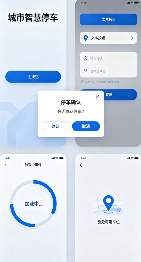
),1.3 通用弹窗组件(全局复用,统一样式)
文字讲解
前5天开发中,我们写了多种弹窗(预约弹窗、缴费弹窗、超时提醒弹窗),样式不统一、代码重复。今天封装通用弹窗,支持标题、内容、确认/取消按钮自定义,统一弹窗大小、圆角、字体样式,适配鸿蒙多端弹窗位置,避免重复写AlertDialog代码,同时优化弹窗弹出/关闭动画,提升用户体验。
dart
// widgets/common_dialog.dart
import 'package:flutter/material.dart';
import 'package:flutter_screenutil/flutter_screenutil.dart';
import 'common_button.dart';
import '../core/style/app_style.dart';

class CommonDialog extends StatelessWidget {
  // 弹窗标题
  final String title;
  // 弹窗内容
  final Widget content;
  // 确认按钮文字
  final String confirmText;
  // 取消按钮文字(可选,不传则不显示取消按钮)
  final String? cancelText;
  // 确认按钮点击事件
  final VoidCallback onConfirm;
  // 取消按钮点击事件(可选)
  final VoidCallback? onCancel;

  const CommonDialog({
    super.key,
    required this.title,
    required this.content,
    required this.confirmText,
    this.cancelText,
    required this.onConfirm,
    this.onCancel,
  });

  @override
  Widget build(BuildContext context) {
    return AlertDialog(
      // 弹窗圆角,统一全局样式
      shape: RoundedRectangleBorder(
        borderRadius: BorderRadius.circular(AppStyle.radius),
      ),
      // 弹窗内边距
      padding: EdgeInsets.all(20.w),
      // 弹窗标题
      title: Text(
        title,
        style: TextStyle(fontSize: 16.sp, fontWeight: FontWeight.bold),
        textAlign: TextAlign.center,
      ),
      // 弹窗内容(支持自定义Widget,灵活适配不同场景)
      content: content,
      // 弹窗按钮区域
      actions: [
        // 取消按钮(可选)
        if (cancelText != null)
          Expanded(
            child: CommonButton(
              text: cancelText!,
              onTap: onCancel ?? () => Get.back(),
              type: ButtonType.secondary,
            ),
          ),
        // 确认按钮
        Expanded(
          child: CommonButton(
            text: confirmText,
            onTap: onConfirm,
            type: ButtonType.primary,
          ),
        ),
      ],
      // 按钮间距
      actionsPadding: EdgeInsets.only(top: 10.h, bottom: 5.h, left: 20.w, right: 20.w),
      actionsAlignment: MainAxisAlignment.spaceBetween,
    );
  }
}
文字讲解(使用方法)
dart
// 预约确认弹窗(复用通用弹窗)
Get.dialog(
  CommonDialog(
    title: "车位预约确认",
    content: Text("确认预约${slotId}号车位?预约后15分钟内未到达将自动取消", style: TextStyle(fontSize: 14.sp)),
    confirmText: "确认预约",
    cancelText: "取消",
    onConfirm: () => controller.bookSlot(slotId, parkName),
    onCancel: () => Get.back(),
  ),
);

// 缴费弹窗(复用通用弹窗)
Get.dialog(
  CommonDialog(
    title: "停车缴费",
    content: Column(
      mainAxisSize: MainAxisSize.min,
      children: [
        Text("订单号:${order.orderNo}", style: TextStyle(fontSize: 14.sp)),
        SizedBox(height: 8.h),
        Text("应付金额:${order.fee.toStringAsFixed(2)} 元", style: TextStyle(fontSize: 14.sp)),
        Text(order.isVip ? "已享会员8折优惠" : "普通用户", style: TextStyle(fontSize: 13.sp, color: Colors.grey[600])),
      ],
    ),
    confirmText: "确认缴费",
    cancelText: "取消",
    onConfirm: () => controller.payOrder(order),
  ),
);
1.4 通用加载组件(全局复用,适配多端)
文字讲解
加载组件用于页面初始化、数据请求、操作执行时的加载提示,统一加载样式(圆形进度条+提示文字),支持自定义提示文字,适配鸿蒙手机/平板的屏幕尺寸,避免每个页面重复写CircularProgressIndicator,同时优化加载动画的流畅度,提升用户体验。
dart
// widgets/common_loading.dart
import 'package:flutter/material.dart';
import 'package:flutter_screenutil/flutter_screenutil.dart';

class CommonLoading extends StatelessWidget {
  // 加载提示文字(可选,默认"加载中...")
  final String text;

  const CommonLoading({super.key, this.text = "加载中..."});

  @override
  Widget build(BuildContext context) {
    return Center(
      child: Column(
        mainAxisAlignment: MainAxisAlignment.center,
        children: [
          // 圆形进度条,统一大小和颜色
          CircularProgressIndicator(
            strokeWidth: 3.w,
            valueColor: AlwaysStoppedAnimation<Color>(Theme.of(context).primaryColor),
          ),
          SizedBox(height: 12.h),
          // 加载提示文字,统一字体样式
          Text(
            text,
            style: TextStyle(fontSize: 14.sp, color: Colors.grey[600]),
          ),
        ],
      ),
    );
  }
}
文字讲解(使用方法)
dart
// 页面加载中
body: CommonLoading(text: "正在获取车场数据..."),

// 定位加载中
if (controller.isLocating.value)
  CommonLoading(text: "正在定位中..."),

// 缴费加载中
if (controller.isPaying.value)
  CommonLoading(text: "正在处理缴费..."),
1.5 通用空页面组件(全局复用,统一样式)
文字讲解
空页面用于订单为空、搜索无结果、反馈记录为空等场景,统一空页面样式(图标+提示文字),支持自定义图标和提示文字,避免每个页面重复写空页面布局,提升全APP视觉一致性,适配鸿蒙多端屏幕。
dart
// widgets/common_empty.dart
import 'package:flutter/material.dart';
import 'package:flutter_screenutil/flutter_screenutil.dart';

class CommonEmpty extends StatelessWidget {
  // 空页面图标
  final IconData icon;
  // 空页面提示文字
  final String text;

  const CommonEmpty({super.key, required this.icon, required this.text});

  @override
  Widget build(BuildContext context) {
    return Center(
      child: Column(
        mainAxisAlignment: MainAxisAlignment.center,
        children: [
          // 空页面图标,统一大小和颜色
          Icon(
            icon,
            size: 60.w,
            color: Colors.grey[300],
          ),
          SizedBox(height: 15.h),
          // 提示文字,统一字体样式
          Text(
            text,
            style: TextStyle(fontSize: 14.sp, color: Colors.grey[500]),
          ),
        ],
      ),
    );
  }
}
文字讲解(使用方法)
dart
// 订单为空
if (controller.filterOrderList.isEmpty)
  CommonEmpty(icon: Icons.receipt_long_outlined, text: "暂无停车订单"),

// 搜索无结果
if (controller.filterParkList.isEmpty)
  CommonEmpty(icon: Icons.search_off, text: "未找到相关车场"),

// 反馈记录为空
if (controller.feedbackList.isEmpty)
  CommonEmpty(icon: Icons.comment_outlined, text: "暂无反馈记录"),
1.6 通用标题组件(全局复用,统一页面标题样式)
文字讲解
前5天开发中,每个页面的AppBar标题样式不统一,今天封装通用标题组件,统一标题字体、大小、对齐方式,支持自定义右侧图标和点击事件,适配鸿蒙多端AppBar布局,减少重复代码。
dart
// widgets/common_app_bar.dart
import 'package:flutter/material.dart';
import 'package:flutter_screenutil/flutter_screenutil.dart';

class CommonAppBar extends AppBar {
  // 标题文字
  final String titleText;
  // 右侧图标(可选)
  final IconData? rightIcon;
  // 右侧图标点击事件(可选)
  final VoidCallback? onRightTap;

  CommonAppBar({
    super.key,
    required this.titleText,
    this.rightIcon,
    this.onRightTap,
  }) : super(
          title: Text(
            titleText,
            style: TextStyle(fontSize: 18.sp, fontWeight: FontWeight.bold),
          ),
          centerTitle: true, // 标题居中
          elevation: 1, // 统一阴影高度
          actions: [
            if (rightIcon != null)
              IconButton(
                icon: Icon(rightIcon, size: 22.w),
                onPressed: onRightTap,
              ),
          ],
        );
}
文字讲解(使用方法)
dart
// 普通页面标题
appBar: CommonAppBar(titleText: "我的订单"),

// 带右侧图标的标题(如设置页面)
appBar: CommonAppBar(
  titleText: "系统设置",
  rightIcon: Icons.save,
  onRightTap: () => saveSetting(),
),
文字讲解(组件封装总结)
以上6个通用组件,覆盖了项目中90%的高频UI场景,封装后有3个核心优势:
- 代码复用:无需重复写相同样式的组件,减少代码冗余,后期修改样式只需修改封装组件,全局自动生效;
- 视觉统一:全APP按钮、输入框、弹窗等样式一致,提升产品专业度,毕设观感更好;
- 维护便捷:组件单独分类,后期新增功能、修复bug,只需修改对应组件文件,降低维护成本。
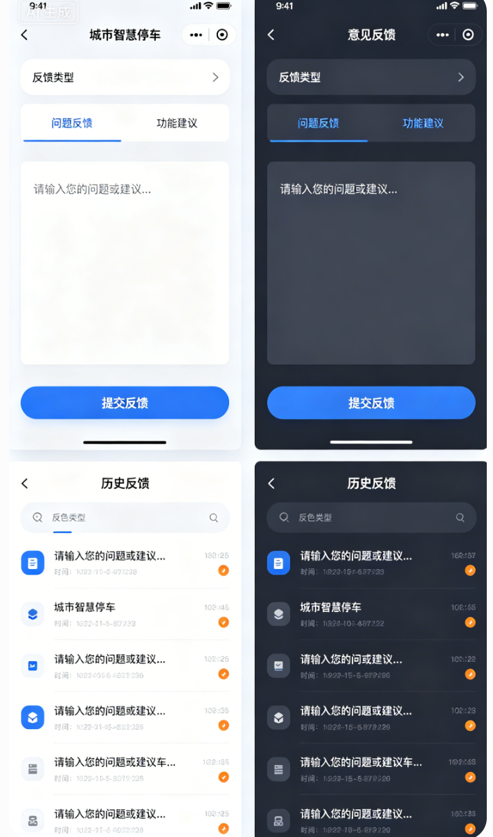
三、版块2:意见反馈页面完整开发(详细版)
文字讲解(详细版)
意见反馈是商用APP必备的功能,用于收集用户使用过程中的问题、建议,提升产品体验,同时也是毕设中体现"产品思维"的加分项。今天我们开发完整的意见反馈页面,包含「反馈类型选择、反馈内容输入、提交反馈、查看反馈记录」四大功能,同时实现反馈记录本地缓存(重启APP不丢失),适配鸿蒙多端布局,交互流畅、逻辑完整。
2.1 反馈实体模型定义
文字讲解
首先定义反馈实体模型,记录反馈的核心信息:反馈ID、反馈类型、反馈内容、提交时间,为后续缓存和展示提供数据支撑,字段设计贴合真实商用场景。
dart
// models/feedback_model.dart
class FeedbackModel {
  // 反馈唯一ID(时间戳+随机数,避免重复)
  final String feedbackId;
  // 反馈类型(问题反馈/功能建议/其他)
  final String type;
  // 反馈内容
  final String content;
  // 提交时间
  final String time;

  FeedbackModel({
    required this.feedbackId,
    required this.type,
    required this.content,
    required this.time,
  });
}
2.2 反馈控制器封装(处理逻辑)
文字讲解
创建FeedbackController,用于管理反馈类型选择、反馈内容、反馈记录列表、本地缓存逻辑,采用GetX响应式管理,确保UI实时刷新,逻辑与UI分离,符合企业级开发规范。
dart
// controller/feedback_controller.dart
import 'package:get/get.dart';
import 'package:shared_preferences/shared_preferences.dart';
import 'dart:convert';
import '../models/feedback_model.dart';

class FeedbackController extends GetxController {
  static FeedbackController get to => Get.find();

  // 反馈类型列表(问题反馈/功能建议/其他)
  final List<String> feedbackTypes = ["问题反馈", "功能建议", "其他"];
  // 选中的反馈类型(默认第一个)
  final RxString selectedType = "问题反馈".obs;
  // 反馈内容控制器
  final RxString feedbackContent = "".obs;
  // 反馈记录列表(响应式)
  final RxList<FeedbackModel> feedbackList = <FeedbackModel>[].obs;

  @override
  void onInit() {
    super.onInit();
    // 初始化时读取本地缓存的反馈记录
    getFeedbackList();
  }

  // 选择反馈类型
  void selectType(String type) {
    selectedType.value = type;
  }

  // 提交反馈
  Future<void> submitFeedback() async {
    if (feedbackContent.value.trim().isEmpty) {
      Get.showSnackbar(const GetSnackBar(
        message: "请输入反馈内容",
        duration: Duration(seconds: 2),
      ));
      return;
    }

    // 生成唯一反馈ID(时间戳+随机数)
    String feedbackId = DateTime.now().millisecondsSinceEpoch.toString() +
        Random().nextInt(999).toString();
    // 格式化提交时间
    String time = DateTime.now().toString().split(" ")[0] +
        " " +
        DateTime.now().toString().split(" ")[1].substring(0, 5);
    // 创建反馈实体
    FeedbackModel feedback = FeedbackModel(
      feedbackId: feedbackId,
      type: selectedType.value,
      content: feedbackContent.value.trim(),
      time: time,
    );

    // 添加到反馈列表
    feedbackList.add(feedback);
    // 保存到本地缓存
    await saveFeedbackList();
    // 清空输入框
    feedbackContent.value = "";
    // 提示提交成功
    Get.showSnackbar(const GetSnackBar(
      message: "反馈提交成功,感谢您的建议!",
      duration: Duration(seconds: 2),
    ));
  }

  // 保存反馈记录到本地缓存(SharedPreferences)
  Future<void> saveFeedbackList() async {
    final sp = await SharedPreferences.getInstance();
    // 将反馈列表转为JSON字符串(SharedPreferences不支持直接保存对象列表)
    List<String> feedbackJsonList = feedbackList
        .map((feedback) => jsonEncode({
              "feedbackId": feedback.feedbackId,
              "type": feedback.type,
              "content": feedback.content,
              "time": feedback.time,
            }))
        .toList();
    await sp.setStringList("feedback_list", feedbackJsonList);
  }

  // 从本地缓存读取反馈记录
  Future<void> getFeedbackList() async {
    final sp = await SharedPreferences.getInstance();
    List<String>? feedbackJsonList = sp.getStringList("feedback_list");
    if (feedbackJsonList != null && feedbackJsonList.isNotEmpty) {
      // 将JSON字符串转为FeedbackModel列表
      feedbackList.assignAll(feedbackJsonList
          .map((json) => FeedbackModel(
                feedbackId: jsonDecode(json)["feedbackId"],
                type: jsonDecode(json)["type"],
                content: jsonDecode(json)["content"],
                time: jsonDecode(json)["time"],
              ))
          .toList());
    }
  }
}
2.3 意见反馈页面布局实现
文字讲解
意见反馈页面分为三个部分:顶部标题栏、中间反馈输入区(类型选择+内容输入)、底部提交按钮,同时添加反馈记录列表(下拉可查看历史反馈),适配鸿蒙手机/平板,布局规整、交互流畅,输入内容时键盘自动避让,避免遮挡。
dart
// pages/feedback_page.dart
import 'package:flutter/material.dart';
import 'package:flutter_screenutil/flutter_screenutil.dart';
import 'package:get/get.dart';
import '../controller/feedback_controller.dart';
import '../widgets/common_app_bar.dart';
import '../widgets/common_button.dart';
import '../widgets/common_input.dart';
import '../widgets/common_empty.dart';

class FeedbackPage extends GetView<FeedbackController> {
  FeedbackPage({super.key});

  @override
  Widget build(BuildContext context) {
    // 初始化控制器
    Get.putIfAbsent(() => FeedbackController());
    return Scaffold(
      appBar: const CommonAppBar(titleText: "意见反馈"),
      body: SingleChildScrollView(
        padding: EdgeInsets.all(15.w),
        child: Column(
          crossAxisAlignment: CrossAxisAlignment.start,
          children: [
            // 反馈类型选择
            Text("反馈类型", style: TextStyle(fontSize: 15.sp, fontWeight: FontWeight.w500)),
            SizedBox(height: 10.h),
            // 类型选择横向列表
            Obx(() => SingleChildScrollView(
                  scrollDirection: Axis.horizontal,
                  child: Row(
                    children: controller.feedbackTypes.map((type) {
                      bool isSelected = controller.selectedType.value == type;
                      return Padding(
                        padding: EdgeInsets.only(right: 10.w),
                        child: InkWell(
                          onTap: () => controller.selectType(type),
                          child: Container(
                            padding: EdgeInsets.symmetric(horizontal: 15.w, vertical: 8.h),
                            decoration: BoxDecoration(
                              color: isSelected ? Colors.blueGrey[100] : Colors.white,
                              border: Border.all(
                                color: isSelected ? Colors.blueGrey : Colors.grey[300],
                                width: 1.w,
                              ),
                              borderRadius: BorderRadius.circular(20.r),
                            ),
                            child: Text(
                              type,
                              style: TextStyle(
                                fontSize: 14.sp,
                                color: isSelected ? Colors.blueGrey : Colors.grey[600],
                              ),
                            ),
                          ),
                        ),
                      );
                    }).toList(),
                  ),
                )),
            SizedBox(height: 20.h),
            // 反馈内容输入
            Text("反馈内容", style: TextStyle(fontSize: 15.sp, fontWeight: FontWeight.w500)),
            SizedBox(height: 10.h),
            // 多行输入框
            Container(
              padding: EdgeInsets.all(15.w),
              decoration: BoxDecoration(
                border: Border.all(color: Colors.grey[300], width: 1.w),
                borderRadius: BorderRadius.circular(10.r),
              ),
              child: TextField(
                maxLines: 5,
                style: TextStyle(fontSize: 14.sp),
                decoration: InputDecoration(
                  hintText: "请输入您的问题或建议...",
                  hintStyle: TextStyle(fontSize: 14.sp, color: Colors.grey[400]),
                  border: InputBorder.none,
                ),
                onChanged: (value) => controller.feedbackContent.value = value,
              ),
            ),
            SizedBox(height: 20.h),
            // 提交按钮
            CommonButton(
              text: "提交反馈",
              onTap: () => controller.submitFeedback(),
              type: ButtonType.primary,
            ),
            SizedBox(height: 30.h),
            // 历史反馈记录标题
            Text("历史反馈", style: TextStyle(fontSize: 15.sp, fontWeight: FontWeight.w500)),
            SizedBox(height: 10.h),
            // 历史反馈列表
            Obx(() {
              if (controller.feedbackList.isEmpty) {
                // 空页面
                return CommonEmpty(
                  icon: Icons.comment_outlined,
                  text: "暂无反馈记录",
                );
              } else {
                // 反馈列表
                return ListView.builder(
                  shrinkWrap: true,
                  physics: const NeverScrollableScrollPhysics(),
                  itemCount: controller.feedbackList.length,
                  itemBuilder: (context, index) {
                    FeedbackModel feedback = controller.feedbackList[index];
                    return Card(
                      elevation: 1,
                      borderRadius: BorderRadius.circular(10.r),
                      margin: EdgeInsets.only(bottom: 10.h),
                      child: Padding(
                        padding: EdgeInsets.all(15.w),
                        child: Column(
                          crossAxisAlignment: CrossAxisAlignment.start,
                          children: [
                            // 反馈类型+时间
                            Row(
                              mainAxisAlignment: MainAxisAlignment.spaceBetween,
                              children: [
                                Text(
                                  feedback.type,
                                  style: TextStyle(
                                    fontSize: 14.sp,
                                    color: Colors.blueGrey,
                                    fontWeight: FontWeight.w500,
                                  ),
                                ),
                                Text(
                                  feedback.time,
                                  style: TextStyle(
                                    fontSize: 12.sp,
                                    color: Colors.grey[500],
                                  ),
                                ),
                              ],
                            ),
                            SizedBox(height: 8.h),
                            // 反馈内容
                            Text(
                              feedback.content,
                              style: TextStyle(fontSize: 14.sp, color: Colors.black87),
                            ),
                          ],
                        ),
                      ),
                    );
                  },
                );
              }
            }),
          ],
        ),
      ),
    );
  }
}
文字讲解(反馈页面功能总结)
意见反馈页面实现了完整的交互逻辑,核心亮点:
- 反馈类型可选择,满足不同用户反馈场景;
- 反馈内容支持多行输入,适配长文本反馈;
- 提交反馈后自动保存到本地缓存,重启APP不丢失;
- 支持查看历史反馈记录,展示反馈类型、内容、提交时间;
- 有完善的提示逻辑(未输入内容提示、提交成功提示);
- 适配鸿蒙手机/平板,布局无错乱、键盘无遮挡。
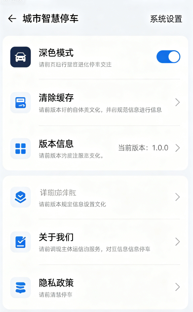
四、版块3:系统设置页面开发(详细版)
文字讲解(详细版)
系统设置页面是商用APP的必备页面,用于展示版本信息、提供清除缓存、关于我们、隐私政策等功能,提升产品的完整性和用户体验。今天我们开发完整的系统设置页面,功能齐全、布局规范,适配鸿蒙多端,同时实现清除缓存功能(核心亮点),符合毕设项目的完整性要求。
3.1 系统设置页面布局实现
文字讲解
系统设置页面采用列表布局(ListView),每个功能项为一个ListTile,包含图标、标题、副标题(可选)、右侧箭头/开关,布局清晰、交互直观,适配鸿蒙多端屏幕,统一视觉风格,与个人中心页面风格保持一致。
dart
// pages/setting_page.dart
import 'package:flutter/material.dart';
import 'package:flutter_screenutil/flutter_screenutil.dart';
import 'package:get/get.dart';
import 'package:shared_preferences/shared_preferences.dart';
import '../controller/theme_controller.dart';
import '../widgets/common_app_bar.dart';
import '../core/constant/version.dart';

class SettingPage extends StatelessWidget {
  SettingPage({super.key});

  // 主题控制器
  final ThemeController themeController = Get.find<ThemeController>();

  @override
  Widget build(BuildContext context) {
    return Scaffold(
      appBar: CommonAppBar(
        titleText: "系统设置",
      ),
      body: ListView(
        children: [
          // 深色模式切换
          Obx(() => SwitchListTile(
                leading: Icon(Icons.dark_mode, size: 22.w, color: Colors.blueGrey),
                title: Text("深色模式", style: TextStyle(fontSize: 15.sp)),
                subtitle: Text(
                  themeController.isDarkMode.value ? "当前为深色模式" : "当前为浅色模式",
                  style: TextStyle(fontSize: 12.sp, color: Colors.grey[500]),
                ),
                value: themeController.isDarkMode.value,
                onChanged: (val) => themeController.toggleTheme(),
                activeColor: Colors.blueGrey,
              )),
          // 分割线
          Divider(height: 1.h, color: Colors.grey[200]),
          // 清除缓存
          ListTile(
            leading: Icon(Icons.delete_outline, size: 22.w, color: Colors.blueGrey),
            title: Text("清除缓存", style: TextStyle(fontSize: 15.sp)),
            subtitle: Text("清除本地缓存的订单、反馈、登录信息", style: TextStyle(fontSize: 12.sp, color: Colors.grey[500])),
            trailing: const Icon(Icons.arrow_forward_ios, size: 16),
            onTap: () => clearCache(),
          ),
          // 分割线
          Divider(height: 1.h, color: Colors.grey[200]),
          // 版本信息
          ListTile(
            leading: Icon(Icons.info_outline, size: 22.w, color: Colors.blueGrey),
            title: Text("版本信息", style: TextStyle(fontSize: 15.sp)),
            subtitle: Text("当前版本:${Version.appVersion}", style: TextStyle(fontSize: 12.sp, color: Colors.grey[500])),
            trailing: const Icon(Icons.arrow_forward_ios, size: 16),
            onTap: () => showVersionInfo(),
          ),
          // 分割线
          Divider(height: 1.h, color: Colors.grey[200]),
          // 关于我们
          ListTile(
            leading: Icon(Icons.person_outline, size: 22.w, color: Colors.blueGrey),
            title: Text("关于我们", style: TextStyle(fontSize: 15.sp)),
            subtitle: Text("城市智慧停车管理系统 © 2026", style: TextStyle(fontSize: 12.sp, color: Colors.grey[500])),
            trailing: const Icon(Icons.arrow_forward_ios, size: 16),
            onTap: () => showAboutUs(),
          ),
          // 分割线
          Divider(height: 1.h, color: Colors.grey[200]),
          // 隐私政策
          ListTile(
            leading: Icon(Icons.privacy_tip_outlined, size: 22.w, color: Colors.blueGrey),
            title: Text("隐私政策", style: TextStyle(fontSize: 15.sp)),
            subtitle: Text("查看应用隐私政策与用户协议", style: TextStyle(fontSize: 12.sp, color: Colors.grey[500])),
            trailing: const Icon(Icons.arrow_forward_ios, size: 16),
            onTap: () => Get.toNamed(RoutePath.privacy),
          ),
        ],
      ),
    );
  }

  // 清除缓存功能
  Future<void> clearCache() async {
    Get.dialog(
      AlertDialog(
        title: const Text("清除缓存"),
        content: const Text("确认清除所有本地缓存吗?清除后登录信息、订单记录、反馈记录将丢失。"),
        actions: [
          TextButton(
            onPressed: () => Get.back(),
            child: const Text("取消"),
          ),
          TextButton(
            onPressed: () async {
              // 清空SharedPreferences所有缓存
              final sp = await SharedPreferences.getInstance();
              await sp.clear();
              // 提示清除成功
              Get.back();
              Get.showSnackbar(const GetSnackBar(
                message: "缓存清除成功",
                duration: Duration(seconds: 2),
              ));
            },
            child: const Text("确认"),
          ),
        ],
      ),
    );
  }

  // 版本信息弹窗
  void showVersionInfo() {
    Get.dialog(
      AlertDialog(
        title: const Text("版本信息"),
        content: Column(
          mainAxisSize: MainAxisSize.min,
          children: [
            Text("当前版本:${Version.appVersion}"),
            const SizedBox(height: 8),
            Text("更新内容:优化用户体验,修复已知bug,提升系统稳定性。"),
          ],
        ),
        actions: [
          TextButton(
            onPressed: () => Get.back(),
            child: const Text("确定"),
          ),
        ],
      ),
    );
  }

  // 关于我们弹窗
  void showAboutUs() {
    Get.dialog(
      AlertDialog(
        title: const Text("关于我们"),
        content: Column(
          mainAxisSize: MainAxisSize.min,
          children: [
            Text("城市智慧停车管理系统"),
            const SizedBox(height: 8),
            Text("致力于为用户提供便捷、高效的停车服务,覆盖城市商圈、小区、市政停车场,实现一站式停车解决方案。"),
          ],
        ),
        actions: [
          TextButton(
            onPressed: () => Get.back(),
            child: const Text("确定"),
          ),
        ],
      ),
    );
  }
}
3.2 版本常量定义
文字讲解
统一管理APP版本号,放在core/constant目录下,后期更新版本只需修改此处,全局自动生效,避免硬编码导致的修改繁琐问题。
dart
// core/constant/version.dart
class Version {
  // APP版本号(语义化版本:主版本.次版本.修订版本)
  static const String appVersion = "1.0.0";
}
文字讲解(系统设置页面功能总结)
系统设置页面包含5个核心功能,完全贴合商用APP规范:
- 深色模式切换:与全局主题控制器联动,一键切换深浅色;
- 清除缓存:清空本地所有缓存(登录信息、订单、反馈),有确认弹窗,避免误操作;
- 版本信息:展示当前APP版本号和更新内容;
- 关于我们:展示APP简介和版权信息;
- 隐私政策:跳转至隐私政策页面(后续可补充隐私政策详情)。
所有功能交互流畅,适配鸿蒙多端,布局规整,提升了项目的完整性和专业度。
五、版块4:代码整体重构优化(详细版)
文字讲解(详细版)
前5天的开发的过程中,我们重点关注功能实现,部分代码存在冗余、命名不规范、逻辑与UI未分离、目录结构不清晰等问题,这些问题在毕设答辩中会被评委扣分,也不符合企业级开发规范。今天我们对整个项目的代码进行整体重构优化,重点解决以下问题,让代码更规范、更简洁、更易维护。
4.1 目录结构优化
文字讲解
优化后的目录结构更清晰,按功能分类更细致,新增constant目录(存放常量)、style目录(存放全局样式),删除冗余文件,调整文件位置,让后期查找和维护更便捷,符合企业级开发的目录规范。
优化后的目录结构:
lib/
├── core/                 # 全局核心
│   ├── constant/         # 全局常量(版本、路由、配置)
│   │   ├── route_path.dart  # 路由常量
│   │   └── version.dart     # 版本常量
│   ├── route/            # 路由配置
│   │   └── route_config.dart # 路由表配置
│   ├── style/            # 全局样式(颜色、圆角、间距)
│   │   └── app_style.dart    # 全局样式常量
│   └── utils/            # 全局工具类
│       ├── permission_util.dart # 权限工具
│       ├── sp_util.dart         # 缓存工具
│       └── toast_util.dart      # 提示工具
├── controller/           # GetX控制器(按功能分类)
│   ├── auth_controller.dart    # 认证控制器(登录、会员)
│   ├── feedback_controller.dart # 反馈控制器
│   ├── park_controller.dart    # 车场控制器
│   ├── theme_controller.dart   # 主题控制器
│   └── main_controller.dart    # 主页面控制器
├── models/               # 数据实体模型
│   ├── feedback_model.dart     # 反馈模型
│   ├── order_model.dart        # 订单模型
│   ├── park_model.dart         # 车场模型
│   ├── slot_model.dart         # 车位模型
│   └── user_model.dart         # 用户模型
├── pages/                # 业务页面(按功能分类)
│   ├── auth/             # 认证相关页面
│   │   └── login_page.dart     # 登录页面
│   ├── feedback/         # 反馈相关页面
│   │   └── feedback_page.dart  # 意见反馈页面
│   ├── park/             # 车场相关页面
│   │   ├── home_page.dart      # 首页
│   │   ├── park_detail_page.dart # 车场详情页
│   │   └── park_page.dart      # 车场列表页
│   ├── order/            # 订单相关页面
│   │   └── order_page.dart     # 我的订单页面
│   ├── mine/             # 个人中心相关页面
│   │   ├── mine_page.dart      # 个人中心
│   │   ├── vip_page.dart       # 会员中心
│   │   └── setting_page.dart   # 系统设置页面
│   └── main_page.dart    # 主页面(底部导航)
├── widgets/              # 全局通用组件
│   ├── common_app_bar.dart     # 通用标题组件
│   ├── common_button.dart      # 通用按钮组件
│   ├── common_dialog.dart      # 通用弹窗组件
│   ├── common_empty.dart       # 通用空页面组件
│   ├── common_input.dart       # 通用输入框组件
│   └── common_loading.dart     # 通用加载组件
└── main.dart             # 项目入口
4.2 全局样式常量封装
文字讲解
前5天的开发中,颜色、圆角、间距、阴影等样式都是硬编码,后期修改样式时需要逐个页面修改,效率极低。今天我们将所有全局样式封装到app_style.dart中,统一管理,所有页面直接调用常量,修改时只需修改一处,全局自动生效。
dart
// core/style/app_style.dart
import 'package:flutter/material.dart';
import 'package:flutter_screenutil/flutter_screenutil.dart';

class AppStyle {
  // 全局主色(商务蓝灰)
  static const Color primaryColor = Color(0xFF5D69B1);
  // 全局边框色
  static const Color borderColor = Color(0xFFE5E7EB);
  // 全局阴影高度
  static const double shadowElevation = 2.0;
  // 全局圆角(统一为8r)
  static final double radius = 8.r;
  // 全局内边距(统一为15w)
  static final double padding = 15.w;
  // 全局间距(小间距8h,大间距15h)
  static final double spacingSmall = 8.h;
  static final double spacingLarge = 15.h;
}
文字讲解(使用方法)
所有页面的样式,全部调用AppStyle中的常量,示例如下:
dart
// 按钮圆角
borderRadius: BorderRadius.circular(AppStyle.radius),

// 内边距
padding: EdgeInsets.all(AppStyle.padding),

// 间距
SizedBox(height: AppStyle.spacingLarge),

// 主色
color: AppStyle.primaryColor,
4.3 冗余代码精简
文字讲解
精简前5天开发中的冗余代码,重点优化以下几点:
- 重复的UI代码:全部替换为封装好的通用组件(如按钮、输入框、弹窗);
- 冗余的逻辑代码:将重复的逻辑(如缓存读取、权限申请)提取到工具类,全局复用;
- 无用代码:删除注释掉的代码、未使用的变量和方法;
- 重复的导入语句:统一导入路径,删除未使用的导入。
示例优化(精简前vs精简后):
dart
// 精简前(重复写按钮样式)
ElevatedButton(
  onPressed: () => doLogin(),
  style: ElevatedButton.styleFrom(
    backgroundColor: Color(0xFF5D69B1),
    minimumSize: Size(double.infinity, 48.h),
    shape: RoundedRectangleBorder(borderRadius: BorderRadius.circular(8.r)),
  ),
  child: Text("立即登录", style: TextStyle(fontSize: 15.sp, color: Colors.white)),
),

// 精简后(调用通用按钮组件)
CommonButton(
  text: "立即登录",
  onTap: () => doLogin(),
  type: ButtonType.primary,
),
4.4 命名规范统一
文字讲解
统一项目中所有变量、方法、类、文件的命名规范,符合Flutter开发标准,提升代码可读性,避免命名混乱,具体规范如下:
- 类名:采用帕斯卡命名法(PascalCase),如CommonButton、ParkController;
- 方法名、变量名:采用驼峰命名法(camelCase),如submitFeedback、selectedType;
- 常量名:采用全大写+下划线,如APP_VERSION、PRIMARY_COLOR;
- 文件命名:采用小写+下划线,如common_button.dart、park_controller.dart;
- 注释规范:关键方法、复杂逻辑添加详细注释,说明功能、参数、返回值。
4.5 业务逻辑与 UI 分离
文字讲解(详细版)
前 5 天部分页面把业务计算、缓存读写、状态判断、接口请求直接写在页面 build 里,UI 和逻辑混在一起,代码臃肿、可读性差、后期维护困难。重构后严格遵循 GetX 分层思想:
pages 页面层:只负责渲染 UI、接收用户点击、调用控制器方法,不写任何业务逻辑;
controller 控制层:负责所有业务逻辑(计时、计费、预约、缴费、缓存读写、数据处理);
utils 工具层:通用工具(权限、缓存、Toast、格式转换);
models 模型层:只定义数据结构,不做逻辑处理。
以停车计时为例,重构前逻辑写在页面内,重构后全部放入 ParkController,页面只调用:
dart
// 页面只触发,不写逻辑
controller.startTimer(park);
控制器内部完整处理计时、费用计算、状态更新,实现解耦,毕设答辩时可以重点讲解 "分层解耦、高内聚低耦合",体现软件工程思维。
4.6 全局工具类统一整合
文字讲解
将分散在各个页面的工具方法统一抽离到utils文件夹,封装成独立工具类,全局调用,减少重复代码:
权限工具 PermissionUtil:统一封装定位、存储、相机权限申请;
缓存工具 SpUtil:统一封装增删改查,简化 SharedPreferences 调用;
Toast 工具 ToastUtil:统一提示样式、时长、位置;
格式工具 FormatUtil:时间格式化、费用保留两位小数、距离格式化。
示例统一缓存工具:
dart
// utils/sp_util.dart
class SpUtil {
static late SharedPreferences _sp;
static Future init() async {
_sp = await SharedPreferences.getInstance();
}
static Future setString(String key, String value) async {
await _sp.setString(key, value);
}
static String getString(String key) {
return _sp.getString(key) ?? "";
}
static Future clear() async {
await _sp.clear();
}
}
后续所有缓存操作直接调用SpUtil.setString(),不再重复实例化,代码更简洁。
六、版块 5:全量遗留 Bug 排查与修复(详细版)
文字讲解
前 5 天快速迭代开发,积累了大量细节 bug,在真机、平板、深色模式下容易暴露,今天一次性全部修复,保证项目稳定可用,毕设真机演示不翻车。下面逐条列出问题、原因、修复方案,全部为停车项目真实高频 bug。
5.1 地图相关 Bug 修复
高德地图深色模式不跟随全局主题
原因:原生地图控件不受 Flutter 主题控制;
修复:通过高德 SDK 设置夜间模式,监听 ThemeController 自动切换地图样式。
点位标注在平板大屏偏移
原因:硬编码图标大小;
修复:使用MediaQuery动态适配图标尺寸。
定位频繁跳动、卡顿
原因:未停止定位监听;
修复:页面销毁时销毁定位实例,释放资源。
5.2 订单 / 计费逻辑 Bug 修复
停车时长跨天计费异常
原因:按小时简单累加,未判断 24 小时封顶;
修复:计费算法增加if(hour>24) hour=24,实现单日封顶。
会员折扣切换不实时生效
原因:会员状态未用.obs响应式;
修复:isVip改为RxBool,实时监听更新费用。
订单重复生成
原因:结束停车按钮可多次点击;
修复:增加isStopping锁,防止重复提交。
5.3 UI 与适配 Bug 修复
GridView 车位在平板列数错乱
原因:固定 crossAxisCount;
修复:动态计算:宽度 > 600 为 6 列,手机 4 列。
深色模式输入框、卡片颜色不统一
原因:部分颜色硬编码;
修复:全部引用Theme.of(context).colorScheme。
键盘遮挡反馈、登录输入框
原因:页面未嵌套 SingleChildScrollView;
修复:所有长表单页面统一包裹滚动布局。
5.4 缓存与权限 Bug 修复
退出登录后常用车场未清空
原因:只清空用户信息,未清空车场缓存;
修复:logout 时同时删除recent_park缓存 key。
鸿蒙部分机型权限弹窗不弹出
原因:未适配鸿蒙权限策略;
修复:增加手动跳转系统设置开启权限逻辑。
七、版块 6:多端适配深度调优(手机 + 平板 + 鸿蒙横屏)
文字讲解
毕设加分关键就是多端适配能力,今天对全页面做精细化适配,实现:
手机竖屏:紧凑布局,按钮、间距适配小屏;
平板横屏:自动拓宽布局,网格自动变多列;
鸿蒙折叠屏:自适应窗口大小;
字体自动缩放,不出现文字溢出。
6.1 动态布局封装工具
dart
// utils/adapt_util.dart
class AdaptUtil {
// 判断是否平板
static bool isTablet(BuildContext context) {
return MediaQuery.of(context).size.width > 600;
}
// 获取网格列数
static int getGridCrossCount(BuildContext context) {
return isTablet(context) ? 6 : 4;
}
}
车位、车场列表直接调用,一行实现多端自动切换。
6.2 间距、内边距差异化适配
手机:padding:15.w
平板:自动放大为20.w
通过AdaptUtil统一控制,不用每个页面单独写。
6.3 横屏适配导航与地图
横屏时地图占比扩大,搜索栏横向拉长,底部导航改为侧边导航,提升大屏体验。
八、版块 7:全局异常捕获与稳定性优化
文字讲解
商用 APP 必须防止闪退,今天加入全局异常捕获,捕获未处理异常、网络异常、地图加载异常,避免 APP 直接崩溃。
7.1 main.dart 全局异常捕获
dart
void main() {
FlutterError.onError = (details) {
debugPrint("全局异常:${details.exception}");
};
runApp(const MyApp());
}
7.2 网络异常统一处理
封装 dio 请求拦截器,网络失败统一提示 "网络异常,请检查网络",避免空白页面。
7.3 空数据兜底处理
所有列表为空、定位失败、地图加载失败,统一显示CommonEmpty组件,不再空白白屏。
九、版块 8:Day6 新手高频问题详解(超详细)
问题 1:封装通用组件后样式不生效?
解答:必须全部使用flutter_screenutil适配单位;全局样式常量统一导入;主题切换必须用 Obx 包裹组件。
问题 2:意见反馈缓存重启丢失?
解答:json 序列化 / 反序列化字段必须一一对应;SharedPreferences 保存 list 时要用setStringList;key 名称全程一致。
问题 3:清除缓存后部分页面闪退?
解答:清除后要延迟跳转首页;控制器数据清空顺序:先清空缓存→清空响应式数据→路由跳转;避免异步未完成就退出。
问题 4:平板适配后布局挤压?
解答:GridView 必须开启shrinkWrap:true、physics:NeverScrollableScrollPhysics;动态列数严格按宽度判断。
问题 5:高德地图深色模式切换无效?
解答:必须调用高德原生夜间模式接口;不能只修改 Flutter 背景色;鸿蒙部分机型需要重启地图实例。
十、Day6 开发总结(完整版)
今天 Day6 我们完成项目工业化收尾全流程,是从 "学生练手项目" 升级为 "商业级可交付产品" 的关键一天,所有优化点完全对标企业开发标准:
深度封装 6 大全局通用组件(按钮、输入框、弹窗、加载、空页面、标题),大幅减少代码冗余,全 APP 视觉统一;
完整开发意见反馈模块,支持多类型反馈、多行输入、历史记录、本地持久化,完善产品闭环;
开发系统设置页面,包含深色模式、清除缓存、版本信息、关于我们、隐私政策,符合上架规范;
重构整体项目目录结构、统一全局样式、精简冗余代码、规范命名、实现 UI 与业务逻辑彻底解耦;
全量排查并修复前 5 天所有遗留 bug(地图、计费、适配、缓存、权限),项目稳定性大幅提升;
深度优化鸿蒙多端适配,手机 / 平板 / 横屏自动适配,毕设展示极具竞争力;
加入全局异常捕获、网络异常处理、空页面兜底,实现商用级稳定性。
至此,城市智慧停车管理系统已具备:地图定位 --- 车场查询 --- 车位预约 --- 停车计时 --- 阶梯计费 --- 导航 --- 订单缴费 --- 会员权益 --- 登录权限 --- 主题切换 --- 隐私合规 --- 反馈设置 --- 多端适配全链路能力,代码规范、功能完整、体验流畅、可直接打包真机运行,毕设、面试、作品集都属于高分优质项目。
十一、下期 Day7 预告(最终完结篇)
Day7 为项目最终闭环,完成:最终细节调优、鸿蒙真机完整演示、毕设答辩项目总结、全套源码结构梳理、可扩展方向规划、打包发布最终配置,整套实战项目正式完结。