文章目录
- 一、基础图表(SIMPLE)
-
- [1. 面积图(`st.area_chart`)](#1. 面积图(
st.area_chart)) -
- [1.1 核心参数](#1.1 核心参数)
- [1.2 使用示例](#1.2 使用示例)
- [2. 柱状图(`st.bar_chart`)](#2. 柱状图(
st.bar_chart)) -
- [2.1 核心参数](#2.1 核心参数)
- [2.2 使用示例](#2.2 使用示例)
- [3. 折线图(`st.line_chart`)](#3. 折线图(
st.line_chart)) -
- [3.1 核心参数](#3.1 核心参数)
- [3.2 使用示例](#3.2 使用示例)
- [4. 地图(`st.map`)](#4. 地图(
st.map)) -
- [4.1 核心参数](#4.1 核心参数)
- [4.2 使用示例](#4.2 使用示例)
- [5. 散点图(`st.scatter_chart`)](#5. 散点图(
st.scatter_chart)) -
- [5.1 核心参数](#5.1 核心参数)
- [5.2 使用示例](#5.2 使用示例)
- [1. 面积图(`st.area_chart`)](#1. 面积图(
- 二、高级图表(ADVANCED)
-
- [1. Altair 图表(`st.altair_chart`)](#1. Altair 图表(
st.altair_chart)) -
- [1.1 核心参数](#1.1 核心参数)
- [1.2 使用示例](#1.2 使用示例)
-
- [示例1:基础 Altair 散点图](#示例1:基础 Altair 散点图)
- 示例2:带交互选择的图表
- [2. Graphviz 图表(`st.graphviz_chart`)](#2. Graphviz 图表(
st.graphviz_chart)) -
- [2.1 前置依赖](#2.1 前置依赖)
- [2.2 核心参数](#2.2 核心参数)
- [2.3 使用示例](#2.3 使用示例)
-
- [示例1:使用 Python Graphviz 对象定义流程图](#示例1:使用 Python Graphviz 对象定义流程图)
- [示例2:直接使用 Dot 语言字符串定义](#示例2:直接使用 Dot 语言字符串定义)
- [3. Plotly 图表(`st.plotly_chart`)](#3. Plotly 图表(
st.plotly_chart)) -
- [3.1 前置依赖](#3.1 前置依赖)
- [3.2 核心参数](#3.2 核心参数)
- [3.3 使用示例](#3.3 使用示例)
-
- [示例1:基础 Plotly 散点图](#示例1:基础 Plotly 散点图)
- 示例2:带交互配置的图表
- 示例3:带选择事件的图表
- [4. PyDeck 3D地图(`st.pydeck_chart`)](#4. PyDeck 3D地图(
st.pydeck_chart)) -
- [4.1 核心参数](#4.1 核心参数)
- [4.2 使用示例](#4.2 使用示例)
- [5. Matplotlib 图表(`st.pyplot`)](#5. Matplotlib 图表(
st.pyplot)) -
- [5.1 前置依赖](#5.1 前置依赖)
- [5.2 核心参数](#5.2 核心参数)
- [5.3 使用示例](#5.3 使用示例)
- [6. Vega-Lite 图表(`st.vega_lite_chart`)](#6. Vega-Lite 图表(
st.vega_lite_chart)) -
- [6.1 核心参数](#6.1 核心参数)
- [6.2 使用示例](#6.2 使用示例)
-
- [示例1:基础散点图(通过 Vega-Lite 配置)](#示例1:基础散点图(通过 Vega-Lite 配置))
- 示例2:带交互选择的图表
- [1. Altair 图表(`st.altair_chart`)](#1. Altair 图表(
一、基础图表(SIMPLE)
1. 面积图(st.area_chart)
st.area_chart 是 Streamlit 中用于快速绘制面积图的组件,是 st.altair_chart 的语法糖,使用便捷但自定义性较低,适合快速可视化趋势数据。
1.1 核心参数
| 参数 | 说明 |
|---|---|
data |
要绘制的数据,支持 st.dataframe 兼容的所有格式(如 Pandas、NumPy 等) |
x |
X 轴数据列名,默认使用数据的索引 |
y |
Y 轴数据列名(可单列或多列),默认绘制所有非 X 轴列 |
x_label/y_label |
X/Y 轴的显示标签 |
color |
数据系列的颜色配置,支持: - 单个颜色值(十六进制、RGB/RGBA 元组) - 颜色列表(为每个系列指定颜色) - 数据列名(根据列值自动分组并着色) |
stack |
面积堆叠方式,可选: - True:非重叠堆叠 - False:不堆叠(重叠显示) - "normalize":标准化为100%堆叠 - "center":居中堆叠(生成流图) |
width/height |
图表尺寸,可选 "stretch"/"content" 或固定像素值 |
1.2 使用示例
示例1:基础面积图
python
import pandas as pd
import streamlit as st
from numpy.random import default_rng as rng

# 生成示例数据
df = pd.DataFrame(rng(0).standard_normal((20, 3)), columns=["a", "b", "c"])

# 绘制面积图(默认使用索引为X轴,所有列为Y轴)
st.area_chart(df)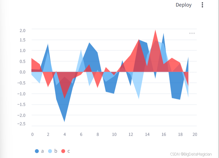
示例2:指定列并配置颜色
python
import pandas as pd
import streamlit as st
from numpy.random import default_rng as rng

df = pd.DataFrame({
    "col1": list(range(20)) * 3,
    "col2": rng(0).standard_normal(20),
    "col3": ["a", "b", "c"] * 20,
})

# 指定X/Y轴,并根据col3的值自动着色
st.area_chart(df, x="col1", y="col2", color="col3")
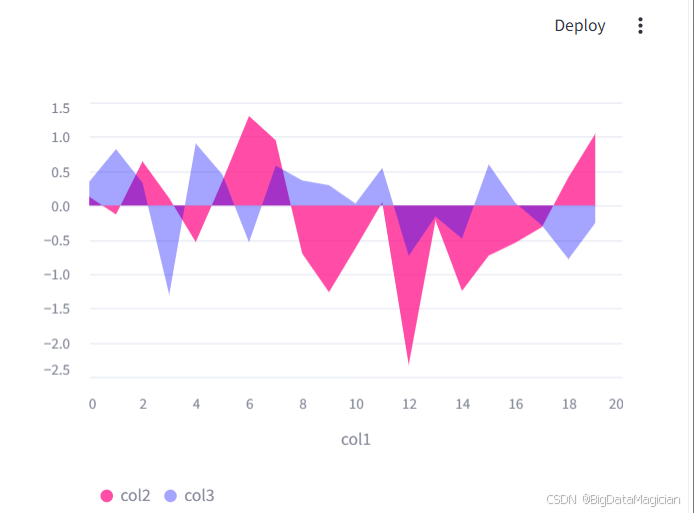
示例3:多列数据与自定义颜色
python
import pandas as pd
import streamlit as st
from numpy.random import default_rng as rng

df = pd.DataFrame({
    "col1": list(range(20)),
    "col2": rng(0).standard_normal(20),
    "col3": rng(1).standard_normal(20),
})

# 为多列数据分别指定颜色
st.area_chart(
    df,
    x="col1",
    y=["col2", "col3"],
    color=["#FF0080", "#0000FF80"],  # 带透明度的颜色
)
示例4:流图(居中堆叠)
python
import streamlit as st
from vega_datasets import data

# 使用示例数据
df = data.unemployment_across_industries()

# 创建居中堆叠的流图
st.area_chart(
    df,
    x="date",
    y="count",
    color="series",
    stack="center"
)
💡 提示:如果需要高度自定义的面积图(如调整坐标轴样式、添加图例位置等),建议使用
st.altair_chart。
2. 柱状图(st.bar_chart)
st.bar_chart 是 Streamlit 中用于快速绘制柱状图的组件,和 st.area_chart 类似,它也是 st.altair_chart 的语法糖,使用便捷但自定义性较低,适合快速对比数据大小。
2.1 核心参数
| 参数 | 说明 |
|---|---|
data |
要绘制的数据,支持 st.dataframe 兼容的所有格式 |
x |
X 轴数据列名,默认使用数据的索引 |
y |
Y 轴数据列名(可单列或多列),默认绘制所有非 X 轴列 |
x_label/y_label |
X/Y 轴的显示标签 |
color |
数据系列的颜色配置,支持: - 单个颜色值(十六进制、RGB/RGBA 元组) - 颜色列表(为每个系列指定颜色) - 数据列名(根据列值自动分组并着色) |
horizontal |
是否绘制水平柱状图(默认 False,即垂直柱状图) |
sort |
柱子排序方式,可选: - True(默认,按分类自动排序) - False(按数据原始顺序) - 列名(按指定列升序/降序排序,如 "-col1" 表示降序) |
stack |
柱子堆叠方式,可选: - True:非重叠堆叠 - False:不堆叠(并列显示) - "layered":重叠显示 - "normalize":标准化为100%堆叠 - "center":居中堆叠 |
width/height |
图表尺寸,可选 "stretch"/"content" 或固定像素值 |
2.2 使用示例
示例1:基础柱状图
python
import pandas as pd
import streamlit as st
from numpy.random import default_rng as rng

# 生成示例数据
df = pd.DataFrame(rng(0).standard_normal((20, 3)), columns=["a", "b", "c"])

# 绘制柱状图(默认使用索引为X轴,所有列为Y轴)
st.bar_chart(df)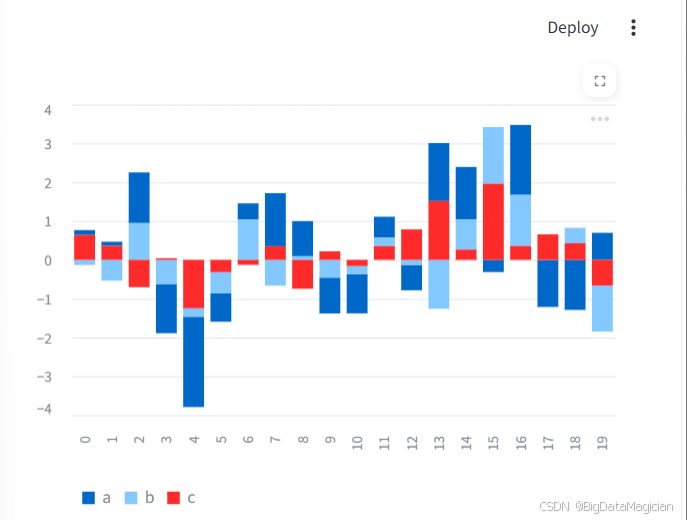
示例2:指定列并配置颜色
python
import pandas as pd
import streamlit as st
from numpy.random import default_rng as rng

df = pd.DataFrame({
    "col1": list(range(20)) * 3,
    "col2": rng(0).standard_normal(60),
    "col3": ["a", "b", "c"] * 20,
})

# 指定X/Y轴,并根据col3的值自动着色
st.bar_chart(df, x="col1", y="col2", color="col3")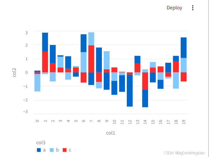
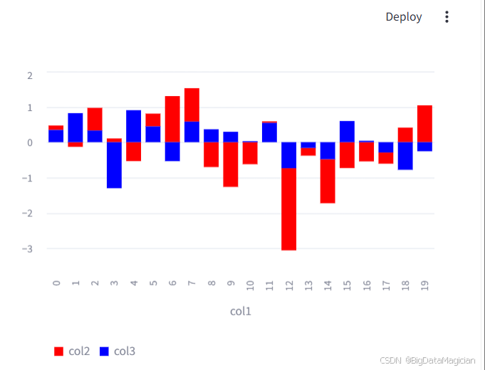
示例3:多列数据与自定义颜色
python
import pandas as pd
import streamlit as st
from numpy.random import default_rng as rng

df = pd.DataFrame({
    "col1": list(range(20)),
    "col2": rng(0).standard_normal(20),
    "col3": rng(1).standard_normal(20),
})

# 为多列数据分别指定颜色
st.bar_chart(
    df,
    x="col1",
    y=["col2", "col3"],
    color=["#FF0000", "#0000FF"],
)
示例4:水平柱状图
python
import streamlit as st
from vega_datasets import data

# 使用示例数据
source = data.barley()

# 绘制水平柱状图
st.bar_chart(
    source,
    x="variety",
    y="yield",
    color="site",
    horizontal=True
)
示例5:不堆叠的并列柱状图
python
import streamlit as st
from vega_datasets import data

# 使用示例数据
source = data.barley()

# 绘制并列柱状图(不堆叠)
st.bar_chart(
    source,
    x="year",
    y="yield",
    color="site",
    stack=False
)
💡 提示:如果需要高度自定义的柱状图(如调整柱子宽度、添加数据标签、修改图例位置等),建议使用
st.altair_chart。
3. 折线图(st.line_chart)
st.line_chart 是 Streamlit 中用于快速绘制折线图的组件,同样是 st.altair_chart 的语法糖,使用便捷但自定义性较低,适合快速展示趋势变化。
3.1 核心参数
| 参数 | 说明 |
|---|---|
data |
要绘制的数据,支持 st.dataframe 兼容的所有格式 |
x |
X 轴数据列名,默认使用数据的索引 |
y |
Y 轴数据列名(可单列或多列),默认绘制所有非 X 轴列 |
x_label/y_label |
X/Y 轴的显示标签 |
color |
线条颜色配置,支持: - 单个颜色值(十六进制、RGB/RGBA 元组) - 颜色列表(为每个系列指定颜色) - 数据列名(根据列值自动分组并着色) |
width/height |
图表尺寸,可选 "stretch"/"content" 或固定像素值 |
3.2 使用示例
示例1:基础折线图
python
import pandas as pd
import streamlit as st
from numpy.random import default_rng as rng

# 生成示例数据
df = pd.DataFrame(rng(0).standard_normal((20, 3)), columns=["a", "b", "c"])

# 绘制折线图(默认使用索引为X轴,所有列为Y轴)
st.line_chart(df)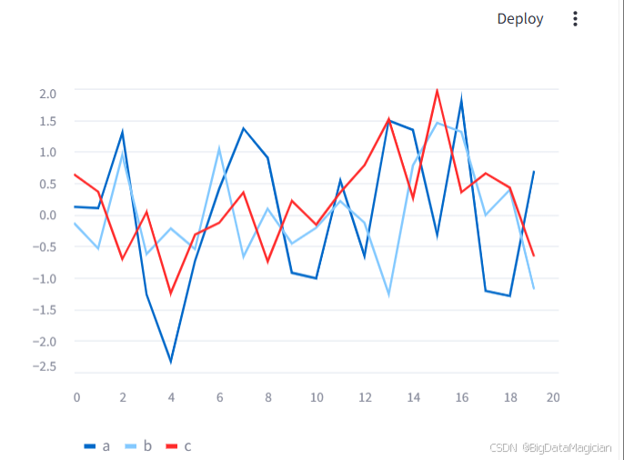
示例2:指定列并配置颜色
python
import pandas as pd
import streamlit as st
from numpy.random import default_rng as rng

df = pd.DataFrame({
    "col1": list(range(20)) * 3,
    "col2": rng(0).standard_normal(60),
    "col3": ["a", "b", "c"] * 20,
})

# 指定X/Y轴,并根据col3的值自动着色
st.line_chart(df, x="col1", y="col2", color="col3")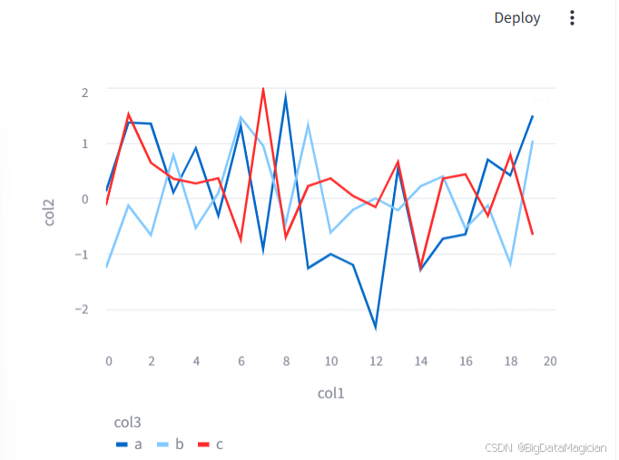
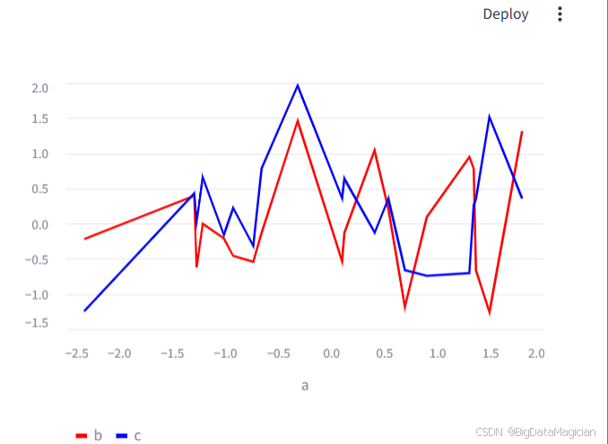
示例3:多列数据与自定义颜色
python
import pandas as pd
import streamlit as st
from numpy.random import default_rng as rng

df = pd.DataFrame(rng(0).standard_normal((20, 3)), columns=["a", "b", "c"])

# 为多列数据分别指定颜色
st.line_chart(
    df,
    x="a",
    y=["b", "c"],
    color=["#FF0000", "#0000FF"],
)
💡 提示:如果需要高度自定义的折线图(如调整线条样式、添加标记点、修改图例位置等),建议使用
st.altair_chart。
4. 地图(st.map)
st.map 是 Streamlit 中用于快速绘制地图散点图的组件,是 st.pydeck_chart 的简化封装,支持自动居中与缩放,适合快速展示地理数据。
4.1 核心参数
| 参数 | 说明 |
|---|---|
data |
要绘制的数据,支持 st.dataframe 兼容的所有格式 |
latitude |
纬度数据列名,默认自动识别列名(如 lat/latitude) |
longitude |
经度数据列名,默认自动识别列名(如 lon/longitude) |
color |
散点颜色配置,支持: - 单个颜色值(十六进制、RGB/RGBA 元组) - 数据列名(根据列值动态着色) |
size |
散点大小配置,支持: - 固定数值(如 20,单位:米) - 数据列名(根据列值动态调整大小) |
zoom |
初始缩放级别(0-18,参考 OpenStreetMap 缩放标准) |
width/height |
图表尺寸,可选 "stretch"/固定像素值(默认高度 500) |
4.2 使用示例
示例1:基础地图散点图
python
import pandas as pd
import streamlit as st
from numpy.random import default_rng as rng

# 生成示例地理数据(以洛杉矶为中心)
df = pd.DataFrame(
    rng(0).standard_normal((1000, 2)) / [50, 50] + [37.76, -122.4],
    columns=["lat", "lon"],
)

# 绘制地图散点图
st.map(df)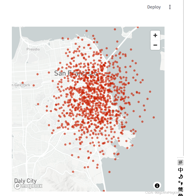
示例2:自定义散点颜色和大小
python
import pandas as pd
import streamlit as st
from numpy.random import default_rng as rng

df = pd.DataFrame(
    rng(0).standard_normal((1000, 2)) / [50, 50] + [37.76, -122.4],
    columns=["lat", "lon"],
)

# 自定义颜色和大小
st.map(df, size=20, color="#0044ff")
示例3:动态调整散点大小和颜色
python
import pandas as pd
import streamlit as st
from numpy.random import default_rng as rng

df = pd.DataFrame({
    "col1": rng(0).standard_normal(1000) / 50 + 37.76,  # 纬度
    "col2": rng(1).standard_normal(1000) / 50 + (-122.4),  # 经度
    "col3": rng(2).standard_normal(1000) * 100,  # 用于控制大小
    "col4": rng(3).standard_normal((1000, 4)).tolist(),  # 用于控制颜色
})

# 动态设置大小和颜色
st.map(df, latitude="col1", longitude="col2", size="col3", color="col4")
💡 提示:如果需要高度自定义的地图(如添加多边形、路径、3D效果等),建议使用
st.pydeck_chart。
5. 散点图(st.scatter_chart)
st.scatter_chart 是 Streamlit 中用于快速绘制散点图的组件,同样是 st.altair_chart 的语法糖,使用便捷但自定义性较低,适合快速展示变量间的关系和分布。
5.1 核心参数
| 参数 | 说明 |
|---|---|
data |
要绘制的数据,支持 st.dataframe 兼容的所有格式 |
x |
X 轴数据列名,默认使用数据的索引 |
y |
Y 轴数据列名(可单列或多列),默认绘制所有非 X 轴列 |
x_label/y_label |
X/Y 轴的显示标签 |
color |
散点颜色配置,支持: - 单个颜色值(十六进制、RGB/RGBA 元组) - 数据列名(根据列值动态着色,支持分类或连续渐变) - 颜色列表(为每个系列指定颜色) |
size |
散点大小配置,支持: - 固定数值(如 100) - 数据列名(根据列值动态调整大小) |
width/height |
图表尺寸,可选 "stretch"/"content" 或固定像素值 |
5.2 使用示例
示例1:基础散点图
python
import pandas as pd
import streamlit as st
from numpy.random import default_rng as rng

# 生成示例数据
df = pd.DataFrame(rng(0).standard_normal((20, 3)), columns=["a", "b", "c"])

# 绘制散点图(默认使用索引为X轴,所有列为Y轴,自动着色)
st.scatter_chart(df)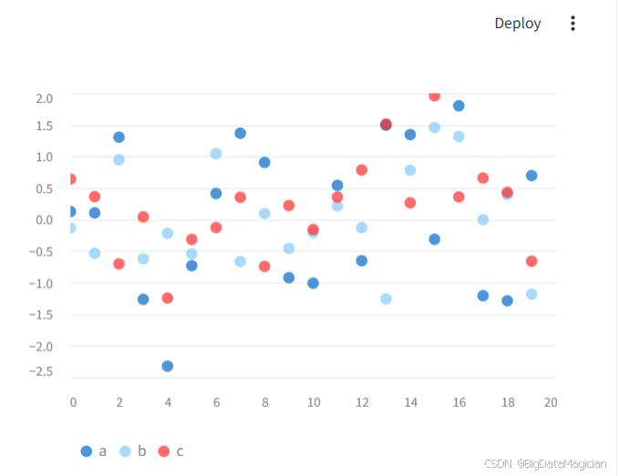
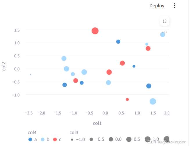
示例2:指定列并动态配置颜色和大小
python
import pandas as pd
import streamlit as st
from numpy.random import default_rng as rng

df = pd.DataFrame(rng(0).standard_normal((20, 3)), columns=["col1", "col2", "col3"])
df["col4"] = rng(0).choice(["a", "b", "c"], 20)  # 用于分类着色

# 指定X/Y轴,并根据col4的值动态着色
st.scatter_chart(
    df,
    x="col1",
    y="col2",
    color="col4",  # 根据col4的值自动着色
    size="col3"    # 根据col3的值动态调整点的大小
)
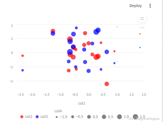
示例3:多列数据与自定义颜色
python
import pandas as pd
import streamlit as st
from numpy.random import default_rng as rng

df = pd.DataFrame(rng(0).standard_normal((20, 4)), columns=["col1", "col2", "col3", "col4"])

# 为多列数据分别指定颜色和大小
st.scatter_chart(
    df,
    x="col1",
    y=["col2", "col3"],  # 绘制两组Y轴数据
    color=["#FF0000", "#0000FF"],  # 为两组数据指定不同颜色
    size="col4"  # 根据col4的值动态调整点的大小
)
💡 提示:如果需要高度自定义的散点图(如添加回归线、修改点的形状、调整图例位置等),建议使用
st.altair_chart。
二、高级图表(ADVANCED)
1. Altair 图表(st.altair_chart)
st.altair_chart 是 Streamlit 中用于展示 Vega-Altair 图表的高级组件,支持声明式定义、高度自定义和交互功能,适合制作复杂、可交互的数据可视化。
1.1 核心参数
| 参数 | 说明 |
|---|---|
altair_chart |
Altair 图表对象,通过 alt.Chart() 创建 |
width/height |
图表尺寸,可选 "stretch"/"content" 或固定像素值 |
theme |
图表主题,默认 "streamlit"(Streamlit 风格),也可设置为 None(Altair 原生主题) |
key |
图表的唯一标识,用于存储交互状态 |
on_select |
交互事件响应方式,可选: - "ignore"(默认,无响应) - "rerun"(用户选择后重新运行应用) - 回调函数(用户选择时执行) |
selection_mode |
交互选择模式,指定使用哪些选择器(如 point/interval) |
1.2 使用示例
示例1:基础 Altair 散点图
python
import altair as alt
import pandas as pd
import streamlit as st
from numpy.random import default_rng as rng

# 生成示例数据
df = pd.DataFrame(rng(0).standard_normal((60, 3)), columns=["a", "b", "c"])

# 创建 Altair 图表
chart = (
    alt.Chart(df)
    .mark_circle()
    .encode(
        x="a",
        y="b",
        size="c",
        color="c",
        tooltip=["a", "b", "c"]
    )
)

# 在 Streamlit 中展示
st.altair_chart(chart, use_container_width=True)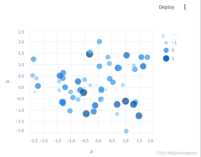
示例2:带交互选择的图表
python
import altair as alt
import pandas as pd
import streamlit as st
from numpy.random import default_rng as rng

df = pd.DataFrame(rng(0).standard_normal((20, 3)), columns=["a", "b", "c"])

# 定义选择器
point_selector = alt.selection_point("point_selection")
interval_selector = alt.selection_interval("interval_selection")

# 创建带交互的图表
chart = (
    alt.Chart(df)
    .mark_circle()
    .encode(
        x="a",
        y="b",
        size="c",
        color="c",
        tooltip=["a", "b", "c"],
        fillOpacity=alt.condition(point_selector, alt.value(1), alt.value(0.3))
    )
    .add_params(point_selector, interval_selector)
)

# 展示图表并获取选择事件
event = st.altair_chart(chart, on_select="rerun", key="alt_chart")
st.write("Selection state:", event.selection)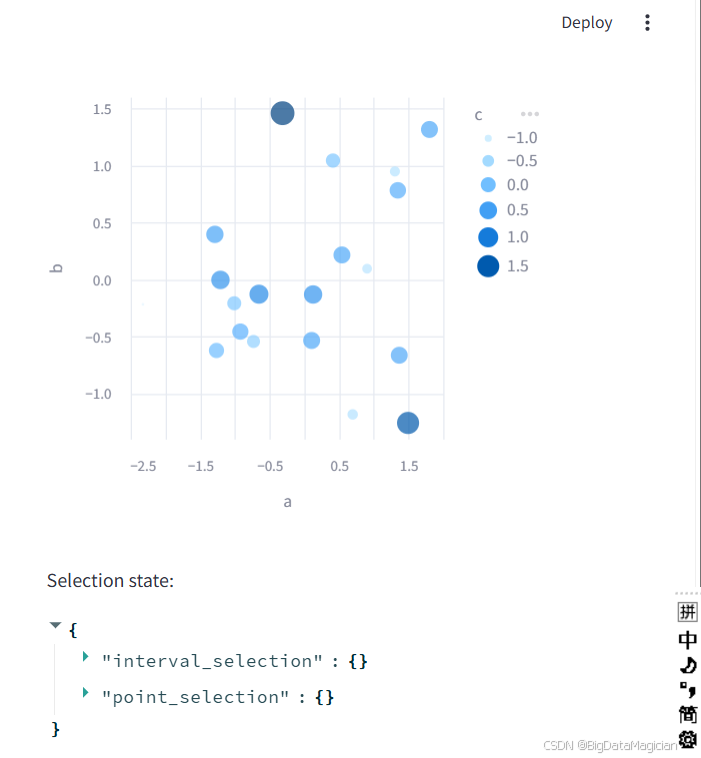
💡 提示:Altair 支持折线图、柱状图、热力图、箱线图等多种图表类型,且可通过
mark_*()和encode()方法实现高度自定义。更多示例可参考 Altair 官方画廊。
2. Graphviz 图表(st.graphviz_chart)
st.graphviz_chart 用于渲染 Graphviz 流程图/有向无环图(DAG),支持通过 Python 对象或 Dot 语言字符串定义,适合展示系统架构、流程关系等。
2.1 前置依赖
需要先安装 graphviz 库:
bash
pip install streamlit[charts]2.2 核心参数
| 参数 | 说明 |
|---|---|
figure_or_dot |
图表定义,支持: - graphviz.dot.Graph/Digraph 对象 - Graphviz Dot 语言字符串 - graphviz.sources.Source 对象 |
width/height |
图表尺寸,可选 "content"(默认,自适应内容)、"stretch"(拉伸至容器)或固定像素值 |
2.3 使用示例
示例1:使用 Python Graphviz 对象定义流程图
python
import streamlit as st
import graphviz

# 创建有向图对象
graph = graphviz.Digraph()

# 添加节点和边
graph.edge("run", "intr")
graph.edge("intr", "runbl")
graph.edge("runbl", "run")
graph.edge("run", "kernel")
graph.edge("kernel", "zombie")
graph.edge("kernel", "sleep")
graph.edge("kernel", "runmem")
graph.edge("sleep", "swap")
graph.edge("swap", "runswap")
graph.edge("runswap", "new")
graph.edge("runswap", "runmem")
graph.edge("new", "runmem")
graph.edge("sleep", "runmem")

# 渲染图表
st.graphviz_chart(graph)
示例2:直接使用 Dot 语言字符串定义
python
import streamlit as st

# 使用 Dot 语言定义流程图
st.graphviz_chart('''
    digraph {
        run -> intr
        intr -> runbl
        runbl -> run
        run -> kernel
        kernel -> zombie
        kernel -> sleep
        kernel -> runmem
        sleep -> swap
        swap -> runswap
        runswap -> new
        runswap -> runmem
        new -> runmem
        sleep -> runmem
    }
''')
💡 提示:Dot 语言支持丰富的样式配置(如节点形状、颜色、边样式等),可参考 Graphviz 官方文档 自定义图表外观。
3. Plotly 图表(st.plotly_chart)
st.plotly_chart 是 Streamlit 中用于展示 Plotly 图表的组件,支持高度交互、丰富的图表类型和自定义配置,适合制作复杂、动态的数据可视化。
3.1 前置依赖
需要先安装 plotly 库:
bash
pip install streamlit[charts]3.2 核心参数
| 参数 | 说明 |
|---|---|
figure_or_data |
Plotly 图表对象,通过 plotly.express 或 plotly.graph_objects 创建 |
width/height |
图表尺寸,可选 "stretch"(默认,拉伸至容器)、"content"(自适应内容)或固定像素值 |
theme |
图表主题,默认 "streamlit"(Streamlit 风格),也可设置为 None(Plotly 原生主题) |
key |
图表的唯一标识,用于存储交互状态 |
on_select |
交互事件响应方式,可选: - "ignore"(默认,无响应) - "rerun"(用户选择后重新运行应用) - 回调函数(用户选择时执行) |
selection_mode |
交互选择模式,可选 "points"/"box"/"lasso"(默认全选) |
config |
Plotly 配置选项,用于自定义交互行为(如禁用缩放、滚动等) |
3.3 使用示例
示例1:基础 Plotly 散点图
python
import plotly.express as px
import streamlit as st

# 使用内置数据集创建散点图
df = px.data.iris()
fig = px.scatter(
    df,
    x="sepal_width",
    y="sepal_length",
    color="species",
    size="petal_length",
    hover_data=["petal_width"]
)

# 在 Streamlit 中展示
st.plotly_chart(fig, use_container_width=True)
示例2:带交互配置的图表
python
import plotly.graph_objects as go
import streamlit as st

# 创建自定义散点图
fig = go.Figure(
    data=[go.Scatter(
        x=[1, 2, 3, 4, 5],
        y=[1, 3, 2, 4, 5],
        mode="markers"
    )]
)

# 禁用缩放滚动,保留工具栏按钮
st.plotly_chart(
    fig,
    config={"scrollZoom": False},
    use_container_width=True
)
示例3:带选择事件的图表
python
import plotly.express as px
import streamlit as st

df = px.data.iris()
fig = px.scatter(df, x="sepal_width", y="sepal_length", color="species")

# 启用交互选择并获取状态
event = st.plotly_chart(fig, on_select="rerun", key="iris_chart")
st.write("Selection state:", event.selection)
💡 提示:Plotly 支持折线图、柱状图、热力图、地图、3D图表等多种类型,且可通过
fig.update_layout()方法实现高度自定义。更多示例可参考 Plotly Python 官方文档。
4. PyDeck 3D地图(st.pydeck_chart)
st.pydeck_chart 是 Streamlit 中用于展示 PyDeck/DeckGL 3D地图的组件,支持六边形热力图、散点图、路径图等多种图层,适合制作复杂的地理空间可视化。
4.1 核心参数
| 参数 | 说明 |
|---|---|
pydeck_obj |
PyDeck 图表对象,通过 pydeck.Deck() 创建 |
width/height |
图表尺寸,默认 width="stretch"(拉伸至容器),height=500(像素) |
on_select |
交互事件响应方式,可选: - "ignore"(默认,无响应) - "rerun"(用户选择后重新运行应用) - 回调函数(用户选择时执行) |
selection_mode |
选择模式,可选 "single-object"(默认,单选)或 "multi-object"(多选) |
key |
图表的唯一标识,用于存储交互状态 |
4.2 使用示例
示例1:六边形热力图与散点图组合
python
import pandas as pd
import pydeck as pdk
import streamlit as st
from numpy.random import default_rng as rng

# 生成示例地理数据(以旧金山为中心)
df = pd.DataFrame(
    rng(0).standard_normal((1000, 2)) / [50, 50] + [37.76, -122.4],
    columns=["lat", "lon"],
)

# 创建PyDeck图表
chart = pdk.Deck(
    map_style=None,  # 自动匹配Streamlit主题(浅色/深色)
    initial_view_state=pdk.ViewState(
        latitude=37.76,
        longitude=-122.4,
        zoom=11,
        pitch=50,
    ),
    layers=[
        # 六边形热力图层
        pdk.Layer(
            "HexagonLayer",
            data=df,
            get_position="[lon, lat]",
            radius=200,
            elevation_scale=4,
            elevation_range=[0, 1000],
            pickable=True,
            extruded=True,
        ),
        # 散点图层
        pdk.Layer(
            "ScatterplotLayer",
            data=df,
            get_position="[lon, lat]",
            get_color="[200, 30, 0, 160]",
            get_radius=200,
        ),
    ],
)

# 在Streamlit中展示
st.pydeck_chart(chart)
示例2:带交互选择的散点图
python
import pandas as pd
import pydeck as pdk
import streamlit as st

# 示例数据:美国州府人口
capitals = pd.read_csv("capitals.csv", header=0)
capitals["size"] = capitals.Population / 10

# 创建散点图层
point_layer = pdk.Layer(
    "ScatterplotLayer",
    data=capitals,
    id="capital-cities",
    get_position=["Longitude", "Latitude"],
    get_color="[255, 75, 75]",
    pickable=True,
    auto_highlight=True,
    get_radius="size",
)

# 设置初始视角
view_state = pdk.ViewState(latitude=40, longitude=-100, zoom=2.4, pitch=30)

# 创建PyDeck图表
chart = pdk.Deck(
    layers=[point_layer],
    initial_view_state=view_state,
    tooltip={
        "text": "{Capital}, {Abbreviation}\nPopulation: {Population}",
    },
)

# 启用交互选择并获取状态
event = st.pydeck_chart(chart, on_select="rerun", selection_mode="multi-object")
st.write("Selection state:", event.selection)
💡 提示:PyDeck 支持多种图层类型(如
ArcLayer路径层、TextLayer文本层等),且可通过tooltip参数自定义提示信息。更多示例可参考 PyDeck 官方文档。
5. Matplotlib 图表(st.pyplot)
st.pyplot 是 Streamlit 中用于展示 Matplotlib 图表的组件,支持直接渲染 Matplotlib 生成的 Figure 对象,适合展示传统静态或半交互式图表。
5.1 前置依赖
需要先安装 matplotlib 库:
bash
pip install streamlit[charts]5.2 核心参数
| 参数 | 说明 |
|---|---|
fig |
Matplotlib 的 Figure 对象,通过 plt.subplots() 创建 |
clear_figure |
渲染后是否清除图表(默认:若指定 fig 则为 False,否则为 True) |
width |
图表宽度,可选 "stretch"(默认,拉伸至容器)、"content"(自适应内容)或固定像素值 |
**kwargs |
传递给 matplotlib.pyplot.savefig() 的额外参数(如 dpi、bbox_inches 等) |
5.3 使用示例
示例1:基础直方图
python
import matplotlib.pyplot as plt
import streamlit as st
from numpy.random import default_rng as rng

# 生成示例数据
arr = rng(0).normal(1, 1, size=100)

# 创建 Matplotlib 图表
fig, ax = plt.subplots()
ax.hist(arr, bins=20)

# 在 Streamlit 中展示
st.pyplot(fig)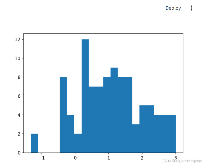
示例2:线程安全的散点图(解决并发问题)
Matplotlib 不支持多线程并发,因此需要使用锁保护图表创建过程:
python
import streamlit as st
import matplotlib.pyplot as plt
import numpy as np
from threading import RLock

# 创建线程锁
_lock = RLock()

# 生成示例数据
x = np.random.normal(1, 1, 100)
y = np.random.normal(1, 1, 100)

# 使用锁保护 Matplotlib 操作
with _lock:
    fig, ax = plt.subplots()
    ax.scatter(x, y)
    st.pyplot(fig)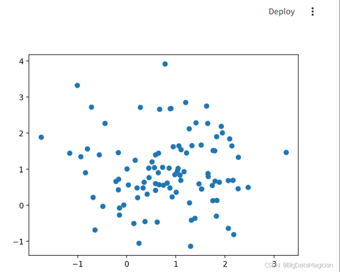
💡 提示:如果遇到 Matplotlib 后端错误(如
TkAgg相关问题),可通过设置matplotlibrc文件指定后端:
bashecho "backend: TkAgg" >> ~/.matplotlib/matplotlibrc
6. Vega-Lite 图表(st.vega_lite_chart)
st.vega_lite_chart 是 Streamlit 中用于展示 Vega-Lite 图表的组件,支持通过 JSON 声明式语法定义图表,适合制作高度自定义的交互式可视化。
6.1 核心参数
| 参数 | 说明 |
|---|---|
data |
要绘制的数据,支持 st.dataframe 兼容的所有格式 |
spec |
Vega-Lite 图表配置(JSON 字典),定义图表类型、编码、交互等 |
width/height |
图表尺寸,可选 "stretch"/"content" 或固定像素值 |
theme |
图表主题,默认 "streamlit"(Streamlit 风格),也可设置为 None(原生 Vega-Lite 主题) |
key |
图表的唯一标识,用于存储交互状态 |
on_select |
交互事件响应方式,可选: - "ignore"(默认,无响应) - "rerun"(用户选择后重新运行应用) - 回调函数(用户选择时执行) |
selection_mode |
交互选择模式,指定使用哪些选择器(如 point/interval) |
6.2 使用示例
示例1:基础散点图(通过 Vega-Lite 配置)
python
import pandas as pd
import streamlit as st
from numpy.random import default_rng as rng

# 生成示例数据
df = pd.DataFrame(rng(0).standard_normal((60, 3)), columns=["a", "b", "c"])

# 定义 Vega-Lite 配置
spec = {
    "mark": {"type": "circle", "tooltip": True},
    "encoding": {
        "x": {"field": "a", "type": "quantitative"},
        "y": {"field": "b", "type": "quantitative"},
        "size": {"field": "c", "type": "quantitative"},
        "color": {"field": "c", "type": "quantitative"},
    },
}

# 在 Streamlit 中展示
st.vega_lite_chart(df, spec)
示例2:带交互选择的图表
python
import pandas as pd
import streamlit as st
from numpy.random import default_rng as rng

df = pd.DataFrame(rng(0).standard_normal((20, 3)), columns=["a", "b", "c"])

# 定义带交互的 Vega-Lite 配置
spec = {
    "mark": {"type": "circle", "tooltip": True},
    "params": [
        {"name": "point_selection", "select": "point"},
        {"name": "interval_selection", "select": "interval"},
    ],
    "encoding": {
        "x": {"field": "a", "type": "quantitative"},
        "y": {"field": "b", "type": "quantitative"},
        "size": {"field": "c", "type": "quantitative"},
        "color": {"field": "c", "type": "quantitative"},
        "fillOpacity": {"param": "point_selection", "value": 1, "condition": {"param": "point_selection", "value": 0.3}},
    },
}

# 展示图表并获取选择事件
event = st.vega_lite_chart(df, spec, key="vega_chart", on_select="rerun")
st.write("Selection state:", event.selection)
💡 提示:Vega-Lite 支持折线图、柱状图、热力图、箱线图等多种图表类型,且可通过
params定义交互行为。更多示例可参考 Vega-Lite 官方文档。