【Flutter x HarmonyOS 6】设置页面的UI设计
前面几篇我们聊了记录页面和挑战页面,这篇来看看导航栏中的最后一个页面------设置页面。
设置页面是用户配置应用偏好的入口,包括主题、显示、训练、挑战等多个分组。这篇我们从 UI 设计的角度,看看这个页面是如何组织的。
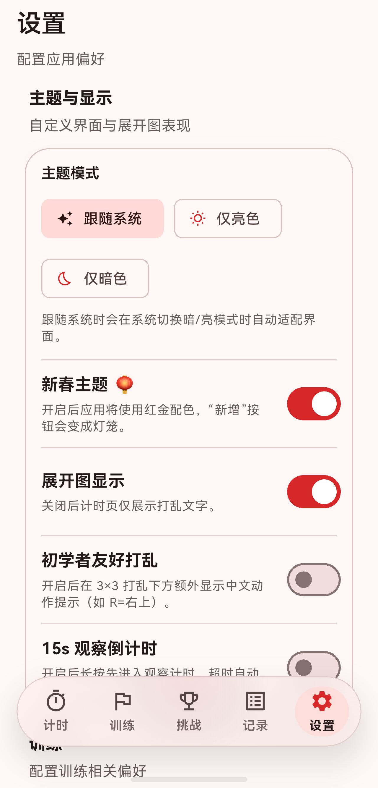
一、页面整体结构
设置页面同样使用 SectionedPage 包裹,内容区域是一个 ListView:
dart
class SettingsPage extends StatelessWidget {
  const SettingsPage({super.key});

  @override
  Widget build(BuildContext context) {
    final bottomSafeArea = MediaQuery.of(context).padding.bottom;
    final bottomNavHeight = AdaptiveLayout.bottomNavReservedHeight(context);
    final bottomSpacer = bottomSafeArea + bottomNavHeight + 16;

    return SectionedPage(
      title: '设置',
      subtitle: const Text('配置应用偏好'),
      child: ListView(
        padding: EdgeInsets.only(top: 8, bottom: bottomSpacer),
        children: [
          const _SettingsGroup(
            title: '主题与显示',
            subtitle: '自定义界面与展开图表现',
            children: [
              _ThemeModeSelector(),
              _ChineseNewYearThemeToggle(),
              _ScrambleNetToggle(),
              _BeginnerScrambleToggle(),
              _InspectionToggle(),
            ],
          ),
          const SizedBox(height: 20),
          _SettingsGroup(
            title: '训练',
            subtitle: '配置训练相关偏好',
            children: [
              _DefaultPlanSelector(),
            ],
          ),
          const SizedBox(height: 20),
          const _SettingsGroup(
            title: '挑战',
            subtitle: '配置挑战进行页展示偏好',
            children: [
              _ChallengeTimerOrderToggle(),
            ],
          ),
          const SizedBox(height: 20),
          _SettingsGroup(
            title: '关于应用',
            subtitle: 'LRTimer',
            children: [
              _SettingsActionTile(...),
              const _SettingsActionTile(...),
            ],
          ),
        ],
      ),
    );
  }
}
页面分为四个设置组:
- 主题与显示:主题模式、新春主题、展开图显示等。
- 训练:默认训练计划。
- 挑战:成绩排序方式。
- 关于应用:使用教程、版本信息。
二、设置组设计
每个设置组由 _SettingsGroup 组件实现:
dart
class _SettingsGroup extends StatelessWidget {
  const _SettingsGroup({
    required this.title,
    required this.subtitle,
    required this.children,
  });

  final String title;
  final String subtitle;
  final List<Widget> children;

  @override
  Widget build(BuildContext context) {
    final theme = Theme.of(context);

    return Column(
      crossAxisAlignment: CrossAxisAlignment.start,
      children: [
        Padding(
          padding: const EdgeInsets.symmetric(horizontal: 4),
          child: Column(
            crossAxisAlignment: CrossAxisAlignment.start,
            children: [
              Text(
                title,
                style: theme.textTheme.titleMedium
                    ?.copyWith(fontWeight: FontWeight.w800),
              ),
              const SizedBox(height: 4),
              Text(
                subtitle,
                style: theme.textTheme.bodyMedium?.copyWith(
                  color: theme.textTheme.bodyMedium?.color?.withOpacity(0.7),
                ),
              ),
            ],
          ),
        ),
        const SizedBox(height: 12),
        _SettingsGroupCard(children: children),
      ],
    );
  }
}
设置组包含两部分:
- 标题区域:组标题 + 副标题说明。
- 卡片区域 :
_SettingsGroupCard包裹的具体设置项。
三、设置组卡片设计
_SettingsGroupCard 是一个带圆角和阴影的卡片:
dart
class _SettingsGroupCard extends StatelessWidget {
  const _SettingsGroupCard({required this.children});

  static const EdgeInsets tilePadding =
      EdgeInsets.symmetric(horizontal: 16, vertical: 6);

  final List<Widget> children;

  @override
  Widget build(BuildContext context) {
    final colorScheme = Theme.of(context).colorScheme;
    final borderRadius = BorderRadius.circular(24);

    final separatedChildren = <Widget>[];
    for (var i = 0; i < children.length; i++) {
      separatedChildren.add(children[i]);
      if (i == children.length - 1) {
        continue;
      }
      separatedChildren.add(
        Divider(
          height: 1,
          thickness: 1,
          indent: 16,
          endIndent: 16,
          color: colorScheme.outlineVariant.withOpacity(0.7),
        ),
      );
    }

    return Container(
      decoration: BoxDecoration(
        borderRadius: borderRadius,
        boxShadow: [
          BoxShadow(
            color: Colors.black.withOpacity(0.04),
            blurRadius: 20,
            offset: const Offset(0, 8),
          ),
        ],
      ),
      child: Material(
        color: colorScheme.surface,
        shape: RoundedRectangleBorder(
          borderRadius: borderRadius,
          side: BorderSide(color: colorScheme.outlineVariant),
        ),
        clipBehavior: Clip.antiAlias,
        child: Column(
          mainAxisSize: MainAxisSize.min,
          crossAxisAlignment: CrossAxisAlignment.stretch,
          children: separatedChildren,
        ),
      ),
    );
  }
}
3.1 分隔线处理
卡片内的设置项之间自动插入分隔线:
dart
final separatedChildren = <Widget>[];
for (var i = 0; i < children.length; i++) {
  separatedChildren.add(children[i]);
  if (i == children.length - 1) {
    continue;  // 最后一项后不加分隔线
  }
  separatedChildren.add(
    Divider(
      height: 1,
      thickness: 1,
      indent: 16,
      endIndent: 16,
      color: colorScheme.outlineVariant.withOpacity(0.7),
    ),
  );
}
分隔线特点:
indent: 16和endIndent: 16让分隔线不贴边。- 颜色使用
outlineVariant并降低透明度。
3.2 卡片样式
dart
Container(
  decoration: BoxDecoration(
    borderRadius: borderRadius,
    boxShadow: [
      BoxShadow(
        color: Colors.black.withOpacity(0.04),
        blurRadius: 20,
        offset: const Offset(0, 8),
      ),
    ],
  ),
  child: Material(
    color: colorScheme.surface,
    shape: RoundedRectangleBorder(
      borderRadius: borderRadius,
      side: BorderSide(color: colorScheme.outlineVariant),
    ),
    clipBehavior: Clip.antiAlias,
    child: Column(...),
  ),
)
卡片样式:
- 圆角 24dp。
- 轻微阴影(黑色 4% 透明度,模糊半径 20,向下偏移 8)。
- 边框使用
outlineVariant颜色。
四、主题模式选择器
主题模式使用 ChoiceChip 实现:
dart
class _ThemeModeSelector extends StatelessWidget {
  const _ThemeModeSelector();

  @override
  Widget build(BuildContext context) {
    final theme = Theme.of(context);
    final settingsService = context.watch<AppSettingsService>();
    final selectedPreference = settingsService.themePreference;

    Widget buildChip({
      required ThemePreference value,
      required String label,
      required IconData icon,
    }) {
      final isSelected = selectedPreference == value;
      return ChoiceChip(
        selected: isSelected,
        showCheckmark: false,
        padding: const EdgeInsets.symmetric(horizontal: 12, vertical: 8),
        avatar: Icon(icon, size: 16),
        label: Text(label),
        onSelected: (shouldSelect) {
          if (!shouldSelect || isSelected) {
            return;
          }
          settingsService.setThemePreference(value);
        },
      );
    }

    return Padding(
      padding: const EdgeInsets.fromLTRB(16, 14, 16, 14),
      child: Column(
        crossAxisAlignment: CrossAxisAlignment.start,
        children: [
          Text(
            '主题模式',
            style: theme.textTheme.titleSmall?.copyWith(fontWeight: FontWeight.w700),
          ),
          const SizedBox(height: 10),
          Wrap(
            spacing: 10,
            runSpacing: 10,
            children: [
              buildChip(
                value: ThemePreference.system,
                label: '跟随系统',
                icon: Icons.auto_awesome,
              ),
              buildChip(
                value: ThemePreference.light,
                label: '仅亮色',
                icon: Icons.wb_sunny_outlined,
              ),
              buildChip(
                value: ThemePreference.dark,
                label: '仅暗色',
                icon: Icons.bedtime_outlined,
              ),
            ],
          ),
          const SizedBox(height: 8),
          Text(
            '跟随系统时会在系统切换暗/亮模式时自动适配界面。',
            style: theme.textTheme.bodySmall?.copyWith(
              color: theme.textTheme.bodySmall?.color?.withOpacity(0.7),
            ),
          ),
        ],
      ),
    );
  }
}
4.1 ChoiceChip 配置
dart
ChoiceChip(
  selected: isSelected,
  showCheckmark: false,  // 不显示勾选图标
  padding: const EdgeInsets.symmetric(horizontal: 12, vertical: 8),
  avatar: Icon(icon, size: 16),  // 左侧图标
  label: Text(label),
  onSelected: (shouldSelect) {
    if (!shouldSelect || isSelected) {
      return;
    }
    settingsService.setThemePreference(value);
  },
)
三个选项:
- 跟随系统 :
auto_awesome图标。 - 仅亮色 :
wb_sunny_outlined图标。 - 仅暗色 :
bedtime_outlined图标。
五、开关设置项
多个设置项使用 GripAwareSwitchTile 实现:
5.1 展开图显示
dart
class _ScrambleNetToggle extends StatelessWidget {
  const _ScrambleNetToggle();

  @override
  Widget build(BuildContext context) {
    final settingsService = context.watch<AppSettingsService>();
    final theme = Theme.of(context);
    final isEnabled = settingsService.showScrambleNet;

    return GripAwareSwitchTile(
      contentPadding: _SettingsGroupCard.tilePadding,
      value: isEnabled,
      onChanged: settingsService.setShowScrambleNet,
      title: const Text('展开图显示'),
      subtitle: Text(
        '关闭后计时页仅展示打乱文字。',
        style: theme.textTheme.bodySmall?.copyWith(
          color: theme.textTheme.bodySmall?.color?.withOpacity(0.7),
        ),
      ),
    );
  }
}
5.2 新春主题
dart
class _ChineseNewYearThemeToggle extends StatelessWidget {
  @override
  Widget build(BuildContext context) {
    final settingsService = context.watch<AppSettingsService>();
    final theme = Theme.of(context);
    final isEnabled = settingsService.chineseNewYearThemeEnabled;

    return GripAwareSwitchTile(
      contentPadding: _SettingsGroupCard.tilePadding,
      value: isEnabled,
      onChanged: settingsService.setChineseNewYearThemeEnabled,
      title: Row(
        mainAxisSize: MainAxisSize.min,
        children: [
          const Text('新春主题'),
          const SizedBox(width: 6),
          Text('🏮', style: TextStyle(fontSize: 16)),
        ],
      ),
      subtitle: Text(
        '开启后应用将使用红金配色,"新增"按钮会变成灯笼。',
        style: theme.textTheme.bodySmall?.copyWith(
          color: theme.textTheme.bodySmall?.color?.withOpacity(0.7),
        ),
      ),
    );
  }
}
标题中加入了灯笼 emoji,增添节日氛围。
5.3 初学者友好打乱
dart
class _BeginnerScrambleToggle extends StatelessWidget {
  @override
  Widget build(BuildContext context) {
    final settingsService = context.watch<AppSettingsService>();
    final theme = Theme.of(context);
    final isEnabled = settingsService.beginnerFriendlyScrambleEnabled;

    return GripAwareSwitchTile(
      contentPadding: _SettingsGroupCard.tilePadding,
      value: isEnabled,
      onChanged: settingsService.setBeginnerFriendlyScrambleEnabled,
      title: const Text('初学者友好打乱'),
      subtitle: Text(
        '开启后在 3×3 打乱下方额外显示中文动作提示(如 R=右上)。',
        style: theme.textTheme.bodySmall?.copyWith(
          color: theme.textTheme.bodySmall?.color?.withOpacity(0.7),
        ),
      ),
    );
  }
}
5.4 15s 观察倒计时
dart
class _InspectionToggle extends StatelessWidget {
  @override
  Widget build(BuildContext context) {
    final settingsService = context.watch<AppSettingsService>();
    final theme = Theme.of(context);
    final isEnabled = settingsService.inspectionCountdownEnabled;

    return GripAwareSwitchTile(
      contentPadding: _SettingsGroupCard.tilePadding,
      value: isEnabled,
      onChanged: settingsService.setInspectionCountdownEnabled,
      title: const Text('15s 观察倒计时'),
      subtitle: Text(
        '开启后长按先进入观察计时,超时自动按 WCA 规则罚时。',
        style: theme.textTheme.bodySmall?.copyWith(
          color: theme.textTheme.bodySmall?.color?.withOpacity(0.7),
        ),
      ),
    );
  }
}
六、操作型设置项
有些设置项需要点击进入下一步操作,使用 _SettingsActionTile:
dart
class _SettingsActionTile extends StatelessWidget {
  const _SettingsActionTile({
    required this.icon,
    required this.title,
    required this.subtitle,
    this.trailing,
    this.onTap,
  });

  final IconData icon;
  final String title;
  final String subtitle;
  final Widget? trailing;
  final VoidCallback? onTap;

  @override
  Widget build(BuildContext context) {
    final theme = Theme.of(context);
    final colorScheme = theme.colorScheme;

    return ListTile(
      onTap: onTap,
      contentPadding: _SettingsGroupCard.tilePadding,
      leading: Container(
        width: 40,
        height: 40,
        decoration: BoxDecoration(
          borderRadius: BorderRadius.circular(14),
          color: colorScheme.primary.withOpacity(0.12),
        ),
        child: Icon(icon, color: colorScheme.primary),
      ),
      title: Text(
        title,
        style: theme.textTheme.titleMedium?.copyWith(fontWeight: FontWeight.w700),
      ),
      subtitle: Text(
        subtitle,
        style: theme.textTheme.bodyMedium?.copyWith(
          color: theme.textTheme.bodyMedium?.color?.withOpacity(0.75),
        ),
      ),
      trailing: trailing,
    );
  }
}
6.1 图标容器
dart
leading: Container(
  width: 40,
  height: 40,
  decoration: BoxDecoration(
    borderRadius: BorderRadius.circular(14),
    color: colorScheme.primary.withOpacity(0.12),
  ),
  child: Icon(icon, color: colorScheme.primary),
),
图标放在圆角矩形容器中:
- 尺寸 40×40。
- 圆角 14dp。
- 背景色为主色 12% 透明度。
- 图标颜色为主色。
6.2 默认训练计划选择
dart
class _DefaultPlanSelector extends StatelessWidget {
  @override
  Widget build(BuildContext context) {
    final settingsService = context.watch<AppSettingsService>();
    final planRepository = context.read<TrainingPlanRepository>();
    final plans = planRepository.fetchPlans();
    final defaultPlanId = settingsService.settings.defaultTrainingPlanId;
    final defaultPlan =
        defaultPlanId != null ? planRepository.findPlan(defaultPlanId) : null;

    return _SettingsActionTile(
      icon: Icons.playlist_add_check_circle_outlined,
      title: '默认训练计划',
      subtitle: defaultPlan?.name ?? '未设置',
      trailing: const Icon(Icons.arrow_forward_ios, size: 16),
      onTap: () {
        final service = context.read<AppSettingsService>();
        _showPlanSelectionDialog(
          context,
          plans,
          service.settings.defaultTrainingPlanId,
          service,
        );
      },
    );
  }
}
点击后弹出选择对话框:
dart
void _showPlanSelectionDialog(
  BuildContext context,
  List<TrainingPlan> plans,
  String? currentPlanId,
  AppSettingsService settingsService,
) {
  showDialog<void>(
    context: context,
    builder: (context) {
      return AlertDialog(
        title: const Text('选择默认训练计划'),
        content: SizedBox(
          width: double.maxFinite,
          child: ListView(
            shrinkWrap: true,
            children: [
              RadioListTile<String?>(
                title: const Text('无'),
                value: null,
                groupValue: currentPlanId,
                onChanged: (value) {
                  settingsService.setDefaultTrainingPlan(value);
                  Navigator.of(context).pop();
                },
              ),
              ...plans.map((plan) {
                return RadioListTile<String?>(
                  title: Text(plan.name),
                  value: plan.id,
                  groupValue: currentPlanId,
                  onChanged: (value) {
                    settingsService.setDefaultTrainingPlan(value);
                    Navigator.of(context).pop();
                  },
                );
              }),
            ],
          ),
        ),
        actions: [
          TextButton(
            onPressed: () => Navigator.of(context).pop(),
            child: const Text('取消'),
          ),
        ],
      );
    },
  );
}
使用 RadioListTile 展示可选计划,选择后自动关闭对话框。
七、设置数据管理
设置数据通过 AppSettingsService 管理:
dart
class AppSettingsService extends ChangeNotifier {
  late Box<AppSettings> _settingsBox;
  static const String _settingsKey = 'appSettings';

  AppSettings get settings => _settingsBox.get(_settingsKey) ?? AppSettings();

  Future<void> init() async {
    if (!Hive.isAdapterRegistered(ThemePreferenceAdapter().typeId)) {
      Hive.registerAdapter(ThemePreferenceAdapter());
    }
    if (!Hive.isAdapterRegistered(AppSettingsAdapter().typeId)) {
      Hive.registerAdapter(AppSettingsAdapter());
    }
    _settingsBox = await Hive.openBox<AppSettings>('app_settings');
    if (_settingsBox.isEmpty) {
      await _settingsBox.put(_settingsKey, AppSettings());
    }
  }
}
7.1 设置项定义
dart
@HiveType(typeId: 3)
class AppSettings extends HiveObject {
  @HiveField(0)
  String? defaultTrainingPlanId;

  @HiveField(1)
  ThemePreference themePreference;

  @HiveField(2)
  bool showScrambleNet;

  @HiveField(3)
  bool enableInspectionCountdown;

  @HiveField(4)
  bool hasSeenUsageTutorial;

  @HiveField(5)
  bool enableBeginnerFriendlyScramble;

  @HiveField(6)
  bool challengeAttemptDetailNewestFirst;

  @HiveField(7)
  bool enableChineseNewYearTheme;

  AppSettings({
    this.defaultTrainingPlanId,
    this.themePreference = ThemePreference.system,
    this.showScrambleNet = true,
    this.enableInspectionCountdown = false,
    this.hasSeenUsageTutorial = false,
    this.enableBeginnerFriendlyScramble = false,
    this.challengeAttemptDetailNewestFirst = true,
    this.enableChineseNewYearTheme = true,
  });
}
使用 Hive 的 @HiveType 和 @HiveField 注解,自动生成序列化代码。
7.2 设置变更方法
dart
Future<void> setThemePreference(ThemePreference preference) async {
  final currentSettings = settings;
  currentSettings.themePreference = preference;
  await _settingsBox.put(_settingsKey, currentSettings);
  notifyListeners();
}

Future<void> setShowScrambleNet(bool value) async {
  final currentSettings = settings;
  currentSettings.showScrambleNet = value;
  await _settingsBox.put(_settingsKey, currentSettings);
  notifyListeners();
}
每个设置项都有对应的 setter 方法:
- 获取当前设置对象。
- 修改对应字段。
- 持久化到 Hive。
- 调用
notifyListeners()通知 UI 刷新。
八、总结
这篇我们从 UI 设计的角度,梳理了设置页面的整体结构:
- 页面结构:SectionedPage + ListView,分为四个设置组。
- 设置组设计:标题区域 + 卡片区域,卡片带圆角和阴影。
- 分隔线处理:设置项之间自动插入分隔线。
- 主题选择器:使用 ChoiceChip 实现三选一。
- 开关设置项:使用 GripAwareSwitchTile,带标题和说明。
- 操作型设置项:使用 ListTile,带图标容器和箭头。
- 数据管理:AppSettingsService + Hive 持久化。
设置页面的设计,体现了分组组织、卡片化呈现、清晰的层级关系,让用户能够快速找到和调整所需配置。