前言
Compose 组件默认有 Ripple,但键盘焦点最好单独做。
InteractionSource 已经能拿到 FocusInteraction,再用 IndicationNodeFactory + DrawModifierNode 画一层焦点样式,就能把逻辑收成一个 Modifier。
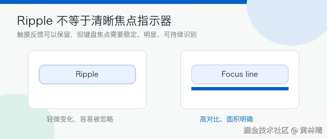
Ripple 不负责键盘焦点
Material 组件会通过 interactionSource 暴露交互状态。
常见状态包括:
bash
FocusInteraction.Focus
FocusInteraction.Unfocus
PressInteraction.Press
PressInteraction.Release
DragInteraction.Start
Ripple 更偏触摸反馈。键盘、方向键、Tab 导航时,需要的是稳定可见的 focus indicator。
直接用 onFocusChanged 加边框也可以:
bash
var focused by remember { mutableStateOf(false) }

Button(
    modifier = Modifier
        .onFocusChanged { focused = it.isFocused }
        .border(
            width = if (focused) 3.dp else 0.dp,
            color = if (focused) Color(0xFF005FCC) else Color.Transparent,
            shape = RoundedCornerShape(12.dp)
        ),
    onClick = {}
) {
    Text("Continue")
}
但这种写法很快会散掉。Button、Row、Card、ListItem 都要各写一遍;边框还可能改变布局。更适合的做法是走 Indication。
用 DrawModifierNode 画
先写一个 Node,监听同一个 InteractionSource,拿到 focus / unfocus 后决定是否绘制。
bash
private class KeyboardFocusNode(
    private val interactionSource: InteractionSource,
    private val color: Color,
) : Modifier.Node(), DrawModifierNode {

    private var focused by mutableStateOf(false)

    override fun onAttach() {
        coroutineScope.launch {
            interactionSource.interactions.collect { interaction ->
                when (interaction) {
                    is FocusInteraction.Focus -> focused = true
                    is FocusInteraction.Unfocus -> focused = false
                }
            }
        }
    }

    override fun ContentDrawScope.draw() {
        drawContent()

        if (!focused) return

        val thickness = 4.dp.toPx()
        drawRect(
            color = color,
            topLeft = Offset(0f, size.height - thickness),
            size = Size(size.width, thickness)
        )
    }
}
几个点:
-
•
drawContent()先画原组件 -
• 焦点线后画,避免被内容盖住
-
• 线宽别太细,
1.dp通常不够明显 -
• 颜色不要直接写死在业务组件里
包成 Indication
IndicationNodeFactory 负责创建上面的 Node。
bash
private data class KeyboardFocusIndication(
    private val color: Color,
) : IndicationNodeFactory {
    override fun create(interactionSource: InteractionSource): Modifier.Node {
        return KeyboardFocusNode(interactionSource, color)
    }
}
再暴露一个 Modifier:
bash
@Composable
fun Modifier.keyboardFocusIndicator(
    interactionSource: MutableInteractionSource,
    color: Color = MaterialTheme.colorScheme.primary,
): Modifier {
    val focusIndication = remember(color) {
        KeyboardFocusIndication(color)
    }
    return indication(interactionSource, focusIndication)
}核心规则只有一个:组件和 Modifier 必须共用同一个 MutableInteractionSource。
Button 用法
Material Button 有 interactionSource 参数,直接传进去。
bash
@Composable
fun PrimaryActionButton(
    text: String,
    onClick: () -> Unit,
) {
    val source = remember { MutableInteractionSource() }

    Button(
        onClick = onClick,
        interactionSource = source,
        modifier = Modifier.keyboardFocusIndicator(source)
    ) {
        Text(text)
    }
}
不要这样写:
bash
Button(
    interactionSource = remember { MutableInteractionSource() },
    modifier = Modifier.keyboardFocusIndicator(
        remember { MutableInteractionSource() }
    ),
    onClick = {}
) {
    Text("Wrong")
}
两个 source 不相通,Button 收到的 focus 事件不会进入自定义 indication。
Row 用法
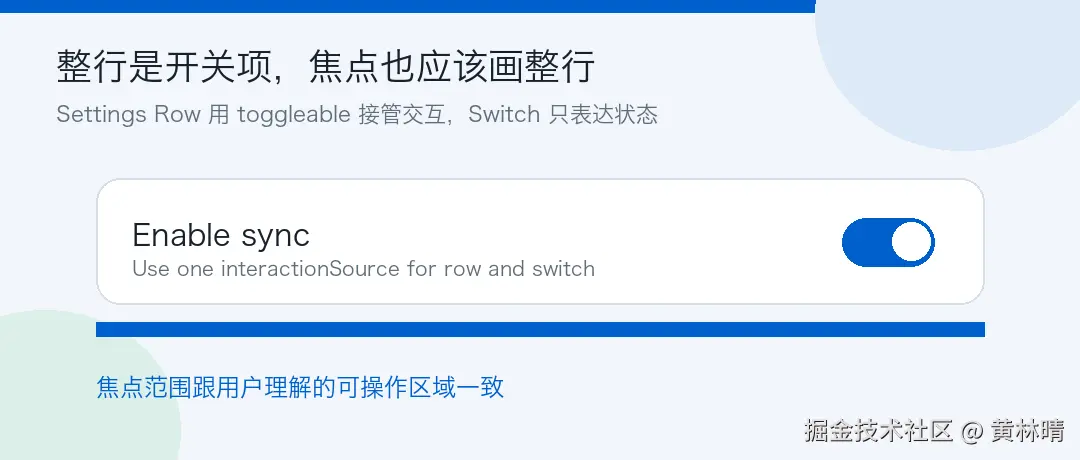
设置页里的 Switch Row,焦点一般应该画整行,不是只画右侧 Switch。
bash
@Composable
fun SettingsSwitchRow(
    title: String,
    checked: Boolean,
    onCheckedChange: (Boolean) -> Unit,
) {
    val source = remember { MutableInteractionSource() }

    Row(
        modifier = Modifier
            .fillMaxWidth()
            .keyboardFocusIndicator(source)
            .toggleable(
                value = checked,
                onValueChange = onCheckedChange,
                role = Role.Switch,
                interactionSource = source,
                indication = ripple()
            )
            .padding(horizontal = 16.dp, vertical = 12.dp),
        verticalAlignment = Alignment.CenterVertically
    ) {
        Text(
            text = title,
            modifier = Modifier.weight(1f)
        )
        Switch(
            checked = checked,
            onCheckedChange = null,
            interactionSource = source
        )
    }
}
这里 Row 负责 toggleable,所以焦点线跟着 Row 画满宽度。Switch 只表达 checked 状态。
触摸模式下隐藏
如果只希望键盘模式显示焦点线,可以让 Node 读取 LocalInputModeManager。
bash
private class KeyboardFocusNode(
private val interactionSource: InteractionSource,
private val color: Color,
) : Modifier.Node(),
DrawModifierNode,
CompositionLocalConsumerModifierNode {
private var focused by mutableStateOf(false)
override fun ContentDrawScope.draw() {
drawContent()
val inputMode = currentValueOf(LocalInputModeManager).inputMode
if (!focused || inputMode != InputMode.Keyboard) return
val thickness = 4.dp.toPx()
drawRect(
color = color,
topLeft = Offset(0f, size.height - thickness),
size = Size(size.width, thickness)
)
}
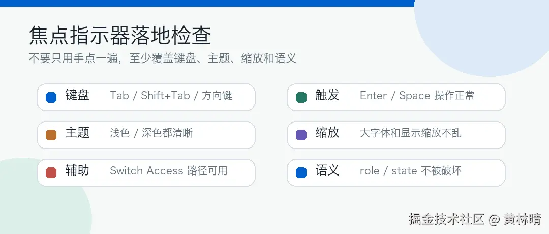
}手机触摸场景可以隐藏。TV、桌面、车机场景可以一直显示。这个策略建议放在设计系统里统一。
颜色单独做 token
焦点颜色不要散在页面里。
bash
object AppFocusTokens {
    val Light = Color(0xFF005FCC)
    val Dark = Color(0xFF9CC9FF)
}

@Composable
fun focusIndicatorColor(): Color {
    return if (isSystemInDarkTheme()) {
        AppFocusTokens.Dark
    } else {
        AppFocusTokens.Light
    }
}
使用时:
bash
val focusColor = focusIndicatorColor()
Modifier.keyboardFocusIndicator(source, focusColor)
浅色、深色、动态色背景都要看一遍。焦点线是状态,不是装饰色。
最后
Compose 下做键盘焦点指示器,重点是三件事:
-
• 用同一个
MutableInteractionSource -
• 用
IndicationNodeFactory + DrawModifierNode统一绘制 -
• 把颜色、线宽、触摸模式策略收进设计系统
这样 Button、Switch Row、Card、List Item 都能复用同一套焦点表现。