论文地址:
https://www.nature.com/articles/s41586-023-06861-4
论文题目:
Disproportionate declines of formerly abundant species underlie insect loss

复现图片:
配色方案:
python
PALETTES = {
    1:  {"name": "原图经典 (青/橙/黄)",    "colors": ["#10A5B5", "#E85D3B", "#D1AC22"]},
    2:  {"name": "Nature 杂志风 (蓝/红/绿)", "colors": ["#2F4B7C", "#A05195", "#F95D6A"]},
    3:  {"name": "Science 经典 (深蓝/桔/灰)", "colors": ["#118AB2", "#FFD166", "#06D6A0"]},
    4:  {"name": "优雅莫兰迪 (雾蓝/灰粉/雅绿)", "colors": ["#769FCD", "#D6E6F2", "#B9D7EA"]},
    5:  {"name": "高级学术复古 (藏青/赭红/复古金)", "colors": ["#1D3557", "#E63946", "#457B9D"]},
    6:  {"name": "马卡龙少女 (浅水蓝/柔粉/奶油黄)", "colors": ["#A8DADC", "#EC9A9A", "#F4A261"]},
    7:  {"name": "现代商务 (深灰蓝/亮橙/浅绿)",  "colors": ["#2A4D69", "#4B86B4", "#ADCBE3"]},
    8:  {"name": "大地色系 (墨绿/驼色/焦糖)",    "colors": ["#264653", "#2A9D8F", "#E76F51"]},
    9:  {"name": "冷调科技 (钛银/深邃蓝/霓虹紫)", "colors": ["#0F4C81", "#1FA59B", "#6C5CE7"]},
    10: {"name": "绚丽渐变 (紫罗兰/珊瑚粉/金黄)", "colors": ["#665191", "#D45087", "#FF7C43"]}
}
完整代码:
python
import os
import numpy as np
import pandas as pd
import matplotlib.pyplot as plt
from scipy.stats import norm
# 1. 自动创建保存图表的文件夹
output_dir = "图表"
os.makedirs(output_dir, exist_ok=True)
# 2. 读取同目录下的 data.xlsx 文件
excel_path = "data.xlsx"
if not os.path.exists(excel_path):
raise FileNotFoundError(f"未在当前目录下找到 {excel_path} 文件,请确保文件存在。")
df = pd.read_excel(excel_path, skiprows=3)
# 重命名列名以方便代码精确调用数据
df.columns = [
"Year",
"Total_Cyan", "Total_Orange", "Total_Yellow",
"Species_Cyan", "Species_Orange", "Species_Yellow",
"Simpson_Cyan", "Simpson_Orange", "Simpson_Yellow",
"Evenness_Cyan", "Evenness_Orange", "Evenness_Yellow"
]
# ==========================================
# 10 种精选配色方案字典
# ==========================================
PALETTES = {
1: {"name": "原图经典 (青/橙/黄)", "colors": ["#10A5B5", "#E85D3B", "#D1AC22"]},
2: {"name": "Nature 杂志风 (蓝/红/绿)", "colors": ["#2F4B7C", "#A05195", "#F95D6A"]},
3: {"name": "Science 经典 (深蓝/桔/灰)", "colors": ["#118AB2", "#FFD166", "#06D6A0"]},
4: {"name": "优雅莫兰迪 (雾蓝/灰粉/雅绿)", "colors": ["#769FCD", "#D6E6F2", "#B9D7EA"]},
5: {"name": "高级学术复古 (藏青/赭红/复古金)", "colors": ["#1D3557", "#E63946", "#457B9D"]},
6: {"name": "马卡龙少女 (浅水蓝/柔粉/奶油黄)", "colors": ["#A8DADC", "#EC9A9A", "#F4A261"]},
7: {"name": "现代商务 (深灰蓝/亮橙/浅绿)", "colors": ["#2A4D69", "#4B86B4", "#ADCBE3"]},
8: {"name": "大地色系 (墨绿/驼色/焦糖)", "colors": ["#264653", "#2A9D8F", "#E76F51"]},
9: {"name": "冷调科技 (钛银/深邃蓝/霓虹紫)", "colors": ["#0F4C81", "#1FA59B", "#6C5CE7"]},
10: {"name": "绚丽渐变 (紫罗兰/珊瑚粉/金黄)", "colors": ["#665191", "#D45087", "#FF7C43"]}
}
# 在这里选择你想要的配色方案(当前默认为第 1 种)
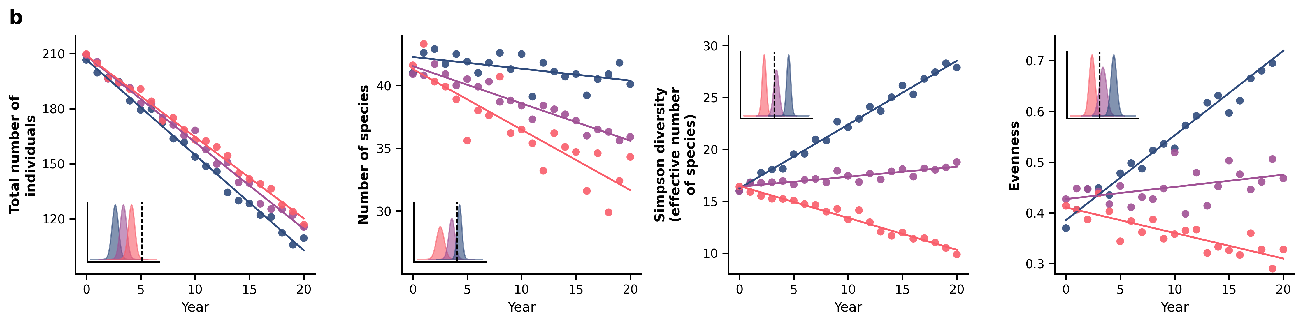
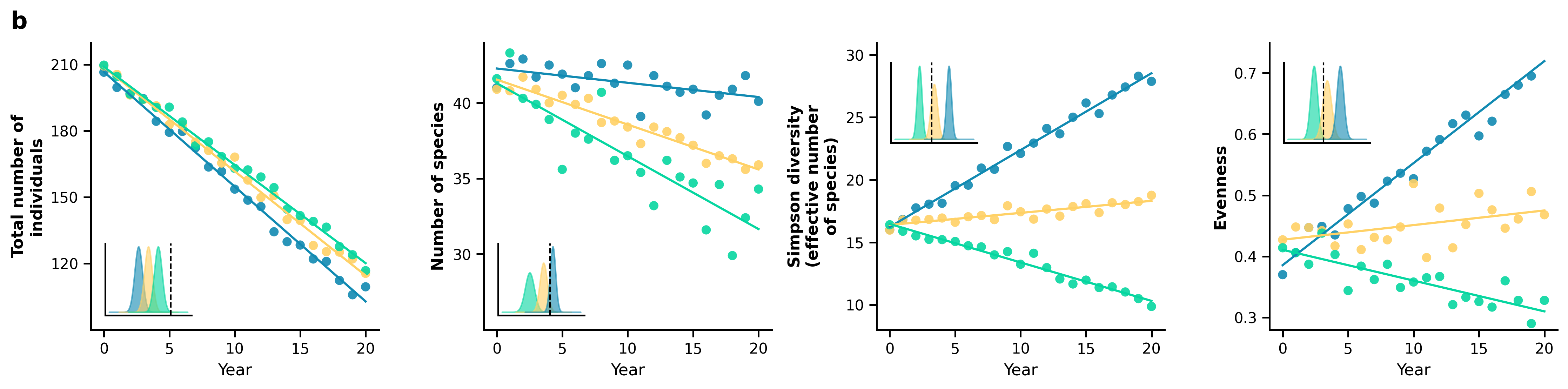
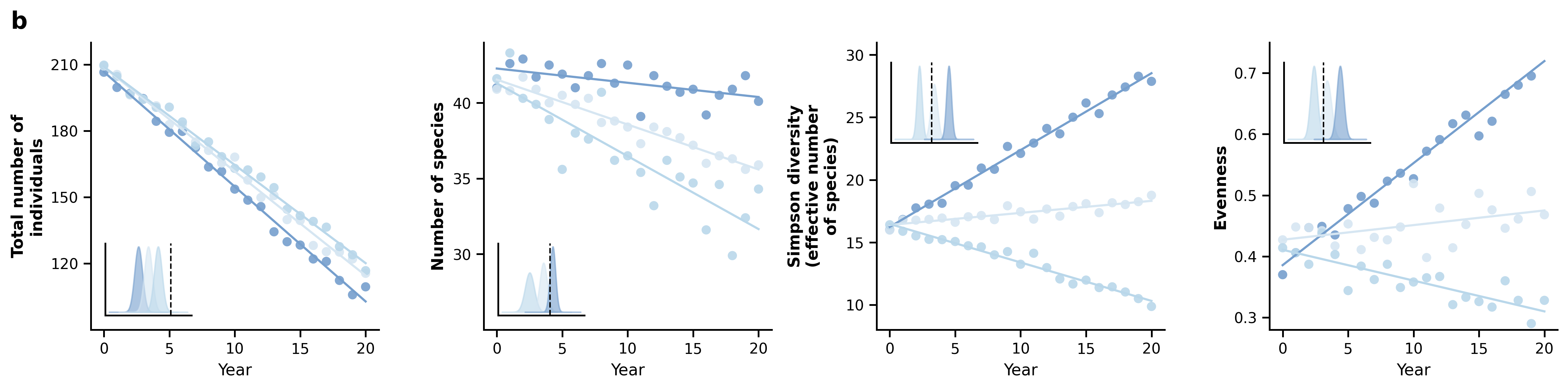
SELECTED_PALETTE = 1
# 提取当前选择的颜色
current_palette = PALETTES[SELECTED_PALETTE]
c_cyan, c_orange, c_yellow = current_palette["colors"]
print(f"当前启用的配色方案: 方案 {SELECTED_PALETTE} - {current_palette['name']}")
# ==========================================
# 3. 设置 matplotlib 样式
# ==========================================
plt.rcParams['font.family'] = 'sans-serif'
plt.rcParams['font.sans-serif'] = ['DejaVu Sans', 'Arial', 'Helvetica']
plt.rcParams['axes.edgecolor'] = '#000000'
plt.rcParams['axes.linewidth'] = 1.2
plt.rcParams['xtick.color'] = '#000000'
plt.rcParams['ytick.color'] = '#000000'
# 趋势线与散点绘制辅助函数
def plot_with_trend(ax, x, y, color):
# 绘制数据散点
ax.scatter(x, y, color=color, s=40, alpha=0.9, edgecolors='none')
# 基于 Excel 真实数据进行线性回归拟合 (y = mx + b)
m, b = np.polyfit(x, y, 1)
ax.plot(x, m * x + b, color=color, linewidth=1.5)
# 初始化 1行 4列 的横向画布
fig, axes = plt.subplots(1, 4, figsize=(15, 3.8))
fig.patch.set_facecolor('white')
# 核心修改:在画布最左上角添加大写粗体序号 "b"
fig.suptitle("b", x=0.01, y=0.96, fontsize=16, fontweight='bold', ha='left', va='top')
# 辅助生成内嵌子图分布的固定 X 轴
x_axis = np.linspace(-3, 3, 100)
# ==========================================
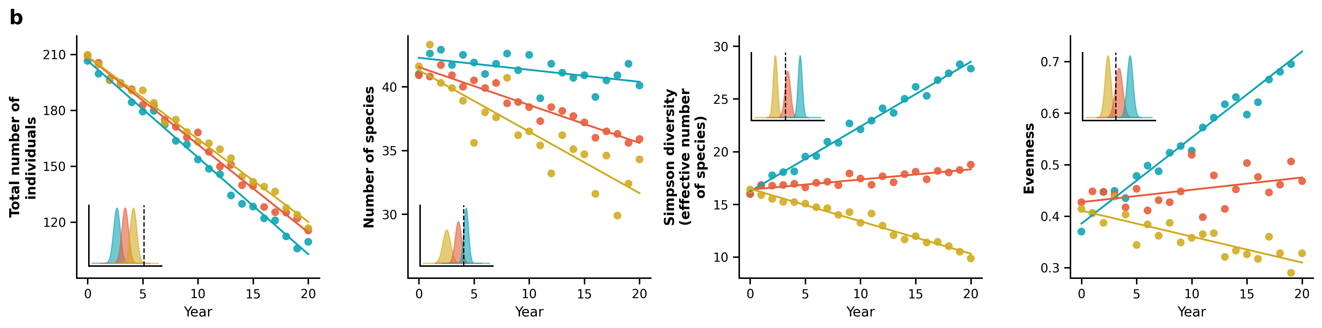
# 子图 1: Total number of individuals
# ==========================================
ax = axes[0]
plot_with_trend(ax, df["Year"], df["Total_Cyan"], c_cyan)
plot_with_trend(ax, df["Year"], df["Total_Orange"], c_orange)
plot_with_trend(ax, df["Year"], df["Total_Yellow"], c_yellow)
ax.set_ylabel("Total number of\nindividuals", fontsize=11, fontweight='bold')
ax.set_ylim(90, 220)
ax.set_yticks([120, 150, 180, 210])
# 左下角嵌入密度分布图 (Inset)
inset1 = ax.inset_axes([0.05, 0.05, 0.3, 0.25])
inset1.fill_between(x_axis - 1.5, norm.pdf(x_axis, 0, 0.4), color=c_cyan, alpha=0.6)
inset1.fill_between(x_axis - 0.5, norm.pdf(x_axis, 0, 0.4), color=c_orange, alpha=0.6)
inset1.fill_between(x_axis + 0.5, norm.pdf(x_axis, 0, 0.4), color=c_yellow, alpha=0.6)
inset1.axvline(x=1.8, color='black', linestyle='--', linewidth=1)
inset1.set_xticks([]); inset1.set_yticks([])
inset1.spines['top'].set_visible(False); inset1.spines['right'].set_visible(False)
# ==========================================
# 子图 2: Number of species
# ==========================================
ax = axes[1]
plot_with_trend(ax, df["Year"], df["Species_Cyan"], c_cyan)
plot_with_trend(ax, df["Year"], df["Species_Orange"], c_orange)
plot_with_trend(ax, df["Year"], df["Species_Yellow"], c_yellow)
ax.set_ylabel("Number of species", fontsize=11, fontweight='bold')
ax.set_ylim(25, 44)
ax.set_yticks([30, 35, 40])
# 左下角嵌入密度分布图 (Inset)
inset2 = ax.inset_axes([0.05, 0.05, 0.3, 0.25])
inset2.fill_between(x_axis - 1.0, norm.pdf(x_axis, 0, 0.5), color=c_yellow, alpha=0.6)
inset2.fill_between(x_axis + 0.5, norm.pdf(x_axis, 0, 0.4), color=c_orange, alpha=0.6)
inset2.fill_between(x_axis + 1.5, norm.pdf(x_axis, 0, 0.3), color=c_cyan, alpha=0.6)
inset2.axvline(x=1.2, color='black', linestyle='--', linewidth=1)
inset2.set_xticks([]); inset2.set_yticks([])
inset2.spines['top'].set_visible(False); inset2.spines['right'].set_visible(False)
# ==========================================
# 子图 3: Simpson diversity
# ==========================================
ax = axes[2]
plot_with_trend(ax, df["Year"], df["Simpson_Cyan"], c_cyan)
plot_with_trend(ax, df["Year"], df["Simpson_Orange"], c_orange)
plot_with_trend(ax, df["Year"], df["Simpson_Yellow"], c_yellow)
ax.set_ylabel("Simpson diversity\n(effective number\nof species)", fontsize=11, fontweight='bold')
ax.set_ylim(8, 31)
ax.set_yticks([10, 15, 20, 25, 30])
# 左上角嵌入密度分布图 (Inset)
inset3 = ax.inset_axes([0.05, 0.65, 0.3, 0.28])
inset3.fill_between(x_axis - 1.8, norm.pdf(x_axis, 0, 0.3), color=c_yellow, alpha=0.6)
inset3.fill_between(x_axis, norm.pdf(x_axis, 0, 0.4), color=c_orange, alpha=0.6)
inset3.fill_between(x_axis + 1.8, norm.pdf(x_axis, 0, 0.3), color=c_cyan, alpha=0.6)
inset3.axvline(x=-0.3, color='black', linestyle='--', linewidth=1)
inset3.set_xticks([]); inset3.set_yticks([])
inset3.spines['top'].set_visible(False); inset3.spines['right'].set_visible(False)
# ==========================================
# 子图 4: Evenness
# ==========================================
ax = axes[3]
plot_with_trend(ax, df["Year"], df["Evenness_Cyan"], c_cyan)
plot_with_trend(ax, df["Year"], df["Evenness_Orange"], c_orange)
plot_with_trend(ax, df["Year"], df["Evenness_Yellow"], c_yellow)
ax.set_ylabel("Evenness", fontsize=11, fontweight='bold')
ax.set_ylim(0.28, 0.75)
ax.set_yticks([0.3, 0.4, 0.5, 0.6, 0.7])
# 左上角嵌入密度分布图 (Inset)
inset4 = ax.inset_axes([0.05, 0.65, 0.3, 0.28])
inset4.fill_between(x_axis - 1.5, norm.pdf(x_axis, 0, 0.4), color=c_yellow, alpha=0.6)
inset4.fill_between(x_axis, norm.pdf(x_axis, 0, 0.5), color=c_orange, alpha=0.6)
inset4.fill_between(x_axis + 1.5, norm.pdf(x_axis, 0, 0.4), color=c_cyan, alpha=0.6)
inset4.axvline(x=-0.4, color='black', linestyle='--', linewidth=1)
inset4.set_xticks([]); inset4.set_yticks([])
inset4.spines['top'].set_visible(False); inset4.spines['right'].set_visible(False)
# ==========================================
# 全局坐标轴统一美化调整
# ==========================================
for ax in axes:
ax.set_xlabel("Year", fontsize=11)
ax.set_xlim(-1, 21)
ax.set_xticks([0, 5, 10, 15, 20])
ax.spines['top'].set_visible(False) # 移除顶部边框
ax.spines['right'].set_visible(False) # 移除右侧边框
ax.tick_params(direction='out', length=5, width=1.2) # 刻度线朝外
# 4. 紧凑布局并微调顶部空间(防止序号被裁切),导出高清 PNG 图片
plt.tight_layout()
fig.subplots_adjust(top=0.88) # 为最上方的序号 "b" 预留出充足的空间
final_output_path = os.path.join(output_dir, "reproduced_chart.png")
plt.savefig(final_output_path, dpi=300, bbox_inches='tight')
plt.close()
print(f"绘图成功!已成功添加最左上角序号 'b',图表保存为: {final_output_path}")数据获取
评论+私信获取