React/Next.js 前端开发与治愈系 UI 设计
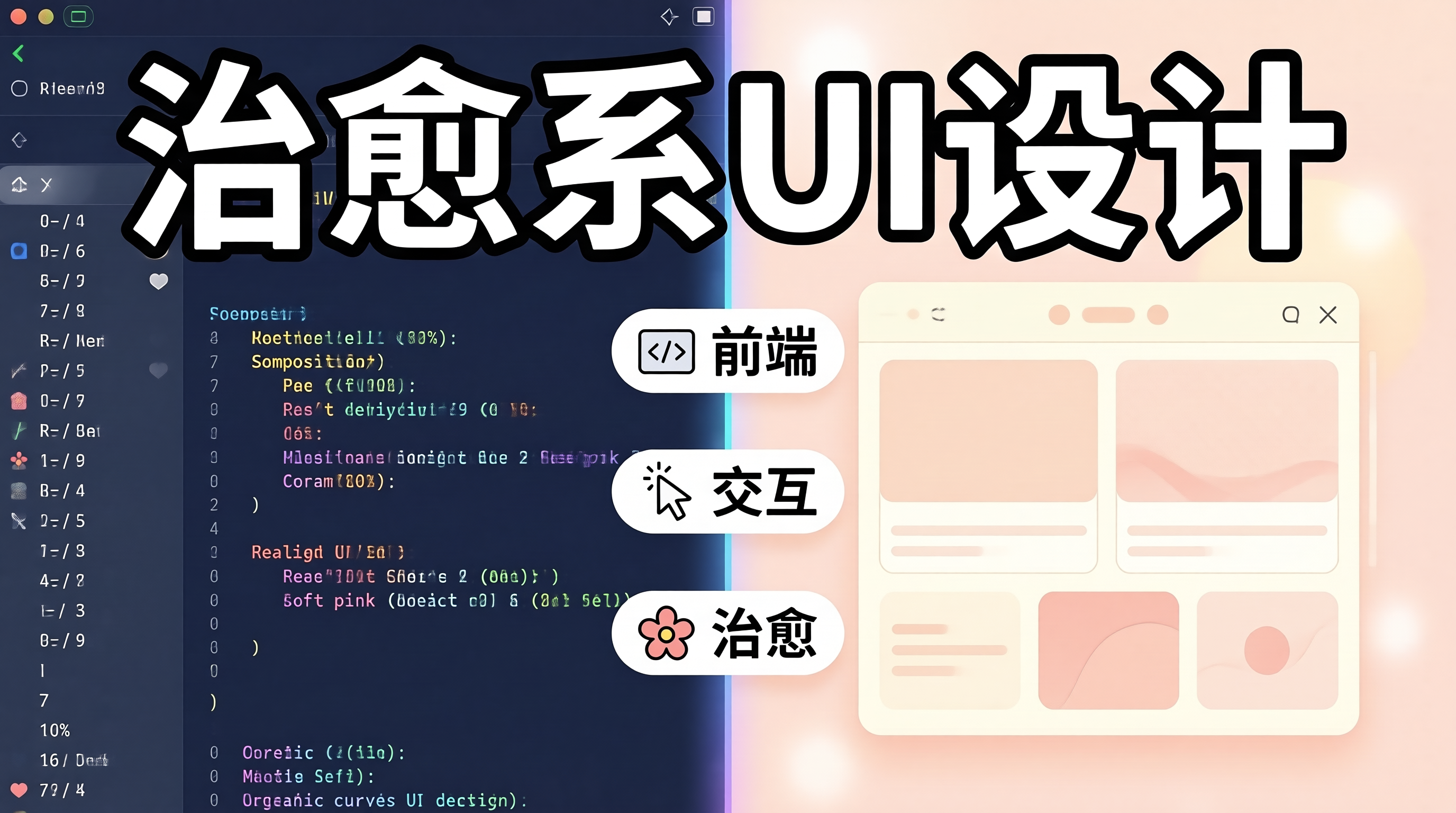
一、技术的温度:为什么 UI 设计需要治愈感
当用户打开一个应用时,视觉是最先触达的感官。一个温暖、舒适的界面,能让用户放下戒备,愿意花更多时间停留。与传统企业软件的"功能优先"不同,生活化应用更需要"体验优先"------让用户在交互中感受到被关怀。
治愈系 UI 的核心不是"可爱",而是一种让人放松、安心、愉悦的整体感受。这包括:柔和的色彩搭配、流畅的动画过渡、符合心理预期的交互反馈,以及对用户情绪的细微感知。
本文探讨如何在前端开发中实现治愈系 UI,从色彩理论到动画设计,从组件封装到用户体验,探讨技术实现与设计理念的融合。
二、色彩理论与情绪设计
2.1 治愈系色彩体系
css
/* 治愈系色彩体系 */

/* 主色调:柔和的暖色 */
:root {
  /* 温暖粉色系 */
  --pink-soft: #FFE4E6;
  --pink-warm: #FDA4AF;

  /* 奶油色系 */
  --cream: #FFFBEB;
  --cream-dark: #FEF3C7;

  /* 薰衣草紫 */
  --lavender: #EDE9FE;
  --lavender-deep: #C4B5FD;

  /* 薄荷绿 */
  --mint: #D1FAE5;
  --mint-deep: #6EE7B7;

  /* 天空蓝 */
  --sky: #E0F2FE;
  --sky-deep: #7DD3FC;

  /* 中性色 */
  --gray-50: #F9FAFB;
  --gray-100: #F3F4F6;
  --gray-500: #6B7280;
  --gray-800: #1F2937;
}

/* 背景层次 */
.bg-primary {
  background: linear-gradient(180deg, #FEF3C7 0%, #FFE4E6 100%);
}

.bg-card {
  background: rgba(255, 255, 255, 0.8);
  backdrop-filter: blur(10px);
}
2.2 色彩心理学应用
python
COLOR_EMOTION_MAPPING = {
    # 暖色系:带来温暖、亲切感
    "warm_pink": {
        "emotion": "温馨、关怀",
        "use_case": ["母婴", "家庭", "陪伴"],
        "combinations": ["cream", "mint"],
    },

    # 冷色系:带来平静、放松感
    "soft_blue": {
        "emotion": "平静、信任",
        "use_case": ["健康", "冥想", "睡眠"],
        "combinations": ["lavender", "white"],
    },

    # 自然色:带来清新、自然感
    "mint_green": {
        "emotion": "清新、自然",
        "use_case": ["环保", "健康", "蔬果"],
        "combinations": ["cream", "sky"],
    },

    # 中性色:专业、沉稳
    "warm_gray": {
        "emotion": "专业、可信赖",
        "use_case": ["金融", "企业", "工具"],
        "combinations": ["cream", "lavender"],
    },
}
三、组件设计与封装
3.1 按钮组件
tsx
// components/ui/Button.tsx
import { forwardRef, ButtonHTMLAttributes } from 'react'
import styles from './Button.module.css'

interface ButtonProps extends ButtonHTMLAttributes<HTMLButtonElement> {
  variant?: 'primary' | 'secondary' | 'ghost'
  size?: 'sm' | 'md' | 'lg'
  loading?: boolean
}

export const Button = forwardRef<HTMLButtonElement, ButtonProps>(
  ({
    variant = 'primary',
    size = 'md',
    loading = false,
    children,
    className,
    disabled,
    ...props
  }, ref) => {
    return (
      <button
        ref={ref}
        className={`${styles.button} ${styles[variant]} ${styles[size]} ${className || ''}`}
        disabled={disabled || loading}
        {...props}
      >
        {loading && (
          <span className={styles.spinner}>
            <svg viewBox="0 0 24 24" fill="none">
              <circle cx="12" cy="12" r="10" stroke="currentColor" strokeWidth="3" strokeLinecap="round" strokeDasharray="32" strokeDashoffset="12">
                <animateTransform attributeName="transform" type="rotate" from="0 12 12" to="360 12 12" dur="1s" repeatCount="indefinite"/>
              </circle>
            </svg>
          </span>
        )}
        <span className={loading ? styles.hiddenText : ''}>
          {children}
        </span>
      </button>
    )
  }
)

Button.displayName = 'Button'
css
/* Button.module.css */

.button {
  display: inline-flex;
  align-items: center;
  justify-content: center;
  gap: 8px;
  border: none;
  border-radius: 12px;
  font-weight: 500;
  cursor: pointer;
  transition: all 0.2s ease;
  position: relative;
  overflow: hidden;
}

/* 悬停效果:柔和放大 + 阴影 */
.button:hover:not(:disabled) {
  transform: translateY(-2px);
  box-shadow: 0 8px 20px rgba(0, 0, 0, 0.1);
}

.button:active:not(:disabled) {
  transform: translateY(0);
}

/* Primary:温暖渐变 */
.primary {
  background: linear-gradient(135deg, #FDA4AF 0%, #FCD34D 100%);
  color: #1F2937;
}

.primary:hover:not(:disabled) {
  background: linear-gradient(135deg, #FBC1C9 0%, #FBBF24 100%);
}

/* Secondary:柔和边框 */
.secondary {
  background: rgba(255, 255, 255, 0.8);
  color: #6B7280;
  border: 1px solid #E5E7EB;
}

.secondary:hover:not(:disabled) {
  background: rgba(255, 255, 255, 0.95);
  border-color: #D1D5DB;
}

/* Ghost:透明背景 */
.ghost {
  background: transparent;
  color: #6B7280;
}

.ghost:hover:not(:disabled) {
  background: rgba(0, 0, 0, 0.05);
}

/* 尺寸 */
.sm { padding: 8px 16px; font-size: 14px; }
.md { padding: 12px 24px; font-size: 16px; }
.lg { padding: 16px 32px; font-size: 18px; }

/* 加载状态 */
.spinner {
  width: 20px;
  height: 20px;
}

.hiddenText {
  opacity: 0;
}
3.2 卡片组件
tsx
// components/ui/Card.tsx
import { ReactNode } from 'react'
import styles from './Card.module.css'

interface CardProps {
  children: ReactNode
  variant?: 'elevated' | 'outlined' | 'glass'
  padding?: 'none' | 'sm' | 'md' | 'lg'
  onClick?: () => void
  hoverable?: boolean
}

export function Card({
  children,
  variant = 'elevated',
  padding = 'md',
  onClick,
  hoverable = false,
}: CardProps) {
  return (
    <div
      className={`${styles.card} ${styles[variant]} ${styles[`padding-${padding}`]} ${hoverable ? styles.hoverable : ''}`}
      onClick={onClick}
      role={onClick ? 'button' : undefined}
      tabIndex={onClick ? 0 : undefined}
    >
      {children}
    </div>
  )
}
css
/* Card.module.css */

/* 玻璃态卡片 */
.glass {
  background: rgba(255, 255, 255, 0.7);
  backdrop-filter: blur(20px);
  border: 1px solid rgba(255, 255, 255, 0.3);
  border-radius: 20px;
}

/* 悬浮卡片 */
.elevated {
  background: white;
  border-radius: 20px;
  box-shadow: 0 4px 20px rgba(0, 0, 0, 0.05);
  transition: all 0.3s ease;
}

.hoverable:hover {
  transform: translateY(-4px);
  box-shadow: 0 12px 40px rgba(0, 0, 0, 0.1);
}

/* 圆角:20px 是治愈系设计常用的圆润值 */
.card {
  border-radius: 20px;
}

/* 内边距系列 */
.padding-sm { padding: 12px; }
.padding-md { padding: 20px; }
.padding-lg { padding: 32px; }
3.3 情绪反馈组件
tsx
// components/ui/EmotionFeedback.tsx
import { useState } from 'react'
import styles from './EmotionFeedback.module.css'

interface EmotionFeedbackProps {
  onSelect?: (emotion: string) => void
}

const emotions = [
  { id: 'happy', emoji: '😊', label: '很棒' },
  { id: 'good', emoji: '🙂', label: '不错' },
  { id: 'neutral', emoji: '😐', label: '一般' },
  { id: 'sad', emoji: '😔', label: '有点失落' },
  { id: 'angry', emoji: '😤', label: '不满意' },
]

export function EmotionFeedback({ onSelect }: EmotionFeedbackProps) {
  const [selected, setSelected] = useState<string | null>(null)
  const [showThankYou, setShowThankYou] = useState(false)

  const handleSelect = (emotion: string) => {
    setSelected(emotion)
    setShowThankYou(true)
    onSelect?.(emotion)

    setTimeout(() => setShowThankYou(false), 2000)
  }

  return (
    <div className={styles.container}>
      <p className={styles.prompt}>今天感觉怎么样?</p>

      <div className={styles.emotions}>
        {emotions.map(({ id, emoji, label }) => (
          <button
            key={id}
            className={`${styles.emotionBtn} ${selected === id ? styles.selected : ''}`}
            onClick={() => handleSelect(id)}
            aria-label={label}
          >
            <span className={styles.emoji}>{emoji}</span>
            <span className={styles.label}>{label}</span>
          </button>
        ))}
      </div>

      {showThankYou && (
        <p className={styles.thankYou}>
          感谢你的反馈 💕
        </p>
      )}
    </div>
  )
}
四、动画与过渡设计
4.1 流畅的页面过渡
tsx
// app/layout.tsx
import { motion, AnimatePresence } from 'framer-motion'

export default function Layout({ children }) {
  return (
    <AnimatePresence mode="wait">
      <motion.div
        initial={{ opacity: 0, y: 20 }}
        animate={{ opacity: 1, y: 0 }}
        exit={{ opacity: 0, y: -20 }}
        transition={{
          duration: 0.3,
          ease: [0.22, 1, 0.36, 1]  // 自定义缓动曲线
        }}
      >
        {children}
      </motion.div>
    </AnimatePresence>
  )
}
4.2 微交互设计
tsx
// hooks/useMicroInteraction.ts
import { useState, useCallback } from 'react'

export function useMicroInteraction() {
  const [state, setState] = useState<'idle' | 'hover' | 'active'>('idle')

  const onHoverStart = useCallback(() => setState('hover'), [])
  const onHoverEnd = useCallback(() => setState('idle'), [])
  const onPress = useCallback(() => {
    setState('active')
    setTimeout(() => setState('hover'), 150)
  }, [])

  return {
    state,
    onHoverStart,
    onHoverEnd,
    onPress,
    style: {
      transform: state === 'idle' ? 'scale(1)' :
                 state === 'hover' ? 'scale(1.02)' :
                 'scale(0.98)',
      transition: 'transform 0.15s ease',
    }
  }
}
五、用户体验细节
5.1 加载状态设计
tsx
// components/ui/Skeleton.tsx
export function Skeleton({ className }: { className?: string }) {
  return (
    <div className={`${styles.skeleton} ${className || ''}`}>
      <div className={styles.shimmer} />
    </div>
  )
}

export function PostSkeleton() {
  return (
    <div className={styles.postCard}>
      <Skeleton className={styles.avatar} />
      <div className={styles.content}>
        <Skeleton className={styles.title} />
        <Skeleton className={styles.body} />
        <Skeleton className={styles.body} style={{ width: '60%' }} />
      </div>
    </div>
  )
}
css
/* Skeleton 动画 */
.skeleton {
  background: #F3F4F6;
  border-radius: 8px;
  overflow: hidden;
  position: relative;
}

.shimmer {
  position: absolute;
  inset: 0;
  background: linear-gradient(
    90deg,
    transparent 0%,
    rgba(255, 255, 255, 0.6) 50%,
    transparent 100%
  );
  animation: shimmer 1.5s infinite;
}

@keyframes shimmer {
  0% { transform: translateX(-100%); }
  100% { transform: translateX(100%); }
}
5.2 空状态设计
tsx
// components/ui/EmptyState.tsx
interface EmptyStateProps {
  illustration?: 'no-data' | 'no-results' | 'error'
  title: string
  description?: string
  action?: {
    label: string
    onClick: () => void
  }
}

const illustrations = {
  'no-data': '📭',
  'no-results': '🔍',
  'error': '💔',
}

export function EmptyState({
  illustration = 'no-data',
  title,
  description,
  action
}: EmptyStateProps) {
  return (
    <div className={styles.container}>
      <span className={styles.illustration}>
        {illustrations[illustration]}
      </span>
      <h3 className={styles.title}>{title}</h3>
      {description && (
        <p className={styles.description}>{description}</p>
      )}
      {action && (
        <Button onClick={action.onClick} variant="primary">
          {action.label}
        </Button>
      )}
    </div>
  )
}
六、总结
治愈系 UI 不是简单的"可爱设计",而是对用户情感的细腻关怀。
实现要点:
- 色彩:柔和、温暖、避免刺眼
- 圆角:20px 左右的圆角带来柔和感
- 动画:流畅、自然、不过度
- 反馈:及时、温暖、让人安心
- 空状态:用友善的插图和文案安慰用户
技术建议:
- 组件封装:保证一致性
- CSS 变量:方便主题切换
- Framer Motion:处理复杂动画
- 无障碍:动画尊重用户偏好
让用户在使用产品的每一刻,都能感受到设计者的用心。