实现出来的效果
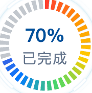
可自定义颜色区间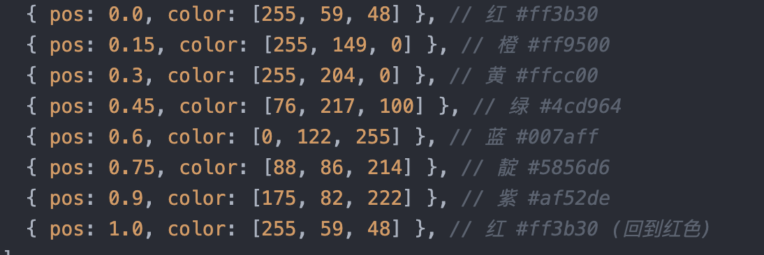 完整代码参考下面(vue2)
javascript
<template>
  <div class="rainbow-progress-container">
    <svg :width="size" :height="size" viewBox="0 0 240 240">
      <!-- 底层背景环 -->
      <circle
        cx="120"
        cy="120"
        r="100"
        fill="none"
        stroke="#334155"
        stroke-opacity="0.3"
        stroke-width="24"
        :stroke-dasharray="bgDashArray"
        stroke-linecap="butt"
      ></circle>

      <!-- 彩虹色条纹环 - 每个条纹根据角度计算颜色 -->
      <g id="rainbow-ring">
        <circle
          v-for="(block, idx) in coloredBlocks"
          :key="idx"
          cx="120"
          cy="120"
          r="100"
          fill="none"
          :stroke="block.color"
          stroke-width="24"
          :stroke-dasharray="block.dashArray"
          :stroke-dashoffset="block.dashOffset"
          stroke-linecap="butt"
          transform="rotate(-90 120 120)"
        ></circle>
      </g>
    </svg>

    <div class="text-center">
      <div class="percentage">{{ percentage }}%</div>
      <h2>已完成</h2>
    </div>
  </div>
</template>

<script>
export default {
  name: "RainbowProgress",
  props: {
    percentage: {
      type: Number,
      default: 70,
      validator: (val) => val >= 0 && val <= 100,
    },
    size: {
      type: Number,
      default: 96,
    },
    radius: {
      type: Number,
      default: 100,
    },
    blockCount: {
      type: Number,
      default: 40,
    },
    gapSize: {
      type: Number,
      default: 6,
    },
  },
  computed: {
    circumference() {
      return 2 * Math.PI * this.radius;
    },
    blockLength() {
      return (
        (this.circumference - this.blockCount * this.gapSize) / this.blockCount
      );
    },
    bgDashArray() {
      return `${this.blockLength} ${this.gapSize}`;
    },
    rainbowColors() {
      return [
        { pos: 0.0, color: [255, 59, 48] }, // 红 #ff3b30
        { pos: 0.15, color: [255, 149, 0] }, // 橙 #ff9500
        { pos: 0.3, color: [255, 204, 0] }, // 黄 #ffcc00
        { pos: 0.45, color: [76, 217, 100] }, // 绿 #4cd964
        { pos: 0.6, color: [0, 122, 255] }, // 蓝 #007aff
        { pos: 0.75, color: [88, 86, 214] }, // 靛 #5856d6
        { pos: 0.9, color: [175, 82, 222] }, // 紫 #af52de
        { pos: 1.0, color: [255, 59, 48] }, // 红 #ff3b30 (回到红色)
      ];
    },
    coloredBlocks() {
      const blocks = [];
      const totalLength = this.circumference;

      for (let i = 0; i < this.blockCount; i++) {
        const blockStart = i * (this.blockLength + this.gapSize);
        const blockCenter = (blockStart + this.blockLength / 2) / totalLength;
        const color = this.getColorAtPosition(blockCenter);

        const activeBlocksFloat = (this.percentage / 100) * this.blockCount;
        const isActive = i < Math.floor(activeBlocksFloat);
        const isPartial = i === Math.floor(activeBlocksFloat);
        const remainderRatio =
          activeBlocksFloat - Math.floor(activeBlocksFloat);
        const partialLen = this.blockLength * remainderRatio;

        let dashArray, dashOffset;

        if (isActive) {
          dashArray = `${this.blockLength} ${totalLength - this.blockLength}`;
          dashOffset = -blockStart;
        } else if (isPartial && partialLen > 0) {
          dashArray = `${partialLen} ${totalLength - partialLen}`;
          dashOffset = -blockStart;
        } else {
          dashArray = `0 ${totalLength}`;
          dashOffset = 0;
        }

        blocks.push({
          color:
            isActive || (isPartial && partialLen > 0) ? color : "transparent",
          dashArray: dashArray,
          dashOffset: dashOffset,
        });
      }
      return blocks;
    },
  },
  methods: {
    getColorAtPosition(pos) {
      const colors = this.rainbowColors;

      for (let i = 0; i < colors.length - 1; i++) {
        const start = colors[i];
        const end = colors[i + 1];

        if (pos >= start.pos && pos <= end.pos) {
          const ratio = (pos - start.pos) / (end.pos - start.pos);

          const r = Math.round(
            start.color[0] + (end.color[0] - start.color[0]) * ratio,
          );
          const g = Math.round(
            start.color[1] + (end.color[1] - start.color[1]) * ratio,
          );
          const b = Math.round(
            start.color[2] + (end.color[2] - start.color[2]) * ratio,
          );

          return `rgb(${r}, ${g}, ${b})`;
        }
      }

      return "rgb(255, 59, 48)";
    },
  },
};
</script>

<style scoped>
.rainbow-progress-container {
  text-align: center;
  position: relative;
  display: inline-block;
  padding-top: 5px;
}

.text-center {
  position: absolute;
  top: 50%;
  left: 50%;
  transform: translate(-50%, -50%);
  width: 100%;
}

.percentage {
  font-weight: bold;
  font-size: 18px;
  color: #00509a;
}

h2 {
  margin: 0;
  font-size: 14px;
  color: #64748b;
  font-weight: normal;
  letter-spacing: 1px;
}
</style>