引言
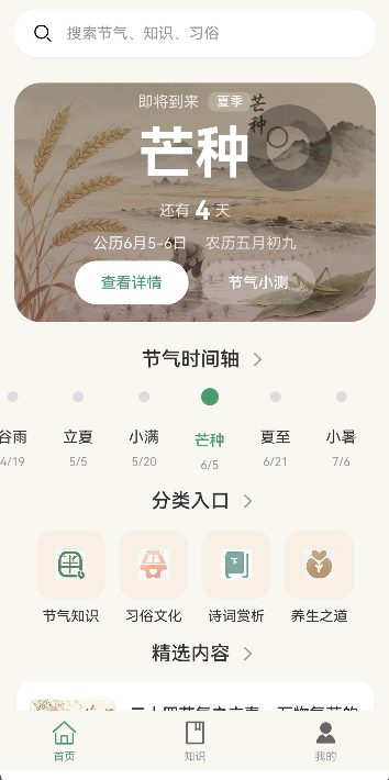
节日卡片组件是展示节日信息的重要UI元素。本文将介绍如何封装一个HolidayCard组件,用于展示节日和节气信息。通过组件封装,可以:
- 统一节日展示风格
- 支持不同类型节日
- 显示日期高亮
- 提供节日详情入口
通过本文,你将掌握如何封装高质量的节日卡片组件。
学习目标
完成本文后,你将能够:
- ✅ 理解节日卡片组件的设计原则
- ✅ 封装HolidayCard组件
- ✅ 添加节日类型标识
- ✅ 实现日期高亮显示
- ✅ 处理点击事件
需求分析
组件功能设计
| 功能 | 描述 | 技术要点 |
|---|---|---|
| 节日图标 | 展示节日图标 | Image组件 |
| 节日名称 | 展示节日名称 | Text组件 |
| 日期信息 | 展示日期 | Text组件 |
| 节日类型 | 标识节日类型 | 颜色区分 |
| 背景图片 | 根据节日类型显示背景 | Image组件 |
| 点击事件 | 跳转到详情页 | 路由跳转 |
核心实现
步骤1: 组件接口定义
typescript
// components/HolidayCard.ets

/**
 * 节日卡片组件
 */
@Component
export struct HolidayCard {
  // 节日ID
  @Prop id: string = '';

  // 节日名称
  @Prop name: string = '';

  // 日期(格式:MM月DD日)
  @Prop date: string = '';

  // 农历日期
  @Prop lunarDate: string = '';

  // 节日类型
  @Prop type: HolidayType = 'solar';

  // 背景图片
  @Prop background: string = '';

  // 点击事件
  @Prop onClick: () => void = () => {};

  /**
   * 获取节日类型配置
   */
  private getTypeConfig(): TypeConfig {
    const configs: Record<HolidayType, TypeConfig> = {
      solar: {
        label: '节气',
        labelColor: '#4A9B6D',
        backgroundColor: '#E8F5E9',
        borderColor: '#4A9B6D'
      },
      lunar: {
        label: '农历',
        labelColor: '#FF5722',
        backgroundColor: '#FFF8E1',
        borderColor: '#FF5722'
      },
      holiday: {
        label: '节日',
        labelColor: '#E91E63',
        backgroundColor: '#FCE4EC',
        borderColor: '#E91E63'
      },
      solarTerm: {
        label: '节气',
        labelColor: '#00BCD4',
        backgroundColor: '#E1F5FE',
        borderColor: '#00BCD4'
      }
    };

    return configs[this.type] || configs.solar;
  }

  /**
   * 构建UI
   */
  build() {
    const config = this.getTypeConfig();

    Card() {
      Stack({ alignContent: Alignment.BottomStart }) {
        // 背景图片
        Image(this.background || $r('app.media.ic_default_bg'))
          .width('100%')
          .height(120)
          .objectFit(ImageFit.Cover)

        // 渐变遮罩
        Row()
          .width('100%')
          .height(120)
          .linearGradient({
            angle: 180,
            colors: [
              ['#00000000', 0.3],
              ['#000000CC', 1]
            ]
          })

        // 内容
        Column({ space: 4 }) {
          // 类型标签
          Text(config.label)
            .fontSize(11)
            .fontColor(config.labelColor)
            .padding({ left: 8, right: 8, top: 2, bottom: 2 })
            .backgroundColor('#FFFFFF')
            .borderRadius(4)
            .opacity(0.9)

          // 节日名称
          Text(this.name)
            .fontSize(20)
            .fontWeight(FontWeight.Bold)
            .fontColor('#FFFFFF')

          // 日期信息
          Row({ space: 8 }) {
            Text(this.date)
              .fontSize(14)
              .fontColor('#FFFFFF')
              .opacity(0.8)

            if (this.lunarDate) {
              Text(this.lunarDate)
                .fontSize(14)
                .fontColor('#FFFFFF')
                .opacity(0.8)
            }
          }
        }
        .padding(12)
      }
    }
    .width('100%')
    .onClick(() => {
      this.onClick();
    })
  }
}

type HolidayType = 'solar' | 'lunar' | 'holiday' | 'solarTerm';

interface TypeConfig {
  label: string;
  labelColor: string;
  backgroundColor: string;
  borderColor: string;
}设计要点:
- 支持多种节日类型
- 背景图片+渐变遮罩
- 类型标签标识
步骤2: 日历视图中的节日卡片
typescript
/**
 * 日历视图中的节日卡片(小尺寸)
 */
@Component
export struct HolidayCardMini {
  @Prop holiday: Holiday = {} as Holiday;
  @Prop isToday: boolean = false;
  @Prop onClick: () => void = () => {};

  build() {
    const config = this.getTypeConfig(this.holiday.type);

    Column({ space: 4 }) {
      // 日期数字
      Stack({ alignContent: Alignment.Center }) {
        if (this.isToday) {
          Circle()
            .width(32)
            .height(32)
            .fillColor('#4A9B6D')

          Text(this.holiday.day)
            .fontSize(14)
            .fontWeight(FontWeight.Bold)
            .fontColor('#FFFFFF')
        } else {
          Text(this.holiday.day)
            .fontSize(14)
            .fontColor('#333333')
        }
      }

      // 节日名称(简短)
      if (this.holiday.name) {
        Text(this.holiday.name.slice(0, 2))
          .fontSize(10)
          .fontColor(config.labelColor)
      }

      // 类型标识点
      Circle()
        .width(4)
        .height(4)
        .fillColor(config.labelColor)
    }
    .width('100%')
    .alignItems(HorizontalAlign.Center)
    .padding(4)
    .onClick(() => {
      this.onClick();
    })
  }

  private getTypeConfig(type: HolidayType): TypeConfig {
    const configs: Record<HolidayType, TypeConfig> = {
      solar: { label: '', labelColor: '#4A9B6D', backgroundColor: '', borderColor: '' },
      lunar: { label: '', labelColor: '#FF5722', backgroundColor: '', borderColor: '' },
      holiday: { label: '', labelColor: '#E91E63', backgroundColor: '', borderColor: '' },
      solarTerm: { label: '', labelColor: '#00BCD4', backgroundColor: '', borderColor: '' }
    };
    return configs[type] || configs.solar;
  }
}

interface Holiday {
  id: string;
  name: string;
  day: string;
  date: string;
  lunarDate?: string;
  type: HolidayType;
  background?: string;
}设计要点:
- 小尺寸卡片,适合日历视图
- 日期高亮显示(当天)
- 节日名称缩写
- 类型颜色标识
步骤3: 使用HolidayCard组件
typescript
// 在页面中使用HolidayCard组件

@Entry
@Component
struct HolidayPage {
  @State holidays: Holiday[] = [
    {
      id: '1',
      name: '立春',
      day: '04',
      date: '02月04日',
      lunarDate: '正月十四',
      type: 'solarTerm',
      background: 'https://example.com/spring.jpg'
    },
    {
      id: '2',
      name: '春节',
      day: '10',
      date: '02月10日',
      lunarDate: '正月初一',
      type: 'holiday',
      background: 'https://example.com/spring_festival.jpg'
    },
    {
      id: '3',
      name: '元宵节',
      day: '24',
      date: '02月24日',
      lunarDate: '正月十五',
      type: 'lunar',
      background: 'https://example.com/lantern.jpg'
    }
  ];

  build() {
    List({ space: 12 }) {
      ForEach(this.holidays, (holiday: Holiday) => {
        ListItem() {
          HolidayCard({
            id: holiday.id,
            name: holiday.name,
            date: holiday.date,
            lunarDate: holiday.lunarDate,
            type: holiday.type,
            background: holiday.background,
            onClick: () => {
              // 跳转到节日详情页
              router.pushUrl({ url: 'pages/HolidayDetail', params: { id: holiday.id } });
            }
          })
        }
      }, (holiday: Holiday) => holiday.id)
    }
    .width('92%')
    .padding({ top: 12 })
  }
}设计要点:
- 在List中使用HolidayCard
- 绑定数据和事件
- 跳转到详情页
步骤4: 横向滚动节日卡片
typescript
/**
 * 横向滚动节日卡片
 */
@Component
export struct HolidayCardHorizontal {
  @Prop holiday: Holiday = {} as Holiday;
  @Prop onClick: () => void = () => {};

  build() {
    const config = this.getTypeConfig(this.holiday.type);

    Card() {
      Column({ space: 8 }) {
        // 日期区域
        Stack({ alignContent: Alignment.Center }) {
          Circle()
            .width(56)
            .height(56)
            .fillColor(config.backgroundColor)

          Column({ space: 2 }) {
            Text(this.holiday.date.split('月')[0])
              .fontSize(18)
              .fontWeight(FontWeight.Bold)
              .fontColor(config.labelColor)

            Text('月')
              .fontSize(10)
              .fontColor(config.labelColor)
          }
        }

        // 节日名称
        Text(this.holiday.name)
          .fontSize(15)
          .fontWeight(FontWeight.Bold)
          .fontColor('#333333')

        // 农历日期
        if (this.holiday.lunarDate) {
          Text(this.holiday.lunarDate)
            .fontSize(12)
            .fontColor('#999999')
        }

        // 类型标签
        Text(config.label)
          .fontSize(11)
          .fontColor(config.labelColor)
          .padding({ left: 8, right: 8, top: 2, bottom: 2 })
          .backgroundColor(config.backgroundColor)
          .borderRadius(4)
      }
      .width(80)
      .padding(12)
      .alignItems(HorizontalAlign.Center)
    }
    .onClick(() => {
      this.onClick();
    })
  }

  private getTypeConfig(type: HolidayType): TypeConfig {
    const configs: Record<HolidayType, TypeConfig> = {
      solar: { label: '节气', labelColor: '#4A9B6D', backgroundColor: '#E8F5E9', borderColor: '' },
      lunar: { label: '农历', labelColor: '#FF5722', backgroundColor: '#FFF8E1', borderColor: '' },
      holiday: { label: '节日', labelColor: '#E91E63', backgroundColor: '#FCE4EC', borderColor: '' },
      solarTerm: { label: '节气', labelColor: '#00BCD4', backgroundColor: '#E1F5FE', borderColor: '' }
    };
    return configs[type] || configs.solar;
  }
}设计要点:
- 横向滚动布局
- 圆形日期展示
- 类型标签
本章小结
核心知识点
本文完成了HolidayCard组件的封装:
1. 组件属性设计
- id: 节日ID
- name: 节日名称
- date: 日期
- lunarDate: 农历日期
- type: 节日类型
- background: 背景图片
- onClick: 点击事件
2. 节日类型支持
- solar: 阳历节日
- lunar: 农历节日
- holiday: 法定节日
- solarTerm: 节气
3. 组件变体
- HolidayCard: 标准卡片,带背景图
- HolidayCardMini: 小尺寸卡片,适合日历
- HolidayCardHorizontal: 横向滚动卡片
下一步预告
HolidayCard组件已经完成!在下一篇文章中,我们将学习:
- Timeline时间线组件封装
- 时间线布局
- 节点展示
- 事件标记
节气通应用已发布上线,可在应用市场下载体验
相关链接
- 项目源码: Atomgit仓库(https://gitcode.com/2301_79280419/jieqitong.git