本篇我们将付诸实践,利用 Highcharts 和 Highcharts.DataTable ,构建一个高保真的 ICU 实时生命体征监护图表。
该图表将:
-
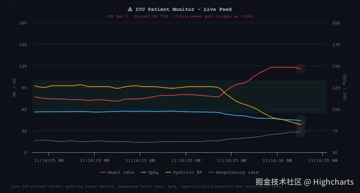
实时滚动更新 4 项关键体征(心率、血氧、收缩压、呼吸率)。
-
使用双 Y 轴保证不同量纲数据的可读性。
-
利用 Highcharts SVG Renderer API 在最新数据点上绘制类似真实监护仪的"呼吸脉动光圈"动画。
-
在第 30 秒时模拟一次"血流动力学危机(Hemodynamic Crisis)",展示图表在异常临界值下的警示表达。
示例预览-Html完整可运行代码
html
<!DOCTYPE html>
<html lang="zh-CN">
<head>
<meta charset="UTF-8">
<title>ICU实时监护面板</title>
<style>
body {
    background: #0d1117; margin: 0; padding: 20px;
    font-family: 'Courier New', monospace; color: #e2e8f0;
}
.highcharts-figure { min-width: 320px; max-width: 1000px; margin: 1em auto; }
#container { height: 520px; border: 1px solid #1f2937; border-radius: 8px; background: #0d1117; }
.highcharts-description { margin: 0.3rem 10px; font-size: 11px; color: #64748b; }
</style>
<!-- 依赖模块:基础图表、导出、数据导出、无障碍 -->
<script src="https://code.highcharts.com/highcharts.js"></script>
<script src="https://code.highcharts.com/modules/exporting.js"></script>
<script src="https://code.highcharts.com/modules/export-data.js"></script>
<script src="https://code.highcharts.com/modules/accessibility.js"></script>
</head>
<body>
<figure class="highcharts-figure">
    <div id="container"></div>
    <p class="highcharts-description">ICU病房3号病床实时生命体征,每秒自动更新,支持导出监护记录</p>
</figure>
<script>
// 生成下一条模拟体征数据(均值回归,符合生理波动规律)
function nextValue(current, baseline, variance, min, max) {
    const delta = (Math.random() - 0.5) * variance;
    const pullBack = (baseline - current) * 0.15;
    return Math.min(max, Math.max(min, current + delta + pullBack));
}
// 各项体征基线、波动范围
const vitalState = {
    hr:   { value: 78,  baseline: 78,  variance: 4,   min: 40, max: 160 },
    spo2: { value: 97,  baseline: 97,  variance: 1,   min: 80, max: 100 },
    sbp:  { value: 125, baseline: 125, variance: 4,   min: 60, max: 200 },
    rr:   { value: 16,  baseline: 16,  variance: 1.5, min: 8,  max: 40  }
};
let runSeconds = 0;
// 30~60秒模拟危象
function inCrisis() { return runSeconds >= 30 && runSeconds <= 60; }
function afterCrisis() { return runSeconds > 60; }
// 获取最新一组体征
function getVitalData() {
    runSeconds++;
    // 危象期基线切换为危急值
    if (inCrisis()) {
        vitalState.hr.baseline = 135;
        vitalState.spo2.baseline = 84;
        vitalState.sbp.baseline = 76;
        vitalState.rr.baseline = 30;
    } else if (afterCrisis()) {
        vitalState.hr.baseline = 82;
        vitalState.spo2.baseline = 96;
        vitalState.sbp.baseline = 120;
        vitalState.rr.baseline = 17;
    }
    Object.keys(vitalState).forEach(key => {
        const item = vitalState[key];
        item.value = nextValue(item.value, item.baseline, item.variance, item.min, item.max);
    })
    return {
        hr: Math.round(vitalState.hr.value),
        spo2: parseFloat(vitalState.spo2.value.toFixed(1)),
        sbp: Math.round(vitalState.sbp.value),
        rr: Math.round(vitalState.rr.value)
    };
}
// 初始化30秒历史数据
const now = Date.now();
const columns = { time: [], hr: [], spo2: [], sbp: [], rr: [] };
for (let i = -29; i <= 0; i++) {
    const t = now + i * 1000;
    const v = getVitalData();
    columns.time.push(t);
    columns.hr.push(v.hr);
    columns.spo2.push(v.spo2);
    columns.sbp.push(v.sbp);
    columns.rr.push(v.rr);
}
// 统一数据源DataTable,多曲线自动同步
const dataTable = new Highcharts.DataTable({ columns });
Highcharts.chart('container', {
    dataTable,
    chart: {
        backgroundColor: '#0d1117',
        animation: { duration: 500 },
        events: {
            load: function (chart) {
                // 每秒追加新数据,删除最旧记录
                setInterval(() => {
                    const newVital = getVitalData();
                    dataTable.deleteRows(0);
                    dataTable.setRow({ time: Date.now(), ...newVital });
                    // 脉冲动画标记最新点位
                    setTimeout(() => {
                        chart.series.forEach(series => {
                            if (!series.pulse) series.pulse = chart.renderer.circle().add(series.markerGroup);
                            const lastPoint = series.points[series.points.length - 1];
                            if (lastPoint) {
                                series.pulse.attr({
                                    x: series.xAxis.toPixels(lastPoint.x, true),
                                    y: series.yAxis.toPixels(lastPoint.y, true),
                                    r: 4, opacity: 1, fill: series.color
                                }).animate({ r: 16, opacity: 0 }, { duration: 900 });
                            }
                        })
                    }, 500)
                }, 1000)
            }
        }
    },
    time: { useUTC: false },
    title: { text: '⚠ ICU实时患者监护面板' },
    subtitle: { text: '3号病床 | 患者ID:7742 | 30秒后模拟血流动力学危象' },
    xAxis: { type: 'datetime', tickPixelInterval: 120 },
    // 双Y轴:左侧心率/呼吸,右侧血氧/血压
    yAxis: [
        {
            title: { text: '心率 / 呼吸率' }, min: 0, max: 160,
            plotBands: [{ from: 60, to: 100, color: "rgba(52,211,153,0.05)" }]
        },
        {
            title: { text: '血氧SpO₂ / 收缩压' }, min: 60, max: 200, opposite: true,
            plotBands: [{ from: 95, to: 100, color: "rgba(56,189,248,0.05)" }]
        }
    ],
    tooltip: { shared: true, shadow: false },
    plotOptions: { series: { dataMapping: { x: 'time' } } },
    series: [
        { name: '心率(bpm)', yAxis: 0, type: 'spline', color: '#ef4444', lineWidth: 2, dataMapping: { y: 'hr' }, tooltip: { valueSuffix: ' bpm' }, marker: { enabled: false } },
        { name: '血氧SpO₂(%)', yAxis: 1, type: 'spline', color: '#38bdf8', lineWidth: 2, dataMapping: { y: 'spo2' }, tooltip: { valueSuffix: ' %' }, marker: { enabled: false } },
        { name: '收缩压(mmHg)', yAxis: 1, type: 'spline', color: '#f59e0b', lineWidth: 2, dataMapping: { y: 'sbp' }, tooltip: { valueSuffix: ' mmHg' }, marker: { enabled: false } },
        { name: '呼吸率(次/分)', yAxis: 0, type: 'spline', color: '#a78bfa', lineWidth: 2, dashStyle: 'ShortDot', dataMapping: { y: 'rr' }, tooltip: { valueSuffix: ' 次/分' }, marker: { enabled: false } }
    ],
    credits: { enabled: false }
})
</script>
</body>
</html>
讲解场景实现步骤
1. 引入依赖与容器准备
我们需要加载 Highcharts 的主库、导出模块(用于临床数据转 CSV 归档)以及无障碍模块(医疗合规必备)。
HTML
html
<!-- 引入 Highcharts 核心及模块 -->
<script src="https://code.highcharts.com/highcharts.js"></script>
<script src="https://code.highcharts.com/modules/exporting.js"></script>
<script src="https://code.highcharts.com/modules/export-data.js"></script>
<script src="https://code.highcharts.com/modules/accessibility.js"></script>

<figure class="highcharts-figure">
    <div id="container"></div>
    <p class="highcharts-description">
        实时 ICU 病房监护系统 - 每秒动态更新核心生命体征。
    </p></figure>
2. 契合医疗环境的暗色调 CSS 样式
为了降低医护人员在夜间值班时的视觉疲劳,我们采用深色背景,并使用等宽字体(Monospace)以营造出类似专业物理监护仪的工业质感。
CSS
css
body {
    background: #0d1117;
    margin: 0;
    padding: 20px;
    font-family: 'Courier New', monospace;
    color: #e2e8f0;
}
.highcharts-figure {
    min-width: 320px;
    max-width: 1000px;
    margin: 1em auto;
}
#container {
    height: 520px;
    border: 1px solid #1f2937;
    border-radius: 8px;
    background: #0d1117;
}
.highcharts-description {
    margin: 0.3rem 10px;
    font-size: 11px;
    color: #64748b;
}
3. JavaScript 核心:数据流模拟与 Highcharts 配置
我们使用 Highcharts.DataTable 作为单一数据源 。每次心跳(每秒)触发时,我们剔除最老的一行数据,并追加一条最新计算的体征数据,确保多条曲线在时间轴上保持绝对同步滚动。
JavaScript
javascript
// ==================== 1. 临床数据生成器 ====================
// 均值回归算法:使体征数据呈生理学合理的随机波动,而非无规则乱飘
function nextValue(current, baseline, variance, min, max) {
    const delta = (Math.random() - 0.5) * variance;
    const pulled = (baseline - current) * 0.15; // 轻轻拉回基线
    return Math.min(max, Math.max(min, current + delta + pulled));
}

const state = {
    hr:   { value: 78,  baseline: 78,  variance: 4,   min: 40, max: 160 },
    spo2: { value: 97,  baseline: 97,  variance: 1,   min: 80, max: 100 },
    sbp:  { value: 125, baseline: 125, variance: 4,   min: 60, max: 200 },
    rr:   { value: 16,  baseline: 16,  variance: 1.5, min: 8,  max: 40  }
};

let secondsElapsed = 0;
const inCrisis = () => secondsElapsed >= 30 && secondsElapsed <= 60;
const postCrisis = () => secondsElapsed > 60;

// 每秒获取一次最新生理指标
function getNextVitals() {
    secondsElapsed++;
    // 模拟第 30s 到 60s 的急性血流动力学危机
    if (inCrisis()) {
        state.hr.baseline = 135;   // 心动过速
        state.spo2.baseline = 84;  // 严重缺氧
        state.sbp.baseline = 76;   // 低血压休克
        state.rr.baseline = 30;    // 呼吸急促
    } else if (postCrisis()) {
        // 危机解除后体征逐渐恢复稳定
        state.hr.baseline = 82;
        state.spo2.baseline = 96;
        state.sbp.baseline = 120;
        state.rr.baseline = 17;
    }

    for (const key of Object.keys(state)) {
        const s = state[key];
        s.value = nextValue(s.value, s.baseline, s.variance, s.min, s.max);
    }

    return {
        hr: Math.round(state.hr.value),
        spo2: parseFloat(state.spo2.value.toFixed(1)),
        sbp: Math.round(state.sbp.value),
        rr:  Math.round(state.rr.value)
    };
}

// 初始化历史数据(前30秒的数据)
const now = new Date().getTime();
const columns = { time: [], hr: [], spo2: [], sbp: [], rr: [] };
for (let i = -29; i <= 0; i++) {
    const t = now + i * 1000;
    const v = getNextVitals();
    columns.time.push(t);
    columns.hr.push(v.hr);
    columns.spo2.push(v.spo2);
    columns.sbp.push(v.sbp);
    columns.rr.push(v.rr);
}

// 实例化数据表
const dataTable = new Highcharts.DataTable({ columns });

// ==================== 2. Highcharts 配置与初始化 ====================
Highcharts.chart('container', {
    dataTable,
    chart: {
        backgroundColor: '#0d1117',
        animation: { duration: 500 },
        events: {
            load: function () {
                const chartInstance = this;
                // 开启每秒一次的定时器
                setInterval(function () {
                    const v = getNextVitals();
                    // 1. 数据表滑动:删除第 0 行,追加最新行
                    dataTable.deleteRows(0);
                    dataTable.setRow({
                        time: new Date().getTime(),
                        hr: v.hr, spo2: v.spo2, sbp: v.sbp, rr: v.rr
                    });

                    // 2. 使用 Renderer 绘制动态脉动光圈
                    setTimeout(function () {
                        chartInstance.series.forEach(function (series) {
                            if (!series.pulse) {
                                series.pulse = chartInstance.renderer.circle().add(series.markerGroup);
                            }
                            const lastPoint = series.points[series.points.length - 1];
                            if (lastPoint) {
                                // 将数据坐标转换为屏幕像素坐标
                                series.pulse
                                    .attr({
                                        x: series.xAxis.toPixels(lastPoint.x, true),
                                        y: series.yAxis.toPixels(lastPoint.y, true),
                                        r: 4,
                                        opacity: 1,
                                        fill: series.color
                                    })
                                    // 模拟脉动向外扩散并淡出的特效
                                    .animate({ r: 16, opacity: 0 }, { duration: 900 });
                            }
                        });
                    }, 500); // 延迟500ms,等待折线平滑过渡动画完成后再震颤脉冲
                }, 1000);
            }
        }
    },
    time: { useUTC: false },
    title:    { text: '⚠ ICU 实时患者监护中心 (Live Feed)' },
    subtitle: { text: '床位: ICU-03 · 患者 ID: 7742 · 预计于 t+30s 发生血流动力学异常' },
    xAxis: {
        type: 'datetime',
        tickPixelInterval: 120
    },
    yAxis: [
        {
            // 左侧 Y 轴:心率 (HR) 与 呼吸率 (RR)
            title: { text: '心率 (bpm) / 呼吸率 (次/分)' },
            min: 0,
            max: 160,
            plotBands: [{
                from: 60, to: 100,
                color: "rgba(52,211,153,0.05)",
                label: { text: '正常心率区间', style: { color: '#10b981' } }
            }]
        },
        {
            // 右侧 Y 轴:血氧 (SpO2) 与 收缩压 (SBP)
            title: { text: '血氧 (%) / 收缩压 (mmHg)' },
            min: 60,
            max: 200,
            opposite: true,
            plotBands: [{
                from: 95, to: 100,
                color: "rgba(56,189,248,0.05)",
                label: { text: '正常血氧区间', style: { color: '#38bdf8' } }
            }]
        }
    ],
    tooltip: {
        shared: true, // 共享提示框:同一时间戳的所有指标合并展示
        shadow: false
    },
    plotOptions: {
        series: {
            dataMapping: { x: 'time' }
        }
    },
    series: [
        {
            name: '心率 (Heart Rate)',
            yAxis: 0,
            type: 'spline',
            dataMapping: { y: 'hr' },
            color: '#ef4444',
            lineWidth: 2.5,
            marker: { enabled: false },
            tooltip: { valueSuffix: ' bpm' }
        },
        {
            name: '血氧饱和度 (SpO₂)',
            yAxis: 1,
            type: 'spline',
            dataMapping: { y: 'spo2' },
            color: '#38bdf8',
            lineWidth: 2.5,
            marker: { enabled: false },
            tooltip: { valueSuffix: ' %' }
        },
        {
            name: '收缩压 (Systolic BP)',
            yAxis: 1,
            type: 'spline',
            dataMapping: { y: 'sbp' },
            color: '#f59e0b',
            lineWidth: 2,
            marker: { enabled: false },
            tooltip: { valueSuffix: ' mmHg' }
        },
        {
            name: '呼吸率 (Respiration Rate)',
            yAxis: 0,
            type: 'spline',
            dataMapping: { y: 'rr' },
            color: '#a78bfa',
            lineWidth: 2,
            dashStyle: 'ShortDot',
            marker: { enabled: false },
            tooltip: { valueSuffix: ' breaths/min' }
        }
    ],
    credits: { enabled: false }
});
代码中的关键临床细节设计
-
数据的"生理学常态"模拟 (
nextValue): 普通的Math.random()会使曲线呈现毫无规律的锯齿状。这里我们引入了均值回归因子(pulled)。每个随机生成的数据点在发生偏移时,都会受到一股拉向正常生理基准线(如心率 78)的反向拉力,从而使曲线在常态下呈现出如同真实心脏跳动的生理级波动。 -
Highcharts.DataTable统一上下文: 避免了传统分别更新 4 条 Series 的高额渲染开销。当dataTable.setRow触发时,Highcharts 会将此数据变更原子性地广播至关联的四个序列上,保证画面在滚动时,各体征数据完美对齐。 -
动态渲染的"心跳脉冲"特效 (
Renderer.circle): 这是图表中最具工业美感的部分。在折线移动到最新点后,我们动态创建或选中对应的 SVG 圆环,并启动一个过渡动画:半径从4px放大到16px,透明度从1渐变为0。这种一闪一闪的呼吸灯效果,高度还原了 ICU 监护设备的真实物理质感。
运行现象观察
-
0 ~ 30 秒: 画面平稳向左滚动。各项体征线稳居绿色和蓝色的"正常阴影区间(
plotBands)"之内,波动温和。 -
30 ~ 60 秒(危机爆发): 模拟患者突发急性心衰。你会看到红色心率线(HR)陡然攀升突破正常区间上限,紫色呼吸率(RR)急促跟进;同时,黄色血压线(SBP)和蓝色血氧线(SpO₂)迅速下坠坠落深渊,视觉张力极强。
-
60 秒之后(抢救恢复): 体征逐渐回归平稳,曲线慢慢收拢回安全阴影区间。
通过这个高度集成的实战案例,我们可以看到,仅需几百行纯前端代码,Highcharts 就能为医院的临床中央监控站提供一套安全、流畅、美观且支持无障碍的高清可视化引擎。