前言
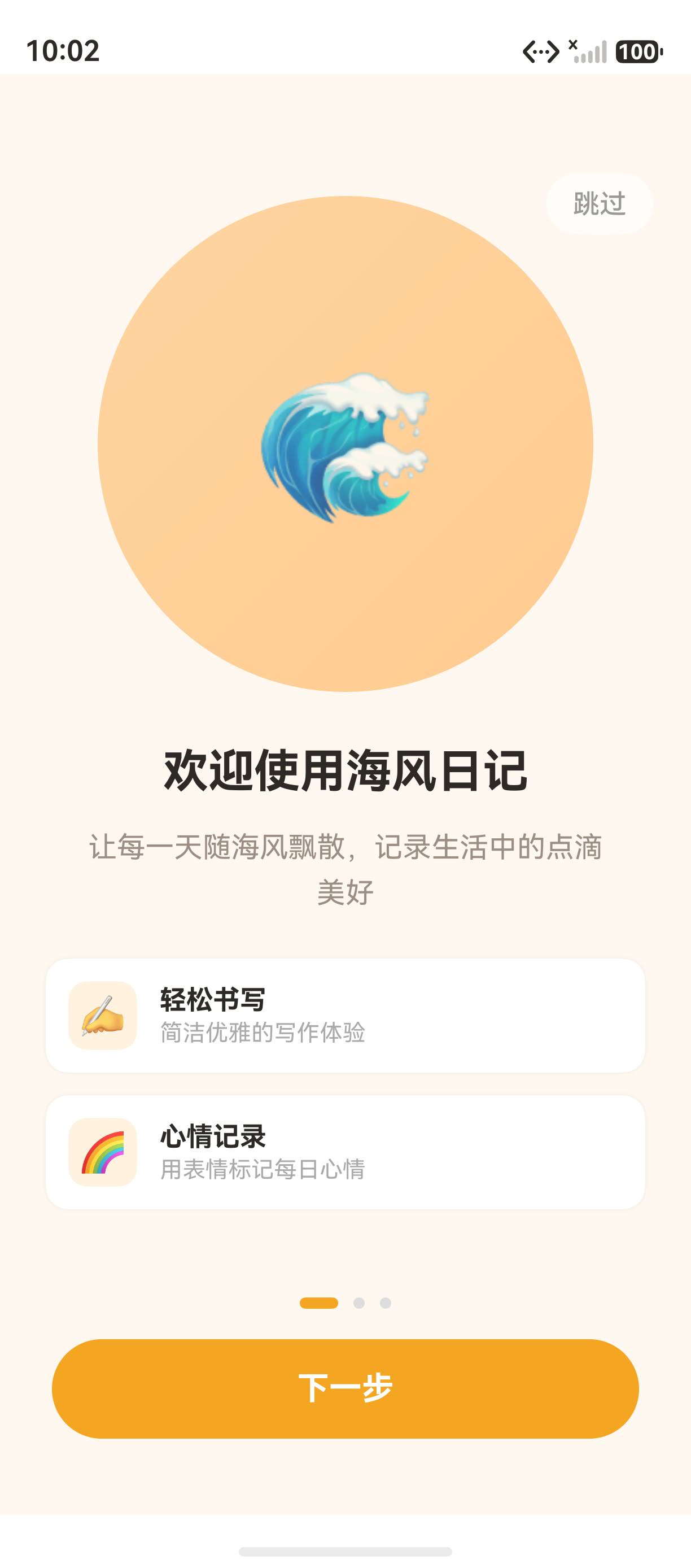
新用户引导是应用留存率的关键环节。"海风日记"的引导页通过 Swiper 轮播组件实现了 3 页功能展示,配合渐变圆形插画、功能亮点卡片和分页圆点,让新用户快速了解应用的核心功能。
本文将从 OnboardingPage.ets 源码出发,深入讲解 Swiper 组件的完整配置、分页控制、自定义指示器以及引导页的交互设计。
一、Swiper 组件概述
1.1 基本用法
typescript
@Entry
@Component
struct OnboardingPage {
  private swiperController: SwiperController = new SwiperController()

  build() {
    Swiper(this.swiperController) {
      ForEach(PAGES, (page: OnboardingPageData) => {
        Column() {
          // 页面内容
        }
      })
    }
    .layoutWeight(1)
    .indicator(false)       // 隐藏默认指示器
    .loop(false)            // 禁止循环
    .onChange((index) => {
      this.currentIndex = index
    })
  }
}
1.2 Swiper 的核心属性
| 属性 | 类型 | 说明 | 海风日记的值 |
|---|---|---|---|
indicator |
boolean | 是否显示默认指示器 | false(自定义) |
loop |
boolean | 是否循环播放 | false |
autoPlay |
boolean | 是否自动播放 | 未设置(默认 false) |
interval |
number | 自动播放间隔 | 未设置 |
duration |
number | 切换动画时长 | 未设置(默认值) |
onChange |
callback | 切换回调 | 更新 currentIndex |
controller |
SwiperController | 控制器 | 用于编程式控制 |
1.3 SwiperController 控制器
typescript
private swiperController: SwiperController = new SwiperController()

// 编程式控制方法
this.swiperController.showNext()  // 下一页
this.swiperController.showPrevious()  // 上一页
this.swiperController.finishAnimation()  // 结束动画
二、引导页的数据结构
2.1 页面数据模型
typescript
interface FeatureItem {
  icon: string
  title: string
  desc: string
  iconBg: string
}

interface OnboardingPageData {
  bg: string              // 页面背景色
  circleGradient: string[]  // 圆形渐变
  title: string           // 页面标题
  desc: string            // 页面描述
  features: FeatureItem[] // 功能亮点列表
}
2.2 三页数据定义
typescript
const PAGES: OnboardingPageData[] = [
  {
    bg: '#FFF8F0',
    circleGradient: ['#FFD4A0', '#FFCC90'],
    title: '欢迎使用海风日记',
    desc: '让每一天随海风飘散,记录生活中的点滴美好',
    features: [
      { icon: '✍️', title: '轻松书写', desc: '简洁优雅的写作体验', iconBg: '#FFF3E0' },
      { icon: '🌈', title: '心情记录', desc: '用表情标记每日心情', iconBg: '#FFF3E0' },
    ]
  },
  {
    bg: '#FFF8F0',
    circleGradient: ['#FFE4B0', '#FFDCA0'],
    title: '记录每一天的精彩',
    desc: '支持文字、图片、心情标签\n让每篇日记都有温度',
    features: [
      { icon: '📷', title: '图文并茂', desc: '一键添加照片,让记忆更生动', iconBg: '#FFF3E0' },
      { icon: '🏷️', title: '标签分类', desc: '自定义标签,轻松归档整理', iconBg: '#FFF3E0' },
    ]
  },
  {
    bg: '#F0F7FF',
    circleGradient: ['#C8E6FF', '#D4EDFF'],
    title: '回顾成长,看见坚持',
    desc: '日历热力图 · 写作统计 · 情绪趋势\n每一天的记录都是珍贵的印记',
    features: [
      { icon: '📅', title: '日历视图', desc: '一眼看清哪些天有记录', iconBg: '#E8F4FF' },
      { icon: '📊', title: '写作统计', desc: '连续天数、总字数,见证坚持', iconBg: '#E8F4FF' },
    ]
  }
]
三、引导页的布局结构
3.1 整体布局
typescript
Stack() {
  Column() {
    // ── Swiper 轮播 ────────────────────────────────
    Swiper(this.swiperController) {
      ForEach(PAGES, (page: OnboardingPageData, idx: number) => {
        this.buildPage(page, idx)
      })
    }
    .layoutWeight(1)
    .indicator(false)
    .loop(false)
    .onChange((index: number) => { this.currentIndex = index })

    // ── 底部固定区域 ────────────────────────────────
    Column({ space: 16 }) {
      // 分页圆点
      this.pageDots()

      // 底部按钮
      this.bottomButton()
    }
    .padding({ top: 16, bottom: 40 })
    .backgroundColor(PAGES[this.currentIndex].bg)
  }

  // ── 右上角跳过按钮 ────────────────────────────────
  Button('跳过')
    .position({ top: 52, right: 20 })
    .onClick(() => { router.replaceUrl({ url: 'pages/Index' }) })
}
3.2 每页的内容构建
typescript
@Builder
buildPage(page: OnboardingPageData, idx: number) {
  Column() {
    // 渐变圆形插画
    Column() {
      Text(idx === 0 ? '🌊' : idx === 1 ? '📖' : '📅').fontSize(80)
    }
    .width(260).height(260).borderRadius(130)
    .linearGradient({
      angle: 135,
      colors: [[page.circleGradient[0], 0], [page.circleGradient[1], 1]]
    })
    .justifyContent(FlexAlign.Center)
    .margin({ top: 64 })

    // 标题
    Text(page.title).fontSize(24).fontColor(COLOR_TEXT_MAIN)
      .fontWeight(FontWeight.Bold).margin({ top: 28 })

    // 描述
    Text(page.desc).fontSize(15).fontColor(COLOR_TEXT_SECONDARY)
      .textAlign(TextAlign.Center).lineHeight(24).margin({ top: 12 })

    // 功能亮点卡片
    Column({ space: 12 }) {
      ForEach(page.features, (feat: FeatureItem) => {
        this.featureCard(feat)
      })
    }
    .padding({ left: 24, right: 24, top: 24 })
  }
  .width('100%').height('100%')
  .backgroundColor(page.bg)
}
四、自定义分页指示器
4.1 分页圆点
typescript
@Builder
pageDots() {
  Row({ space: 8 }) {
    ForEach(PAGES, (page: OnboardingPageData, idx: number) => {
      Column()
        .width(this.currentIndex === idx ? 20 : 6)  // 选中态变宽
        .height(6)
        .borderRadius(3)
        .backgroundColor(
          this.currentIndex === idx ? COLOR_PRIMARY : '#DDDDDD'
        )
        .animation({ duration: 200 })  // 动画过渡
    })
  }
  .width('100%')
  .justifyContent(FlexAlign.Center)
}
4.2 指示器动画
选中圆点的宽度从 6vp 变为 20vp,配合 200ms 动画:
| 状态 | 宽度 | 颜色 | 圆角 |
|---|---|---|---|
| 未选中 | 6vp | #DDDDDD(灰色) |
3vp |
| 选中 | 20vp | COLOR_PRIMARY(橙色) |
3vp |
五、底部按钮与交互
5.1 底部按钮
typescript
@Builder
bottomButton() {
  Button(this.currentIndex === 2 ? '立即开始' : '下一步')
    .width('85%').height(52)
    .fontSize(17).fontColor('#FFFFFF').fontWeight(FontWeight.Bold)
    .backgroundColor(COLOR_PRIMARY).borderRadius(26)
    .onClick(() => {
      if (this.currentIndex === 2) {
        // 最后一页:进入首页
        router.replaceUrl({ url: 'pages/Index' })
      } else {
        // 翻页
        this.swiperController.showNext()
      }
    })
}
5.2 跳过按钮
typescript
// 右上角浮层跳过按钮
Button('跳过')
  .fontSize(14).fontColor('#999999')
  .backgroundColor('rgba(255,255,255,0.6)')
  .borderRadius(16).height(32).padding({ left: 14, right: 14 })
  .position({ top: 52, right: 20 })
  .onClick(() => { router.replaceUrl({ url: 'pages/Index' }) })
5.3 交互逻辑
┌─────────────────────────────────────────┐
│  右上角"跳过"按钮 → 立即进入首页        │
│                                          │
│  第 1 页:"下一步" → 翻到第 2 页        │
│  第 2 页:"下一步" → 翻到第 3 页        │
│  第 3 页:"立即开始" → 进入首页         │
│                                          │
│  分页圆点:点击无效,仅展示当前进度       │
└─────────────────────────────────────────┘
六、引导页的完整交互流程
6.1 用户操作流程
应用安装 → 首次打开 → 闪屏页 → 登录页 → 引导页 → 首页
                                    ↓ 跳过
                                    直接进入首页
6.2 生命周期顺序
引导页 → 点击"下一步"(3次) → router.replaceUrl('pages/Index')
   ↓
SplashPage 销毁
   ↓
LoginPhonePage 销毁
   ↓
OnboardingPage 销毁
   ↓
Index 创建 → HomeTab 显示
七、常见问题与排查
7.1 Swiper 不显示
问题:Swiper 区域显示为空白。
原因:Swiper 没有设置宽高,或子组件为空。
解决方案 :为 Swiper 设置 layoutWeight(1) 或固定宽高。
7.2 指示器重复
问题:同时显示了默认指示器和自定义指示器。
原因 :未设置 indicator(false)。
解决方案:
typescript
Swiper()
  .indicator(false)  // 隐藏默认指示器
7.3 循环导致的问题
问题:最后一页可以继续翻到第一页。
原因 :loop 属性为 true。
解决方案:
typescript
Swiper()
  .loop(false)  // 禁止循环
总结
本文通过"海风日记"引导页的源码,深入讲解了 Swiper 轮播组件的完整用法:
- Swiper 基础:属性配置、控制器、事件回调
- 数据驱动:页面数据的模型定义和三页数据
- 布局结构:Swiper + 底部固定区域 + 浮层按钮
- 自定义指示器:分页圆点的选中态动画
- 交互逻辑:下一页/立即开始/跳过三种操作
- 完整流程:从闪屏到引导页到首页的跳转链路
下一篇文章将深入讲解 SwiperController 编程式控制翻页与 showNext 的用法,敬请期待。
如果这篇文章对你有帮助,欢迎点赞👍、收藏⭐、关注🔔,你的支持是我持续创作的动力!
相关资源: