作者 :孟少康(世人万千)
仓库地址 :https://gitcode.com/feng8403000/FlutterfromBeginnertoAdvancedForHarmonyOS.git
联系邮箱:372699828@qq.com
概述
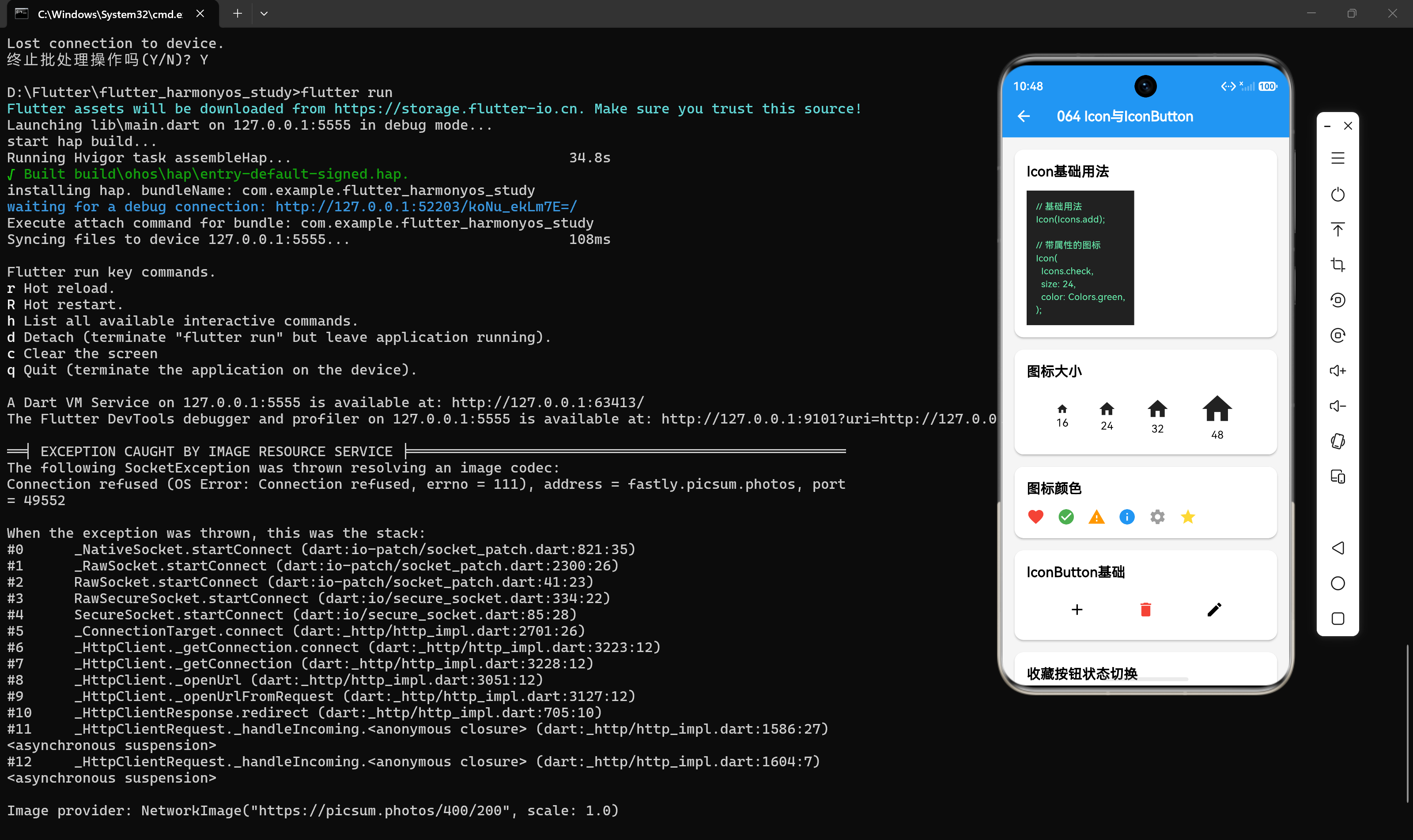
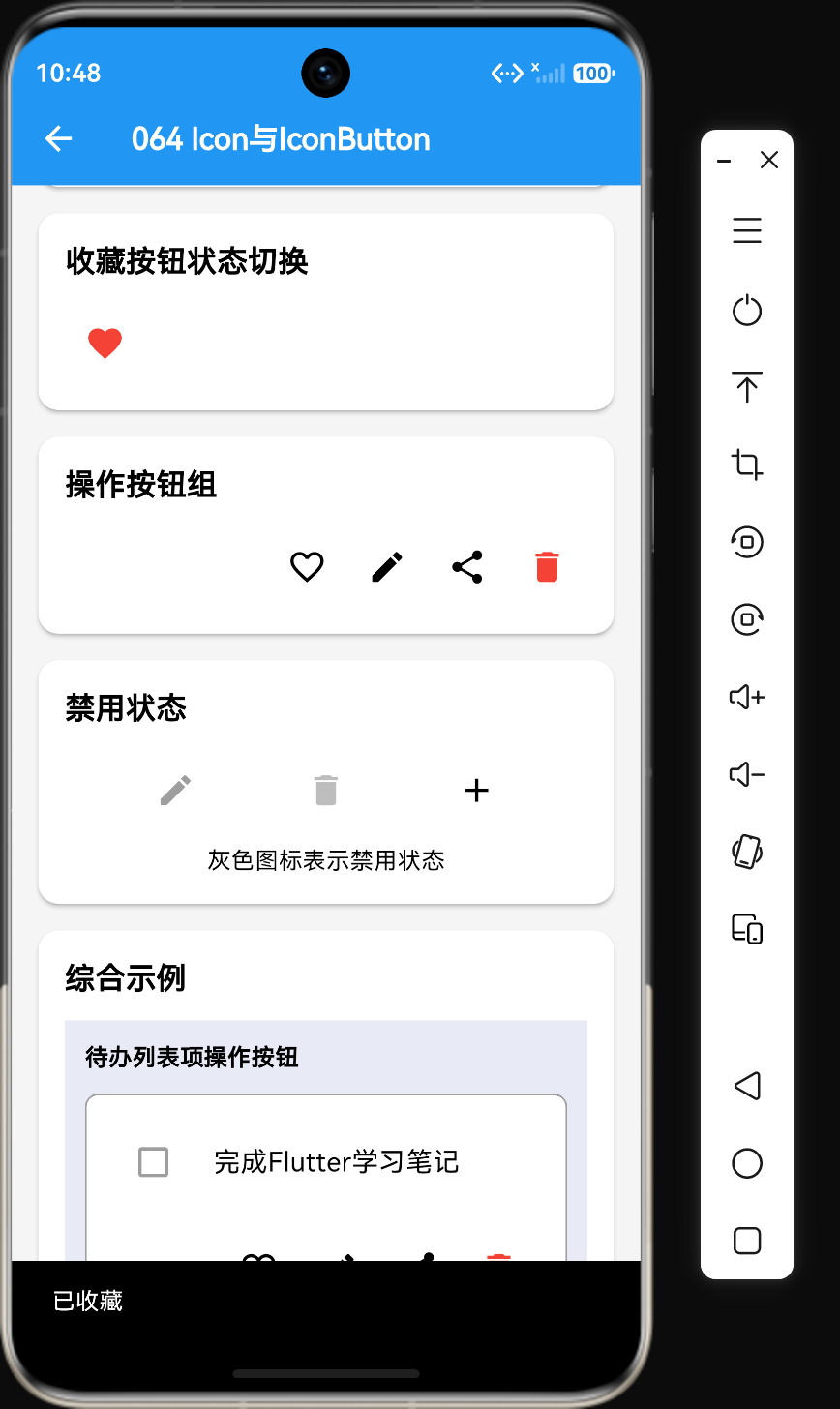
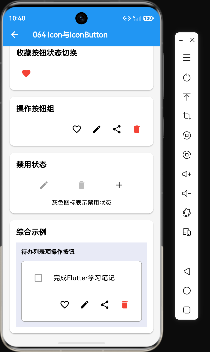
图标是用户界面中不可或缺的元素,它们能够直观地传达信息和操作意图。Flutter提供了两个核心组件来处理图标:Icon和IconButton。Icon用于显示静态图标,而IconButton用于创建可交互的图标按钮。
Icon组件详解
基础用法
dart
Icon(Icons.home);这是Icon组件最基本的用法,直接传入一个图标数据即可显示图标。
带样式的Icon
dart
Icon(
  Icons.home,
  color: Colors.blue,
  size: 32,
);
Icon的构造函数
dart
Icon(
  this.icon,
  {
    Key? key,
    this.size,
    this.color,
    this.semanticLabel,
    this.textDirection,
  }
);
icon属性
icon属性是必填参数,类型为IconData,表示要显示的图标。
dart
Icon(Icons.star);
Icon(Icons.favorite);
Icon(Icons.settings);
size属性
size属性定义图标的大小,单位为逻辑像素。
dart
Icon(Icons.home, size: 24);
Icon(Icons.home, size: 32);
Icon(Icons.home, size: 48);
color属性
color属性定义图标的颜色。
dart
Icon(Icons.home, color: Colors.red);
Icon(Icons.home, color: Colors.blue[500]);
Icon(Icons.home, color: const Color(0xFF0000FF));
semanticLabel属性
semanticLabel属性用于屏幕阅读器等辅助技术。
dart
Icon(
  Icons.home,
  semanticLabel: "首页",
);
textDirection属性
textDirection属性指定图标的方向。
dart
Icon(
  Icons.home,
  textDirection: TextDirection.ltr,
);
Material图标库
Flutter内置了丰富的Material Design图标库,可以通过Icons类访问。
常用图标分类
操作类图标
dart
Icon(Icons.add);           // 添加
Icon(Icons.delete);        // 删除
Icon(Icons.edit);          // 编辑
Icon(Icons.save);          // 保存
Icon(Icons.cancel);        // 取消
Icon(Icons.check);         // 确认
Icon(Icons.close);         // 关闭
导航类图标
dart
Icon(Icons.home);          // 首页
Icon(Icons.menu);          // 菜单
Icon(Icons.arrow_back);    // 返回
Icon(Icons.arrow_forward); // 前进
Icon(Icons.refresh);       // 刷新
Icon(Icons.search);        // 搜索
Icon(Icons.settings);      // 设置
社交类图标
dart
Icon(Icons.favorite);      // 收藏
Icon(Icons.share);         // 分享
Icon(Icons.comment);       // 评论
Icon(Icons.send);          // 发送
Icon(Icons.message);       // 消息
媒体类图标
dart
Icon(Icons.play_arrow);    // 播放
Icon(Icons.pause);         // 暂停
Icon(Icons.stop);          // 停止
Icon(Icons.volume_up);     // 音量+
Icon(Icons.volume_off);    // 静音
Icon(Icons.image);         // 图片
通讯类图标
dart
Icon(Icons.phone);         // 电话
Icon(Icons.email);         // 邮件
Icon(Icons.message);       // 消息
Icon(Icons.video_call);    // 视频通话
文件类图标
dart
Icon(Icons.file);          // 文件
Icon(Icons.folder);        // 文件夹
Icon(Icons.download);      // 下载
Icon(Icons.upload);        // 上传
状态类图标
dart
Icon(Icons.check_circle);  // 成功
Icon(Icons.error);         // 错误
Icon(Icons.warning);       // 警告
Icon(Icons.info);          // 信息
Icon(Icons.lock);          // 锁定
Icon(Icons.lock_open);     // 解锁
IconButton组件详解
基础用法
dart
IconButton(
  icon: const Icon(Icons.home),
  onPressed: () {
    print("图标被点击");
  },
);
完整示例
dart
IconButton(
  icon: const Icon(Icons.favorite),
  iconSize: 24,
  color: Colors.red,
  disabledColor: Colors.grey,
  onPressed: () {
    // 处理点击事件
  },
  tooltip: "收藏",
);
IconButton的构造函数
dart
IconButton({
  Key? key,
  this.iconSize = 24.0,
  this.padding = const EdgeInsets.all(8.0),
  this.alignment = Alignment.center,
  this.splashRadius,
  this.color,
  this.focusColor,
  this.hoverColor,
  this.highlightColor,
  this.splashColor,
  this.disabledColor,
  required this.onPressed,
  this.focusNode,
  this.autofocus = false,
  this.tooltip,
  bool enableFeedback = true,
  this.constraints,
  required this.icon,
  this.style,
})
icon属性
icon属性定义要显示的图标,类型为Widget。
dart
IconButton(
  icon: const Icon(Icons.home),
  onPressed: () {},
);
也可以使用自定义Widget作为图标:
dart
IconButton(
  icon: const Icon(Icons.star),
  onPressed: () {},
);
onPressed属性
onPressed属性是必填参数,定义点击事件处理函数。
dart
IconButton(
  icon: const Icon(Icons.refresh),
  onPressed: () {
    // 刷新数据
  },
);当onPressed为null时,按钮会被禁用:
dart
IconButton(
  icon: const Icon(Icons.refresh),
  onPressed: null, // 按钮被禁用
);
iconSize属性
iconSize属性定义图标的大小,默认值为24。
dart
IconButton(
  icon: const Icon(Icons.home),
  iconSize: 32,
  onPressed: () {},
);
color属性
color属性定义图标的颜色。
dart
IconButton(
  icon: const Icon(Icons.favorite),
  color: Colors.red,
  onPressed: () {},
);
disabledColor属性
disabledColor属性定义按钮禁用时图标的颜色。
dart
IconButton(
  icon: const Icon(Icons.favorite),
  color: Colors.red,
  disabledColor: Colors.grey,
  onPressed: null, // 禁用状态
);
tooltip属性
tooltip属性定义长按或悬停时显示的提示文本。
dart
IconButton(
  icon: const Icon(Icons.settings),
  tooltip: "设置",
  onPressed: () {},
);
padding属性
padding属性定义按钮的内边距。
dart
IconButton(
  icon: const Icon(Icons.home),
  padding: const EdgeInsets.all(16),
  onPressed: () {},
);
splashColor属性
splashColor属性定义点击时的水波纹颜色。
dart
IconButton(
  icon: const Icon(Icons.home),
  splashColor: Colors.blue.withOpacity(0.3),
  onPressed: () {},
);
highlightColor属性
highlightColor属性定义按钮按下时的高亮颜色。
dart
IconButton(
  icon: const Icon(Icons.home),
  highlightColor: Colors.blue.withOpacity(0.2),
  onPressed: () {},
);
splashRadius属性
splashRadius属性定义水波纹的半径。
dart
IconButton(
  icon: const Icon(Icons.home),
  splashRadius: 20,
  onPressed: () {},
);
自定义图标
使用自定义字体图标
首先,将字体图标文件添加到项目中:
- 创建
assets/fonts目录 - 将字体文件(如
iconfont.ttf)放入该目录 - 在
pubspec.yaml中配置:
yaml
flutter:
  fonts:
    - family: MyIcons
      fonts:
        - asset: assets/fonts/iconfont.ttf
然后,创建图标数据:
dart
class MyIcons {
  static const IconData home = IconData(0xe600, fontFamily: 'MyIcons');
  static const IconData settings = IconData(0xe601, fontFamily: 'MyIcons');
  static const IconData user = IconData(0xe602, fontFamily: 'MyIcons');
}
最后,使用自定义图标:
dart
Icon(MyIcons.home);
Icon(MyIcons.settings);
Icon(MyIcons.user);
使用图片作为图标
dart
IconButton(
  icon: Image.asset(
    'assets/images/icon_home.png',
    width: 24,
    height: 24,
  ),
  onPressed: () {},
);
使用IconTheme统一管理图标样式
dart
IconTheme(
  data: const IconThemeData(
    color: Colors.blue,
    size: 24,
  ),
  child: Column(
    children: const [
      Icon(Icons.home),
      Icon(Icons.settings),
      Icon(Icons.user),
    ],
  ),
);
实际应用示例
底部导航栏
dart
BottomNavigationBar(
  items: const [
    BottomNavigationBarItem(
      icon: Icon(Icons.home),
      label: "首页",
    ),
    BottomNavigationBarItem(
      icon: Icon(Icons.search),
      label: "搜索",
    ),
    BottomNavigationBarItem(
      icon: Icon(Icons.add),
      label: "发布",
    ),
    BottomNavigationBarItem(
      icon: Icon(Icons.message),
      label: "消息",
    ),
    BottomNavigationBarItem(
      icon: Icon(Icons.person),
      label: "我的",
    ),
  ],
);
AppBar操作按钮
dart
AppBar(
  title: const Text("页面标题"),
  actions: [
    IconButton(
      icon: const Icon(Icons.search),
      onPressed: () {
        // 打开搜索
      },
    ),
    IconButton(
      icon: const Icon(Icons.more_vert),
      onPressed: () {
        // 打开更多选项
      },
    ),
  ],
);
收藏按钮(带动画)
dart
class FavoriteButton extends StatefulWidget {
  const FavoriteButton({super.key});

  @override
  State<FavoriteButton> createState() => _FavoriteButtonState();
}

class _FavoriteButtonState extends State<FavoriteButton> {
  bool _isFavorite = false;

  @override
  Widget build(BuildContext context) {
    return IconButton(
      icon: Icon(
        _isFavorite ? Icons.favorite : Icons.favorite_border,
        color: _isFavorite ? Colors.red : Colors.grey,
      ),
      onPressed: () {
        setState(() {
          _isFavorite = !_isFavorite;
        });
      },
      tooltip: _isFavorite ? "取消收藏" : "收藏",
    );
  }
}
点赞按钮
dart
class LikeButton extends StatefulWidget {
  const LikeButton({super.key});

  @override
  State<LikeButton> createState() => _LikeButtonState();
}

class _LikeButtonState extends State<LikeButton> {
  bool _isLiked = false;

  @override
  Widget build(BuildContext context) {
    return IconButton(
      icon: Icon(
        _isLiked ? Icons.thumb_up : Icons.thumb_up_outlined,
        color: _isLiked ? Colors.blue : Colors.grey,
      ),
      onPressed: () {
        setState(() {
          _isLiked = !_isLiked;
        });
      },
    );
  }
}
分享按钮
dart
IconButton(
  icon: const Icon(Icons.share),
  onPressed: () {
    // 弹出分享选项
    showModalBottomSheet(
      context: context,
      builder: (context) => Column(
        mainAxisSize: MainAxisSize.min,
        children: [
          ListTile(
            leading: const Icon(Icons.message),
            title: const Text("发送给朋友"),
            onTap: () {},
          ),
          ListTile(
            leading: const Icon(Icons.link),
            title: const Text("复制链接"),
            onTap: () {},
          ),
        ],
      ),
    );
  },
);
设置页面图标列表
dart
ListTile(
  leading: const Icon(Icons.notifications),
  title: const Text("通知设置"),
  trailing: const Icon(Icons.arrow_forward_ios),
  onTap: () {},
);

ListTile(
  leading: const Icon(Icons.privacy_tip),
  title: const Text("隐私设置"),
  trailing: const Icon(Icons.arrow_forward_ios),
  onTap: () {},
);

ListTile(
  leading: const Icon(Icons.help),
  title: const Text("帮助与反馈"),
  trailing: const Icon(Icons.arrow_forward_ios),
  onTap: () {},
);
浮动操作按钮
dart
FloatingActionButton(
  onPressed: () {
    // 创建新内容
  },
  child: const Icon(Icons.add),
);
带数量角标的图标
dart
Stack(
  children: [
    const Icon(Icons.message, size: 24),
    Positioned(
      right: 0,
      top: 0,
      child: Container(
        padding: const EdgeInsets.all(2),
        decoration: const BoxDecoration(
          color: Colors.red,
          borderRadius: BorderRadius.all(Radius.circular(10)),
        ),
        constraints: const BoxConstraints(
          minWidth: 16,
          minHeight: 16,
        ),
        child: const Text(
          "3",
          style: TextStyle(
            color: Colors.white,
            fontSize: 12,
            fontWeight: FontWeight.bold,
          ),
          textAlign: TextAlign.center,
        ),
      ),
    ),
  ],
);
性能优化建议
使用常量图标
dart
// 好的做法:使用const修饰
const Icon(Icons.home);
const Icon(Icons.settings);
避免在build中创建图标数据
dart
// 不好的做法
Widget build(BuildContext context) {
  return Icon(
    IconData(0xe600, fontFamily: 'MyIcons'), // 每次build都会创建新对象
  );
}

// 好的做法
static const IconData _homeIcon = IconData(0xe600, fontFamily: 'MyIcons');

Widget build(BuildContext context) {
  return Icon(_homeIcon);
}
使用IconTheme统一管理样式
dart
// 避免重复设置样式
IconTheme(
  data: const IconThemeData(color: Colors.grey),
  child: Column(
    children: const [
      Icon(Icons.home),
      Icon(Icons.settings),
      // 所有子图标都会继承这个样式
    ],
  ),
);
常见问题
如何改变图标颜色?
使用color属性。
dart
Icon(Icons.home, color: Colors.blue);如何改变图标大小?
使用size属性。
dart
Icon(Icons.home, size: 32);如何创建可点击的图标?
使用IconButton组件。
dart
IconButton(
  icon: const Icon(Icons.home),
  onPressed: () {},
);
如何禁用IconButton?
将onPressed设置为null。
dart
IconButton(
  icon: const Icon(Icons.home),
  onPressed: null, // 禁用状态
);
如何添加长按提示?
使用tooltip属性。
dart
IconButton(
  icon: const Icon(Icons.settings),
  tooltip: "设置",
  onPressed: () {},
);
总结
Icon和IconButton是Flutter中处理图标的核心组件。以下是一些关键点:
- Icon组件:用于显示静态图标,支持颜色、大小等样式配置
- IconButton组件:用于创建可交互的图标按钮,支持点击事件、禁用状态等
- Material图标库:Flutter内置了丰富的Material Design图标
- 自定义图标:支持字体图标和图片图标
- IconTheme:用于统一管理图标样式
- 性能优化:使用const修饰、避免重复创建对象
掌握这两个组件的用法对于构建美观、交互友好的界面至关重要。
参考资料:
- Flutter官方文档:Icon
- Flutter官方文档:IconButton
- Flutter官方文档:Icons