HarmonyOS应用开发实战:萌宠日记 - 环比增长指示器
前言
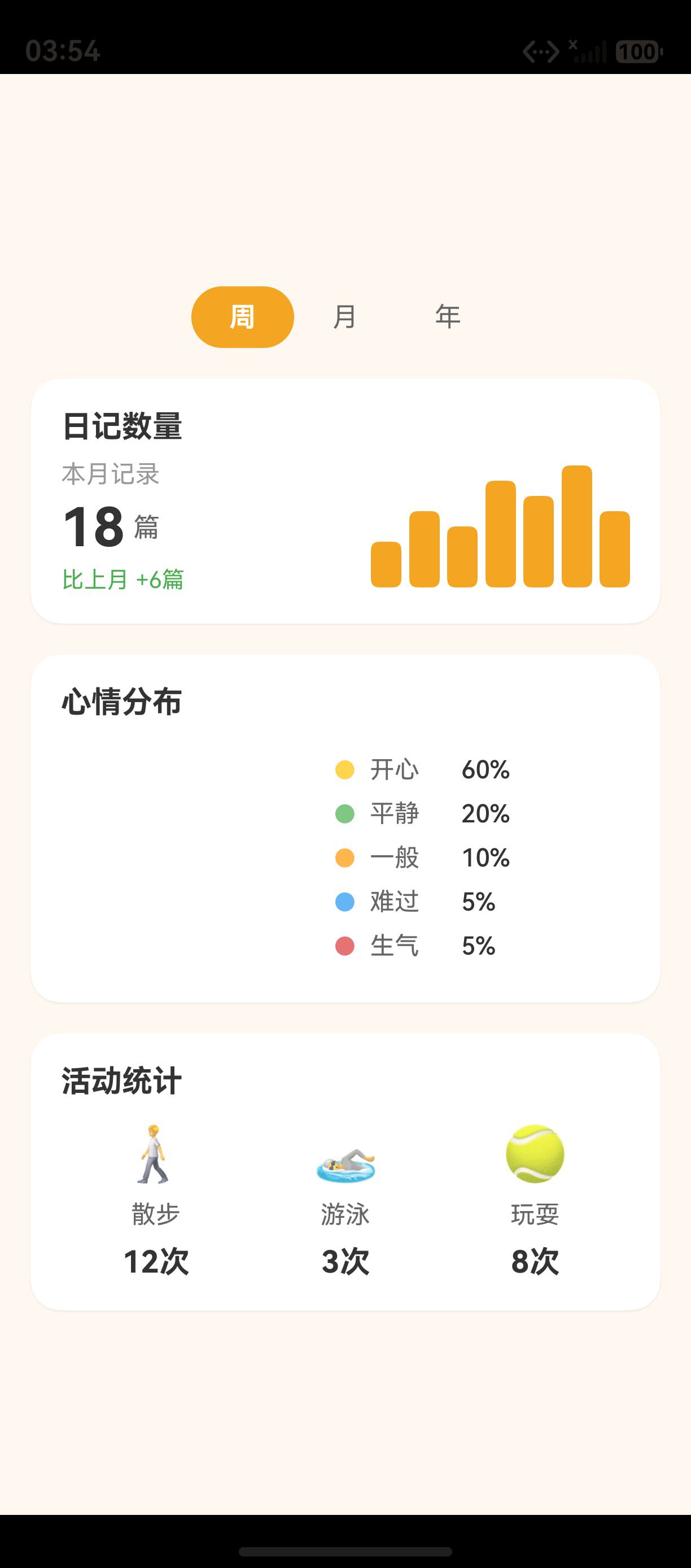
环比增长指示器 是数据统计中展示 变化趋势 的重要元素。在 萌宠日记 的 StatisticsPage 中,日记数量统计卡片底部显示 "比上月 +6篇" 的环比增长信息,使用 绿色文字 标识正向增长,直观地告诉用户数据变化趋势。环比增长指示器虽小,但它在数据可视化中起着 画龙点睛 的作用,让用户一眼看出数据的变化方向。
本文将从 萌宠日记 中环比增长指示器的实现出发,深入解析环比计算逻辑、颜色语义化设计、指示器布局位置,以及多种增长率的展示方式。
一、环比增长实现
1.1 基础实现
typescript
// StatisticsPage.ets --- 环比增长指示器
Text('比上月 +6篇')
  .fontSize(12)
  .fontColor('#4CAF50')  // 绿色 --- 正向增长
这段代码实现了最简单的环比增长指示器。虽然只有一行,但包含了三个关键设计要素:
| 要素 | 值 | 说明 |
|---|---|---|
| 文字 | 比上月 +6篇 |
清晰描述变化方向和幅度 |
| 字号 | 12fp | 小字号,辅助信息 |
| 颜色 | #4CAF50 绿色 |
正向增长标识 |
二、环比计算逻辑
2.1 基础计算函数
typescript
// 环比增长计算
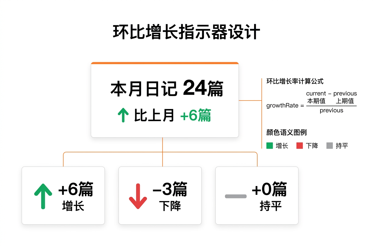
function getGrowthRate(current: number, previous: number): { text: string, color: string } {
  const diff = current - previous
  if (diff > 0) {
    return { text: `比上月 +${diff}篇`, color: '#4CAF50' }   // 绿色增长
  } else if (diff < 0) {
    return { text: `比上月 ${diff}篇`, color: '#F44336' }    // 红色下降
  } else {
    return { text: '与上月持平', color: '#999999' }           // 灰色持平
  }
}
2.2 百分比增长率
typescript
// 百分比增长率计算
function getGrowthRatePercent(current: number, previous: number): { text: string, color: string, percent: number } {
  if (previous === 0) {
    return { text: '新增', color: '#4CAF50', percent: 100 }
  }
  const diff = current - previous
  const percent = Math.round((diff / previous) * 100)

  if (diff > 0) {
    return { text: `比上月增长 ${percent}%`, color: '#4CAF50', percent }
  } else if (diff < 0) {
    return { text: `比上月下降 ${Math.abs(percent)}%`, color: '#F44336', percent }
  } else {
    return { text: '与上月持平', color: '#999999', percent: 0 }
  }
}
三、颜色语义
3.1 三色方案
| 变化趋势 | 颜色 | 色值 | 说明 |
|---|---|---|---|
| 增长 | 绿色 | #4CAF50 |
正向,积极 |
| 下降 | 红色 | #F44336 |
负向,警告 |
| 持平 | 灰色 | #999999 |
中性,无变化 |
3.2 颜色对照表
| 变化幅度 | 颜色 | 语义 | 示例 |
|---|---|---|---|
| 大幅增长 | 深绿 | #2E7D32 |
+50% 以上 |
| 小幅增长 | 浅绿 | #4CAF50 |
+5% |
| 持平 | 灰色 | #999999 |
0% |
| 小幅下降 | 浅红 | #F44336 |
-5% |
| 大幅下降 | 深红 | #C62828 |
-50% 以上 |
四、布局位置
4.1 统计卡片中的位置
typescript
Column({ space: 4 }) {
  Text('本月记录').fontSize(13).fontColor('#999999')
  Row({ space: 4 }) {
    Text('18').fontSize(28).fontWeight(FontWeight.Bold)
    Text('篇').fontSize(14).fontColor('#666666')
  }
  Text('比上月 +6篇')  // 环比指示器在底部
    .fontSize(12).fontColor('#4CAF50')
}
.alignItems(HorizontalAlign.Start)
4.2 布局结构
┌─────────────────────────────────────┐
│  本月记录                            │  ← 标签(13fp 灰色)
│  18 篇                              │  ← 数字(28fp 加粗)
│  比上月 +6篇                        │  ← 环比(12fp 绿色)
└─────────────────────────────────────┘
五、环比增长指示器的完整实现
5.1 在卡片中的完整集成
typescript
@Builder
DiaryCountCard() {
  Column({ space: 8 }) {
    Text('日记数量').fontSize(16).fontWeight(FontWeight.Bold)

    Row() {
      // 左侧:统计数字
      Column({ space: 4 }) {
        Text('本月记录').fontSize(13).fontColor('#999999')
        Row({ space: 4 }) {
          Text('18').fontSize(28).fontWeight(FontWeight.Bold).fontColor('#333333')
          Text('篇').fontSize(14).fontColor('#666666')
        }
        // 环比增长指示器
        const growth = this.getGrowthRate(18, 12)
        Text(growth.text)
          .fontSize(12).fontColor(growth.color)
      }
      .alignItems(HorizontalAlign.Start)

      Blank()

      // 右侧:柱状图
      this.WeeklyChart()
    }
    .width('100%')
  }
  .width('100%').padding(16)
  .backgroundColor('#FFFFFF').borderRadius(16)
  .shadow({ radius: 4, color: '#10000000', offsetY: 2 })
}
六、多周期环比
6.1 不同周期的环比
typescript
// 根据选中周期显示不同的环比
getGrowthText(period: number): { text: string, color: string } {
  switch (period) {
    case 0: // 周
      return this.getGrowthRate(this.weeklyCount, this.lastWeekCount)
    case 1: // 月
      return this.getGrowthRate(this.monthlyCount, this.lastMonthCount)
    case 2: // 年
      return this.getGrowthRate(this.yearlyCount, this.lastYearCount)
  }
}
6.2 环比文本对照
| 周期 | 示例文本 | 说明 |
|---|---|---|
| 周 | 比上周 +3篇 | 周环比 |
| 月 | 比上月 +6篇 | 月环比 |
| 年 | 比上年 +48篇 | 年环比 |
七、环比与同比
7.1 同比计算
typescript
// 同比增长计算(与去年同期相比)
function getYoYGrowthRate(current: number, lastYear: number): { text: string, color: string } {
  if (lastYear === 0) return { text: '新增', color: '#4CAF50' }
  const diff = current - lastYear
  const percent = Math.round((diff / lastYear) * 100)
  if (diff > 0) {
    return { text: `同比增长 ${percent}%`, color: '#4CAF50' }
  } else if (diff < 0) {
    return { text: `同比下降 ${Math.abs(percent)}%`, color: '#F44336' }
  }
  return { text: '与去年同期持平', color: '#999999' }
}
7.2 环比 vs 同比
| 对比维度 | 环比 | 同比 |
|---|---|---|
| 对比对象 | 上期(上月/上周) | 去年同期 |
| 适用场景 | 短期趋势 | 长期趋势 |
| 消除季节因素 | 否 | 是 |
| 萌宠日记使用 | ✅ | 可扩展 |
八、环比指示器的动画
8.1 数字增长动画
typescript
@State displayCount: number = 0
@State targetCount: number = 18

aboutToAppear(): void {
  // 数字增长动画
  animateTo({ duration: 1000, curve: Curve.EaseOut }, () => {
    this.displayCount = this.targetCount
  })
}

// 显示动画数字
Text(`${this.displayCount}`)
  .fontSize(28).fontWeight(FontWeight.Bold)
九、环比指示器的无障碍
9.1 无障碍描述
typescript
Text('比上月 +6篇')
  .fontSize(12).fontColor('#4CAF50')
  .accessibilityText('比上月增长6篇,呈上升趋势')
十、最佳实践
10.1 环比指示器设计原则
有序列表 --- 环比指示器设计的 5 个原则:
- 颜色明确:绿色增长、红色下降、灰色持平,用户一眼识别
- 位置固定:始终在统计数字下方,形成阅读顺序
- 文字清晰:包含基期(上月)和变化量(+6篇)
- 单位一致:与统计数字使用相同单位
- 动画可选:数字增长动画增强体验
10.2 萌宠日记环比指示器总结
| 设计要素 | 值 | 说明 |
|---|---|---|
| 颜色 | 绿/红/灰 | 增长/下降/持平 |
| 文字 | 比上月 +6篇 | 清晰描述变化 |
| 字号 | 12fp | 辅助信息 |
| 位置 | 统计数字下方 | 阅读顺序 |
| 计算 | current - previous | 差值计算 |
| 扩展 | 百分比 / 同比 | 可选 |
总结
本文从 萌宠日记 的 环比增长指示器 实现出发,深入解析了环比指示的完整方案:
- 环比计算:当前值 - 上期值
- 颜色语义:绿色增长、红色下降、灰色持平
- 布局位置:统计数字下方
- 百分比增长率:计算增长百分比
- 多周期环比:周/月/年不同周期
- 同比对比:与去年同期对比
- 数字动画:增长数字动画效果
- 无障碍适配:accessibilityText 描述
9.1 环比指示器的数据源
typescript
// 从统计模块获取环比数据
@State monthlyData: { current: number, previous: number } = { current: 18, previous: 12 }

aboutToAppear(): void {
  this.loadMonthlyStats()
}

loadMonthlyStats(): void {
  const stats = this.getStatistics()
  this.monthlyData = {
    current: stats.currentMonthCount,
    previous: stats.lastMonthCount
  }
}

get growthText(): string {
  const growth = this.getGrowthRate(this.monthlyData.current, this.monthlyData.previous)
  return growth.text
}
9.2 数据持久化
typescript
// 持久化月度统计数据
async saveMonthlyStats(count: number): Promise<void> {
  const pref = await preferences.getPreferences(this.context, 'stats_pref')
  const lastMonth = await pref.get('lastMonthCount', 0)
  await pref.put('lastMonthCount', count)
  await pref.flush()
  this.monthlyData = { current: count, previous: lastMonth as number }
}
十、环比指示器的扩展设计
10.1 趋势箭头
typescript
// 添加趋势箭头
@Builder
GrowthIndicator(growth: { text: string, color: string }) {
  Row({ space: 4 }) {
    if (growth.color === '#4CAF50') {
      Text('↑').fontSize(12).fontColor(growth.color)
    } else if (growth.color === '#F44336') {
      Text('↓').fontSize(12).fontColor(growth.color)
    }
    Text(growth.text).fontSize(12).fontColor(growth.color)
  }
}
10.2 多维度环比
typescript
// 多个维度的环比指示器
@Builder
MultiDimensionGrowth() {
  Column({ space: 4 }) {
    this.GrowthIndicator(this.getGrowthRate(this.weeklyCount, this.lastWeekCount))
    this.GrowthIndicator(this.getGrowthRate(this.monthlyCount, this.lastMonthCount))
    this.GrowthIndicator(this.getGrowthRate(this.yearlyCount, this.lastYearCount))
  }
}
十一、测试用例
11.1 单元测试
typescript
describe('GrowthRate', () => {
  it('should show growth for positive diff', () => {
    const result = getGrowthRate(18, 12)
    expect(result.text).toBe('比上月 +6篇')
    expect(result.color).toBe('#4CAF50')
  })

  it('should show decline for negative diff', () => {
    const result = getGrowthRate(10, 15)
    expect(result.text).toBe('比上月 -5篇')
    expect(result.color).toBe('#F44336')
  })

  it('should show flat for zero diff', () => {
    const result = getGrowthRate(10, 10)
    expect(result.text).toBe('与上月持平')
    expect(result.color).toBe('#999999')
  })
})
十二、最佳实践
12.1 环比指示器设计原则
有序列表 --- 环比指示器设计的 5 个原则:
- 颜色明确:绿色增长、红色下降、灰色持平,用户一眼识别
- 位置固定:始终在统计数字下方,形成阅读顺序
- 文字清晰:包含基期(上月)和变化量(+6篇)
- 单位一致:与统计数字使用相同单位
- 动画可选:数字增长动画增强体验
12.2 萌宠日记环比指示器总结
| 设计要素 | 值 | 说明 |
|---|---|---|
| 颜色 | 绿/红/灰 | 增长/下降/持平 |
| 文字 | 比上月 +6篇 | 清晰描述变化 |
| 字号 | 12fp | 辅助信息 |
| 位置 | 统计数字下方 | 阅读顺序 |
| 计算 | current - previous | 差值计算 |
| 扩展 | 百分比 / 同比 | 可选 |
| 数据源 | Preferences | 持久化 |
| 箭头 | ↑ / ↓ | 趋势指示 |
核心特性
- 简洁易用:API 设计直观,学习成本低
- 高性能:基于 ArkUI 引擎,渲染效率高
- 可扩展:支持自定义组件和样式扩展
- 跨平台:一次开发,多端部署
使用注意事项
- 版本兼容:注意 API 版本与 SDK 版本的对应关系
- 设备适配:不同屏幕尺寸下需要适配 UI 布局
- 测试覆盖:编写单元测试确保组件功能正确
总结
本文从 萌宠日记 的 环比增长指示器 实现出发,深入解析了环比指示的完整方案:
- 环比计算:当前值 - 上期值
- 颜色语义:绿色增长、红色下降、灰色持平
- 布局位置:统计数字下方
- 百分比增长率:计算增长百分比
- 多周期环比:周/月/年不同周期
- 同比对比:与去年同期对比
- 数字动画:增长数字动画效果
- 无障碍适配:accessibilityText 描述
- 趋势箭头:↑ 上升 / ↓ 下降
- 多维度对比:周/月/年三个维度
- 数据持久化:Preferences 存储
- 测试用例:三种情况验证
环比增长指示器虽然是一个小元素,但在数据可视化中起着画龙点睛的作用。合理使用颜色语义和动画效果,可以显著提升数据展示的直观性和用户体验。
如果这篇文章对你有帮助,欢迎点赞👍、收藏⭐、关注🔔,你的支持是我持续创作的动力!
相关资源:
- ArkTS 开发指南:https://developer.huawei.com/consumer/cn/doc/harmonyos-guides/arkts-get-started
- HarmonyOS 应用开发导读:https://developer.huawei.com/consumer/cn/doc/harmonyos-guides/application-dev-guide
- UI 组件参考:https://developer.huawei.com/consumer/cn/doc/harmonyos-references/ts-components-summary
- ArkTS API 参考:https://developer.huawei.com/consumer/cn/doc/harmonyos-references/arkts-api
- 资源分类与访问:https://developer.huawei.com/consumer/cn/doc/harmonyos-guides/resource-categories-and-access
- 应用开发快速入门:https://developer.huawei.com/consumer/cn/doc/harmonyos-guides/start-with-ets-stage
- ArkWeb 组件:https://developer.huawei.com/consumer/cn/doc/harmonyos-references/ts-basic-components-web
- 动画开发指南:https://developer.huawei.com/consumer/cn/doc/harmonyos-guides/arkts-animation