前言
欢迎加入开源鸿蒙跨平台社区:https://openharmonycrossplatform.csdn.net
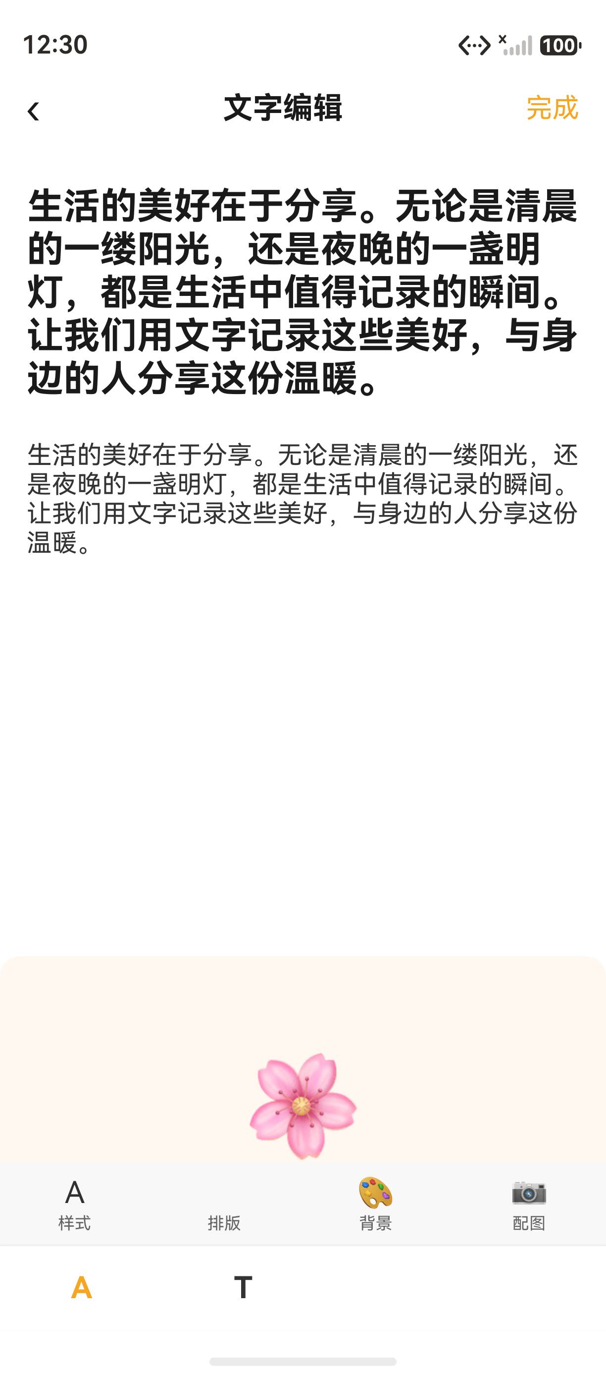
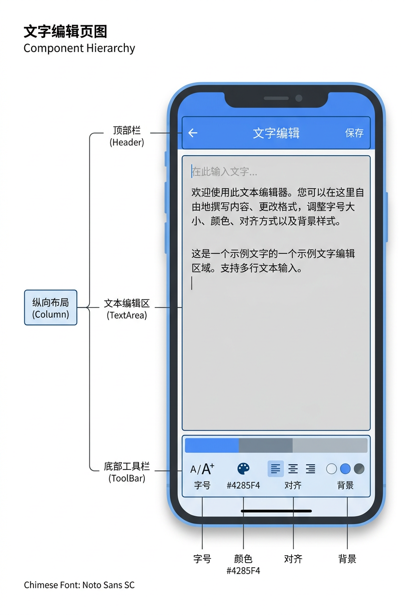
文字编辑器 是小分享 App 的核心功能之一,用户在此输入文字内容、调整格式,最终生成分享卡片。本篇以 TextEditPage 为例,讲解 Header 导航栏 、TextArea 多行输入 、@Builder 工具栏 、@State 双向绑定 等核心实现。详细 API 可参考 HarmonyOS TextArea 官方文档。
一、TextEditPage 完整代码
1.1 页面完整实现
typescript
import router from '@ohos.router';

@Entry
@Component
struct TextEditPage {
  @State textContent: string = '生活的美好在于分享';
  @State fontSize: number = 16;

  build() {
    Column() {
      // Header 导航栏
      Row() {
        Text('‹').fontSize(24).fontColor('#1A1A1A')
          .onClick(() => { router.back() })
        Text('文字编辑').fontSize(18).fontWeight(FontWeight.Bold)
          .fontColor('#1A1A1A').layoutWeight(1).textAlign(TextAlign.Center)
        Text('完成').fontSize(16).fontColor('#F5A623')
          .onClick(() => { router.pushUrl({ url: 'pages/PreviewPage' }) })
      }
      .width('100%').padding({ left: 16, right: 16, top: 12, bottom: 12 })
      .backgroundColor(Color.White)

      // 编辑区
      Scroll() {
        Column({ space: 16 }) {
          // 标题展示
          Text(this.textContent).fontSize(22).fontWeight(FontWeight.Bold)
            .fontColor('#1A1A1A').width('100%').padding({ left: 16, right: 16, top: 20 })

          // 多行输入
          TextArea({ text: '生活的美好在于分享...', placeholder: '输入你想分享的内容...' })
            .fontSize(15).fontColor('#333333').backgroundColor(Color.Transparent)
            .width('100%').height(300).padding({ left: 16, right: 16 })
            .onChange((value: string) => { this.textContent = value })

          // 配图占位
          Column() { Text('🌸').fontSize(60) }
            .width('100%').height(180).backgroundColor('#FFF8F0')
            .borderRadius(12).margin({ left: 16, right: 16 })
            .justifyContent(FlexAlign.Center).alignItems(HorizontalAlign.Center)
        }
      }
      .layoutWeight(1)

      // 底部工具栏
      Column() {
        // 工具行
        Row({ space: 0 }) {
          this.ToolItem('A', '样式')
          this.ToolItem('️', '排版')
          this.ToolItem('🎨', '背景')
          this.ToolItem('📷', '配图')
        }
        .width('100%').height(50).backgroundColor('#F8F8F8')
        .justifyContent(FlexAlign.SpaceAround)

        // 格式行
        Row({ space: 0 }) {
          this.FormatItem('A', '#F5A623')
          this.FormatItem('T', '#333333')
          this.FormatItem('', '#333333')
          this.FormatItem('', '#333333')
        }
        .width('100%').height(50).backgroundColor(Color.White)
        .justifyContent(FlexAlign.SpaceAround)
        .shadow({ radius: 4, color: '#10000000', offsetY: -2 })
      }
    }
    .width('100%').height('100%').backgroundColor(Color.White)
  }

  @Builder ToolItem(icon: string, label: string) {
    Column({ space: 2 }) {
      Text(icon).fontSize(18)
      Text(label).fontSize(10).fontColor('#666666')
    }
    .alignItems(HorizontalAlign.Center)
  }

  @Builder FormatItem(text: string, color: string) {
    Text(text).fontSize(18).fontColor(color).fontWeight(FontWeight.Bold)
  }
}
二、Header 导航栏
2.1 三栏布局
Header 采用左中右三栏布局:
typescript
Row() {
  Text('‹')           // 左侧返回按钮
  Text('文字编辑')     // 居中标题
  Text('完成')         // 右侧操作按钮
}
2.2 布局结构
| 位置 | 内容 | 作用 | 样式 |
|---|---|---|---|
| 左侧 | ‹ | 返回 | fontSize 24, router.back() |
| 居中 | 文字编辑 | 标题 | fontSize 18, Bold, layoutWeight(1) |
| 右侧 | 完成 | 确认 | fontSize 16, #F5A623, 跳转预览页 |
三、TextArea 组件
3.1 基本用法
typescript
TextArea({ text: '默认文字', placeholder: '输入你想分享的内容...' })
  .fontSize(15)
  .fontColor('#333333')
  .backgroundColor(Color.Transparent)
  .width('100%')
  .height(300)
  .padding({ left: 16, right: 16 })
  .onChange((value: string) => {
    this.textContent = value   // 状态绑定
  })
3.2 TextArea 常用属性
| 属性 | 作用 | 示例值 |
|---|---|---|
text |
初始文本 | '默认文字' |
placeholder |
占位符 | '输入内容...' |
onChange |
内容变化回调 | (value) => {} |
maxLength |
最大字符数 | 500 |
editable |
是否可编辑 | true |
height |
高度 | 300 |
3.3 代码块:TextInput 对比
typescript
// TextInput - 单行输入
TextInput({ placeholder: '搜索...', text: this.searchKey })
  .onChange((value) => { this.searchKey = value })

// TextArea - 多行输入
TextArea({ text: this.textContent, placeholder: '输入内容...' })
  .height(300)
  .onChange((value) => { this.textContent = value })
四、@State 文本双向绑定
4.1 状态声明
typescript
@State textContent: string = '生活的美好在于分享';
@State fontSize: number = 16;
4.2 双向绑定
typescript
TextArea({ text: this.textContent, placeholder: '输入...' })
  .onChange((value: string) => {
    this.textContent = value  // 状态变化 → UI 自动刷新
  })
提示:
onChange回调中更新@State变量,ArkUI 会自动重新渲染依赖该变量的 UI 组件。
五、@Builder 工具栏
5.1 @Builder 定义
typescript
@Builder ToolItem(icon: string, label: string) {
  Column({ space: 2 }) {
    Text(icon).fontSize(18)
    Text(label).fontSize(10).fontColor('#666666')
  }
  .alignItems(HorizontalAlign.Center)
}

@Builder FormatItem(text: string, color: string) {
  Text(text).fontSize(18).fontColor(color).fontWeight(FontWeight.Bold)
}
5.2 @Builder 调用
typescript
Row({ space: 0 }) {
  this.ToolItem('A', '样式')
  this.ToolItem('️', '排版')
  this.ToolItem('🎨', '背景')
  this.ToolItem('📷', '配图')
}
5.3 @Builder 与 @Component 对比
| 对比维度 | @Builder | @Component |
|---|---|---|
| 复用粒度 | UI 片段 | 完整组件 |
| 状态管理 | 共享外部状态 | 独立状态管理 |
| 调用方式 | this.xxx() |
标签调用 |
| 适用场景 | 简单 UI 复用 | 复杂独立组件 |
六、编辑区布局
6.1 布局结构
text
Scroll (可滚动)
  └─ Column (space: 16)
       ├─ Text (标题展示) 22px Bold
       ├─ TextArea (编辑区) 300px 高度
       └─ Column (配图占位) 180px #FFF8F0
6.2 配图占位区
typescript
Column() { Text('🌸').fontSize(60) }
  .width('100%').height(180)
  .backgroundColor('#FFF8F0')
  .borderRadius(12)
  .margin({ left: 16, right: 16 })
  .justifyContent(FlexAlign.Center)
  .alignItems(HorizontalAlign.Center)
七、页面跳转流程
7.1 路由跳转
typescript
// 返回按钮
router.back()

// 完成按钮 → 跳转预览页
router.pushUrl({ url: 'pages/PreviewPage' })
7.2 路由策略
| 按钮 | 路由 API | 说明 |
|---|---|---|
| ‹ 返回 | router.back() |
返回编辑页 |
| ✕ 关闭 | router.back() |
返回首页 |
| 完成 | router.pushUrl() |
跳转预览页 |
八、常见问题
8.1 问题 1:TextArea 高度无法自适应
原因 :height 属性固定了高度,内容超出时会滚动。
解决 :不设置 height,让 TextArea 根据内容自动扩展。
8.2 问题 2:@State 更新后 UI 不刷新
原因:直接修改字符串变量是有效的,但如果修改对象属性需要创建新对象。
九、核心知识点
9.1 技术要点
- TextArea 多行文本输入,支持 onChange 双向绑定
- @State 管理编辑内容状态
- 工具栏用 @Builder 封装复用
- Header 三栏布局控制
9.2 实战建议
- onChange 中更新 @State 实现双向绑定
- 工具栏用 @Builder 复用 UI 片段
- 完成按钮用 pushUrl 跳转预览页
总结
本文详细讲解了 TextEditPage 文字编辑器的完整实现,从 Header 三栏布局 、TextArea 多行输入 、@State 双向绑定 到 @Builder 工具栏,涵盖了文字编辑器的全部核心功能。下一篇我们将深入 ImageEditPage 图片编辑器的实现。
相关资源
- HarmonyOS TextArea 官方文档 :TextArea Reference
- HarmonyOS TextInput 文档 :TextInput Reference
- HarmonyOS @Builder 装饰器 :@Builder Guide
- HarmonyOS @State 装饰器 :@State Guide
- HarmonyOS 状态管理 :State Management
- HarmonyOS Router 路由 :Router API
- HarmonyOS Scroll 组件 :Scroll Component
- 开源鸿蒙跨平台社区 :https://openharmonycrossplatform.csdn.net
附录:编辑器的完整实现细节
1. 完整的 @Builder 工具栏
小分享 App 的 TextEditPage 使用两个工具栏行:工具行和格式行。工具行包含样式、排版、背景、配图四个功能入口;格式行包含字号加粗、斜体、下划线等格式控制。
typescript
@Builder ToolItem(icon: string, label: string) {
  Column({ space: 2 }) {
    Text(icon).fontSize(18)
    Text(label).fontSize(10).fontColor('#666666')
  }
  .alignItems(HorizontalAlign.Center)
}
2. 路由跳转策略
| 按钮 | 目标 | API | 效果 |
|---|---|---|---|
| ‹ 返回 | 上一页 | router.back() |
出栈返回 |
| 完成 | PreviewPage | router.pushUrl() |
入栈跳转 |
3. TextArea 与 TextInput 对比
| 对比维度 | TextArea | TextInput |
|---|---|---|
| 行数 | 多行 | 单行 |
| 高度 | 可设置固定高度 | 自适应 |
| 滚动 | 内容溢出时自动滚动 | 不滚动 |
| 适用场景 | 文章编辑、评论输入 | 搜索框、用户名 |
4. 编辑区布局的完整代码
typescript
Scroll() {
  Column({ space: 16 }) {
    // 标题展示
    Text(this.textContent)
      .fontSize(22).fontWeight(FontWeight.Bold).fontColor('#1A1A1A')
      .width('100%').padding({ left: 16, right: 16, top: 20 })

    // 多行输入
    TextArea({ text: '生活的美好在于分享...', placeholder: '输入你想分享的内容...' })
      .fontSize(15).fontColor('#333333').backgroundColor(Color.Transparent)
      .width('100%').height(300).padding({ left: 16, right: 16 })
      .onChange((value: string) => { this.textContent = value })

    // 配图占位区
    Column() { Text('🌸').fontSize(60) }
      .width('100%').height(180).backgroundColor('#FFF8F0')
      .borderRadius(12).margin({ left: 16, right: 16 })
      .justifyContent(FlexAlign.Center).alignItems(HorizontalAlign.Center)
  }
}
.layoutWeight(1)
5. 完整的页码结构
text
Column (主容器)
├─ Row (Header 导航栏) - 左‹ 中标题 右完成
├─ Scroll (编辑区) - layoutWeight(1) 撑开
│   └─ Column (space: 16)
│       ├─ Text (标题展示)
│       ├─ TextArea (编辑区)
│       └─ Column (配图占位)
└─ Column (底部工具栏)
    ├─ Row (工具行)
    └─ Row (格式行)
提示:以上布局结构是小分享 App 所有编辑器的标准模板,后续的 ImageEditPage 和 LinkEditPage 均采用类似的三段式布局。
6. 编辑器的扩展方向
| 扩展功能 | 实现方式 | 优先级 |
|---|---|---|
| 字号选择 | @State fontSize + 滑动选择器 | 高 |
| 字体颜色 | @State fontColor + 色板选择 | 高 |
| 加粗/斜体 | @State isBold + Toggle 切换 | 中 |
| 对齐方式 | @State textAlign + 三选一按钮 | 中 |
| 配图上传 | PhotoViewPicker 选择图片 | 高 |
7. 完整的代码文件结构
text
entry/src/main/ets/
├── pages/
│   └── TextEditPage.ets       # 文字编辑器页面
├── components/
│   └── StyleToolbar.ets       # 样式工具栏组件(可选抽取)
├── common/
│   └── interfaces.ets         # 公共接口定义
└── entryability/
    └── EntryAbility.ets       # 入口 Ability
上述文件结构展示了 TextEditPage 在小分享 App 工程中的位置。
- 第一步:了解组件的基本用法
- 第二步:掌握组件的核心属性
如果这篇文章对你有帮助,欢迎点赞👍、收藏⭐、关注🔔,你的支持是我持续创作的动力!