唯美花朵风格的黑胶唱片音乐播放器功能说明
表格
功能 操作 播放/暂停 点击底部大按钮 或 按空格键 切歌 左右箭头按钮 或 键盘 ← → 进度拖拽 点击底部进度条任意位置 音量调节 左侧滑块拖拽或点击 循环播放 左下角 ↻ 按钮 播放列表 右上角 ♪ 按钮 视觉特点
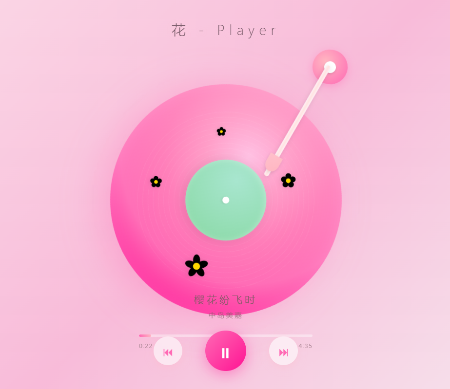
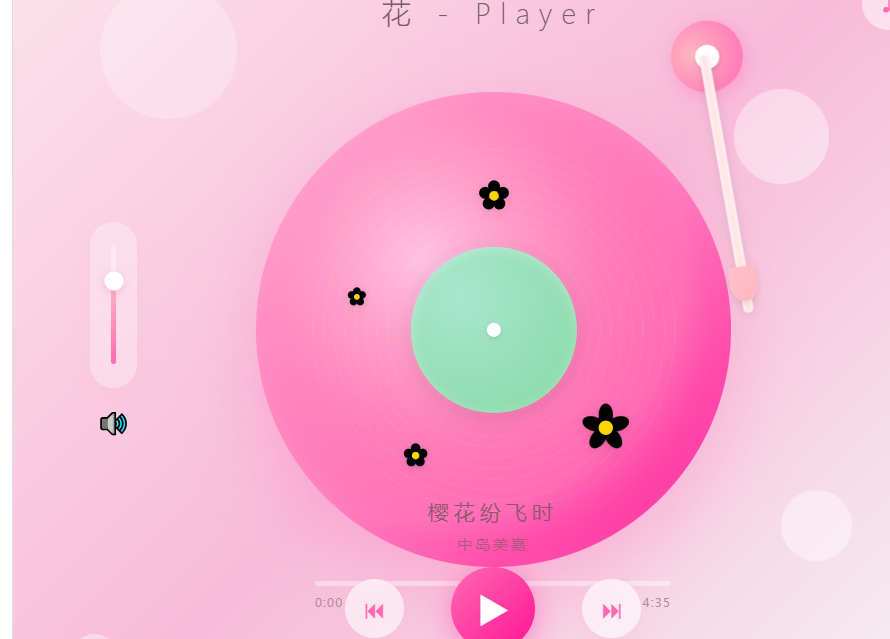
粉色渐变唱片:带纹理高光,播放时匀速旋转
唱臂动画:播放时从休息位平滑移动到唱片上方
四朵手绘花:白、红、橙、黄四色小花点缀盘面
绿色中心标签:模拟真实唱片标签
毛玻璃控件:按钮和滑块采用半透明磨砂质感
呼吸光晕:唱片外圈有柔和的脉动光效
🎮 操作指南
表格
操作 方式 播放 / 暂停 点击底部大按钮 或按 Space上一首 点击 ⏮或按←下一首 点击 ⏭或按→跳转进度 点击底部进度条 调节音量 拖拽左侧滑块 循环播放 点击左下角 ↻查看列表 点击右上角 ♪🛠 技术栈
HTML5 --- 语义化结构
CSS3 --- 渐变、动画、滤镜、毛玻璃效果
原生 JavaScript --- 无框架,ES6+
📁 文件结构
plain
flower-player/
├── index.html      # 完整播放器(单文件)
├── preview.png     # 预览截图
└── README.md       # 本文件
🎨 自定义
更换歌曲
在
<script>标签内修改songs数组:JavaScript
const songs = [
    { name: '你的歌名', artist: '歌手名', duration: 秒数 },
    // ...
];
更换配色
修改 CSS 变量中的渐变颜色,例如唱片背景:
css
.record {
    background: radial-gradient(circle at 35% 35%,
        #ffc1e3 0%,
        #ff9ec8 20%,
        ...
    );
}
添加真实音频
目前为演示版本,接入真实音频只需:
在 HTML 中添加
<audio id="audio" src="your-music.mp3"></audio>在
togglePlay()中调用audio.play()/audio.pause()监听
audio.ontimeupdate同步进度条📄 协议
MIT License --- 自由使用,欢迎二次创作。
html<!DOCTYPE html> <html lang="zh-CN"> <head> <meta charset="UTF-8"> <meta name="viewport" content="width=device-width, initial-scale=1.0"> <title>花 - Player</title> <style> * { margin: 0; padding: 0; box-sizing: border-box; } body { width: 100vw; height: 100vh; background: linear-gradient(135deg, #fce4ec 0%, #f8bbd9 50%, #f5f5f5 100%); display: flex; flex-direction: column; align-items: center; justify-content: center; font-family: 'Segoe UI', 'PingFang SC', 'Microsoft YaHei', sans-serif; overflow: hidden; position: relative; } /* 背景装饰粒子 */ .bg-particle { position: absolute; border-radius: 50%; background: rgba(255, 255, 255, 0.4); animation: float 6s ease-in-out infinite; } @keyframes float { 0%, 100% { transform: translateY(0) scale(1); opacity: 0.4; } 50% { transform: translateY(-20px) scale(1.2); opacity: 0.7; } } /* 标题 */ .title { position: absolute; top: 8%; font-size: 24px; color: #7a5c6b; letter-spacing: 8px; font-weight: 300; text-shadow: 0 2px 10px rgba(255, 182, 193, 0.3); z-index: 10; } /* 主容器 */ .player-container { position: relative; width: 500px; height: 500px; display: flex; align-items: center; justify-content: center; } /* 唱片外圈光晕 */ .record-glow { position: absolute; width: 420px; height: 420px; border-radius: 50%; background: radial-gradient(circle, rgba(255,182,193,0.3) 0%, transparent 70%); filter: blur(20px); animation: pulse 3s ease-in-out infinite; } @keyframes pulse { 0%, 100% { transform: scale(1); opacity: 0.6; } 50% { transform: scale(1.05); opacity: 0.9; } } /* 唱片主体 */ .record { width: 400px; height: 400px; border-radius: 50%; background: radial-gradient(circle at 35% 35%, #ffc1e3 0%, #ff9ec8 20%, #ff7eb9 40%, #ff69b4 60%, #ff1493 80%, #db7093 100%); position: relative; box-shadow: 0 20px 60px rgba(255, 105, 180, 0.3), inset 0 0 80px rgba(255, 255, 255, 0.2), inset 0 0 20px rgba(255, 255, 255, 0.1); animation: rotate 8s linear infinite; animation-play-state: paused; transition: all 0.5s ease; } .record.playing { animation-play-state: running; } @keyframes rotate { from { transform: rotate(0deg); } to { transform: rotate(360deg); } } /* 唱片纹理 */ .record::before { content: ''; position: absolute; top: 10%; left: 10%; right: 10%; bottom: 10%; border-radius: 50%; background: repeating-radial-gradient( circle at center, transparent 0px, transparent 8px, rgba(255, 255, 255, 0.05) 8px, rgba(255, 255, 255, 0.05) 9px ); } /* 中心标签 */ .label { position: absolute; top: 50%; left: 50%; transform: translate(-50%, -50%); width: 140px; height: 140px; border-radius: 50%; background: radial-gradient(circle at 30% 30%, #a8e6cf, #88d8a3); box-shadow: 0 4px 20px rgba(0, 0, 0, 0.1), inset 0 2px 10px rgba(255, 255, 255, 0.3); display: flex; align-items: center; justify-content: center; z-index: 5; } .label::after { content: ''; width: 12px; height: 12px; border-radius: 50%; background: #fff; box-shadow: 0 2px 4px rgba(0,0,0,0.1); } /* 花朵样式 */ .flower { position: absolute; z-index: 3; filter: drop-shadow(0 2px 4px rgba(0,0,0,0.1)); } /* 白色小花 - 顶部 */ .flower-1 { top: 18%; left: 50%; transform: translateX(-50%); } /* 红色花朵 - 右下 */ .flower-2 { bottom: 25%; right: 22%; transform: scale(1.2); } /* 橙色小花 - 左中 */ .flower-3 { top: 40%; left: 18%; transform: scale(0.8); } /* 黄色小花 - 左下 */ .flower-4 { bottom: 20%; left: 30%; transform: scale(0.9); } /* 花朵SVG绘制 */ .petal { fill: currentColor; } .flower-center { fill: #ffd700; } /* 唱臂 */ .tonearm { position: absolute; top: -10px; right: 40px; width: 200px; height: 280px; z-index: 20; transform-origin: 170px 30px; transform: rotate(-35deg); transition: transform 0.8s cubic-bezier(0.4, 0, 0.2, 1); pointer-events: none; } .tonearm.playing { transform: rotate(5deg); } .tonearm-pivot { position: absolute; top: 0; right: 0; width: 60px; height: 60px; border-radius: 50%; background: radial-gradient(circle at 35% 35%, #ffb6c1, #ff69b4); box-shadow: 0 4px 15px rgba(255, 105, 180, 0.4); display: flex; align-items: center; justify-content: center; } .tonearm-pivot::after { content: ''; width: 20px; height: 20px; border-radius: 50%; background: #fff; box-shadow: 0 2px 4px rgba(0,0,0,0.1); } .tonearm-rod { position: absolute; top: 28px; right: 28px; width: 8px; height: 220px; background: linear-gradient(90deg, #fff0f5, #ffe4e1, #fff0f5); border-radius: 4px; box-shadow: 0 2px 8px rgba(0,0,0,0.1); transform-origin: top center; transform: rotate(25deg); } .tonearm-head { position: absolute; bottom: 10px; left: 50%; transform: translateX(-50%); width: 24px; height: 30px; background: linear-gradient(135deg, #ffc0cb, #ffb6c1); border-radius: 0 0 50% 50%; box-shadow: 0 2px 6px rgba(0,0,0,0.1); } /* 左侧音量滑块 */ .volume-container { position: absolute; left: 8%; top: 50%; transform: translateY(-50%); display: flex; flex-direction: column; align-items: center; gap: 15px; z-index: 10; } .volume-slider { -webkit-appearance: none; appearance: none; width: 6px; height: 120px; background: rgba(255, 255, 255, 0.5); border-radius: 3px; outline: none; writing-mode: bt-lr; /* IE */ -webkit-appearance: slider-vertical; /* WebKit */ } /* 自定义垂直滑块样式 */ .volume-wrapper { position: relative; width: 40px; height: 140px; background: rgba(255, 255, 255, 0.3); border-radius: 20px; display: flex; align-items: center; justify-content: center; backdrop-filter: blur(10px); box-shadow: 0 4px 15px rgba(255, 182, 193, 0.2); } .volume-track { width: 4px; height: 100px; background: rgba(255, 255, 255, 0.4); border-radius: 2px; position: relative; cursor: pointer; } .volume-fill { position: absolute; bottom: 0; left: 0; width: 100%; height: 70%; background: linear-gradient(to top, #ff69b4, #ffb6c1); border-radius: 2px; transition: height 0.2s; } .volume-thumb { position: absolute; bottom: 70%; left: 50%; transform: translate(-50%, 50%); width: 16px; height: 16px; border-radius: 50%; background: #fff; box-shadow: 0 2px 8px rgba(255, 105, 180, 0.4); cursor: pointer; transition: transform 0.2s; } .volume-thumb:hover { transform: translate(-50%, 50%) scale(1.2); } .volume-icon { font-size: 20px; color: #ff69b4; cursor: pointer; transition: transform 0.2s; } .volume-icon:hover { transform: scale(1.1); } /* 底部控制栏 */ .controls { position: absolute; bottom: 10%; display: flex; align-items: center; gap: 40px; z-index: 10; } .control-btn { background: rgba(255, 255, 255, 0.6); border: none; border-radius: 50%; width: 50px; height: 50px; display: flex; align-items: center; justify-content: center; cursor: pointer; backdrop-filter: blur(10px); box-shadow: 0 4px 15px rgba(255, 182, 193, 0.3); transition: all 0.3s ease; color: #ff69b4; font-size: 20px; } .control-btn:hover { transform: scale(1.1); background: rgba(255, 255, 255, 0.9); box-shadow: 0 6px 20px rgba(255, 105, 180, 0.4); } .play-btn { width: 70px; height: 70px; background: linear-gradient(135deg, #ff69b4, #ff1493); color: white; font-size: 28px; box-shadow: 0 6px 25px rgba(255, 20, 147, 0.4); } .play-btn:hover { background: linear-gradient(135deg, #ff1493, #ff69b4); transform: scale(1.15); } /* 右上角音乐按钮 */ .music-btn { position: absolute; top: 6%; right: 6%; width: 45px; height: 45px; border-radius: 50%; background: rgba(255, 255, 255, 0.5); border: none; display: flex; align-items: center; justify-content: center; cursor: pointer; backdrop-filter: blur(10px); box-shadow: 0 4px 15px rgba(255, 182, 193, 0.3); color: #ff69b4; font-size: 20px; transition: all 0.3s; z-index: 10; } .music-btn:hover { transform: scale(1.1) rotate(15deg); background: rgba(255, 255, 255, 0.8); } /* 左下角循环按钮 */ .loop-btn { position: absolute; bottom: 6%; left: 6%; width: 40px; height: 40px; border-radius: 50%; background: rgba(255, 255, 255, 0.4); border: none; display: flex; align-items: center; justify-content: center; cursor: pointer; backdrop-filter: blur(10px); color: #ff69b4; font-size: 16px; transition: all 0.3s; z-index: 10; } .loop-btn:hover { transform: scale(1.1); background: rgba(255, 255, 255, 0.7); } .loop-btn.active { background: rgba(255, 105, 180, 0.2); color: #ff1493; } /* 歌曲信息 */ .song-info { position: absolute; bottom: 22%; text-align: center; color: #8b5a6b; z-index: 10; } .song-name { font-size: 18px; font-weight: 500; letter-spacing: 4px; margin-bottom: 6px; } .artist { font-size: 13px; opacity: 0.7; letter-spacing: 2px; } /* 进度条 */ .progress-container { position: absolute; bottom: 18%; width: 300px; height: 4px; background: rgba(255, 255, 255, 0.4); border-radius: 2px; cursor: pointer; z-index: 10; overflow: hidden; } .progress-fill { height: 100%; width: 0%; background: linear-gradient(90deg, #ff69b4, #ffb6c1); border-radius: 2px; transition: width 0.3s; } /* 时间显示 */ .time-display { position: absolute; bottom: 15%; width: 300px; display: flex; justify-content: space-between; font-size: 11px; color: #b08a99; z-index: 10; letter-spacing: 1px; } /* 响应式 */ @media (max-width: 600px) { .player-container { transform: scale(0.7); } .title { font-size: 18px; letter-spacing: 4px; } } </style> <base target="_blank"> </head> <body> <!-- 背景粒子 --> <div class="bg-particle" style="width: 100px; height: 100px; top: 10%; left: 10%; animation-delay: 0s;"></div> <div class="bg-particle" style="width: 60px; height: 60px; top: 70%; left: 80%; animation-delay: 2s;"></div> <div class="bg-particle" style="width: 80px; height: 80px; top: 20%; right: 15%; animation-delay: 4s;"></div> <!-- 标题 --> <div class="title">花 - Player</div> <!-- 右上角音乐按钮 --> <button class="music-btn" onclick="togglePlaylist()" title="播放列表">♪</button> <!-- 左下角循环按钮 --> <button class="loop-btn" id="loopBtn" onclick="toggleLoop()" title="循环播放">↻</button> <!-- 左侧音量 --> <div class="volume-container"> <div class="volume-wrapper" id="volumeWrapper"> <div class="volume-track" id="volumeTrack"> <div class="volume-fill" id="volumeFill"></div> <div class="volume-thumb" id="volumeThumb"></div> </div> </div> <div class="volume-icon" onclick="toggleMute()" id="muteIcon">🔊</div> </div> <!-- 主播放器 --> <div class="player-container"> <div class="record-glow"></div> <div class="record" id="record"> <!-- 中心标签 --> <div class="label"></div> <!-- 花朵装饰 --> <!-- 白色小花 --> <svg class="flower flower-1" width="30" height="30" viewBox="0 0 30 30"> <g transform="translate(15,15)"> <circle class="petal" cx="0" cy="-8" r="5" fill="#fff"/> <circle class="petal" cx="7.5" cy="-2.5" r="5" fill="#fff"/> <circle class="petal" cx="4.5" cy="6.5" r="5" fill="#fff"/> <circle class="petal" cx="-4.5" cy="6.5" r="5" fill="#fff"/> <circle class="petal" cx="-7.5" cy="-2.5" r="5" fill="#fff"/> <circle class="flower-center" cx="0" cy="0" r="4"/> </g> </svg> <!-- 红色花朵 --> <svg class="flower flower-2" width="35" height="35" viewBox="0 0 35 35"> <g transform="translate(17.5,17.5)"> <ellipse class="petal" cx="0" cy="-9" rx="5" ry="8" fill="#ff6b6b" transform="rotate(0)"/> <ellipse class="petal" cx="0" cy="-9" rx="5" ry="8" fill="#ff6b6b" transform="rotate(72)"/> <ellipse class="petal" cx="0" cy="-9" rx="5" ry="8" fill="#ff6b6b" transform="rotate(144)"/> <ellipse class="petal" cx="0" cy="-9" rx="5" ry="8" fill="#ff6b6b" transform="rotate(216)"/> <ellipse class="petal" cx="0" cy="-9" rx="5" ry="8" fill="#ff6b6b" transform="rotate(288)"/> <circle class="flower-center" cx="0" cy="0" r="5" fill="#ffd93d"/> </g> </svg> <!-- 橙色小花 --> <svg class="flower flower-3" width="25" height="25" viewBox="0 0 25 25"> <g transform="translate(12.5,12.5)"> <circle class="petal" cx="0" cy="-6" r="4" fill="#ffa502"/> <circle class="petal" cx="5.5" cy="-2" r="4" fill="#ffa502"/> <circle class="petal" cx="3.5" cy="5" r="4" fill="#ffa502"/> <circle class="petal" cx="-3.5" cy="5" r="4" fill="#ffa502"/> <circle class="petal" cx="-5.5" cy="-2" r="4" fill="#ffa502"/> <circle class="flower-center" cx="0" cy="0" r="3" fill="#ff6348"/> </g> </svg> <!-- 黄色小花 --> <svg class="flower flower-4" width="28" height="28" viewBox="0 0 28 28"> <g transform="translate(14,14)"> <circle class="petal" cx="0" cy="-7" r="4.5" fill="#ffeaa7"/> <circle class="petal" cx="6.5" cy="-2" r="4.5" fill="#ffeaa7"/> <circle class="petal" cx="4" cy="5.5" r="4.5" fill="#ffeaa7"/> <circle class="petal" cx="-4" cy="5.5" r="4.5" fill="#ffeaa7"/> <circle class="petal" cx="-6.5" cy="-2" r="4.5" fill="#ffeaa7"/> <circle class="flower-center" cx="0" cy="0" r="3.5" fill="#fdcb6e"/> </g> </svg> </div> <!-- 唱臂 --> <div class="tonearm" id="tonearm"> <div class="tonearm-pivot"></div> <div class="tonearm-rod"> <div class="tonearm-head"></div> </div> </div> </div> <!-- 歌曲信息 --> <div class="song-info"> <div class="song-name">樱花纷飞时</div> <div class="artist">中岛美嘉</div> </div> <!-- 进度条 --> <div class="progress-container" id="progressContainer"> <div class="progress-fill" id="progressFill"></div> </div> <div class="time-display"> <span id="currentTime">0:00</span> <span id="totalTime">4:35</span> </div> <!-- 控制按钮 --> <div class="controls"> <button class="control-btn" onclick="prevSong()" title="上一首">⏮</button> <button class="control-btn play-btn" id="playBtn" onclick="togglePlay()" title="播放/暂停">▶</button> <button class="control-btn" onclick="nextSong()" title="下一首">⏭</button> </div> <script> let isPlaying = false; let isLooping = false; let progress = 0; let progressInterval; let currentSongIndex = 0; let isMuted = false; let volume = 70; const songs = [ { name: '樱花纷飞时', artist: '中岛美嘉', duration: 275 }, { name: '花のように', artist: '松隆子', duration: 248 }, { name: '春よ、来い', artist: '松任谷由实', duration: 290 }, { name: '桜色舞うころ', artist: '中岛美嘉', duration: 265 } ]; const record = document.getElementById('record'); const tonearm = document.getElementById('tonearm'); const playBtn = document.getElementById('playBtn'); const progressFill = document.getElementById('progressFill'); const currentTimeEl = document.getElementById('currentTime'); const songNameEl = document.querySelector('.song-name'); const artistEl = document.querySelector('.artist'); const totalTimeEl = document.getElementById('totalTime'); const loopBtn = document.getElementById('loopBtn'); function togglePlay() { isPlaying = !isPlaying; if (isPlaying) { record.classList.add('playing'); tonearm.classList.add('playing'); playBtn.innerHTML = '⏸'; startProgress(); } else { record.classList.remove('playing'); tonearm.classList.remove('playing'); playBtn.innerHTML = '▶'; stopProgress(); } } function startProgress() { progressInterval = setInterval(() => { progress += 0.5; if (progress >= 100) { if (isLooping) { progress = 0; } else { nextSong(); return; } } updateProgress(); }, 100); } function stopProgress() { clearInterval(progressInterval); } function updateProgress() { progressFill.style.width = progress + '%'; const current = Math.floor((progress / 100) * songs[currentSongIndex].duration); currentTimeEl.textContent = formatTime(current); } function formatTime(seconds) { const m = Math.floor(seconds / 60); const s = seconds % 60; return m + ':' + (s < 10 ? '0' : '') + s; } function prevSong() { currentSongIndex = (currentSongIndex - 1 + songs.length) % songs.length; loadSong(); } function nextSong() { currentSongIndex = (currentSongIndex + 1) % songs.length; loadSong(); } function loadSong() { const song = songs[currentSongIndex]; songNameEl.textContent = song.name; artistEl.textContent = song.artist; totalTimeEl.textContent = formatTime(song.duration); progress = 0; updateProgress(); if (isPlaying) { stopProgress(); startProgress(); } } function toggleLoop() { isLooping = !isLooping; loopBtn.classList.toggle('active'); } function togglePlaylist() { alert('播放列表功能:\n' + songs.map((s, i) => (i === currentSongIndex ? '▶ ' : ' ') + s.name + ' - ' + s.artist ).join('\n')); } // 进度条点击 document.getElementById('progressContainer').addEventListener('click', (e) => { const rect = e.currentTarget.getBoundingClientRect(); const x = e.clientX - rect.left; progress = (x / rect.width) * 100; updateProgress(); }); // 音量控制 const volumeTrack = document.getElementById('volumeTrack'); const volumeFill = document.getElementById('volumeFill'); const volumeThumb = document.getElementById('volumeThumb'); let isDraggingVolume = false; function updateVolumeDisplay() { volumeFill.style.height = volume + '%'; volumeThumb.style.bottom = volume + '%'; } volumeTrack.addEventListener('click', (e) => { const rect = volumeTrack.getBoundingClientRect(); const y = rect.bottom - e.clientY; volume = Math.max(0, Math.min(100, (y / rect.height) * 100)); updateVolumeDisplay(); }); volumeThumb.addEventListener('mousedown', (e) => { isDraggingVolume = true; e.preventDefault(); }); document.addEventListener('mousemove', (e) => { if (!isDraggingVolume) return; const rect = volumeTrack.getBoundingClientRect(); const y = rect.bottom - e.clientY; volume = Math.max(0, Math.min(100, (y / rect.height) * 100)); updateVolumeDisplay(); }); document.addEventListener('mouseup', () => { isDraggingVolume = false; }); function toggleMute() { isMuted = !isMuted; document.getElementById('muteIcon').textContent = isMuted ? '🔇' : '🔊'; } // 键盘控制 document.addEventListener('keydown', (e) => { if (e.code === 'Space') { e.preventDefault(); togglePlay(); } else if (e.code === 'ArrowLeft') { prevSong(); } else if (e.code === 'ArrowRight') { nextSong(); } }); // 初始化 updateVolumeDisplay(); </script> </body> </html>