一、基础知识
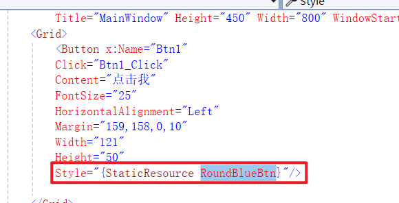
- WPF前端需要手写,但可以通过拖动改变Margin属性
- WPF前端绑定事件需要手写,但可以通过提示词生成,并且按F12跳转相应事件
- WPF支持热重载,改代码后保存可实时预览效果
二、初始化窗体
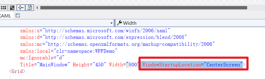
启动居中
cs
WindowStartupLocation="CenterScreen"效果
三、常见控件
1.标签Label
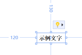
基础属性
XML
        <Label
            x:Name="Label1"
            Content="示例文字"
            FontSize="15"
            FontFamily="宋体"
            FontWeight="Bold"
            Margin="120,130,605,279"/>
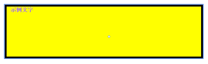
常用属性
XML
        <Label
            x:Name="Label1"
            Content="示例文字"
            FontSize="15"
            FontFamily="宋体"
            FontWeight="Bold"
            Foreground="#FF9955FF"
            Background="Yellow"
            Padding="10,0,130,10"
            Margin="120,130,150,160"
            HorizontalContentAlignment="Left"
            BorderBrush="Black"
            BorderThickness="5"/>
常用事件
MouseDoubleClick
2.按钮Button
基础属性
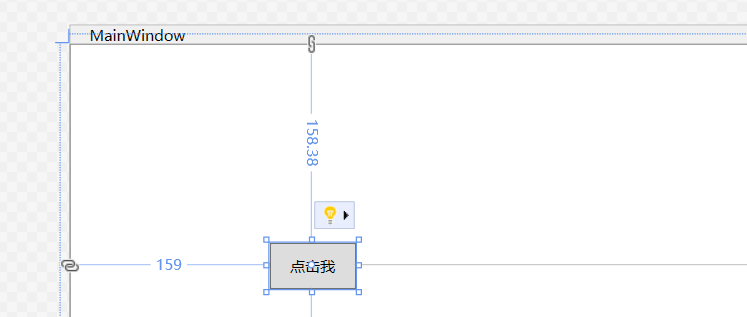
XML
        <Button x:Name="Btn1"
                Click="Btn1_Click"
                Content="点击我"
                HorizontalAlignment="Left"
                Margin="159,69,0,150"
                Width="69"
                Height="37"/>
常用属性
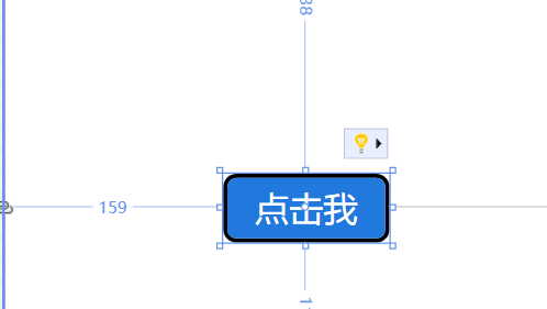
XML
<Button x:Name="Btn1"
Click="Btn1_Click"
Content="点击我"
FontSize="25"
HorizontalAlignment="Left"
Margin="159,158,0,10"
Width="121"
Height="50"
Foreground="White">
    <Button.Template>
        <ControlTemplate TargetType="Button">
            <!--在这里Border才有CornerRadius!-->
            <Border x:Name="bd"
            Background="#2178DD"
            BorderBrush="Black"
            BorderThickness="3"
            CornerRadius="8">
                <ContentPresenter HorizontalAlignment="Center" VerticalAlignment="Center"/>
            </Border>
            <ControlTemplate.Triggers>
                <!--鼠标悬浮变色-->
                <Trigger Property="IsMouseOver" Value="True">
                    <Setter TargetName="bd" Property="Background" Value="#144b94"/>
                </Trigger>
                <!--点击按下效果(可选)-->
                <Trigger Property="IsPressed" Value="True">
                    <Setter TargetName="bd" Property="Background" Value="#0c3060"/>
                </Trigger>
            </ControlTemplate.Triggers>
        </ControlTemplate>
    </Button.Template>
</Button>
常用事件
Click
3.TextBox/PasswordBox
基础属性
默认可以换行
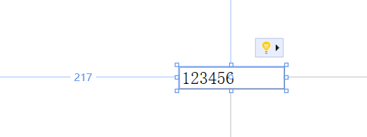
XML
        <TextBox
                 x:Name="TextBox1"
                 HorizontalAlignment="Left"
                 Margin="217,217,0,0"
                 TextWrapping="Wrap"
                 Text="123456"
                 VerticalAlignment="Top"
                 FontSize="20"
                 FontFamily="宋体"
                 Width="120"/>
常用属性
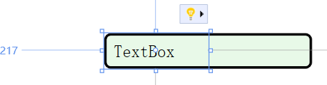
XML
<TextBox HorizontalAlignment="Left"
 Margin="217,217,0,0"
 TextWrapping="Wrap"
 Text="TextBox"
 VerticalAlignment="Top"
 FontSize="20"
 FontFamily="宋体"
 Width="120">
    <TextBox.Template>
        <ControlTemplate TargetType="TextBox">
            <Border x:Name="border"
            Background="#E8F9E8"
            BorderBrush="Black"
            BorderThickness="3"
            CornerRadius="6" Margin="0,0,-119,0">
                <!--圆角-->
                <ScrollViewer x:Name="PART_ContentHost"
                      Margin="6"/>
                <!--文字内边距,文字不贴边框-->
            </Border>
            <ControlTemplate.Triggers>
                <!--鼠标悬浮:背景稍微变深一点-->
                <Trigger Property="IsMouseOver" Value="True">
                    <Setter TargetName="border" Property="Background" Value="#D4F2D4"/>
                </Trigger>
                <!--获得输入焦点,边框变色提示正在编辑-->
                <Trigger Property="IsFocused" Value="True">
                    <Setter TargetName="border" Property="BorderBrush" Value="#006400"/>
                    <Setter TargetName="border" Property="Background" Value="#D9F7D9"/>
                </Trigger>
            </ControlTemplate.Triggers>
        </ControlTemplate>
    </TextBox.Template>
</TextBox>
常用事件
LostFocus(失去焦点)
4.单选CheckBox
基础属性
XML
    <CheckBox Content="CheckBox"
              IsChecked="True"
              HorizontalAlignment="Left"
              Margin="217,262,0,0"
              VerticalAlignment="Top"/>
常用属性
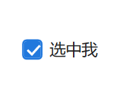
XML
<CheckBox Content="选中我"
      IsChecked="True"
      HorizontalAlignment="Left"
      Margin="217,262,0,0"
      VerticalAlignment="Top"
      FontSize="18"
      Foreground="#222222">
    <CheckBox.Template>
        <ControlTemplate TargetType="CheckBox">
            <Grid>
                <Grid.ColumnDefinitions>
                    <ColumnDefinition Width="Auto"/>
                    <ColumnDefinition Width="Auto"/>
                </Grid.ColumnDefinitions>

                <!-- 自定义方框 -->
                <Border x:Name="box"
                    Width="23"
                    Height="23"
                    BorderBrush="#2178DD"
                    BorderThickness="2"
                    CornerRadius="4"
                    Background="White">
                    <!-- 对勾图标,选中才显示 -->
                    <Path x:Name="checkIcon"
                      Data="M 4 10 L 9 15 L 18 5"
                      Stroke="White"
                      StrokeThickness="2.5"

                      Visibility="Collapsed"/>
                </Border>

                <!--文字内容,左边留空隙,不和方框贴死-->
                <ContentPresenter Grid.Column="1"
                              VerticalAlignment="Center"
                              Margin="8,0,0,0"/>
            </Grid>

            <ControlTemplate.Triggers>
                <!-- 选中状态:方框变蓝色背景,显示白色对勾 -->
                <Trigger Property="IsChecked" Value="True">
                    <Setter TargetName="box" Property="Background" Value="#2178DD"/>
                    <Setter TargetName="checkIcon" Property="Visibility" Value="Visible"/>
                </Trigger>
                <!--鼠标悬浮效果-->
                <Trigger Property="IsMouseOver" Value="True">
                    <Setter TargetName="box" Property="BorderBrush" Value="#144b94"/>
                </Trigger>
                <!--禁用状态可选,这里保留默认-->
            </ControlTemplate.Triggers>
        </ControlTemplate>
    </CheckBox.Template>
</CheckBox>
常用事件
无
5.单选RadioBtn
基础属性
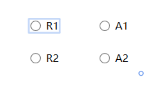
XML
        <RadioButton Content="R1" GroupName="R" HorizontalAlignment="Left" Margin="270,154,0,0" VerticalAlignment="Top"/>
        <RadioButton Content="R2" GroupName="R" HorizontalAlignment="Left" Margin="270,192,0,0" VerticalAlignment="Top"/>
        <RadioButton Content="A1" GroupName="A" HorizontalAlignment="Left" Margin="350,154,0,0" VerticalAlignment="Top"/>
        <RadioButton Content="A2" GroupName="A" HorizontalAlignment="Left" Margin="350,192,0,0" VerticalAlignment="Top"/>
常用属性
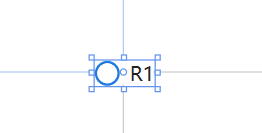
XML
<RadioButton Content="R1"
    GroupName="R"
    HorizontalAlignment="Left"
    Margin="270,154,0,0"
    VerticalAlignment="Top"
    FontSize="16"
    Foreground="#222">
    <RadioButton.Template>
        <ControlTemplate TargetType="RadioButton">
            <Grid>
                <Grid.ColumnDefinitions>
                    <ColumnDefinition Width="Auto"/>
                    <ColumnDefinition Width="Auto"/>
                </Grid.ColumnDefinitions>
                <!--外层圆环-->
                <Border x:Name="outerRing"
                Width="20"
                Height="20"
                CornerRadius="10"
                BorderBrush="#2178DD"
                BorderThickness="2"
                Background="White">
                    <!--内部选中圆点,默认隐藏-->
                    <Ellipse x:Name="innerDot"
                     Width="10"
                     Height="10"
                     Fill="#2178DD"
                     Visibility="Collapsed"/>
                </Border>
                <!--文字,和圆圈留出间隔-->
                <ContentPresenter Grid.Column="1"
                          VerticalAlignment="Center"
                          Margin="8,0,0,0"/>
            </Grid>

            <ControlTemplate.Triggers>
                <!--选中:显示内部蓝圆点-->
                <Trigger Property="IsChecked" Value="True">
                    <Setter TargetName="innerDot" Property="Visibility" Value="Visible"/>
                </Trigger>
                <!--鼠标悬浮,边框加深-->
                <Trigger Property="IsMouseOver" Value="True">
                    <Setter TargetName="outerRing" Property="BorderBrush" Value="#144b94"/>
                </Trigger>
            </ControlTemplate.Triggers>
        </ControlTemplate>
    </RadioButton.Template>
</RadioButton>
常用事件
无
6.下拉框
基础属性
XML
        <ComboBox x:Name="cboStudent"
                  HorizontalAlignment="Left"
                  Margin="179,121,0,0"
                  VerticalAlignment="Top"
                  Width="202"
                  Height="21"
                  DisplayMemberPath="Name"
            SelectedValuePath="Id"/>
cs
        private void Window_Loaded(object sender, RoutedEventArgs e)
        {
            // 1、获取学生集合(模拟你的 StudentDetail 数据源)
            List<StudentDetail> studentList = new List<StudentDetail>
            {
                new StudentDetail{Id=1, Name="张三"},
                new StudentDetail{Id=2, Name="李四"},
                new StudentDetail{Id=3, Name="王五"}
            };

            // 2、赋值给ComboBox数据源
            cboStudent.ItemsSource = studentList;

            // 3、默认选中第一个
            if (studentList.Count > 0)
            {
                cboStudent.SelectedIndex = 0;
            }

        }

        public class StudentDetail
        {
            public int Id { get; set; }
            public string Name { get; set; }
        }
常用属性
无
常用事件
SelectionChanged
四、封装字典资源
1.创建资源字典
例如我创建Btn.xaml
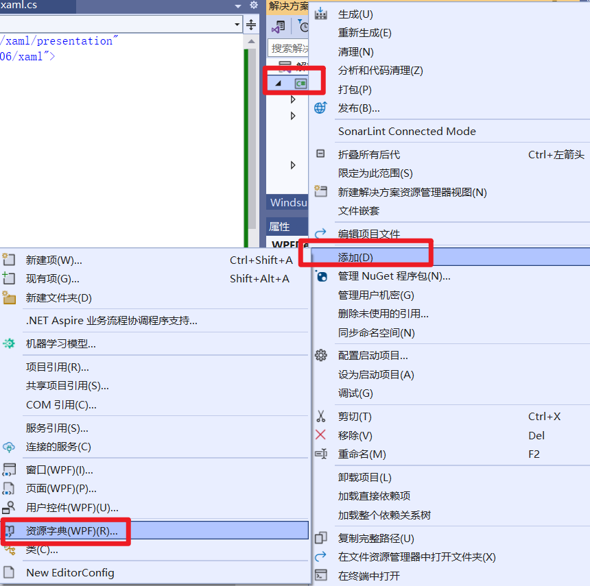
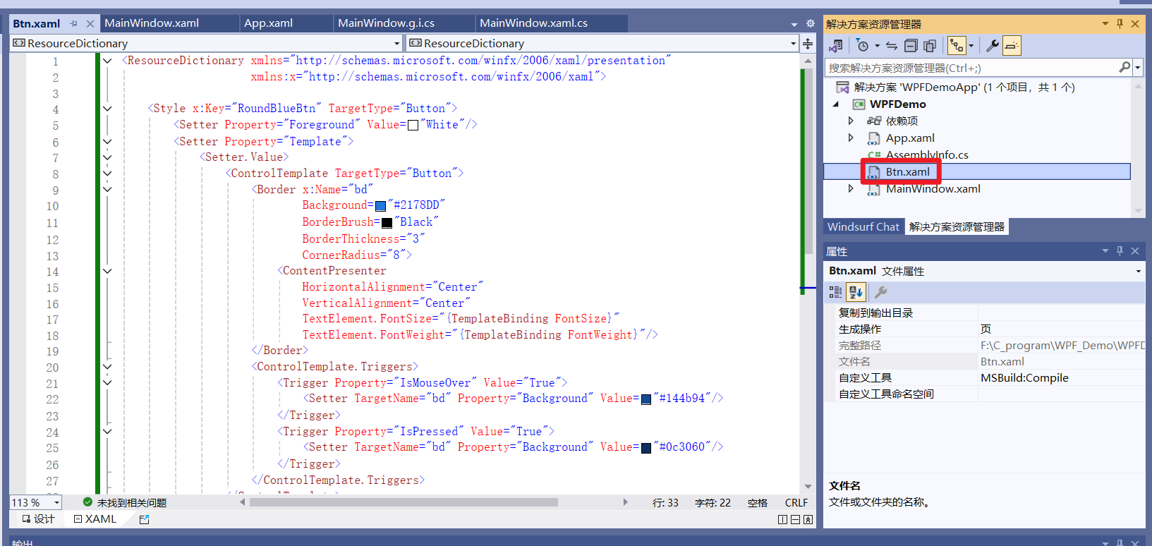
XML
<ResourceDictionary xmlns="http://schemas.microsoft.com/winfx/2006/xaml/presentation"
                    xmlns:x="http://schemas.microsoft.com/winfx/2006/xaml">

    <Style x:Key="RoundBlueBtn" TargetType="Button">
        <Setter Property="Foreground" Value="White"/>
        <Setter Property="Template">
            <Setter.Value>
                <ControlTemplate TargetType="Button">
                    <Border x:Name="bd"
                            Background="#2178DD"
                            BorderBrush="Black"
                            BorderThickness="3"
                            CornerRadius="8">
                        <ContentPresenter
                            HorizontalAlignment="Center"
                            VerticalAlignment="Center"
                            TextElement.FontSize="{TemplateBinding FontSize}"
                            TextElement.FontWeight="{TemplateBinding FontWeight}"/>
                    </Border>
                    <ControlTemplate.Triggers>
                        <Trigger Property="IsMouseOver" Value="True">
                            <Setter TargetName="bd" Property="Background" Value="#144b94"/>
                        </Trigger>
                        <Trigger Property="IsPressed" Value="True">
                            <Setter TargetName="bd" Property="Background" Value="#0c3060"/>
                        </Trigger>
                    </ControlTemplate.Triggers>
                </ControlTemplate>
            </Setter.Value>
        </Setter>
    </Style>

</ResourceDictionary>
2.添加全局引用
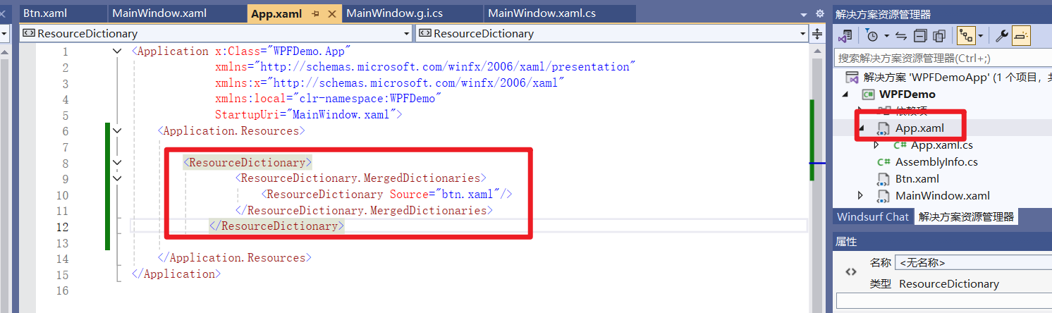
XML
        <ResourceDictionary>
                <ResourceDictionary.MergedDictionaries>
                    <ResourceDictionary Source="btn.xaml"/>
                </ResourceDictionary.MergedDictionaries>
            </ResourceDictionary>
3.使用资源字典
根据资源字典的Key实现复用