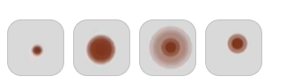
<template>
  <div class="pulse-container">
    <!-- 核心小圆点 -->
    <div class="pulse-core"></div>

    <!-- 多重光环:3 层 -->
    <div
        v-for="(ring, index) in rings"
        :key="index"
        class="pulse-ring"
        :style="{
        width: ring.size + 'px',
        height: ring.size + 'px',
        backgroundColor: ring.color,
        boxShadow: `0 0 ${ring.blur}px ${ring.color}`,
        animationDelay: index * 0.06 + 's' /* 50px下,延迟极短,避免挤在一起 */
      }"
    ></div>
  </div>
</template>

<script setup>
import { ref } from 'vue'

const rings = ref([
  { size: 20, color: 'rgba(168, 71, 47, 0.85)', blur: 6 },
  { size: 35, color: 'rgba(210, 135, 115, 0.6)', blur: 12 },
  { size: 50, color: 'rgba(235, 190, 175, 0.3)', blur: 20 }
])
</script>

<style scoped>
.pulse-container {
  position: relative;
  width: 50px;
  height: 50px;
  display: flex;
  justify-content: center;
  align-items: center;
}

.pulse-ring {
  position: absolute;
  border-radius: 50%;
  top: 50%;
  left: 50%;
  transform: translate(-50%, -50%) scale(0);
  opacity: 0;
  /*
    总时长 1 秒
    使用 cubic-bezier(0.5, 0, 0.5, 1) 实现匀加速-匀减速对称
    让变大和变小看起来用时完全相等,节奏一致
  */
  animation: pulse-wave-symmetry 1s cubic-bezier(0.5, 0, 0.5, 1) infinite;
}

.pulse-core {
  position: absolute;
  width: 8px;
  height: 8px;
  border-radius: 50%;
  background-color: #4a1a10;
  z-index: 10;
  box-shadow: 0 0 4px rgba(74, 26, 16, 0.8);
  animation: core-pulse-symmetry 1s cubic-bezier(0.5, 0, 0.5, 1) infinite;
}

/* --- 完美对称的动画关键帧 --- */
/* 0% -> 50% 变大 (耗时 0.5s) */
/* 50% -> 100% 变小 (耗时 0.5s) */

@keyframes pulse-wave-symmetry {
  0% {
    transform: translate(-50%, -50%) scale(0);
    opacity: 1;
  }
  50% {
    /* 在此处达到最大,正好过去 0.5 秒 */
    transform: translate(-50%, -50%) scale(1.2);
    opacity: 0.5;
  }
  100% {
    /* 再过去 0.5 秒,回到起点 */
    transform: translate(-50%, -50%) scale(0);
    opacity: 0;
  }
}

/* 核心点的呼吸也完美对称 */
@keyframes core-pulse-symmetry {
  0% {
    transform: scale(0.8);
    opacity: 0.8;
  }
  50% {
    /* 在 0.5 秒时变大到最大 */
    transform: scale(1.1);
    opacity: 1;
  }
  100% {
    /* 1 秒时缩回最小 */
    transform: scale(0.8);
    opacity: 0.8;
  }
}
</style>