前言
本篇聚焦 Matplotlib 核心 API plt.plot() 之應用:涵蓋 折線圖(Line Plot)的時間序列趨勢解析,以及散佈圖(Scatter Plot)**的資料分佈與樣式調校實戰。從 StackExchange 取得每種程式語言的貼文總數作為實作資料來源。
matplotlib.pyplot.plot() 語法與參數說明
plt.plot(x, y, fmt, data=None, **kwargs)
| 參數名稱 | 資料型態 / 預設值 | 說明 |
|---|---|---|
x, y |
List / Array / Series | 資料的坐標值。 • 支援傳入 List、NumPy Array 或 Pandas Series/Column。 • 若省略 x(僅傳入 y) :系統預設自動產生 [0, 1, ..., N-1] 作為 X 軸索引。 |
fmt |
str (Format String) |
快捷樣式字串。 用簡短代碼一次設定 顏色 (Color) 、標記 (Marker) 與 線條樣式 (Line Style)。 範例 :'r--o' 代表紅色 (r)、虛線 (--)、圓點標記 (o)。 |
color / c |
str |
線條顏色。 支援顏色名稱或 Hex 色碼(如 'blue', '#FF5733')。 |
linestyle / ls |
str |
線條樣式。 常見選項:'-' (實線)、'--' (虛線)、':' (點線)、'-.' (點虛線)。 |
marker |
str |
數據點標記形狀。 常見選項:'o' (圓點)、's' (方塊)、'^' (三角形)、'x' (叉號)。 |
linewidth / lw |
float / int |
線條寬度 (預設粗細為 1,數值越大線條越粗)。 |
label |
str |
圖例標籤名稱。 設定後需搭配 plt.legend() 呼叫,才會在圖表上顯示圖例。 |
測試資料來源
透過在 StackExchange 上執行 SQL 查詢來取得每種程式語言的貼文總數資料
點擊此連結從 [StackExchange](https://data.stackexchange.com/stackoverflow/query/675441/popular-programming-languages-per-over-time-eversql-com "StackExchange")(https://data.stackexchange.com/stackoverflow/query/675441/popular-programming-languages-per-over-time-eversql-com) 執行查詢以取得您自己的 .csv 文件
畫單條線
python
xpoints = np.array([1, 8])
ypoints = np.array([3, 10])

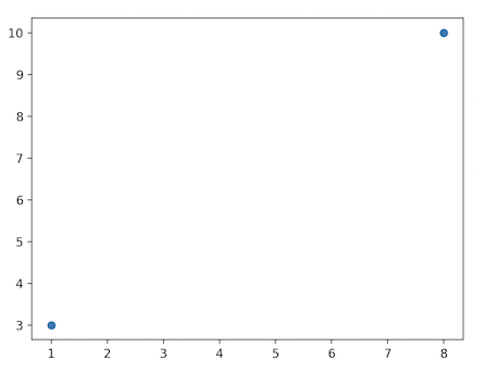
# 繪製兩個座標點,而不是一條線,可以使用 o 參數,表示一個實心圈的標記
plt.plot(xpoints, ypoints, 'o')
plt.show()執行結果
python
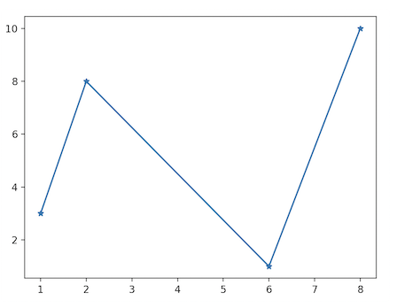
# 繪製一條不規則線
xpoints = np.array([1, 2, 6, 8])
ypoints = np.array([3, 8, 1, 10])
# marker 可以定義的符號
plt.plot(xpoints, ypoints,marker = '*')
plt.show()
執行結果
範例 programming_posts.csv
Date,Language,Posts
"2008-07-01 00:00:00","c#","3"
"2008-08-01 00:00:00","assembly","8"
"2008-08-01 00:00:00","c","81"
"2008-08-01 00:00:00","c++","164"
"2008-08-01 00:00:00","java","220"
...
...
"2026-07-01 00:00:00","go","4"
"2026-07-01 00:00:00","java","70"
"2026-07-01 00:00:00","javascript","73"
"2026-07-01 00:00:00","perl","6"
"2026-07-01 00:00:00","php","27"
"2026-07-01 00:00:00","python","142"
"2026-07-01 00:00:00","r","54"
"2026-07-01 00:00:00","ruby","2"
"2026-07-01 00:00:00","swift","17"
實作
讀取CSV檔案
python
import pandas as pd
import matplotlib.pyplot as plt

df = pd.read_csv(csv_path, names=['DATE', 'LANG', 'POSTS'], header=0)
print(f"df.shape: {df.shape}, df.head()顯示前 5 列資料 :\n{df.head()}")
% python3 programming_posts.py
df.shape: (2999, 3), df.head()顯示前 5 列資料 :
DATE LANG POSTS
0 2008-07-01 00:00:00 c# 3
1 2008-08-01 00:00:00 assembly 8
2 2008-08-01 00:00:00 c 81
3 2008-08-01 00:00:00 c# 503
4 2008-08-01 00:00:00 c++ 164
python
# 日期轉換
df["DATE"] = pd.to_datetime(
    df["DATE"]
)


# 把 Language 變成 Columns
pivot_df = df.pivot(
    index="DATE",
    columns="LANG",
    values="POSTS"
)

# fillna() 用常數 0 填入所有缺失值.傳回一個新的 DataFrame(如果 inplace=False),或 None(如果 inplace=True)
pivot_df.fillna(
    0,
    inplace=True
)


# 繪製折線圖
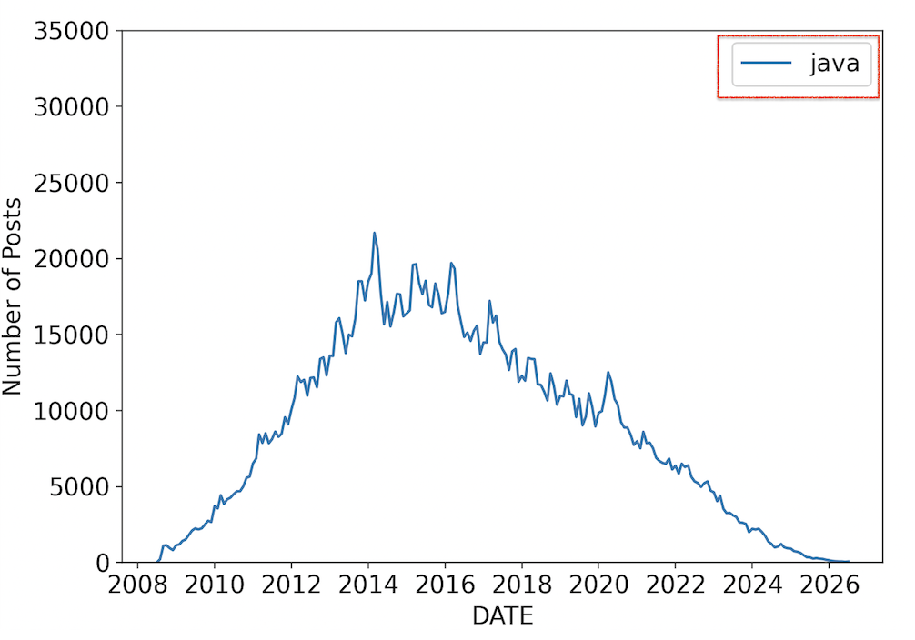
plt.plot(pivot_df.index, pivot_df.java, label="java")
plt.xticks(fontsize=14)
plt.yticks(fontsize=14)
plt.xlabel('DATE', fontsize=14)
plt.ylabel('Number of Posts', fontsize=14)
plt.ylim(0, 35000)
plt.legend(fontsize=14)

plt.show()執行結果
python
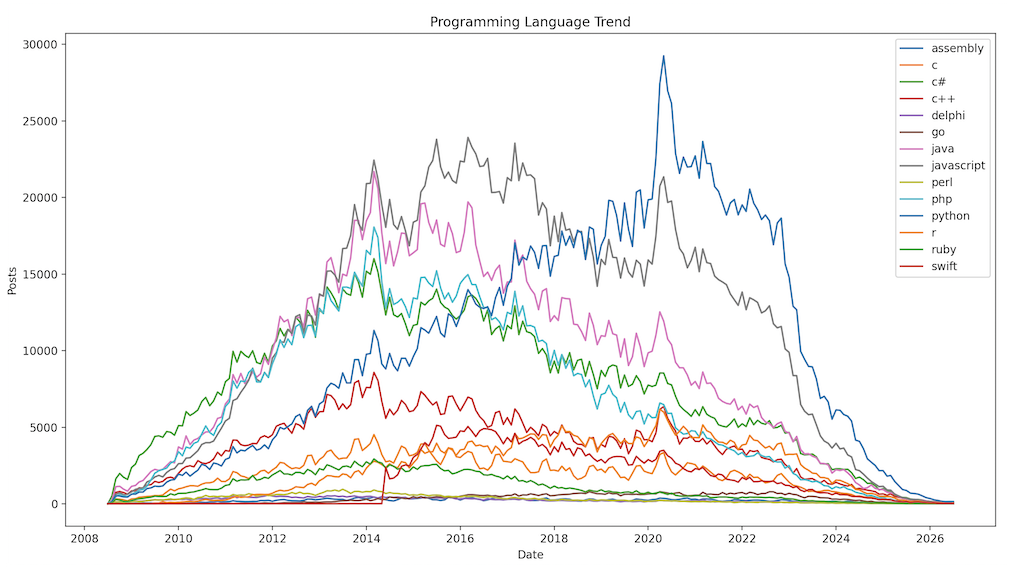
# 繪製各語言貼文折線圖
plt.figure(figsize=(15,8))

for column in pivot_df.columns:
    plt.plot(
        pivot_df.index,
        pivot_df[column],
        label=column
    )

plt.legend()
plt.title("Programming Language Trend")

plt.xlabel("Date")
plt.ylabel("Posts")

plt.show()執行結果
python
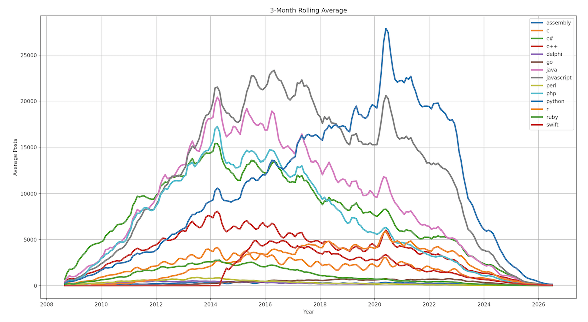
# Rolling Mean 三個月平均
rolling_df = pivot_df.rolling(
    window=3
).mean()
plt.figure(figsize=(18,9))
for column in rolling_df.columns:
    plt.plot(
        rolling_df.index,
        rolling_df[column],
        linewidth=3,
        label=column
    )

plt.legend()
plt.grid()
plt.xlabel("Year")
plt.ylabel("Average Posts")
plt.title("3-Month Rolling Average")
plt.tight_layout()
plt.show()執行結果