** **算法原理** **
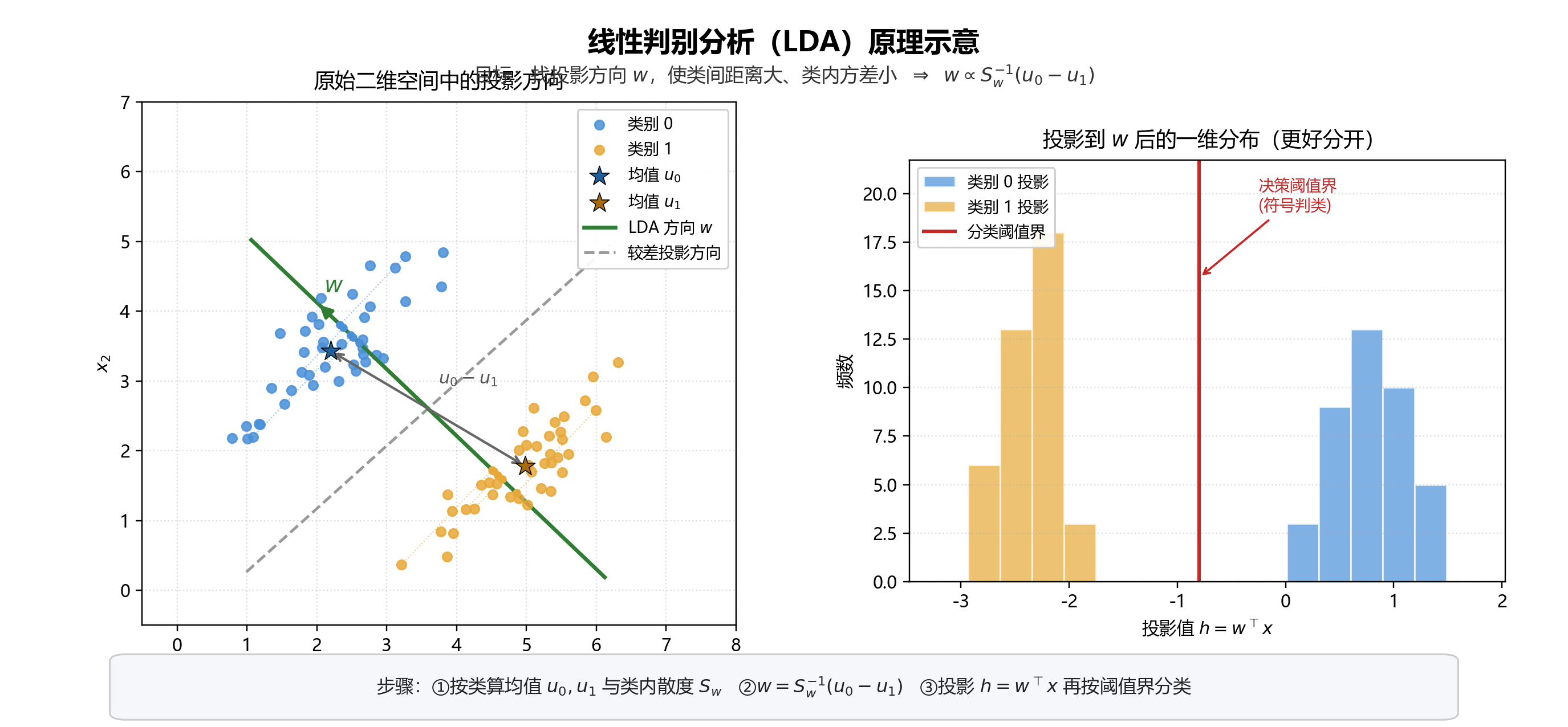
LDA 是 线性判别分析( Linear Discriminant Analysis ) ,一种有监督的降维/分类方法(不是主题模型那个 LDA)。
核心思想
把数据投影到一条(或几条)直线上,使得:
- 类内 尽量紧(同类点靠近)
- 类间 尽量远(不同类中心拉开)
二分类时,就是找投影方向 w  ,让投影后两类最好分开。
关键公式
两类样本均值  ,类内散度
,类内散度  (notebook 里用两类协方差之和近似):

目标可写成(Fisher 准则):最大化

最优解满足:

与 notebook 代码对应
| 步骤 | 代码 | 含义 |
|---|---|---|
| 按类分组 | X0=X[y==0], X1=X[y==1] | 两类样本 |
| 类内散度 | Sw = sigma0 + sigma1 | Sw  |
| 均值差 | mean_diff = u0 - u1 | u 0 - u1  |
求 w  |
self.w = Sw_.dot(mean_diff) | w= S w -1 u 0 - u1  (SVD 求逆) (SVD 求逆) |
| 投影 | h = sample.dot(self.w) | h= w Tx  |
| 分类 | y = 1 * (h < 0) | 按投影符号判类 |
直观理解
- 算两类中心差:指明"类间该往哪拉开"
- 用 S w -1
 校正类内形状(方差大的方向少用力)
 - 得到 w
 后投影,再阈值阈值分类
和 PCA 的区别
| PCA | LDA | |
|---|---|---|
| 是否用标签 | 否(无监督) | 是(有监督) |
| 目标 | 方差最大 | 类间大、类内小 |
| 典型用途 | 降维、可视化 | 分类、有监督降维 |
Notebook 在鸢尾花两类子集上自实现准确率约 0.85,sklearn 的 LDA 为 1.0(实现细节与阈值阈值方式不同)。
一句话: LDA 用标签找"最能分开两类"的投影方向 w= S w -1 u 0 - u 1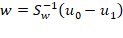 ,再投影做分类。
** **代码** **
import numpy as np

class LDA():
    def __init__(self):
        # 初始化权重矩阵
        self.w = None

    # 计算协方差矩阵
    def calc_cov(self, X, Y=None):
        m = X.shape[0]
        # 数据标准化
        X = (X - np.mean(X, axis=0))/np.std(X, axis=0)
        Y = X if Y == None else (Y - np.mean(Y, axis=0))/np.std(Y, axis=0)
        return 1 / m * np.matmul(X.T, Y)

    # 对数据进行投影
    def project(self, X, y):
        self.fit(X, y)
        X_projection = X.dot(self.w)
        return X_projection

    # LDA拟合过程
    def fit(self, X, y):
        # 按类分组
        X0 = X[y == 0]
        X1 = X[y == 1]

        # 分别计算两类数据自变量的协方差矩阵
        sigma0 = self.calc_cov(X0)
        sigma1 = self.calc_cov(X1)
        # 计算类内散度矩阵
        Sw = sigma0 + sigma1

        # 分别计算两类数据自变量的均值和差
        u0, u1 = np.mean(X0, axis=0), np.mean(X1, axis=0)
        mean_diff = np.atleast_1d(u0 - u1)

        # 对类内散度矩阵进行奇异值分解
        U, S, V = np.linalg.svd(Sw)
        # 计算类内散度矩阵的逆
        Sw_ = np.dot(np.dot(V.T, np.linalg.pinv(np.diag(S))), U.T)
        # 计算w
        self.w = Sw_.dot(mean_diff)


    # LDA分类预测
    def predict(self, X):
        y_pred = []
        for sample in X:
            h = sample.dot(self.w)
            y = 1 * (h < 0)
            y_pred.append(y)
        return y_pred
这段 fit 就是在求 最优投影方向 w  ,对应 Fisher 准则下的解析解
w= S w -1 u 0 - u1  。
。
逐步对应
1. 按类分组
X0 = Xy == 0
X1 = Xy == 1
把有标签样本拆成两类,后面分别算"类内"与"类间"信息
2. 类内散度 Sw 
sigma0 = self.calc_cov(X0)
sigma1 = self.calc_cov(X1)
Sw = sigma0 + sigma1
 :两类各自的协方差(类内分散程度)
 :总类内散度
 大,说明同类点散得开;LDA 希望投影后这类方差尽量小。
3. 类间方向(均值差)
u0, u1 = np.mean(X0, axis=0), np.mean(X1, axis=0)
mean_diff = u0 - u1
 指向两类中心连线,是"该把两类拉开"的方向。
(完整类间散度是  ,二分类时最优
  与
与  同向。)
同向。)
4. 求 
U, S, V = np.linalg.svd(Sw)
Sw_ = V.T @ pinv(diag(S)) @ U.T
用 SVD 求伪逆,比直接 inv 更稳(Sw  可能接近奇异)。
得到  (代码里的 Sw_)。
5. 得到投影向量(下一段)
self.w = Sw_.dot(mean_diff) # w = S_w^{-1}(u0-u1)
用  "校正"均值差:
类内方差大的方向会被压低,从而选出 类间大、类内小 的投影方向。
直觉
| 量 | 作用 |
|---|---|
 |
告诉你两类中心差在哪 |
 |
按类内形状加权,避免往"本来就很散"的方向猛投 |
 |
最终投影轴;预测时算 h= w ⊤x  ,再按符号/阈值判类 ,再按符号/阈值判类 |
一句话: 拟合 = 算两类协方差得  、算均值差,再解
  。
。
** **代码** **
from sklearn import datasets
import matplotlib.pyplot as plt
from sklearn.model_selection import train_test_split

data = datasets.load_iris()
X = data.data
y = data.target
** **代码** **
X = X[y != 2]
y = y[y != 2]
X_train, X_test, y_train, y_test = train_test_split(X, y, test_size=0.2, random_state=41)
print(X_train.shape, X_test.shape, y_train.shape, y_test.shape)
** **输出** **
(80, 4) (20, 4) (80,) (20,)
** **代码** **
lda = LDA()
lda.fit(X_train, y_train)
y_pred = lda.predict(X_test)

from sklearn.metrics import accuracy_score
accuracy = accuracy_score(y_test, y_pred)
print(accuracy)
** **输出** **
-0.38776207 1.27520386 -1.697222 -0.09784557
0.85
** **代码** **
y_test** **输出** **
array(0, 1, 0, 0, 1, 0, 0, 0, 0, 1, 1, 1, 1, 0, 1, 1, 1, 0, 0, 0)
代码
y_pred** **输出** **
0, 1, 0, 0, 1, 0, 1, 0, 0, 1, 1, 1, 1, 0, 1, 1, 1, 0, 1, 1
** **代码** **
import matplotlib.pyplot as plt
import matplotlib.cm as cmx
import matplotlib.colors as colors

class Plot():
    def __init__(self):
        self.cmap = plt.get_cmap('viridis')

    def _transform(self, X, dim):
        covariance = calculate_covariance_matrix(X)
        eigenvalues, eigenvectors = np.linalg.eig(covariance)
        # Sort eigenvalues and eigenvector by largest eigenvalues
        idx = eigenvalues.argsort()[::-1]
        eigenvalues = eigenvalues[idx][:dim]
        eigenvectors = np.atleast_1d(eigenvectors[:, idx])[:, :dim]
        # Project the data onto principal components
        X_transformed = X.dot(eigenvectors)

        return X_transformed


    def plot_regression(self, lines, title, axis_labels=None, mse=None, scatter=None, legend={"type": "lines", "loc": "lower right"}):

        if scatter:
            scatter_plots = scatter_labels = []
            for s in scatter:
                scatter_plots += [plt.scatter(s["x"], s["y"], color=s["color"], s=s["size"])]
                scatter_labels += [s["label"]]
            scatter_plots = tuple(scatter_plots)
            scatter_labels = tuple(scatter_labels)

        for l in lines:
            li = plt.plot(l["x"], l["y"], color=s["color"], linewidth=l["width"], label=l["label"])

        if mse:
            plt.suptitle(title)
            plt.title("MSE: %.2f" % mse, fontsize=10)
        else:
            plt.title(title)

        if axis_labels:
            plt.xlabel(axis_labels["x"])
            plt.ylabel(axis_labels["y"])

        if legend["type"] == "lines":
            plt.legend(loc="lower_left")
        elif legend["type"] == "scatter" and scatter:
            plt.legend(scatter_plots, scatter_labels, loc=legend["loc"])

        plt.show()


    # Plot the dataset X and the corresponding labels y in 2D using PCA.
    def plot_in_2d(self, X, y=None, title=None, accuracy=None, legend_labels=None):
        X_transformed = self._transform(X, dim=2)
        x1 = X_transformed[:, 0]
        x2 = X_transformed[:, 1]
        class_distr = []

        y = np.array(y).astype(int)

        colors = [self.cmap(i) for i in np.linspace(0, 1, len(np.unique(y)))]

        # Plot the different class distributions
        for i, l in enumerate(np.unique(y)):
            _x1 = x1[y == l]
            _x2 = x2[y == l]
            _y = y[y == l]
            class_distr.append(plt.scatter(_x1, _x2, color=colors[i]))

        # Plot legend
        if not legend_labels is None:
            plt.legend(class_distr, legend_labels, loc=1)

        # Plot title
        if title:
            if accuracy:
                perc = 100 * accuracy
                plt.suptitle(title)
                plt.title("Accuracy: %.1f%%" % perc, fontsize=10)
            else:
                plt.title(title)

        # Axis labels
        plt.xlabel('class 1')
        plt.ylabel('class 2')

        plt.show()
** **代码** **
Plot().plot_in_2d(X_test, y_pred, title="LDA", accuracy=accuracy)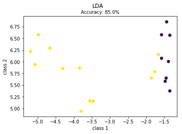
鸢尾花测试集是 4 维,没法直接画,所以函数里先用 PCA 压到 2 维,再按 LDA 的预测标签 y_pred 上色画散点。
| 图上元素 | 含义 |
|---|---|
| 点的位置 | 样本在 PCA 二维平面上的坐标(不是 LDA 投影轴) |
| 点的颜色 | LDA 预测 的类别(0 / 1) |
| 标题 Accuracy | 这次自实现 LDA 的准确率(约 85%) |
| 轴标签 class 1 / class 2 | 实际是 PCA 的第 1、2 主成分(命名容易误解) |
该怎么理解
- 用途:看预测结果在降维平面上是否大致成两团,方便直观检查分类效果。
- 不是 LDA 原理图:坐标轴是 PCA,不是 w ⊤x
 ;颜色是预测类,不是真实类。
 - 和真实标签比:若某点颜色与真标签不符,就是误分类;图本身没标出真标签。
对应代码注释也写了:Plot the dataset X and the corresponding labels y in 2D using PCA.
** **代码** **
from sklearn.discriminant_analysis import LinearDiscriminantAnalysis
clf = LinearDiscriminantAnalysis()
clf.fit(X_train, y_train)
y_pred = clf.predict(X_test)
accuracy = accuracy_score(y_test, y_pred)
print(accuracy)
** **输出** **
1.0