Jetpack Compose 实现 iOS 风格 3D WheelPicker
本文介绍一个可直接用于业务项目的 Jetpack Compose 3D 滚轮选择器。组件支持圆柱透视、 惯性减速、自动吸附、循环滚动、遮罩内文字变色、自定义选项,以及开箱即用的年月日选择器。
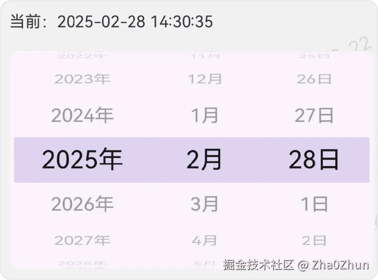
一、实现效果
组件最终具备以下行为:
- 选项沿圆柱弧面排列,而不是简单地缩放一个平面列表。
- 中心选项正对用户,上下选项逐渐旋转、缩小并淡出。
- 快速甩动后先高速运动,再按指数曲线逐渐减速,最后吸附到中心。
- 支持近似无限的循环滚动,不复制大量业务数据。
- 文字进入中央遮罩多少,就有多少切换为选中颜色。
- 选中区域内外使用互斥裁剪,不会出现两层文字或重影。
- 可见行数支持 3、5、7、9 等奇数,并自动调整圆柱行间角度。
- 提供年月日组合控件,自动处理闰年、大小月和非法日期收敛。
二、为什么使用 VerticalPager
普通 LazyColumn 很容易实现竖向滚动,但这个组件还有两个特殊要求:
- 每次滚动结束必须严格吸附到某一个中心项。
- 容器高度按圆柱投影收紧后,部分项目的平面位置已经位于视口外,但经过 3D 位移后仍需显示。
VerticalPager 原生提供页面吸附,并且支持 beyondViewportPageCount,可以继续组装视口外的 页面。因此它比手动组合 LazyColumn、SnapFlingBehavior 和额外测量逻辑更适合当前场景。
核心结构如下:
kotlin
VerticalPager(
    state = pagerState,
    pageSize = PageSize.Fixed(style.itemHeight),
    contentPadding = PaddingValues(vertical = verticalPadding),
    beyondViewportPageCount = style.visibleItemCount / 2,
    flingBehavior = flingBehavior,
) { virtualIndex ->
    // 将虚拟索引映射为业务数据,并执行圆柱投影。
}
三、受控状态设计
WheelPicker 是受控组件。调用方持有 selectedIndex,组件只负责显示和产生新选择:
kotlin
var selectedIndex by rememberSaveable { mutableIntStateOf(0) }

WheelPicker(
    items = listOf("北京", "上海", "深圳"),
    selectedIndex = selectedIndex,
    onSelected = { index, item ->
        selectedIndex = index
    },
)
受控设计有三个好处:
- 状态可以由 ViewModel、表单或业务状态统一管理。
- 外部修改索引后,滚轮会自动滚动到新选项。
- 页面重建、配置变更和状态恢复不依赖组件内部的隐藏状态。
滚动过程中不会经过一项就回调一次。组件等待 isScrollInProgress 变为 false,确认惯性和 吸附全部结束后,才提交最终选中值:
kotlin
snapshotFlow { pagerState.isScrollInProgress }
    .filter { scrolling -> !scrolling }
    .collect {
        val dataIndex = pagerState.currentPage.floorMod(items.size)
        if (dataIndex != latestSelectedIndex) {
            latestOnSelected(dataIndex, latestItems[dataIndex])
        }
    }
四、循环滚动
循环模式没有把原始列表复制成一个超大集合,而是创建一个大范围的虚拟页索引:
kotlin
private const val LoopItemCount = Int.MAX_VALUE
private const val LoopCenter = LoopItemCount / 2

val dataIndex = virtualIndex.floorMod(itemCount)
初始页位于虚拟列表中点附近,并保持下面的映射关系:
text
virtualIndex % itemCount == dataIndex这样向上和向下都拥有足够大的滚动空间。组件接近虚拟边界时,会在保持当前业务选项不变的 情况下静默回到中部,避免长期运行后触及 Int 边界。
外部改变 selectedIndex 时,组件会寻找距离当前页最近的同值虚拟页,只滚动最短距离。
五、3D 圆柱投影
仅设置 rotationX 会得到一列倾斜文字,但项目中心仍按照平面列表等距排列,看起来不是真正的 圆形滚轮。这里同时计算圆柱上的旋转角度和纵向投影。
假设:
- 单行高度为圆弧长度
s。 - 相邻两行夹角为
theta。 - 圆柱半径为
r。
根据圆弧公式:
text
s = r * theta
r = s / theta
项目中心在屏幕纵向的投影为:
text
y = r * sin(angle)核心代码:
kotlin
val angleRadians = rotation * PI.toFloat() / 180f
val radiansPerItem = effectiveRotationPerItem * PI.toFloat() / 180f
val itemHeightPx = style.itemHeight.toPx()
val cylinderRadius = itemHeightPx / radiansPerItem
val projectedY = cylinderRadius * sin(angleRadians)
val flatY = distance * itemHeightPx

translationY = projectedY - flatY
rotationX = -rotation
scaleX = scale
scaleY = scale
alpha = 1f - fraction.absoluteValue * (1f - style.minAlpha)
cameraDistance = 12f * density
translationY 会先抵消平面列表位置,再把项目移动到圆柱投影位置。旋转、缩放、透明度和透视 共同形成接近 iOS Picker 的轮面效果。
可见行数自适应
如果固定使用每行 32 度,当可见行数设置为 9 时,外侧多行可能同时被限制到最大旋转角, 产生重叠。实际行间角度需要根据可见行数收敛:
kotlin
private fun WheelPickerStyle.effectiveRotationPerItem(): Float {
    val stepsToEdge = visibleItemCount / 2f
    return minOf(rotationPerItem, maxRotation / stepsToEdge)
}
因此 visibleItemCount = 9 时,9 行都能拥有独立的弧面位置。
六、真实轮面高度
平面列表常用下面的高度:
text
itemHeight * visibleItemCount但项目经过圆柱投影后会向中心收拢,继续使用平面高度会在顶部和底部留下明显空白。
本组件逐行计算最终视觉边界:
kotlin
val projectedCenter = radius * sin(angleRadians)
val projectedHalfItem =
    itemHeight.value / 2f * cos(angleRadians) * scale

maxExtent = max(maxExtent, projectedCenter + projectedHalfItem)
最后使用 maxExtent * 2 作为组件高度。修改 itemHeight、visibleItemCount、曲率或缩放后, 高度都会自动重新计算。
七、惯性减速和中心吸附
Pager 默认一次甩动只允许跨越很少页面,作为滚轮时惯性不明显。组件扩大可跨越项目数,并使用 指数衰减模拟由快到慢的运动:
kotlin
val flingBehavior = PagerDefaults.flingBehavior(
    state = pagerState,
    pagerSnapDistance = PagerSnapDistance.atMost(style.maxFlingItems),
    decayAnimationSpec = exponentialDecay(
        frictionMultiplier = style.flingFriction,
    ),
    snapAnimationSpec = spring(
        stiffness = Spring.StiffnessMediumLow,
        dampingRatio = Spring.DampingRatioNoBouncy,
    ),
    snapPositionalThreshold = 0.35f,
)
滚动分为两个阶段:
- 手指释放后保留当前速度,并按指数曲线连续减速。
- 接近最终项目时使用无回弹弹簧吸附到中心。
可以通过样式调整惯性:
kotlin
WheelPickerStyle(
    maxFlingItems = 30,
    flingFriction = 1.35f,
)flingFriction越小,滚动越远、减速越慢。flingFriction越大,停止越快。- 推荐在
0.8f..3f范围内调整。
八、遮罩内文字连续变色
目标不是等项目吸附完成后整行切换颜色,而是文字进入中央区域多少,就改变多少。
每个文本项目绘制两个版本:
- 普通层使用
unselectedTextStyle。 - 选中层使用
selectedTextStyle。
两层必须使用互斥裁剪。如果先完整绘制普通层,再把选中层叠在上面,当字号或字重不同时会看到 底层文字,形成重影。当前实现是:
text
普通层:只绘制遮罩上方和下方
选中层:只绘制遮罩内部
项目经过旋转和缩放后,需要把中央遮罩边界反算到项目局部坐标:
kotlin
val verticalProjection =
    (cos(angleRadians).absoluteValue * scale).coerceAtLeast(0.001f)

val clipTop = localCenter +
    (-maskHalfHeight - projectedCenter) / verticalProjection
val clipBottom = localCenter +
    (maskHalfHeight - projectedCenter) / verticalProjection
普通层和选中层共用相同的 clipTop、clipBottom,确保不存在重叠或缝隙。
文本快捷 API 已默认启用该效果。自定义内容可以提供 selectedItemContent:
kotlin
WheelPicker(
    items = users,
    selectedIndex = selectedIndex,
    onSelected = { index, _ -> selectedIndex = index },
    selectedItemContent = { user ->
        Text(user.name, color = Color.Black)
    },
) { user, _ ->
    Text(user.name, color = Color.Gray)
}
九、基础使用方法
1. 文本列表
kotlin
val years = remember { (2020..2035).toList() }
var selectedIndex by rememberSaveable { mutableIntStateOf(6) }

WheelPicker(
    items = years,
    selectedIndex = selectedIndex,
    onSelected = { index, year ->
        selectedIndex = index
    },
    loop = true,
    label = { "${it}年" },
)
2. 自定义样式
kotlin
val pickerStyle = WheelPickerStyle(
    itemHeight = 40.dp,
    visibleItemCount = 9,
    selectedBackgroundColor = MaterialTheme.colorScheme.secondaryContainer,
    selectedTextStyle = TextStyle(
        color = Color.Black,
        fontSize = 22.sp,
        textAlign = TextAlign.Center,
    ),
    unselectedTextStyle = TextStyle(
        color = Color.LightGray,
        fontSize = 19.sp,
        textAlign = TextAlign.Center,
    ),
    rotationPerItem = 32f,
    maxRotation = 84f,
    minScale = 0.68f,
    minAlpha = 0.08f,
    maxFlingItems = 30,
    flingFriction = 1.35f,
)
visibleItemCount 必须是大于等于 3 的奇数,以保证存在唯一中心行。
3. 禁用和非循环模式
kotlin
WheelPicker(
    items = items,
    selectedIndex = selectedIndex,
    onSelected = { index, _ -> selectedIndex = index },
    enabled = formEnabled,
    loop = false,
)
非循环模式会自动为首尾项目提供中心留白,因此第一项和最后一项都能移动到中央选择区域。
十、年月日控件
业务通常不希望分别维护年、月、日三个索引,因此项目额外封装了 DateWheelPicker。调用方只需 维护一个 LocalDate:
kotlin
var date by remember { mutableStateOf(LocalDate.now()) }

DateWheelPicker(
    value = date,
    onValueChange = { date = it },
)
自定义年份范围和样式:
kotlin
DateWheelPicker(
    value = date,
    onValueChange = { date = it },
    yearRange = 2000..2050,
    loop = true,
    style = WheelPickerStyle(
        itemHeight = 40.dp,
        visibleItemCount = 7,
    ),
)
日期联动使用 YearMonth.lengthOfMonth() 计算合法天数:
kotlin
val validDay = day.coerceAtMost(
    YearMonth.of(year, month).lengthOfMonth(),
)
val newValue = LocalDate.of(year, month, validDay)
因此组件可以正确处理:
- 平年和闰年的二月。
- 30 天与 31 天月份。
- 1 月 31 日切换到 2 月时自动选择 2 月最后一天。
- 年份变化导致的 2 月 29 日合法性变化。
十一、年月日时分秒组合
日期使用 DateWheelPicker,时间部分使用三个基础 WheelPicker 即可:
kotlin
val hours = remember { (0..23).toList() }
val values = remember { (0..59).toList() }

Row(Modifier.fillMaxWidth()) {
    WheelPicker(
        items = hours,
        selectedIndex = hourIndex,
        onSelected = { index, _ -> hourIndex = index },
        modifier = Modifier.weight(1f),
        label = { "%02d时".format(it) },
    )
    WheelPicker(
        items = values,
        selectedIndex = minuteIndex,
        onSelected = { index, _ -> minuteIndex = index },
        modifier = Modifier.weight(1f),
        label = { "%02d分".format(it) },
    )
    WheelPicker(
        items = values,
        selectedIndex = secondIndex,
        onSelected = { index, _ -> secondIndex = index },
        modifier = Modifier.weight(1f),
        label = { "%02d秒".format(it) },
    )
}
测试页面包含可以直接运行的完整组合示例。
十二、生产环境注意事项
数据稳定性
滚动过程中应避免原地修改 items。推荐传入不可变列表,并保证 selectedIndex 始终位于 items.indices。
状态恢复
页面状态应使用 rememberSaveable 或 ViewModel 保存。LocalDate 可以转换成 epochDay:
kotlin
var epochDay by rememberSaveable {
    mutableLongStateOf(LocalDate.now().toEpochDay())
}
val date = LocalDate.ofEpochDay(epochDay)
性能
循环模式虽然使用 Int.MAX_VALUE 作为虚拟页数,但 Pager 只组装视口及少量额外页面,不会创建 数十亿个节点。遮罩变色会让文本内容绘制两次,但只有可见范围内的少量项目参与绘制。
对于复杂自定义选项,如果不需要遮罩内变色,不传 selectedItemContent 即可保持单层绘制。
无障碍
每个选项使用 Role.RadioButton,中心项设置 selected 语义。业务自定义内容时仍应提供有意义的 文字或 contentDescription。
参数建议
一组适合常规日期选择器的配置:
kotlin
WheelPickerStyle(
    itemHeight = 40.dp,
    visibleItemCount = 7,
    rotationPerItem = 32f,
    maxRotation = 84f,
    minScale = 0.68f,
    minAlpha = 0.08f,
    maxFlingItems = 30,
    flingFriction = 1.35f,
)
如果希望更紧凑,可将 visibleItemCount 调为 5;如果希望显示更多上下文,可设置为 9,组件会 自动调整实际行间角度并重新计算轮面高度。
十三、完整代码
WheelPicker.kt
kotlin
// 循环模式不复制真实数据,而是把有限数据映射到一个足够大的虚拟列表。
// 从 Int 范围中点开始,可以给向上、向下滚动都留出近似无限的空间。
private const val LoopItemCount = Int.MAX_VALUE
private const val LoopCenter = LoopItemCount / 2
/**
 * [WheelPicker] 的视觉配置。
 * @param itemHeight 每个选项的固定高度。固定行高是吸附和圆柱投影准确的前提。
 * @param visibleItemCount 可见行数,必须是大于等于 3 的奇数,以保证始终存在唯一中心行。
 * @param selectedBackgroundColor 中心选中区域的背景色。
 * @param selectedTextStyle 中心选项的文字样式,仅对文本快捷重载生效。
 * @param unselectedTextStyle 非中心选项的文字样式,仅对文本快捷重载生效。
 * @param selectionShape 中心选中区域的形状。
 * @param rotationPerItem 相邻两行期望使用的最大夹角。数值越大,滚轮曲率越明显;当
 * [visibleItemCount] 较大时,组件会自动缩小实际夹角,保证所有行都位于 [maxRotation]
 * 限定的正面圆弧内,而不是在边缘重叠。
 * @param maxRotation 边缘选项允许达到的最大旋转角,避免选项翻转到圆柱背面。
 * @param minScale 最边缘选项的最小缩放比例。
 * @param minAlpha 最边缘选项的最小透明度。
 * @param maxFlingItems 一次快速甩动最多允许跨越的选项数。值越大,惯性滚动距离越长。
 * @param flingFriction 惯性摩擦系数。值越小滑得越远、减速越慢;值越大停止越快。
 * 建议范围为 0.8 到 3,默认 1.35 能提供明显的由快到慢曲线。
 */
@Stable
data class WheelPickerStyle(
    val itemHeight: Dp = 40.dp,
    val visibleItemCount: Int = 7,
    val selectedBackgroundColor: Color = Color(0xFFF2F2F4),
    val selectedTextStyle: TextStyle = TextStyle(
        color = Color(0xFF222222),
        fontSize = 22.sp,
        textAlign = TextAlign.Center,
    ),
    val unselectedTextStyle: TextStyle = TextStyle(
        color = Color(0xFF8E8E93),
        fontSize = 19.sp,
        textAlign = TextAlign.Center,
    ),
    val selectionShape: RoundedCornerShape = RoundedCornerShape(1.dp),
    val rotationPerItem: Float = 32f, // 越大越圆
    val maxRotation: Float = 84f,
    val minScale: Float = 0.68f,
    val minAlpha: Float = 0.08f,
    val maxFlingItems: Int = 95,
    val flingFriction: Float = 1.35f,
) {
    init {
        require(visibleItemCount >= 3 && visibleItemCount % 2 == 1) {
            "visibleItemCount must be an odd number greater than or equal to 3"
        }
        require(itemHeight > 0.dp) { "itemHeight must be greater than 0.dp" }
        require(rotationPerItem in 1f..45f) { "rotationPerItem must be between 1 and 45" }
        require(maxRotation in 0f..90f) { "maxRotation must be between 0 and 90" }
        require(minScale in 0f..1f) { "minScale must be between 0 and 1" }
        require(minAlpha in 0f..1f) { "minAlpha must be between 0 and 1" }
        require(maxFlingItems >= 1) { "maxFlingItems must be greater than or equal to 1" }
        require(flingFriction > 0f) { "flingFriction must be greater than 0" }
    }
}
kotlin
/**
 * iOS 风格的 3D 圆柱滚轮选择器。
 *
 * 这是一个受控组件:[selectedIndex] 是唯一选中状态来源。用户滚动停止后,组件通过
 * [onSelected] 通知新选项,调用方应在回调中更新 [selectedIndex]。调用方主动修改
 * [selectedIndex] 时,滚轮也会自动滚动到对应位置。
 * 循环模式使用虚拟索引实现,不会创建或复制海量业务数据。接近虚拟列表边缘时,组件会在
 * 保持选中项不变的情况下自动回到中部,因此适合长时间连续滚动。
 * @param items 可选择的数据。空列表不会渲染任何内容。
 * @param selectedIndex 当前选中项在 [items] 中的真实索引,非空数据时必须合法。
 * @param onSelected 用户滚动或点击并吸附完成后的回调,依次返回真实索引和对应数据。
 * @param modifier 作用于整个滚轮容器的 [Modifier]。
 * @param loop 是否循环滚动。严格范围数据可设为 `false`。
 * @param enabled 是否允许手势滚动和点击,设为 `false` 时仍会显示当前选项。
 * @param style 滚轮尺寸和 3D 视觉配置。
 * @param itemContent 自定义选项内容,同时提供数据和当前是否位于中心的信息。
 * @param selectedItemContent 可选的遮罩内内容。提供后,每个项目会先绘制普通内容,再把
 * 此内容裁剪到中央选中区域;适合实现文字进入遮罩多少就变色多少的连续效果。
 */
@OptIn(ExperimentalFoundationApi::class)
@Composable
fun <T> WheelPicker(
    items: List<T>,
    selectedIndex: Int,
    onSelected: (index: Int, item: T) -> Unit,
    modifier: Modifier = Modifier,
    loop: Boolean = true,
    enabled: Boolean = true,
    style: WheelPickerStyle = WheelPickerStyle(),
    selectedItemContent: (@Composable BoxScope.(item: T) -> Unit)? = null,
    itemContent: @Composable BoxScope.(item: T, selected: Boolean) -> Unit,
) {
    if (items.isEmpty()) return
    require(selectedIndex in items.indices) { "selectedIndex must be within items.indices" }
    val itemCount = items.size
    // 循环模式从虚拟列表中点附近开始;非循环模式直接使用真实索引。
    val initialIndex = remember(itemCount, loop) {
        if (loop && itemCount > 1) alignedLoopIndex(selectedIndex, itemCount) else selectedIndex
    }
    val virtualItemCount = if (loop && itemCount > 1) LoopItemCount else itemCount
    val pagerState = rememberPagerState(initialPage = initialIndex) { virtualItemCount }
    val coroutineScope = rememberCoroutineScope()
    // 长生命周期的 LaunchedEffect 必须读取最新参数,避免重组后调用旧闭包或旧数据。
    val latestOnSelected by rememberUpdatedState(onSelected)
    val latestItems by rememberUpdatedState(items)
    val latestSelectedIndex by rememberUpdatedState(selectedIndex)
    val centerVirtualIndex = pagerState.currentPage
    val centerDataIndex = centerVirtualIndex.floorMod(itemCount)
    // 可见行较多时,固定角度会让外侧多行被 maxRotation 夹到同一位置。
    // 根据可见行数收敛实际夹角,确保每一行在圆柱上都有独立位置。
    val effectiveRotationPerItem = style.effectiveRotationPerItem()
    // 使用圆柱投影后的真实视觉边界,而不是平面列表的 itemHeight * visibleItemCount。
    // 投影高度通常明显小于 itemHeight * visibleItemCount 的平面列表高度。
    val pickerHeight = style.projectedWheelHeight()
    // 首末项需要能移动到新容器的正中心,因此 padding 必须跟随投影高度重新计算。
    val verticalPadding = (pickerHeight - style.itemHeight) / 2
    // Pager 默认一次最多只跨一页,体感更像普通选择而不是惯性滚轮。这里使用指数衰减
    // 保留手指释放瞬间的速度,再随时间连续降低速度,最后用低刚度弹簧吸附到中心。
    val flingBehavior = PagerDefaults.flingBehavior(
        state = pagerState,
        pagerSnapDistance = PagerSnapDistance.atMost(style.maxFlingItems),
        decayAnimationSpec = exponentialDecay(frictionMultiplier = style.flingFriction),
        snapAnimationSpec = spring(
            stiffness = Spring.StiffnessMediumLow,
            dampingRatio = Spring.DampingRatioNoBouncy,
        ),
        snapPositionalThreshold = 0.35f,
    )
    // 同步外部受控状态。只有外部索引和当前中心项不一致时才启动动画,避免回调循环。
    LaunchedEffect(selectedIndex, itemCount, loop) {
        if (pagerState.isScrollInProgress || centerDataIndex == selectedIndex) return@LaunchedEffect
        val target = if (loop && itemCount > 1) {
            nearestVirtualIndex(pagerState.currentPage, selectedIndex, itemCount)
        } else {
            selectedIndex
        }
        pagerState.animateScrollToPage(target)
    }
    // VerticalPager 会先完成页面吸附;isScrollInProgress 变为 false 后再提交选择结果,
    // 因此业务层不会在惯性滚动经过每一项时收到大量中间回调。
    LaunchedEffect(pagerState, itemCount, loop) {
        snapshotFlow { pagerState.isScrollInProgress }
            .filter { scrolling -> !scrolling }
            .collect {
                val virtualIndex = pagerState.currentPage.coerceIn(0, virtualItemCount - 1)
                val dataIndex = virtualIndex.floorMod(itemCount)
                if (dataIndex != latestSelectedIndex) {
                    latestOnSelected(dataIndex, latestItems[dataIndex])
                }
                // 正常使用几乎不可能到达 Int 边界,此处仍保留回中逻辑以保证长期运行稳定。
                // 使用 Long 计算缓冲区,避免超大数据集执行 itemCount * 100 时整数溢出。
                val edgeBuffer = (itemCount.toLong() * 100L).coerceAtMost(LoopCenter.toLong())
                if (loop && itemCount > 1 &&
                    (virtualIndex.toLong() < edgeBuffer || virtualIndex.toLong() > LoopItemCount - edgeBuffer)
                ) {
                    pagerState.scrollToPage(alignedLoopIndex(dataIndex, itemCount))
                }
            }
    }

    Box(
        modifier = modifier
            // 清除 fillMaxHeight/fillMaxSize 等 Modifier 带入的最小高度约束,保证组件
            // 始终包裹真实轮面高度;不会影响 fillMaxWidth 等水平方向约束。
            .wrapContentHeight()
            .height(pickerHeight)
            .clipToBounds(),
        contentAlignment = Alignment.Center,
    ) {
        // 选中背景固定在容器中心,列表内容从它上方滚过。
        Box(
            Modifier
                .fillMaxWidth()
                .height(style.itemHeight)
                .background(style.selectedBackgroundColor, style.selectionShape),
        )

        VerticalPager(
            modifier = Modifier.fillMaxSize(),
            state = pagerState,
            userScrollEnabled = enabled,
            contentPadding = PaddingValues(vertical = verticalPadding),
            pageSize = PageSize.Fixed(style.itemHeight),
            flingBehavior = flingBehavior,
            // 容器缩短后,最外侧项目的平面位置处于视口外。Pager 会继续组装并绘制
            // 指定数量的页面,使这些项目经过 translationY 后出现在完整圆弧上。
            beyondViewportPageCount = style.visibleItemCount / 2,
            key = if (loop && itemCount > 1) null else { index: Int -> index },
        ) { virtualIndex ->
            val dataIndex = virtualIndex.floorMod(itemCount)
            val distance = virtualIndex - pagerState.currentPage -
                pagerState.currentPageOffsetFraction
            val selected = virtualIndex == centerVirtualIndex
            // distance 以"行"为单位:中心为 0,上方为负,下方为正。
            // 将行距离换算成圆柱角度,再限制在正面可见范围内。
            val rotation = (distance * effectiveRotationPerItem)
                .coerceIn(-style.maxRotation, style.maxRotation)
            val fraction = rotation / style.maxRotation.coerceAtLeast(1f)
            val scale = 1f - fraction.absoluteValue * (1f - style.minScale)

            Box(
                modifier = Modifier
                    .fillMaxWidth()
                    .height(style.itemHeight)
                    .graphicsLayer {
                            // 把原本等距排列的平面列表投影到圆柱表面:
                            // 1. 每行高度视为圆弧长度 s;由 s = r * theta 得到半径 r。
                            // 2. 圆柱表面的纵向投影为 r * sin(theta)。
                            // 3. projectedY - flatY 抵消平面位置并移动到圆弧位置。
                            val angleRadians = rotation * PI.toFloat() / 180f
                            val radiansPerItem = effectiveRotationPerItem * PI.toFloat() / 180f
                            val itemHeightPx = style.itemHeight.toPx()
                            val cylinderRadius = itemHeightPx / radiansPerItem
                            val projectedY = cylinderRadius * sin(angleRadians)
                            val flatY = distance * itemHeightPx

                            translationY = projectedY - flatY
                            rotationX = -rotation
                            scaleX = scale
                            scaleY = scaleX
                            alpha = 1f - fraction.absoluteValue * (1f - style.minAlpha)
                            // Compose 的 cameraDistance 使用像素;乘 density 保持不同屏幕密度下
                            // 透视强度一致。数值过小会产生夸张透视甚至裁切。
                            cameraDistance = 12f * density
                    }
                    .semantics { this.selected = selected }
                    .clickable(
                        enabled = enabled,
                        role = Role.RadioButton,
                    ) {
                        if (virtualIndex != centerVirtualIndex) {
                            coroutineScope.launch {
                                pagerState.animateScrollToPage(virtualIndex)
                            }
                        }
                    },
                contentAlignment = Alignment.Center,
            ) {
                // 两层必须使用互斥裁剪:普通层只画遮罩外,选中层只画遮罩内。
                // 如果普通层完整绘制后再叠加选中层,两种样式的字号或字重不同时会露出底层,
                // 视觉上就会出现重影或"两层文字"。
                Box(
                    modifier = Modifier
                        .fillMaxSize()
                        .then(
                            if (selectedItemContent != null) {
                                Modifier.drawWithContent {
                                    val (clipTop, clipBottom) = selectionClipBounds(
                                        rotation = rotation,
                                        effectiveRotationPerItem = effectiveRotationPerItem,
                                        scale = scale,
                                        itemHeightPx = size.height,
                                    )

                                    // 分别绘制遮罩上方和下方,中央交集区域完全留给选中层。
                                    clipRect(bottom = clipTop) {
                                        this@drawWithContent.drawContent()
                                    }
                                    clipRect(top = clipBottom) {
                                        this@drawWithContent.drawContent()
                                    }
                                }
                            } else {
                                Modifier
                            },
                        ),
                    contentAlignment = Alignment.Center,
                ) {
                    // 未提供 selectedItemContent 时保持原 API 行为,中心项收到 selected=true。
                    itemContent(items[dataIndex], selected && selectedItemContent == null)
                }
                selectedItemContent?.let { selectedContent ->
                    Box(
                        modifier = Modifier
                            .fillMaxSize()
                            .drawWithContent {
                                val (clipTop, clipBottom) = selectionClipBounds(
                                    rotation = rotation,
                                    effectiveRotationPerItem = effectiveRotationPerItem,
                                    scale = scale,
                                    itemHeightPx = size.height,
                                )

                                clipRect(
                                    top = clipTop,
                                    bottom = clipBottom,
                                ) {
                                    this@drawWithContent.drawContent()
                                }
                            },
                        contentAlignment = Alignment.Center,
                    ) {
                        selectedContent(items[dataIndex])
                    }
                }
            }
        }
    }
}
kotlin
/**
 * 纯文本场景的快捷重载。
 *
 * @param label 把业务数据转换成显示文字,例如 `{ "${it}年" }`。
 * 其余参数含义与自定义内容版本的 [WheelPicker] 一致。
 */
@Composable
fun <T> WheelPicker(
    items: List<T>,
    selectedIndex: Int,
    onSelected: (index: Int, item: T) -> Unit,
    modifier: Modifier = Modifier,
    loop: Boolean = true,
    enabled: Boolean = true,
    style: WheelPickerStyle = WheelPickerStyle(),
    label: (T) -> String = { it.toString() },
) {
    WheelPicker(
        items = items,
        selectedIndex = selectedIndex,
        onSelected = onSelected,
        modifier = modifier,
        loop = loop,
        enabled = enabled,
        style = style,
        selectedItemContent = { item ->
            Text(
                text = label(item),
                modifier = Modifier
                    .fillMaxWidth()
                    .padding(horizontal = 8.dp),
                style = style.selectedTextStyle,
                maxLines = 1,
            )
        },
    ) { item, selected ->
        Text(
            text = label(item),
            modifier = Modifier
                .fillMaxWidth()
                .padding(horizontal = 8.dp),
            style = if (selected) style.selectedTextStyle else style.unselectedTextStyle,
            maxLines = 1,
        )
    }
}
kotlin
private fun alignedLoopIndex(dataIndex: Int, itemCount: Int): Int {
    // 先找到不破坏数据取模关系的中点,再加真实索引。
    // 这样 virtualIndex % itemCount 永远等于 dataIndex。
    val base = LoopCenter - LoopCenter.floorMod(itemCount)
    return base + dataIndex
}
kotlin
/**
 * 计算圆柱投影后所有可见项目的真实纵向包围高度。
 *
 * 每个项目的最终边界由两部分组成:项目中心在圆柱上的投影位置,以及该项目绕 X 轴
 * 旋转、缩放后剩余的半高。逐行计算最大边界,比直接使用圆柱直径更适用于 3/5/7 等
 * 不同可见行数,也不会在滚轮上下留下平面布局产生的空白。
 */
private fun WheelPickerStyle.projectedWheelHeight(): Dp {
    val effectiveRotationPerItem = effectiveRotationPerItem()
    val radiansPerItem = effectiveRotationPerItem * PI.toFloat() / 180f
    val radius = itemHeight.value / radiansPerItem
    var maxExtent = itemHeight.value / 2f

    for (distance in 1..visibleItemCount / 2) {
        val rotation = (distance * effectiveRotationPerItem).coerceAtMost(maxRotation)
        val angleRadians = rotation * PI.toFloat() / 180f
        val fraction = rotation / maxRotation.coerceAtLeast(1f)
        val scale = 1f - fraction * (1f - minScale)
        val projectedCenter = radius * sin(angleRadians)
        val projectedHalfItem = itemHeight.value / 2f * cos(angleRadians) * scale
        maxExtent = max(maxExtent, projectedCenter + projectedHalfItem)
    }
    return (maxExtent * 2f).dp
}
kotlin
/**
 * 把滚轮中央遮罩的纵向边界反算到当前项目的局部坐标。
 *
 * 返回值已经限制在 `[0, itemHeightPx]`,可以同时用于普通层的排除裁剪和选中层的包含
 * 裁剪,确保二者边界完全一致且不存在重复绘制区域。
 */
private fun selectionClipBounds(
    rotation: Float,
    effectiveRotationPerItem: Float,
    scale: Float,
    itemHeightPx: Float,
): Pair<Float, Float> {
    val angleRadians = rotation * PI.toFloat() / 180f
    val radiansPerItem = effectiveRotationPerItem * PI.toFloat() / 180f
    val cylinderRadius = itemHeightPx / radiansPerItem
    val projectedCenter = cylinderRadius * sin(angleRadians)

    // 中央遮罩在滚轮坐标中为 [-itemHeight/2, itemHeight/2]。项目经过 rotationX 和
    // scaleY 后,局部纵坐标到屏幕纵坐标的比例约为 cos(angle) * scale。
    val verticalProjection =
        (cos(angleRadians).absoluteValue * scale).coerceAtLeast(0.001f)
    val maskHalfHeight = itemHeightPx / 2f
    val localCenter = itemHeightPx / 2f
    val clipTop = localCenter + (-maskHalfHeight - projectedCenter) / verticalProjection
    val clipBottom = localCenter + (maskHalfHeight - projectedCenter) / verticalProjection

    return clipTop.coerceIn(0f, itemHeightPx) to clipBottom.coerceIn(0f, itemHeightPx)
}
kotlin
/**
 * 返回当前可见行数真正使用的行间角度。
 *
 * 最外侧行距离中心共有 `visibleItemCount / 2` 步,因此每步最多只能占用
 * `maxRotation / steps`。取它与用户期望角度的较小值,可以同时满足曲率配置和完整显示。
 */
private fun WheelPickerStyle.effectiveRotationPerItem(): Float {
    val stepsToEdge = visibleItemCount / 2f
    return minOf(rotationPerItem, maxRotation / stepsToEdge)
}
kotlin
private fun nearestVirtualIndex(center: Int, dataIndex: Int, itemCount: Int): Int {
    // 同一个真实选项会周期性出现在虚拟列表中。这里选择离当前项最近的那一次出现,
    // 让外部修改 selectedIndex 时只滚动最短距离,而不是跨越大量虚拟项。
    val currentDataIndex = center.floorMod(itemCount)
    var delta = dataIndex - currentDataIndex
    if (delta > itemCount / 2) delta -= itemCount
    if (delta < -itemCount / 2) delta += itemCount
    return (center + delta).coerceIn(0, LoopItemCount - 1)
}
DateWheelPicker.kt
kotlin
/**
 * var date by remember {
 *     mutableStateOf(LocalDate.now())
 * }
 * DateWheelPicker(
 *     value = date,
 *     onValueChange = { date = it },
 * )
 * 默认的年月日滚轮选择器。
 *
 * 调用方只需维护一个 [LocalDate],无需分别维护年月日索引。组件会根据当前年份和月份
 * 自动生成合法天数,并处理闰年以及长短月份切换。例如当前日期为 1 月 31 日,切换到
 * 2 月时会自动得到 2 月的最后一天。
 *
 * 这是一个受控组件:[value] 是唯一状态来源。用户完成任意一列的选择后,组件通过
 * [onValueChange] 返回完整且合法的新日期,调用方应使用该日期更新 [value]。
 *
 * @param value 当前选中的日期,其年份必须位于 [yearRange]。
 * @param onValueChange 日期变化回调,仅返回合法的 [LocalDate]。
 * @param modifier 整个年月日三列容器的 Modifier。
 * @param yearRange 可选择的年份范围。
 * @param loop 是否允许每一列循环滚动。
 * @param enabled 是否允许手势和点击操作。
 * @param style 三列共用的滚轮视觉样式。
 * @param yearWeight 年列宽度权重。年份文字通常较长,默认比月、日列稍宽。
 * @param yearLabel 年份显示格式。
 * @param monthLabel 月份显示格式。
 * @param dayLabel 日期显示格式。
 */
@Composable
fun DateWheelPicker(
    value: LocalDate,
    onValueChange: (LocalDate) -> Unit,
    modifier: Modifier = Modifier,
    yearRange: IntRange = 1900..2100,
    loop: Boolean = true,
    enabled: Boolean = true,
    style: WheelPickerStyle = WheelPickerStyle(),
    yearWeight: Float = 1.25f,
    yearLabel: (Int) -> String = { "${it}年" },
    monthLabel: (Int) -> String = { "${it}月" },
    dayLabel: (Int) -> String = { "${it}日" },
) {
    require(!yearRange.isEmpty()) { "yearRange must not be empty" }
    require(value.year in yearRange) { "value.year must be within yearRange" }
    require(yearWeight > 0f) { "yearWeight must be greater than 0" }

    val years = remember(yearRange.first, yearRange.last) { yearRange.toList() }
    val months = remember { (1..12).toList() }
    val days = remember(value.year, value.monthValue) {
        (1..YearMonth.of(value.year, value.monthValue).lengthOfMonth()).toList()
    }

    /** 创建新日期,同时把原日期收敛到目标月份允许的最后一天。 */
    fun updateDate(
        year: Int = value.year,
        month: Int = value.monthValue,
        day: Int = value.dayOfMonth,
    ) {
        val validDay = day.coerceAtMost(YearMonth.of(year, month).lengthOfMonth())
        val newValue = LocalDate.of(year, month, validDay)
        if (newValue != value) onValueChange(newValue)
    }

    Row(modifier = modifier.fillMaxWidth()) {
        WheelPicker(
            items = years,
            selectedIndex = value.year - yearRange.first,
            onSelected = { _, year -> updateDate(year = year) },
            modifier = Modifier.weight(yearWeight),
            loop = loop,
            enabled = enabled,
            style = style,
            label = yearLabel,
        )
        WheelPicker(
            items = months,
            selectedIndex = value.monthValue - 1,
            onSelected = { _, month -> updateDate(month = month) },
            modifier = Modifier.weight(1f),
            loop = loop,
            enabled = enabled,
            style = style,
            label = monthLabel,
        )
        WheelPicker(
            items = days,
            selectedIndex = value.dayOfMonth - 1,
            onSelected = { _, day -> updateDate(day = day) },
            modifier = Modifier.weight(1f),
            loop = loop,
            enabled = enabled,
            style = style,
            label = dayLabel,
        )
    }
}
十四、总结
这个 WheelPicker 的核心不是给列表项简单添加 rotationX,而是把滚动、圆柱投影、真实高度、 惯性吸附、循环索引和遮罩裁剪作为一套相互配合的系统:
VerticalPager提供稳定的页面吸附和视口外页面组装。- 虚拟索引实现低成本循环滚动。
- 正弦投影让项目中心真正分布在圆柱弧面上。
- 投影包围盒消除顶部和底部空白。
- 指数衰减与弹簧完成自然的由快到慢滚动。
- 互斥裁剪实现遮罩内连续变色且没有文字重影。
- 受控 API 和
DateWheelPicker让组件能够直接进入实际业务表单。
在此基础上,还可以继续封装时间、日期时间、地区级联等组合选择器,而不需要修改底层滚轮逻辑。