
图表是数据可视化的核心工具,能够将抽象的数字转化为直观的图形表达。在 Word 文档中嵌入图表,可以使报告、方案和分析文档更具说服力。传统做法是在 Word 中手动插入图表并逐个编辑数据,效率低下且难以保持一致性。通过 Python 编程方式创建图表,可以实现数据到文档的自动化流水线,批量生成带有图表的标准化报告。本文将介绍如何使用 Python 在 Word 文档中创建多种类型的图表,并设置图表标题、数据系列和坐标轴格式。
为什么以编程方式创建图表
与手动操作相比,编程方式具有以下优势:
- 批量生成:根据数据源自动生成多份带有图表的报告文档
- 数据同步:图表数据直接来自程序变量或数据库查询,确保数据实时准确
- 样式统一:通过代码统一定义图表尺寸、标题格式和坐标轴样式,避免人工操作的不一致性
- 流程集成:将图表创建嵌入到文档自动化流水线中,实现数据采集、分析和报告生成的一体化
环境搭建
本文使用 Spire.Doc for Python,它提供了在 Word 文档中插入和自定义图表的 API。
bash
pip install Spire.Doc安装完成后,即可在 Python 脚本中导入相关模块开始工作。
创建柱状图
柱状图是最常用的图表类型之一,适合展示各分类项的数值对比。以下代码演示了如何创建一个带有数据系列的柱状图:
python
from spire.doc import *
from spire.doc.common import *
from spire.doc.charts import ChartType

outputFile = "ColumnChart.docx"

# 创建文档并添加节
document = Document()
section = document.AddSection()

# 添加说明文字
section.AddParagraph().AppendText("Column chart.")

# 添加段落用于承载图表
newPara = section.AddParagraph()

# 向段落追加柱状图,指定宽度和高度
shape = newPara.AppendChart(ChartType.Column, float(500), float(300))
chart = shape.Chart

# 清除默认数据系列
chart.Series.Clear()

# 添加自定义数据系列
chart.Series.Add("Test Series",
                 ["Word", "PDF", "Excel", "GoogleDocs", "Office"], [
                     float(1900000),
                     float(850000),
                     float(2100000),
                     float(600000),
                     float(1500000)
                 ])

# 设置 Y 轴数字格式
chart.AxisY.NumberFormat.FormatCode = "#,##0"

# 保存文档
document.SaveToFile(outputFile, FileFormat.Docx)
document.Dispose()
生成的Word文档:
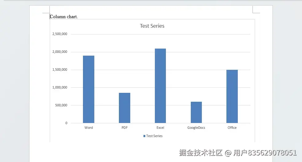
代码中的关键步骤:
- 追加图表 :
AppendChart(ChartType.Column, width, height)方法将图表形状添加到段落中,返回一个图表形状对象。 - 数据系列 :
Series.Add()方法接受系列名称、分类列表(X 轴)和数值列表(Y 轴)三个参数。 - 坐标轴格式 :
AxisY.NumberFormat.FormatCode设置 Y 轴标签的数字显示格式,"#,##0"表示千位分隔符格式。
创建折线图并设置标题
折线图适合展示数据随时间或类别的变化趋势。以下代码创建一个包含多个数据系列的折线图,并设置图表标题:
python
from spire.doc import *
from spire.doc.common import *
from spire.doc.charts import ChartType

outputFile = "LineChart.docx"

document = Document()
section = document.AddSection()
section.AddParagraph().AppendText("Line chart.")

newPara = section.AddParagraph()

# 追加折线图
shape = newPara.AppendChart(ChartType.Line, 500.0, 300.0)
chart = shape.Chart

# 设置图表标题
title = chart.Title
title.Text = "My Chart"
title.Show = True
title.Overlay = True

# 添加多个数据系列
seriesColl = chart.Series
seriesColl.Clear()

categories = ["C1", "C2", "C3", "C4", "C5", "C6"]

seriesColl.Add("AW Series 1", categories, [1.0, 2.0, 2.5, 4.0, 5.0, 6.0])
seriesColl.Add("AW Series 2", categories, [2.0, 3.0, 3.5, 6.0, 6.5, 7.0])

document.SaveToFile(outputFile, FileFormat.Docx)
document.Dispose()
生成的Word文档:
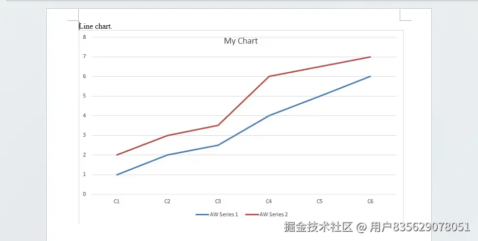
标题设置说明:
title.Text:设置标题文本内容title.Show:控制标题是否显示title.Overlay:设为True时标题叠加在图表上方,不占据额外空间
创建饼图
饼图用于展示各部分占整体的比例关系。饼图只需要一个数据系列即可:
python
from spire.doc import *
from spire.doc.common import *
from spire.doc.charts import ChartType

outputFile = "PieChart.docx"

document = Document()
section = document.AddSection()
section.AddParagraph().AppendText("Pie chart.")

newPara = section.AddParagraph()

# 追加饼图
shape = newPara.AppendChart(ChartType.Pie, 500.0, 300.0)
chart = shape.Chart

# 添加数据系列
chart.Series.Add("Test Series", ["Word", "PDF", "Excel"],
                          [2.7, 3.2, 0.8])

document.SaveToFile(outputFile, FileFormat.Docx)
document.Dispose()饼图的数据系列添加方式与柱状图一致,ChartType.Pie 指定图表类型为饼图。
创建散点图和气泡图
散点图用于展示两组数据之间的相关关系,气泡图在此基础上通过第三个维度表示数据权重。
散点图:
python
from spire.doc import *
from spire.doc.common import *
from spire.doc.charts import ChartType

outputFile = "ScatterChart.docx"

document = Document()
section = document.AddSection()
section.AddParagraph().AppendText("Scatter chart.")

newPara = section.AddParagraph()

# 追加散点图
shape = newPara.AppendChart(ChartType.Scatter, 450.0, 300.0)
chart = shape.Chart
chart.Series.Clear()

# 添加数据系列,提供 X 和 Y 值列表
chart.Series.Add("Scatter chart", [1.0, 2.0, 3.0, 4.0, 5.0],
                 [1.0, 20.0, 40.0, 80.0, 160.0])

document.SaveToFile(outputFile, FileFormat.Docx)
document.Dispose()气泡图:
python
from spire.doc import *
from spire.doc.common import *
from spire.doc.charts import ChartType

outputFile = "BubbleChart.docx"

document = Document()
section = document.AddSection()
section.AddParagraph().AppendText("Bubble chart.")

newPara = section.AddParagraph()

# 追加气泡图
shape = newPara.AppendChart(ChartType.Bubble, float(500), float(300))
chart = shape.Chart
chart.Series.Clear()

# 添加数据系列,提供 X、Y 和气泡大小三个列表
chart.Series.Add("Test Series",
                 [2.9, 3.5, 1.1, 4.0, 4.0],
                 [1.9, 8.5, 2.1, 6.0, 1.5],
                 [9.0, 4.5, 2.5, 8.0, 5.0])

document.SaveToFile(outputFile, FileFormat.Docx)
document.Dispose()
两者的关键区别在于 Series.Add() 的参数数量:散点图提供 X 和 Y 两个列表,气泡图额外提供第三个列表表示气泡大小。
创建三维曲面图
三维曲面图适合展示多变量数据的立体分布。以下代码创建包含三个数据系列的曲面图:
python
from spire.doc import *
from spire.doc.common import *
from spire.doc.charts import ChartType

outputFile = "Surface3DChart.docx"

document = Document()
section = document.AddSection()
section.AddParagraph().AppendText("Surface3D chart.")

newPara = section.AddParagraph()

# 追加三维曲面图
shape = newPara.AppendChart(ChartType.Surface3D, 500.0, 300.0)
chart = shape.Chart
chart.Series.Clear()

# 设置标题
chart.Title.Text = "My chart"

# 添加多个数据系列
categories = ["Word", "PDF", "Excel", "GoogleDocs", "Office"]

chart.Series.Add("Series 1", categories,
                 [1900000.0, 850000.0, 2100000.0, 600000.0, 1500000.0])
chart.Series.Add("Series 2", categories,
                 [900000.0, 50000.0, 1100000.0, 400000.0, 250000.0])
chart.Series.Add("Series 3", categories,
                 [500000.0, 820000.0, 1500000.0, 400000.0, 100000.0])

document.SaveToFile(outputFile, FileFormat.Docx)
document.Dispose()
通过添加多个数据系列,曲面图可以同时展示多组数据的三维分布,适合对比分析场景。
实战技巧
根据数据自动选择图表类型
在实际应用中,可以根据数据特征自动选择最合适的图表类型:
python
def create_chart(document, chart_type, title, categories, values):
    section = document.AddSection()
    section.AddParagraph().AppendText(title)
    para = section.AddParagraph()
    shape = para.AppendChart(chart_type, 500.0, 300.0)
    chart = shape.Chart
    chart.Series.Clear()
    chart.Title.Text = title
    chart.Title.Show = True
    chart.Series.Add("Data", categories, values)
    return chart

# 使用示例
doc = Document()
create_chart(doc, ChartType.Column, "季度销售额",
             ["Q1", "Q2", "Q3", "Q4"], [120.0, 150.0, 180.0, 200.0])
create_chart(doc, ChartType.Line, "月度增长趋势",
             ["Jan", "Feb", "Mar", "Apr", "May", "Jun"],
             [10.0, 15.0, 22.0, 28.0, 35.0, 42.0])
doc.SaveToFile("Report.docx", FileFormat.Docx)
doc.Dispose()
将图表创建封装为函数后,可以在同一文档中快速添加多种图表,适用于生成包含多个数据视图的综合报告。
设置坐标轴数字格式
对于大数值数据,设置坐标轴数字格式可以提升可读性:
python
# 千位分隔符格式
chart.AxisY.NumberFormat.FormatCode = "#,##0"

# 百分比格式
chart.AxisY.NumberFormat.FormatCode = "0%"

# 带小数位的千位分隔符
chart.AxisY.NumberFormat.FormatCode = "#,##0.00"
总结
本文介绍了使用 Python 在 Word 文档中创建图表的完整流程,涵盖柱状图、折线图、饼图、散点图、气泡图和三维曲面图六种图表类型。
关键要点回顾:
- 使用
AppendChart(ChartType, width, height)方法向段落追加图表,通过ChartType枚举指定图表类型 - 通过
chart.Series.Add()添加数据系列,不同图表类型的参数数量不同(散点图需 X/Y 两个列表,气泡图需 X/Y/大小三个列表) - 使用
chart.Title设置图表标题的文本、显示状态和叠加方式 - 通过
chart.AxisY.NumberFormat.FormatCode自定义坐标轴数字显示格式
掌握这些技能后,你可以将图表创建集成到报告生成流水线中,根据业务数据自动生成带有可视化图表的 Word 文档,显著提升数据报告的生成效率和一致性。