本文是《30天精通CSS》专栏第 15 篇,订阅专栏不迷路。
本文目录
-
同一个效果,两种写法
-
差在哪:一个真加了标签,一个只是画了个装饰
-
content:伪元素的发动机
-
进阶:attr() 让装饰读 HTML 里的值
-
分界线:伪类单冒号,伪元素双冒号
-
最容易翻车的地方:content 漏写,装饰凭空消失
同一个效果,两种写法
需求:给评论区引用块的两端加上装饰性大引号。两种写法摆一起。
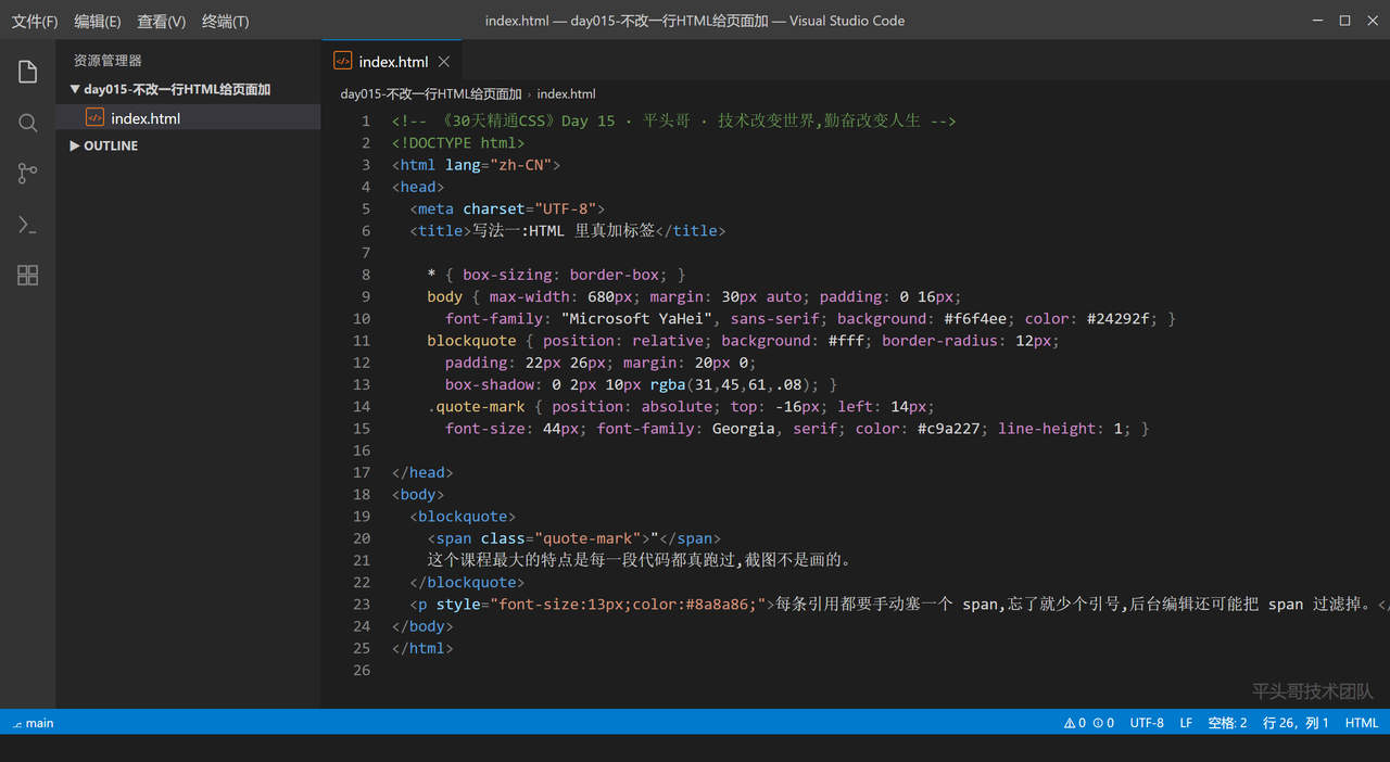
第一种,老实人的做法------往 HTML 里真塞两个标签:
Plaintext
<!-- 《30天精通CSS》Day 15 · 平头哥 · 技术改变世界,勤奋改变人生 -->
<!DOCTYPE html>
<html lang="zh-CN">
<head>
  <meta charset="UTF-8">
  <title>写法一:HTML 里真加标签</title>
  <style>
    * { box-sizing: border-box; }
    body { max-width: 680px; margin: 30px auto; padding: 0 16px;
      font-family: "Microsoft YaHei", sans-serif; background: #f6f4ee; color: #24292f; }
    blockquote { position: relative; background: #fff; border-radius: 12px;
      padding: 22px 26px; margin: 20px 0;
      box-shadow: 0 2px 10px rgba(31,45,61,.08); }
    .quote-mark { position: absolute; top: -16px; left: 14px;
      font-size: 44px; font-family: Georgia, serif; color: #c9a227; line-height: 1; }
  </style>
</head>
<body>
  <blockquote>
    <span class="quote-mark">"</span>
    这个课程最大的特点是每一段代码都真跑过,截图不是画的。
  </blockquote>
  <p style="font-size:13px;color:#8a8a86;">每条引用都要手动塞一个 span,忘了就少个引号,后台编辑还可能把 span 过滤掉。</p>
</body>
</html>
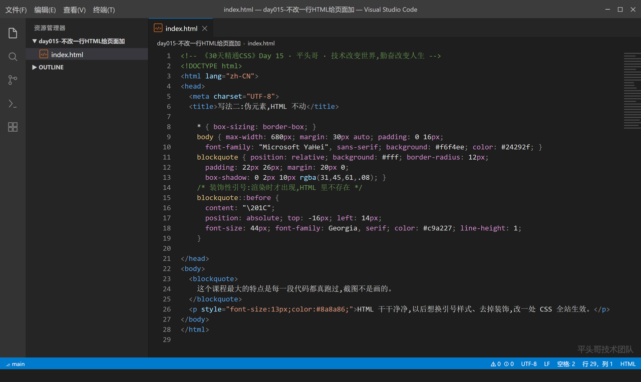
第二种,伪元素------HTML 一行不动:
Plaintext
<!-- 《30天精通CSS》Day 15 · 平头哥 · 技术改变世界,勤奋改变人生 -->
<!DOCTYPE html>
<html lang="zh-CN">
<head>
  <meta charset="UTF-8">
  <title>写法二:伪元素,HTML 不动</title>
  <style>
    * { box-sizing: border-box; }
    body { max-width: 680px; margin: 30px auto; padding: 0 16px;
      font-family: "Microsoft YaHei", sans-serif; background: #f6f4ee; color: #24292f; }
    blockquote { position: relative; background: #fff; border-radius: 12px;
      padding: 22px 26px; margin: 20px 0;
      box-shadow: 0 2px 10px rgba(31,45,61,.08); }
    /* 装饰性引号:渲染时才出现,HTML 里不存在 */
    blockquote::before {
      content: "\201C";
      position: absolute; top: -16px; left: 14px;
      font-size: 44px; font-family: Georgia, serif; color: #c9a227; line-height: 1;
    }
  </style>
</head>
<body>
  <blockquote>
    这个课程最大的特点是每一段代码都真跑过,截图不是画的。
  </blockquote>
  <p style="font-size:13px;color:#8a8a86;">HTML 干干净净,以后想换引号样式、去掉装饰,改一处 CSS 全站生效。</p>
</body>
</html>
差在哪:一个真加了标签,一个只是画了个装饰
写法一的问题不是"错",是污染了内容 :那个 " 不是内容,是装饰,但它混进了 HTML------读屏软件会把它念出来,后台富文本编辑器可能吞掉它,想统一改样式得改 N 个地方。
写法二的 ::before 是一个只在渲染时存在的盒子。它真的能被定位、上色、做动画(前面 Day 13 的角标套路也完全适用),但它不出现在 DOM 里,不污染内容。
选型标准一句话:是内容就进 HTML,是装饰就进伪元素。判断方法:读屏软件需要读它吗?需要(比如"必填"提示),进 HTML;不需要(引号、分隔线、光斑),伪元素。
外链图片转存失败,源站可能有防盗链机制,建议将图片保存下来直接上传
content:伪元素的发动机
::before/::after 必须带 content 属性,没有它伪元素整个不渲染------这是今天的翻车主角,后面单说。
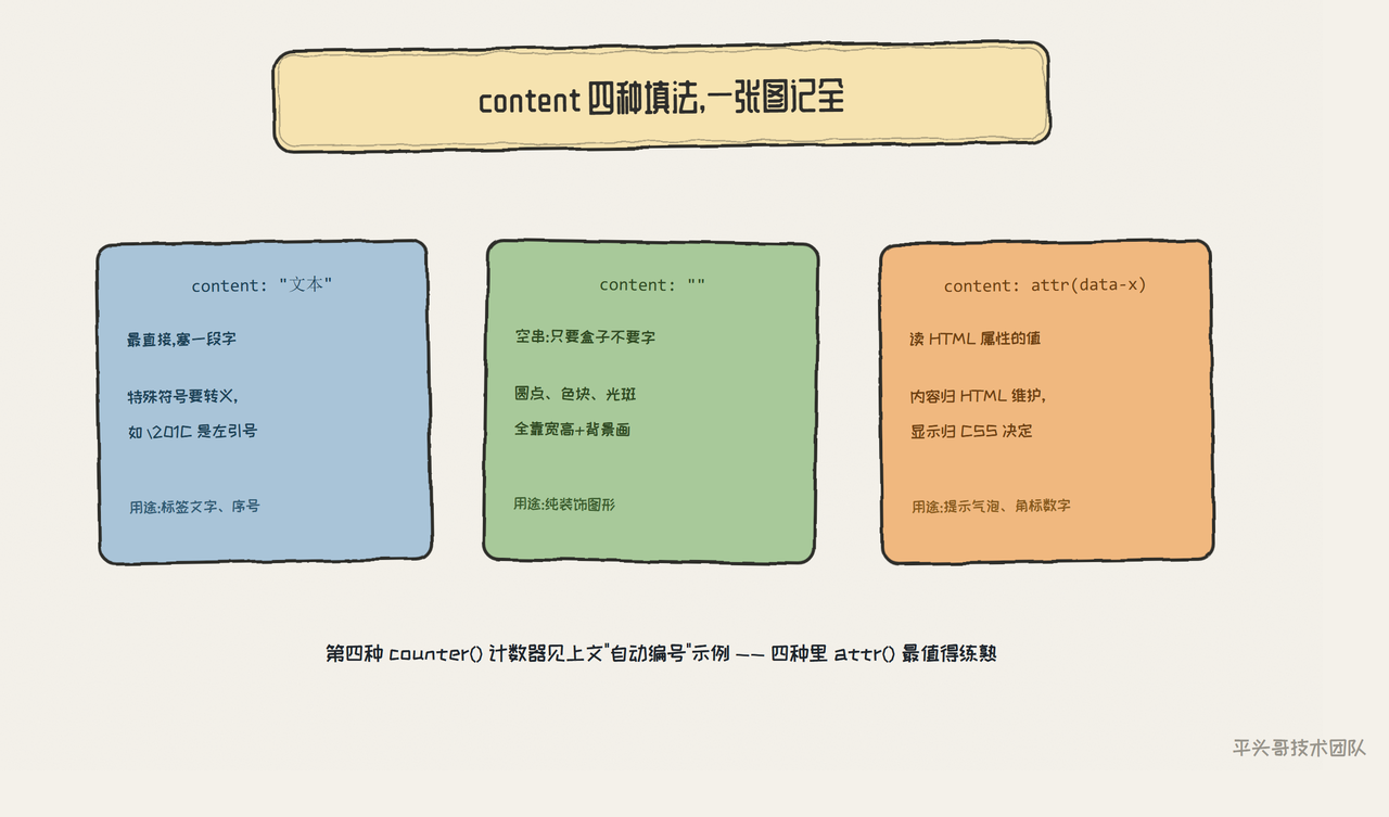
content 的四种填法,从常用到高级:
Plaintext
<!-- 《30天精通CSS》Day 15 · 平头哥 · 技术改变世界,勤奋改变人生 -->
<!DOCTYPE html>
<html lang="zh-CN">
<head>
  <meta charset="UTF-8">
  <title>content 的四种填法</title>
  <style>
    * { box-sizing: border-box; }
    body { max-width: 720px; margin: 30px auto; padding: 0 16px;
      font-family: "Microsoft YaHei", sans-serif; background: #f6f4ee; color: #24292f; }
    h3 { font-size: 16px; color: #1b4055; margin: 24px 0 8px; }
    /* 1. 纯文本 */
    .hot::after { content: " 热"; color: #c2185b; font-size: 12px; }
    /* 2. 空串:只为生成一个可定位的盒子 */
    .dot { position: relative; padding-left: 20px; }
    .dot::before { content: ""; position: absolute; left: 0; top: 50%;
      width: 12px; height: 12px; margin-top: -6px; border-radius: 50%; background: #2f8f4e; }
    /* 3. attr():读 HTML 属性里的值 */
    .tip::after { content: attr(data-hint); margin-left: 8px; font-size: 12px;
      color: #8a8a86; }
    /* 4. 计数器:自动编号 */
    .steps { counter-reset: step; }
    .steps li { list-style: none; margin: 6px 0; }
    .steps li::before { counter-increment: step; content: "第" counter(step) "步 ";
      color: #2563eb; font-weight: bold; }
    .box { background: #fff; border-radius: 10px; padding: 16px 20px;
      box-shadow: 0 2px 8px rgba(31,45,61,.08); margin: 8px 0; }
  </style>
</head>
<body>
  <h3>1. 纯文本</h3>
  <div class="box hot">限时折扣</div>

  <h3>2. 空串 ------ 只要盒子不要字</h3>
  <div class="box dot">列表项前面这个绿点,就是 ::before 画的</div>

  <h3>3. attr() ------ 读 HTML 里 data- 属性</h3>
  <div class="box tip" data-hint="(点击右上角可收起)">悬浮提示区</div>

  <h3>4. 计数器 ------ 自动编号</h3>
  <ol class="steps box">
    <li>装好编辑器</li><li>写 HTML 骨架</li><li>加 CSS 装饰</li>
  </ol>
</body>
</html>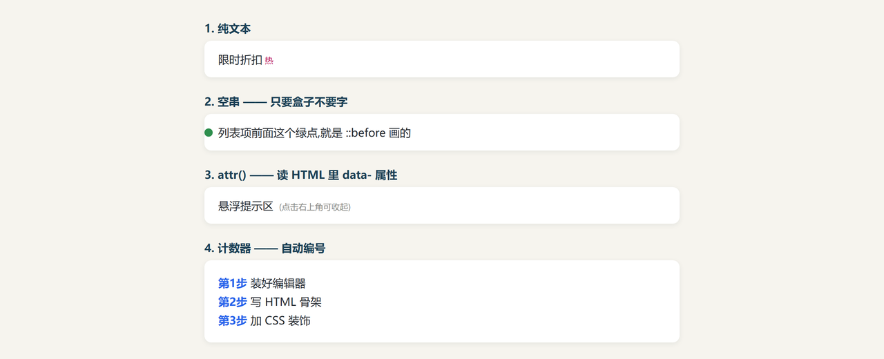
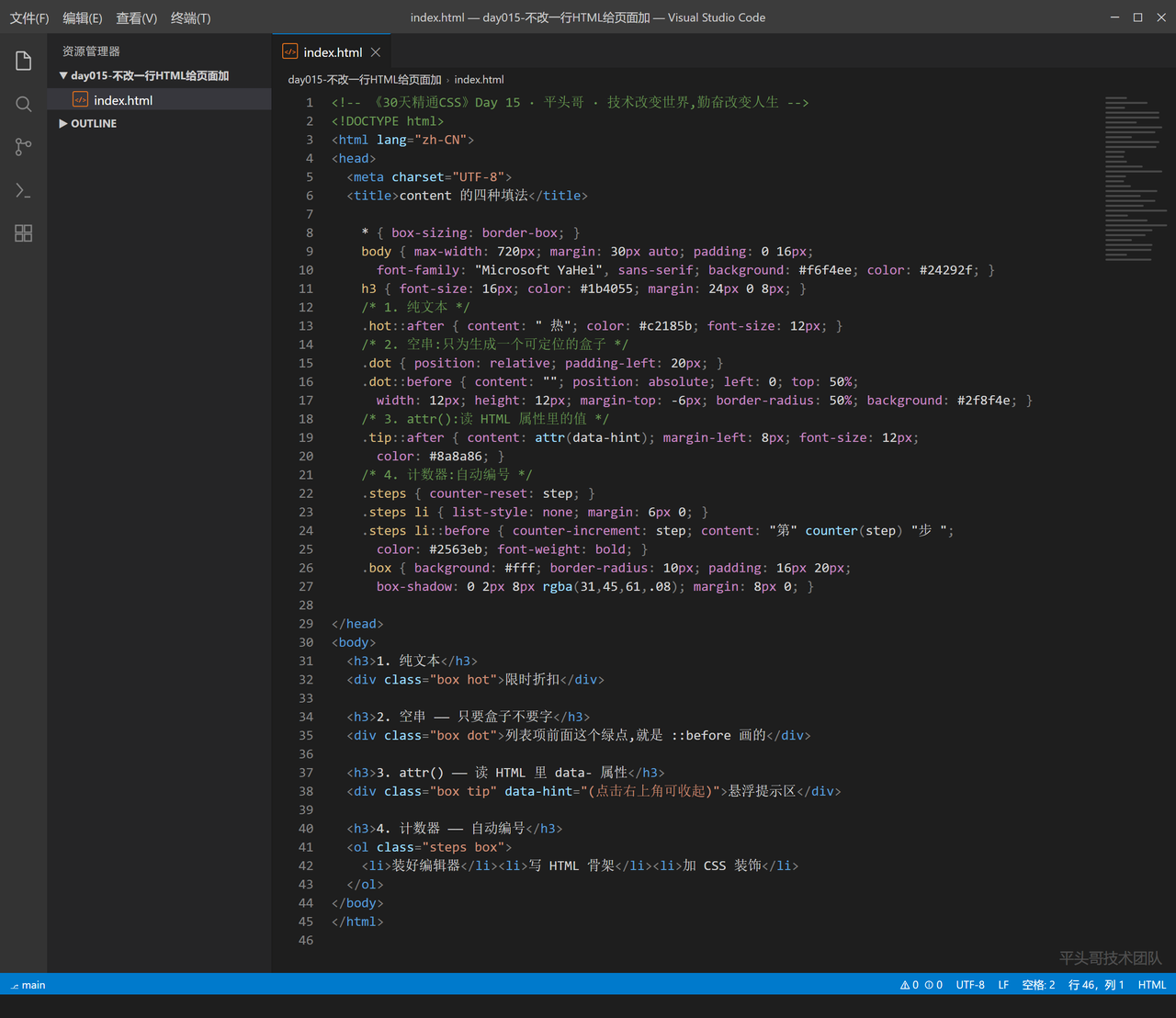
四种里最值得多看一眼的是 attr():content: attr(data-hint) 把 HTML 属性的值搬进伪元素,内容还是内容(在 HTML 里维护),展示归展示(CSS 决定怎么显示)。提示文字、角标数字都可以这么解耦。
计数器那套(counter-reset + counter-increment)适合"第 N 步"这种顺序性装饰,序号变了 HTML 一行不用改。
进阶:attr() 让装饰读 HTML 里的值
顺带一个实战组合------悬停气泡,把 attr 和定位串起来:
Plaintext
<!-- 《30天精通CSS》Day 15 · 平头哥 · 技术改变世界,勤奋改变人生 -->
<!DOCTYPE html>
<html lang="zh-CN">
<head>
  <meta charset="UTF-8">
  <title>attr 实战:悬停提示</title>
  <style>
    * { box-sizing: border-box; }
    body { max-width: 680px; margin: 40px auto; padding: 0 16px;
      font-family: "Microsoft YaHei", sans-serif; background: #f6f4ee; color: #24292f; }
    .word { color: #2563eb; border-bottom: 1px dashed #93b4e8; cursor: help; }
    /* 平时隐藏,悬停时显示 ------ attr 从 data-tip 读内容 */
    .word::after { content: attr(data-tip); position: absolute;
      left: 50%; transform: translateX(-50%);
      background: #1b4055; color: #fff; font-size: 12px;
      padding: 6px 10px; border-radius: 6px; white-space: nowrap;
      opacity: 0; transition: opacity .2s; pointer-events: none; }
    .wrap { position: relative; display: inline-block; }
    .wrap:hover .word::after { opacity: 1; }
    p { line-height: 2; }
  </style>
</head>
<body>
  <p>
    CSS 里最难的不是属性多,而是像
    <span class="wrap"><span class="word" data-tip="层叠上下文,Day 14 讲过">层叠</span></span>
    和
    <span class="wrap"><span class="word" data-tip="内容与样式分离的设计思想">语义</span></span>
    这种概念。把鼠标悬到这两个词上看看。
  </p>
</body>
</html>
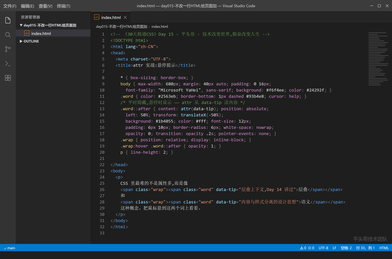
注意这个组合里,提示文字写在 HTML 的 data-tip 里------它是内容 ,归 HTML;显示时机和样式是装饰,归 CSS。这就是解耦的样板。
分界线:伪类单冒号,伪元素双冒号
:hover 是一个冒号,::before 是两个。这不是新旧写法,是两个物种:
伪类(pseudo-class) :描述元素的某种状态 。:hover、:focus、:visited------元素还是那个元素,只是换了状态。
伪元素(pseudo-element) :凭空创造 一个新盒子。::before、::after、::selection------它们不是元素的状态,是不存在的额外东西。
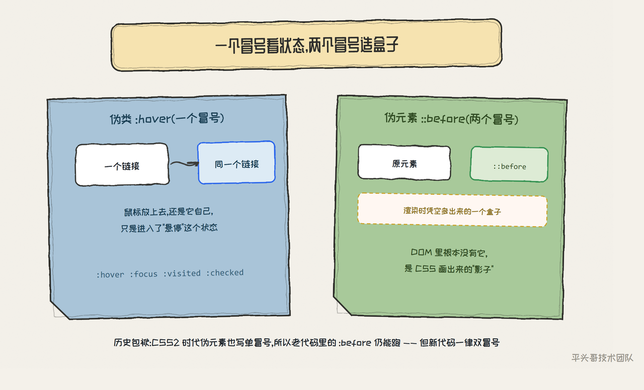
历史包袱要交代:CSS2 时代伪元素也用单冒号,浏览器为了兼容至今仍认 :before。所以老代码里的单冒号不算 bug,能跑;但新代码一律写双冒号,让人一眼看出"这里造了个盒子"。
最容易翻车的地方:content 漏写,装饰凭空消失
Plaintext
<!-- 《30天精通CSS》Day 15 · 平头哥 · 技术改变世界,勤奋改变人生 -->
<!DOCTYPE html>
<html lang="zh-CN">
<head>
  <meta charset="UTF-8">
  <title>content 漏写了</title>
  <style>
    * { box-sizing: border-box; }
    body { max-width: 680px; margin: 30px auto; padding: 0 16px;
      font-family: "Microsoft YaHei", sans-serif; background: #f6f4ee; color: #24292f; }
    .bar { background: #fff3e0; border: 1px solid #e3e0d8; border-radius: 6px;
      padding: 8px 14px; font-size: 14px; color: #8a3a28; margin-bottom: 26px; }
    .box { background: #fff; border-radius: 12px; padding: 20px; margin: 16px 0;
      box-shadow: 0 2px 10px rgba(31,45,61,.08); }
    /* 第一个盒子:全套样式都写了,唯独没有 content */
    .broken { position: relative; }
    .broken::before { position: absolute; top: -10px; left: 14px;
      font-size: 40px; color: #c9a227; font-family: Georgia, serif; }
    /* 第二个盒子:一模一样,只多了 content 一行 */
    .works { position: relative; }
    .works::before { content: "\201C"; position: absolute; top: -10px; left: 14px;
      font-size: 40px; color: #c9a227; font-family: Georgia, serif; }
  </style>
</head>
<body>
  <div class="bar">两个盒子样式几乎一样,一个有引号一个没有 ------ 差在 content</div>
  <div class="box broken">第一个盒子:定位、字号、颜色全写了,::before 却完全不存在。</div>
  <div class="box works">第二个盒子:多了一行 content,装饰出现。</div>
</body>
</html>
没有 content,伪元素连盒子都不生成 ------不是渲染成空白,是不存在。哪怕你只想要一个纯色块(不需要文字),也要写 content: "" 把盒子"召唤"出来。
第二个常见变体:content 里写中文引号没问题,但写特殊符号 要转义,比如 content: "\201C" 是左双引号。直接在 content: " 里手敲 " 会和外层引号打架。查转义码用 MDN 的 Unicode 表,或者用更省事的办法------空盒子 + 背景图/纯 CSS 画。
参考资料