Observable Plot 源码深度解析(一)认识 Observable Plot
配套代码仓库:https://github.com/observablehq/plot(即
@observablehq/plotv0.6.17 源码本体)图表渲染说明:本文档内嵌 mermaid(流程图/时序图/状态图/概念关系/类结构)代码块,在 Typora、Obsidian、VS Code(+ 插件)、GitHub 等平台均可自动渲染。
写在前面
主要目的
这份解析,主要是解决下面几个问题:
- 自底向上理解一张图是怎么画出来的 :从
Plot.plot({...})调用开始,沿着源码真正走一遍"数据 → 通道 → 比例尺 → 像素"的全链路。 - 理解 Plot 与 D3 的真实分工:知道 Plot 用 D3 的哪些模块、各自负责什么、什么时候该绕开 Plot 直接用 D3。
- 有能力自己实现一个迷你图表库:第 13 章给出一个最简可用的声明式图表库骨架,参考 Plot 的抽象。
- 可以扩展新图表类型:知道注册自定义 Mark、Scale、Transform 的入口与约束。
图例
| 图类型 | 用途 | 渲染要求 |
|---|---|---|
| mermaid | 概念关系、流程图、时序图、状态图、模块依赖架构图 | mermaid 引擎 |
第 1 章 认识 Observable Plot
1.1 一个最小示例
js
import * as Plot from "https://cdn.jsdelivr.net/npm/@observablehq/plot@0.6/+esm";

// 数据:12 个城市的气温
const cities = [
  {name: "北京", temp: 12}, {name: "上海", temp: 17}, {name: "广州", temp: 23},
  {name: "深圳", temp: 23}, {name: "杭州", temp: 16}, {name: "成都", temp: 15},
  {name: "武汉", temp: 16}, {name: "西安", temp: 13}, {name: "南京", temp: 15},
  {name: "重庆", temp: 18}, {name: "天津", temp: 12}, {name: "苏州", temp: 16}
];

// 一行代码:水平条形图
const chart = Plot.barX(cities, {y: "name", x: "temp"});
Plot.barX(cities, {y: "name", x: "temp"}) 调用返回的是 SVG <g> 元素。包裹到 DOM:
js
document.querySelector("#app").append(chart);
//document.body.append(chart);
就得到一张图。Plot 没有图表容器,没有 axes 配置,没有 margin 配置,没有 xScale、yScale 的代码------全部由 Plot 根据你的 {y: "name", x: "temp"} 推断出来 。
完整的在HTML代码为:
js
<!DOCTYPE html>
<div id="app"></div>
<script type="module">

import * as Plot from "https://cdn.jsdelivr.net/npm/@observablehq/plot@0.6/+esm";

// 数据:12 个城市的气温
const cities = [
  {name: "北京", temp: 12}, {name: "上海", temp: 17}, {name: "广州", temp: 23},
  {name: "深圳", temp: 23}, {name: "杭州", temp: 16}, {name: "成都", temp: 15},
  {name: "武汉", temp: 16}, {name: "西安", temp: 13}, {name: "南京", temp: 15},
  {name: "重庆", temp: 18}, {name: "天津", temp: 12}, {name: "苏州", temp: 16}
];

// 一行代码:水平条形图
const chart = Plot.barX(cities, {y: "name", x: "temp"}).plot();
const container= document.querySelector("#app");
container.append(chart);

</script>
结果如图:
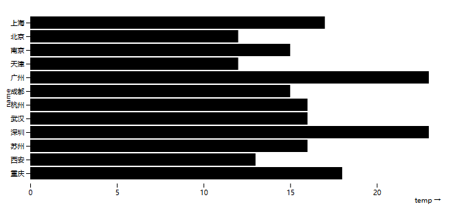
当然,最佳探索该图表库的地方是https://observablehq.com/
1.2 Plot 要解决的痛点
如果用 D3 命令式手写同样的柱状图,至少要做这些事(基于 d3 v7):
js
<!DOCTYPE html>
<div id="app"></div>
<script type="module">
import * as d3 from "https://cdn.jsdelivr.net/npm/d3@7/+esm";

const cities = [
  {name: "北京", temp: 12}, {name: "上海", temp: 17}, {name: "广州", temp: 23},
  {name: "深圳", temp: 23}, {name: "杭州", temp: 16}, {name: "成都", temp: 15},
  {name: "武汉", temp: 16}, {name: "西安", temp: 13}, {name: "南京", temp: 15},
  {name: "重庆", temp: 18}, {name: "天津", temp: 12}, {name: "苏州", temp: 16}
];

// Plot默认进行了排序
const sortedData = [...cities].sort((a,b)=> a.name < b.name ? -1 : 1);

const margin = {top:20, right:30, bottom:45, left:60};
const width = 800 - margin.left - margin.right;
const height = 460 - margin.top - margin.bottom;

// 画布属性
const svg = d3.select("#app")
  .append("svg")
  .attr("width", width + margin.left + margin.right)
  .attr("height", height + margin.top + margin.bottom)
  .append("g")
  .attr("transform", `translate(${margin.left},${margin.top})`);

//y比例尺
const yScale = d3.scaleBand()
  .domain(sortedData.map(d=>d.name))
  .range([ 0, height]) // barX Y轴反转
  .padding(0.15);

//x比例尺
const xScale = d3.scaleLinear()
  .domain([0,24])
  .range([0, width]);

//柱状图的条
svg.selectAll("rect")
  .data(sortedData)
  .enter()
  .append("rect")
  .attr("y", d=>yScale(d.name))
  .attr("height", yScale.bandwidth())
  .attr("x",0)
  .attr("width", d=>xScale(d.temp))
  .attr("fill","#000000");

//画y轴/x轴
svg.append("g").call(d3.axisLeft(yScale));
svg.append("g")
  .attr("transform", `translate(0,${height})`)
  .call(d3.axisBottom(xScale));

// 添加轴标题
svg.append("text")
  .attr("x", width)
  .attr("y", height+32)
  .attr("text-anchor","end")
  .text("temp →");

svg.append("text")
  .attr("transform", "rotate(-90)")
  .attr("x", -height/2)
  .attr("y", -42)
  .attr("text-anchor","middle")
  .text("name");
</script>
D3 这段代码量明显大于Plot ,差距来自:
| 维度 | D3(命令式) | Plot(声明式) |
|---|---|---|
| 选元素 | selectAll |
自动 |
| 绑数据 | .data() |
data 参数 |
| 算比例尺 | 手动 domain/range | 自动推断 |
| 算坐标 | 手动 attr | 自动 scale 应用 |
| 画轴 | axisBottom 手动 |
隐式推断 |
| 边距 | 手动 translate | 自动 margin |
1.3 Plot 的定位
Plot 不是 D3 的替代品,而是 D3 之上的声明式语法层。Plot 的 package.json 一行说清楚了依赖关系:
json
// package.json (line 80)
"dependencies": {
  "d3": "^7.9.0",
  "interval-tree-1d": "^1.0.0",
  "isoformat": "^0.2.0",
  "rimraf": "^6.1.3"
}
D3 7.9 是唯一核心运行时依赖。其他只是辅助(interval-tree-1d 用于二维区间查询、isoformat 用于日期格式、rimraf 用于构建)。
设计哲学:Plot 用最少的代码完成常见的探索式数据可视化,把 D3 的"装配语言"地位保留给精细控制场景。
------Mike Bostock
1.4 总结
- Plot 是声明式的:你描述"图长什么样",不描述"怎么画"。
- Plot 是组合式 的:
marks数组里堆叠多个标记。 - Plot 是可推导的:比例尺、坐标轴、图例、边距都能从你的数据 + 选项自动算出。
- Plot 是 D3 7.9 之上的高层语法层:底层还是 D3。