1. 系统组件与自定义组件的区别
1.1 系统组件
系统组件是 ArkUI 已经提供好的 UI 积木。你直接在 build() 中使用即可。
arkts
Column() {
  Text('你好,ArkUI')
  Button('点击我')
}
常见系统组件:
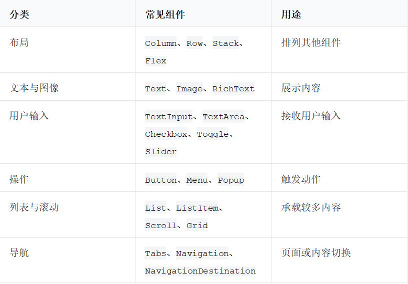
1.2 自定义组件
当一段 UI 或交互有明确职责、会被复用,或者让页面代码变得很长时,就应该封装为自定义组件。
arkts
@Component
struct WelcomeCard {
  build() {
    Column() {
      Text('欢迎学习 ArkUI')
        .fontSize(22)
        .fontWeight(FontWeight.Bold)

      Text('从组件开始构建你的第一个应用。')
        .fontSize(14)
        .fontColor('#666666')
    }
    .padding(16)
    .backgroundColor('#F5F7FA')
    .borderRadius(12)
  }
}
在页面中使用它:
arkts
@Entry
@Component
struct Index {
  build() {
    Column() {
      WelcomeCard()
    }
    .padding(20)
  }
}
把它当成一个"自己定义的标签"即可:
WelcomeCard()1.3 什么时候应该拆出自定义组件
符合下面任一情况,通常值得拆组件:
- 一段 UI 在两个或更多地方重复出现。
- 一段 UI 有清晰职责,例如"用户卡片""商品行""搜索栏""空状态页"。
- 一个页面的 build() 已经很长,读起来要不断上下翻。
- 一段 UI 需要独立维护自己的状态或交互。
- 你希望以后修改这部分 UI 时不影响其他区域。
不需要为了"组件化"把每一个 Text 都拆成组件。好的拆分边界是:
一个组件完成一件清楚的事;组件名能说明它在做什么。
2. 自定义组件的最小结构
最基础的自定义组件由三部分组成:
@Component
struct ComponentName {
  build() {
    // 在这里描述 UI
  }
}
例子:
arkts
@Component
struct TitleBlock {
  build() {
    Text('今日学习计划')
      .fontSize(24)
      .fontWeight(FontWeight.Bold)
      .fontColor('#222222')
  }
}
使用:
arkts
@Entry
@Component
struct Index {
  build() {
    Column() {
      TitleBlock()
    }
    .padding(20)
  }
}
2.1 struct 为什么用来定义组件
ArkUI 的经典声明式组件使用 struct:
arkts
@Component
struct UserCard {
  build() {
    Text('用户卡片')
  }
}
它与普通 ArkTS 对象、工具类的职责不同:
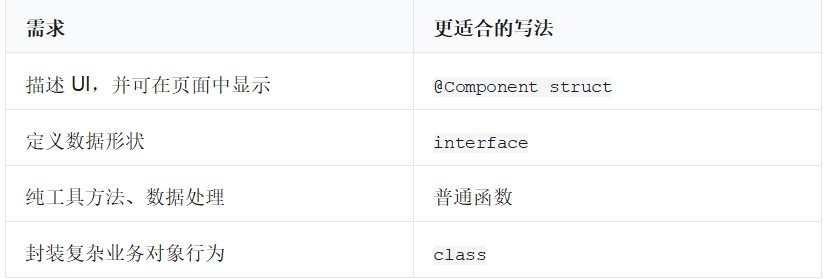
2.2 组件名称的命名习惯
推荐用大驼峰命名(PascalCase):
arkts
@Component
struct UserCard {
  build() {
  }
}

@Component
struct CourseProgress {
  build() {
  }
}
不推荐:
// 不推荐:首字母小写,阅读时不容易看出是组件
// struct userCard { }
// 不推荐:名字过于模糊
// struct Box1 { }
好名字能够表达职责:
• ProfileHeader:个人资料页头部。
• TodoItemView:一条待办事项。
• EmptyState:列表为空时的提示。
• PrimaryButton:主要操作按钮。
3. build():组件的 UI 描述区域
每个自定义组件都要有 build() 方法。它返回的不是普通字符串,而是以声明式方式描述 UI。
arkts
@Component
struct LearningTip {
  build() {
    Row({ space: 8 }) {
      Text('提示')
        .fontColor(Color.White)
        .backgroundColor('#0A59F7')
        .padding({ left: 8, right: 8, top: 4, bottom: 4 })
        .borderRadius(6)

      Text('每天练习 20 分钟,比一次学很久更有效。')
        .fontSize(14)
    }
    .padding(12)
  }
}
读这段代码可以按"从外到内"理解:
- 创建一个横向容器 Row。
- 第一项是蓝底白字的"提示"。
- 第二项是说明文字。
- 整个容器有内边距。
4. 常用基础组件:先会搭出一个页面
4.1 Text:显示文字
arkts
Text('你好,ArkUI')
  .fontSize(20)
  .fontColor('#222222')
  .fontWeight(FontWeight.Bold)
常见属性:
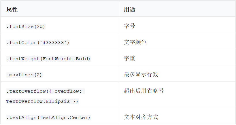
例子:
arkts
Text('这是一段可能比较长的说明文字,超过两行后将显示省略号。')
  .fontSize(16)
  .maxLines(2)
  .textOverflow({ overflow: TextOverflow.Ellipsis })
4.2 Button:让用户触发操作
arkts
Button('保存')
  .width('100%')
  .onClick(() => {
    console.info('用户点击了保存按钮');
  })
按钮通常包含两部分:
Button('按钮文字')
  .onClick(() => {
    // 点击后做什么
  })
要记住:onClick 里传入的是一个函数,而不是立刻执行函数。
// 正确
.onClick(() => {
  this.saveData();
})
// 错误示意:会在页面构建时就调用,不是点击时调用
// .onClick(this.saveData())
4.3 Image:显示图片
图片通常来自应用资源:
arkts
Image($r('app.media.app_icon'))
  .width(64)
  .height(64)
  .borderRadius(32)
$r('app.media.app_icon') 表示取应用的图片资源。不同项目的资源名称可能不同;如果项目找不到该资源,请将其替换为你项目中实际存在的图片资源。
常见属性:
arkts
Image($r('app.media.app_icon'))
  .width(100)
  .height(100)
  .objectFit(ImageFit.Cover)
  .borderRadius(12)
4.4 TextInput:单行输入框
arkts
@State userName: string = ''

TextInput({ placeholder: '请输入姓名', text: this.userName })
  .onChange((value: string) => {
    this.userName = value;
  })
输入框和状态的关系:
用户输入文字
    ↓
onChange 得到 value
    ↓
更新 @State userName
    ↓
页面中所有使用 userName 的地方自动刷新
4.5 TextArea:多行输入框
arkts
@State note: string = ''

TextArea({ placeholder: '写下你的学习笔记', text: this.note })
  .height(120)
  .onChange((value: string) => {
    this.note = value;
  })
4.6 Divider:分隔线
arkts
Divider()
  .color('#E5E6EB')
  .margin({ top: 12, bottom: 12 })
适合用在卡片中分开上下内容,或列表项之间分隔。
5. 布局组件:决定"谁在上、谁在左、谁覆盖谁"
5.1 Column:从上到下排列
arkts
Column({ space: 12 }) {
  Text('标题')
  Text('说明')
  Button('开始学习')
}
.padding(16)
space: 12 表示子组件之间间隔 12。
常用对齐:
arkts
Column() {
  Text('内容')
}
.width('100%')
.height('100%')
.justifyContent(FlexAlign.Center)
.alignItems(HorizontalAlign.Center)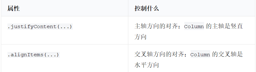
5.2 Row:从左到右排列
arkts
Row({ space: 10 }) {
  Text('昵称')
  Text('小明')
}
在 Row 中:
• 主轴是水平方向。
• 交叉轴是竖直方向。
arkts
Row() {
  Text('左边')
  Text('右边')
}
.width('100%')
.justifyContent(FlexAlign.SpaceBetween)
.alignItems(VerticalAlign.Center)
5.3 Stack:层叠摆放
适合图片角标、头像上的在线状态、封面上的标题等。
arkts
Stack({ alignContent: Alignment.BottomEnd }) {
  Image($r('app.media.app_icon'))
    .width(96)
    .height(96)
    .borderRadius(48)

  Text('NEW')
    .fontSize(12)
    .fontColor(Color.White)
    .backgroundColor('#F53F3F')
    .padding({ left: 6, right: 6, top: 3, bottom: 3 })
    .borderRadius(8)
}
后面的子组件会绘制在上面。
5.4 Scroll:内容超过屏幕时可以滚动
arkts
Scroll() {
  Column({ space: 12 }) {
    Text('第一段')
    Text('第二段')
    Text('更多内容......')
  }
  .width('100%')
}
.width('100%')
.height('100%')
内容很少时 Column 就够用。内容会变长、需要上下滚动时使用 Scroll。重复数据较多、需要更好性能时优先使用 List。
5.5 List 与 ListItem:列表内容
arkts
List({ space: 8 }) {
  ListItem() {
    Text('第一项')
      .padding(16)
      .width('100%')
  }

  ListItem() {
    Text('第二项')
      .padding(16)
      .width('100%')
  }
}
.width('100%')
.height('100%')
真正的业务列表一般结合 ForEach:
arkts
@State courses: string[] = ['ArkTS 基础', 'ArkUI 组件', '状态管理']

List({ space: 8 }) {
  ForEach(this.courses, (course: string) => {
    ListItem() {
      Text(course)
        .padding(16)
        .width('100%')
    }
  }, (course: string) => course)
}
6. 组件样式:边距、尺寸、背景与圆角
下面的属性是日常开发最常用的外观设置。
arkts
Column() {
  Text('一张卡片')
}
.width('100%')
.padding(16)
.margin({ top: 12 })
.backgroundColor('#FFFFFF')
.borderRadius(12)
.shadow({
  radius: 8,
  color: '#1A000000',
  offsetX: 0,
  offsetY: 3
})
6.1 padding 与 margin 的区别
┌───────────────────────────┐
│          margin           │  ← 组件与外部的距离
│  ┌─────────────────────┐  │
│  │       padding       │  │  ← 内容与组件边缘的距离
│  │   组件内部的内容     │  │
│  └─────────────────────┘  │
└───────────────────────────┘
Text('内容')
  .padding(12) // 文字离自己的背景边缘 12
  .margin(16)  // 这个组件离其他组件 16
6.2 layoutWeight:在 Row 或 Column 中分配剩余空间
arkts
Row({ space: 8 }) {
  TextInput({ placeholder: '请输入内容' })
    .layoutWeight(1)

  Button('提交')
}
.width('100%')
这里输入框会占用除按钮外的剩余宽度。它在搜索栏、表单行中非常常见。
7. 自定义组件的第一步:抽出重复 UI
假设页面有多处"课程卡片"。如果每次都手写同样的 Column 和样式,代码会越来越难维护。
7.1 没有封装时
arkts
Column() {
  Text('ArkTS 基础')
    .fontSize(18)
    .fontWeight(FontWeight.Bold)
  Text('学习变量、类型和函数')
    .fontSize(14)
    .fontColor('#666666')
}
.padding(16)
.width('100%')
.backgroundColor('#F7F8FA')
.borderRadius(12)
如果同样结构出现多次,适合封装。
7.2 封装成 CourseCard
arkts
@Component
struct CourseCard {
  build() {
    Column() {
      Text('ArkTS 基础')
        .fontSize(18)
        .fontWeight(FontWeight.Bold)

      Text('学习变量、类型和函数')
        .fontSize(14)
        .fontColor('#666666')
        .margin({ top: 8 })
    }
    .padding(16)
    .width('100%')
    .backgroundColor('#F7F8FA')
    .borderRadius(12)
  }
}
页面中使用:
arkts
Column({ space: 12 }) {
  CourseCard()
  CourseCard()
  CourseCard()
}
此时虽能复用外观,但三张卡片内容相同。下一步要学习"给自定义组件传参数"。
8. @Prop:父组件把数据传给子组件
@Prop 是最常见的"父传子"方式。子组件拿到父组件的数据后,主要用于展示。
arkts
@Component
struct CourseCard {
  @Prop title: string = ''
  @Prop description: string = ''

  build() {
    Column() {
      Text(this.title)
        .fontSize(18)
        .fontWeight(FontWeight.Bold)

      Text(this.description)
        .fontSize(14)
        .fontColor('#666666')
        .margin({ top: 8 })
    }
    .padding(16)
    .width('100%')
    .backgroundColor('#F7F8FA')
    .borderRadius(12)
  }
}
父组件传值:
arkts
@Entry
@Component
struct Index {
  build() {
    Column({ space: 12 }) {
      CourseCard({
        title: 'ArkTS 基础',
        description: '学习变量、类型和函数'
      })

      CourseCard({
        title: 'ArkUI 组件',
        description: '学习页面布局与用户交互'
      })
    }
    .padding(20)
  }
}
8.1 为什么要写默认值
@Prop title: string = ''默认值有两个好处:
-
让字段在组件刚创建时有明确的初始值。
-
当你临时预览组件或忘记传某些非关键参数时,能避免显示异常。
但对业务必须的数据,仍然应该从父组件明确传入:CourseCard({
title: 'ArkTS 基础',
description: '学习变量、类型和函数'
})
8.2 传数字、布尔值和对象
arkts
interface Course {
  id: number;
  title: string;
  done: boolean;
}

@Component
struct CourseRow {
  @Prop course: Course = { id: 0, title: '', done: false }

  build() {
    Row() {
      Text(this.course.title)
        .layoutWeight(1)

      Text(this.course.done ? '已完成' : '学习中')
        .fontColor(this.course.done ? '#2E8B57' : '#E67E22')
    }
    .padding(16)
    .width('100%')
  }
}
使用:
arkts
CourseRow({
  course: {
    id: 1,
    title: '认识 @Component',
    done: true
  }
})
9. @State:组件内部自己管理的状态
当状态只属于当前组件,不需要父组件控制时,使用 @State。
arkts
@Component
struct LikeButton {
  @State liked: boolean = false

  build() {
    Button(this.liked ? '已点赞' : '点赞')
      .onClick(() => {
        this.liked = !this.liked;
      })
  }
}
使用:
arkts
@Entry
@Component
struct Index {
  build() {
    Column() {
      LikeButton()
    }
    .padding(20)
  }
}
这个例子里,liked 是 LikeButton 自己的内部状态。父组件不需要知道它是否被点赞。
9.1 什么时候用 @State,什么时候用 @Prop
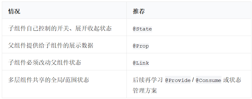
一个实用判断:
谁拥有数据,谁就负责维护该数据的 @State。
只负责展示数据的子组件,优先使用 @Prop。
10. @Link:子组件修改父组件的状态
@Prop 适合"父组件给、子组件看"。但有时子组件内部的操作,需要修改父组件拥有的数据,例如一个计数器按钮、开关行、编辑表单。
这时可以使用 @Link。
arkts
@Component
struct CounterControl {
  @Link count: number

  build() {
    Row({ space: 12 }) {
      Button('-')
        .onClick(() => {
          if (this.count > 0) {
            this.count--;
          }
        })

      Text(`${this.count}`)
        .fontSize(24)
        .width(60)
        .textAlign(TextAlign.Center)

      Button('+')
        .onClick(() => {
          this.count++;
        })
    }
  }
}
父组件:
arkts
@Entry
@Component
struct Index {
  @State count: number = 0

  build() {
    Column({ space: 16 }) {
      Text(`父组件中的计数:${this.count}`)
        .fontSize(20)

      CounterControl({ count: $count })
    }
    .padding(20)
  }
}
注意最重要的一点:
CounterControl({ count: $count })传给 @Link 时要使用 $count,它代表这个状态变量的"可链接引用"。
10.1 @Prop 与 @Link 对比
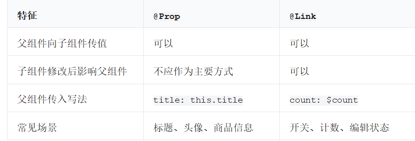
不要因为 @Link 强大就到处使用。状态共享越多,数据流越难追踪。能用 @Prop 展示时,就用 @Prop。
11. 事件回调:子组件把"发生了什么"通知父组件
有时父组件拥有数据,子组件不直接修改数据,只负责在用户操作后通知父组件。
例如:任务项上的"删除"按钮。子组件知道"用户点击了删除",但真正从列表删除哪个任务,应该由父组件统一处理。
可以将函数作为参数传给子组件。
arkts
interface Todo {
  id: number;
  title: string;
  done: boolean;
}

@Component
struct TodoRow {
  @Prop todo: Todo = { id: 0, title: '', done: false }
  onDelete: (id: number) => void = () => {}

  build() {
    Row({ space: 12 }) {
      Text(this.todo.title)
        .layoutWeight(1)
        .fontSize(17)

      Button('删除')
        .fontSize(14)
        .backgroundColor('#F53F3F')
        .onClick(() => {
          this.onDelete(this.todo.id);
        })
    }
    .width('100%')
    .padding(14)
    .backgroundColor('#F7F8FA')
    .borderRadius(10)
  }
}
父组件:
arkts
@Entry
@Component
struct Index {
  @State todos: Todo[] = [
    { id: 1, title: '完成组件学习', done: false },
    { id: 2, title: '练习自定义组件', done: false }
  ]

  build() {
    Column({ space: 10 }) {
      ForEach(this.todos, (item: Todo) => {
        TodoRow({
          todo: item,
          onDelete: (id: number) => {
            this.todos = this.todos.filter((todo: Todo) => todo.id !== id);
          }
        })
      }, (item: Todo) => item.id.toString())
    }
    .padding(20)
  }
}
这个模式很重要:
父组件:拥有列表数据,负责修改数据
      ↓
子组件:展示一项,接收用户点击
      ↓
子组件调用 onDelete(id)
      ↓
父组件收到通知,更新 @State todos
      ↓
页面自动刷新
它通常比让每一层都能随意改父组件数据更清晰。
12. @Builder:把一段可复用 UI 写成构建函数
有时一段 UI 很小,只在当前组件中复用,不值得单独定义完整 @Component。这时可以使用 @Builder。
arkts
@Entry
@Component
struct Index {
  @State count: number = 0

  @Builder
  private buildSectionTitle(title: string): void {
    Text(title)
      .fontSize(20)
      .fontWeight(FontWeight.Bold)
      .width('100%')
      .margin({ top: 12, bottom: 8 })
  }

  build() {
    Column() {
      this.buildSectionTitle('学习进度')
      Text(`已完成 ${this.count} 个练习`)

      this.buildSectionTitle('操作')
      Button('+1')
        .onClick(() => {
          this.count++;
        })
    }
    .padding(20)
  }
}
12.1 @Builder 和自定义组件如何选
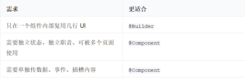
可以简单记住:
@Builder 是页面内部的小模板。
@Component 是可以独立使用的完整积木。
13. @BuilderParam:让父组件传入一块自定义 UI
有些组件需要预留一块区域,让使用它的父组件决定里面放什么。比如通用卡片:
• 卡片有统一圆角、边距、背景。
• 卡片内容由使用者决定。
• 有的卡片放文字,有的卡片放按钮,有的卡片放表单。
这就是 @BuilderParam 的典型场景。
arkts
@Component
struct CommonCard {
  @BuilderParam content: () => void = this.defaultContent

  @Builder
  private defaultContent(): void {
    Text('这里还没有放内容')
      .fontColor('#999999')
  }

  build() {
    Column() {
      this.content()
    }
    .width('100%')
    .padding(16)
    .backgroundColor('#F7F8FA')
    .borderRadius(12)
  }
}
使用时传入一段 UI:
arkts
@Entry
@Component
struct Index {
  build() {
    Column({ space: 12 }) {
      CommonCard({
        content: () => {
          Column({ space: 8 }) {
            Text('学习提醒')
              .fontSize(18)
              .fontWeight(FontWeight.Bold)

            Text('今天完成"自定义组件"这一节练习。')
              .fontColor('#666666')
          }
        }
      })

      CommonCard({
        content: () => {
          Row() {
            Text('当前进度:60%')
              .layoutWeight(1)

            Button('继续学习')
          }
          .width('100%')
        }
      })
    }
    .padding(20)
  }
}
可以把 @BuilderParam 理解为组件的"内容插槽":
CommonCard 负责卡片外壳
父组件负责卡片里面的具体内容
初学阶段,你不必一开始就在所有组件中使用它;先掌握它能解决"同样外壳,不同内容"的问题即可。
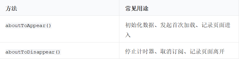
14. 生命周期:组件在什么时候开始和结束
组件在显示到页面前后,或即将消失时,会经历一些生命周期阶段。初学阶段最常使用下面两个:
arkts
@Component
struct LifecycleExample {
  aboutToAppear(): void {
    console.info('组件即将显示到页面上');
  }

  aboutToDisappear(): void {
    console.info('组件即将从页面上消失');
  }

  build() {
    Text('打开日志查看生命周期输出')
  }
}
示例:
arkts
@Entry
@Component
struct Index {
  @State message: string = '尚未初始化'

  aboutToAppear(): void {
    this.message = '页面已经完成初始化';
  }

  build() {
    Text(this.message)
      .fontSize(20)
      .padding(20)
  }
}
注意:不要在 build() 中无条件修改 @State,否则可能造成反复刷新。初始化、数据加载等逻辑更适合放到生命周期方法或用户事件中。
15. 组件拆分的实战方法
假设你要做一个"学习中心"页面。不要一开始写一个 300 行的 Index。先按职责拆分:
LearningHomePage
├── PageHeader            页面标题和欢迎语
├── ProgressCard          学习进度
├── CourseList            课程列表
│   └── CourseItem        单个课程行
└── EmptyState            没有课程时的提示
15.1 拆分时问四个问题
- 这块 UI 是否有自己的明确名称?
- 它是否会复用?
- 它的数据是谁拥有?
- 它的用户操作应该通知谁?
例如 CourseItem:
• 名称明确:一条课程记录。
• 会复用:每门课程都需要显示。
• 数据归属:课程数组应由 CourseList 或页面拥有。
• 用户操作:点击"完成"后通知父组件更新课程数组。
15.2 推荐的数据流方向
推荐保持单向数据流:
父组件状态
    ↓ 通过 @Prop 传给子组件
子组件展示数据
    ↓ 通过回调通知操作
父组件更新 @State
    ↓
页面和子组件自动刷新
这种方式在项目变大后尤其重要:你能快速知道"数据从哪里来、谁能改、为什么改"。
16. 完整可运行示例一:课程卡片与组件传参
这个示例练习:
• 自定义组件 CourseCard
• @Prop 传入字符串、数字、布尔值
• 子组件通过回调通知父组件
• 父组件用 @State 管理课程列表
• ForEach 渲染多个组件
将以下代码完整替换 entry/src/main/ets/pages/Index.ets 后运行:
arkts
interface Course {
  id: number;
  title: string;
  description: string;
  lessonCount: number;
  finished: boolean;
}

@Component
struct CourseCard {
  @Prop course: Course = {
    id: 0,
    title: '',
    description: '',
    lessonCount: 0,
    finished: false
  }

  onToggleFinished: (id: number) => void = () => {}

  build() {
    Column({ space: 10 }) {
      Row() {
        Column({ space: 4 }) {
          Text(this.course.title)
            .fontSize(19)
            .fontWeight(FontWeight.Bold)
            .fontColor('#222222')

          Text(this.course.description)
            .fontSize(14)
            .fontColor('#666666')
            .maxLines(2)
            .textOverflow({ overflow: TextOverflow.Ellipsis })
        }
        .layoutWeight(1)
        .alignItems(HorizontalAlign.Start)

        Text(this.course.finished ? '已完成' : '学习中')
          .fontSize(13)
          .fontColor(this.course.finished ? '#2E8B57' : '#E67E22')
          .backgroundColor(this.course.finished ? '#E8F7EE' : '#FFF3E0')
          .padding({ left: 8, right: 8, top: 4, bottom: 4 })
          .borderRadius(8)
      }
      .width('100%')
      .alignItems(VerticalAlign.Top)

      Divider()
        .color('#E5E6EB')

      Row() {
        Text(`共 ${this.course.lessonCount} 节课`)
          .fontSize(14)
          .fontColor('#666666')
          .layoutWeight(1)

        Button(this.course.finished ? '重新学习' : '标记完成')
          .fontSize(14)
          .onClick(() => {
            this.onToggleFinished(this.course.id);
          })
      }
      .width('100%')
      .alignItems(VerticalAlign.Center)
    }
    .width('100%')
    .padding(16)
    .backgroundColor('#F7F8FA')
    .borderRadius(14)
  }
}

@Entry
@Component
struct Index {
  @State courses: Course[] = [
    {
      id: 1,
      title: 'ArkTS 基础语法',
      description: '变量、类型、函数、数组和对象。',
      lessonCount: 12,
      finished: true
    },
    {
      id: 2,
      title: 'ArkUI 基础组件',
      description: 'Text、Button、输入框与基础布局。',
      lessonCount: 10,
      finished: false
    },
    {
      id: 3,
      title: '自定义组件',
      description: '组件拆分、参数传递与状态管理。',
      lessonCount: 8,
      finished: false
    }
  ]

  build() {
    Column({ space: 16 }) {
      Text('我的鸿蒙学习课程')
        .fontSize(26)
        .fontWeight(FontWeight.Bold)
        .width('100%')

      Text(`已完成 ${this.getFinishedCount()} / ${this.courses.length} 门课程`)
        .fontSize(15)
        .fontColor('#666666')
        .width('100%')

      List({ space: 12 }) {
        ForEach(this.courses, (course: Course) => {
          ListItem() {
            CourseCard({
              course: course,
              onToggleFinished: (id: number) => {
                this.toggleCourseFinished(id);
              }
            })
          }
        }, (course: Course) => course.id.toString())
      }
      .width('100%')
      .layoutWeight(1)
    }
    .width('100%')
    .height('100%')
    .padding(20)
  }

  private getFinishedCount(): number {
    return this.courses.filter((course: Course) => course.finished).length;
  }

  private toggleCourseFinished(id: number): void {
    this.courses = this.courses.map((course: Course) => {
      if (course.id === id) {
        return {
          id: course.id,
          title: course.title,
          description: course.description,
          lessonCount: course.lessonCount,
          finished: !course.finished
        };
      }
      return course;
    });
  }
}
16.1 这个示例的重点
CourseCard 不保存全部课程列表,它只接收一门课程:
@Prop course: Course课程列表由页面 Index 保存:
@State courses: Course[] = [...]卡片上的按钮并不直接修改列表,而是调用回调:
this.onToggleFinished(this.course.id);父组件收到 id 后更新自己的状态:
this.toggleCourseFinished(id);这就是"父组件拥有数据,子组件负责展示与通知"的常用结构。
17. 完整可运行示例二:可复用计数器与 @Link
这个示例练习:
• 父组件的 @State
• 子组件的 @Link
• 同一个计数器组件复用两次
• 组件的内部状态与父组件共享状态的差异
将以下代码完整替换 entry/src/main/ets/pages/Index.ets 后运行:
arkts
@Component
struct QuantityStepper {
  @Prop title: string = '数量'
  @Link value: number

  build() {
    Column({ space: 10 }) {
      Text(this.title)
        .fontSize(17)
        .fontWeight(FontWeight.Medium)
        .width('100%')

      Row({ space: 16 }) {
        Button('-')
          .width(44)
          .height(40)
          .fontSize(20)
          .onClick(() => {
            if (this.value > 0) {
              this.value--;
            }
          })

        Text(`${this.value}`)
          .fontSize(24)
          .fontWeight(FontWeight.Bold)
          .width(56)
          .textAlign(TextAlign.Center)

        Button('+')
          .width(44)
          .height(40)
          .fontSize(20)
          .onClick(() => {
            this.value++;
          })
      }
      .width('100%')
      .justifyContent(FlexAlign.Center)
      .alignItems(VerticalAlign.Center)
    }
    .width('100%')
    .padding(16)
    .backgroundColor('#F7F8FA')
    .borderRadius(12)
  }
}

@Entry
@Component
struct Index {
  @State completedCount: number = 0
  @State practiceCount: number = 0

  build() {
    Column({ space: 16 }) {
      Text('使用 @Link 的计数器')
        .fontSize(26)
        .fontWeight(FontWeight.Bold)
        .width('100%')

      Text(`总练习数:${this.completedCount + this.practiceCount}`)
        .fontSize(18)
        .fontColor('#0A59F7')
        .width('100%')

      QuantityStepper({
        title: '已完成课程数',
        value: $completedCount
      })

      QuantityStepper({
        title: '今日练习题数',
        value: $practiceCount
      })

      Text('两个子组件各自修改的值,会立刻同步回父组件。')
        .fontSize(14)
        .fontColor('#666666')
        .width('100%')
        .margin({ top: 8 })
    }
    .width('100%')
    .height('100%')
    .padding(20)
    .justifyContent(FlexAlign.Center)
  }
}
17.1 为什么 @Link 示例中父组件能同步更新
@State completedCount: number = 0这是父组件真正拥有的数据。
@Link value: number这是子组件连接到父组件数据的入口。
QuantityStepper({
  value: $completedCount
})
$completedCount 把可变状态连接给子组件。于是子组件执行:
this.value++;
父组件的 completedCount 也随之变化,父组件中"总练习数"自动更新。
18. 完整可运行示例三:通用卡片与 @BuilderParam
这个示例练习:
• 用 @BuilderParam 创建可复用卡片外壳。
• 父组件向卡片中传不同 UI。
• 用 @Builder 提取页面内部小片段。
将以下代码完整替换 entry/src/main/ets/pages/Index.ets 后运行:
arkts
@Component
struct SectionCard {
  @Prop title: string = ''
  @BuilderParam content: () => void = this.defaultContent

  @Builder
  private defaultContent(): void {
    Text('暂无内容')
      .fontSize(14)
      .fontColor('#999999')
  }

  build() {
    Column({ space: 12 }) {
      Text(this.title)
        .fontSize(19)
        .fontWeight(FontWeight.Bold)
        .width('100%')

      Divider()
        .color('#E5E6EB')

      this.content()
    }
    .width('100%')
    .padding(16)
    .backgroundColor('#F7F8FA')
    .borderRadius(14)
  }
}

@Entry
@Component
struct Index {
  @State name: string = '小明'
  @State learningMinutes: number = 20

  @Builder
  private progressRow(label: string, value: string): void {
    Row() {
      Text(label)
        .fontSize(15)
        .fontColor('#666666')
        .layoutWeight(1)

      Text(value)
        .fontSize(16)
        .fontWeight(FontWeight.Medium)
        .fontColor('#222222')
    }
    .width('100%')
  }

  build() {
    Scroll() {
      Column({ space: 16 }) {
        Text('我的学习面板')
          .fontSize(26)
          .fontWeight(FontWeight.Bold)
          .width('100%')

        SectionCard({
          title: '个人信息',
          content: () => {
            Column({ space: 10 }) {
              TextInput({ placeholder: '请输入姓名', text: this.name })
                .onChange((value: string) => {
                  this.name = value;
                })

              Text(`你好,${this.name.length > 0 ? this.name : '同学'}!`)
                .fontSize(18)
                .fontColor('#0A59F7')
            }
            .width('100%')
          }
        })

        SectionCard({
          title: '今日进度',
          content: () => {
            Column({ space: 12 }) {
              this.progressRow('学习时长', `${this.learningMinutes} 分钟`)
              this.progressRow('学习主题', 'ArkUI 组件化')
              this.progressRow('下一步', '练习组件传参')

              Row({ space: 10 }) {
                Button('减少 5 分钟')
                  .layoutWeight(1)
                  .onClick(() => {
                    if (this.learningMinutes >= 5) {
                      this.learningMinutes -= 5;
                    }
                  })

                Button('增加 5 分钟')
                  .layoutWeight(1)
                  .onClick(() => {
                    this.learningMinutes += 5;
                  })
              }
              .width('100%')
            }
            .width('100%')
          }
        })

        SectionCard({
          title: '学习建议',
          content: () => {
            Text('先完成一个小页面,再把其中重复的区域抽成组件。每次拆分后都运行验证,逐步体会组件之间的数据流。')
              .fontSize(15)
              .lineHeight(24)
              .fontColor('#555555')
              .width('100%')
          }
        })
      }
      .width('100%')
      .padding(20)
    }
    .width('100%')
    .height('100%')
  }
}
19. 组件设计的常见错误与改进
19.1 错误:子组件直接承担全部业务数据
不推荐让每一个卡片都各自保存一份课程列表:
// 错误思路示意:每个卡片都各自拥有完整列表
// @State courses: Course[] = [...]
改进:列表属于页面或列表容器;单个卡片只接收自己需要的那一项:
@Prop course: Course19.2 错误:所有代码堆在一个巨大的 build() 中
现象:
• 页面代码几百行。
• 同一套卡片样式复制多次。
• 修改一处时很容易漏改另一处。
改进:
重复 UI → @Component
本页面内部的小片段 → @Builder
同外壳、不同内容 → @BuilderParam
19.3 错误:组件名描述的是外观,不是职责
不够清楚:
// Box、Card2、BlueView更清楚:
// UserProfileCard、LearningProgress、TodoRow
"蓝色"会变,"卡片 2"也没有业务含义;职责名称更稳定。
19.4 错误:为了改数据而到处使用 @Link
@Link 很方便,但会扩大可修改状态的范围。优先使用如下方式:
子组件展示数据:@Prop
子组件发生操作:回调函数通知父组件
父组件修改 @State:统一更新
只有当子组件确实需要直接双向编辑某个状态时,再使用 @Link。
19.5 错误:列表 ForEach 的键不稳定
不推荐在可增删排序的业务列表中用索引做唯一标识:
// 不推荐示意
// (item: Todo, index: number) => index.toString()
推荐使用业务唯一 id:
(item: Todo) => item.id.toString()19.6 错误:在 build() 中修改状态
不要这样做:
build() {
  // 错误示意:每次构建都改状态,容易反复刷新
  // this.count++;

  Text(`${this.count}`)
}
改在用户事件或生命周期里:
arlts
Button('+1')
  .onClick(() => {
    this.count++;
  })