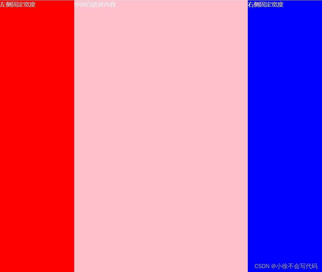
双飞翼布局是一种经典的CSS布局模式,主要用于实现左右两列固定宽度,中间列自适应的布局。
比如:写一个左中右布局占满全屏,其中左、右两块固定宽 200px,中间自适应,要求先加载中间块。
html
<!DOCTYPE html>
<html lang="en">
<head>
    <meta charset="UTF-8">
    <meta name="viewport" content="width=device-width, initial-scale=1.0">
    <title>双飞翼布局</title>
    <style>
      * {
        margin: 0;
        padding: 0;
      }
      body {
        width: 100vw;
        height: 100vh;
        color: #fff;
      }
        /* 内容区域 */
        .container > div {
          float: left;
        }

        /* 左侧栏 */
        .left {
          width: 200px;
          height: 100vh;
          margin-left: -100%;
          background-color: red;
        }

        /* 右侧栏 */
        .right {
          width: 200px;
          height: 100vh;
          margin-left: -200px;
          background-color: blue;
        }

        /* 中间栏 */
        .middle {
          width: 100%;
          height: 100vh;
          background-color: pink;
        }
        .main {
          padding: 0 200px;
        }
    </style>
</head>
<body>
  <!-- 双飞翼布局 -->
    <div class="container">
        <div class="middle">
          <div class="main">中间自适应内容</div>
        </div>
        <div class="left">左侧固定宽度</div>
        <div class="right">右侧固定宽度</div>
    </div>
</body>
</html>
左右 200px 中间自适应