自定义tabBar注意事项:
- 在自定义 tabBar 模式下 ,为了保证低版本兼容以及区分哪些页面是 tab 页,app.json文件中 tabBar 的相关配置项需完整声明,但这些字段不会作用于自定义 tabBar 的渲染。
- 所有 tabBar 的样式都由该自定义组件渲染。推荐用 fixed 在底部的 cover-view + cover-image 组件渲染样式,以保证 tabBar 层级相对较高。(不使用也没关系)
- 与 tabBar 样式相关的接口,如 wx.setTabBarItem 等将失效。
- 每个 tab 页下的自定义 tabBar 组件实例是不同的 ,可通过自定义组件下的**
getTabBar接口** ,获取当前页面的自定义 tabBar 组件实例。例如:如需实现 tab 选中态,要在当前页面下,通过getTabBar接口获取组件实例,并调用 setData 更新选中态。
实现步骤:
1. 配置信息
-
在
app.json中的tabBar项指定custom字段值为 true ,同时其余tabBar相关配置也补充完整。 -
所有 tab 页的 json 里需声明
usingComponents项,也可以在app.json全局开启。 -
代码示例 ( app.json中的配置项):
javascript"tabBar": { "custom": true, "color": "#000000", "selectedColor": "#CBB486", "borderStyle": "white", "list": [ { "pagePath": "pages/member-announce/index", "text": "公告", "iconPath": "/public/img/icon-announce.png", "selectedIconPath": "/public/img/icon-announce-selected.png" }, { "pagePath": "pages/member-operation/index", "text": "活动", "iconPath": "/public/img/icon-operation.png", "selectedIconPath": "/public/img/icon-operation-selected.png" }, { "pagePath": "pages/space-map/index", "text": "空间", "iconPath": "/public/img/icon-spaceNew.png", "selectedIconPath": "/public/img/icon-space-selectedNew.png" }, { "pagePath": "pages/member-center/index", "text": "我的", "iconPath": "/public/img/icon-centerNew.png", "selectedIconPath": "/public/img/icon-center-selectedNew.png" } ] },
其中 iconPath 代表未被选中时的 icon 图标,selectedIconPath 代表当前被选中时的 icon图标。
2. 添加 tabBar 代码文件
- 在代码根目录下添加入口文件
- 文件名必须为custom-tab-bar
- 必须在根目录处添加(与page文件同级)
javascript
custom-tab-bar/index.js
custom-tab-bar/index.json
custom-tab-bar/index.wxml
custom-tab-bar/index.wxss
3. 编写tabBar代码
用自定义组件的方式 编写即可,该自定义组件完全接管 tabBar 的渲染。另外,自定义组件新增 getTabBar 接口,可获取当前页面下的自定义 tabBar 组件实例。
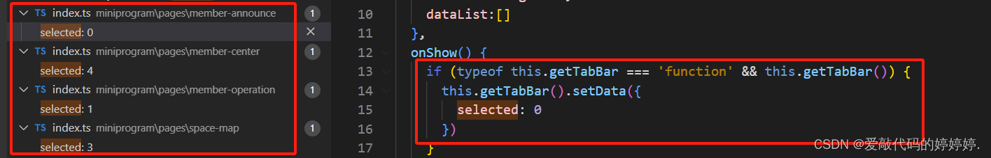
4. 实现tabBar选中态:
在 tabBar 所在页面的 js或ts 文件中的onShow方法写入:
javascript
onShow() {
    if (typeof this.getTabBar === 'function' && this.getTabBar()) {
      this.getTabBar().setData({
        selected: 0 // 当前页面所在数据的索引值
      })
    }
  },
大家可根据上述步骤一步步实现,下面是我的代码demo。先配置好上述步骤中标红的1、2,再赋值下面代码,最后再在每个tabBar所在的页面配置好选中态,再根据项目需求调整即可。
自定义 tabBar 代码示例分享:
custom-tab-bar文件中的index.wxml:
javascript
<view class="tab-bar">
  <view wx:for="{{list}}" wx:key="index" class="tab-bar-item {{item.bulge?'bulge':''}}" data-path="{{item.pagePath}}" data-index="{{index}}" bindtap="switchTab">
    <view wx:if="{{item.bulge}}" class="tab-bar-bulge tab-bar-view"></view>
    <image class="image" src="{{selected === index ? item.selectedIconPath : item.iconPath}}"></image>
    <view wx:if="{{item.text}}" style="color: {{selected === index ? selectedColor : color}}" class="tab-bar-view">{{item.text}}</view>
  </view>
</view>
custom-tab-bar文件中的index.ts:(我这里用的是ts,用js的伙伴稍微改一下类型就可以)
TypeScript
Component({
  data: {
    color: "#545454",
    selectedColor: "#CBB486",
    backgroundColor: "#fff",
    list:[
      {
        pagePath: "/pages/member-announce/index",
        text: "公告",
        iconPath: "/public/img/icon-announce.png",
        selectedIconPath: "/public/img/icon-announce-selected.png"
      },
      {
        pagePath: "/pages/member-operation/index",
        text: "活动",
        iconPath: "/public/img/icon-operation.png",
        selectedIconPath: "/public/img/icon-operation-selected.png"
      },
      {
        pagePath: "",
        bulge: true,
        iconPath: "/public/img/icon-chat-ai.png",
        selectedIconPath: "/public/img/icon-chat-ai.png"
      },
      {
        pagePath: "/pages/space-map/index",
        text: "空间",
        iconPath: "/public/img/icon-spaceNew.png",
        selectedIconPath: "/public/img/icon-space-selectedNew.png"
      },
      {
        pagePath: "/pages/member-center/index",
        text: "我的",
        iconPath: "/public/img/icon-centerNew.png",
        selectedIconPath: "/public/img/icon-center-selectedNew.png"
      },
    ],
  },
  methods: {
    switchTab(e: { currentTarget: { dataset: any } }) {
      const data = e.currentTarget.dataset
      const url = data.path
      if (url === '') {
        const token = wx.getStorageSync("token");
        wx.navigateTo({ url: token ? "/pages/member-chat-ai/index" : "/pages/login/index" });
      } else {
        console.log(url);
        wx.switchTab({ url });
      }
    }
  }
})
custom-tab-bar文件中的index.wxss:
TypeScript
.tab-bar {
  position: fixed;
  bottom: 0;
  left: 0;
  right: 0;
  /* 兼容 iOS < 11.2 */
  height: calc(96rpx + constant(safe-area-inset-bottom));
  /* 兼容 iOS >= 11.2 */
  height: calc(96rpx + env(safe-area-inset-bottom));
  background: #fff;
  display: flex;
  box-shadow: 0px -10rpx 12rpx rgba(0, 0, 0, 0.08);
}

.tab-bar-item {
  flex: 1;
  text-align: center;
  display: flex;
  justify-content: center;
  align-items: center;
  flex-direction: column;
}

.tab-bar-item .image {
  width: 48rpx;
  height: 48rpx;
}

.bulge {
  background-color: #fff;
}

.bulge .image {
  position: absolute;
  width: 96rpx;
  height: 96rpx;
  top: 13rpx;
}

.tab-bar-item .tab-bar-view {
  font-size: 20rpx;
}
custom-tab-bar文件中的index.json:
TypeScript
{
  "component": true
}
不要忘记设置选中态:
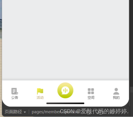
底部效果如图: