Qt Quick Extras Examples
阅读官方的源码然后尝试做了下
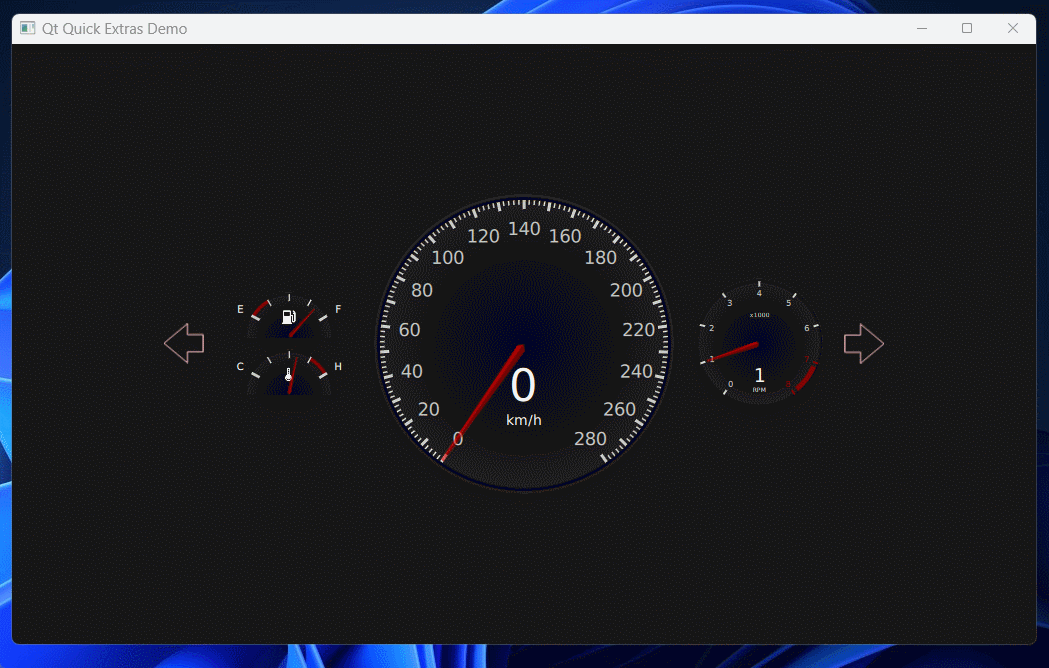
01 A car dashboard
-
样例演示:
-
-
说明:
ValueSource组件控制数值相关的动画,例如图中数值的变化;TurnIndicator组件是控制左右方向灯的闪烁和背景,里面使用了Canvas来绘制样式;IconGaugeStyle是对DashboardGaugeStyle的封装,里面绘制了带图标仪表盘的样式,用于左边油量表和水温表的样式;DashboardGaugeStyle是对CircularGaugeStyle的封装,用于中间的速度仪表的样式;TachometerStyle是对DashboardGaugeStyle的封装,用于右边转速表的样式;
具体代码:
TestExtrasDashboard.qml:
js
import QtQuick 2.2
import QtQuick.Controls 1.4
import QtQuick.Controls.Styles 1.4
import QtQuick.Extras 1.4

import "./Component"

Rectangle {
    id: root
    width: 1024
    height: 600

    color: "#161616"

    ValueSource {
        id: valueSource
    }

    // Dashboards are typically in a landscape orientation, so we need to ensure
    // our height is never greater than our width.
    Item {
        id: container
        width: root.width
        height: Math.min(root.width, root.height)
        anchors.centerIn: parent

        Row {
            id: gaugeRow
            spacing: container.width * 0.02
            anchors.centerIn: parent

            TurnIndicator {
                id: leftIndicator
                anchors.verticalCenter: parent.verticalCenter
                width: height
                height: container.height * 0.1 - gaugeRow.spacing

                direction: Qt.LeftArrow
                on: valueSource.turnSignal === Qt.LeftArrow
            }

            Item {
                width: height
                height: container.height * 0.25 - gaugeRow.spacing
                anchors.verticalCenter: parent.verticalCenter

                CircularGauge {
                    id: fuelGauge
                    value: valueSource.fuel
                    maximumValue: 1
                    y: parent.height / 2 - height / 2 - container.height * 0.01
                    width: parent.width
                    height: parent.height * 0.7

                    style: IconGaugeStyle {
                        id: fuelGaugeStyle

                        icon: "qrc:/Icons/Used_Images/Icons/02_10-fuel-icon.png"
                        minWarningColor: Qt.rgba(0.5, 0, 0, 1)

                        tickmarkLabel: Text {
                            color: "white"
                            visible: styleData.value === 0 || styleData.value === 1
                            font.pixelSize: fuelGaugeStyle.toPixels(0.225)
                            text: styleData.value === 0 ? "E" : (styleData.value === 1 ? "F" : "")
                        }
                    }
                }

                CircularGauge {
                    value: valueSource.temperature
                    maximumValue: 1
                    width: parent.width
                    height: parent.height * 0.7
                    y: parent.height / 2 + container.height * 0.01

                    style: IconGaugeStyle {
                        id: tempGaugeStyle

                        icon: "qrc:/Icons/Used_Images/Icons/03_10-temperature-icon.png"
                        maxWarningColor: Qt.rgba(0.5, 0, 0, 1)

                        tickmarkLabel: Text {
                            color: "white"
                            visible: styleData.value === 0 || styleData.value === 1
                            font.pixelSize: tempGaugeStyle.toPixels(0.225)
                            text: styleData.value === 0 ? "C" : (styleData.value === 1 ? "H" : "")
                        }
                    }
                }
            }

            CircularGauge {
                id: speedometer
                value: valueSource.kph
                anchors.verticalCenter: parent.verticalCenter
                maximumValue: 280
                // We set the width to the height, because the height will always be
                // the more limited factor. Also, all circular controls letterbox
                // their contents to ensure that they remain circular. However, we
                // don't want to extra space on the left and right of our gauges,
                // because they're laid out horizontally, and that would create
                // large horizontal gaps between gauges on wide screens.
                width: height
                height: container.height * 0.5

                style: DashboardGaugeStyle {}
            }

            CircularGauge {
                id: tachometer
                width: height
                height: container.height * 0.25 - gaugeRow.spacing
                value: valueSource.rpm
                maximumValue: 8
                anchors.verticalCenter: parent.verticalCenter

                style: TachometerStyle {}
            }

            TurnIndicator {
                id: rightIndicator
                anchors.verticalCenter: parent.verticalCenter
                width: height
                height: container.height * 0.1 - gaugeRow.spacing

                direction: Qt.RightArrow
                on: valueSource.turnSignal === Qt.RightArrow
            }
        }
    }
}DashboardGaugeStyle.qml:
js
import QtQuick 2.2
import QtQuick.Controls.Styles 1.4

CircularGaugeStyle {
    tickmarkInset: toPixels(0.04)
    minorTickmarkInset: tickmarkInset
    labelStepSize: 20
    labelInset: toPixels(0.23)

    property real xCenter: outerRadius
    property real yCenter: outerRadius
    property real needleLength: outerRadius - tickmarkInset * 1.25
    property real needleTipWidth: toPixels(0.02)
    property real needleBaseWidth: toPixels(0.06)
    property bool halfGauge: false

    function toPixels(percentage) {
        return percentage * outerRadius;
    }

    function degToRad(degrees) {
        return degrees * (Math.PI / 180);
    }

    function radToDeg(radians) {
        return radians * (180 / Math.PI);
    }

    function paintBackground(ctx) {
        if (halfGauge) {
            ctx.beginPath();
            ctx.rect(0, 0, ctx.canvas.width, ctx.canvas.height / 2);
            ctx.clip();
        }

        ctx.beginPath();
        ctx.fillStyle = "black";
        ctx.ellipse(0, 0, ctx.canvas.width, ctx.canvas.height);
        ctx.fill();

        ctx.beginPath();
        ctx.lineWidth = tickmarkInset;
        ctx.strokeStyle = "black";
        ctx.arc(xCenter, yCenter, outerRadius - ctx.lineWidth / 2, outerRadius - ctx.lineWidth / 2, 0, Math.PI * 2);
        ctx.stroke();

        ctx.beginPath();
        ctx.lineWidth = tickmarkInset / 2;
        ctx.strokeStyle = "#222";
        ctx.arc(xCenter, yCenter, outerRadius - ctx.lineWidth / 2, outerRadius - ctx.lineWidth / 2, 0, Math.PI * 2);
        ctx.stroke();

        ctx.beginPath();
        var gradient = ctx.createRadialGradient(xCenter, yCenter, 0, xCenter, yCenter, outerRadius * 1.5);
        gradient.addColorStop(0, Qt.rgba(1, 1, 1, 0));
        gradient.addColorStop(0.7, Qt.rgba(1, 1, 1, 0.13));
        gradient.addColorStop(1, Qt.rgba(1, 1, 1, 1));
        ctx.fillStyle = gradient;
        ctx.arc(xCenter, yCenter, outerRadius - tickmarkInset, outerRadius - tickmarkInset, 0, Math.PI * 2);
        ctx.fill();
    }

    background: Canvas {
        onPaint: {
            var ctx = getContext("2d");
            ctx.reset();
            paintBackground(ctx);
        }

        Text {
            id: speedText
            font.pixelSize: toPixels(0.3)
            text: kphInt
            color: "white"
            horizontalAlignment: Text.AlignRight
            anchors.horizontalCenter: parent.horizontalCenter
            anchors.top: parent.verticalCenter
            anchors.topMargin: toPixels(0.1)

            readonly property int kphInt: control.value
        }
        Text {
            text: "km/h"
            color: "white"
            font.pixelSize: toPixels(0.09)
            anchors.top: speedText.bottom
            anchors.horizontalCenter: parent.horizontalCenter
        }
    }

    needle: Canvas {
        implicitWidth: needleBaseWidth
        implicitHeight: needleLength

        property real xCenter: width / 2
        property real yCenter: height / 2

        onPaint: {
            var ctx = getContext("2d");
            ctx.reset();

            ctx.beginPath();
            ctx.moveTo(xCenter, height);
            ctx.lineTo(xCenter - needleBaseWidth / 2, height - needleBaseWidth / 2);
            ctx.lineTo(xCenter - needleTipWidth / 2, 0);
            ctx.lineTo(xCenter, yCenter - needleLength);
            ctx.lineTo(xCenter, 0);
            ctx.closePath();
            ctx.fillStyle = Qt.rgba(0.66, 0, 0, 0.66);
            ctx.fill();

            ctx.beginPath();
            ctx.moveTo(xCenter, height)
            ctx.lineTo(width, height - needleBaseWidth / 2);
            ctx.lineTo(xCenter + needleTipWidth / 2, 0);
            ctx.lineTo(xCenter, 0);
            ctx.closePath();
            ctx.fillStyle = Qt.lighter(Qt.rgba(0.66, 0, 0, 0.66));
            ctx.fill();
        }
    }

    foreground: null
}IconGaugeStyle.qml:
js
import QtQuick 2.2
import QtQuick.Controls.Styles 1.4
import QtQuick.Extras 1.4

DashboardGaugeStyle {
    id: fuelGaugeStyle
    minimumValueAngle: -60
    maximumValueAngle: 60
    tickmarkStepSize: 1
    labelStepSize: 1
    labelInset: toPixels(-0.25)
    minorTickmarkCount: 3

    needleLength: toPixels(0.85)
    needleBaseWidth: toPixels(0.08)
    needleTipWidth: toPixels(0.03)

    halfGauge: true

    property string icon: ""
    property color minWarningColor: "transparent"
    property color maxWarningColor: "transparent"
    readonly property real minWarningStartAngle: minimumValueAngle - 90
    readonly property real maxWarningStartAngle: maximumValueAngle - 90

    tickmark: Rectangle {
        implicitWidth: toPixels(0.06)
        antialiasing: true
        implicitHeight: toPixels(0.2)
        color: "#c8c8c8"
    }

    minorTickmark: Rectangle {
        implicitWidth: toPixels(0.03)
        antialiasing: true
        implicitHeight: toPixels(0.15)
        color: "#c8c8c8"
    }

    background: Item {
        Canvas {
            anchors.fill: parent
            onPaint: {
                var ctx = getContext("2d");
                ctx.reset();

                paintBackground(ctx);

                if (minWarningColor != "transparent") {
                    ctx.beginPath();
                    ctx.lineWidth = fuelGaugeStyle.toPixels(0.08);
                    ctx.strokeStyle = minWarningColor;
                    ctx.arc(outerRadius, outerRadius,
                        // Start the line in from the decorations, and account for the width of the line itself.
                        outerRadius - tickmarkInset - ctx.lineWidth / 2,
                        degToRad(minWarningStartAngle),
                        degToRad(minWarningStartAngle + angleRange / (minorTickmarkCount + 1)), false);
                    ctx.stroke();
                }
                if (maxWarningColor != "transparent") {
                    ctx.beginPath();
                    ctx.lineWidth = fuelGaugeStyle.toPixels(0.08);
                    ctx.strokeStyle = maxWarningColor;
                    ctx.arc(outerRadius, outerRadius,
                        // Start the line in from the decorations, and account for the width of the line itself.
                        outerRadius - tickmarkInset - ctx.lineWidth / 2,
                        degToRad(maxWarningStartAngle - angleRange / (minorTickmarkCount + 1)),
                        degToRad(maxWarningStartAngle), false);
                    ctx.stroke();
                }
            }
        }

        Image {
            source: icon
            anchors.bottom: parent.verticalCenter
            anchors.bottomMargin: toPixels(0.3)
            anchors.horizontalCenter: parent.horizontalCenter
            width: toPixels(0.3)
            height: width
            fillMode: Image.PreserveAspectFit
        }
    }
}TachometerStyle.qml:
js
import QtQuick 2.2
import QtQuick.Controls.Styles 1.4
import QtQuick.Extras 1.4

DashboardGaugeStyle {
    id: tachometerStyle
    tickmarkStepSize: 1
    labelStepSize: 1
    needleLength: toPixels(0.85)
    needleBaseWidth: toPixels(0.08)
    needleTipWidth: toPixels(0.03)

    tickmark: Rectangle {
        implicitWidth: toPixels(0.03)
        antialiasing: true
        implicitHeight: toPixels(0.08)
        color: styleData.index === 7 || styleData.index === 8 ? Qt.rgba(0.5, 0, 0, 1) : "#c8c8c8"
    }

    minorTickmark: null

    tickmarkLabel: Text {
        font.pixelSize: Math.max(6, toPixels(0.12))
        text: styleData.value
        color: styleData.index === 7 || styleData.index === 8 ? Qt.rgba(0.5, 0, 0, 1) : "#c8c8c8"
        antialiasing: true
    }

    background: Canvas {
        onPaint: {
            var ctx = getContext("2d");
            ctx.reset();
            paintBackground(ctx);

            ctx.beginPath();
            ctx.lineWidth = tachometerStyle.toPixels(0.08);
            ctx.strokeStyle = Qt.rgba(0.5, 0, 0, 1);
            var warningCircumference = maximumValueAngle - minimumValueAngle * 0.1;
            var startAngle = maximumValueAngle - 90;
            ctx.arc(outerRadius, outerRadius,
                // Start the line in from the decorations, and account for the width of the line itself.
                outerRadius - tickmarkInset - ctx.lineWidth / 2,
                degToRad(startAngle - angleRange / 8 + angleRange * 0.015),
                degToRad(startAngle - angleRange * 0.015), false);
            ctx.stroke();
        }

        Text {
            id: rpmText
            font.pixelSize: tachometerStyle.toPixels(0.3)
            text: rpmInt
            color: "white"
            horizontalAlignment: Text.AlignRight
            anchors.horizontalCenter: parent.horizontalCenter
            anchors.top: parent.verticalCenter
            anchors.topMargin: 20

            readonly property int rpmInt: valueSource.rpm
        }
        Text {
            text: "x1000"
            color: "white"
            font.pixelSize: tachometerStyle.toPixels(0.1)
            anchors.top: parent.top
            anchors.topMargin: parent.height / 4
            anchors.horizontalCenter: parent.horizontalCenter
        }
        Text {
            text: "RPM"
            color: "white"
            font.pixelSize: tachometerStyle.toPixels(0.1)
            anchors.top: rpmText.bottom
            anchors.horizontalCenter: parent.horizontalCenter
        }
    }
}TurnIndicator.qml:
js
import QtQuick 2.2

Item {
    // This enum is actually keyboard-related, but it serves its purpose
    // as an indication of direction for us.
    property int direction: Qt.LeftArrow
    property bool on: false

    property bool flashing: false

    scale: direction === Qt.LeftArrow ? 1 : -1
//! [1]
    Timer {
        id: flashTimer
        interval: 500
        running: on
        repeat: true
        onTriggered: flashing = !flashing
    }
//! [1]
//! [2]
    function paintOutlinePath(ctx) {
        ctx.beginPath();
        ctx.moveTo(0, height * 0.5);
        ctx.lineTo(0.6 * width, 0);
        ctx.lineTo(0.6 * width, height * 0.28);
        ctx.lineTo(width, height * 0.28);
        ctx.lineTo(width, height * 0.72);
        ctx.lineTo(0.6 * width, height * 0.72);
        ctx.lineTo(0.6 * width, height);
        ctx.lineTo(0, height * 0.5);
    }
//! [2]
    Canvas {
        id: backgroundCanvas
        anchors.fill: parent

        onPaint: {
            var ctx = getContext("2d");
            ctx.reset();

            paintOutlinePath(ctx);

            ctx.lineWidth = 1;
            ctx.strokeStyle = "pink";
            ctx.stroke();
        }
    }
//! [3]
    Canvas {
        id: foregroundCanvas
        anchors.fill: parent
        visible: on && flashing

        onPaint: {
            var ctx = getContext("2d");
            ctx.reset();

            paintOutlinePath(ctx);

            ctx.fillStyle = "green";
            ctx.fill();
        }
    }
//! [3]
}ValueSource.qml:
js
import QtQuick 2.2
//! [0]
Item {
    id: valueSource
    property real kph: 0
    property real rpm: 1
    property real fuel: 0.85
    property string gear: {
        var g;
        if (kph == 0) {
            return "P";
        }
        if (kph < 30) {
            return "1";
        }
        if (kph < 50) {
            return "2";
        }
        if (kph < 80) {
            return "3";
        }
        if (kph < 120) {
            return "4";
        }
        if (kph < 160) {
            return "5";
        }
    }
    property int turnSignal: gear == "P" && !start ? randomDirection() : -1
    property real temperature: 0.6
    property bool start: true
//! [0]

    function randomDirection() {
        return Math.random() > 0.5 ? Qt.LeftArrow : Qt.RightArrow;
    }

    SequentialAnimation {
        running: true
        loops: 1

        // We want a small pause at the beginning, but we only want it to happen once.
        PauseAnimation {
            duration: 1000
        }

        PropertyAction {
            target: valueSource
            property: "start"
            value: false
        }

        SequentialAnimation {
            loops: Animation.Infinite
//! [1]
            ParallelAnimation {
                NumberAnimation {
                    target: valueSource
                    property: "kph"
                    easing.type: Easing.InOutSine
                    from: 0
                    to: 30
                    duration: 3000
                }
                NumberAnimation {
                    target: valueSource
                    property: "rpm"
                    easing.type: Easing.InOutSine
                    from: 1
                    to: 6.1
                    duration: 3000
                }
            }
//! [1]
            ParallelAnimation {
                // We changed gears so we lost a bit of speed.
                NumberAnimation {
                    target: valueSource
                    property: "kph"
                    easing.type: Easing.InOutSine
                    from: 30
                    to: 26
                    duration: 600
                }
                NumberAnimation {
                    target: valueSource
                    property: "rpm"
                    easing.type: Easing.InOutSine
                    from: 6
                    to: 2.4
                    duration: 600
                }
            }
            ParallelAnimation {
                NumberAnimation {
                    target: valueSource
                    property: "kph"
                    easing.type: Easing.InOutSine
                    to: 60
                    duration: 3000
                }
                NumberAnimation {
                    target: valueSource
                    property: "rpm"
                    easing.type: Easing.InOutSine
                    to: 5.6
                    duration: 3000
                }
            }
            ParallelAnimation {
                // We changed gears so we lost a bit of speed.
                NumberAnimation {
                    target: valueSource
                    property: "kph"
                    easing.type: Easing.InOutSine
                    to: 56
                    duration: 600
                }
                NumberAnimation {
                    target: valueSource
                    property: "rpm"
                    easing.type: Easing.InOutSine
                    to: 2.3
                    duration: 600
                }
            }
            ParallelAnimation {
                NumberAnimation {
                    target: valueSource
                    property: "kph"
                    easing.type: Easing.InOutSine
                    to: 100
                    duration: 3000
                }
                NumberAnimation {
                    target: valueSource
                    property: "rpm"
                    easing.type: Easing.InOutSine
                    to: 5.1
                    duration: 3000
                }
            }
            ParallelAnimation {
                // We changed gears so we lost a bit of speed.
                NumberAnimation {
                    target: valueSource
                    property: "kph"
                    easing.type: Easing.InOutSine
                    to: 96
                    duration: 600
                }
                NumberAnimation {
                    target: valueSource
                    property: "rpm"
                    easing.type: Easing.InOutSine
                    to: 2.2
                    duration: 600
                }
            }

            ParallelAnimation {
                NumberAnimation {
                    target: valueSource
                    property: "kph"
                    easing.type: Easing.InOutSine
                    to: 140
                    duration: 3000
                }
                NumberAnimation {
                    target: valueSource
                    property: "rpm"
                    easing.type: Easing.InOutSine
                    to: 6.2
                    duration: 3000
                }
            }

            // Start downshifting.

            // Fifth to fourth gear.
            ParallelAnimation {
                NumberAnimation {
                    target: valueSource
                    property: "kph"
                    easing.type: Easing.Linear
                    to: 100
                    duration: 5000
                }

                NumberAnimation {
                    target: valueSource
                    property: "rpm"
                    easing.type: Easing.InOutSine
                    to: 3.1
                    duration: 5000
                }
            }

            // Fourth to third gear.
            NumberAnimation {
                target: valueSource
                property: "rpm"
                easing.type: Easing.InOutSine
                to: 5.5
                duration: 600
            }

            ParallelAnimation {
                NumberAnimation {
                    target: valueSource
                    property: "kph"
                    easing.type: Easing.InOutSine
                    to: 60
                    duration: 5000
                }
                NumberAnimation {
                    target: valueSource
                    property: "rpm"
                    easing.type: Easing.InOutSine
                    to: 2.6
                    duration: 5000
                }
            }

            // Third to second gear.
            NumberAnimation {
                target: valueSource
                property: "rpm"
                easing.type: Easing.InOutSine
                to: 6.3
                duration: 600
            }

            ParallelAnimation {
                NumberAnimation {
                    target: valueSource
                    property: "kph"
                    easing.type: Easing.InOutSine
                    to: 30
                    duration: 5000
                }
                NumberAnimation {
                    target: valueSource
                    property: "rpm"
                    easing.type: Easing.InOutSine
                    to: 2.6
                    duration: 5000
                }
            }

            NumberAnimation {
                target: valueSource
                property: "rpm"
                easing.type: Easing.InOutSine
                to: 6.5
                duration: 600
            }

            // Second to first gear.
            ParallelAnimation {
                NumberAnimation {
                    target: valueSource
                    property: "kph"
                    easing.type: Easing.InOutSine
                    to: 0
                    duration: 5000
                }
                NumberAnimation {
                    target: valueSource
                    property: "rpm"
                    easing.type: Easing.InOutSine
                    to: 1
                    duration: 4500
                }
            }

            PauseAnimation {
                duration: 5000
            }
        }
    }
}
02 Flat Style
目前已经没有QtQuick.Controls.Styles.Flat,该例子没有实验成功;
main.cpp:
c++
#include <QtGui/QGuiApplication>
#include <QtQml/QQmlApplicationEngine>
#include <QtGui/QFontDatabase>
#include <QtCore/QDir>

int main(int argc, char *argv[])
{
    QGuiApplication app(argc, argv);
    if (qgetenv("QT_QUICK_CONTROLS_1_STYLE").isEmpty()) {
#ifdef QT_STATIC
        // Need a full path to find the style when built statically
        qputenv("QT_QUICK_CONTROLS_1_STYLE", ":/ExtrasImports/QtQuick/Controls/Styles/Flat");
#else
        qputenv("QT_QUICK_CONTROLS_1_STYLE", "Flat");
#endif
    }
    QQmlApplicationEngine engine;
    engine.load(QUrl("qrc:/main.qml"));
    if (engine.rootObjects().isEmpty())
        return -1;
    return app.exec();
}main.qml:
js
import QtQml 2.14 as Qml
import QtQuick 2.4
import QtQuick.Layouts 1.0
import QtQuick.Controls 1.4
import QtQuick.Controls.Styles.Flat 1.0 as Flat
import QtQuick.Extras 1.4
import QtQuick.Extras.Private 1.0
ApplicationWindow {
id: window
width: 480
height: 860
title: "Flat Example"
visible: true
readonly property bool contentLoaded: contentLoader.item
readonly property alias anchorItem: controlsMenu
property int currentMenu: -1
readonly property int textMargins: Math.round(32 * Flat.FlatStyle.scaleFactor)
readonly property int menuMargins: Math.round(13 * Flat.FlatStyle.scaleFactor)
readonly property int menuWidth: Math.min(window.width, window.height) * 0.75
onCurrentMenuChanged: {
xBehavior.enabled = true;
anchorCurrentMenu();
}
onMenuWidthChanged: anchorCurrentMenu()
function anchorCurrentMenu() {
switch (currentMenu) {
case -1:
anchorItem.x = -menuWidth;
break;
case 0:
anchorItem.x = 0;
break;
case 1:
anchorItem.x = -menuWidth * 2;
break;
}
}
Item {
id: container
anchors.fill: parent
Item {
id: loadingScreen
anchors.fill: parent
visible: !contentLoaded
Timer {
running: true
interval: 100
// TODO: Find a way to know when the loading screen has been rendered instead
// of using an abritrary amount of time.
onTriggered: contentLoader.sourceComponent = Qt.createComponent("Content.qml")
}
Column {
anchors.centerIn: parent
spacing: Math.round(10 * Flat.FlatStyle.scaleFactor)
BusyIndicator {
anchors.horizontalCenter: parent.horizontalCenter
}
Label {
text: "Loading Light Flat UI..."
width: Math.min(loadingScreen.width, loadingScreen.height) * 0.8
height: font.pixelSize
anchors.horizontalCenter: parent.horizontalCenter
renderType: Text.QtRendering
font.pixelSize: Math.round(26 * Flat.FlatStyle.scaleFactor)
horizontalAlignment: Text.AlignHCenter
fontSizeMode: Text.Fit
font.family: Flat.FlatStyle.fontFamily
font.weight: Font.Light
}
}
}
Rectangle {
id: controlsMenu
x: container.x - width
z: contentContainer.z + 1
width: menuWidth
height: parent.height
// Don't let the menus become visible when resizing the window
Qml.Binding {
target: controlsMenu
property: "x"
value: container.x - controlsMenu.width
when: !xBehavior.enabled && !xNumberAnimation.running && currentMenu == -1
restoreMode: Binding.RestoreBinding
}
Behavior on x {
id: xBehavior
enabled: false
NumberAnimation {
id: xNumberAnimation
easing.type: Easing.OutExpo
duration: 500
onRunningChanged: xBehavior.enabled = false
}
}
Rectangle {
id: controlsTitleBar
width: parent.width
height: toolBar.height
color: Flat.FlatStyle.defaultTextColor
Label {
text: "Controls"
font.family: Flat.FlatStyle.fontFamily
font.pixelSize: Math.round(16 * Flat.FlatStyle.scaleFactor)
renderType: Text.QtRendering
color: "white"
anchors.left: parent.left
anchors.leftMargin: menuMargins
anchors.verticalCenter: parent.verticalCenter
}
}
ListView {
id: controlView
width: parent.width
anchors.top: controlsTitleBar.bottom
anchors.bottom: parent.bottom
clip: true
currentIndex: 0
model: contentLoaded ? contentLoader.item.componentModel : null
delegate: MouseArea {
id: delegateItem
width: parent.width
height: 64 * Flat.FlatStyle.scaleFactor
onClicked: {
if (controlView.currentIndex != index)
controlView.currentIndex = index;
currentMenu = -1;
}
Rectangle {
width: parent.width
height: Flat.FlatStyle.onePixel
anchors.bottom: parent.bottom
color: Flat.FlatStyle.lightFrameColor
}
Label {
text: delegateItem.ListView.view.model[index].name
font.pixelSize: Math.round(15 * Flat.FlatStyle.scaleFactor)
font.family: Flat.FlatStyle.fontFamily
renderType: Text.QtRendering
color: delegateItem.ListView.isCurrentItem ? Flat.FlatStyle.styleColor : Flat.FlatStyle.defaultTextColor
anchors.left: parent.left
anchors.leftMargin: menuMargins
anchors.verticalCenter: parent.verticalCenter
}
}
Rectangle {
width: parent.height
height: 8 * Flat.FlatStyle.scaleFactor
rotation: 90
anchors.left: parent.right
transformOrigin: Item.TopLeft
gradient: Gradient {
GradientStop {
color: Qt.rgba(0, 0, 0, 0.15)
position: 0
}
GradientStop {
color: Qt.rgba(0, 0, 0, 0.05)
position: 0.5
}
GradientStop {
color: Qt.rgba(0, 0, 0, 0)
position: 1
}
}
}
}
}
Item {
id: contentContainer
anchors.top: parent.top
anchors.bottom: parent.bottom
anchors.left: controlsMenu.right
width: parent.width
ToolBar {
id: toolBar
visible: !loadingScreen.visible
width: parent.width
height: 54 * Flat.FlatStyle.scaleFactor
z: contentLoader.z + 1
style: Flat.ToolBarStyle {
padding.left: 0
padding.right: 0
}
RowLayout {
anchors.fill: parent
MouseArea {
id: controlsButton
Layout.preferredWidth: toolBar.height + textMargins
Layout.preferredHeight: toolBar.height
onClicked: currentMenu = currentMenu == 0 ? -1 : 0
Column {
id: controlsIcon
anchors.left: parent.left
anchors.leftMargin: textMargins
anchors.verticalCenter: parent.verticalCenter
spacing: Math.round(2 * Flat.FlatStyle.scaleFactor)
Repeater {
model: 3
Rectangle {
width: Math.round(4 * Flat.FlatStyle.scaleFactor)
height: width
radius: width / 2
color: Flat.FlatStyle.defaultTextColor
}
}
}
}
Text {
text: "Light Flat UI Demo"
font.family: Flat.FlatStyle.fontFamily
font.pixelSize: Math.round(16 * Flat.FlatStyle.scaleFactor)
horizontalAlignment: Text.AlignHCenter
color: "#666666"
Layout.fillWidth: true
}
MouseArea {
id: settingsButton
Layout.preferredWidth: controlsButton.Layout.preferredWidth
Layout.preferredHeight: controlsButton.Layout.preferredHeight
onClicked: currentMenu = currentMenu == 1 ? -1 : 1
SettingsIcon {
width: Math.round(32 * Flat.FlatStyle.scaleFactor)
height: Math.round(32 * Flat.FlatStyle.scaleFactor)
anchors.verticalCenter: parent.verticalCenter
anchors.right: parent.right
anchors.rightMargin: textMargins - Math.round(8 * Flat.FlatStyle.scaleFactor)
}
}
}
}
Loader {
id: contentLoader
anchors.left: parent.left
anchors.right: parent.right
anchors.top: toolBar.bottom
anchors.bottom: parent.bottom
property QtObject settingsData: QtObject {
readonly property bool checks: disableSingleItemsAction.checked
readonly property bool frames: !greyBackgroundAction.checked
readonly property bool allDisabled: disableAllAction.checked
}
property QtObject controlData: QtObject {
readonly property int componentIndex: controlView.currentIndex
readonly property int textMargins: window.textMargins
}
MouseArea {
enabled: currentMenu != -1
// We would be able to just set this to true here, if it weren't for QTBUG-43083.
hoverEnabled: enabled
anchors.fill: parent
preventStealing: true
onClicked: currentMenu = -1
focus: enabled
z: 1000
}
}
}
Rectangle {
id: settingsMenu
z: contentContainer.z + 1
width: menuWidth
height: parent.height
anchors.left: contentContainer.right
Rectangle {
id: optionsTitleBar
width: parent.width
height: toolBar.height
color: Flat.FlatStyle.defaultTextColor
Label {
text: "Options"
font.family: Flat.FlatStyle.fontFamily
font.pixelSize: Math.round(16 * Flat.FlatStyle.scaleFactor)
renderType: Text.QtRendering
color: "white"
anchors.left: parent.left
anchors.leftMargin: menuMargins
anchors.verticalCenter: parent.verticalCenter
}
}
Action {
id: disableAllAction
checkable: true
checked: false
}
Action {
id: disableSingleItemsAction
checkable: true
checked: false
}
Action {
id: greyBackgroundAction
checkable: true
checked: false
}
ListView {
id: optionsListView
width: parent.width
anchors.top: optionsTitleBar.bottom
anchors.bottom: parent.bottom
clip: true
interactive: delegateHeight * count > height
readonly property int delegateHeight: 64 * Flat.FlatStyle.scaleFactor
model: [
{ name: "Disable all", action: disableAllAction },
{ name: "Disable single items", action: disableSingleItemsAction },
{ name: "Grey background", action: greyBackgroundAction },
{ name: "Exit", action: null }
]
delegate: Rectangle {
id: optionDelegateItem
width: parent.width
height: optionsListView.delegateHeight
Rectangle {
width: parent.width
height: Flat.FlatStyle.onePixel
anchors.bottom: parent.bottom
color: Flat.FlatStyle.lightFrameColor
}
Loader {
sourceComponent: optionText !== "Exit"
? optionsListView.checkBoxComponent : optionsListView.exitComponent
anchors.fill: parent
anchors.leftMargin: menuMargins
property string optionText: optionsListView.model[index].name
property int optionIndex: index
}
}
property Component checkBoxComponent: Item {
Label {
text: optionText
font.family: Flat.FlatStyle.fontFamily
font.pixelSize: Math.round(15 * Flat.FlatStyle.scaleFactor)
fontSizeMode: Text.Fit
renderType: Text.QtRendering
verticalAlignment: Text.AlignVCenter
color: Flat.FlatStyle.defaultTextColor
height: parent.height
anchors.left: parent.left
anchors.right: checkBox.left
anchors.rightMargin: Flat.FlatStyle.twoPixels
}
CheckBox {
id: checkBox
checked: optionsListView.model[optionIndex].action.checked
anchors.right: parent.right
anchors.rightMargin: menuMargins
anchors.verticalCenter: parent.verticalCenter
onCheckedChanged: optionsListView.model[optionIndex].action.checked = checkBox.checked
}
}
property Component exitComponent: MouseArea {
anchors.fill: parent
onClicked: Qt.quit()
Label {
text: optionText
font.family: Flat.FlatStyle.fontFamily
font.pixelSize: Math.round(15 * Flat.FlatStyle.scaleFactor)
renderType: Text.QtRendering
color: Flat.FlatStyle.defaultTextColor
anchors.verticalCenter: parent.verticalCenter
}
}
Rectangle {
width: parent.height
height: 8 * Flat.FlatStyle.scaleFactor
rotation: -90
anchors.right: parent.left
transformOrigin: Item.TopRight
gradient: Gradient {
GradientStop {
color: Qt.rgba(0, 0, 0, 0.15)
position: 0
}
GradientStop {
color: Qt.rgba(0, 0, 0, 0.05)
position: 0.5
}
GradientStop {
color: Qt.rgba(0, 0, 0, 0)
position: 1
}
}
}
}
}
}
}03 Gallery
Point
-
当需要有连续的
model时:-
可以等
model创建完成后再添加item:
jsmodel: ListModel { //等ListModel创建出来再添加 Component.onCompleted: { for (var i = 2000; i < 2100; ++i) { append({value: i.toString()}); } } } -
-
需要用不同字体时,可以在root组件创建一个空字体,然后在对应的组件来根据root字体来按比例缩放:
-
root中最外层的字体:
jsText { id: textSingleton } //or: FontMetrics { id: fontMetrics font.family: "Arial" }-
要使用时:
jsXxxx{ Label { font.pixelSize: textSingleton.font.pixelSize * 1.25 font.family: fontMetrics.font.family } }-
如果是外部字体,也可以导入使用,例如:
jsFontLoader { id: openSans source: "qrc:/fonts/OpenSans-Regular.ttf" } //use: Label { font.pixelSize: textSingleton.font.pixelSize * 1.25 font.family: openSans.name //use name! } -
-
当有组件类似功能时,可以使用同一种Control来管理;
源码
主界面
TestAllExtraGallery.qml:
js
import QtQuick 2.2
import QtQuick.Controls 1.4
import QtQuick.Controls.Styles 1.4
import QtQuick.Extras 1.4
import QtQuick.Layouts 1.15
import "./Viewer/"
import "./Customizer/"
import "./Style/"
Rectangle {
id: root
width: 480
height: 600
color: "#161616"
clip: true
function toPixels(percentage) {
return percentage * Math.min(root.width, root.height);
}
property bool isScreenPortrait: height > width
property color lightFontColor: "#222" //亮色模式字体统一颜色
property color darkFontColor: "#e7e7e7" //暗色模式字体颜色
readonly property color lightBackgroundColor: "#cccccc" //亮色背景颜色
readonly property color darkBackgroundColor: "#161616" //暗色背景颜色
property real customizerPropertySpacing: 10 //设置中自定义控制组件的间隔
property real colorPickerRowSpacing: 8
//01 CircularGauge仪表盘组件,由CircularGaugeView单独管理
property Component circularGauge: CircularGaugeView {}
//02 DelayButton延迟按钮组件,由ControlView统一管理
property Component delayButton: ControlView {
darkBackground: false
//中间延迟按钮区域组件,无自定组件区域
control: ColumnLayout { //加个布局方便随主界面大小变化而变化
// width: parent.width
// height: (delayButtonColumn.height - delayButtonColumn.spacing) / 2
// spacing: height * 0.025
width: controlBounds.width
height: controlBounds.height - spacing
spacing: root.toPixels(0.05)
DelayButton {
id: delayButton
Layout.alignment: Qt.AlignCenter
Layout.fillWidth: true
Layout.fillHeight: true
text: "Alarm"
//Quick Contral 1 通过这种方式更改按钮中字体的大小:
style: DelayButtonStyle {
label: Text {
renderType: Text.NativeRendering
verticalAlignment: Text.AlignVCenter
horizontalAlignment: Text.AlignHCenter
font.pointSize: 20
font.bold: true
font.family: "Source Code Pro"
color: "blue"
text: delayButton.text
}
}
}
}
}
//03 Dial旋钮组件,由ControlView统一管理
property Component dial: ControlView {
darkBackground: false
//中间控制旋钮区域
control: Column {
id: dialColumn
width: controlBounds.width
height: controlBounds.height - spacing
spacing: root.toPixels(0.05)
//第一个旋钮
ColumnLayout {
id: volumeColumn
width: parent.width
height: (dialColumn.height - dialColumn.spacing) / 2
spacing: height * 0.025
//上面的旋钮
Dial {
id: volumeDial
Layout.alignment: Qt.AlignCenter
Layout.fillWidth: true
Layout.fillHeight: true
onPressedChanged: console.log("current value:" + value);
/*!
Determines whether the dial animates its rotation to the new value when
a single click or touch is received on the dial.
*/
//当animate按钮打开时,单击Dial会使用属性动画,而按住拖拉则不会
property bool animate: customizerItem.animate
Behavior on value {
enabled: volumeDial.animate && !volumeDial.pressed
NumberAnimation {
duration: 300
easing.type: Easing.OutSine
}
}
}
//旋钮文字
ControlLabel {
id: volumeText
text: "Volume"
Layout.alignment: Qt.AlignCenter
}
}
//第二个旋钮
ColumnLayout {
id: trebleColumn
width: parent.width
height: (dialColumn.height - dialColumn.spacing) / 2
spacing: height * 0.025
Dial {
id: dial2
Layout.alignment: Qt.AlignCenter
Layout.fillWidth: true
Layout.fillHeight: true
//设置显示外面的刻度
stepSize: 1
maximumValue: 10
style: DialStyle {
//以像素为单位的从表盘(外半径)外部到值标记文本中心的距离。
labelInset: outerRadius * 0
}
}
ControlLabel {
id: trebleText
text: "Treble"
Layout.alignment: Qt.AlignCenter
}
}
}
//设置中的自定义控制区
customizer: Column {
spacing: customizerPropertySpacing
property alias animate: animateCheckBox.checked
CustomizerLabel {
text: "Animate" + (animateCheckBox.checked ? " On" : " Off")
}
CustomizerSwitch {
id: animateCheckBox
}
}
}
//04 Gauge刻度计组件,由ControlView统一管理
property Component gauge: ControlView {
//刻度计没有使用Style,所以默认暗色背景显示
// darkBackground: false
//中间刻度计区域
control: Gauge {
id: gauge
//根据设置的方向判断长和宽
width: orientation === Qt.Vertical ? implicitWidth : controlBounds.width
height: orientation === Qt.Vertical ? controlBounds.height : implicitHeight
anchors.centerIn: parent
minimumValue: 0
value: customizerItem.value
maximumValue: 100
//根据 设置中的自定义控制区中 手动设定的方向 来控制 中间刻度计区域的方向
orientation: customizerItem.orientationFlag ? Qt.Vertical : Qt.Horizontal
tickmarkAlignment: orientation === Qt.Vertical
? (customizerItem.alignFlag ? Qt.AlignLeft : Qt.AlignRight)
: (customizerItem.alignFlag ? Qt.AlignTop : Qt.AlignBottom)
}
//设置中的自定义控制区
customizer: Column {
spacing: customizerPropertySpacing
//方便ControlView的其他组件使用
property alias value: valueSlider.value
property alias orientationFlag: orientationCheckBox.checked
property alias alignFlag: alignCheckBox.checked
CustomizerLabel {
text: "Value"
}
CustomizerSlider {
id: valueSlider
minimumValue: 0
value: 50
maximumValue: 100
}
CustomizerLabel {
text: "Vertical orientation"
}
CustomizerSwitch {
id: orientationCheckBox
checked: true
}
CustomizerLabel {
text: controlItem.orientation === Qt.Vertical ? "Left align" : "Top align"
}
CustomizerSwitch {
id: alignCheckBox
checked: true
}
}
}
//05 PieMenu圆盘形菜单组件,由PieMenuControlView单独管理
property Component pieMenu: PieMenuControlView {}
//06 StatusIndicator状态指示灯组件,由ControlView统一管理
property Component statusIndicator: ControlView {
id: statusIndicatorView
darkBackground: false
//中间指示灯区域组件,无自定组件区域
control: ColumnLayout { //使得两个状态指示灯能随主窗口拉伸而拉伸
id: indicatorLayout
width: statusIndicatorView.controlBounds.width * 0.25
height: statusIndicatorView.controlBounds.height * 0.75
anchors.centerIn: parent
//闪烁间隔时间
Timer {
id: recordingFlashTimer
running: true
repeat: true
interval: 1000
}
Repeater {
model: ListModel {
id: indicatorModel
ListElement {
name: "Power"
indicatorColor: "#35e02f"
}
ListElement {
name: "Recording"
indicatorColor: "red"
}
}
ColumnLayout {
//设置单个指示灯宽度,可随拉伸而拉伸
Layout.preferredWidth: indicatorLayout.width
spacing: 0
StatusIndicator {
id: indicator
color: indicatorColor
Layout.preferredWidth: statusIndicatorView.controlBounds.width * 0.07
Layout.preferredHeight: Layout.preferredWidth
Layout.alignment: Qt.AlignHCenter
on: true
//当定时器出发时改变状态
Connections {
target: recordingFlashTimer
function onTriggered() {
if (name == "Recording")
indicator.active = !indicator.active
}
}
}
ControlLabel {
id: indicatorLabel
text: name
Layout.alignment: Qt.AlignHCenter
Layout.maximumWidth: parent.width
horizontalAlignment: Text.AlignHCenter
}
}
}
}
}
//07 ToggleButton状态按钮组件,由ControlView统一管理
property Component toggleButton: ControlView {
id: toggleButtonView
darkBackground: false
//中间控制区域,无自定组件区域
control: ColumnLayout {
id: toggleButtonLayout
width: controlBounds.width
height: controlBounds.height - spacing
spacing: root.toPixels(0.05)
ToggleButton {
Layout.alignment: Qt.AlignCenter
Layout.fillWidth: true
Layout.fillHeight: true
text: checked ? "On" : "Off"
}
}
}
//08 Tumbler滚动选择器组件,由ControlView统一管理
property Component tumbler: ControlView {
id: tumblerView
darkBackground: false
//中间控制区域,无自定组件区域
control: Tumbler { //注意,这里是Extra1.4的Tumbler,不是QuickControls2的Tumbler
id: tumbler
anchors.centerIn: parent
// TODO: Use FontMetrics with 5.4
//需要有这个字符度规(衡量标准)不然会ReferenceError: characterMetrics is not defined
Label {
id: characterMetrics
font.bold: true
font.pixelSize: textSingleton.font.pixelSize * 1.25
font.family: openSans.name
visible: false
text: "D"
}
readonly property real delegateTextMargins: characterMetrics.width * 1.5
readonly property var days: [31, 28, 31, 30, 31, 30, 31, 31, 30, 31, 30, 31]
//日期的滚筒选择器
TumblerColumn {
id: tumblerDayColumn
// model: ListModel {}
function updateModel() {
console.log("tumblerDayColumn-->updateModel()");
var previousIndex = tumblerDayColumn.currentIndex;
var newDays = tumbler.days[monthColumn.currentIndex];
//模型不存在则增加
if (!model) {
var array = [];
for (var i = 0; i < newDays; ++i) {
array.push(i + 1);
}
model = array;
} else {
// If we've already got days in the model, just add or remove
// the minimum amount necessary to make spinning the month column fast.
var difference = model.length - newDays;
if (model.length > newDays) {
//有bug,删除数组这里的初始坐标应该加上difference,原例子没加
console.log("diff:" + difference);
var deleteArr = model.splice(model.length - difference, difference);
console.log("deleteArr:" + deleteArr + " new:" + model);
} else {
var lastDay = model[model.length - 1];
//这里difference是负的,所以是减difference,原例子是+,有bug
for (i = lastDay; i < lastDay - difference; ++i) {
model.push(i + 1);
}
}
//同步一下
tumblerDayColumn.model = model;
}
//月份改变时,如果之前的日期比当前月份大,则设为当前月份的最后一天
//curentIndex是只读属性
// tumblerDayColumn.currentIndex = Math.min(newDays - 1, previousIndex);
tumbler.setCurrentIndexAt(0, Math.min(newDays - 1, previousIndex));
}
}
//月份的滚筒选择器
TumblerColumn {
id: monthColumn
width: characterMetrics.width * 3 + tumbler.delegateTextMargins
model: ["Jan", "Feb", "Mar", "Apr", "May", "Jun", "Jul", "Aug", "Sep", "Oct", "Nov", "Dec"]
//月份的值改变时,更新日期滚筒选择器
onCurrentIndexChanged: {
console.log("monthTumblerColumn: onCurrentIndexChanged(): currentIndex:" + currentIndex + " role:" + role + " value:" + model[currentIndex]);
tumblerDayColumn.updateModel();
}
}
//年份的滚筒选择器
TumblerColumn {
width: characterMetrics.width * 4 + tumbler.delegateTextMargins
model: ListModel {
    //等ListModel创建出来再添加
    Component.onCompleted: {
        for (var i = 2000; i < 2100; ++i) {
            append({value: i.toString()});
        }
    }
}
}
}
}
//组件集合
property var componentMap: {
"CircularGauge": circularGauge,
"DelayButton": delayButton,
"Dial": dial,
"Gauge": gauge,
"PieMenu": pieMenu,
"StatusIndicator": statusIndicator,
"ToggleButton": toggleButton,
"Tumbler": tumbler
}
Text {
id: textSingleton
}
//字体加载器
FontLoader {
id: openSans
source: "qrc:/Others/Used_Others/01_11used_OpenSans-Regular.ttf"
}
//所有组件列表
StackView {
id: stackView
anchors.fill: parent
initialItem: ListView {
model: ListModel {
ListElement {
title: "CircularGauge"
}
ListElement {
title: "DelayButton"
}
ListElement {
title: "Dial"
}
ListElement {
title: "Gauge"
}
ListElement {
title: "PieMenu"
}
ListElement {
title: "StatusIndicator"
}
ListElement {
title: "ToggleButton"
}
ListElement {
title: "Tumbler"
}
}
delegate: Button {
width: stackView.width
height: root.height * 0.125
text: title
style: BlackButtonStyle {
fontColor: root.darkFontColor
rightAlignedIconSource: "qrc:/Icons/Used_Images/Icons/09_11used_PieMenuControlView_go.png"
}
onClicked: {
if (stackView.depth == 1) {
// Only push the control view if we haven't already pushed it...
stackView.push({item: componentMap[title]});
stackView.currentItem.forceActiveFocus();
}
}
}
}
}
}View组件界面
-
Viewer
-
CircularGaugeView.qml
jsimport QtQuick 2.15 import QtQuick.Controls 1.4 import QtQuick.Extras 1.4 import "../Style/" import "../Customizer/" ControlView { id: controlView darkBackground: customizerItem.currentStyleDark property color fontColor: darkBackground ? "white" : "black" property bool accelerating: false Keys.onSpacePressed: accelerating = true Keys.onReleased: { if (event.key === Qt.Key_Space) { accelerating = false; event.accepted = true; } } Button { id: accelerate text: "Accelerate" anchors.horizontalCenter: parent.horizontalCenter anchors.bottom: parent.bottom height: root.height * 0.125 onPressedChanged: accelerating = pressed style: BlackButtonStyle { background: BlackButtonBackground { pressed: control.pressed } label: Text { text: control.text color: "white" font.pixelSize: Math.max(textSingleton.font.pixelSize, root.toPixels(0.04)) font.family: openSans.name horizontalAlignment: Text.AlignHCenter verticalAlignment: Text.AlignVCenter } } } //中央控制区域为CircularGauge control: CircularGauge { id: gauge minimumValue: customizerItem.minimumValue maximumValue: customizerItem.maximumValue width: controlBounds.width height: controlBounds.height value: accelerating ? maximumValue : 0 style: styleMap[customizerItem.currentStylePath] // This stops the styles being recreated when a new one is chosen. property var styleMap: { var styles = {}; for (var i = 0; i < customizerItem.allStylePaths.length; ++i) { var path = customizerItem.allStylePaths[i]; styles[path] = Qt.createComponent(path, gauge); } styles; } // Called to update the style after the user has edited a property. Connections { target: customizerItem function onMinimumValueAngleChanged() { __style.minimumValueAngle = customizerItem.minimumValueAngle } function onMaximumValueAngleChanged() { __style.maximumValueAngle = customizerItem.maximumValueAngle } function onLabelStepSizeChanged() { __style.tickmarkStepSize = __style.labelStepSize = customizerItem.labelStepSize } } Behavior on value { NumberAnimation { easing.type: Easing.OutCubic duration: 6000 } } } //自定义组件区域 customizer: Column { readonly property var allStylePaths: { var paths = []; for (var i = 0; i < stylePicker.model.count; ++i) { paths.push(stylePicker.model.get(i).path); } paths; } property alias currentStylePath: stylePicker.currentStylePath property alias currentStyleDark: stylePicker.currentStyleDark property alias minimumValue: minimumValueSlider.value property alias maximumValue: maximumValueSlider.value property alias minimumValueAngle: minimumAngleSlider.value property alias maximumValueAngle: maximumAngleSlider.value property alias labelStepSize: labelStepSizeSlider.value id: circularGaugeColumn spacing: customizerPropertySpacing readonly property bool isDefaultStyle: stylePicker.model.get(stylePicker.currentIndex).name === "Default" Item { id: stylePickerBottomSpacing width: parent.width height: stylePicker.height + textSingleton.implicitHeight StylePicker { id: stylePicker currentIndex: 1 model: ListModel { ListElement { name: "Default" path: "../Style/CircularGaugeDefaultStyle.qml" dark: true } ListElement { name: "Dark" path: "../Style/CircularGaugeDarkStyle.qml" dark: true } ListElement { name: "Light" path: "../Style/CircularGaugeLightStyle.qml" dark: false } } } } CustomizerLabel { text: "Minimum angle" } CustomizerSlider { id: minimumAngleSlider minimumValue: -180 value: -145 maximumValue: 180 width: parent.width } CustomizerLabel { text: "Maximum angle" } CustomizerSlider { id: maximumAngleSlider minimumValue: -180 value: 145 maximumValue: 180 } CustomizerLabel { text: "Minimum value" } CustomizerSlider { id: minimumValueSlider minimumValue: 0 value: 0 maximumValue: 360 stepSize: 1 } CustomizerLabel { text: "Maximum value" } CustomizerSlider { id: maximumValueSlider minimumValue: 0 value: 240 maximumValue: 300 stepSize: 1 } CustomizerLabel { text: "Label step size" } CustomizerSlider { id: labelStepSizeSlider minimumValue: 10 value: 20 maximumValue: 100 stepSize: 20 } } }-
ControlLabel.qml
jsimport QtQuick 2.15 import QtQuick.Extras 1.4 Text { font.pixelSize: Math.max(textSingleton.font.pixelSize, Math.min(32, root.toPixels(0.045))) color: "#4e4e4e" styleColor: "#ffffff" style: Text.Raised }-
ControlView.qml
jsimport QtQuick 2.15 import QtQuick.Controls 1.4 ///!所有控制区域组件的实体化 Rectangle { id: view color: darkBackground ? "transparent" : lightBackgroundColor Keys.onReleased: { if (event.key === Qt.Key_Back) { stackView.pop(); event.accepted = true; } } //是否开启暗色主题默认为true property bool darkBackground: true //控制区域的组件,提供给上层来定义 property Component control //设置中自定义组件区域,提供给上层来定义 property Component customizer property alias controlItem: controlLoader.item property alias customizerItem: customizerLoader.item property bool isCustomizerVisible: false property real margin: root.toPixels(0.05) property rect controlBounds: Qt.rect(largestControlItem.x + controlBoundsItem.x, largestControlItem.y + controlBoundsItem.y, controlBoundsItem.width, controlBoundsItem.height) Item { id: largestControlItem x: margin y: margin width: isCustomizerVisible ? widthWhenCustomizing : widthWhenNotCustomizing height: isCustomizerVisible ? heightWhenCustomizing : heightWhenNotCustomizing readonly property real widthWhenCustomizing: (!isScreenPortrait ? parent.width / 2 : parent.width) - margin * 2 readonly property real heightWhenCustomizing: (isScreenPortrait ? parent.height / 2 : parent.height - toolbar.height) - margin * 2 readonly property real widthWhenNotCustomizing: parent.width - margin * 2 readonly property real heightWhenNotCustomizing: parent.height - toolbar.height - margin * 2 Item { id: controlBoundsItem x: parent.width / 2 - controlBoundsItem.width / 2 y: customizer && customizerItem.visible ? 0 : (isScreenPortrait ? (parent.height / 2) - (controlBoundsItem.height / 2) : 0) width: Math.min(parent.widthWhenCustomizing, parent.widthWhenNotCustomizing) height: Math.min(parent.heightWhenCustomizing, parent.heightWhenNotCustomizing) Behavior on x { id: controlXBehavior enabled: false NumberAnimation {} } Behavior on y { id: controlYBehavior enabled: false NumberAnimation {} } Loader { id: controlLoader sourceComponent: control anchors.centerIn: parent property alias view: view } } } Flickable { id: flickable // Hide the customizer on the right of the screen if it's not visible. x: (isScreenPortrait ? 0 : (isCustomizerVisible ? largestControlItem.x + largestControlItem.width + margin : view.width)) + margin y: (isScreenPortrait ? largestControlItem.y + largestControlItem.height : 0) + margin width: largestControlItem.width height: parent.height - y - toolbar.height - margin anchors.leftMargin: margin anchors.rightMargin: margin visible: customizerLoader.opacity > 0 flickableDirection: Flickable.VerticalFlick clip: true contentWidth: width contentHeight: customizerLoader.height Behavior on x { id: flickableXBehavior enabled: false NumberAnimation {} } Behavior on y { id: flickableYBehavior enabled: false NumberAnimation {} } Loader { id: customizerLoader sourceComponent: customizer opacity: 0 width: flickable.width property alias view: view Behavior on opacity { NumberAnimation { duration: 300 } } } } ControlViewToolbar { id: toolbar onCustomizeClicked: { controlXBehavior.enabled = !isScreenPortrait; controlYBehavior.enabled = isScreenPortrait; isCustomizerVisible = !isCustomizerVisible; if (isScreenPortrait) { flickableXBehavior.enabled = false; flickableYBehavior.enabled = true; } else { flickableXBehavior.enabled = true; flickableYBehavior.enabled = false; } customizerLoader.opacity = isCustomizerVisible ? 1 : 0; } } FlickableMoreIndicator { flickable: flickable atTop: true gradientColor: view.darkBackground ? darkBackgroundColor : lightBackgroundColor } FlickableMoreIndicator { flickable: flickable atTop: false gradientColor: view.darkBackground ? darkBackgroundColor : lightBackgroundColor } }-
ControlViewToolbar.qml
jsimport QtQuick 2.15 import QtQuick.Controls 1.4 import "../Style/" BlackButtonBackground { anchors.bottom: parent.bottom anchors.left: parent.left anchors.right: parent.right height: root.height * 0.125 signal customizeClicked gradient: Gradient { GradientStop { color: "#333" position: 0 } GradientStop { color: "#222" position: 1 } } Button { id: back width: parent.height height: parent.height anchors.left: parent.left anchors.bottom: parent.bottom iconSource: "qrc:/Icons/Used_Images/Icons/07_11used_PieMenuControlView_back.png" onClicked: stackView.pop() style: BlackButtonStyle { } } Button { id: customize width: parent.height height: parent.height anchors.right: parent.right anchors.bottom: parent.bottom iconSource: "qrc:/Icons/Used_Images/Icons/08_11used_PieMenuControlView_settings.png" visible: customizer style: BlackButtonStyle { } onClicked: customizeClicked() } }-
FlickableMoreIndicator.qml
jsimport QtQuick 2.15 Rectangle { anchors.top: atTop ? flickable.top : undefined anchors.bottom: atTop ? undefined : flickable.bottom anchors.left: isScreenPortrait ? parent.left : parent.horizontalCenter anchors.right: parent.right height: 30 visible: flickable.visible opacity: atTop ? (flickable.contentY > showDistance ? 1 : 0) : (flickable.contentY < flickable.contentHeight - showDistance ? 1 : 0) scale: atTop ? 1 : -1 readonly property real showDistance: 0 property Flickable flickable property color gradientColor /*! \c true if this indicator is at the top of the item */ property bool atTop Behavior on opacity { NumberAnimation { } } gradient: Gradient { GradientStop { position: 0.0 color: gradientColor } GradientStop { position: 1.0 color: "transparent" } } }-
PieMenuControlView.qml
jsimport QtQuick 2.15 import QtQuick.Controls 1.4 import QtQuick.Extras 1.4 import "../Style/" Rectangle { id: view color: customizerItem.currentStyleDark ? "#111" : "#555" Behavior on color { ColorAnimation {} } Keys.onReleased: { if (event.key === Qt.Key_Back) { stackView.pop(); event.accepted = true; } } property bool darkBackground: true property Component mouseArea property Component customizer: Item { property alias currentStylePath: stylePicker.currentStylePath property alias currentStyleDark: stylePicker.currentStyleDark StylePicker { id: stylePicker currentIndex: 0 width: Math.round(Math.max(textSingleton.implicitHeight * 6 * 2, parent.width * 0.5)) anchors.centerIn: parent model: ListModel { ListElement { name: "Default" path: "../Style/PieMenuDefaultStyle.qml" dark: false } ListElement { name: "Dark" path: "../Style/PieMenuDarkStyle.qml" dark: true } } } } property alias controlItem: pieMenu property alias customizerItem: customizerLoader.item Item { id: controlBoundsItem width: parent.width height: parent.height - toolbar.height visible: customizerLoader.opacity === 0 Image { id: bgImage anchors.centerIn: parent height: 48 Text { id: bgLabel anchors.top: parent.bottom anchors.topMargin: 20 anchors.horizontalCenter: parent.horizontalCenter text: "Tap to open" color: "#999" font.pointSize: 20 } } MouseArea { id: touchArea anchors.fill: parent onClicked: pieMenu.popup(touchArea.mouseX, touchArea.mouseY) } PieMenu { id: pieMenu triggerMode: TriggerMode.TriggerOnClick width: Math.min(controlBoundsItem.width, controlBoundsItem.height) * 0.5 height: width style: Qt.createComponent(customizerItem.currentStylePath) MenuItem { text: "Zoom In" onTriggered: { bgImage.source = iconSource bgLabel.text = text + " selected" } iconSource: "qrc:/Icons/Used_Images/Icons/04_11used_PieMenuControlView_zoomIn.png" } MenuItem { text: "Zoom Out" onTriggered: { bgImage.source = iconSource bgLabel.text = text + " selected" } iconSource: "qrc:/Icons/Used_Images/Icons/05_11used_PieMenuControlView_zoomOut.png" } MenuItem { text: "Info" onTriggered: { bgImage.source = iconSource bgLabel.text = text + " selected" } iconSource: "qrc:/Icons/Used_Images/Icons/06_11used_PieMenuControlView_info.png" } } } Loader { id: customizerLoader sourceComponent: customizer opacity: 0 anchors.left: parent.left anchors.right: parent.right anchors.leftMargin: 30 anchors.rightMargin: 30 y: parent.height / 2 - height / 2 - toolbar.height visible: customizerLoader.opacity > 0 property alias view: view Behavior on y { NumberAnimation { duration: 300 } } Behavior on opacity { NumberAnimation { duration: 300 } } } ControlViewToolbar { id: toolbar onCustomizeClicked: { customizerLoader.opacity = customizerLoader.opacity == 0 ? 1 : 0; } } } -
Style样式
-
Style
-
BlackButtonBackground.qml
jsimport QtQuick 2.15 import QtQuick.Controls 1.4 import QtQuick.Controls.Styles 1.4 Rectangle { property bool pressed: false gradient: Gradient { GradientStop { color: pressed ? "#222" : "#333" position: 0 } GradientStop { color: "#222" position: 1 } } Rectangle { height: 1 width: parent.width anchors.top: parent.top color: "#444" visible: !pressed } Rectangle { height: 1 width: parent.width anchors.bottom: parent.bottom color: "#000" } }-
BlackButtonStyle.qml
jsimport QtQuick 2.15 import QtQuick.Controls 1.4 import QtQuick.Controls.Styles 1.4 ButtonStyle { property color fontColor property url rightAlignedIconSource background: BlackButtonBackground { pressed: control.pressed } label: Item { implicitWidth: row.implicitWidth implicitHeight: row.implicitHeight baselineOffset: row.y + text.y + text.baselineOffset Row { id: row anchors.left: control.text.length === 0 ? undefined : parent.left anchors.leftMargin: control.text.length === 0 ? 0 : textSingleton.implicitHeight anchors.verticalCenter: parent.verticalCenter anchors.horizontalCenter: control.text.length === 0 ? parent.horizontalCenter : undefined Image { source: control.iconSource width: Math.min(sourceSize.width, height) height: text.implicitHeight fillMode: Image.PreserveAspectFit } Text { id: text text: control.text color: fontColor font.pixelSize: control.height * 0.25 font.family: openSans.name horizontalAlignment: Text.AlignLeft verticalAlignment: Text.AlignVCenter anchors.verticalCenter: parent.verticalCenter } } Loader { active: rightAlignedIconSource.toString().length !== 0 anchors.verticalCenter: parent.verticalCenter anchors.right: parent.right anchors.rightMargin: textSingleton.implicitHeight sourceComponent: Image { width: Math.min(sourceSize.width, height) height: text.implicitHeight fillMode: Image.PreserveAspectFit source: rightAlignedIconSource } } } }-
CircularGaugeDarkStyle.qml
jsimport QtQuick 2.15 import QtQuick.Controls.Styles 1.4 CircularGaugeStyle { id: root tickmarkStepSize: 10 minorTickmarkCount: 1 labelStepSize: 20 tickmarkInset: outerRadius * 0.06 minorTickmarkInset: tickmarkInset labelInset: outerRadius * 0.23 background: Image { source: "qrc:/StylesPic/Used_Images/Pictures/02_11used_CircularGaugeDarkStyle_background.png" } needle: Image { id: needleImage transformOrigin: Item.Bottom source: "qrc:/StylesPic/Used_Images/Pictures/03_11used_CircularGaugeDarkStyle_needle.png" scale: { var distanceFromLabelToRadius = labelInset / 2; var idealHeight = outerRadius - distanceFromLabelToRadius; var originalImageHeight = needleImage.sourceSize.height; idealHeight / originalImageHeight; } } foreground: Item { Image { anchors.centerIn: parent source: "qrc:/StylesPic/Used_Images/Pictures/04_11used_CircularGaugeDarkStyle_center.png" scale: (outerRadius * 0.25) / sourceSize.height } } tickmark: Rectangle { implicitWidth: outerRadius * 0.02 antialiasing: true implicitHeight: outerRadius * 0.05 color: "#888" } minorTickmark: Rectangle { implicitWidth: outerRadius * 0.01 antialiasing: true implicitHeight: outerRadius * 0.02 color: "#444" } tickmarkLabel: Text { font.pixelSize: Math.max(6, outerRadius * 0.1) text: styleData.value color: "white" } }-
CircularGaugeDefaultStyle.qml
jsimport QtQuick 2.15 import QtQuick.Controls.Styles 1.4 CircularGaugeStyle { labelStepSize: 20 }-
CircularGaugeLightStyle.qml
jsimport QtQuick 2.15 import QtQuick.Controls.Styles 1.4 CircularGaugeStyle { id: root tickmarkStepSize: 10 minorTickmarkCount: 2 labelStepSize: 40 tickmarkInset: outerRadius * 0.06 minorTickmarkInset: tickmarkInset labelInset: outerRadius * 0.23 background: Image { source: "qrc:/StylesPic/Used_Images/Pictures/05_11used_CircularGaugeDarkStyle_background-light.png" } needle: Image { id: needleImage source: "qrc:/StylesPic/Used_Images/Pictures/06_11used_CircularGaugeDarkStyle_needle-light.png" transformOrigin: Item.Bottom scale: { var distanceFromLabelToRadius = labelInset / 2; var idealHeight = outerRadius - distanceFromLabelToRadius; var originalImageHeight = needleImage.sourceSize.height; idealHeight / originalImageHeight; } } foreground: Item { Image { anchors.centerIn: parent source: "qrc:/StylesPic/Used_Images/Pictures/07_11used_CircularGaugeDarkStyle_center-light.png" scale: (outerRadius * 0.25) / sourceSize.height } } tickmark: Rectangle { implicitWidth: outerRadius * 0.01 antialiasing: true implicitHeight: outerRadius * 0.04 color: "#999" } minorTickmark: Rectangle { implicitWidth: outerRadius * 0.01 antialiasing: true implicitHeight: outerRadius * 0.02 color: "#bbb" } tickmarkLabel: Text { font.family: "qrc:/Others/Used_Others/01_11used_OpenSans-Regular.ttf" font.pixelSize: Math.max(6, outerRadius * 0.1) text: styleData.value color: "#333" } }-
PieMenuDarkStyle.qml
jsimport QtQuick.Controls.Styles 1.4 PieMenuStyle { backgroundColor: "#222" shadowColor: Qt.rgba(1, 1, 1, 0.26) }-
PieMenuDefaultStyle.qml
jsimport QtQuick.Controls.Styles 1.4 PieMenuStyle { }-
StylePicker.qml
jsimport QtQuick 2.15 import QtQuick.Controls 1.4 import QtQuick.Controls.Styles 1.4 import QtQuick.Extras 1.4 ListView { id: stylePicker width: parent.width height: root.height * 0.06 interactive: false spacing: -1 orientation: ListView.Horizontal readonly property string currentStylePath: stylePicker.model.get(stylePicker.currentIndex).path readonly property bool currentStyleDark: stylePicker.model.get(stylePicker.currentIndex).dark !== undefined ? stylePicker.model.get(stylePicker.currentIndex).dark : true ExclusiveGroup { id: styleExclusiveGroup } delegate: Button { width: Math.round(stylePicker.width / stylePicker.model.count) height: stylePicker.height checkable: true checked: index === ListView.view.currentIndex exclusiveGroup: styleExclusiveGroup onCheckedChanged: { if (checked) { ListView.view.currentIndex = index; } } style: ButtonStyle { background: Rectangle { readonly property color checkedColor: currentStyleDark ? "#444" : "#777" readonly property color uncheckedColor: currentStyleDark ? "#222" : "#bbb" color: checked ? checkedColor : uncheckedColor border.color: checkedColor border.width: 1 radius: 1 } label: Text { text: name color: currentStyleDark ? "white" : (checked ? "white" : "black") font.pixelSize: root.toPixels(0.04) font.family: openSans.name anchors.centerIn: parent horizontalAlignment: Text.AlignHCenter verticalAlignment: Text.AlignVCenter } } } } -
Customizer自定义组件
-
Customizer
-
CustomizerLabel.qml
jsimport QtQuick 2.15 Text { color: darkBackground ? root.darkFontColor : root.lightFontColor font.pixelSize: root.toPixels(0.04) font.family: openSans.name anchors.horizontalCenter: parent.horizontalCenter }-
CustomizerSlider.qml
jsimport QtQuick 2.15 import QtQuick.Controls 1.4 import QtQuick.Controls.Styles 1.4 Slider { id: slider width: parent.width height: root.toPixels(0.1) style: SliderStyle { handle: Rectangle { height: root.toPixels(0.06) width: height radius: width/2 color: "#fff" } groove: Rectangle { implicitHeight: root.toPixels(0.015) implicitWidth: 100 radius: height/2 border.color: "#333" color: "#222" Rectangle { height: parent.height width: styleData.handlePosition implicitHeight: 6 implicitWidth: 100 radius: height/2 color: "#555" } } } }-
CustomizerSwitch.qml
jsimport QtQuick 2.15 import QtQuick.Controls 1.4 Switch { anchors.horizontalCenter: parent.horizontalCenter } -
以上就是所有关于Extras的官方例子;