官方文档:布局概述
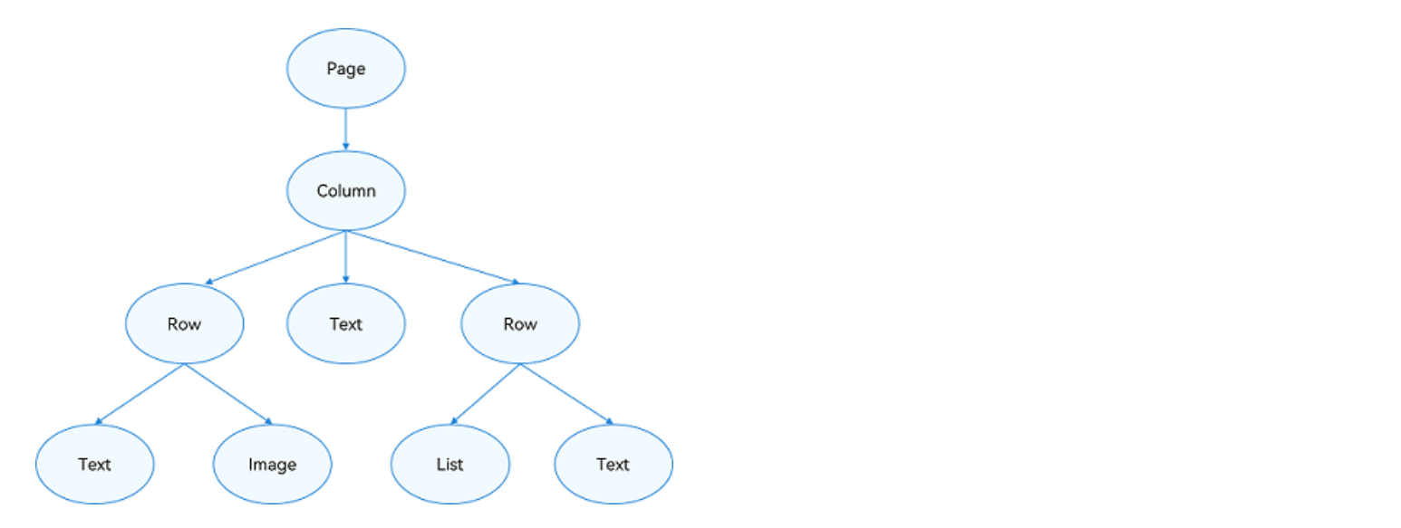
常见页面结构图
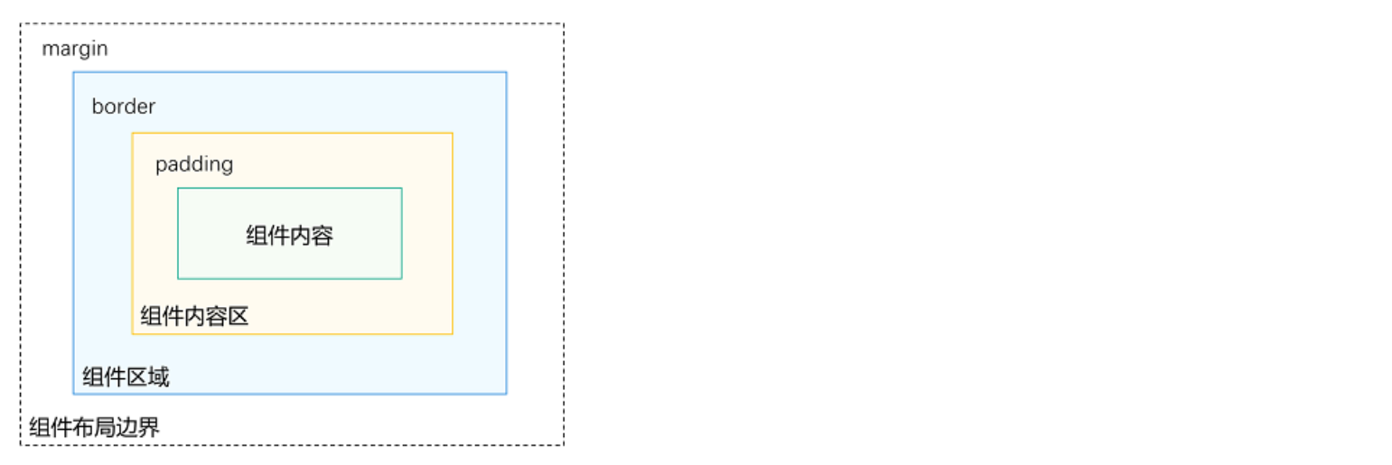
布局元素的组成
线性布局(Row、Column)
了解思路即可,更多样例去看官方文档
cpp
@Entry
@Component
struct PracExample {
build() {
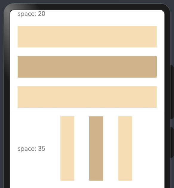
Column() {
Column({ space: 20 }) {
Text('space: 20').fontSize(15).fontColor(Color.Gray).width('90%')
Row().width('90%').height(50).backgroundColor(0xF5DEB3)
Row().width('90%').height(50).backgroundColor(0xD2B48C)
Row().width('90%').height(50).backgroundColor(0xF5DEB3)
}.width('100%')
Divider().height(20)
Row({ space: 35 }) {
Text('space: 35').fontSize(15).fontColor(Color.Gray)
Row().width('10%').height(150).backgroundColor(0xF5DEB3)
Row().width('10%').height(150).backgroundColor(0xD2B48C)
Row().width('10%').height(150).backgroundColor(0xF5DEB3)
}.width('90%')
}
}
}
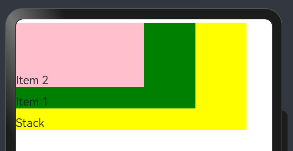
层叠布局 (Stack)
了解思路即可,更多样例去看官方文档
cpp
@Entry
@Component
struct PracExample {
  build() {
    Stack({ alignContent: Alignment.TopStart }) {
      Text('Stack').width('90%').height('100%').backgroundColor(Color.Yellow).align(Alignment.BottomStart)
      Text('Item 1').width('70%').height('80%').backgroundColor(Color.Green).align(Alignment.BottomStart)
      Text('Item 2').width('50%').height('60%').backgroundColor(Color.Pink).align(Alignment.BottomStart)
    }.width('100%').height(150).margin({ top: 5 })
  }
}
弹性布局(Flex)
了解思路即可,更多样例去看官方文档

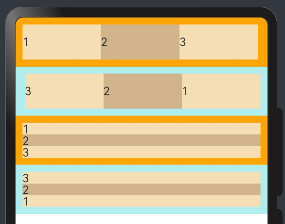
布局方向
cpp
@Entry
@Component
struct PracExample {
  build() {
    Column() {
      Flex({ direction: FlexDirection.Row }) {
        Text('1').width('33%').height(50).backgroundColor(0xF5DEB3)
        Text('2').width('33%').height(50).backgroundColor(0xD2B48C)
        Text('3').width('33%').height(50).backgroundColor(0xF5DEB3)
      }.height(70).width('100%').padding(10).backgroundColor(Color.Orange)

      Flex({ direction: FlexDirection.RowReverse }) {
        Text('1').width('33%').height(50).backgroundColor(0xF5DEB3)
        Text('2').width('33%').height(50).backgroundColor(0xD2B48C)
        Text('3').width('33%').height(50).backgroundColor(0xF5DEB3)
      }.height(70).width('100%').padding(10).backgroundColor(0xAFEEEE)

      Flex({ direction: FlexDirection.Column }) {
        Text('1').width('100%').height(50).backgroundColor(0xF5DEB3)
        Text('2').width('100%').height(50).backgroundColor(0xD2B48C)
        Text('3').width('100%').height(50).backgroundColor(0xF5DEB3)
      }.height(70).width('100%').padding(10).backgroundColor(Color.Orange)

      Flex({ direction: FlexDirection.ColumnReverse }) {
        Text('1').width('100%').height(50).backgroundColor(0xF5DEB3)
        Text('2').width('100%').height(50).backgroundColor(0xD2B48C)
        Text('3').width('100%').height(50).backgroundColor(0xF5DEB3)
      }.height(70).width('100%').padding(10).backgroundColor(0xAFEEEE)
    }
  }
}
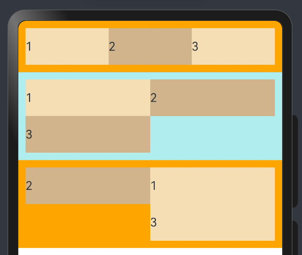
布局换行
cpp
@Entry
@Component
struct PracExample {
  build() {
    Column() {
      Flex({ wrap: FlexWrap.NoWrap }) {
        Text('1').width('50%').height(50).backgroundColor(0xF5DEB3)
        Text('2').width('50%').height(50).backgroundColor(0xD2B48C)
        Text('3').width('50%').height(50).backgroundColor(0xF5DEB3)
      }.width('100%').padding(10).backgroundColor(Color.Orange)

      Flex({ wrap: FlexWrap.Wrap }) {
        Text('1').width('50%').height(50).backgroundColor(0xF5DEB3)
        Text('2').width('50%').height(50).backgroundColor(0xD2B48C)
        Text('3').width('50%').height(50).backgroundColor(0xD2B48C)
      }.width('100%').padding(10).backgroundColor(0xAFEEEE)

      Flex({ wrap: FlexWrap.WrapReverse}) {
        Text('1').width('50%').height(50).backgroundColor(0xF5DEB3)
        Text('2').width('50%').height(50).backgroundColor(0xD2B48C)
        Text('3').width('50%').height(50).backgroundColor(0xF5DEB3)
      }.width('100%').padding(10).backgroundColor(Color.Orange)
    }
  }
}
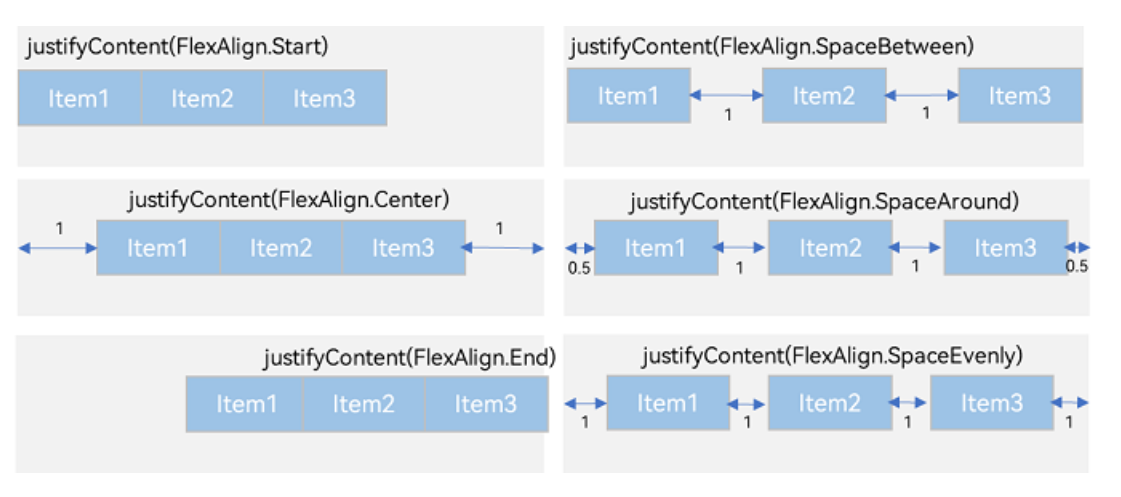
主轴对齐方式
cpp
@Entry
@Component
struct PracExample {
  build() {
    Flex({ justifyContent: FlexAlign.Start }) {
        Text('1').width('20%').height(50).backgroundColor(0xF5DEB3)
        Text('2').width('20%').height(50).backgroundColor(0xD2B48C)
        Text('3').width('20%').height(50).backgroundColor(0xF5DEB3)
      }
      .width('90%')
      .padding({ 'top': 10, 'bottom': 10 })
      .backgroundColor(0xAFEEEE)
  }
}
未完待续
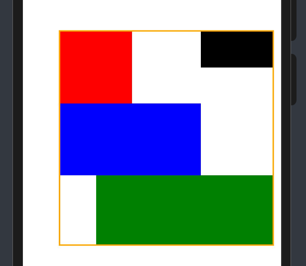
相对布局 (RelativeContainer)
了解思路即可,更多样例去看官方文档
cpp
@Entry
@Component
struct PracExample {
  build() {
    Row() {
      RelativeContainer() {
        Row().width(100).height(100).backgroundColor(Color.Red)
          .alignRules({
            top: { anchor: "__container__", align: VerticalAlign.Top },
            left: { anchor: "__container__", align: HorizontalAlign.Start }
          }).id("row1")

        Row().width(100).backgroundColor(Color.Black)
          .alignRules({
            top: { anchor: "__container__", align: VerticalAlign.Top },
            right: { anchor: "__container__", align: HorizontalAlign.End },
            bottom: { anchor: "row1", align: VerticalAlign.Center },
          }).id("row2")

        Row().height(100).backgroundColor(Color.Blue)
          .alignRules({
            top: { anchor: "row1", align: VerticalAlign.Bottom },
            left: { anchor: "row1", align: HorizontalAlign.Start },
            right: { anchor: "row2", align: HorizontalAlign.Start }
          }).id("row3")

        Row().backgroundColor(Color.Green)
          .alignRules({
            top: { anchor: "row3", align: VerticalAlign.Bottom },
            left: { anchor: "row1", align: HorizontalAlign.Center },
            right: { anchor: "row2", align: HorizontalAlign.End },
            bottom: { anchor: "__container__", align: VerticalAlign.Bottom }
          }).id("row4")
      }.width(300).height(300).margin({ left: 50 }).border({ width: 2, color: Color.Orange })
    }.height('100%')
  }
}
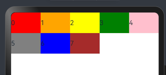
栅格布局 (GridRow/GridCol)
了解思路即可,更多样例去看官方文档
cpp
@Entry
@Component
struct PracExample {
  @State bgColors: Color[] = [Color.Red, Color.Orange, Color.Yellow, Color.Green, Color.Pink, Color.Grey, Color.Blue, Color.Brown];

  build() {
    Column() {
      GridRow({ columns: 10 }) {
        ForEach(this.bgColors, (color: Color, index?: number | undefined) => {
          GridCol({ span: 2 }) {
            Row() {Text(`${index}`)}.width('100%').height('50vp')
          }.backgroundColor(color)
        })
      }
    }
  }
}
媒体查询 (@ohos.mediaquery)
需要消化
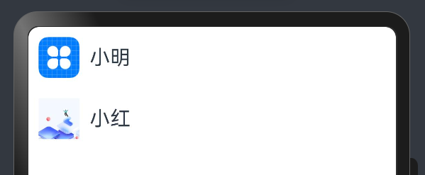
创建列表 (List)
列表是一种复杂的容器,当列表项达到一定数量,内容超过屏幕大小时,可以自动提供滚动功能。
cpp
@Entry
@Component
struct PracExample {
  build() {
    Column({ space: 5 }) {
      List() {
        ListItem() {
          Row() {
            Image($r('app.media.icon')).width(40).height(40).margin(10)
            Text('小明').fontSize(20)
          }
        }

        ListItem() {
          Row() {
            Image($r('app.media.ic_main')).width(40).height(40).margin(10)
            Text('小红').fontSize(20)
          }
        }
      }
    }.width('100%').height('100%')
  }
}
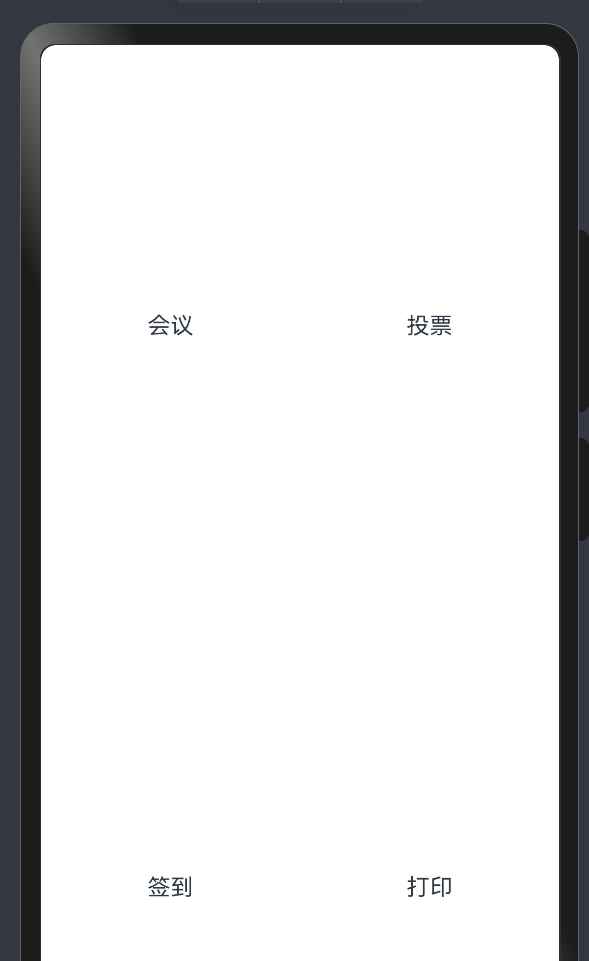
创建网格 (Grid/GridItem)
网格布局具有较强的页面均分能力,子组件占比控制能力,是一种重要自适应布局,其使用场景有九宫格图片展示、日历、计算器等。
cpp
@Entry
@Component
struct PracExample {
  @State services: Array<string> = ['会议', '投票', '签到', '打印']

  build() {
    Column() {
      Grid() {
        ForEach(this.services, (service:string) => {
          GridItem() {Text(service)}
        }, (service:string):string => service)
      }
      .rowsTemplate(('1fr 1fr') as string)
      .columnsTemplate(('1fr 1fr') as string)
    }
  }
}
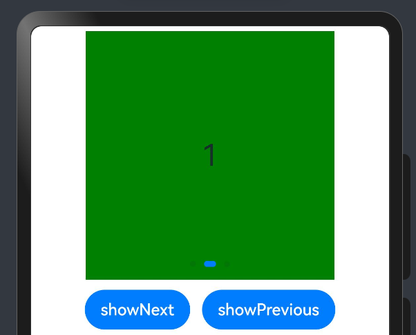
创建轮播 (Swiper)
Swiper本身是一个容器组件,当设置了多个子组件后,可以对这些子组件进行轮播显示。通常,在一些应用首页显示推荐的内容时,需要用到轮播显示的能力。
cpp
@Entry
@Component
struct PracExample {
  private swiperController: SwiperController = new SwiperController();

  build() {
    Column({ space: 5 }) {
      Swiper(this.swiperController) {
        Text('0').width(250).height(250).backgroundColor(Color.Gray).textAlign(TextAlign.Center).fontSize(30)
        Text('1').width(250).height(250).backgroundColor(Color.Green).textAlign(TextAlign.Center).fontSize(30)
        Text('2').width(250).height(250).backgroundColor(Color.Pink).textAlign(TextAlign.Center).fontSize(30)
      }.indicator(true)

      Row({ space: 12 }) {
        Button('showNext')
          .onClick(() => {
            this.swiperController.showNext(); // 通过controller切换到后一页
          })
        Button('showPrevious')
          .onClick(() => {
            this.swiperController.showPrevious(); // 通过controller切换到前一页
          })
      }.margin(5)
    }.width('100%').margin({ top: 5 })
  }
}
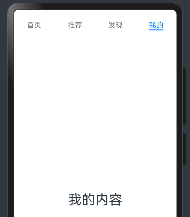
选项卡 (Tabs)
当页面信息较多时,为了让用户能够聚焦于当前显示的内容,需要对页面内容进行分类,提高页面空间利用率。
cpp
@Entry
@Component
struct PracExample {
  build() {
    Column({ space: 5 }) {
      Tabs() {
        TabContent() {
          Text('首页的内容').fontSize(30)
        }
        .tabBar('首页')

        TabContent() {
          Text('推荐的内容').fontSize(30)
        }
        .tabBar('推荐')

        TabContent() {
          Text('发现的内容').fontSize(30)
        }
        .tabBar('发现')

        TabContent() {
          Text('我的内容').fontSize(30)
        }
        .tabBar("我的")
      }
    }.width('100%').margin({ top: 5 })
  }
}