为啥不直接用Cascader 级联选择组件呢?主要是因为作为老项目,已经引入了antd-mobile@2.3.4,同时引入v5版本会有兼容性问题。
原始数据格式:
首先需要将后端返回的数据转为前端定义的格式,方便使用:
json
[
  {
    "label": "安徽省",
    "value": "340000",
    "children": [
      {
        "label": "安庆市",
        "value": "340800",
        "children": [
          {
            "label": "大观区",
            "value": "340803",
            "children": []
          },
          ...其他区
        ]
      },
      ...其他市
    ]
  },
  ...其他省份
]
树结构转数组结构:
研究了下antd-mobile的cascader-view源码,我发现精髓在于将树结构转换成了方便开发的数组:
javascript
  //选择的value 一维数组
  const [value, setValue] = useState([]);

  const levels = useMemo(() => {
    const ret = [];
    //当前列表
    let currentOptions = options;
    //是否到底
    let reachedEnd = false;
    for (const v of value) {
      const target = currentOptions.find(option => option['value'] === v);
      ret.push({
        selected: target,
        options: currentOptions,
      });

      if (!target || !target['children'] || isEmpty(target['children'])) {
        reachedEnd = true;
        break;
      }
      currentOptions = target['children'];
    }
    if (!reachedEnd) {
      ret.push({
        selected: undefined,
        options: currentOptions,
      });
    }
    return ret;
  }, [value]);
当未选择时levels结构:
json
[
  {
    //未选中
    selected: undefined,
    options: [
      {
        "label": "安徽省",
        "value": "340000",
        "children": [
          {
            "label": "安庆市",
            "value": "340800",
            "children": [
              {
                "label": "大观区",
                "value": "340803",
                "children": []
              },
              ...其他区
            ]
          },
          ...其他市
        ]
      },
      ...其他省份
    ]
  }
]
选中省份时levels结构:
json
[
  {
    //选中省份
    "selected": {
      "label": "安徽省",
      "value": "340000",
      "children": [
        {
          "label": "安庆市",
          "value": "340800",
          "children": [
            {
              "label": "大观区",
              "value": "340803",
              "children": []
            },
            ...其他区
          ]
        },
        ...其他市
      ]
    },
    "options": [
      {
        "label": "安徽省",
        "value": "340000",
        "children": [
          {
            "label": "安庆市",
            "value": "340800",
            "children": [
              {
                "label": "大观区",
                "value": "340803",
                "children": []
              },
              ...其他区
            ]
          },
          ...其他市
        ]
      },
      ...其他省份
    ]
  },
  {
    //未选中
    "selected": undefined,
    "options": [
      {
        "label": "安庆市",
        "value": "340800",
        "children": [
          {
            "label": "大观区",
            "value": "340803",
            "children": []
          },
          ...其他区
        ]
      },
      ...其他市
    ]
  }
]
数据结构清楚以后,编码就相对简单了:
javascript
import PopShow from '@/components/PopShow';
import React, { useMemo, useState } from 'react';
//v2版本的
import { Tabs } from 'antd-mobile';
import styles from './index.less';
import { isEmpty } from 'lodash';
import { CheckOutline } from 'antd-mobile-icons';
import classNames from 'classnames';

const AddressModal = ({options}) => {

  const [value, setValue] = useState([]);

  const [page, setPage] = useState(0);

  //精髓在于这段代码,将树形结构转为数组
  const levels = useMemo(() => {
    const ret = [];
    //当前列表
    let currentOptions = options;
    //是否到底
    let reachedEnd = false;
    for (const v of value) {
      const target = currentOptions.find(option => option['value'] === v);
      ret.push({
        selected: target,
        options: currentOptions,
      });

      if (!target || !target['children'] || isEmpty(target['children'])) {
        reachedEnd = true;
        break;
      }
      currentOptions = target['children'];
    }
    if (!reachedEnd) {
      ret.push({
        selected: undefined,
        options: currentOptions,
      });
    }
    return ret;
  }, [value]);

  const tabs = useMemo(() => {
    const ret = levels?.map(level => {
      if (level?.selected) {
        return {
          title: level?.selected['label'],
        };
      }
      return {
        title: '请选择',
      };
    }) || [{
      title: '请选择',
    }];
    //滑动到下一tab
    setPage(ret?.length - 1);
    return ret;
  }, [levels]);

  const onItemSelect = (selectValue, depth) => {
    const next = value.slice(0, depth);
    if (selectValue !== undefined) {
      next[depth] = selectValue;
    }
    setValue(next);
  };

  return <PopShow visible={true}>
    <div className={styles.popShow}>
      <div className={styles.topButtons}>
        <span>取消</span>
        <span>确定</span>
      </div>
      <Tabs tabs={tabs} swipeable={false} page={page}
            onChange={(_, index) => setPage(index)}
            tabBarActiveTextColor={'#BB6532'}
            tabBarInactiveTextColor={'#000000'}
            tabBarUnderlineStyle={{ display: 'none' }}
            tabBarTextStyle={{ fontSize: '14px' }}
      >
        {
          levels?.map((level, index) => {
            const options = level?.options;
            return (
              <div className={styles.checklist}>
                {
                  options?.map(option => {
                    const active = value[index] === option['value'];
                    return <div onClick={() => onItemSelect(option['value'], index)}
                      className={classNames({[styles.active]: active})}
                    >
                      <span>{option['label']}</span>
                      {active && <CheckOutline />}
                    </div>;
                  })
                }
              </div>
            );
          })
        }
      </Tabs>
    </div>
  </PopShow>;
};

export default AddressModal;
css
@import (reference) '../../styles/index.less';
.popShow {
height: 60vh;
display: flex;
flex-direction: column;
overflow: hidden;
.topButtons {
display: flex;
justify-content: space-between;
padding: 8*@rem 16*@rem 4*@rem;
color: #343434;
}
.checklist {
flex: 1;
overflow-y: scroll;
&::-webkit-scrollbar {
display: none;
}
& > div {
text-align: left;
padding: 8*@rem 16*@rem;
display: flex;
justify-content: space-between;
align-items: center;
}
.active{
color: #BB6532;
}
}
:global {
.am-tabs-default-bar-tab {
width: auto !important;
padding-left: 16*@rem;
padding-right: 16*@rem;
max-width: 33.3%;
.textEllipsis;
}
.am-tabs-default-bar-content {
position: relative;
&:after {
content: '';
position: absolute;
background-color: #ddd;
display: block;
z-index: 1;
top: auto;
right: auto;
bottom: 0;
left: 0;
width: 100%;
height: 1px;
}
}
}
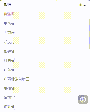
}附上效果图: