目录
前言
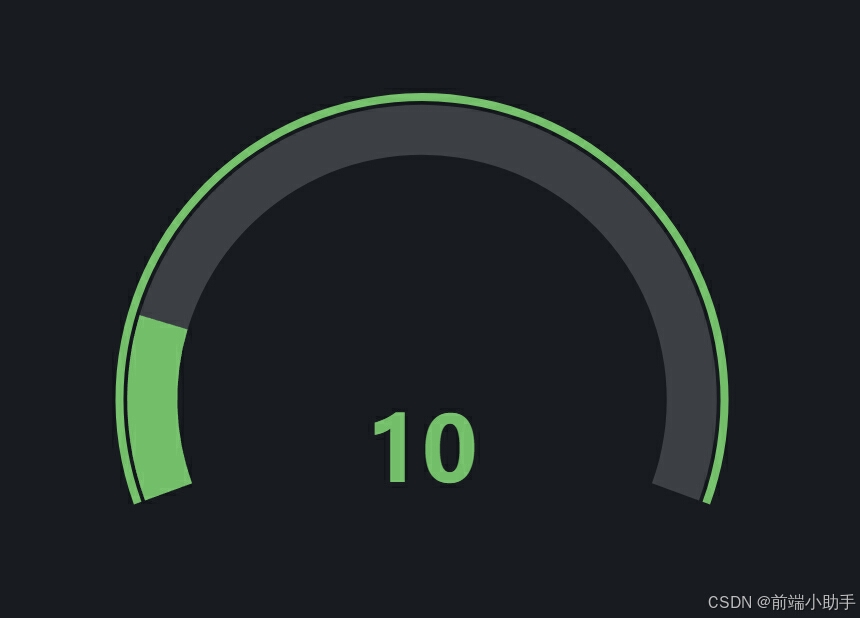
Grafana 是一个开源的可视化监控工具,支持多种数据源,并且可以创建丰富的仪表盘。ECharts 是一个强大的开源数据可视化库,通过结合这两者,我们可以创建自定义的仪表盘,以满足特定的需求。本文将介绍如何使用 ECharts 创建一个 Grafana 面板的仪表盘。
准备工作
在开始之前,请确保你已经安装了以下内容:
安装 ECharts:
bash
npm install echarts实现代码
创建一个 HTML 文件并添加以下代码:
html
<!DOCTYPE html>
<html>
<head>
  <meta charset="UTF-8">
  <title>ECharts 仪表盘</title>
  <script src="https://cdn.jsdelivr.net/npm/echarts/dist/echarts.min.js"></script>
</head>
<body>
  <div id="main" style="width: 600px; height: 400px;"></div>
  <script>
    var chartDom = document.getElementById('main');
    var myChart = echarts.init(chartDom, 'dark');
    var option;

    option = {
       backgroundColor: '#181b1f',
      series: [
        {
          type: 'gauge',
          center: ['50%', '60%'],
          startAngle: 200,
          endAngle: -20,
          min: 0,
          max: 60,
          splitNumber: 12,
          itemStyle: {
            color: '#FFAB91'
          },
          progress: {
            show: true,
            width: 50,
            itemStyle: {
              color: '#73bf69'
            }
          },
          pointer: {
            show: false
          },
          axisLine: {
            lineStyle: {
              width: 50
            }
          },
          axisTick: {
            show: false
          },
          splitLine: {
            show: false
          },
          axisLabel: {
            show: false
          },
          anchor: {
            show: false
          },
          title: {
            show: false
          },
          detail: {
            valueAnimation: true,
            width: '60%',
            lineHeight: 0,
            borderRadius: 8,
            offsetCenter: [0, '20%'],
            fontSize: 90,
            fontWeight: 'bolder',
            formatter: '{value}',
            color: '#73bf69'
          },
          data: [
            {
              value: 10
            }
          ]
        },
        {
          type: 'gauge',
          center: ['50%', '60%'],
          radius: '78%',
          startAngle: 200,
          endAngle: -20,
          min: 0,
          max: 60,
          itemStyle: {
            color: '#FD7347'
          },
          progress: {
            show: true,
            width: 8,
            itemStyle: {
              color: '#73bf69'
            }
          },
          pointer: {
            show: false
          },
          axisLine: {
            show: false
          },
          axisTick: {
            show: false
          },
          splitLine: {
            show: false
          },
          axisLabel: {
            show: false
          },
          detail: {
            show: false
          },
          data: [
            {
              value: 100
            }
          ]
        }
      ]
    };

    option && myChart.setOption(option);
  </script>
</body>
</html>
代码详解
以下是代码的详细解释:
初始化 ECharts
首先,我们需要获取要渲染图表的 DOM 元素,并使用 echarts.init 方法初始化 ECharts 实例。
javascript
var chartDom = document.getElementById('main');
var myChart = echarts.init(chartDom, 'dark');
配置选项
接下来,我们定义了一个 option 对象,其中包含了两个仪表盘配置:
javascript
option = {
   backgroundColor: '#181b1f',
  series: [
    {
      type: 'gauge',
      center: ['50%', '60%'],
      startAngle: 200,
      endAngle: -20,
      min: 0,
      max: 60,
      splitNumber: 12,
      itemStyle: {
        color: '#FFAB91'
      },
      progress: {
        show: true,
        width: 50,
        itemStyle: {
          color: '#73bf69'
        }
      },
      pointer: {
        show: false
      },
      axisLine: {
        lineStyle: {
          width: 50
        }
      },
      axisTick: {
        show: false
      },
      splitLine: {
        show: false
      },
      axisLabel: {
        show: false
      },
      anchor: {
        show: false
      },
      title: {
        show: false
      },
      detail: {
        valueAnimation: true,
        width: '60%',
        lineHeight: 0,
        borderRadius: 8,
        offsetCenter: [0, '20%'],
        fontSize: 90,
        fontWeight: 'bolder',
        formatter: '{value}',
        color: '#73bf69'
      },
      data: [
        {
          value: 10
        }
      ]
    },
    {
      type: 'gauge',
      center: ['50%', '60%'],
      radius: '78%',
      startAngle: 200,
      endAngle: -20,
      min: 0,
      max: 60,
      itemStyle: {
        color: '#FD7347'
      },
      progress: {
        show: true,
        width: 8,
        itemStyle: {
          color: '#73bf69'
        }
      },
      pointer: {
        show: false
      },
      axisLine: {
        show: false
      },
      axisTick: {
        show: false
      },
      splitLine: {
        show: false
      },
      axisLabel: {
        show: false
      },
      detail: {
        show: false
      },
      data: [
        {
          value: 100
        }
      ]
    }
  ]
};
渲染图表
最后,我们使用 setOption 方法将配置应用到图表实例中:
javascript
option && myChart.setOption(option);总结
通过以上步骤,我们成功使用 ECharts 创建了一个 Grafana 风格的仪表盘。ECharts 提供了丰富的图表类型和灵活的配置选项,可以轻松实现各种复杂的图表需求。在实际项目中,可以根据需要调整配置选项,创建更加复杂和美观的仪表盘。