记录,以防忘记
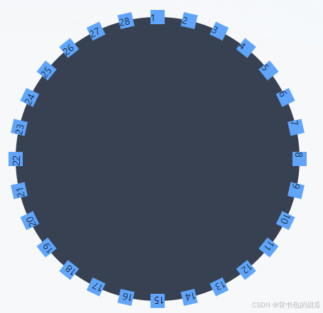
围绕圆
import React, { useEffect } from 'react';
import './index.scoped.scss';


const Test = () => {


    const arr = Array.from({ length: 28 }, (_, index) => index + 1);

    useEffect(() => {
        const dayTotal = arr.length;

        // 动态设置每个点的旋转角度
        const dots = document.querySelectorAll('.dot') as NodeListOf<HTMLElement>;
        const pDeg = 360 / dayTotal;
        dots.forEach((dot, index) => {
            dot.style.transform = `rotate(${index * pDeg}deg) translate(0, -200px)`;
        });
    }, [arr.length]);


    return <div className='flex items-center justify-center w-full h-[100vh]'>

        <div className='relative bg-gray-700 rounded-full box'>
            {arr.map((item, index) => {
                return <div key={index} className='absolute bg-blue-400 dot'>{item}</div>;
            })}
        </div>
    </div>;
};

export default Test;


// scss


$containSize: 400px;
$ballSize: 20px;

.box {
    width: $containSize;
    height: $containSize;
    position: relative;

    .dot {
        width: $ballSize;
        height: $ballSize;
        position: absolute;
        top: 50%;
        left: 50%;
        margin-left: calc(-1 * $ballSize / 2);
        margin-top: calc(-1 * $ballSize / 2);
        transform-origin: center;
    }
}
进阶 实现loading加载

import React, { useEffect } from 'react';
import './index.scoped.scss';


const Test = () => {


    const arr = Array.from({ length: 32 }, (_, index) => index + 1);


    return <div className='flex items-center justify-center w-full h-[100vh] bg-[#5bbff1]'>

        <div className='relative rounded-full loading'>
            {arr.map((item, index) => {
                return <div key={index} className='absolute dot' />;
            })}
        </div>
    </div>;
};

export default Test;


// scss

$containSize: 150px;
$ballSize: 10px;

.loading {
    width: $containSize;
    height: $containSize;


    $n: 32; // 小球数量
    $pDeg: calc(360deg / $n);   // 每个小球旋转的角度


    .dot {
        width: $ballSize;
        height: $ballSize;
        top: 0;
        left: 50%;
        margin-left: calc(-1 * $ballSize / 2);
        margin-top: calc(-1 * $ballSize / 2);
        transform-origin: center calc($containSize / 2) + calc($ballSize / 2);

        $duration: 2s; // 小球动画总时长

        @for $i from 1 through $n {
            &:nth-child(#{$i}) {
                transform: rotate(calc($i - 1) * $pDeg);

                &::after,
                &::before {
                    animation-delay: -(calc($duration / $n * ($i - 1) * 6));
                }

            }
        }

        &::before,
        &::after {
            content: '';
            position: absolute;
            width: 100%;
            height: 100%;
            border-radius: 100px;
        }

        perspective: 70px;
        transform-style: preserve-3d;

        &::before {
            top: -100%;
            background: #000;
            animation: rotate-black $duration infinite;

            @keyframes rotate-black {
                0% {
                    animation-timing-function: ease-in;
                }

                25% {
                    transform: translate3d(0, 100%, $ballSize);
                    animation-timing-function: ease-out;
                }

                50% {
                    transform: translate3d(0, 200%, 0);
                    animation-timing-function: ease-in;
                }

                75% {
                    transform: translate3d(0, 100%, -$ballSize);
                    animation-timing-function: ease-out;
                }
            }
        }

        &::after {
            top: 100%;
            background: #fff;
            animation: rotate-white $duration infinite;

            @keyframes rotate-white {
                0% {
                    animation-timing-function: ease-in;
                }

                25% {
                    transform: translate3d(0, -100%, -$ballSize);
                    animation-timing-function: ease-out;
                }

                50% {
                    transform: translate3d(0, -200%, 0);
                    animation-timing-function: ease-in;
                }

                75% {
                    transform: translate3d(0, -100%, $ballSize);
                    animation-timing-function: ease-out;
                }
            }
        }
    }
}