一个简单的移动端案例,模拟不同设备下逻辑分辨率不同,宽高自适应
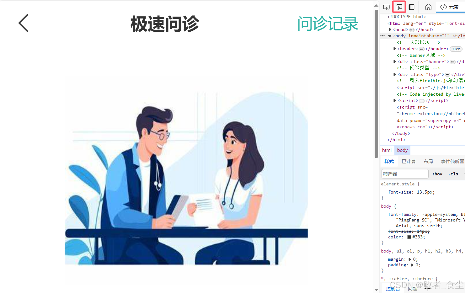
正常打开整体布局

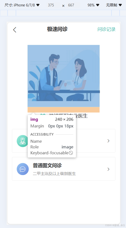
打开 f12 (ctrl + shift + M)或者点击左上角图标,将其模拟为移动端设备
在移动设备iPhone6/7/8,逻辑分辨率375的整体布局

其banner图尺寸
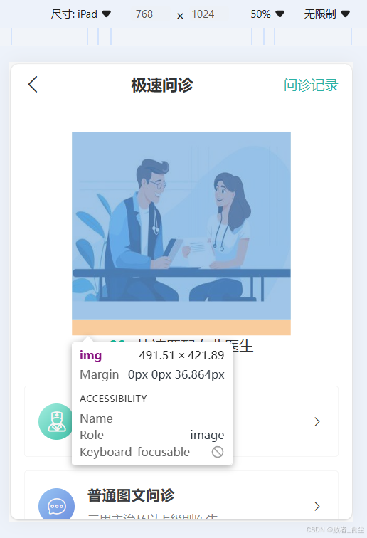
现在切换设备为iPad,逻辑分辨率为768,此设备下banner图尺寸自适应
再切换设备为iPhone 14 Pro Max,逻辑分辨率为430,此设备下banner图尺寸自适应

源码
HTML(index.html)代码
<!DOCTYPE html>
<html lang="en">
<head>
    <meta charset="UTF-8">
    <meta name="viewport" content="width=device-width, initial-scale=1.0">
    <title>极速问诊</title>
    <link rel="stylesheet" href="./iconfont/iconfont.css">
    <link rel="stylesheet" href="./css/index.css">
</head>
<body>
    <!-- 头部区域 -->
    <header>
        <a href="#" class="back"><span class="iconfont icon-jiantou3"></span></a>
        <h3>极速问诊</h3>
        <a href="#" class="note">问诊记录</a>
    </header>

    <!-- banner区域 -->
    <div class="banner">
        <img src="./assets/docter.jpg" alt="">
        <p><span>20s</span> 快速匹配专业医生</p>
    </div>

    <!-- 问诊类型 -->
    <div class="type">
        <ul>
            <li>
                <a href="#">
                    <span class="iconfont icon-yisheng"></span>
                    <div class="txt">
                        <h4>三甲图文问诊</h4>
                        <p>三甲主治及以上级别医生</p>
                    </div>
                    <span class="iconfont icon-jiantou21"></span>
                </a>
            </li>
            <li>
                <a href="#">
                    <span class="iconfont icon-xinxi1"></span>
                    <div class="txt">
                        <h4>普通图文问诊</h4>
                        <p>二甲主治及以上级别医生</p>
                    </div>
                    <span class="iconfont icon-jiantou21"></span>
                </a>
            </li>
        </ul>
    </div>
    <!-- 引入flexible.js移动端布局js -->
    <script src="./js/flexible.js"></script>
</body>
</html>
CSS样式(index.css)代码:
*,
::after,
::before {
  box-sizing: border-box;
}
body,
ul,
ol,
p,
h1,
h2,
h3,
h4,
h5,
h6 {
  margin: 0;
  padding: 0;
}
body {
  font-family: -apple-system, BlinkMacSystemFont, PingFangSC-Regular, "PingFang SC", "Microsoft YaHei", "Helvetica Neue", Helvetica, Arial, sans-serif;
  font-size: 14px;
  color: #333;
}
a {
  color: #333;
  text-decoration: none;
  -webkit-tap-highlight-color: regb(0, 0, 0, 0);
}
ul {
  list-style-type: none;
}
li {
  list-style: none;
}
img {
  vertical-align: bottom;
}
header {
  display: flex;
  justify-content: space-between;
  padding: 0 0.4rem;
  height: 1.17333333rem;
  line-height: 1.17333333rem;
}
header .icon-jiantou3 {
  font-size: 0.48rem;
}
header h3 {
  font-size: 0.45333333rem;
}
header .note {
  font-size: 0.4rem;
  color: #2cb2a5;
}
.banner {
  margin-top: 0.8rem;
  margin-bottom: 0.90666667rem;
  text-align: center;
}
.banner img {
  margin-bottom: 0.48rem;
  width: 6.4rem;
  height: 5.49333333rem;
}
.banner p {
  font-size: 0.42666667rem;
}
.banner p span {
  color: #16c2a3;
}
.type {
  padding: 0 0.4rem;
}
.type li {
  margin-bottom: 0.4rem;
  padding: 0 0.4rem;
  height: 2.08rem;
  border: 0.5px solid #ededed;
  border-radius: 0.10666667rem;
}
.type a {
  display: flex;
  align-items: center;
  height: 2.08rem;
}
.type a .icon-yisheng,
.type a .icon-xinxi1 {
  margin-right: 0.37333333rem;
  width: 1.06666667rem;
  height: 1.06666667rem;
  border-radius: 50%;
  line-height: 1.06666667rem;
  text-align: center;
  font-size: 0.64rem;
  color: #faf5f5;
}
.type a .icon-yisheng {
  background-color: #16c2a3;
  background-image: linear-gradient(to right bottom, #a3eddf, #41c2aa);
}
.type a .icon-xinxi1 {
  background-color: aqua;
  background-image: linear-gradient(to right bottom, #97c4f3, #6c8dde);
}
.type a .txt {
  flex: 1;
}
.type a .txt h4 {
  margin-bottom: 0.13333333rem;
  font-size: 0.42666667rem;
  color: #3c3e42;
  line-height: 0.64rem;
}
.type a .txt p {
  font-size: 0.34666667rem;
  color: #848484;
  line-height: 0.53333333rem;
}
.type a .icon-jiantou21 {
  font-size: 0.42666667rem;
}
JS(flexible.js)代码:
(function flexible(window, document) {
    //获取html根目录
    var docEl = document.documentElement
        //dpr 物理像素比
    var dpr = window.devicePixelRatio || 1

    // adjust body font size 设置body字体大小
    function setBodyFontSize() {
        if (document.body) {
            document.body.style.fontSize = (12 * dpr) + 'px'
        } else {
            //如果页面没有body 这个元素,则只用DOMContentLoaded 监听,等待 DOM 元素加载完毕
            document.addEventListener('DOMContentLoaded', setBodyFontSize)
        }
    }
    setBodyFontSize();

    // set 1rem = viewWidth / 10 设置html 元素字体大小
    function setRemUnit() {
        var rem = docEl.clientWidth / 10
        docEl.style.fontSize = rem + 'px'
    }

    setRemUnit()

    // reset rem unit on page resize 当页面尺寸大小发生改变时,重新设置一下rem大小。
    window.addEventListener('resize', setRemUnit)
        //pageshow 是我们重新加载页面触发的事件
    window.addEventListener('pageshow', function(e) {
        //e.persisted 返回的是 true 就是如果这个页面从缓存中获取过来,也要重新设置rem大小
        if (e.persisted) {
            setRemUnit()
        }
    })

    // detect 0.5px supports 解决移动端浏览器支持0.5像素
    if (dpr >= 2) {
        var fakeBody = document.createElement('body')
        var testElement = document.createElement('div')
        testElement.style.border = '.5px solid transparent'
        fakeBody.appendChild(testElement)
        docEl.appendChild(fakeBody)
        if (testElement.offsetHeight === 1) {
            docEl.classList.add('hairlines')
        }
        docEl.removeChild(fakeBody)
    }
}(window, document))