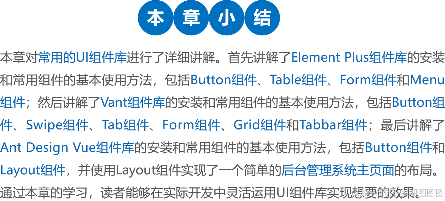
一.Element Plus组件库
1. 安装Element Plus
什么是Element Plus?
Element Plus 是基于Vue 3开发的优秀的PC端 开源UI组件库,它是Element的升级版,对于习惯使用Element的人员来说,在学习Element Plus时,不用花费太多的时间。因为Vue 3不再支持IE 11,所以Element Plus也不再支持IE 11及更低的IE版本。
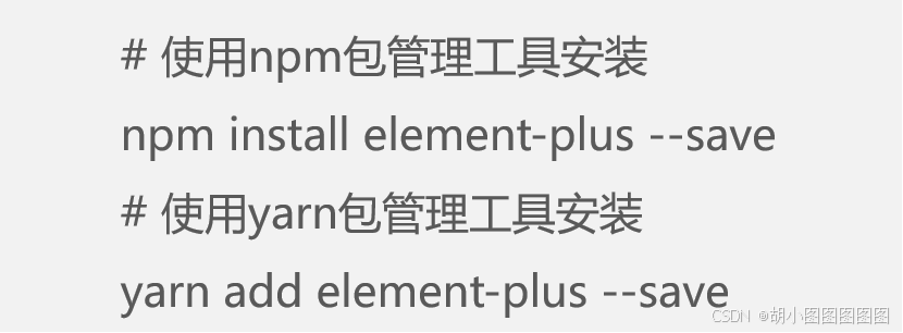
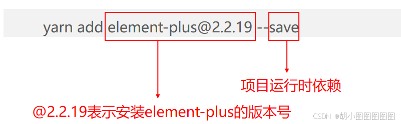
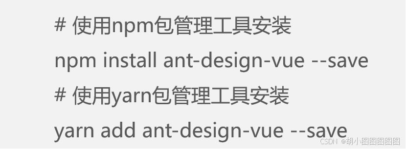
使用npm 或yarn包管理工具安装Element Plus。
在Vue 3项目中安装Element Plus
步骤一:

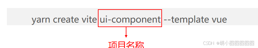
步骤一:


步骤二:

步骤三:

import { createApp } from 'vue'
import './style.css'
import ElementPlus from 'element-plus'
import 'element-plus/dist/index.css'
import App from './App.vue'
const app = createApp(App)
app.use(ElementPlus)
app.mount('#app')
步骤四:
执行命令启动服务。

项目启动后,会默认开启一个本地服务,地址为http://127.0.0.1:5173/。
2. Element Plus中的常用组件
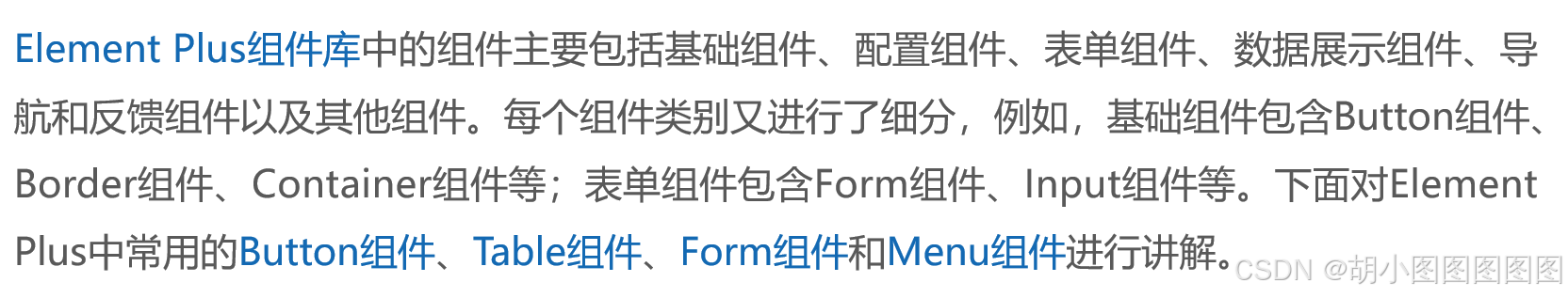
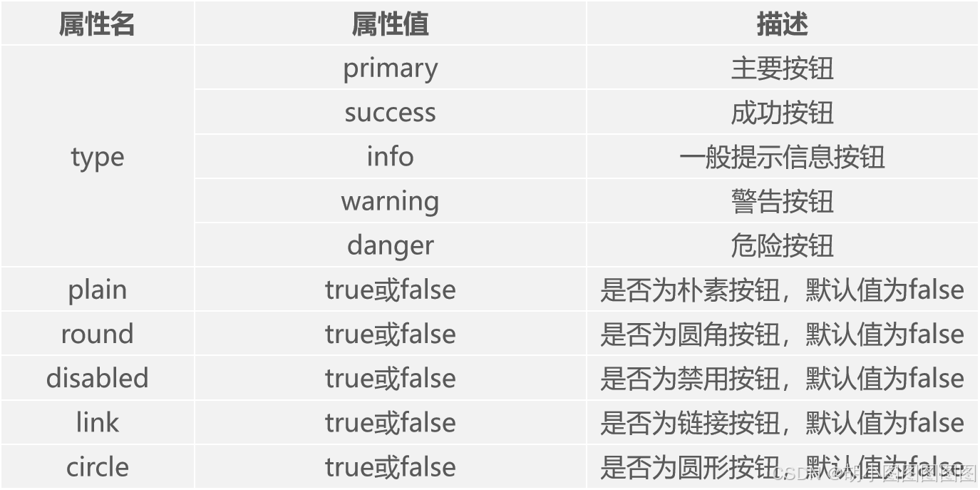
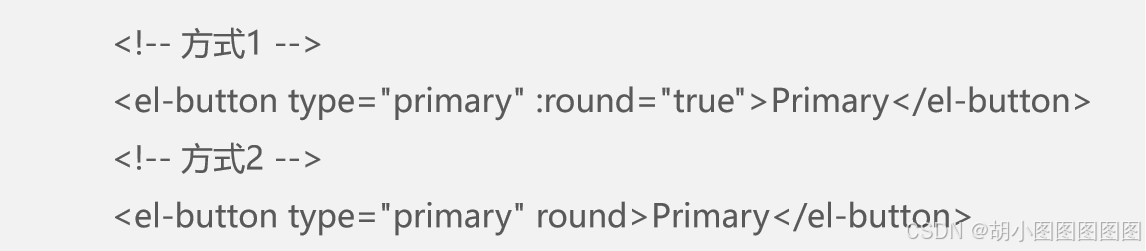
1. Button组件


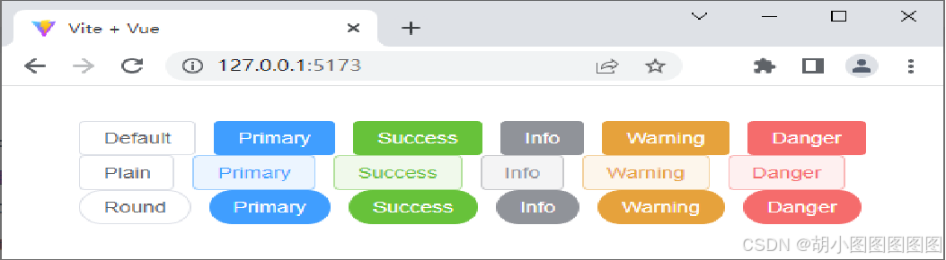
演示基础的按钮效果
步骤一:创建src\components\Button.vue文件。
<template>
<el-row class="mb-4">
<el-button>Default</el-button>
<el-button type="primary">Primary</el-button>
<el-button type="success">Success</el-button>
<el-button type="info">Info</el-button>
<el-button type="warning">Warning</el-button>
<el-button type="danger">Danger</el-button>
</el-row>
<!-- 此处省略了两个<el-row></el-row> -->
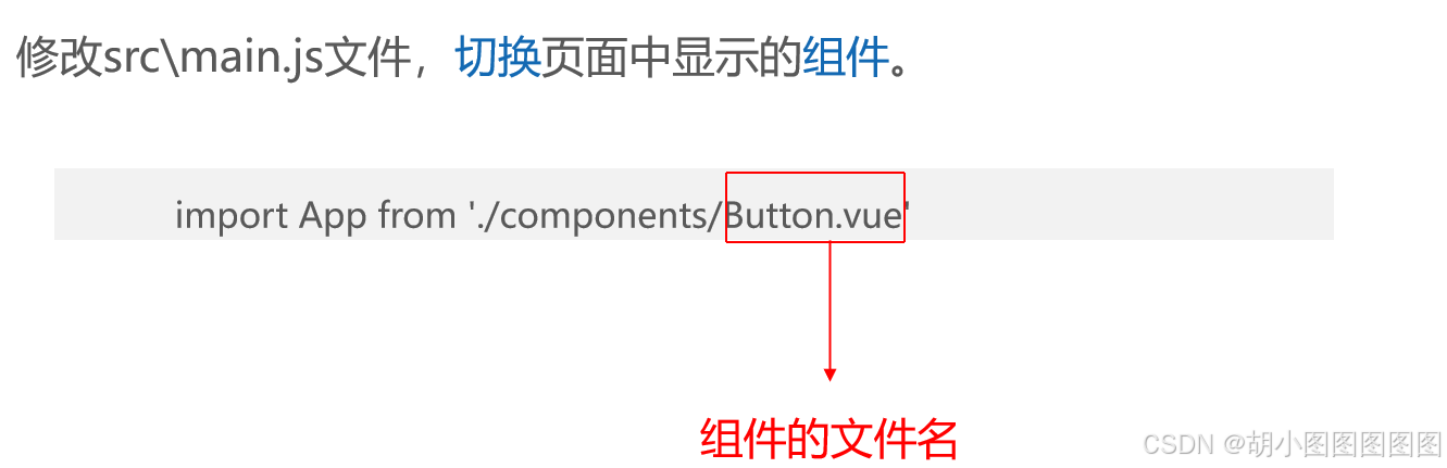
</template>步骤二:修改src\main.js文件,切换页面中显示的组件,具体代码如下。
在浏览器中查看Element Plus的按钮效果如下图所示。
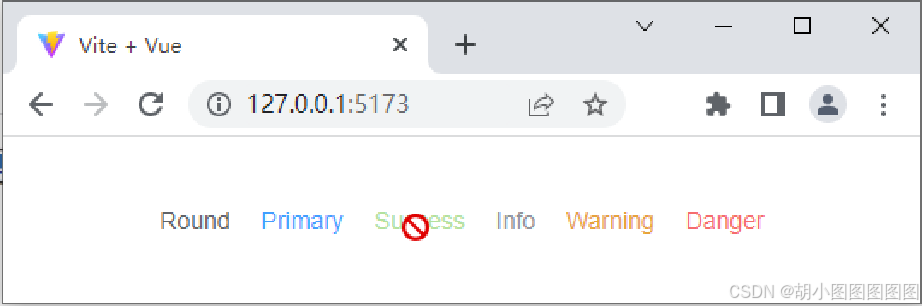
演示链接按钮和禁用按钮的使用
步骤二:
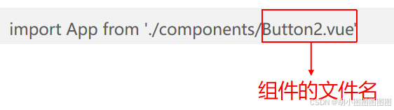
创建src\components\Button2.vue文件。
<template>
  <el-row class="mb-4">
    <el-button link>Round</el-button>
    <el-button type="primary" link :disabled="false">Primary</el-button>
    <el-button type="success" link :disabled="true">Success</el-button>
    <el-button type="info" link>Info</el-button>
    <el-button type="warning" link>Warning</el-button>
    <el-button type="danger" link>Danger</el-button>
  </el-row>
</template>
步骤二:
修改src\main.js文件,切换页面中显示的组件。
在浏览器中查看Element Plus的链接按钮和禁用按钮效果如下图所示。
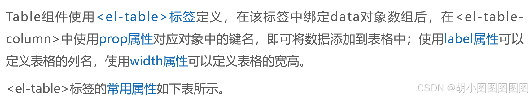
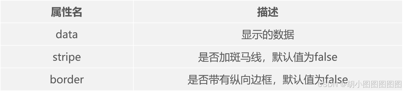
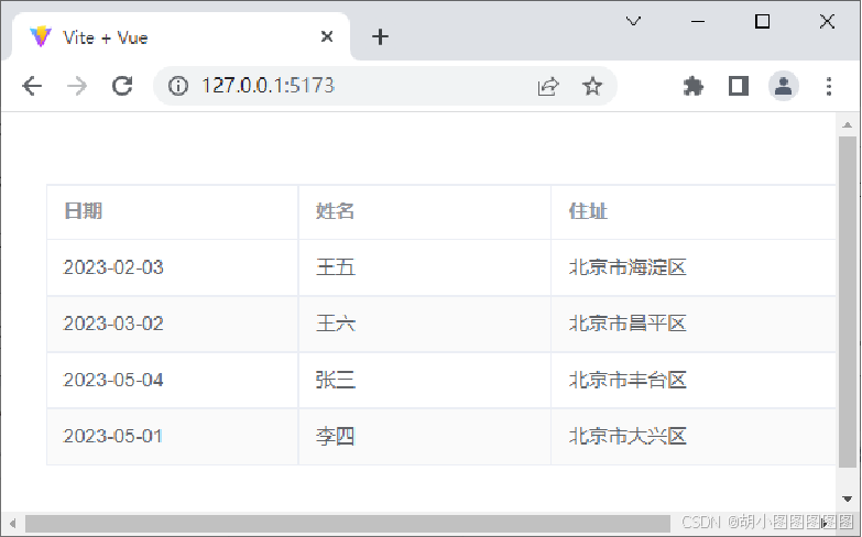
2. Table组件
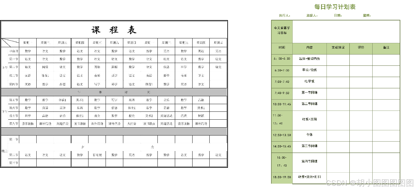
Element Plus组件库提供了Table组件,用于展示多条结构类似的数据,例如工资表、课程表和计划表等,可以对数据进行排序、筛选、对比或其他自定义操作。
演示基础的表格效果
步骤一:
创建src\components\Table.vue文件。
<template>
  <el-table :data="tableData" stripe border style="width: 100%">
    <el-table-column prop="date" label="日期" width="180" />
    <el-table-column prop="name" label="姓名" width="180" />
    <el-table-column prop="address" label="住址" width="300" />
  </el-table>
</template>
<script setup>
const tableData = [
  { date: '2023-02-03', name: '王五', address: '北京市海淀区' },
 // 此处省略了3行数据]
</script>
步骤二:
修改src\main.js文件,切换页面中显示的组件。
在浏览器中查看Element Plus的表格效果如下图所示。
3. Form组件
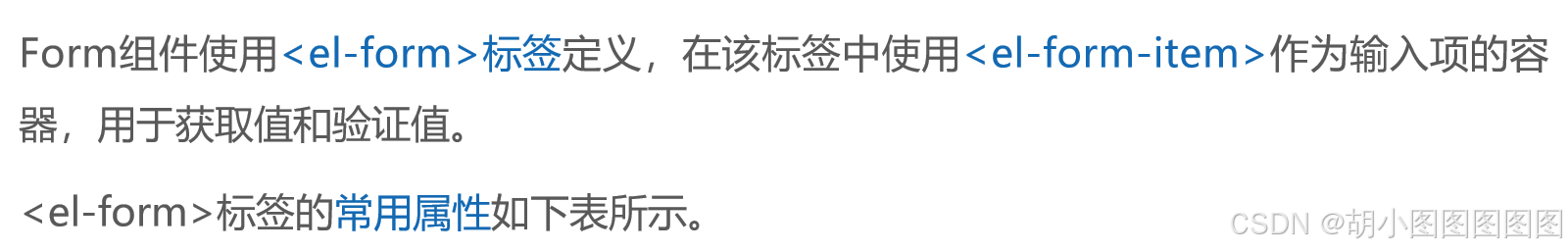

演示基础的表单效果
步骤一:
创建src\components\Form.vue文件 ,在Element Plus官方文档中找到Form组件的相关代码,复制部分核心代码到当前文件中。
<template>
  <el-form :model="form" label-width="80px" label-position="left">
    <el-form-item label="用户名:">
      <el-input v-model="form.name" />
    </el-form-item>
    <!-- 此处省略了两个<el-form-item></el-form-item> -->
</template>
<script setup>
import { reactive } from 'vue'
const form = reactive({ pass:'', name: '' })
</script>
步骤二:
修改src\main.js文件,切换页面中显示的组件。
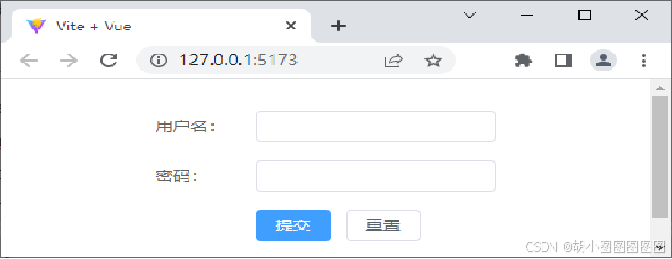
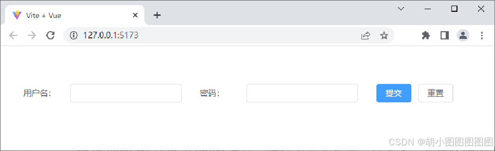
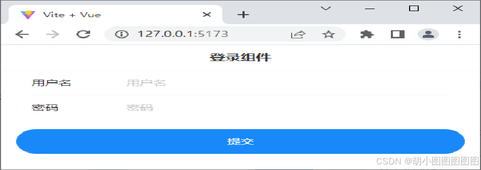
在浏览器中查看Element Plus的表单效果如下图所示。

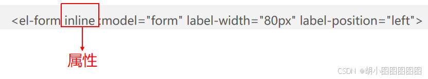
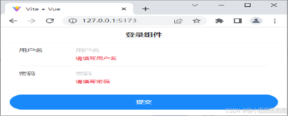
在浏览器中查看表单内容横向排列效果如下图所示。
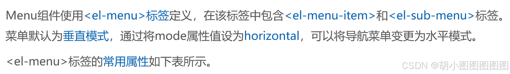
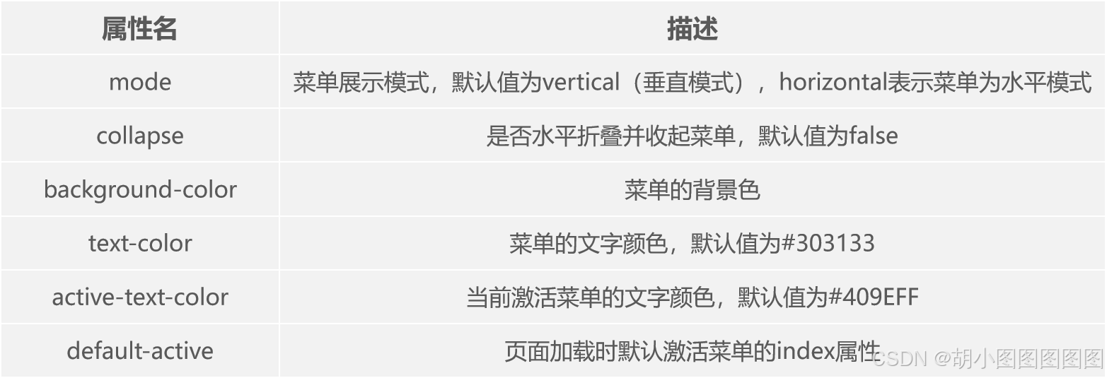
4. Menu组件


演示顶部菜单栏效果
步骤一:
创建src\components\Menu.vue文件。
<template>
  <el-menu class="el-menu-demo" mode="horizontal">
    <el-menu-item index="1">首页</el-menu-item>
    <el-sub-menu index="2"><!-- 此处省略了部分代码 --> </el-sub-menu>
    <el-menu-item index="3" disabled>信息</el-menu-item>
    <el-menu-item index="4">联系</el-menu-item>
  </el-menu>
</template>
<script setup>
import { ref } from 'vue'
const activeIndex = ref('1')
</script>
步骤二:
修改src\main.js文件,切换页面中显示的组件。
步骤三:
修改src\main.js文件,将导入style.css的代码进行注释,以免其影响Menu组件的样式效果。
// import './style.css'在浏览器中查看Element Plus顶部菜单栏效果如下图所示。
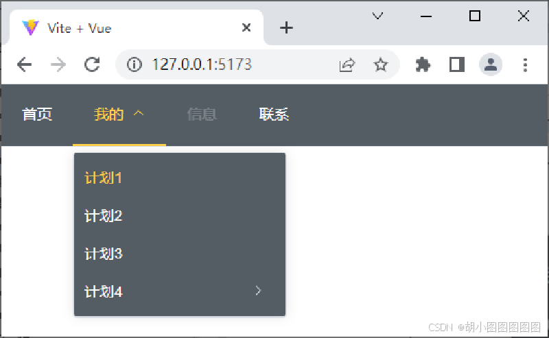
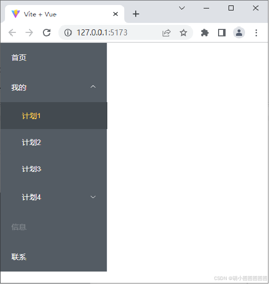
若想实现垂直菜单栏效果,可以修改上述代码,将**<el-menu>标签中class的值改为el-menu-vertical-demo**,将mode的值改为vertical。单击"我的"菜单项,会显示折叠的子菜单信息,如下图所示。
二.Vant组件库
1. 安装Vant
什么是Vant?
Vant是一个轻量级的、可靠的移动端组件库,于2017年开源。目前Vant官方提供了对Vue 2、Vue 3和微信小程序的支持。
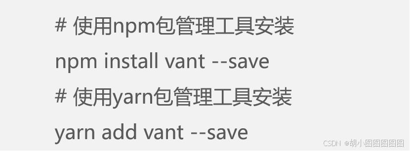
使用npm或yarn包管理工具安装Vant。
在Vue 3项目中使用yarn安装Vant
步骤一:
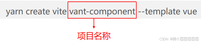
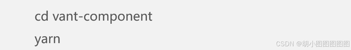
打开命令提示符,切换到D:\vue\chapter06目录,使用yarn创建一个名称为vant-component的项目。
在命令提示符中,切换到vant-component目录,为项目安装所有依赖。
步骤二:
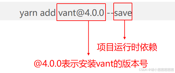
在vant-component目录下使用yarn安装Vant。
步骤三:
使用VS Code编辑器打开vant-component目录,在src\main.js文件中,导入并挂载Vant模块。
import { createApp } from 'vue'
import './style.css'
import Vant from 'vant'
import 'vant/lib/index.css'
import App from './App.vue'
const app = createApp(App)
app.use(Vant)
app.mount('#app')
步骤四:
执行命令启动服务。
yarn dev项目启动后,会默认开启一个本地服务,地址为http://127.0.0.1:5173/。
2 .Vant中的常用组件
Vant组件库中包含很多组件,由于篇幅有限,仅对Vant组件库中Button组件、Swipe组件、Tab组件、Form组件、Grid组件和Tabbar组件进行讲解。
1. Button组件
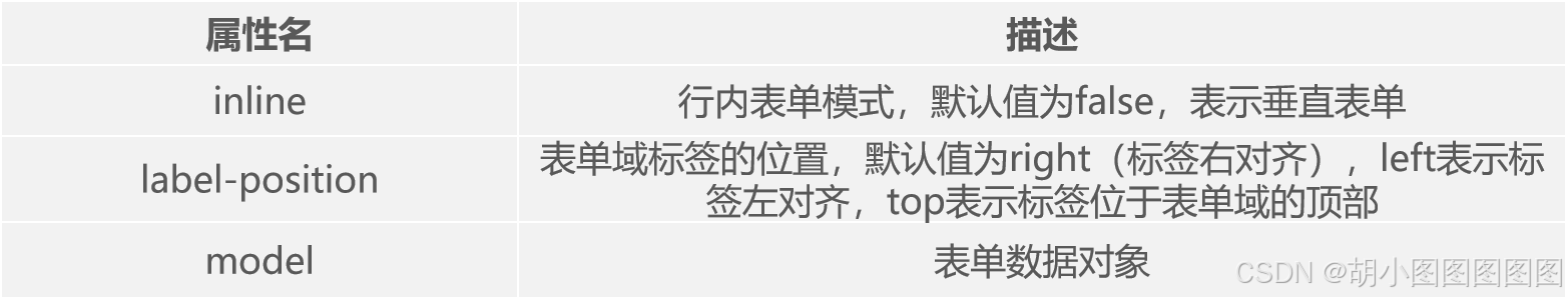
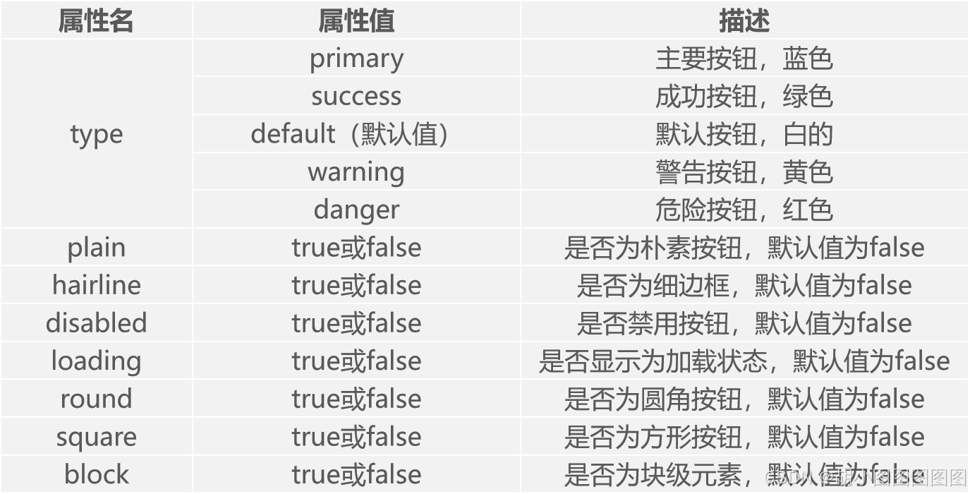
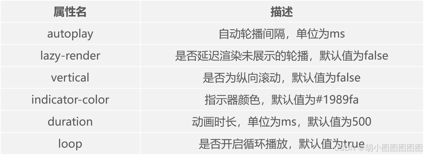
Button组件使用<van-button>标签定义,<van-button>标签的常用属性如下表所示。
演示基础的按钮效果
步骤一:
创建src\components\Button.vue文件。
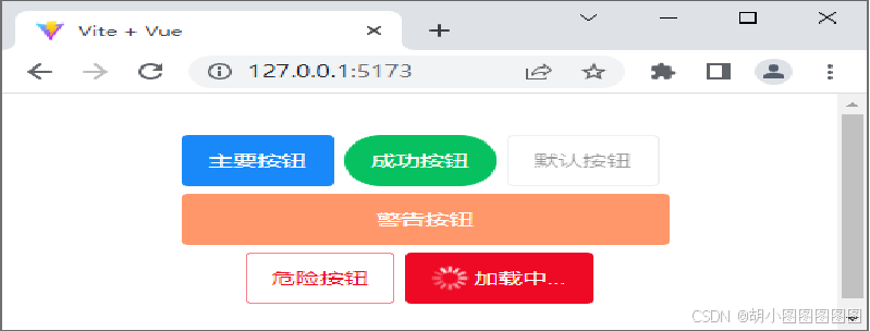
<template>
  <van-button type="primary">主要按钮</van-button>
  <van-button type="success" round>成功按钮</van-button>
  <van-button type="default" disabled>默认按钮</van-button>
  <van-button type="warning" block>警告按钮</van-button>
  <van-button type="danger" plain hairline>危险按钮</van-button>
  <van-button type="danger" loading loading-type="spinner" loading-text="加载中..." />
</template>
<style scoped>
  button{ margin: 3px; }
</style>
步骤二:
修改src\main.js文件,切换页面中显示的组件。
在浏览器中查看Vant的按钮效果如下图所示。
演示图标按钮的使用
步骤一:
创建src\components\Button2.vue文件。
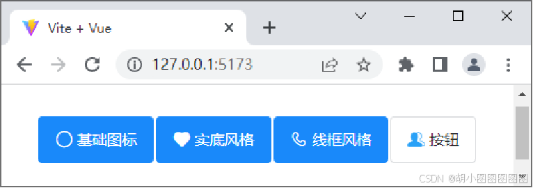
<template>
  <van-button icon="circle" type="primary">基础图标</van-button>
  <van-button icon="like" type="primary">实底风格</van-button>
  <van-button icon="phone-o" type="primary">线框风格</van-button>
  <van-button :icon="icon">按钮</van-button>
</template>
<script setup>
import icon from '../assets/user-active.png'
</script>
<style>
.van-button { margin: 5px 1px !important; }
</style>
步骤二:
修改src\main.js文件,切换页面中显示的组件。
在浏览器中打开开发者工具,测试在移动设备模拟环境下Vant的图标按钮效果如下图所示。
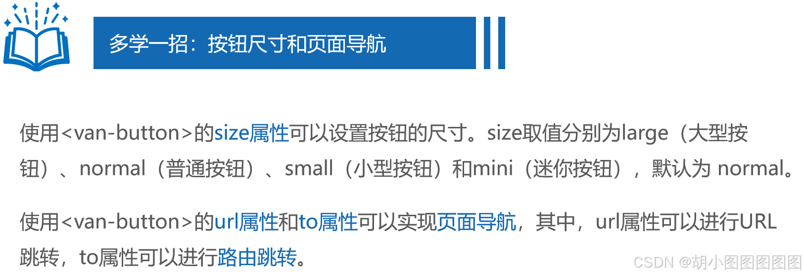
演示按钮尺寸和页面导航效果
步骤一:
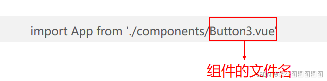
创建src\components\Button3.vue文件。
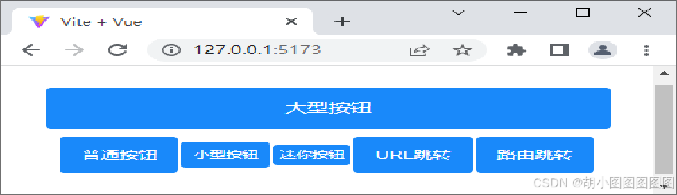
<template>
  <van-button type="primary" size="large">大型按钮</van-button>
  <van-button type="primary" size="normal">普通按钮</van-button>
  <van-button type="primary" size="small">小型按钮</van-button>
  <van-button type="primary" size="mini">迷你按钮</van-button>
  <van-button type="primary" url="/test.html">URL跳转</van-button>
  <van-button type="primary" to="目标地址">路由跳转</van-button>
</template>
<style>
.van-button { margin: 5px 1px !important; }
</style>
步骤二:
修改src\main.js文件,切换页面中显示的组件。
在浏览器中查看Vant按钮尺寸和页面导航效果如下图所示。
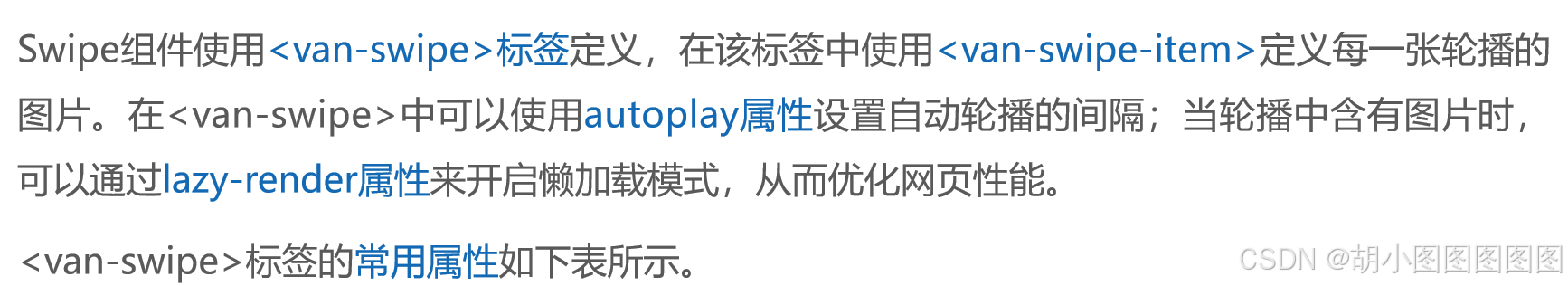
2. Swipe组件
Vant组件库提供了Swipe组件,用于实现图片轮播效果。轮播图是页面结构中重要的组成部分,常用于网站的首页,主要用于展示页面中的活动信息,让用户不用滚动屏幕就能看到更多内容,可以最大化信息密度。
演示一种简单的图片轮播效果
步骤一:
创建src\components\Swipe.vue文件,在Vant官方文档中找到Swipe组件相关代码,复制部分核心代码到当前文件中。
<template>
  <van-swipe :autoplay="3000" lazy-render style="width:300px;">
    <van-swipe-item v-for="image in images" :key="image">
      <img :src="image" />
    </van-swipe-item>
  </van-swipe>
</template>
<script setup>
const images = [ '/images/01.jpg', '/images/02.jpg', '/images/03.jpg', '/images/04.jpg']
</script>
步骤二:
修改src\main.js文件,切换页面中显示的组件。
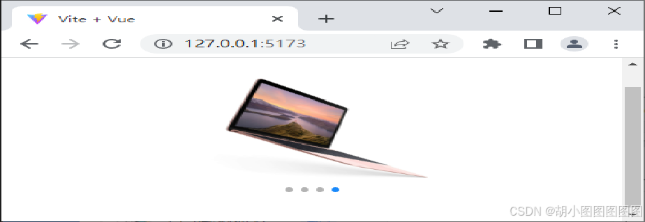
在浏览器中查看图片的横向滚动如下图所示。
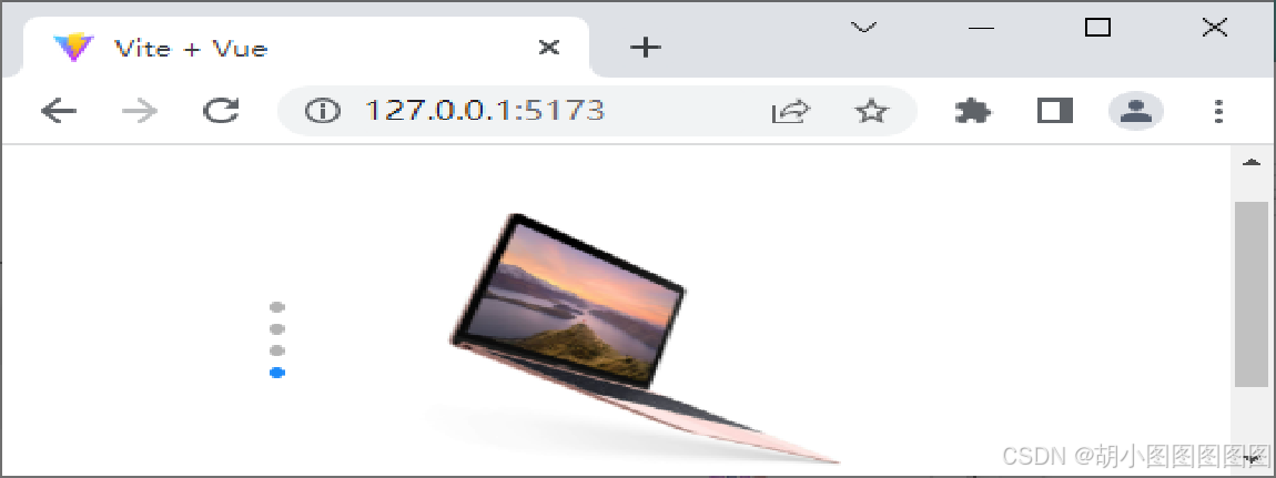
若想要图片纵向滚动,可以为<van-swipe>标签添加vertical属性,并设置滑块容器的高度,使轮播图片纵向排列。在浏览器中查看图片的纵向滚动如下图所示。
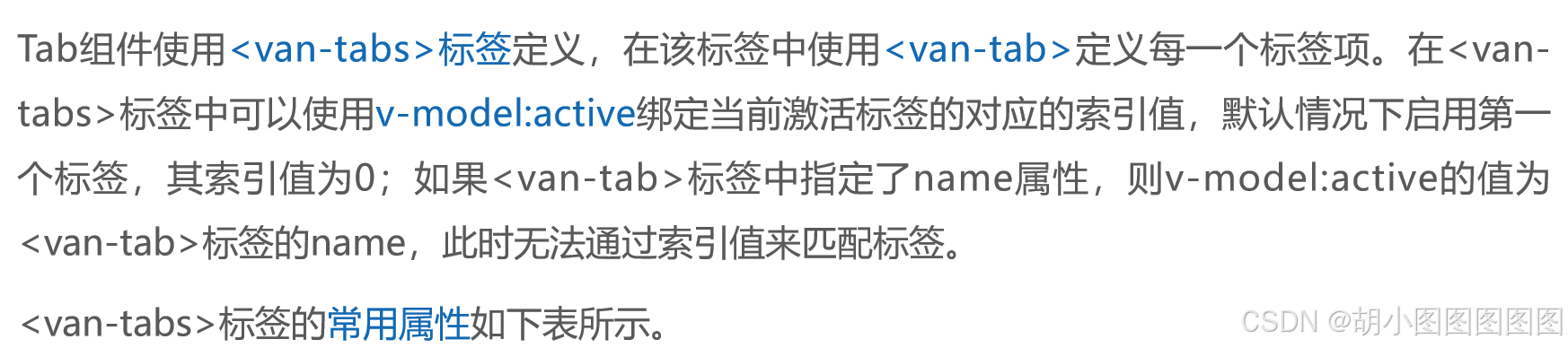
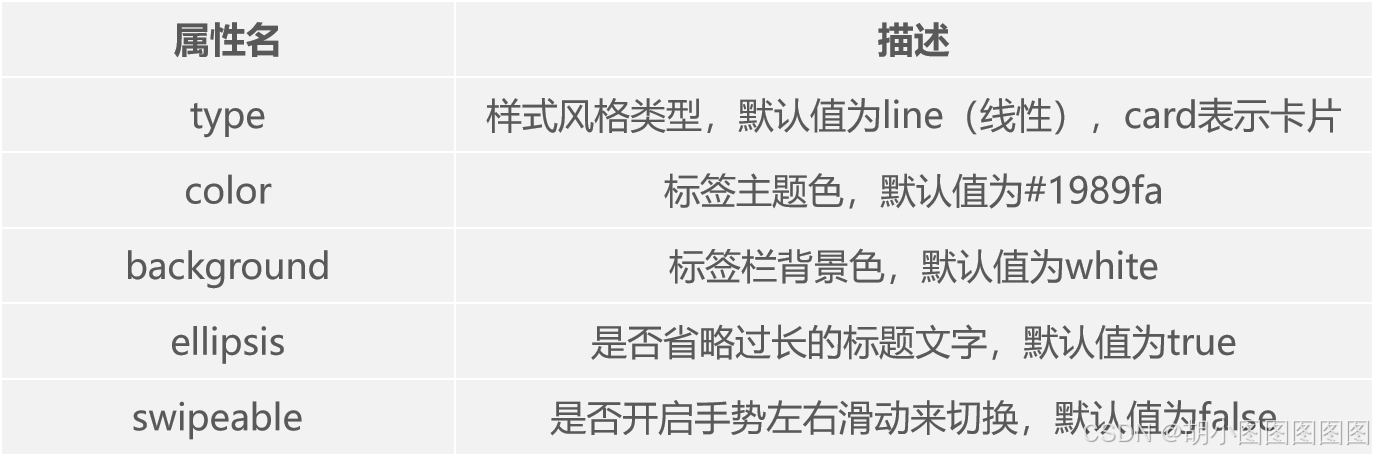
3. Tab组件
Vant组件库提供了Tab组件,用于实现标签页效果。标签页一般出现在页面的顶部或者页面中,用于在不同的内容区域之间进行切换。
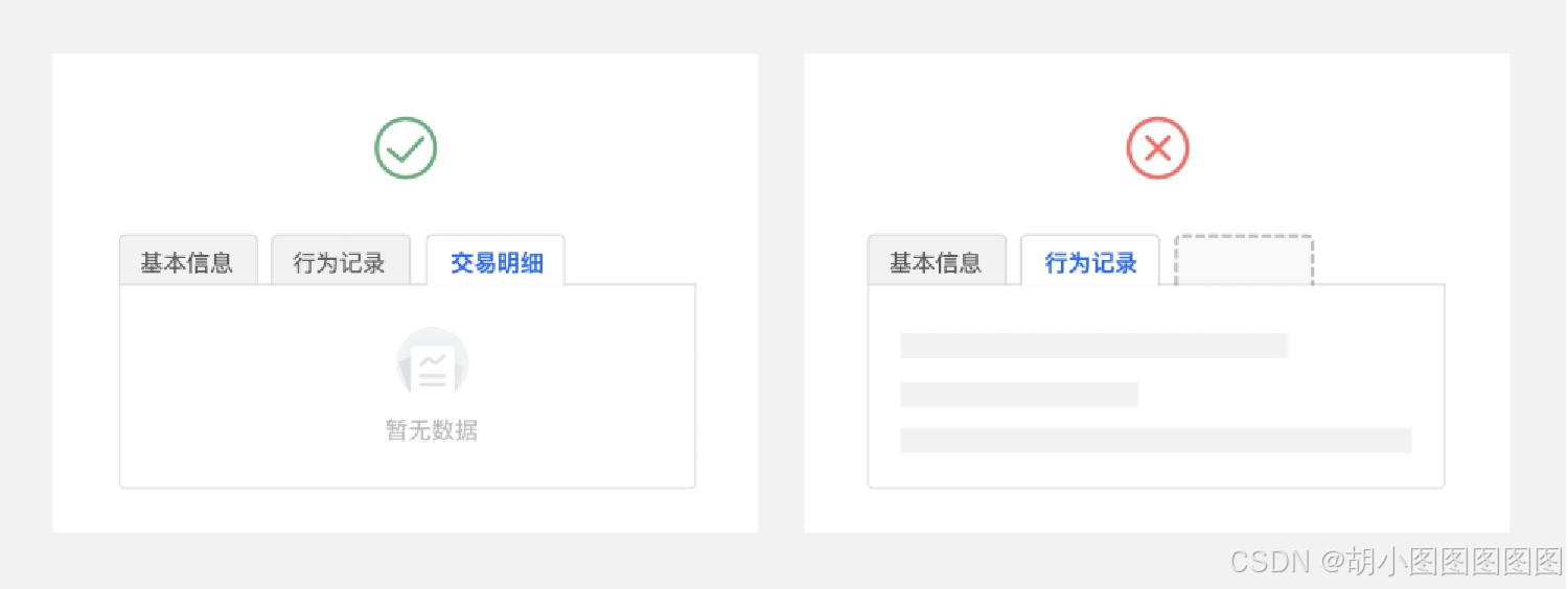
演示一种简单的标签页效果
步骤一:
创建src\components\Tab.vue文件。
<template>
  <div style="width: 350x; text-align: center;">
    <van-tabs v-model:active="active" swipeable type="card">
      <van-tab title="我是标签1的内容">内容 1</van-tab>
      <!-- 此处省略3个<van-tab></<van-tab>标签 -->
  </div>
</template>
<script setup>
import { ref } from 'vue'
const active = ref(0)
</script>
步骤二:
修改src\main.js文件,切换页面中显示的组件。
在浏览器中查看Vant的标签页效果如下图所示。

4. Form组件
Vant组件库提供了Form组件,用于数据输入、校验,支持输入框、单选框、复选框等类型。
Form组件使用**<van-form>标签定义,该标签需要与<van-field>标签搭配使用,用户可以在输入框内输入或编辑文字。<van-field>标签内可以通过rules属性定义校验规则,通过@submit触发**单击事件。
演示一种简单的表单效果
步骤一:
创建src\components\Form.vue文件,在Vant官方文档中找到Form组件相关代码,复制部分核心代码到当前组件中。
<template>
  <van-nav-bar title="登录组件" />
  <van-form @submit="onSubmit">
    <van-cell-group inset>
      <van-field v-model="username" :rules="[{  }]" />
      <van-field v-model="password" :rules="[{  }]" />
  </van-cell-group>
  <van-button block type="primary" native-type="submit">提交</van-button>
  </van-form>
</template>
步骤二:
修改src\main.js文件,切换页面中显示的组件。
步骤三:
修改src\main.js文件,对导入style.css文件的代码进行注释。
// import './style.css'在浏览器中查看Vant的表单效果如下图所示。
单击"提交"按钮后,会进行规则校验,如下图所示。
5. Grid组件
Vant组件库提供了Grid组件,用于实现网格效果,网格可以在水平方向上把页面分隔成等宽度的区块,一般用于同时展示多个同类项目的场景,例如微信支付页面。
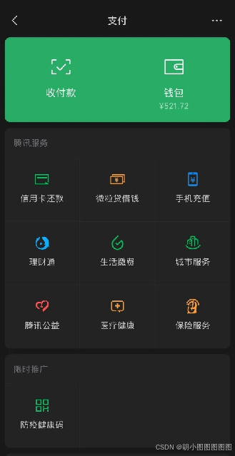

演示一种基础的网格效果
步骤一:
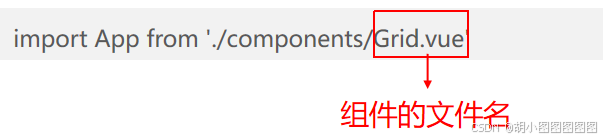
创建src\components\Grid.vue文件,在Vant官方文档中找到Grid组件相关代码,复制部分核心代码到当前文件中。
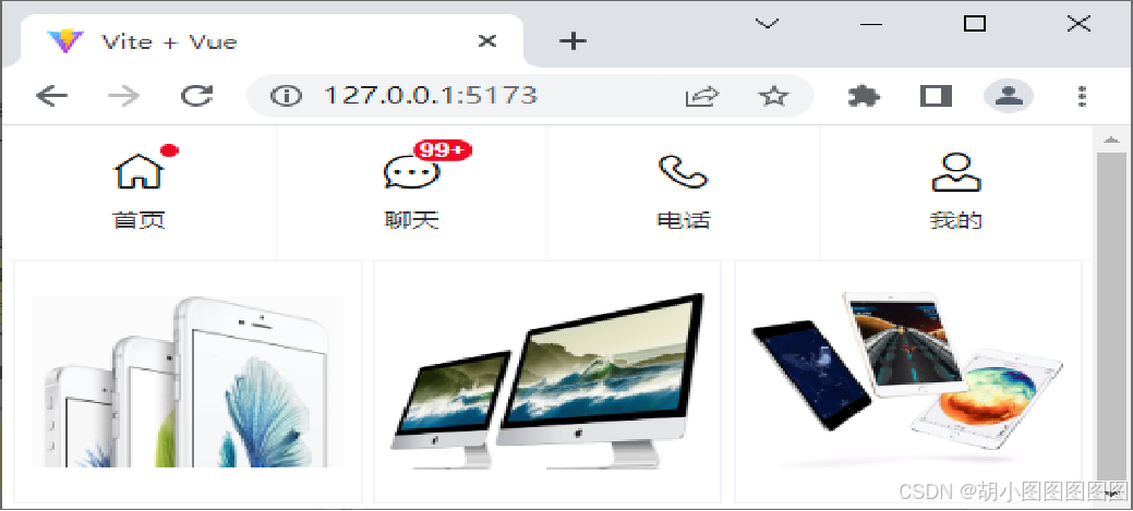
<template>
<van-grid>
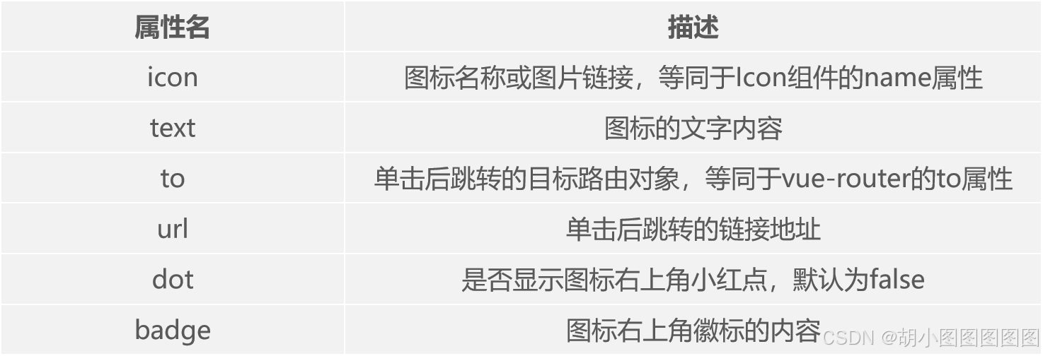
<van-grid-item icon="wap-home-o" text="首页" dot />
<van-grid-item icon="chat-o" text="聊天" badge="99+" />
<van-grid-item icon="phone-o" text="电话" />
<van-grid-item icon="user-o" text="我的" />
</van-grid>
<!-- 见下一页 -->
</template>实现一行中平均显示3列图片,图片素材从配套源代码中获取。
<van-grid :column-num="3" square :gutter="5">
    <van-grid-item icon="more-o" text="文字">
      <van-image src=" /images/01.jpg" />
    </van-grid-item>
    <van-grid-item icon="more-o" text="文字">
      <van-image src=" /images/02.jpg" />
    </van-grid-item>
    <van-grid-item icon="more-o" text="文字">
      <van-image src=" /images/03.jpg" />
    </van-grid-item>
</van-grid>修改src\main.js文件,切换页面中显示的组件。
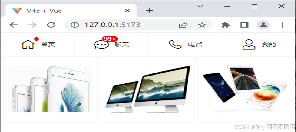
在浏览器中查看Vant的网格效果如下图所示。
若想网格的内容呈横向排列,则可以为**<van-grid>标签添加direction属性,将属性值设置为horizontal**,网格内容横向排列效果如下图所示。
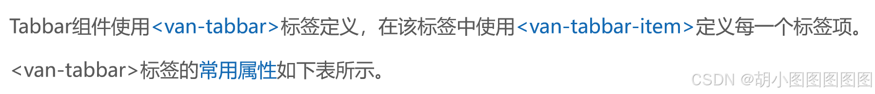
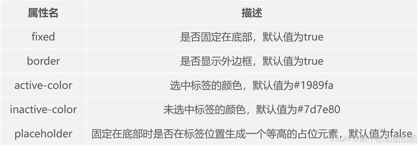
6. Tabbar组件
Vant组件提供了Tabbar组件,用于在不同页面之间进行切换,常放置在页面的底部。

演示一种基础的标签栏效果
步骤一:
创建src\components\Tabbar.vue文件,在Vant官方文档中找到Tabbar组件相关代码,复制部分核心代码到当前文件中。
<template>
  <van-tabbar v-model="active" fixed active-color="red" inactive-color="blue" :placeholder="true">
    <van-tabbar-item icon="home-o">标签</van-tabbar-item>
    <!-- 此处省略了3个 <van-tabbar-item>标签 -->
  </van-tabbar>
</template>
<script setup>
import { ref } from 'vue'
const active = ref(2)
</script>
步骤二:
修改src\main.js文件,切换页面中显示的组件。
在浏览器中查看Vant的标签栏效果如下图所示。
三.Ant Design Vue组件库
1 .安装Ant Design Vue
什么是Ant Design Vue?
Ant Design Vue是一个优秀的前端UI组件库,由蚂蚁金服体验技术部推出,于2018年3月正式开源,受到众多前端开发者及企业的喜爱。Ant Design Vue基于Vue实现,专门服务于企业级后台产品,支持主流浏览器和服务器端渲染。
使用npm或yarn包管理工具安装Ant Design Vue。
在Vue 3项目中使用yarn安装Ant Design Vue
步骤一:
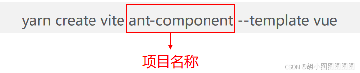
打开命令提示符,切换到D:\vue\chapter06目录,使用yarn创建一个名称为ant-component的项目。
在命令提示符中,切换到ant-component目录,为项目安装所有依赖。
cd ant-component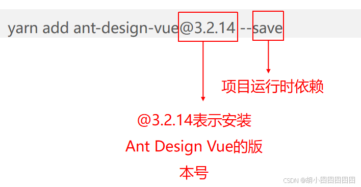
yarn在ant-component目录下使用yarn安装Ant Design Vue。
步骤三:
使用VS Code编辑器打开vant-component目录,在src\main.js文件中,导入并挂载Ant Design Vue模块。
import { createApp } from 'vue'
import './style.css'
import AntDesignVue from 'ant-design-vue'
import 'ant-design-vue/dist/antd.css'
import App from './App.vue'
const app = createApp(App)
app.use(AntDesignVue)
app.mount('#app')
步骤四:
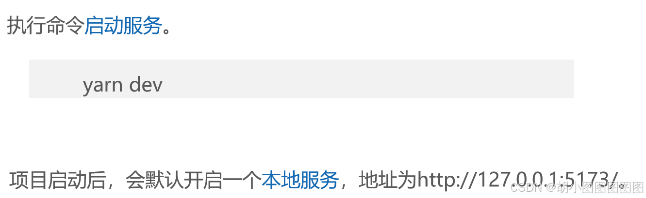
2 .Ant Design Vue中的常用组件
1. Button组件
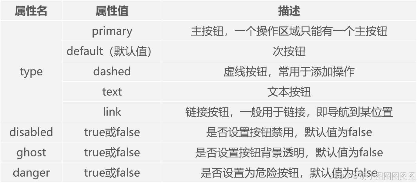
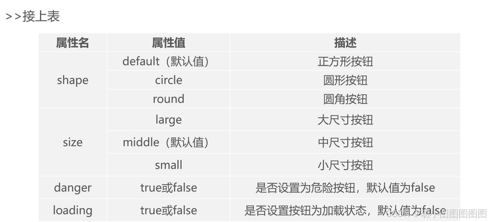
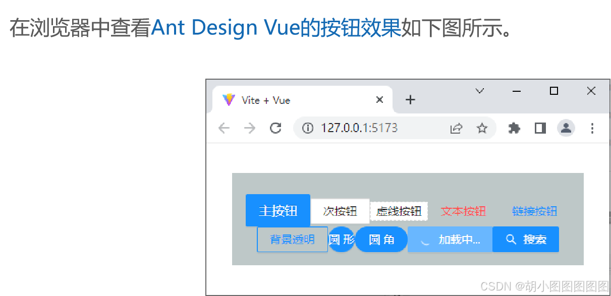
Button组件使用<a-button>标签定义,<a-button>标签的常用属性如下表所示。

<template>
  <div :style="{ background: 'rgb(190, 200, 200)', padding: '26px 16px 16px' }">
    <a-button type="primary" size="large">主按钮</a-button>
    <!-- 此处省略了8个<a-button></a-button>标签 -->
    <a-button type="primary">
      <template #icon><SearchOutlined /></template>
      搜索
    </a-button>
  </div>
</template>
步骤二:
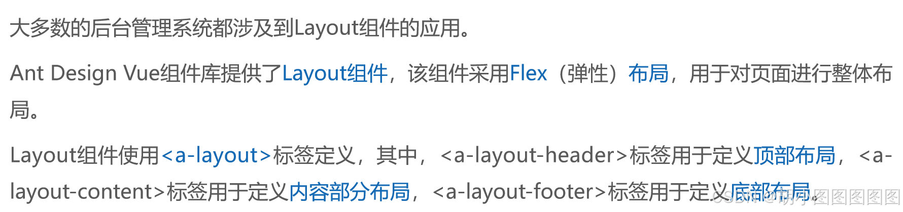
2. Layout组件