前言
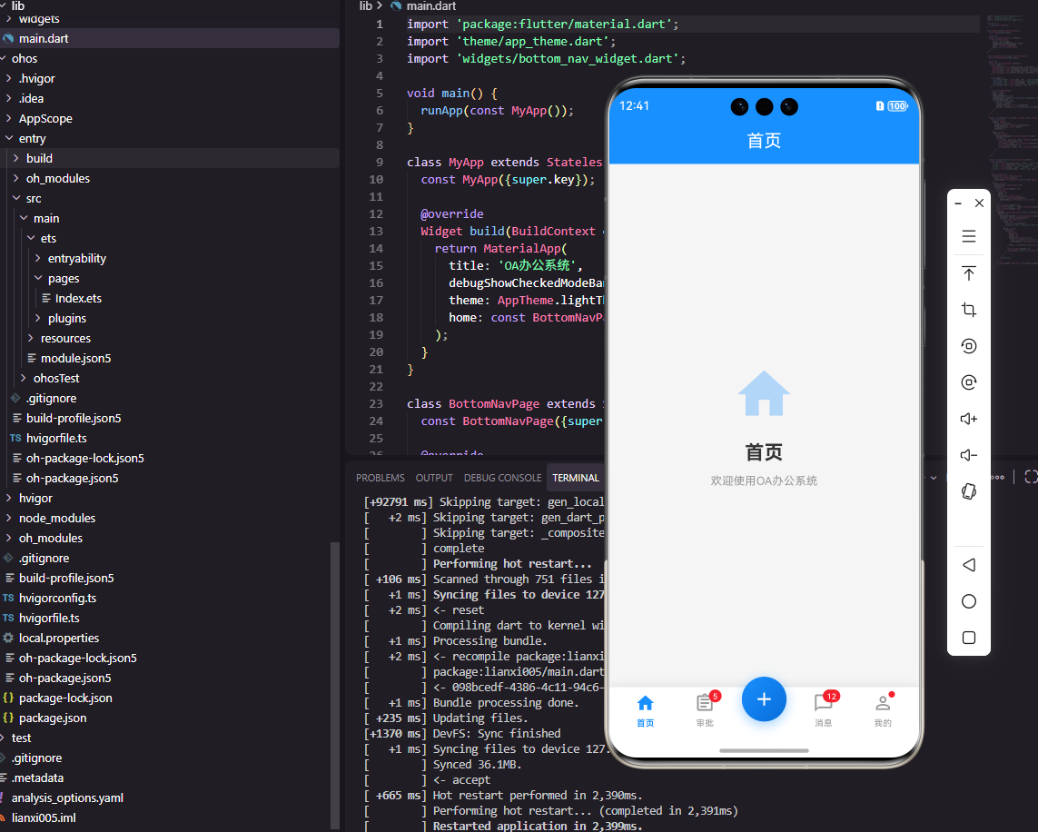
底部导航栏是OA系统中最常用的导航组件,它提供了在主要功能模块之间快速切换的能力。一个优秀的底部导航栏组件需要支持图标和文字展示、选中状态切换、角标提示、中间凸起按钮等功能。本文将详细介绍如何使用Flutter和OpenHarmony开发一个功能完善的底部导航栏组件。
组件功能设计
底部导航栏通常包含3-5个导航项,每个导航项包含图标和文字。选中的导航项需要有明显的视觉区分,如颜色变化或图标变化。部分导航项需要显示角标提示未读消息或待办数量。某些设计还需要中间凸起的特殊按钮,如快速发起功能。
Flutter端实现
定义导航项数据模型:
dart
class NavItem {
  final String label;
  final IconData icon;
  final IconData? activeIcon;
  final int? badge;
  final bool isSpecial;

  NavItem({
    required this.label,
    required this.icon,
    this.activeIcon,
    this.badge,
    this.isSpecial = false,
  });
}
NavItem定义导航项信息,activeIcon用于选中状态的图标,badge显示角标数量,isSpecial标识是否为特殊的中间凸起按钮。
底部导航栏组件的基础结构:
dart
class BottomNavBar extends StatelessWidget {
  final List<NavItem> items;
  final int currentIndex;
  final Function(int) onTap;

  const BottomNavBar({
    Key? key,
    required this.items,
    required this.currentIndex,
    required this.onTap,
  }) : super(key: key);
}
组件接收导航项列表、当前选中索引和点击回调。使用StatelessWidget因为选中状态由父组件管理。
导航栏构建:
dart
@override
Widget build(BuildContext context) {
  return Container(
    height: 60,
    decoration: BoxDecoration(
      color: Colors.white,
      boxShadow: [
        BoxShadow(
          color: Colors.black.withOpacity(0.1),
          blurRadius: 10,
          offset: Offset(0, -2),
        ),
      ],
    ),
    child: Row(
      mainAxisAlignment: MainAxisAlignment.spaceAround,
      children: items.asMap().entries.map((entry) {
        final index = entry.key;
        final item = entry.value;
        return item.isSpecial
          ? _buildSpecialItem(item, index)
          : _buildNavItem(item, index);
      }).toList(),
    ),
  );
}
导航栏使用Row水平排列导航项,spaceAround使各项均匀分布。boxShadow添加顶部阴影效果,增加层次感。
普通导航项构建:
dart
Widget _buildNavItem(NavItem item, int index) {
  final isSelected = index == currentIndex;

  return GestureDetector(
    onTap: () => onTap(index),
    child: Container(
      padding: EdgeInsets.symmetric(horizontal: 16, vertical: 8),
      child: Column(
        mainAxisSize: MainAxisSize.min,
        children: [
          Stack(
            clipBehavior: Clip.none,
            children: [
              Icon(
                isSelected ? (item.activeIcon ?? item.icon) : item.icon,
                color: isSelected ? Colors.blue : Colors.grey,
                size: 24,
              ),
              if (item.badge != null && item.badge! > 0)
                Positioned(
                  right: -8,
                  top: -4,
                  child: _buildBadge(item.badge!),
                ),
            ],
          ),
          SizedBox(height: 4),
          Text(
            item.label,
            style: TextStyle(
              fontSize: 12,
              color: isSelected ? Colors.blue : Colors.grey,
            ),
          ),
        ],
      ),
    ),
  );
}
普通导航项垂直排列图标和文字,选中状态使用蓝色,未选中使用灰色。Stack用于叠加角标,Positioned定位在图标右上角。
特殊中间按钮:
dart
Widget _buildSpecialItem(NavItem item, int index) {
  return GestureDetector(
    onTap: () => onTap(index),
    child: Container(
      width: 56,
      height: 56,
      margin: EdgeInsets.only(bottom: 20),
      decoration: BoxDecoration(
        color: Colors.blue,
        shape: BoxShape.circle,
        boxShadow: [
          BoxShadow(
            color: Colors.blue.withOpacity(0.3),
            blurRadius: 10,
            offset: Offset(0, 4),
          ),
        ],
      ),
      child: Icon(item.icon, color: Colors.white, size: 28),
    ),
  );
}
特殊按钮使用圆形设计,通过负margin向上凸起。蓝色背景和阴影效果使按钮更加突出,适合放置快速发起等重要功能。
OpenHarmony鸿蒙端实现
定义导航项接口:
typescript
interface NavItem {
  label: string
  icon: Resource
  activeIcon?: Resource
  badge?: number
  isSpecial?: boolean
}
NavItem定义导航项信息,activeIcon用于选中状态,badge显示角标数量。
底部导航栏组件的基础结构:
typescript
@Component
struct BottomNavBar {
  @Prop items: NavItem[] = []
  @Prop currentIndex: number = 0
  private onTap: (index: number) => void = () => {}
}
使用@Prop接收导航项和当前索引,回调函数处理点击事件。
导航栏构建:
typescript
build() {
  Row() {
    ForEach(this.items, (item: NavItem, index: number) => {
      if (item.isSpecial) {
        this.SpecialItem(item, index)
      } else {
        this.NavItem(item, index)
      }
    })
  }
  .width('100%')
  .height(60)
  .backgroundColor(Color.White)
  .justifyContent(FlexAlign.SpaceAround)
  .shadow({ radius: 10, color: '#1A000000', offsetY: -2 })
}
导航栏使用Row水平排列,SpaceAround使各项均匀分布。shadow添加顶部阴影效果。
普通导航项构建:
typescript
@Builder
NavItem(item: NavItem, index: number) {
  Column() {
    Stack() {
      Image(this.currentIndex === index ? (item.activeIcon || item.icon) : item.icon)
        .width(24)
        .height(24)
        .fillColor(this.currentIndex === index ? '#1890FF' : '#999999')

      if (item.badge && item.badge > 0) {
        Text(`${item.badge}`)
          .fontSize(10)
          .fontColor(Color.White)
          .backgroundColor('#F5222D')
          .padding({ left: 4, right: 4, top: 1, bottom: 1 })
          .borderRadius(8)
          .position({ x: 16, y: -4 })
      }
    }

    Text(item.label)
      .fontSize(12)
      .fontColor(this.currentIndex === index ? '#1890FF' : '#999999')
      .margin({ top: 4 })
  }
  .padding({ left: 16, right: 16, top: 8, bottom: 8 })
  .onClick(() => this.onTap(index))
}
普通导航项垂直排列图标和文字,选中状态使用蓝色。Stack叠加角标,position定位在图标右上角。
特殊中间按钮:
typescript
@Builder
SpecialItem(item: NavItem, index: number) {
  Column() {
    Image(item.icon)
      .width(28)
      .height(28)
      .fillColor(Color.White)
  }
  .width(56)
  .height(56)
  .backgroundColor('#1890FF')
  .borderRadius(28)
  .justifyContent(FlexAlign.Center)
  .margin({ bottom: 20 })
  .shadow({ radius: 10, color: '#4D1890FF', offsetY: 4 })
  .onClick(() => this.onTap(index))
}
特殊按钮使用圆形蓝色背景,margin向上凸起。shadow添加阴影效果使按钮更加突出。
带动画的选中效果:
typescript
@Builder
AnimatedNavItem(item: NavItem, index: number) {
  Column() {
    Image(this.currentIndex === index ? (item.activeIcon || item.icon) : item.icon)
      .width(this.currentIndex === index ? 28 : 24)
      .height(this.currentIndex === index ? 28 : 24)
      .fillColor(this.currentIndex === index ? '#1890FF' : '#999999')
      .animation({ duration: 200, curve: Curve.EaseOut })

    Text(item.label)
      .fontSize(this.currentIndex === index ? 13 : 12)
      .fontColor(this.currentIndex === index ? '#1890FF' : '#999999')
      .fontWeight(this.currentIndex === index ? FontWeight.Medium : FontWeight.Normal)
      .margin({ top: 4 })
      .animation({ duration: 200, curve: Curve.EaseOut })
  }
  .onClick(() => this.onTap(index))
}
带动画的导航项在选中时图标放大、文字加粗,animation属性添加平滑过渡效果。这种微交互提升了用户体验。
总结
本文详细介绍了Flutter和OpenHarmony平台上底部导航栏组件的开发方法。底部导航栏是OA系统中最常用的导航组件,需要支持图标文字展示、选中状态切换、角标提示等功能。两个平台都提供了灵活的布局组件来实现导航栏,开发者需要注意选中状态的视觉反馈和特殊按钮的设计处理。
欢迎加入开源鸿蒙跨平台社区:https://openharmonycrossplatform.csdn.net