目录
[import QtQuick.Controls 2.4](#import QtQuick.Controls 2.4)
[import QtQuick.Templates 2.4 as T](#import QtQuick.Templates 2.4 as T)
[import QtGraphicalEffects 1.15](#import QtGraphicalEffects 1.15)
[import QtQuick 2.15 as T2](#import QtQuick 2.15 as T2)
一.添加模块
import QtQuick.Controls 2.4
-
作用: 引入Qt Quick Controls模块,提供了一组常见的UI控件(如按钮、文本框等),用于快速开发现代用户界面。
-
性质: 这个模块包含了许多预定义的控件和样式,可以大大简化UI开发。版本号2.4表示你正在使用该模块的第2.4版。
import QtQuick.Templates 2.4 as T
- 作用: 引入Qt Quick Templates模块,这个模块提供了一些常用的模板组件,例如Repeater、Loader等,用于动态创建和管理UI元素。
- 性质 : 通过给模块起别名
T,你可以在代码中用T来引用该模块中的类型和函数。版本号2.4表示你正在使用该模块的第2.4版。
import QtGraphicalEffects 1.15
-
作用: 引入Qt Graphical Effects模块,提供了一组图形效果类,用于为UI元素添加视觉效果,如阴影、模糊、渐变等。
-
性质: 这个模块允许你在应用程序中实现复杂的视觉效果,提升用户体验。版本号1.15表示你正在使用该模块的第1.15版。
import QtQuick 2.15 as T2
-
作用: 引入Qt Quick基础模块,这是Qt Quick的核心部分,提供了构建动态用户界面的基本功能和类型。
-
性质 : 通过给模块起别名
T2,你可以在代码中用T2来引用该模块中的类型和函数。版本号2.15表示你正在使用该模块的第2.15版。
二.自定义Combox
1.combox文字显示
2.设置下拉图标显示
3.下拉框中选中背景设置
4.下拉框中选中文字设置
5.下拉框设置
三.效果显示


四.代码
javascript
import QtQuick 2.11
import QtQuick.Window 2.3
import QtQuick.Controls 2.4
import QtQuick.Templates 2.4 as T
import QtGraphicalEffects 1.15
import QtQuick 2.15 as T2
Window{
width: 800
height: 600
visible: true
property int inPopHeight: 0
property int inRadius: 20
property int inTextWidth: 380
property bool sizeToContents: false
property real _largestTextWidth: 0
property real _popupWidth: sizeToContents ? _largestTextWidth + itemDelegateMetrics.leftPadding + itemDelegateMetrics.rightPadding : control.width
property bool _onCompleted: false
property int _fontSize: 30
ComboBox {
id: control
anchors.centerIn: parent
padding: 10
spacing: 10
font.family: "微软雅黑"
implicitWidth: 400
implicitHeight:70
leftPadding: padding + (!control.mirrored || !indicator || !indicator.visible ? 0 : indicator.width + spacing)
rightPadding: padding + (control.mirrored || !indicator || !indicator.visible ? 0 : indicator.width)
TextMetrics {
id: textMetrics
font.pixelSize: _fontSize
font.family: "微软雅黑"
}
ItemDelegate {
id: itemDelegateMetrics
visible: false
font.pixelSize: _fontSize
font.family: "微软雅黑"
}
function _adjustSizeToContents() {
if (_onCompleted && sizeToContents && model) {
_largestTextWidth = 0
for (var i = 0; i < model.length; i++){
textMetrics.text = model[i]
_largestTextWidth = Math.max(textMetrics.width, _largestTextWidth)
}
}
}
onModelChanged: _adjustSizeToContents()
Component.onCompleted: {
_onCompleted = true
_adjustSizeToContents()
}
// The items in the popup
delegate: ItemDelegate {
width: _popupWidth
//height: Math.round(popupItemMetrics.height * 1.75)
property string _text: control.textRole ? (Array.isArray(control.model) ? modelData[control.textRole] : model[control.textRole]) : modelData
TextMetrics {
id: popupItemMetrics
font: control.font
text: _text
}
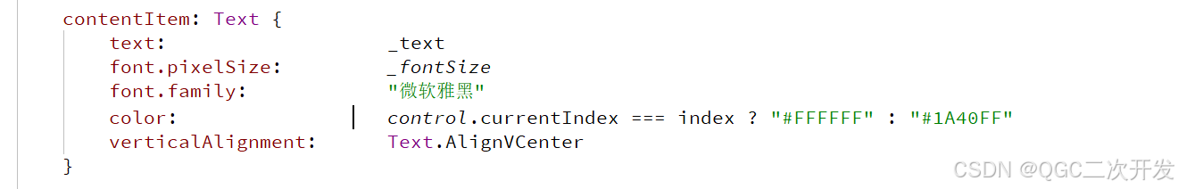
contentItem: Text {
text: _text
font.pixelSize: _fontSize
font.family: "微软雅黑"
color: control.currentIndex === index ? "#FFFFFF" : "#1A40FF"
verticalAlignment: Text.AlignVCenter
}
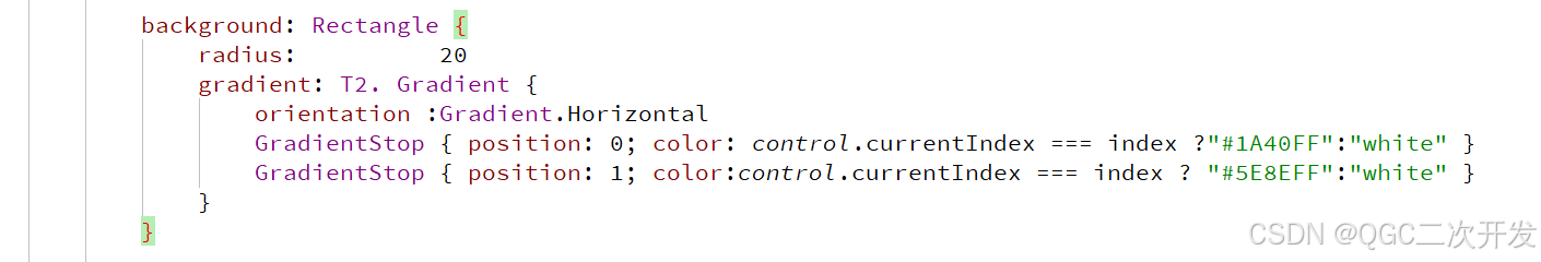
background: Rectangle {
radius: 20
gradient: T2. Gradient {
orientation :Gradient.Horizontal
GradientStop { position: 0; color: control.currentIndex === index ?"#1A40FF":"white" }
GradientStop { position: 1; color:control.currentIndex === index ? "#5E8EFF":"white" }
}
}
highlighted: control.highlightedIndex === index
}
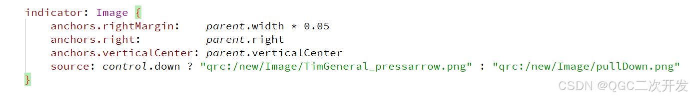
indicator: Image {
anchors.rightMargin: parent.width * 0.05
anchors.right: parent.right
anchors.verticalCenter: parent.verticalCenter
source: control.down ? "qrc:/new/Image/TimGeneral_pressarrow.png" : "qrc:/new/Image/pullDown.png"
}
// The label of the button
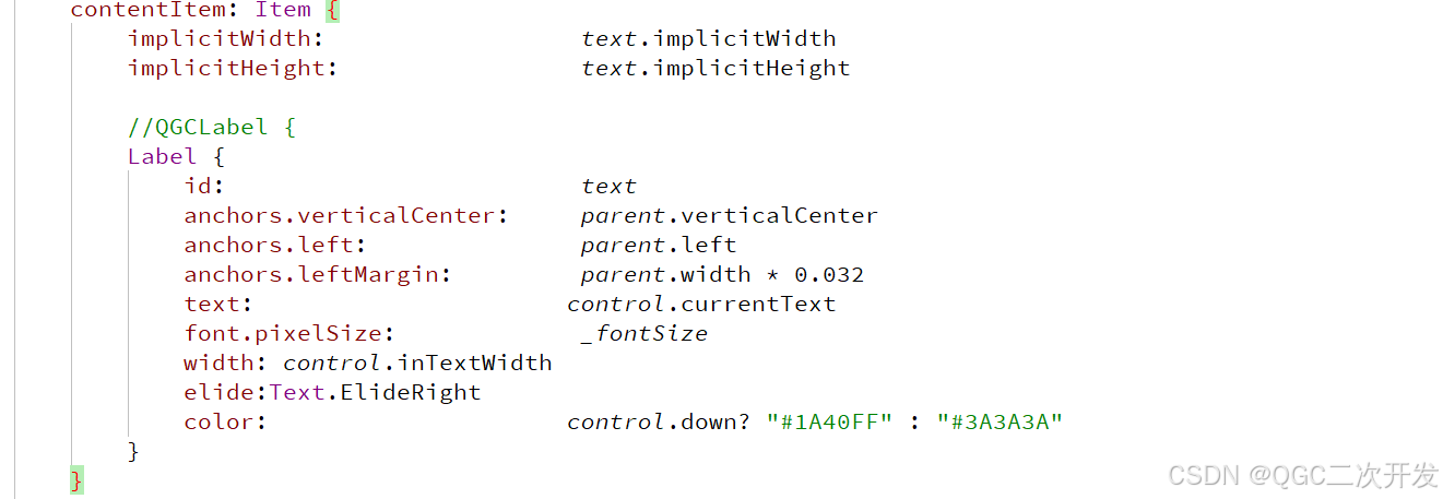
contentItem: Item {
implicitWidth: text.implicitWidth
implicitHeight: text.implicitHeight
//QGCLabel {
Label {
id: text
anchors.verticalCenter: parent.verticalCenter
anchors.left: parent.left
anchors.leftMargin: parent.width * 0.032
text: control.currentText
font.pixelSize: _fontSize
width: control.inTextWidth
elide:Text.ElideRight
color: control.down? "#1A40FF" : "#3A3A3A"
}
}
background: Rectangle {
implicitWidth: 5
implicitHeight: 1.6
border.color: control.down? "#508AFF" : "#FFFFFF"
border.width: 2
color: control.down? "#FFFFFF" : "#4ceaf1fb"
radius: 20
layer.enabled: true
layer.effect: DropShadow {
verticalOffset: 4
radius: 10
samples: 17
color: "#B2C5E0"
}
}
model: ListModel {
id: model
ListElement { text: "Banana" }
ListElement { text: "Apple" }
ListElement { text: "Coconut" }
}
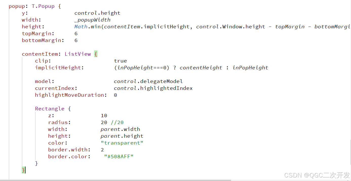
popup: T.Popup {
y: control.height
width: _popupWidth
height: Math.min(contentItem.implicitHeight, control.Window.height - topMargin - bottomMargin)
topMargin: 6
bottomMargin: 6
contentItem: ListView {
clip: true
implicitHeight: (inPopHeight===0) ? contentHeight : inPopHeight
model: control.delegateModel
currentIndex: control.highlightedIndex
highlightMoveDuration: 0
Rectangle {
z: 10
radius: 20 //20
width: parent.width
height: parent.height
color: "transparent"
border.width: 2
border.color: "#508AFF"
}
}
//下拉框背景
background: Rectangle {
radius: 20 //20
color: "white"
}
}
}
}