CSS系列文章目录
文章目录
- CSS系列文章目录
- 一、前言
- 二、静态定位:position:static;
- 二、相对定位:position:relative
- 三、绝对定位:position:absolute
- 四、固定定位:position:fixed
- 五、粘性定位:position:sticky
一、前言
position 属性规定应用于元素的定位方法的类型(static、relative、fixed、absolute 或 sticky)。
元素其实是使用 top、bottom、left 和 right 属性定位的。但是,除非首先设置了 position 属性,否则这些属性将不起作用。根据不同的 position 值,它们的工作方式也不同。
二、静态定位:position:static;
HTML 元素默认情况下的定位方式为 static(静态)定位,表示没有定位,元素会按照正常的位置显示,此时 top、bottom、left 和 right 4 个定位属性也 不会被应用。
position: static; 的元素不会以任何特殊方式定位;它始终根据页面的正常流进行定位:
🌰举个栗子:
html
<!DOCTYPE html>
<html>
<head>
    <style>
        div{
            height: 100px;
            border: 1px solid black;
        }
        div.static {
            width: 130px;
            height: 50px;
            background-color: #CCC;
            line-height: 50px;
            text-align: center;
            position: static;
            top: 50px;
            left: 20px;
        }
    </style>
</head>
<body>
    <div>
        <div class="static">item;</div>
    </div>
</body>
</html>
🤖运行结果:

二、相对定位:position:relative
相对定位 的元素相对于其正常位置进行定位。
设置相对定位的元素的 top、right、bottom 和 left 属性将导致其偏离其正常位置进行调整。不会对其余内容进行调整来适应元素留下的任何空间。
🌰举个栗子:
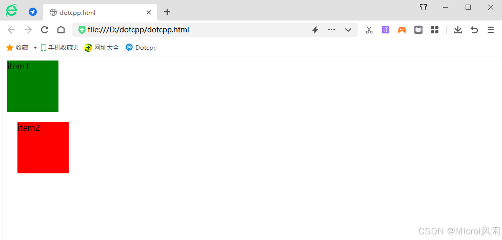
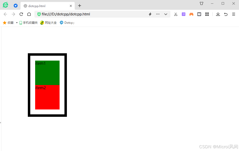
1、未使用 position:relative :
html
<html>
    <head>
        <style type="text/css">
           #item1 {
               width:100px;
               height:100px;
               background-color:green;
           }
           #item2 {
               width:100px;
               height:100px;
               background-color:red;
           }
         </style>
    </head>
    <body>
           <div id="content">
            <div id="item1" >item1</div>
            <div id="item2">item2</div>
        </div>
    </body>
</html>
🤖运行结果:

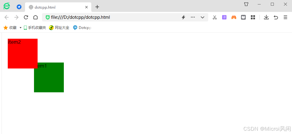
2、使用 position:relative :
html
<html>
    <head>
        <style type="text/css">
           #item1 {
              width:100px;
              height:100px;
              background-color:green;
           }
           #item2 {
              width:100px;
              height:100px;
              background-color:red;
              position:relative;
              left:20px;
              top:20px;
           }

         </style>
    </head>
    <body>
           <div id="content">
            <div id="item1" >item1</div>
            <div id="item2">item2</div>
        </div>
    </body>
</html>
🤖运行结果:
🎯总结:relative 是相对正常文档流的位置进行偏移,原先占据的位置依然存在,也就是说它不会影响后面元素的位置。left 表示相对原先位置右边进行偏移,top 表示相对原先位置下边进行偏移。当 left和 right 同时存在,仅 left 有效,当 top 和 bottom 同时存在仅 top 有效。relative 的偏移是基于对象的 margin 左上侧的。
三、绝对定位:position:absolute
绝对定位 的元素相对于最近的定位祖先元素进行定位(而不是相对于视口定位,如 fixed)。
然而,如果绝对定位的元素没有祖先,它将使用文档主体(body),并随页面滚动一起移动。
🎯注意:"被定位的"元素是其位置除 static 以外的任何元素。
🌰举个栗子:
1、未使用 position:absolute :
html
<html>
    <head>
        <style type="text/css">
           #item1 {
               width:100px;
               height:100px;
               background-color:green;
           }
           #item2 {
               width:100px;
               height:100px;
               background-color:red;
           }
   #content {
     margin-left:100px;
     margin-top: 100px;
   }

         </style>
    </head>
    <body>
           <div id="content">
            <div id="item1" >item1</div>
            <div id="item2">item2</div>
        </div>
    </body>
</html>
🤖运行结果:

2、使用 position:absolute :
html
<html>
    <head>
        <style type="text/css">
          #item1 {
              width:100px;
              height:100px;
              background-color:green;
          }
          #item2 {
              width:100px;
              height:100px;
              background-color:red;
              position: absolute;
              left:20px;
              top:20px;
          }
          #content {
              margin-left:100px;
              margin-top:100px;
          }


         </style>
    </head>
    <body>
           <div id="content">
            <div id="item1" >item1</div>
            <div id="item2">item2</div>
        </div>
    </body>
</html>
🤖运行结果:
由此可见当父级元素的 position 属性值为默认值时(static), absolute 是相对于浏览器窗口进行定位的。
如果设置 content 的 position 属性值为非默认值,那么 absolute 就是相对于该父级元素进行定。
html
<html>
    <head>
        <style type="text/css">
          #item1 {
              width:100px;
              height:100px;
              background-color:green;
          }
          #item2 {
              width:100px;
              height:100px;
              background-color:red;
              position: absolute;
              left:20px;
              top:20px;
          }
          #content {
              margin-left:100px;
              margin-top: 100px;
              position: relative
          }
         </style>
    </head>
    <body>
           <div id="content">
            <div id="item1" >item1</div>
            <div id="item2">item2</div>
        </div>
    </body>
</html>
🤖运行结果:

继续修改css样式:
html
<html>
    <head>
        <style type="text/css">
          #item1 {
              width:100px;
              height:100px;
              background-color:green;
          }
          #item2 {
           width:100px;
           height:100px;
           background-color:red;
          }
          #content {
           margin-left:100px;
           margin-top: 100px;
           position:absolute;
           padding:20px;
           border:10px solid black;
          }

         </style>
    </head>
    <body>
           <div id="content">
            <div id="item1" >item1</div>
            <div id="item2">item2</div>
        </div>
    </body>
</html>
🤖运行结果:
注意到变化了吗,当把外层 div 设置为 absolute 时,外层 div 宽度由原来的100%变为 auto。
当把一个元素 position 属性设置为 absolute 或 fixed 的时候,会发生三件事:
-
把该元素往
Z轴方向移了一层,元素脱离了普通流,所以不再占据原来那层的空间,还会覆盖下层的元素。 -
该元素将变为块级元素,相当于给该元素设置了
display: block;(给一个内联元素,如<span>,设置absolute之后发现它可以设置宽高了)。 -
如果该元素是块级元素,元素的宽度由原来的
width: 100%(占据一行),变为了auto。
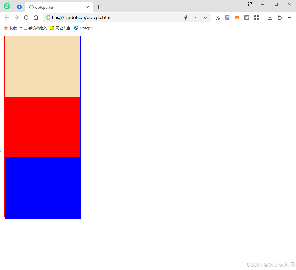
四、固定定位:position:fixed
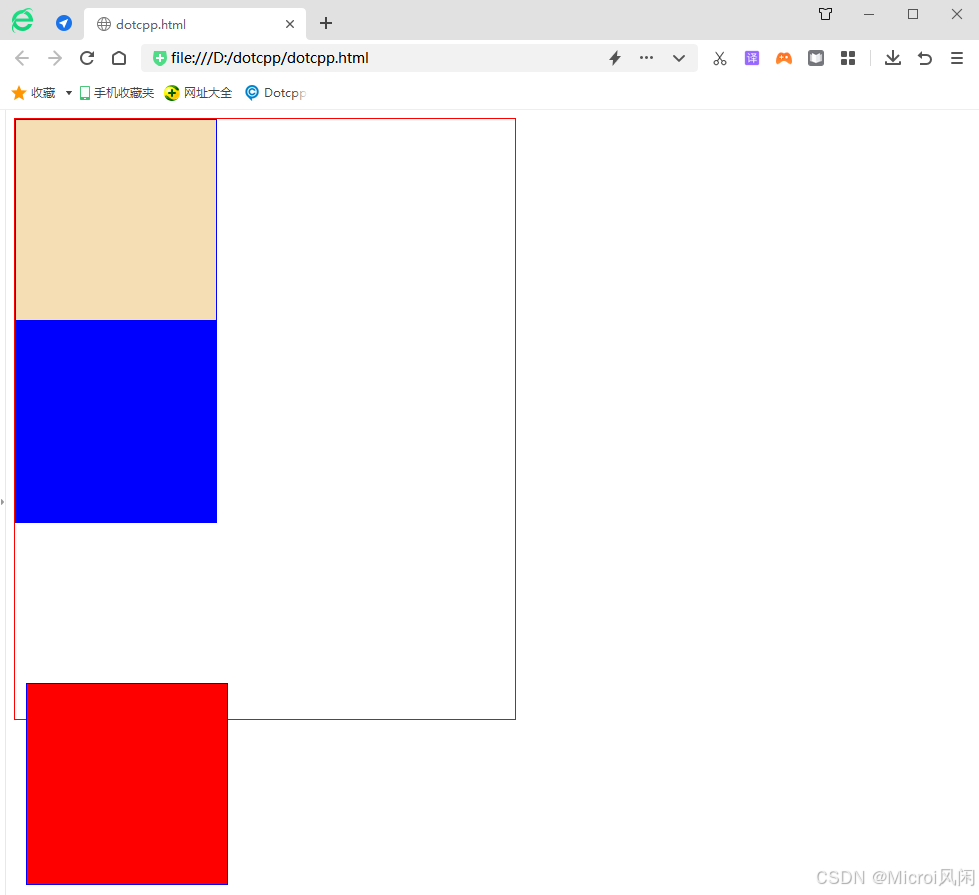
固定定位 就是将元素相对于浏览器窗口进行定位,使用固定定位的元素不会因为浏览器窗口的滚动而移动,就像是固定在了页面上一样,我们经常在网页上看到的返回顶部按钮就是使用固定定位实现的。
🌰举个栗子:
html
<!DOCTYPE html>
<html>
    <head>
        <meta charset="UTF-8">
        <title></title>
        <style>
            .out{
                border: red 1px solid;
                height: 600px;
                width: 500px;
            }
            .in{
                border: blue 1px solid;
                height: 200px;
                width: 200px;
            }

        </style>
    </head>
    <body>
        <div class="out" style="position: relative;" >
            <div class="in" style=" background-color: wheat;"></div>
            <div class="in" style=" background-color: red; position: fixed; left: 20px; bottom: 10px;"></div>
            <div class="in" style=" background-color: blue;"></div>
        </div>
    </body>
</html>
🤖运行结果:
五、粘性定位:position:sticky
粘性定位 与前面介绍的四种定位方式不太一下,它像是相对定位和固定定位的结合体,当滚动页面时它的效果与相对定位相同,当元素滚动到一定程度时它又会呈现出固定定位的效果。比如一些网页上的导航菜单,当页面加载完成时它在自己默认的位置,当我们向下滚动页面时它又会固定在页面的最顶端。
🌰举个栗子:
html
<!DOCTYPE html>
<html>
    <head>
        <meta charset="UTF-8">
        <title></title>
        <style>
            .out{
                border: red 1px solid;
                height: 600px;
                width: 500px;
            }
            .in{
                border: blue 1px solid;
                height: 200px;
                width: 250px;
            }
        </style>
    </head>
    <body>
        <div class="out" >
            <div class="in" style=" background-color: wheat;"></div>
            <div class="in" style=" background-color: red;"></div>
            <div class="in" style=" background-color: blue;"></div>
        </div>
    </body>
</html>
🤖运行结果: