程序员Feri一名12年+的程序员,做过开发带过团队创过业,擅长Java、嵌入式、鸿蒙、人工智能等,专注于程序员搞钱那点儿事,希望在搞钱的路上有你相伴!君志所向,一往无前!
1.Swiper
1.1 Swiper组件
Swiper组件提供滑动轮播显示的能力。
Swiper本身是一个容器组件,当设置了多个子组件后,可以对这些子组件进行轮播显示,比如:
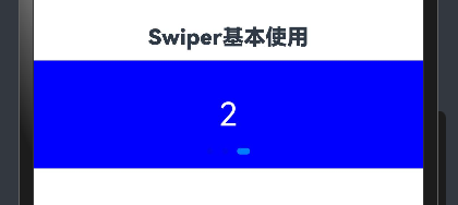
1.2 基本用法
首先来看看如何设置轮播内容,以及设置尺寸
-
轮播内容:内容作为Swiper的子组件即可
-
尺寸:
a. 设置 Swiper 的尺寸:内容会拉伸为和 Swiper 一致(优先级高)
b. 设置内容尺寸:会将Swiper撑开
  @Entry
@Component
struct Index {
  // Swiper 基本使用
  build() {
    Column() {
      Text('Swiper基本使用')
        .fontSize(20)
        .fontWeight(900)
        .padding(10)
      Swiper() {
        Text('0')
          .textAlign(TextAlign.Center)
          .backgroundColor(Color.Red)
          .fontColor(Color.White)
          .fontSize(30)
        Text('1')
          .textAlign(TextAlign.Center)
          .backgroundColor(Color.Green)
          .fontColor(Color.White)
          .fontSize(30)
        Text('2')
          .textAlign(TextAlign.Center)
          .backgroundColor(Color.Blue)
          .fontColor(Color.White)
          .fontSize(30)
      }
      .width('100%')
      .height(100)
    }
    .width('100%')
    .height('100%')
  }
}
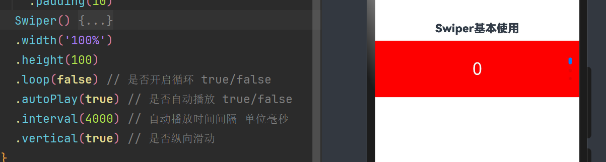
1.3 常用属性
设置了内容以及尺寸之后已经可以实现基础的轮播效果,接下来看看一些常见属性
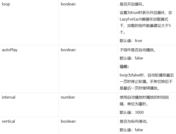
使用上述属性,将轮播图调整为:
-
自动播放
-
播放间隔:1 秒钟
-
纵向滑动
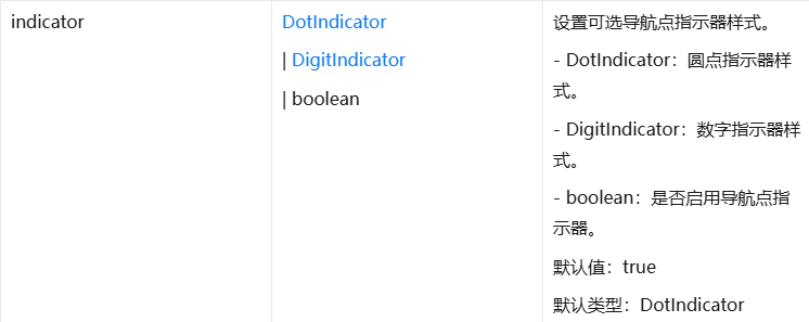
1.4 调整导航点
如果默认的导航点不满足效果,可以自行调整
导航点的调整可以分为 2 类:
-
显示 or 隐藏
-
导航点类型:
a. 圆点(掌握)
b. 数字(了解)
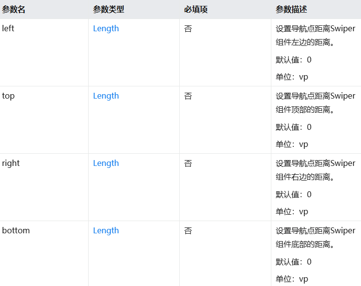
位置属性取值:
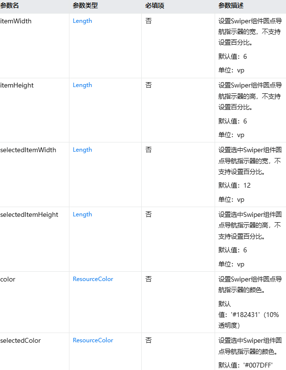
样式属性取值:
 Swiper() {
        Text('0')
          .textAlign(TextAlign.Center)
          .backgroundColor(Color.Red)
          .fontColor(Color.White)
          .fontSize(30)
        Text('1')
          .textAlign(TextAlign.Center)
          .backgroundColor(Color.Green)
          .fontColor(Color.White)
          .fontSize(30)
        Text('2')
          .textAlign(TextAlign.Center)
          .backgroundColor(Color.Blue)
          .fontColor(Color.White)
          .fontSize(30)
      }
      .width('100%')
      .height(100)
      .loop(false) // 是否开启循环 true/false
      .autoPlay(true) // 是否自动播放 true/false
      .interval(4000) // 自动播放时间间隔 单位毫秒
      .vertical(false) // 是否纵向滑动
      .indicator(
        Indicator.dot()
          .left(10)// 左侧距离
          .top(10)// 顶部距离
          .bottom(10)// 底部距离
          .right(10)// 右侧距离(距离属性组合使用,无需全部设置)
          .itemWidth(20)// 指示器宽度
          .itemHeight(20)// 指示器高度
          .selectedItemWidth(30)// 选中指示器宽度
          .selectedItemHeight(30)// 选中指示器高度
          .selectedColor(Color.Yellow)// 选中指示器颜色
          .color(Color.Black) // 默认指示器宽度
      ) // 圆形导航点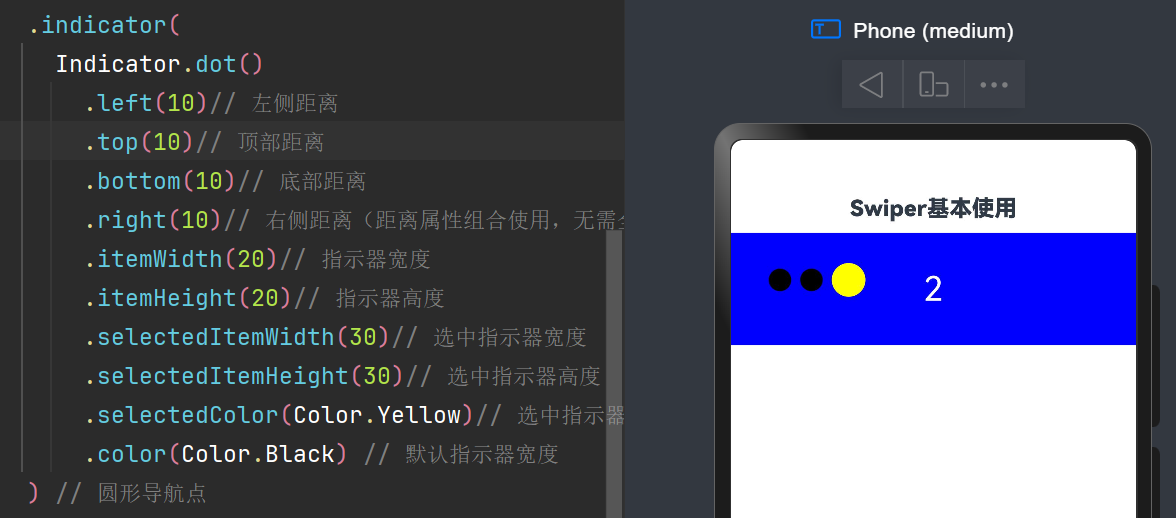
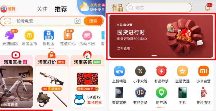
2 Swiper综合实践
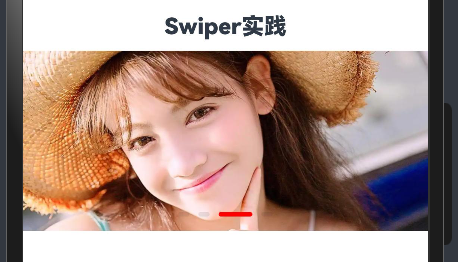
@Entry
@Component
struct Index {

  build() {
    Column() {
      Text('Swiper实践')
        .fontSize(20)
        .fontWeight(900)
        .padding(10)
      Swiper() {
        Image($r('app.media.lb_1'))
        Image($r('app.media.lb_2'))
        Image($r('app.media.lb_3'))
        Image($r('app.media.lb_4'))
      }
      .width('100%')
      .height(160)
      .autoPlay(true)
      .interval(2000)
      .indicator(
        Indicator.dot()// 圆形导航点
          .selectedColor(Color.Red)// 选中颜色
          .selectedItemWidth(30)// 选中宽度
          .selectedItemHeight(4)// 选中高度
          .itemWidth(10)// 默认宽度
          .itemHeight(4) // 默认高度
      )
    }
    .width('100%')
    .height('100%')
  }
}