1. 前言
桑基图是一种用于直观显示流向数据的可视化工具,特别适合展示复杂的网络关系和资源流动。在前端项目中,通过结合 Vue 3 和 ECharts,可以快速实现交互性强、样式美观的桑基图。本文将通过完整的代码示例,带你一步步完成一个桑基图的实现。
2. 项目准备
2.1 安装必要的依赖
在 Vue 3 项目中使用 ECharts,首先需要安装 ECharts 包:
javascript
npm install echarts2.2 创建项目结构
在项目中创建一个组件文件,例如 SankeyChart.vue,用于封装桑基图的实现逻辑和展示。
3. 代码实现
以下是完整的代码实现,包括模板、脚本和样式。
javascript
<!--
 * @Author: 彭麒
 * @Date: 2025/1/20
 * @Email: 1062470959@qq.com
 * @Description: 此源码版权归吉檀迦俐所有,可供学习和借鉴或商用。
 -->
<template>
  <div class="w-full justify-start flex h-[180px] items-center pl-10">
    <BackButton @click="goBack"/>
  </div>
  <div class="font-bold text-[24px]">在Vue3中使用Echarts实现桑基图</div>
  <div class="chart-container">
    <div ref="chartRef" class="sankey-chart"></div>
  </div>
</template>

<script setup lang="ts">
import { ref, onMounted, onUnmounted } from 'vue'
import * as echarts from 'echarts'
import BackButton from "@/views/components/BackButton.vue";
import router from "@/router";
const goBack = () => {
  setTimeout(() => {
    router.push('/Echarts')
  }, 1000)
}
const chartRef = ref<HTMLElement | null>(null)
let chart: echarts.ECharts | null = null

const initChart = () => {
  if (!chartRef.value) return

  chart = echarts.init(chartRef.value)

  const option = {
    color: ['#7BC074', '#709EF1', '#F59363'],
    series: [{
      type: 'sankey',
      draggable: false,
      left: '8%',
      right: '8%',
      data: [
        // 左点
        { name: '安徽', label: { position: 'left' } },
        { name: '广西', label: { position: 'left' } },
        { name: '江西', label: { position: 'left' } },
        { name: '青海', label: { position: 'left' } },
        { name: '湖南', label: { position: 'left' } },
        { name: '四川', label: { position: 'left' } },
        { name: '湖北', label: { position: 'left' } },
        // 右点
        { name: '江苏 ', label: { position: 'right' } },
        { name: '广东 ', label: { position: 'right' } },
        { name: '浙江 ', label: { position: 'right' } },
        { name: '重庆', label: { position: 'right' } }
      ],
      links: [
        { source: '安徽', target: '江苏 ', value: 18.68 },
        { source: '安徽', target: '浙江 ', value: 12.38 },
        { source: '广西', target: '广东 ', value: 30.36 },
        { source: '江西', target: '广东 ', value: 12.48 },
        { source: '江西', target: '浙江 ', value: 12.67 },
        { source: '青海', target: '广东 ', value: 13.47 },
        { source: '青海', target: '浙江 ', value: 11.03 },
        { source: '湖南', target: '广东 ', value: 19.11 },
        { source: '四川', target: '重庆 ', value: 15.02 },
        { source: '湖北', target: '广东 ', value: 11.66 }
      ],
      label: {
        normal: {
          color: 'rgba(9, 27, 61, 0.6)',
          fontSize: 14,
          fontWeight: '400'
        }
      },
      itemStyle: {
        normal: {
          borderWidth: 1,
          borderColor: '#aaa'
        }
      },
      lineStyle: {
        normal: {
          color: 'gradient',
          borderColor: 'black',
          borderWidth: 0,
          opacity: 0.3,
          curveness: 0.6
        }
      }
    }]
  }

  chart.setOption(option)
}

const handleResize = () => {
  chart?.resize()
}

onMounted(() => {
  initChart()
  window.addEventListener('resize', handleResize)
})

onUnmounted(() => {
  chart?.dispose()
  window.removeEventListener('resize', handleResize)
})
</script>

<style scoped>
.chart-container {
  width: 100%;
  height: 70%;
  min-height: 600px;
  background-color: #fff;
}

.sankey-chart {
  width: 100%;
  height: 100%;
}

@media screen and (max-width: 768px) {
  .chart-container {
    min-height: 400px;
  }
}

@media screen and (max-width: 480px) {
  .chart-container {
    min-height: 300px;
  }
}
</style>
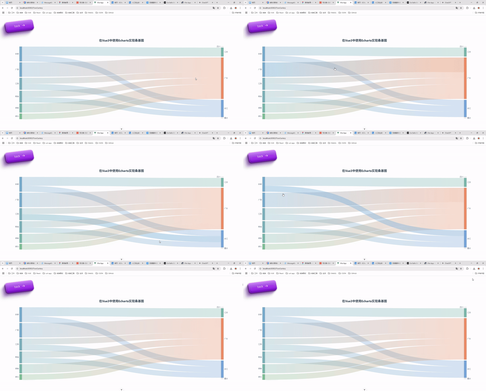
4. 运行效果
运行项目后,访问相应页面,即可看到一个动态的桑基图,展示了各省份之间的流向数据。
5. 功能扩展
-
数据动态更新
-
将图表数据通过 API 获取,并动态更新图表内容。
-
示例:
javascriptchart.setOption({ series: [{ data: newData, links: newLinks }] });
-
-
交互功能
-
添加鼠标悬停事件,展示详细信息。
-
使用
tooltip配置实现:javascripttooltip: { trigger: 'item', formatter: '{b}: {c}', }
-
6. 总结
本文通过完整的代码示例,展示了如何使用 Vue 3 和 ECharts 实现桑基图。从项目搭建到细节优化,都进行了详细讲解。希望这篇文章对你有所帮助!
参考资料:
- ECharts 官方文档
- Vue 3 官方文档
欢迎留言交流,如果你有更好的思路或实现方式,也欢迎分享! 😊