我们在自定义组件的时候,无论是用 @Styles 还是 @Extend,都很难真正做到独立的封装样式,因为这两者都不支持导出,不可以跨文件调用
这篇文章主要介绍一个接口 AttributeModifier,它很好的解决了这些弊端,可以实现样式的集中管理和复用,支持跨文件调用封装好的样式类
AttributeModifier
使用介绍
AttributeModifier 是一个接口,我们需要实现其中的一个方法 apply<状态名称>Attribute,来实现不同的场景
状态名称分为:默认态(Normal)、按压态(Pressed)、焦点态(Focused)、禁用态(Disabled)、选择态(Selected)
如果想设置元素的默认样式,就是 applyNormalAttribute,如果想设置元素的按压场景下的样式,就是 applyPressedAttribute
typescript
declare interface AttributeModifier<T> {

  applyNormalAttribute?(instance: T): void;

  applyPressedAttribute?(instance: T): void;

  applyFocusedAttribute?(instance: T): void;

  applyDisabledAttribute?(instance: T): void;

  applySelectedAttribute?(instance: T): void;

}
举例
文字描述比较抽象,下面举例代码来讲解:
- 我们可以新建个目录
modifier,新建个文件index.ets,封装一个作用于Button组件的样式类,给它添加一些样式,如下:
typescript
export class ButtonModifier implements AttributeModifier<ButtonAttribute> {
  applyNormalAttribute(instance: ButtonAttribute): void {
    instance
      .width(150)
      .height(50)
      .fontSize(20)
      .backgroundColor(Color.Orange)
  }
}- 第一步:用
AttributeModifier接口定义了一个ButtonModifier样式类 - 第二步:再实现
applyNormalAttribute设置默认态样式:包括宽度、高度、字体等
- 在组件文件中使用
typescript
import { ButtonModifier } from './modifier/index'

@Entry
@Component
struct Index {
  @State buttonModifier: ButtonModifier = new ButtonModifier()

  build() {
    Column() {
      Button('按钮')
        .attributeModifier(this.buttonModifier)
    }
    .width('100%')
  }
}
效果如下:
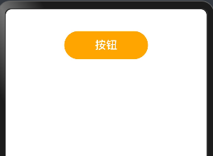
这样我们就实现了一个对 Button 组件的样式封装,并且支持导出,跨文件使用
支持同时设置多个场景的样式
上面给 Button 组件增加了"默认态"的样式,可以在这基础上继续增加"按压态"的样式,就是按钮按下时的样式,如下:
- 按钮按下的时候:增加边框,边框颜色等
typescript
export class ButtonModifier2 implements AttributeModifier<ButtonAttribute> {
  applyNormalAttribute(instance: ButtonAttribute): void {
    instance
      .width(150)
      .height(80)
      .fontSize(20)
      .backgroundColor(Color.Orange)
  }

  applyPressedAttribute(instance: ButtonAttribute): void {
    instance
      .borderWidth(5)
      .borderColor(Color.Blue)
      .borderStyle(BorderStyle.Solid)
      .backgroundColor('#17A98D')
  }
}- 在组件中引用
typescript
import { ButtonModifier2 } from './modifier/index'

@Entry
@Component
struct Index {
  @State buttonModifier: ButtonModifier2 = new ButtonModifier2()

  build() {
    Column() {
      Button('按钮')
        .attributeModifier(this.buttonModifier)
    }
    .width('100%')
  }
}
效果如下:

接口中支持传参和业务逻辑
在 ButtonModifier3 样式类中,定义一个 isClick 变量,来区分按钮是否点击过,然后分别对点击和没有点击的情况下增加样式,如下:
typescript
export class ButtonModifier3 implements AttributeModifier<ButtonAttribute> {
  isClick: boolean = false

  constructor(flag?: boolean) {
    this.isClick = !!flag
  }

  applyNormalAttribute(instance: ButtonAttribute): void {
    if (this.isClick) {
      instance.backgroundColor('#707070')
    } else {
      instance
        .borderColor('#707070')
        .borderWidth(2)
        .backgroundColor('#17A98D')
    }
  }
}- 在组件中调用
typescript
import { ButtonModifier3 } from './modifier/index'

@Entry
@Component
struct Index {
  @State buttonModifier: ButtonModifier3 = new ButtonModifier3()
  // @State buttonModifier: ButtonModifier3 = new ButtonModifier3(true)

  build() {
    Column() {
      Button('按钮')
        .attributeModifier(this.buttonModifier)
        .onClick(() => {
          this.buttonModifier.isClick = !this.buttonModifier.isClick
        })
    }
    .width('100%')
  }
}
效果如下:

总结
- 注意事项
我们在实现 AttributeModifier<T> 接口的实例,T 必须指定为组件对应的 Attribute类型,或者是CommonAttribute,如下:
typescript
// 作用于 Button 组件,就要传入 ButtonAttribute
export class Modifier1 implements AttributeModifier<ButtonAttribute> {
 applyNormalAttribute?(instance: ButtonAttribute): void;
}

// 作用于 TextInput 组件,就要传入 TextInputAttribute
export class Modifier2 implements AttributeModifier<TextInputAttribute> {
 applyNormalAttribute?(instance: ButtonAttribute): void;
}- @Style 和 @Extend 和 AttributeModifier 三者对比
| 能力 | @Styles | @Extend | AttributeModifier |
|---|---|---|---|
| 跨文件导出 | 不支持 | 不支持 | 支持 |
| 通用属性设置 | 支持 | 支持 | 支持 |
| 通用事件设置 | 支持 | 支持 | 部分支持 |
| 组件特有属性设置 | 不支持 | 支持 | 部分支持 |
| 组件特有事件设置 | 不支持 | 支持 | 部分支持 |
| 参数传递 | 不支持 | 支持 | 支持 |
| 多态样式 | 支持 | 不支持 | 支持 |
| 业务逻辑 | 不支持 | 不支持 | 支持 |
最后
如果大家有不理解的地方可以留言,或自行阅读文档 文档地址