目录
-
- [1. 窗体设置](#1. 窗体设置)
- [2. 字体图标](#2. 字体图标)
- [3. 控件模板](#3. 控件模板)
- [4. 页面逻辑](#4. 页面逻辑)
-
- [4.1. 不使用MVVM](#4.1. 不使用MVVM)
- [4.2. MVVM模式实现](#4.2. MVVM模式实现)
本篇我们开发一个基于MVVM的登录页面,用来回顾下之前学习的内容
登录页面如下:
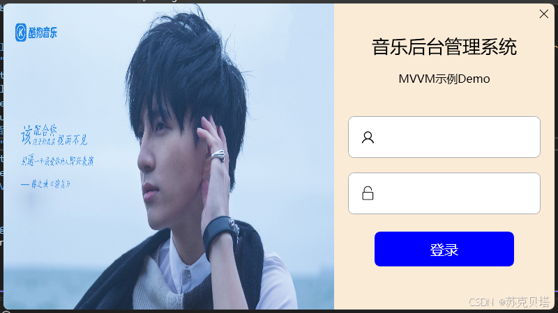
窗体取消了默认的标题栏,调整为带阴影的圆角窗体,左侧放一张登录背景图,右边自绘了一个关闭按钮,文本框和按钮也做了美化。快速来看一下如何实现的。
1. 窗体设置
窗口样式调整为None,不允许调整窗口大小,用Border包裹整个窗体实现圆角以及阴影效果,整体分两部分 - 左侧图片、右侧背景图:
xml
<Window x:Class="MVVMDemo.MainView"

        xmlns="http://schemas.microsoft.com/winfx/2006/xaml/presentation"
        xmlns:x="http://schemas.microsoft.com/winfx/2006/xaml"
        xmlns:d="http://schemas.microsoft.com/expression/blend/2008"
        xmlns:local="clr-namespace:MVVMDemo"
        xmlns:mc="http://schemas.openxmlformats.org/markup-compatibility/2006"
        Title="MainView"
        Width="800"
        Height="450"
        AllowsTransparency="True"
        Background="{x:Null}"
        ResizeMode="NoResize"
        WindowStartupLocation="CenterScreen"
        WindowStyle="None"
        mc:Ignorable="d">
    <Border Margin="5" Background="AntiqueWhite" CornerRadius="8">
        <Border.Effect>
            <DropShadowEffect BlurRadius="5"
                              Direction="0"
                              Opacity="0.3"
                              ShadowDepth="0"
                              Color="Gray" />
        </Border.Effect>
        <Grid>
            <Grid.ColumnDefinitions>
                <ColumnDefinition Width="6*" />
                <ColumnDefinition Width="4*" />
            </Grid.ColumnDefinitions>
            <Border CornerRadius="8,0,0,8">
                <Border.Background>
                    <ImageBrush ImageSource="./Assets/Images/LoginBackground.png" Stretch="Fill" />
                </Border.Background>
            </Border>
            <Border Grid.Column="1" CornerRadius="0,8,0,8">
               ...	// 内容部分
            </Border>
        </Grid>
    </Border>
</Window>
2. 字体图标
去阿里巴巴矢量图标库选好要用的图标,添加入库,然后下载下来添加至项目:
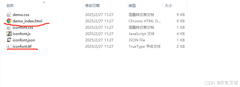
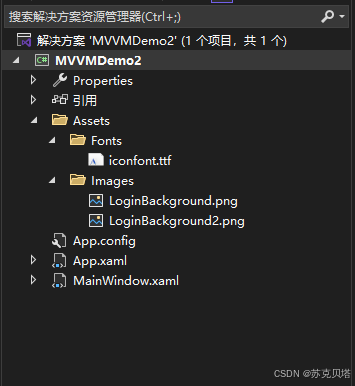
主要用上面勾选的两个文件,html文件是下载的图标演示,tff是程序中用到的字体文件了,把它放到新建的Assets资源文件夹下边:
之后就可以用了,Text内容可以从演示的html中找到,也可以在矢量图项目里面复制代码:
<TextBox Text="" FontFamily="./Assets/Fonts/#iconfont"/>
3. 控件模板
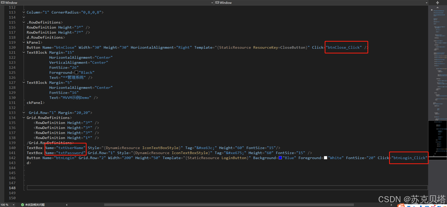
模板内容因为只在这一个登录窗体上使用,就都定义在车Window.Resources窗体资源里了,所以看上去页面内容有点多,大家也可以单独定义资源文件。先说按钮,两个按钮都是通过自定义控件模板来完成的,关闭按钮主要是定义了一个 Path 控件,用于绘制一个 "X" 形状,类似于关闭按钮的图标,登录按钮就直接用 TextBlock 代替的:
xml
<ControlTemplate x:Key="CloseButton" TargetType="Button">

    <Border Name="back" Background="Transparent" CornerRadius="0,8,0,0">
        <Path HorizontalAlignment="Center"
              VerticalAlignment="Center"
              Data="M0 0 12 12M0 12 12 0"
              Stroke="Black"
              StrokeThickness="1" />
    </Border>
    <ControlTemplate.Triggers>
        <Trigger Property="IsMouseOver" Value="true">
            <Setter TargetName="back" Property="Background" Value="red" />
        </Trigger>
    </ControlTemplate.Triggers>
</ControlTemplate>


<ControlTemplate x:Key="LoginButton" TargetType="Button">

    <Border Name="back" Background="{TemplateBinding Background}" CornerRadius="8">
        <TextBlock Text="登录" VerticalAlignment="Center" HorizontalAlignment="Center"/>
    </Border>
    <ControlTemplate.Triggers>
        <Trigger Property="IsMouseOver" Value="true">
            <Setter TargetName="back" Property="Background" Value="red"/>
        </Trigger>
    </ControlTemplate.Triggers>
</ControlTemplate>
图标属性因为Text属性要获取输入的文本,所以改成了通过文本框的 Tag 属性绑定内容。
而后的控件布局就不解释了吧,直接看代码吧:
xml
<Window x:Class="MVVMDemo2.MainWindow"
xmlns="http://schemas.microsoft.com/winfx/2006/xaml/presentation"
xmlns:x="http://schemas.microsoft.com/winfx/2006/xaml"
xmlns:d="http://schemas.microsoft.com/expression/blend/2008"
xmlns:local="clr-namespace:MVVMDemo2"
xmlns:mc="http://schemas.openxmlformats.org/markup-compatibility/2006"
Title="MainView"
Width="800"
Height="450"
AllowsTransparency="True"
Background="{x:Null}"
ResizeMode="NoResize"
WindowStartupLocation="CenterScreen"
WindowStyle="None"
mc:Ignorable="d">
<Window.Resources>
<ControlTemplate x:Key="CloseButton" TargetType="Button">
<Border Name="back" Background="Transparent" CornerRadius="0,8,0,0">
<Path HorizontalAlignment="Center"
VerticalAlignment="Center"
Data="M0 0 12 12M0 12 12 0"
Stroke="Black"
StrokeThickness="1" />
</Border>
<ControlTemplate.Triggers>
<Trigger Property="IsMouseOver" Value="true">
<Setter TargetName="back" Property="Background" Value="red" />
</Trigger>
</ControlTemplate.Triggers>
</ControlTemplate>
<ControlTemplate x:Key="LoginButton" TargetType="Button">
<Border Name="back" Background="{TemplateBinding Background}" CornerRadius="8">
<TextBlock Text="登录" VerticalAlignment="Center" HorizontalAlignment="Center"/>
</Border>
<ControlTemplate.Triggers>
<Trigger Property="IsMouseOver" Value="true">
<Setter TargetName="back" Property="Background" Value="red"/>
</Trigger>
</ControlTemplate.Triggers>
</ControlTemplate>
<SolidColorBrush x:Key="TextBox.Static.Border" Color="#FFABAdB3"/>
<SolidColorBrush x:Key="TextBox.MouseOver.Border" Color="#FF7EB4EA"/>
<SolidColorBrush x:Key="TextBox.Focus.Border" Color="#FF569DE5"/>
<Style x:Key="IconTextBoxStyle" TargetType="{x:Type TextBox}">
<Setter Property="Background" Value="{DynamicResource {x:Static SystemColors.WindowBrushKey}}"/>
<Setter Property="BorderBrush" Value="{StaticResource TextBox.Static.Border}"/>
<Setter Property="Foreground" Value="{DynamicResource {x:Static SystemColors.ControlTextBrushKey}}"/>
<Setter Property="BorderThickness" Value="1"/>
<Setter Property="KeyboardNavigation.TabNavigation" Value="None"/>
<Setter Property="HorizontalContentAlignment" Value="Left"/>
<Setter Property="FocusVisualStyle" Value="{x:Null}"/>
<Setter Property="AllowDrop" Value="true"/>
<Setter Property="ScrollViewer.PanningMode" Value="VerticalFirst"/>
<Setter Property="Stylus.IsFlicksEnabled" Value="False"/>
<Setter Property="Template">
<Setter.Value>
<ControlTemplate TargetType="{x:Type TextBox}">
<Border x:Name="border" Background="{TemplateBinding Background}" BorderBrush="{TemplateBinding BorderBrush}" BorderThickness="{TemplateBinding BorderThickness}" SnapsToDevicePixels="True" CornerRadius="8">
<Grid>
<Grid.ColumnDefinitions>
<ColumnDefinition Width="2*"/>
<ColumnDefinition Width="8*"/>
</Grid.ColumnDefinitions>
<TextBlock FontFamily="./Assets/Fonts/#iconfont" Text="{TemplateBinding Tag}" FontSize="20" VerticalAlignment="Center" HorizontalAlignment="Center" />
<ScrollViewer Grid.Column="1" x:Name="PART_ContentHost" Focusable="false" HorizontalScrollBarVisibility="Hidden" VerticalScrollBarVisibility="Hidden" VerticalAlignment="Center"/>
</Grid>
</Border>
<ControlTemplate.Triggers>
<Trigger Property="IsEnabled" Value="false">
<Setter Property="Opacity" TargetName="border" Value="0.56"/>
</Trigger>
<Trigger Property="IsMouseOver" Value="true">
<Setter Property="BorderBrush" TargetName="border" Value="{StaticResource TextBox.MouseOver.Border}"/>
</Trigger>
<Trigger Property="IsKeyboardFocused" Value="true">
<Setter Property="BorderBrush" TargetName="border" Value="{StaticResource TextBox.Focus.Border}"/>
</Trigger>
</ControlTemplate.Triggers>
</ControlTemplate>
</Setter.Value>
</Setter>
<Style.Triggers>
<MultiTrigger>
<MultiTrigger.Conditions>
<Condition Property="IsInactiveSelectionHighlightEnabled" Value="true"/>
<Condition Property="IsSelectionActive" Value="false"/>
</MultiTrigger.Conditions>
<Setter Property="SelectionBrush" Value="{DynamicResource {x:Static SystemColors.InactiveSelectionHighlightBrushKey}}"/>
</MultiTrigger>
</Style.Triggers>
</Style>
</Window.Resources>
<Border Margin="5" Background="AntiqueWhite" CornerRadius="8">
<Border.Effect>
<DropShadowEffect BlurRadius="5"
Direction="0"
Opacity="0.3"
ShadowDepth="0"
Color="Gray" />
</Border.Effect>
<Grid>
<Grid.ColumnDefinitions>
<ColumnDefinition Width="6*" />
<ColumnDefinition Width="4*" />
</Grid.ColumnDefinitions>
<Border CornerRadius="8,0,0,8">
<Border.Background>
<ImageBrush ImageSource="./Assets/Images/LoginBackground.png" Stretch="Fill" />
</Border.Background>
</Border>
<Border Grid.Column="1" CornerRadius="0,8,0,8">
<Grid>
<Grid.RowDefinitions>
<RowDefinition Height="3*" />
<RowDefinition Height="7*" />
</Grid.RowDefinitions>
<StackPanel>
<Button Width="30" Height="30" HorizontalAlignment="Right" Template="{StaticResource ResourceKey=CloseButton}" />
<TextBlock Margin="15"
HorizontalAlignment="Center"
VerticalAlignment="Center"
FontSize="26"
Foreground="Black"
Text="**管理系统" />
<TextBlock Margin="5"
HorizontalAlignment="Center"
FontSize="16"
Text="MVVM示例Demo" />
</StackPanel>
<Grid Grid.Row="1" Margin="20,20">
<Grid.RowDefinitions>
<RowDefinition Height="3*" />
<RowDefinition Height="3*" />
<RowDefinition Height="3*" />
<RowDefinition Height="1*" />
</Grid.RowDefinitions>
<TextBox Style="{DynamicResource IconTextBoxStyle}" Tag="" Height="60" FontSize="15"/>
<TextBox Grid.Row="1" Style="{DynamicResource IconTextBoxStyle}" Tag="" Height="60" FontSize="15" />
<Button Grid.Row="2" Width="200" Height="50" Template="{StaticResource LoginButton}" Background="Blue" Foreground="White" FontSize="20"/>
</Grid>
</Grid>
</Border>
</Grid>
</Border>
</Window>4. 页面逻辑
4.1. 不使用MVVM
在不使用MVVM情况下实现点击登录:点击登录按钮获取输入的用户名密码,验证是否正确,正确则创建页面隐藏当前页:
后台Login.xaml.cs:
csharp
 private void btnClose_Click(object sender, RoutedEventArgs e)
 {
     this.Close();
 }


 private void btnLogin_Click(object sender, RoutedEventArgs e)
 {
     if (txtUserName.Text == "admin" && txtPassword.Text == "123456")
     {
         MainWindow main = new MainWindow();
         main.Show();
         this.Close();
     }
     else
     {
         MessageBox.Show("用户名或密码错误。");
     }
 }
现在所有东西是耦合在一起的,虽然这样看起来实现起来比较快,但是在后期维护起来是非常麻烦的,尤其是工程代码量大了以后,假如其中任何一个环节发生了变化,程序就会出问题,简而言之就是牵一发而动全身。
4.2. MVVM模式实现
接下来看一下MVVM模式实现方式:
- Model部分
这部分主要是登录页面的数据部分,涉及两个字段,用户名和密码:
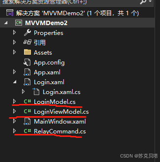
LoginModel.cs:
csharp
 public class LoginModel
 {
     private string _UserName;


     public string UserName
     {
         get { return _UserName; }
         set { _UserName = value; }
     }


     private string _Password;


     public string Password
     {
         get { return _Password; }
         set { _Password = value; }
     }
}- View部分
视图部分主要做数据的呈现,通过绑定和命令解耦图形界面和数据以及执行动作之间的关系,数据之间的交互在用户名和密码文本框:
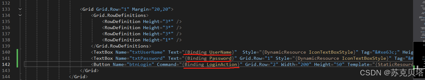
动作有两个,一个是关闭按钮,另一个是登录按钮。关闭按钮只是关闭当前窗体,不涉及业务交互,所以保留之前的Click事件即可,登录按钮就涉及到视图、数据以及业务逻辑了,这就需要通过命令来完成。
- ViewModel部分
在这之前需要完成命令接口的定义,新建一个文件:RelayCommand.cs实现ICommand接口:
csharp
    public class RelayCommand : ICommand
    {
        private readonly Action _execute;   // 需要执行的操作(命令体)
        private readonly Func<bool> _canExecute;    // 命令是否可以执行的逻辑


        public RelayCommand(Action action, Func<bool> canExecute)
        {
            _execute = action;
            _canExecute = canExecute;
        }


        public bool CanExecute(object parameter)    // ICommand接口方法之一,用于判断命令是否可以执行
        {
            if (_canExecute == null)
            {
                return true;	// 命令始终可以执行
            }
            else
            {
                return _canExecute();	// 调用 _canExecute() 获取判断结果
            }
        }


        public void Execute(object parameter)   // ICommand接口方法之一 用于执行命令体,调用 _execute 所存储的操作
        {
            _execute?.Invoke();
        }


        public event EventHandler CanExecuteChanged	// ICommad接口中的事件,当命令的可执行状态发生变化时,触发此事件来通知界面元素更新
        {
            add
            {
                if (_canExecute != null) { CommandManager.RequerySuggested += value; }
            }
            remove
            {
                if (_canExecute != null) { CommandManager.RequerySuggested -= value; }
            }
        }
    }
这样就完成了命令接口的实现,接着来看ViewModel视图模型,视图模型作为沟通数据Model和视图View之间的桥梁,就得多干一些活了。
首先是数据部分,为了更好的解耦,不让图形界面与数据产生直接交互,在ViewModel里嵌套一层在获取Model以及View部分的数据并完成验证处理、数据更新还有命令操作:
LoginViewModel.cs:
csharp
 public class LoginViewModel : INotifyPropertyChanged
 {
     public event PropertyChangedEventHandler PropertyChanged;
     private LoginModel _loginModel;
     private Login _loginView;


     public LoginViewModel(Login view)
     {
         _loginModel = new LoginModel();
         _loginView = view;
     }


     // 绑定到登录界面文本框的属性,用于获取和设置用户名和密码
     public string UserName
     {
         get { return _loginModel.UserName; }
         set
         {
             _loginModel.UserName = value;
             OnPropertyChanged(UserName);
         }
     }


     public string Password
     {
         get { return _loginModel.Password; }
         set
         {
             _loginModel.Password = value;
             OnPropertyChanged(Password);
         }
     }


     protected virtual void OnPropertyChanged([CallerMemberName] string propertyName = null)	// 触发属性更改通知的方法
     {
         PropertyChanged?.Invoke(this, new PropertyChangedEventArgs(propertyName));
     }


     private void LoginFunc()	// 处理登录操作
     {
         if (UserName == "admin" && Password == "123456")
         {
             MainWindow main = new MainWindow();
             main.Show();
             _loginView.Close();
         }
         else
         {
             MessageBox.Show("用户名或密码错误");
             UserName = "";
             Password = "";
         }
     }


     private bool CanLoginExecute()
     {
         return true;
     }


     public ICommand LoginAction	// 绑定到登录按钮的命令属性
     {
         get
         {
             return new RelayCommand(LoginFunc, CanLoginExecute);	//(执行体,判断条件)
         }
     }
 }
完成了沟通部分的桥梁怎样,和其他两部分取得联系呢?数据部分,通过属性更新已经通知到了,视图部分就需要通过绑定数据上下文来完成了:
Login.xaml.cs:
csharp
 public partial class Login : Window
 {
     public Login()
     {
         InitializeComponent();
         this.DataContext = new LoginViewModel(this);
     }


     private void btnClose_Click(object sender, RoutedEventArgs e)
     {
         this.Close();
     }


 }
以上一个简单的MVVM示例就完成了,怎么说呢,虽然看着很简单,代码也没多少,但是对初学者来说绝非易事。希望大家能多多练习,多多思考,多多总结,多多交流,多多进步。
详细代码我上传到gitee:https://gitee.com/zypapa100/MVVMPractice