目录
[2. 自定义按钮](#2. 自定义按钮)
[2.1 自定义工具栏按钮](#2.1 自定义工具栏按钮)
[2.2 自定义图标按钮](#2.2 自定义图标按钮)
[3. 顶部工具栏](#3. 顶部工具栏)
[4. 主体](#4. 主体)
[5. 底部工具栏](#5. 底部工具栏)
[6. 主文件](#6. 主文件)
[7. 最终效果](#7. 最终效果)
上一章内容讲解了QML基本使用方法。本章内容继续延续"音乐播放器"项目主线,完成程序的界面设计任务。
1.版面设计
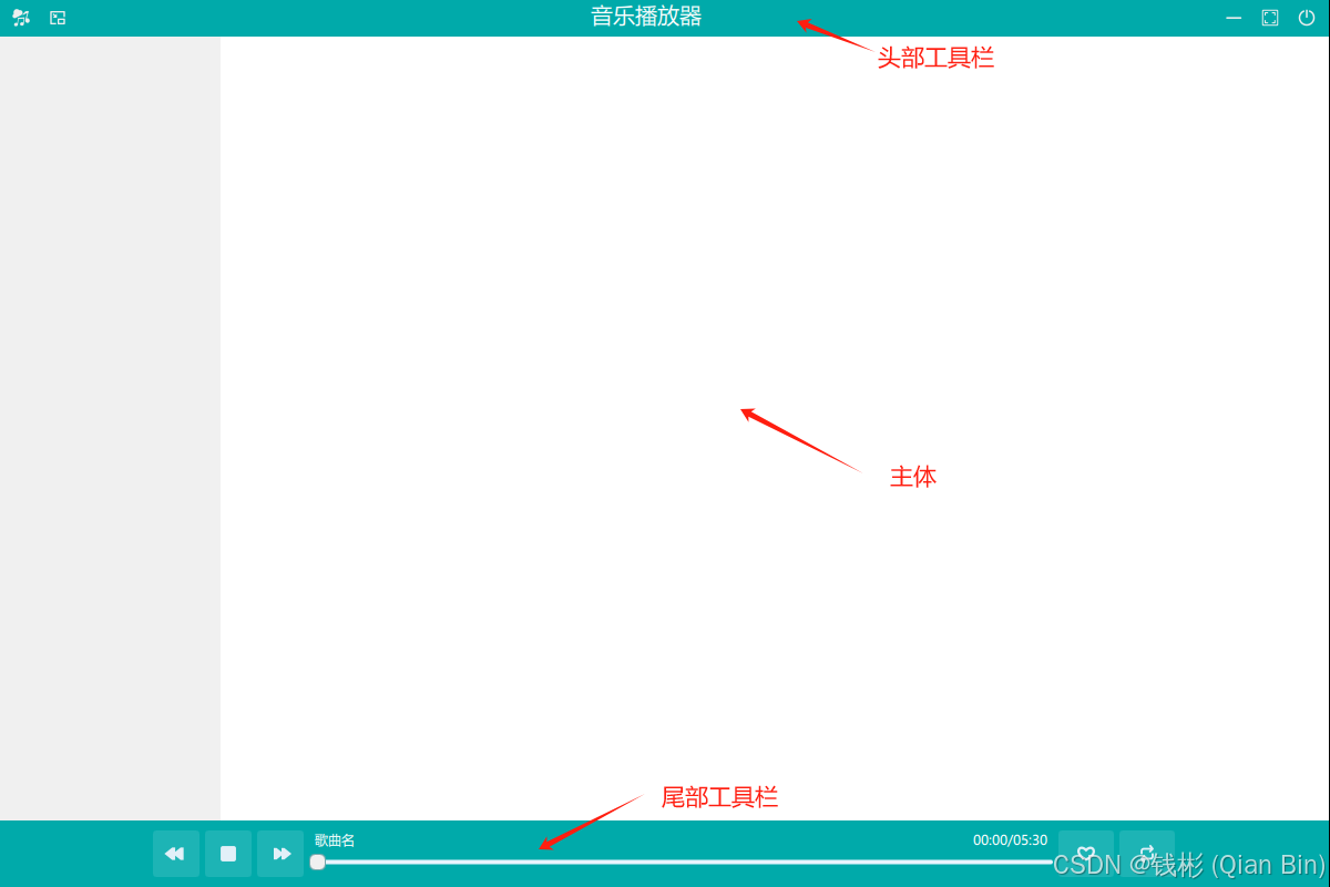
本项目实现的音乐播放器主界面可以分成3部分,从上到下依次为:头部工具栏、主体、尾部工具栏,如下图所示:
为了便于后续管理,每个部分单独定义一个qml文件。
- 头部工具栏:LayoutHeaderView.qml
- 主体:PageHomeView.qml
- 尾部工具栏:LayoutBottomView.qml
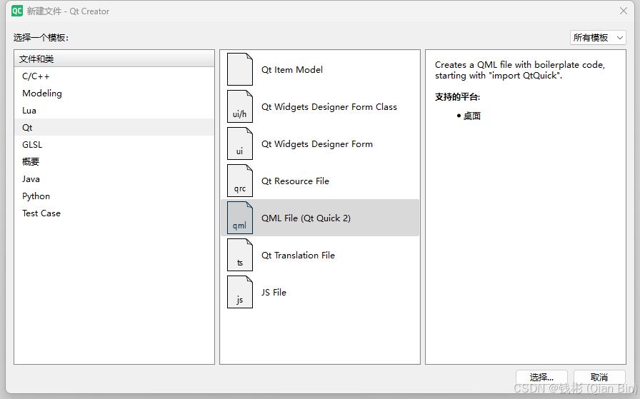
按照上述qml文件名称,在AudioPlayer项目中添加上述三个qml文件。具体添加方法:在项目文件目录中右键,选择"添加新文件",在下图所示窗口中选择QML File即可:
2. 自定义按钮
根据前面的音乐播放器界面效果,考虑美观因素,在头部工具栏和尾部工具栏会使用自定义按钮,具体如下。
2.1 自定义工具栏按钮
新建一个qml文件MusicToolButton.qml,其完整代码如下:
cpp
import QtQuick
import QtQuick.Controls

ToolButton{
    property string iconSource: ""
    property string toolTip: ""

    id:self

    icon.source:iconSource

    ToolTip.visible: hovered  //鼠标划过时显示提示词
    ToolTip.text: toolTip

    background: Rectangle {
        color: {
            if (self.down) {
                "#eeeeee"  // 按下状态:浅白背景
            } else if (self.hovered) {
                "#008080"  // 悬停状态:深青背景
            } else {
                "#00000000" // 默认状态:透明
            }
        }
    }

    icon.color: {
        if (self.down) {
            "#000000"  // 按下状态:黑色图标
        } else if (self.hovered) {
            "#ffffff"  // 悬停状态:白色图标
        } else {
            "#eeeeee"  // 默认状态:浅白色图标
        }
    }
}
此代码使用 QML 定义了一个自定义 ToolButton 组件。首先导入 QtQuick 和 QtQuick.Controls 模块,为后续构建按钮提供基础功能。
接下来定义了两个属性,iconSource 用于指定按钮图标资源路径,toolTip 用于设置鼠标悬停时显示的提示文本。id 设为 self 以便在组件内部引用自身。icon.source 绑定到 iconSource 属性,实现图标的动态设置。ToolTip 的可见性与 hovered 状态关联,当鼠标悬停时显示 toolTip 内容。
背景颜色方面,通过 Rectangle 作为背景,根据按钮状态改变颜色:按下时为浅白色 #eeeeee,悬停时为深青色 #008080,默认状态为透明 #00000000。图标颜色同样根据按钮状态变化,按下时为黑色 #000000,悬停时为白色 #ffffff,默认状态为浅白色 #eeeeee。整体来看,该组件实现了带有自定义图标、工具提示以及根据不同交互状态改变背景和图标颜色的功能。
2.2 自定义图标按钮
打开MusicIconButton.qml文件,编写代码如下:
cpp
import QtQuick
import QtQuick.Controls

Button{
    property string iconSource: ""

    property string toolTip: ""

    property int iconWidth: 32
    property int iconHeight: 32

    id:self

    icon.source:iconSource
    icon.height: iconHeight
    icon.width: iconWidth

    ToolTip.visible: hovered
    ToolTip.text: toolTip

    background: Rectangle{
        color: self.down?"#497563":"#20e9f4ff"
        radius: 3
    }
    icon.color: self.down?"#ffffff":"#e2f0f8"
}
上述使用 QML 定义了一个自定义按钮组件。导入 QtQuick 和 QtQuick.Controls 模块来使用基础功能和控件。定义了四个属性:iconSource 用于指定图标资源路径;toolTip 用于设置鼠标悬停时显示的提示文本;iconWidth 和 iconHeight 用于设置图标显示的宽高,默认值均为 32。组件 id 设为 self 方便内部引用。icon 的 source、height 和 width 分别绑定到对应属性以动态设置图标。ToolTip 在鼠标悬停时显示,文本内容为 toolTip。
背景使用 Rectangle,颜色根据按钮是否按下而变化,按下时为 #497563,未按下时为 #20e9f4ff,且设置了圆角半径为 3。图标颜色也随按钮按下状态改变,按下时为白色 #ffffff,未按下时为 #e2f0f8。整体实现了一个带有自定义图标、工具提示以及根据按下状态改变背景和图标颜色的按钮。
3. 顶部工具栏
打开LayoutHeaderView.qml文件,编辑代码如下:
cpp
import QtQuick
import QtQuick.Controls
import QtQuick.Layouts
import QtQuick.Window


ToolBar{
    background: Rectangle{
        color: "#00AAAA"
    }
    width: parent.width
    Layout.fillWidth: true

    //存储窗口原始尺寸
    property int savedWindowWidth: 1200  // 默认值,与 main.qml 一致
    property int savedWindowHeight: 800  // 默认值,与 main.qml 一致

    RowLayout{
        anchors.fill: parent

        MusicToolButton{
            icon.source: "qrc:/images/music.png"
            toolTip: "关于"
        }
        MusicToolButton{
            id:smallWindow
            iconSource: "qrc:/images/small-window.png"
            toolTip: "小窗播放"
            onClicked: {
                // 记录当前窗口尺寸
                savedWindowWidth = window.width
                savedWindowHeight = window.height
                setWindowSize(330,650)
                smallWindow.visible=false
                normalWindow.visible=true
            }
        }
        MusicToolButton{
            id:normalWindow
            iconSource: "qrc:/images/exit-small-window.png"
            toolTip: "退出小窗播放"
            visible: false
            onClicked: {
                setWindowSize(savedWindowWidth,savedWindowHeight)
                normalWindow.visible=false
                smallWindow.visible=true
            }
        }

        Item{
            Layout.fillWidth: true
            anchors.centerIn: parent
            height: 32
            Text {
                anchors.centerIn: parent
                height: 25
                text: qsTr("音乐播放器")
                font.family: qsTr("微软雅黑")
                font.pointSize: 12
                color:"#ffffff"
            }
            // 双击最大化/还原
           TapHandler {
               onTapped: if (tapCount === 2) toggleMaximized()
               gesturePolicy: TapHandler.DragThreshold
           }
            // 拖动窗口
            DragHandler {
                grabPermissions: TapHandler.CanTakeOverFromAnything
                onActiveChanged: if (active) { window.startSystemMove(); }
            }
        }
        MusicToolButton{
            icon.source: "qrc:/images/minimize-screen.png"
            toolTip: "最小化"
            onClicked: {
                window.visibility = Window.Minimized
            }
        }
        MusicToolButton{
            id:resize
            icon.source: "qrc:/images/small-screen.png"
            toolTip: "退出全屏"
            visible: false
            onClicked: {
                setWindowSize()
                window.visibility = Window.AutomaticVisibility
                maxWindow.visible = true
                resize.visible = false
            }
        }
        MusicToolButton{
            id:maxWindow
            icon.source: "qrc:/images/full-screen.png"
            toolTip: "全屏"
            onClicked: {
                window.visibility = Window.Maximized
                maxWindow.visible = false
                resize.visible = true
            }
        }
        MusicToolButton{
            icon.source: "qrc:/images/power.png"
            toolTip: "退出"
            onClicked: {
                Qt.quit()
            }
        }
    }

    function toggleMaximized() {
        if (window.visibility === Window.Maximized) {
            window.showNormal();
        } else {
            window.showMaximized();
        }
    }

    function setWindowSize(width = window.width,height = window.height){
        //输出
        window.width = width
        window.height = height

        window.x=(Screen.desktopAvailableWidth-window.width)/2
        window.y=(Screen.desktopAvailableHeight-window.height)/2
    }
}
上述QML代码定义了一个自定义的 ToolBar 组件,用于音乐播放器的顶部工具栏,具备丰富交互功能。首先导入了 QtQuick、QtQuick.Controls、QtQuick.Layouts 和 QtQuick.Window 模块,为创建界面元素和处理窗口操作提供基础。ToolBar 组件设置了背景颜色为 #00AAAA,宽度填充父元素。
ToolBar 内部定义了两个属性 savedWindowWidth 和 savedWindowHeight,用于存储窗口的原始尺寸,默认值与 main.qml 一致。接着使用 RowLayout 来水平排列子元素,填充整个 ToolBar。
在 RowLayout 中,依次放置了多个 MusicToolButton 按钮。第一个按钮图标为 music.png,工具提示为 "关于"。"小窗播放" 按钮点击后记录当前窗口尺寸,将窗口大小设置为 330x650,隐藏自身并显示 "退出小窗播放" 按钮。"退出小窗播放" 按钮点击后恢复窗口到之前记录的尺寸,隐藏自身并显示 "小窗播放" 按钮。
中间有一个 Item 元素,内部包含一个居中显示的文本 "音乐播放器",字体为微软雅黑,大小 12 点,颜色白色。还添加了 TapHandler 用于处理双击事件,实现窗口最大化或还原;DragHandler 用于处理拖动事件,可拖动窗口。
后续的按钮分别实现了最小化、全屏、退出全屏和退出功能。"最小化" 按钮点击后将窗口设置为最小化状态;"全屏" 按钮点击后将窗口设置为最大化状态,隐藏自身并显示 "退出全屏" 按钮;"退出全屏" 按钮点击后恢复窗口大小,将窗口设置为自动可见状态,隐藏自身并显示 "全屏" 按钮;"退出" 按钮点击后调用 Qt.quit() 退出应用程序。
ToolBar 组件还定义了两个函数。toggleMaximized() 函数用于切换窗口的最大化和正常状态;setWindowSize() 函数用于设置窗口的宽度和高度,并将窗口居中显示在可用桌面区域。整体而言,该代码实现了一个功能丰富的音乐播放器顶部工具栏,增强了用户交互体验。
4. 主体
打开PageHomeView.qml文件,编辑代码如下:
cpp
import QtQuick
import QtQuick.Controls
import QtQuick.Layouts

Frame{
    Layout.preferredWidth: 200
    Layout.fillHeight: true
    background: Rectangle{
        color: "#f0f0f0"
    }
    padding: 0
}
上述代码使用 QML 定义了一个 Frame 组件。导入了 QtQuick、QtQuick.Controls 和 QtQuick.Layouts 模块,以提供基础功能、控件及布局支持。Frame 的 Layout.preferredWidth 属性设置为 200,表明其在布局中优先采用的宽度为 200 像素;Layout.fillHeight 设为 true,意味着它会在布局中填满可用的垂直空间。背景采用 Rectangle,颜色设定为 #f0f0f0,即浅灰色背景。padding 设为 0,说明该 Frame 内部内容与边框之间没有额外的间距。整体而言,这段代码创建了一个宽度固定、高度自适应且带有浅灰色背景的框架组件,方便后续继续进行设计和扩展。
5. 底部工具栏
打开LayoutBottomView.qml文件,编辑代码如下:
cpp
import QtQuick
import QtQuick.Controls
import QtQuick.Layouts
import QtQuick.Window

//底部工具栏
Rectangle{
    Layout.fillWidth: true
    height: 60
    color: "#00AAAA"

    RowLayout{
        anchors.fill: parent

        Item{
            Layout.preferredWidth: parent.width/10
            Layout.fillWidth: true
        }
        MusicIconButton{
            icon.source: "qrc:/images/previous.png"
            iconWidth: 32
            iconHeight: 32
            toolTip: "上一曲"
        }
        MusicIconButton{
            iconSource: "qrc:/images/stop.png"
            iconWidth: 32
            iconHeight: 32
            toolTip: "暂停/播放"
        }
        MusicIconButton{
            icon.source: "qrc:/images/next.png"
            iconWidth: 32
            iconHeight: 32
            toolTip: "下一曲"
        }
        Item{
            Layout.preferredWidth: parent.width/2
            Layout.fillHeight: true
            Layout.fillWidth: true
            Layout.topMargin: 25

            Text{
                id:nameText
                anchors.left:slider.left
                anchors.bottom: slider.top
                anchors.leftMargin: 5
                text:"歌曲名"
                font.family: "微软雅黑"
                color: "#ffffff"
            }
            Text{
                id:timeText
                anchors.right: slider.right
                anchors.bottom: slider.top
                anchors.rightMargin: 5
                text:"00:00/05:30"
                font.family: "微软雅黑"
                color: "#ffffff"
            }

            Slider{
                id:slider
                width: parent.width
                Layout.fillWidth: true
                height: 25
                background:Rectangle{
                    x:slider.leftPadding
                    y:slider.topPadding+(slider.availableHeight-height)/2
                    width: slider.availableWidth
                    height: 4
                    radius: 2
                    color: "#e9f4ff"
                    Rectangle{
                        width: slider.visualPosition*parent.width
                        height: parent.height
                        color: "#73a7ab"
                        radius: 2
                    }
                }
                handle:Rectangle{
                    x:slider.leftPadding+(slider.availableWidth-width)*slider.visualPosition
                    y:slider.topPadding+(slider.availableHeight-height)/2
                    width: 15
                    height: 15
                    radius: 5
                    color: "#f0f0f0"
                    border.color: "#73a7ab"
                    border.width: 0.5
                }
            }
        }

        MusicIconButton{
            Layout.preferredWidth: 50
            icon.source: "qrc:/images/favorite.png"
            iconWidth: 32
            iconHeight: 32
            toolTip: "我喜欢"
        }
        MusicIconButton{
            Layout.preferredWidth: 50
            icon.source: "qrc:/images/repeat.png"
            iconWidth: 32
            iconHeight: 32
            toolTip: "重复播放"
        }
        Item{
            Layout.preferredWidth: parent.width/10
            Layout.fillWidth: true
        }
    }
}
上述代码使用 QML 构建了一个音乐播放器的底部工具栏。导入了 QtQuick、QtQuick.Controls、QtQuick.Layouts 和 QtQuick.Window 模块以支持界面构建、布局管理和窗口操作。整体布局以 Rectangle 为容器,宽度填充父元素,高度为 60 像素,背景颜色为 #00AAAA。内部使用 RowLayout 水平排列子元素。首先有1个占位 Item,占据父元素宽度的 1/10,用于留出左边距。接着是三个 MusicIconButton,分别用于切换上一曲、暂停 / 播放、下一曲,每个按钮都有对应的图标和工具提示。中间的 Item 占据父元素宽度的一半,包含两个 Text 元素显示歌曲名和播放时间,以及一个 Slider 用于显示和控制播放进度,Slider 的背景和滑块都有自定义样式。最后还有两个 MusicIconButton,分别用于标记喜欢和设置重复播放,最后又有一个占位 Item 占据父元素宽度的 1/10,用于留出右边距。整体实现了一个功能较为丰富、布局合理的音乐播放器底部工具栏。
6. 主文件
编辑Main.qml文件,完整代码如下:
cpp
import QtQuick
import QtQuick.Controls
import QtQuick.Layouts

Window {
    id: window
    width: 1200
    height: 800
    visible: true
    flags: Qt.FramelessWindowHint  | Qt.Window

    ColumnLayout{
        anchors.fill: parent
        spacing: 0
        //顶部工具栏
        LayoutHeaderView{
            id:layoutHeaderView
        }
        //主体
        PageHomeView{
            id:pageHomeView
        }
        //底部工具栏
        LayoutBottomView{
            id:layoutBottomView
        }
    }
}
上述代码使用 QML 构建了一个无框窗口应用程序。导入了 QtQuick、QtQuick.Controls 和 QtQuick.Layouts 模块以提供必要的功能和布局支持。Window 组件作为应用程序的主窗口,设置宽度为 1200 像素,高度为 800 像素,且初始可见。flags 属性设置为 Qt.FramelessWindowHint | Qt.Window,使窗口无系统边框。在 Window 内部使用 ColumnLayout 进行垂直布局,填充整个窗口,子元素间间距为 0。ColumnLayout 包含三个自定义组件,分别是 LayoutHeaderView 作为顶部工具栏、PageHomeView 作为主体内容、LayoutBottomView 作为底部工具栏,每个组件都有对应的 id 以便后续引用。整体上,代码搭建了一个具有特定布局结构的无框窗口应用程序框架。
最后在CMakeLists.txt中同步添加相关图片资源文件,编辑代码如下:
cpp
qt_add_resources(appAudioPlayer "app_images"
        PREFIX "/"
        FILES
            images/music.png
            images/small-window.png
            images/exit-small-window.png
            images/small-screen.png
            images/minimize-screen.png
            images/full-screen.png
            images/power.png
            images/previous.png
            images/stop.png
            images/next.png
            images/favorite.png
            images/repeat.png
)
7. 最终效果
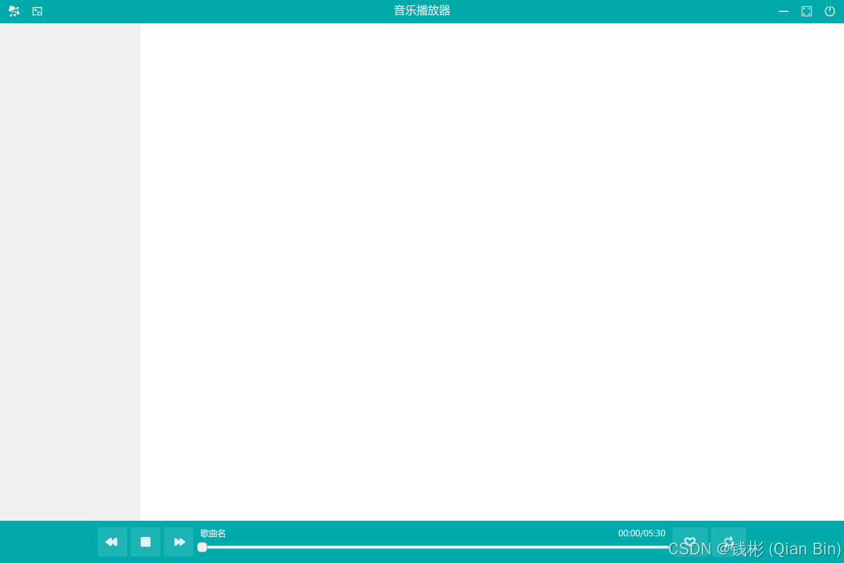
保存所有修改后,运行程序。初始界面如下:
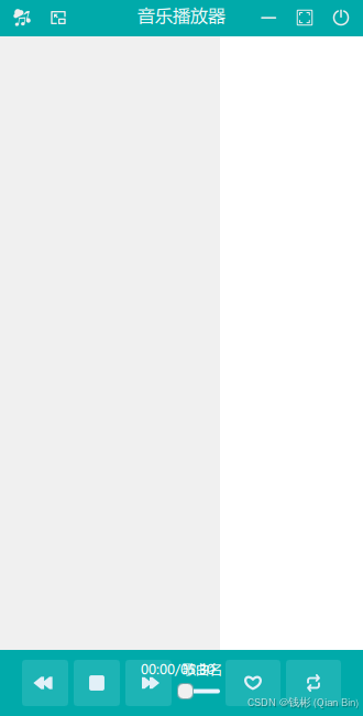
单击顶部小窗播放按钮后,效果如下:
到这里,程序的基本界面设计完毕。
上一章:QT Quick(C++)跨平台应用程序项目实战教程 4 --- QML基本使用方法_qt qml toppanel-CSDN博客
下一章: