大家好,我是 前端架构师 - 大卫。
更多优质内容请关注微信公众号 @程序员大卫。
初心为助前端人🚀,进阶路上共星辰✨,
您的点赞👍与关注❤️,是我笔耕不辍的灯💡。
1.图片引用的简写写法
依次表示:图片地址、不平铺、位置(左上角)、缩放方式(等比缩放至完全包含)。
css
.bg {
  background: url(xxx) no-repeat 0 0 / contain;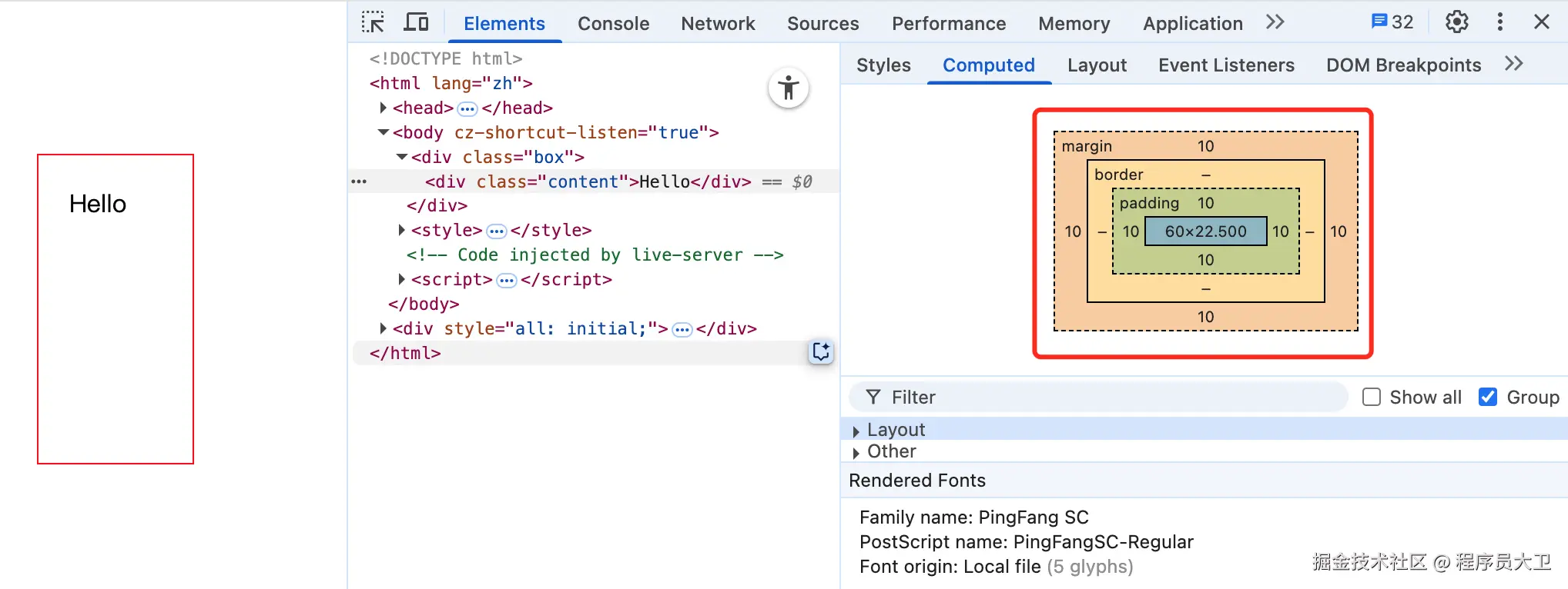
}2.padding 和 margin 的百分比计算方式
它们的百分比值是基于包含块的宽度(即父元素的宽度)进行计算的,而不是高度。
例如:
html
<style>
  * {
    padding: 0;
    margin: 0;
    box-sizing: border-box;
  }
  body {
    padding: 100px;
  }
  .box {
    width: 100px;
    height: 200px;
    overflow: hidden;
    outline: 1px solid red;
  }
  .content {
    margin: 10%;
    padding: 10%;
  }
</style>
<div class="box">
  <div class="content">Hello</div>
</div>
content元素的10%margin 和 padding,都是基于.box的100px宽度计算的,因此最终为10px。
3.用 background 模拟 border: dashed 的效果
css
.box {
  height: 1px;
  background: linear-gradient(to right, #658aaa 50%, transparent 50%),
              linear-gradient(to right, #658aaa 50%, transparent 50%);
  background-size: 6px 1px;
  background-position: 0 0, 0 100%;
  background-repeat: repeat-x;
}
通过两条水平的 linear-gradient 背景图层,分别放在顶部和底部,来模拟上下边框为虚线的效果。

4.CSS Grid 中的 24 栏布局理念
源自于传统 UI 框架(如 Ant Design、Element UI)中的栅格系统设计,其优势包括:
- 可整除性强:24 可被 2、3、4、6、8、12 等多个数字整除,便于灵活组合布局。
- 更细粒度控制:比常见的 12 栏或 16 栏系统提供更精细的宽度控制。
- 统一性好:在团队协作中,使用统一的布局系统能提升开发效率与设计一致性。
5.-webkit-min-device-pixel-ratio 属性说明
这是一个用于媒体查询的 CSS 属性,常用于判断设备的像素比(Device Pixel Ratio,简称 DPR)。
它可用于为高分辨率屏幕(如 Retina)提供更清晰的样式,例如:
css
@media only screen and (-webkit-min-device-pixel-ratio: 2),
       only screen and (min-resolution: 2dppx) {
  /* 针对 DPR 为 2 的设备应用高清样式 */
}
建议结合
min-resolution一起使用,增强兼容性。
6.移除 IE11 中 select 的默认样式
css
select::-ms-expand {
  display: none;
}
select {
  border: none;
}
::-ms-expand 是 IE 和旧版 Edge 中 select 右侧小箭头的伪元素,隐藏它可以实现更灵活的自定义样式。
7.让 div 占满父元素剩余高度的几种方式
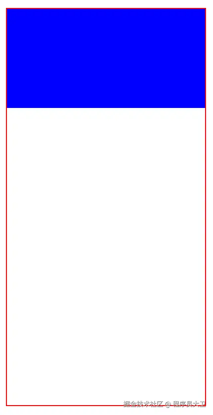
HTML 结构:
html
<style>
  .container {
    height: 400px;
    width: 200px;
    outline: 1px solid red;
  }
  .one {
    height: 100px;
    background-color: blue;
  }
  .two {
    background-color: red;
  }
</style>
<div class="container">
  <div class="one"></div>
  <div class="two"></div>
</div>方法一:calc 计算高度
css
.two {
  height: calc(100% - 100px);
}
方法二:绝对定位
css
.container {
  position: relative;
}
.two {
  position: absolute;
  top: 100px;
  bottom: 0;
  left: 0;
  right: 0;
  background: #ff0;
}
方法三:Flex 布局
css
.container {
  display: flex;
  flex-direction: column;
}
.two {
  flex-grow: 1;
}
推荐使用 Flex 布局,结构更清晰,响应式也更友好。
8.自定义滚动条颜色
html
<style>
  .box {
    width: 300px;
    height: 300px;
    border: 1px solid #000;
    overflow: scroll;
    /* 注意:不要加 -webkit-overflow-scrolling: touch,会导致 iOS 下滚动条消失 */
  }

  .box .inner {
    width: 1000px;
    height: 600px;
  }

  .box::-webkit-scrollbar {
    height: 9px;
  }

  .box::-webkit-scrollbar-thumb {
    border-radius: 10px;
    background-color: blue;
  }

  .box::-webkit-scrollbar-track {
    border-radius: 10px;
    background-color: red;
  }
</style>
<div class="box">
  <div class="inner"></div>
</div>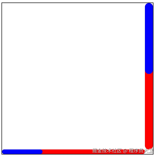
9.position 属性详解
- static:默认值,不进行定位,元素按正常文档流排列。
- relative:相对定位,元素相对其原本位置偏移,但仍占据原有空间。
- absolute :绝对定位,元素脱离文档流,定位相对于最近的已定位(非
static)祖先元素;若没有,则相对于html元素。 - fixed :固定定位,元素脱离文档流,默认相对于视口(viewport)定位;但若祖先元素设置了
transform、filter、perspective等属性,则可能相对于该祖先元素定位。 - sticky:粘性定位,元素在滚动达到设定阈值前处于正常流中,之后会固定在指定位置。
- inherit :继承父元素的
position属性值。