background: linear-gradient(red, yellow, blue);
background: linear-gradient(red 0%, yellow 50%, blue 100%);
background: linear-gradient(to right, red 0%, yellow 50%, blue 100%);
background: linear-gradient(90deg, red 0%, yellow 50%, blue 100%);
to right代表渐变偏移角度,to right(相当于90deg)
1、四角边框的背景
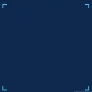
这里我们使用linear-gradient方式实现,结合background一些其他属性,可以更加灵活。下面的方式是用linear-gradient画线的方式,画上下两条边,然后通过background-size的方式截取边角上的部分,组合形成的。
width: 200px;
height: 200px;
padding: 10px;
background-origin: content-box;
background-color: #0e294c;
background-image:
	linear-gradient(#4cc7f3 2px, transparent 2px, transparent calc(100% - 2px), #4cc7f3 calc(100% - 2px), #4cc7f3 100%),
	linear-gradient(90deg, #4cc7f3 2px, transparent 2px, transparent calc(100% - 2px), #4cc7f3 calc(100% - 2px), #4cc7f3 100%),
	linear-gradient(#4cc7f3 2px, transparent 2px, transparent calc(100% - 2px), #4cc7f3 calc(100% - 2px), #4cc7f3 100%),
	linear-gradient(90deg, #4cc7f3 2px, transparent 2px, transparent calc(100% - 2px), #4cc7f3 calc(100% - 2px), #4cc7f3 100%);
background-repeat: no-repeat;
background-position: top left, top left, bottom right, bottom right;
background-size: 10px 100%, 100% 10px;